
Boston Symphony Orchestra
A digital brand worthy of a world-class institution. All four of them.
The Boston Symphony Orchestra came to the project with a discerning audience, a high-profile reputation, and box office numbers moving the wrong way. The goal reached further than a redesign:
Create a digital brand that wins a new generation without losing the one already in the seats.
Bowman Design Direction redesigned and developed the digital experience for the Boston Symphony Orchestra, Tanglewood, Boston Pops, and Symphony Hall. We carried the work from digital visual expression and information architecture through interface design and code in just under twelve months.
Read the Story
Challenge
The Boston Symphony Orchestra had a well-earned reputation, a discerning audience, and a problem it could see in the box office: sales were declining, and the audience that loved it most was aging. The obvious move, chasing a younger crowd, risked alienating the patrons who filled Symphony Hall every season.
Beneath that sat a structural puzzle. BSO, Boston Pops, Tanglewood, and Symphony Hall each had their own greatness and their own following, but online they behaved like strangers. A Pops fan could love an institution for years and never discover the rest of it.
Direction
Discovery reframed the audience problem. The BSO didn’t need a younger voice, because the audience it wanted was already listening to the music. Every fan, new or lifelong, simply knew one door. The work was to connect them: four institutions to each other, and each fan to everything they hadn’t discovered yet.
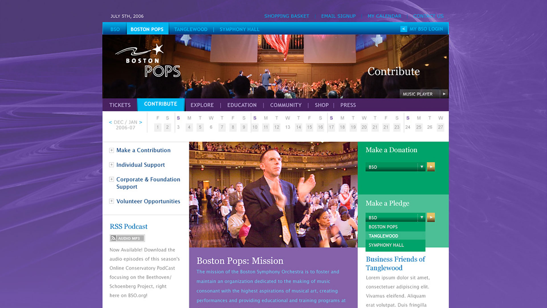
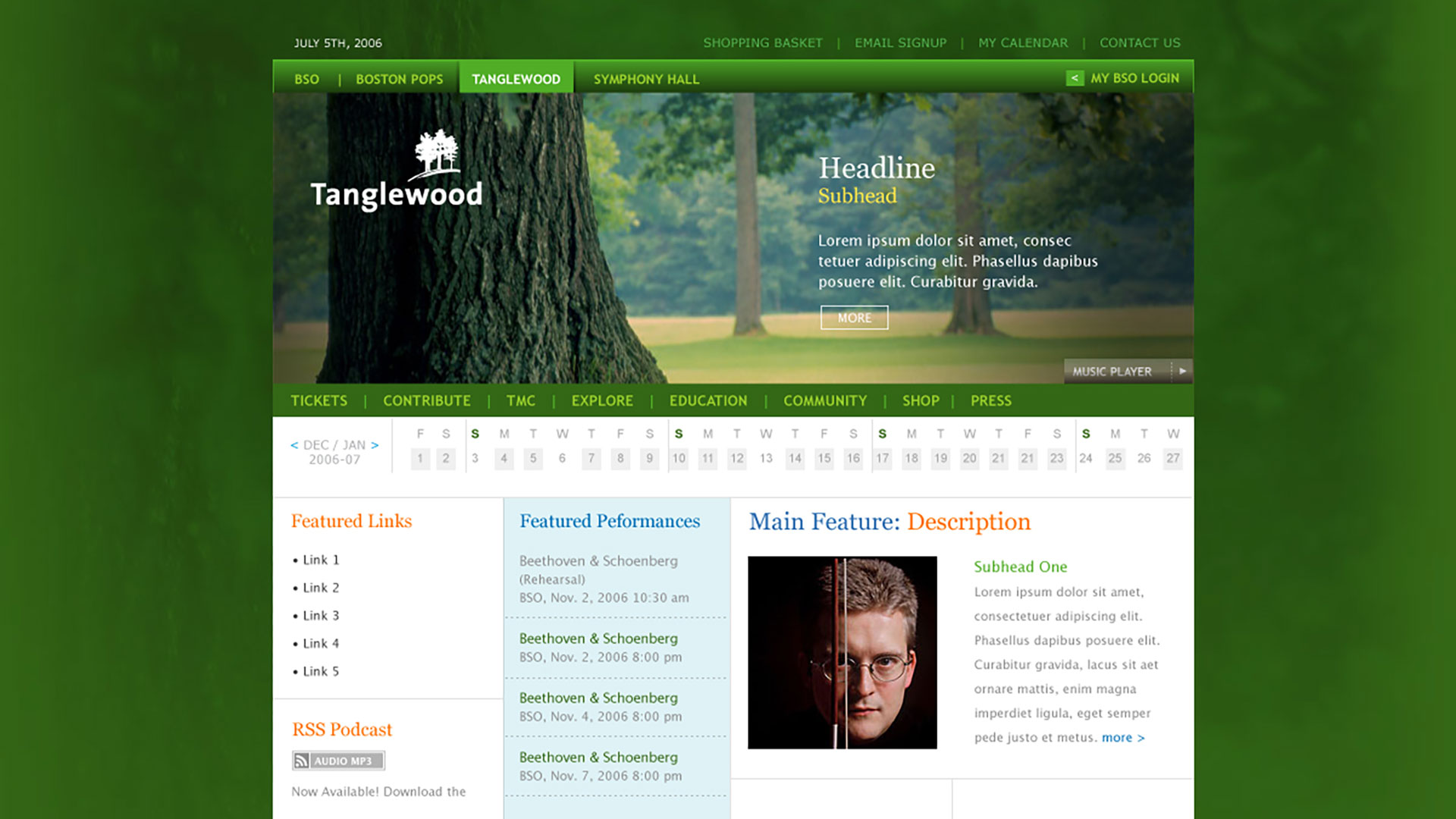
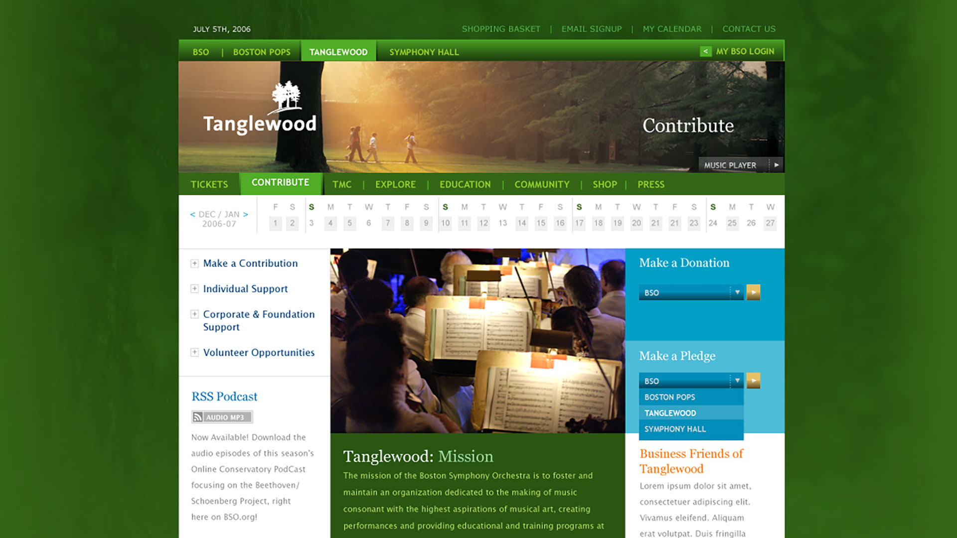
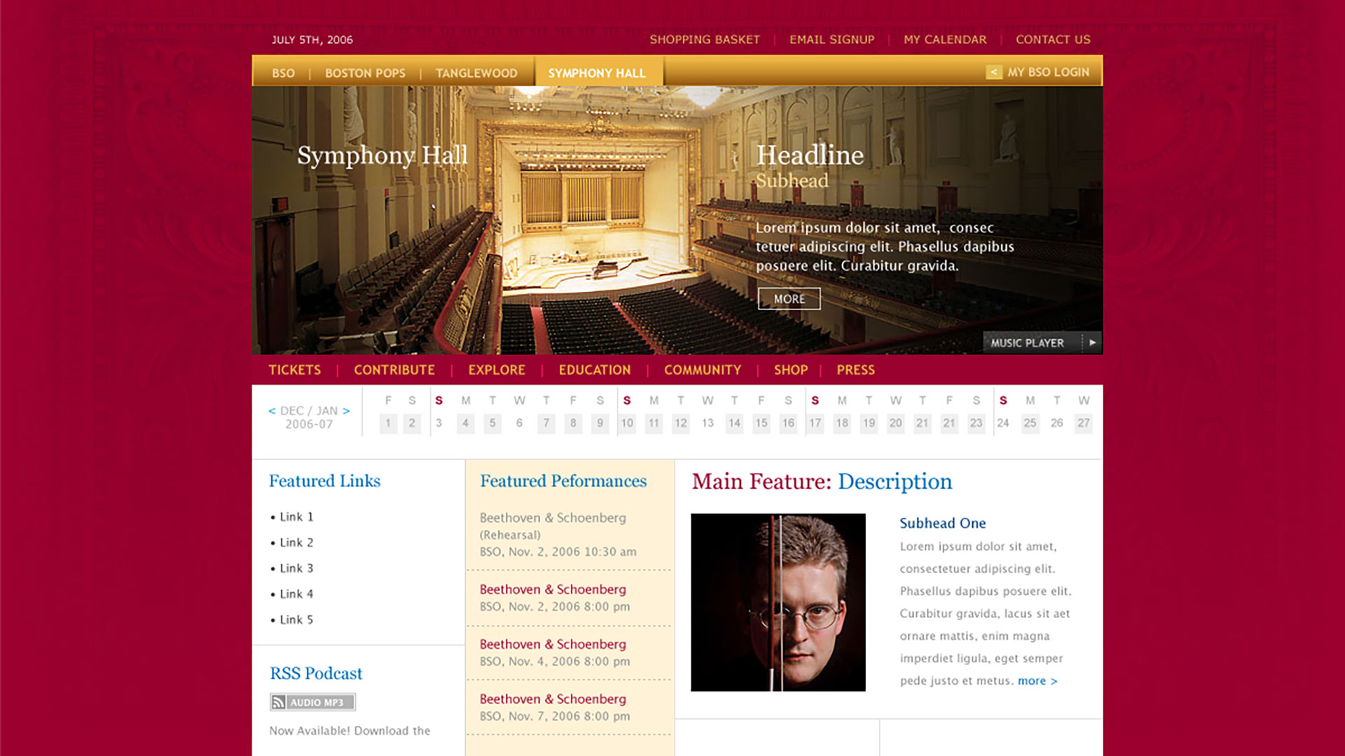
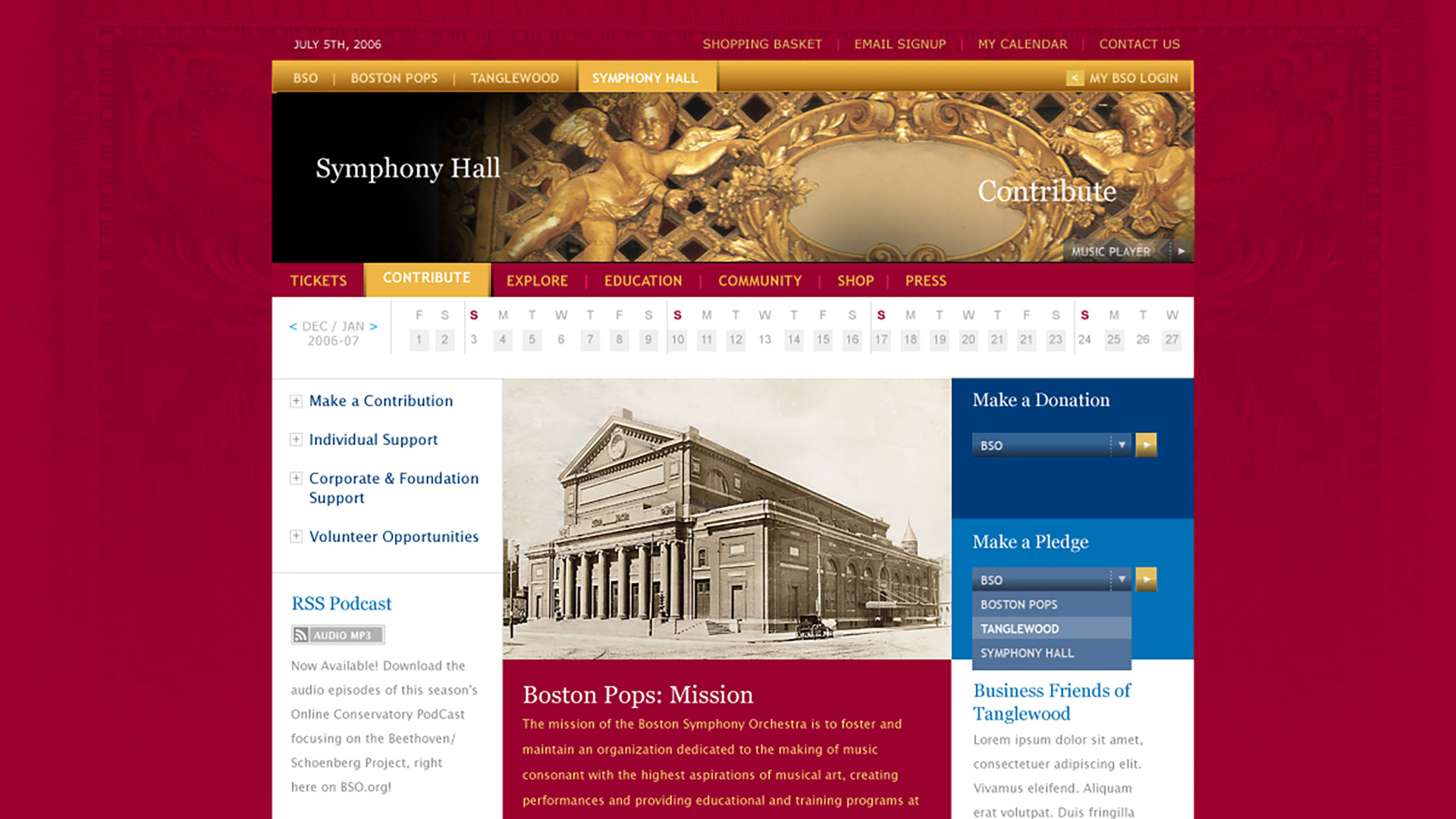
So one unified experience held all four brands, each keeping its own character. An all-in-one calendar put the season’s changing catalog on every page. A media player let newcomers listen first, then linked straight to tickets. And personalization recommended the next evening based on what each fan already loved.
Outcome
Declining sales reversed. The new site earned a 30% increase, selling performances, events, and recordings across every touchpoint, with the 2007-08 season subscribable entirely online.
Our work was named Adobe Site of the Day and Site of the Week by Communication Arts’ Design Interact, praised as “an unaffected, user-centered design” that made a vast amount of content feel considered. The established audience kept their orchestra. A new one found it.
Takeaway
Institutions with aging audiences are usually told to sound younger. The BSO’s real advantage was a catalog of unforgettable evenings sitting behind doors most fans never tried. The work translated listening into attending, one door into four. The audience the BSO wanted was already listening. The work gave them a seat.
What We Built
Brand & Identity
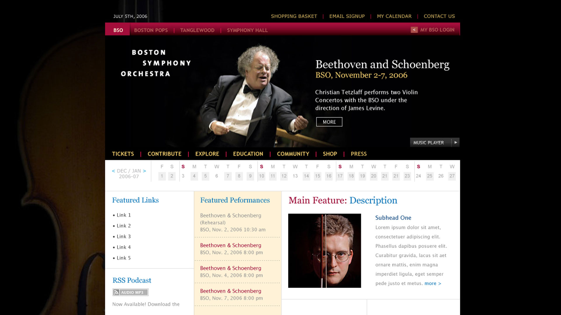
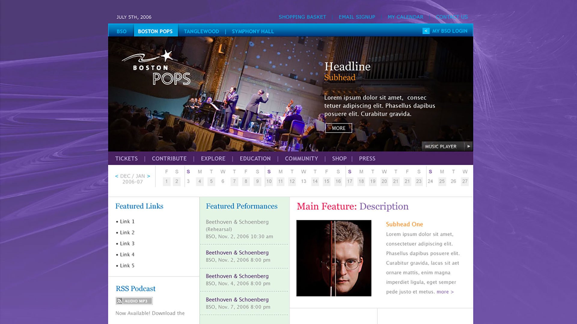
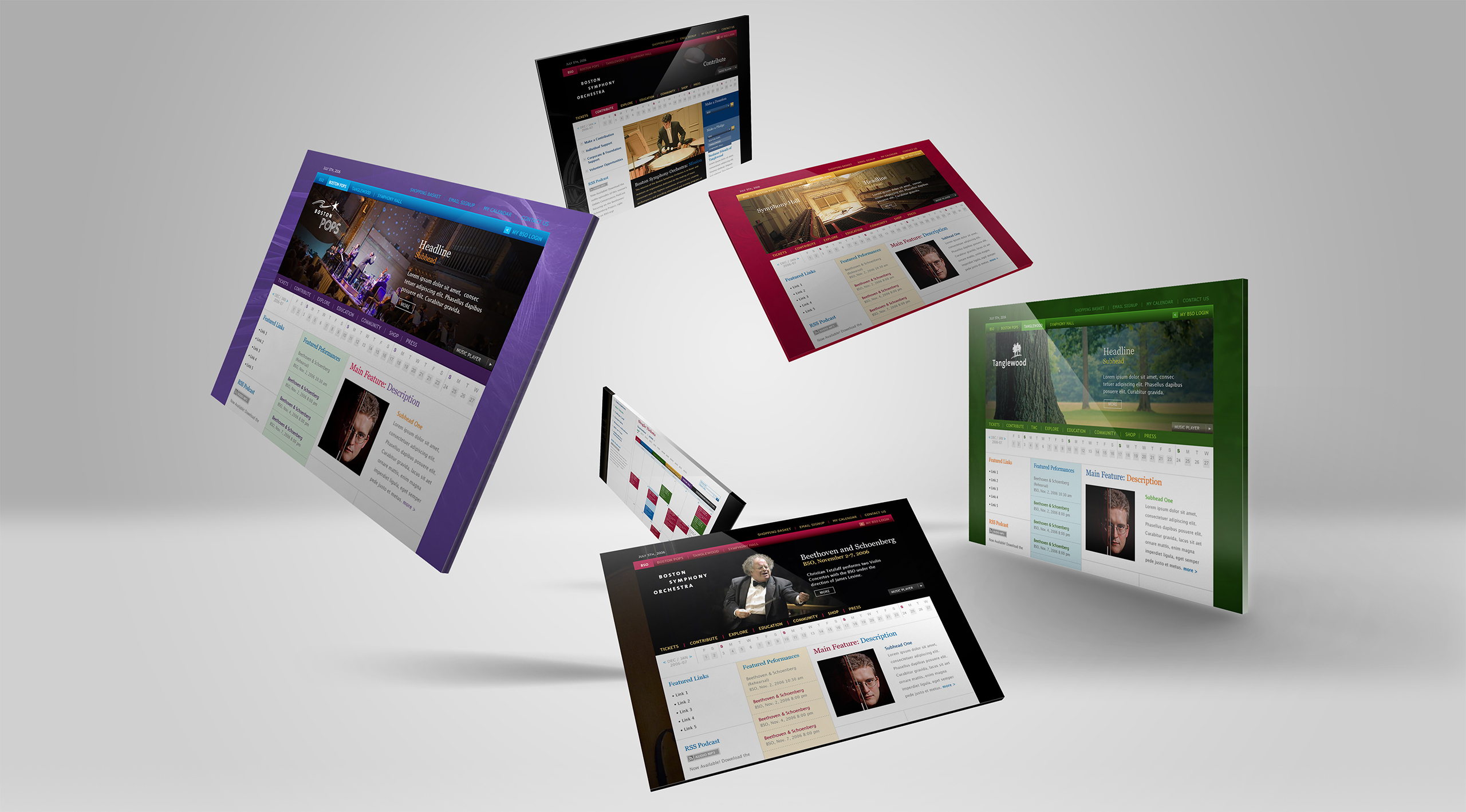
We created the new Symphony Hall identity and unified the digital brand across The Boston Symphony Orchestra, Tanglewood, and Boston Pops, giving each institution its own character inside one recognizable family. Individuality preserved, relationship made visible.
The All-in-One Calendar
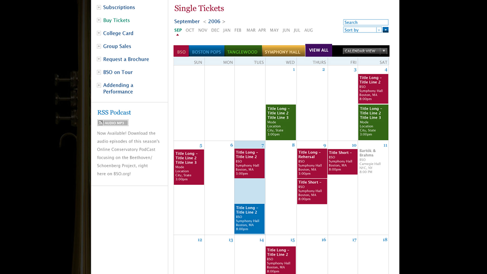
A season is a catalog that changes nightly. The persistent QuickCalendar put every performance one glance away from any page, letting patrons reach any date without losing their place, and cross-selling the full catalog of events at every touchpoint.
The Media Player
Newcomers could listen before they ever bought, through a familiar player stocked with upcoming performances and linked directly to tickets and recordings. And in an era of autoplaying websites, the music waited to be asked. Reviewers noticed the restraint.
Personalization
We identified each visitor’s key interests and personalized the experience across performances, events, and recordings. Whether a fan searched by date or arrived through the player, the site gracefully recommended the next relevant evening inside a visually immersive experience.

The Through-Line
What began as a declining box office and four separate stories became one brand a fan could wander, and a 30% increase in sales.
Where four institutions once behaved like strangers, the identity and architecture made them one family with four front doors, each keeping its own character. Where most redesigns chase newcomers by shedding tradition, this one put the BSO’s depth to work: history, photography, and substance that made trust feel earned.
Where a season used to hide in brochures, the calendar put every evening one glance away, from any page, at any moment.
Where sound is usually a website’s decoration, the media player made it the sales force. Listening led to tickets, tickets to seats chosen on screen, and a first evening to a personalized recommendation for the next one.
That is what the redesign proved: an institution this rich doesn’t need reinvention to grow. It needs every one of its doors open.
Every Deliverable Opened Another Door to the Same Orchestra.
Discovery + Strategy
Before a page was designed, we mapped how four institutions could share one front door.
Box Office Roadmap
Declining sales set the brief. We aligned awareness, discovery, conversion, and loyalty into one system pointed at a single measure: seats filled.
Brand Architecture
Four beloved names, one institution. We gave BSO, Pops, Tanglewood, and Symphony Hall each their own presence inside one unified brand, so loving any of them led to the others.
Audience Architecture
A lifelong subscriber and a first-time listener buy the same seat differently. We mapped how each generation discovers, decides, and returns, then built both paths without privileging either.
Calendar Strategy
An orchestra’s inventory is time. We made the season itself the storefront: a persistent calendar on every page, so no visit ended without seeing what was playing next.
Listen-First Strategy
You can’t describe a symphony into a sale. The media player let the music make the argument, then connected the listening directly to tickets, recordings, and the season ahead.
Content Depth
Trust is built on substance. Deep historical and institutional content served the devoted patron, prepared the newcomer, and gave a 126-year-old institution the digital gravity it deserved.
Brand Identity
The Symphony Hall identity anchored a new digital brand family spanning The Boston Symphony Orchestra, Boston Pops, and Tanglewood. Each institution kept its own character, its own color, its own audience, while the system beneath them made their relationship unmistakable: four names, one standard of greatness.
The design language took its cues from the institutions themselves rather than from digital fashion. Photography of the musicians carried the emotional weight. Typography and restraint did the rest, giving a century-old institution a contemporary presence without a costume.
The result was recognized with Adobe’s Site of the Day and Communication Arts’ Design Interact Site of the Week, but the more important verdict came from the audience: a brand devoted patrons recognized as theirs, and newcomers wanted to belong to.
Creations
Boston Symphony Orchestra
Website + Ticketing + Membership
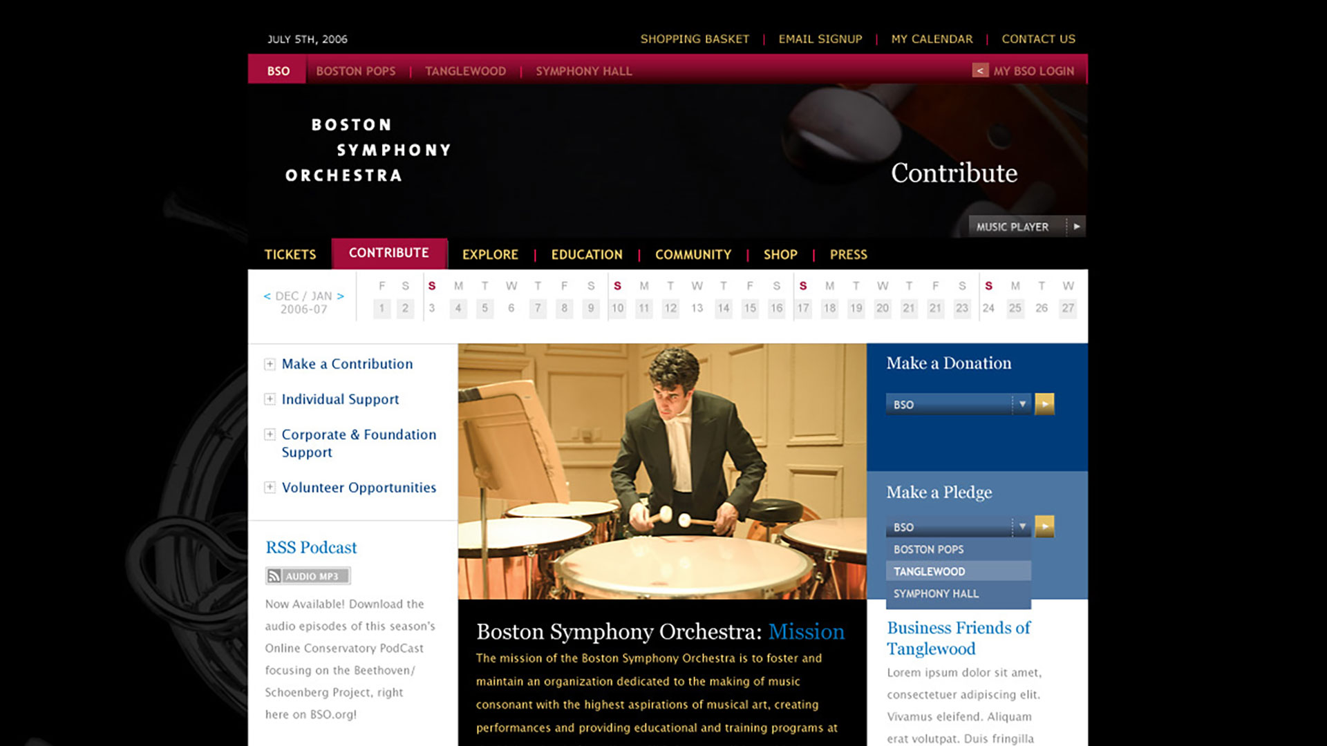
We designed the site around the moments that matter to a patron: finding an evening, hearing the music, choosing the seat. Seven sections organize the full breadth of the institution, with expandable navigation keeping a surprisingly large amount of content feeling effortless. The persistent QuickCalendar carries the season onto every page, so any date is one glance away without ever losing your place.
The media player turns listening into the first step of a purchase, linking performances directly to tickets and recordings. The dynamic seat viewer makes buying visual: patrons choose the perfect seat on screen, and the 2007-08 season could be subscribed to entirely online.
Beneath it all, personalization identifies what each visitor loves and recommends the next relevant evening, across performances, events, and recordings. The site sells the evening a fan came for, then introduces the one they’ll come back for.