Opens in a new tab
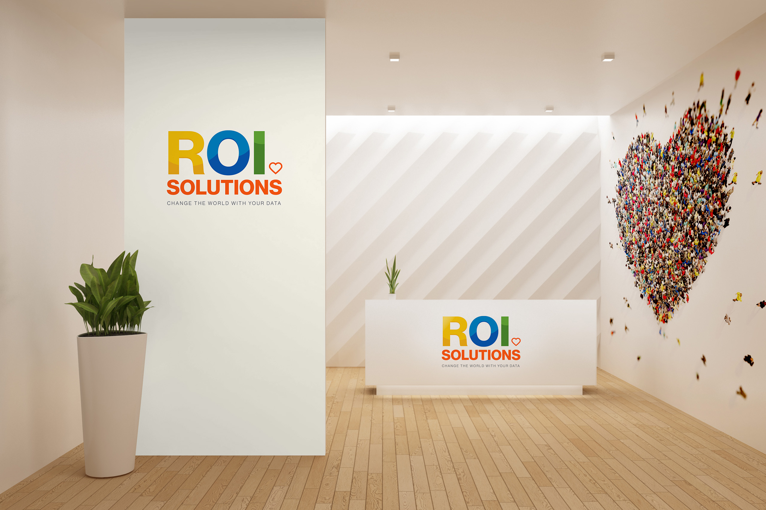
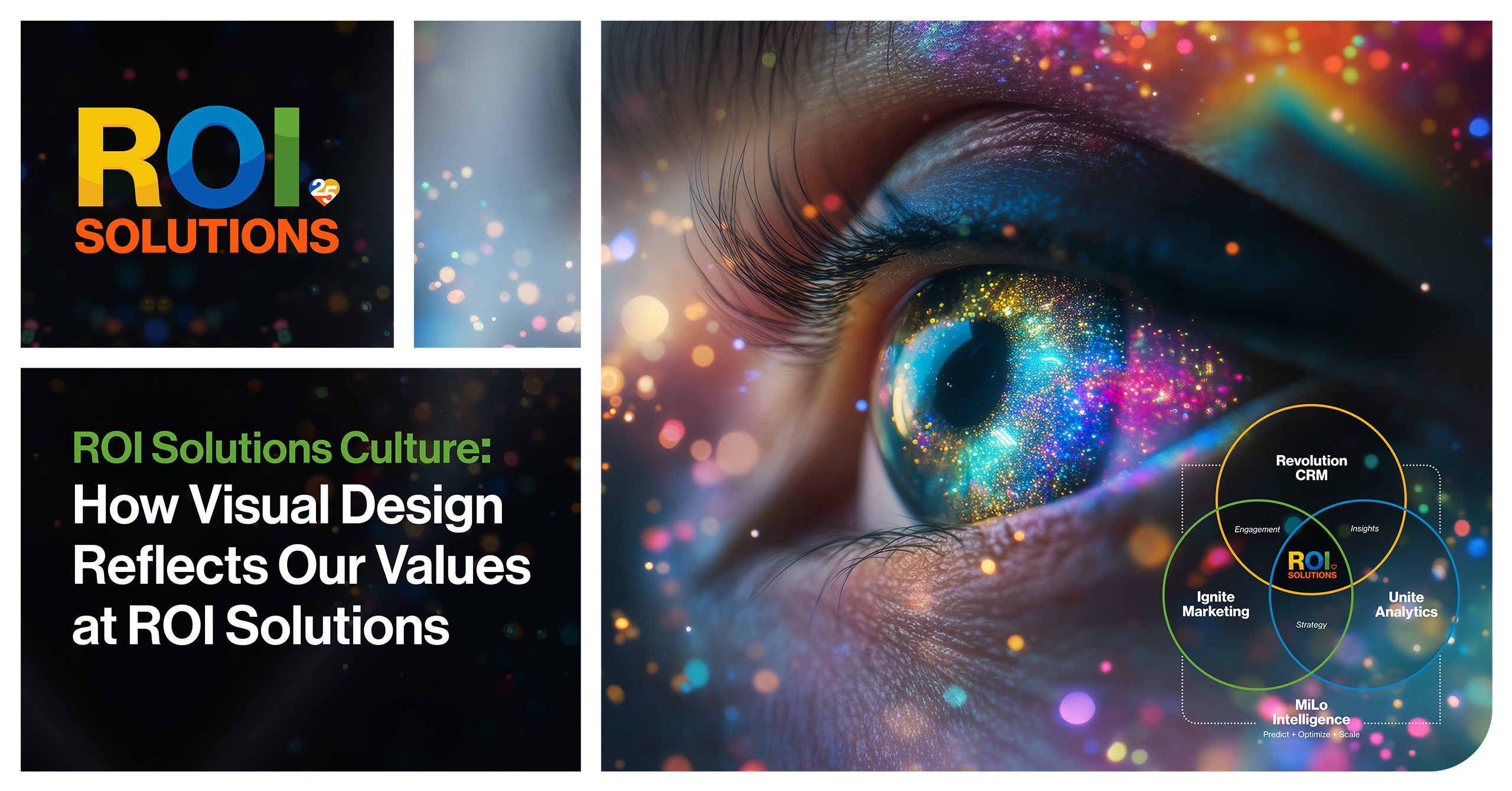
Multicolor ROI logotype with the outlined orange heart, the no-tagline parent mark set reversed on a dark field.

ROI Solutions

A brand that leads with heart. And systems that begin with understanding.

ROI Solutions had spent twenty-five years building the data systems behind some of the country’s most recognized nonprofits, with a goal the brand had never expressed:

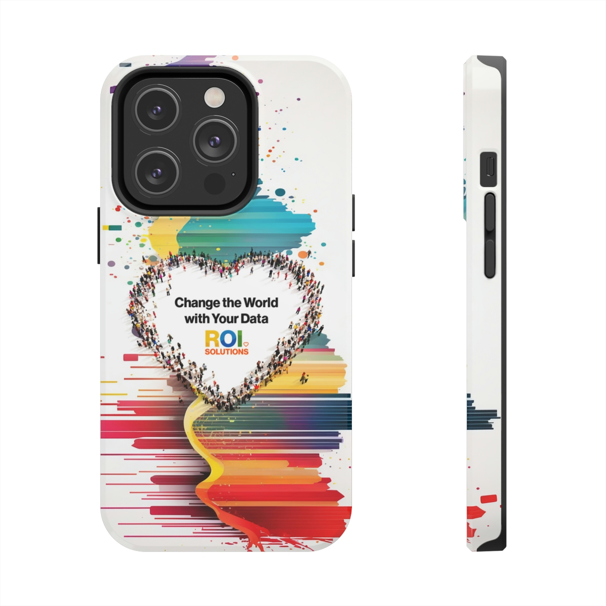
Change the world with your data.

Bowman Design Direction partnered with ROI Solutions on three years of continuous work: strategic discovery, a new brand constellation, a website and publishing system, a full marketing engine, and finally an AI layer that turned the discovery itself into infrastructure.

Challenge

Nonprofit technology is a category of giants, and it dresses accordingly: platform-safe greys and blues, feature lists, acronyms. After twenty-five years of quiet excellence, ROI Solutions was competing against companies many times its size with a brand that said nothing about who they were.

The uncertainty ran deeper than a dated logo. The company knew its products and its clients knew its people, but nobody could articulate what made the whole thing different. Growth meant standing apart from the platforms. Standing apart meant knowing, precisely, who they really are.

Direction

Discovery held up the mirror. Their clients described them as intellectually curious, committed, bold, fun, quirky, different. Every answer pointed the same way: not at the technology, but at the relationships behind it. A company of nonprofit people, independent, giving 1% back, measuring itself by its clients’ missions.

The insight became the architecture. We put a heart at the center of every product identity and understanding at the start of every system: a brand promise built on the client’s data, not the company’s software. Change the world with your data.

Outcome

ROI Solutions now looks the way it always behaved. A vibrant constellation of product identities stands apart in a category of greys and blues. The company operates every part of it: marketing publishes the website without waiting on IT, editors build white papers and emails from templates, and the brand standards live one login away from anyone who needs them.

The proof is longevity. Three years after launch the engagement was still compounding: website traffic up 206% year over year, a growth strategy, an anniversary campaign, a merchandise line, a family of AI characters, and an intelligence layer that introduces the company to nonprofits by their missions, not its features.

Takeaway

A discovery deck is usually the first thing an engagement forgets. The BDD Discovery + Strategy deck refused to retire. The questions that found the heart of the brand in 2022 kept working: they organized the website, aimed the marketing, and by 2025, BDD Business Intelligence was asking those questions across 2,267 nonprofit organizations at once. The work turned discovery from a phase into an asset. Understanding became the infrastructure everything else runs on.

What We Built

Brand Constellation

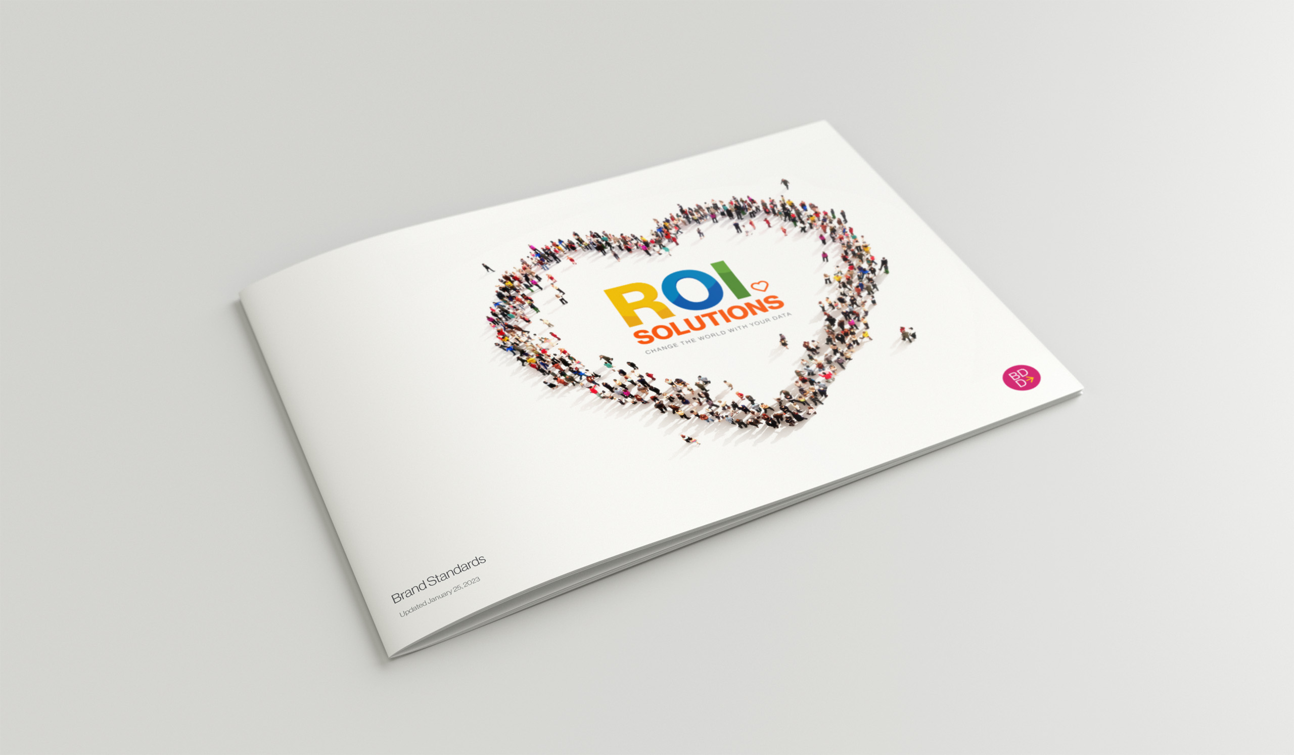
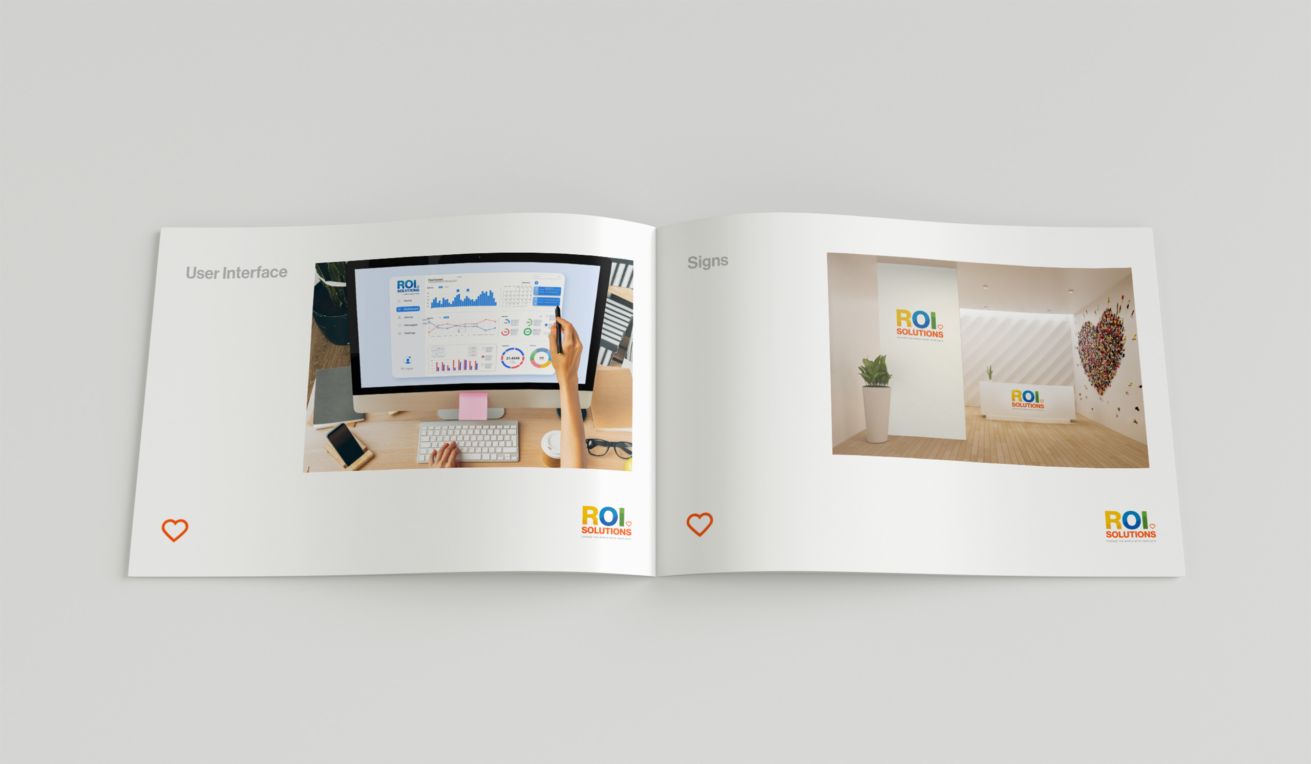
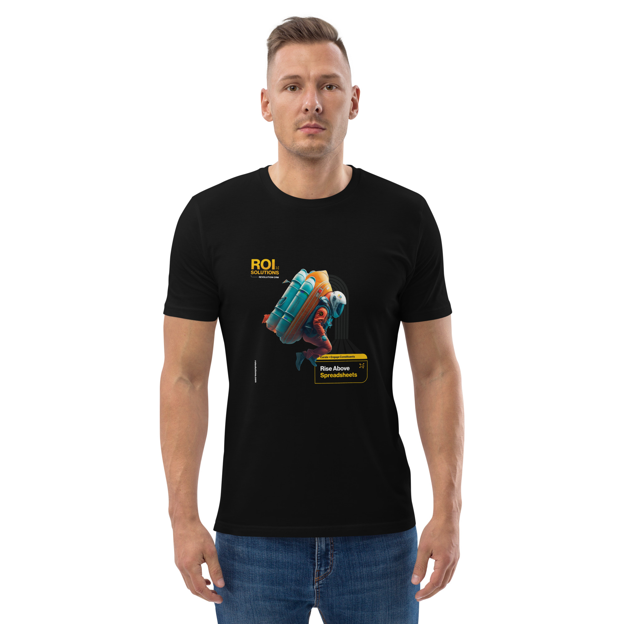
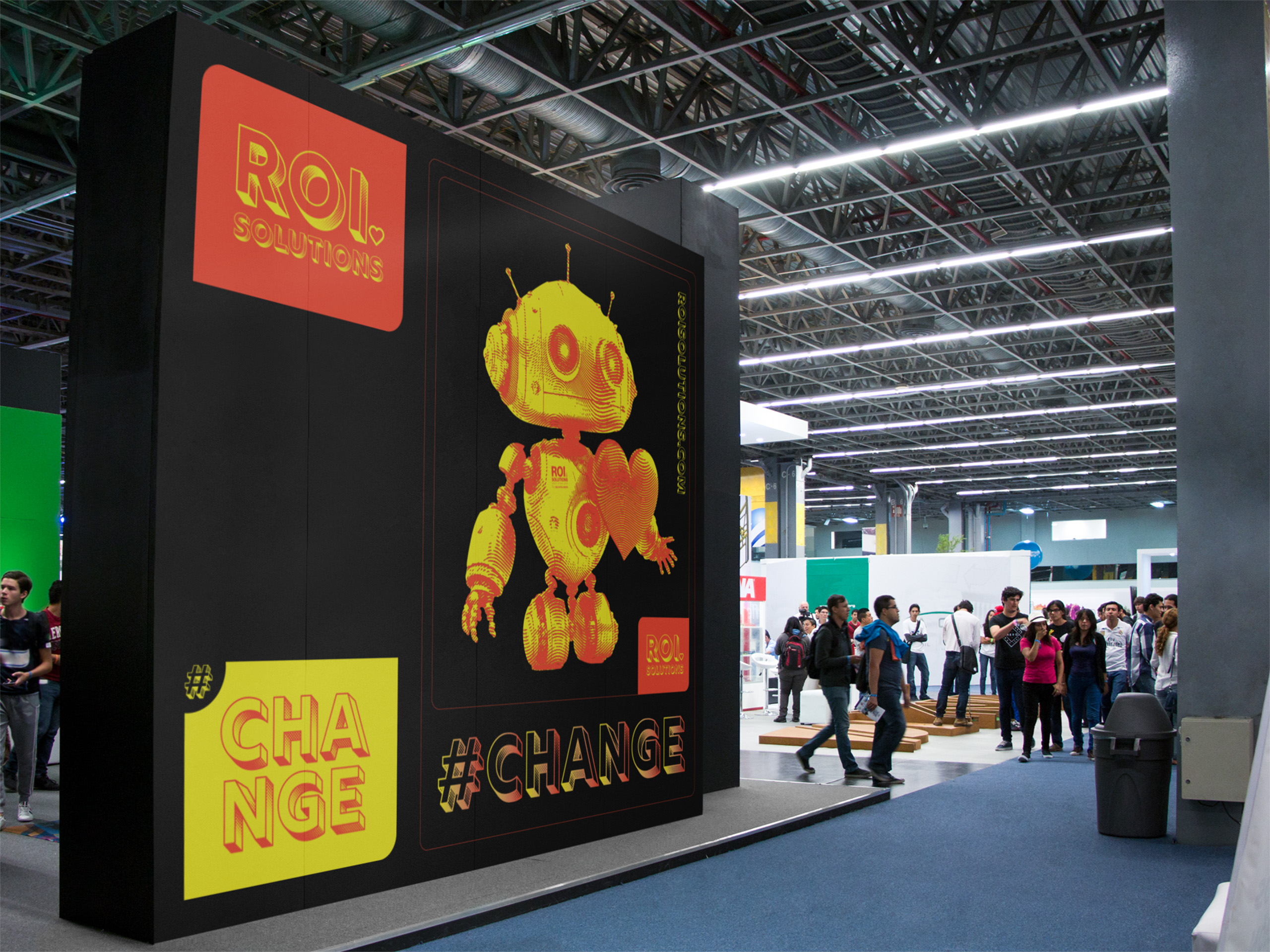
We created a parent identity with a family of product marks: Revolution CRM, Unite Analytics, Ignite Marketing, and MiLo Intelligence, each carrying a heart at its center. A digital standards guide and asset library specced everything from typography to paint codes, so the brand could live on a screen, a trade-show wall, or a hoodie without losing itself.

Website + Publishing

We architected the website around missions and roles instead of feature lists, then built the publishing system underneath it: custom content types, resources, landing pages, and predictive search, all editable by the marketing team. The company that sells data independence to nonprofits gained the same independence for its own story.

Marketing Engine

One brand system powered every channel: full-funnel digital advertising aimed by mission sector, an email template program, editable white-paper systems, an adaptive pitch deck, banners, Zoom backgrounds, and an on-demand merchandise shop. Different surfaces, one voice, operated in-house.

AI + Mission Intelligence

We gave the company’s intelligence a face, a voice, and finally understanding: a redesigned character family, MariaGPT trained on decades of institutional knowledge, and an enrichment engine that performs strategic discovery on every prospective nonprofit, powering personalized marketing, sales enablement, and enterprise analytics from one trusted source.

Outlined orange heart from the parent identity, the symbol placed at the center of every product mark in the constellation.

The Through-Line

What began as a worksheet of questions became a brand, a website, a voice, and finally an intelligence every system shares.

The identity answers it with a heart at the center of every mark, drawn for the people each product serves. The website answers it structurally: organized by mission and by role, so a visitor finds their cause before they find a feature.

The publishing system answers it for the people inside the company. Templates, standards, and a CMS the marketing team runs themselves turned brand consistency from a rule into a capability.

The marketing engine answers it at scale. Advertising retargets by mission sector, emails and white papers speak in one voice, and even the merchandise shop lets the team wear the brand without asking permission or carrying inventory.

And the AI answers it literally. MariaGPT begins every conversation with the company’s knowledge, and Mission Intelligence begins every relationship with the nonprofit’s own story. Three years on, the discovery is still answering questions.

Every Deliverable Asks the Same Question First: Who Is on the Other Side, and What Do They Believe In?

Laptop showing the three-circle discovery Venn diagram, product identities overlapping into engagement, insights, and strategy around the parent mark.

Discovery + Strategy

Before the brand, we asked the questions. The answers became the architecture.

  • Business Roadmap

    What are you building, and for whom? Discovery aligned the offering, the audiences, and the launch sequence into one plan, staging each product’s debut so the brand and the business arrived together.

  • Brand Architecture

    A parent brand with product children, governed by a less-is-more system. Discovery evolved the promise itself, from technology that powers your vision to a commitment anchored in the client: change the world with your data.

  • Audience Architecture

    From CIOs to membership directors, we mapped how each role evaluates, decides, and succeeds, then built personas that gave every page, campaign, and conversation a person to serve rather than a market to address.

  • Product Architecture

    Four products with overlapping edges became a portfolio with clean boundaries. Naming, verb sets, and positioning gave Revolution, Unite, Ignite, and MiLo each a distinct job and a shared heart.

  • Mission Architecture

    BDD Discovery + Strategy organized ROI Solutions’ market around the missions nonprofits serve, but that taxonomy was only one layer. The discovery model enriched lightweight CRM records with structured context across the questions that distinguish one organization from another. Two years later, that discovery architecture became part of the contextual foundation used to understand 2,267 organizations.

  • Competitive Positioning

    Against platform giants in category greys and blues, discovery positioned ROI Solutions on what the giants can’t claim: independence, nonprofit-native people, and a brand vibrant enough to prove it. Simplify the complex. Lead with heart.

Brand Identity

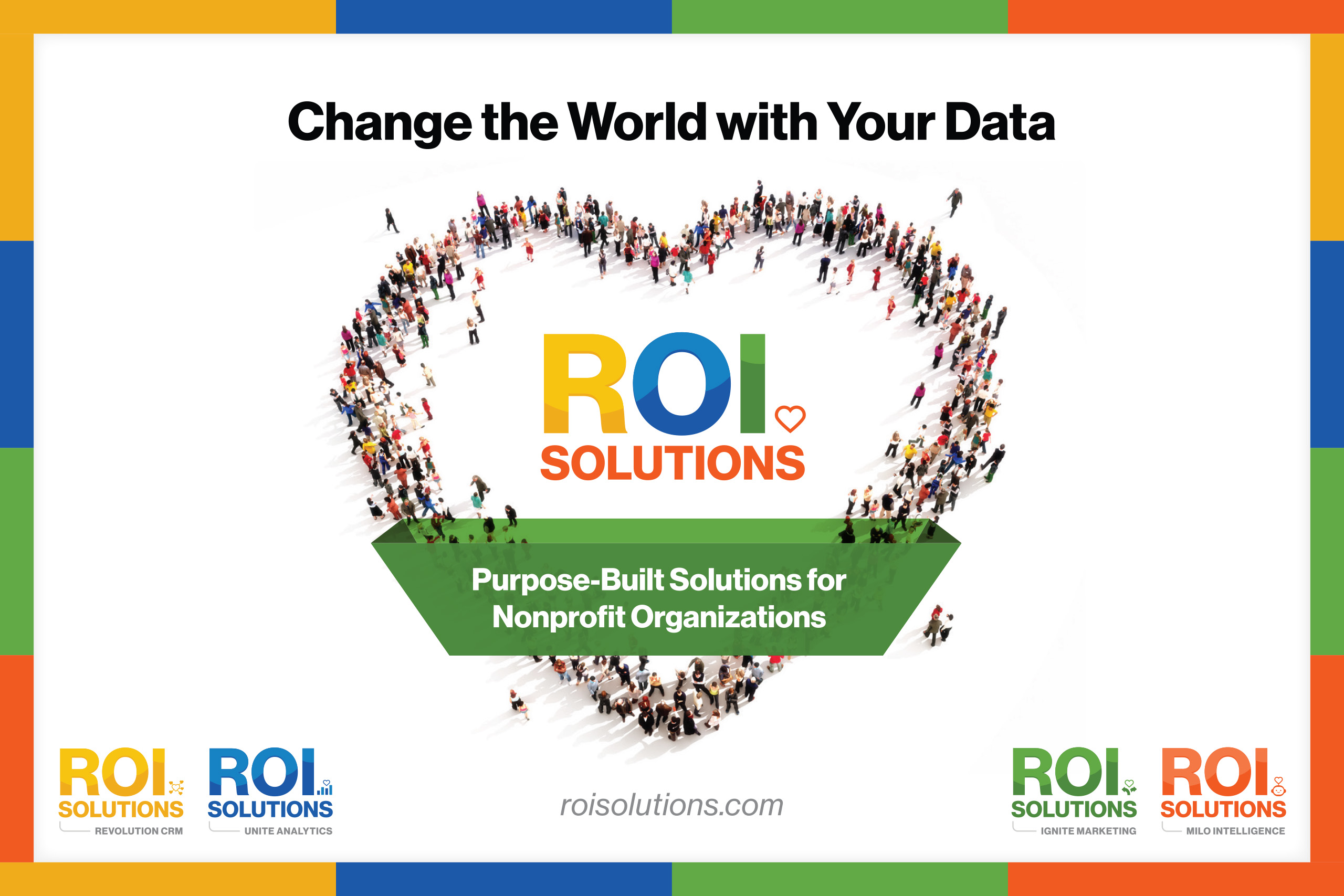
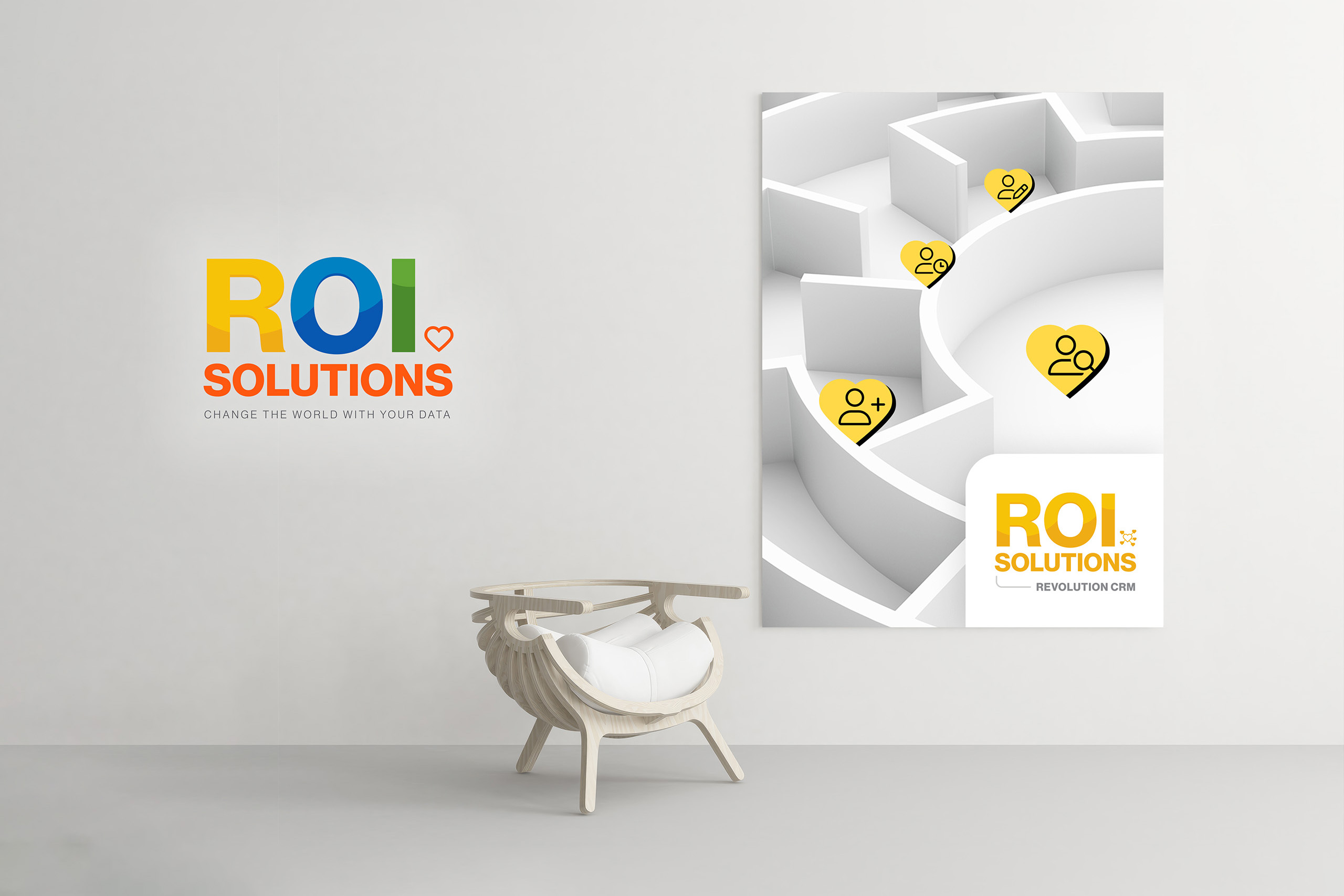
Multicolor ROI logotype in yellow, blue, and green with an orange heart, above the brand promise Change the World with Your Data.
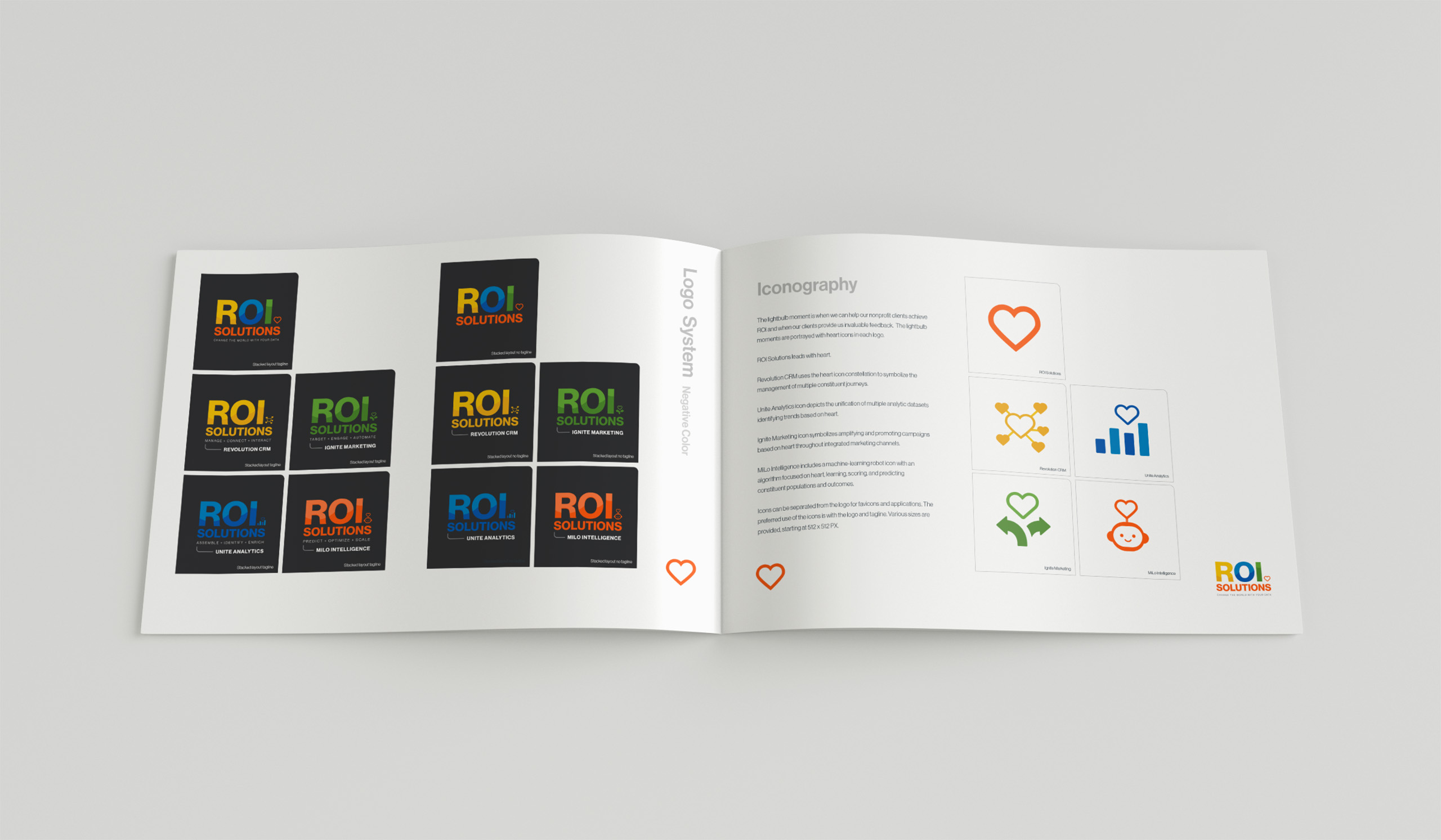
Multicolor ROI logotype with orange heart and the Change the World with Your Data tagline, set reversed on a dark field.
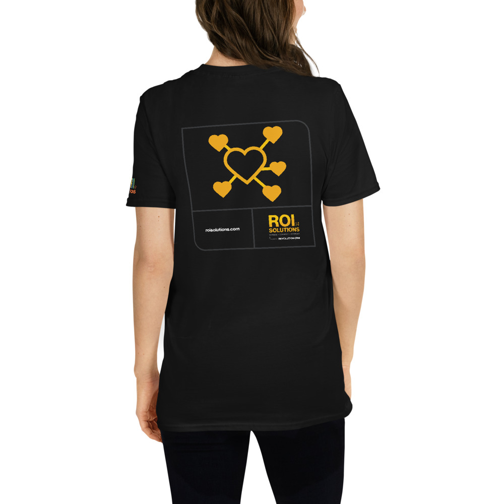
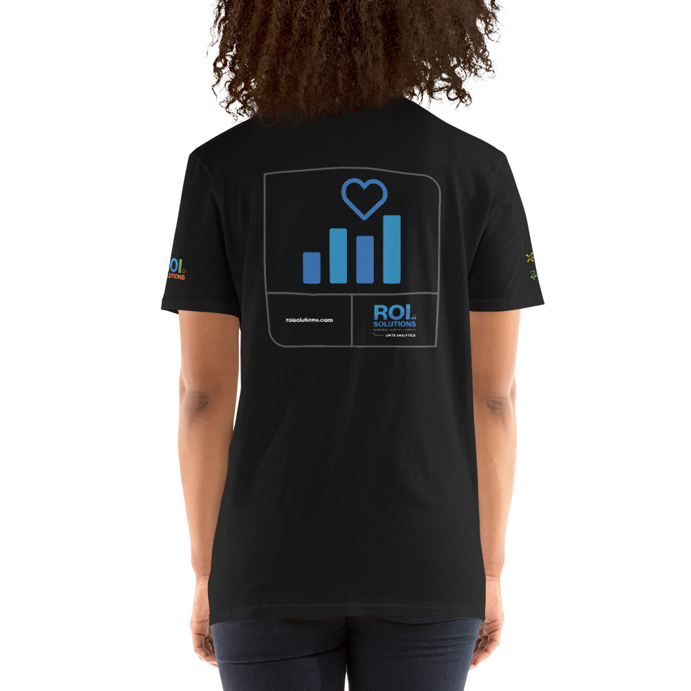
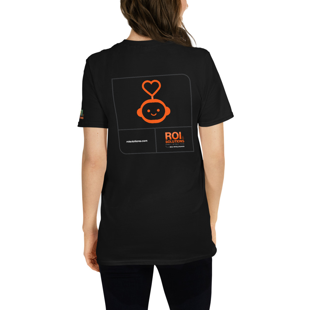
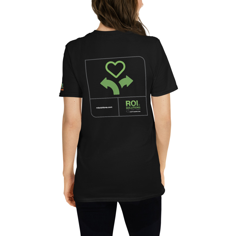
Gold product lockup with networked-hearts glyph, the words Manage Connect Interact above the Revolution CRM name line.Blue product lockup with heart-and-bar-chart glyph, the words Assemble Identify Enrich above the Unite Analytics name line.Green product lockup with sprouting-heart glyph, the words Target Engage Automate above the Ignite Marketing name line.Orange product lockup with robot-head heart glyph, the words Predict Optimize Scale above the MiLo Intelligence name line.

The ROI Solutions identity translates twenty-five years of leading with heart into a visual system you can read at a glance. The founder drew the original logo when the company began; the new constellation honors that lineage and gives it a family: a parent mark and product identities, each carrying a heart at its center.

Every heart earns its place. Revolution’s constellation of hearts maps constituent paths. Unite finds the trends hiding in unified data. Ignite amplifies campaigns outward. MiLo, the machine-learning character, runs an algorithm with heart at its core. A less-is-more discipline keeps recognition compounding instead of fragmenting.

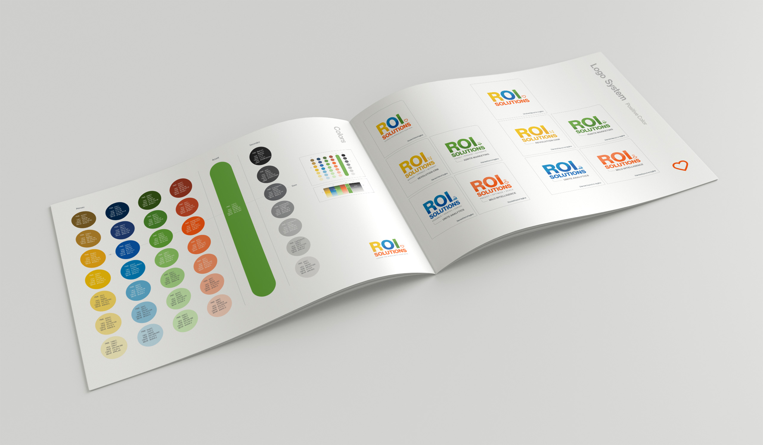
The palette breaks the category on purpose. Where nonprofit technology defaults to cautious greys and blues, ROI Solutions leads with vibrancy, energy, and growth, balanced by a sixty-ten-thirty rule that keeps boldness organized. Green, deliberately unclaimed by the platforms, became the call to action.

Neue Haas Grotesk gives the voice its confidence, and the standards guide specs every element down to physical paint codes: an identity built to be operated.

When ROI Solutions later introduced Epiphany Benchmarking, the system proved it could grow without being redesigned. ROI Solutions originated the product and created its initial logo and PowerPoint. We refined the identity so its scale, proportion, geometry, and execution aligned mathematically with the established product family. Drawing from earlier articles, we wrote the complete product-page narrative, designed and built the page, integrated Epiphany into the mega-menu and product architecture, and extended it through the relevant Client Experience, Mission Focus, and Role Enablement pages.

Epiphany joined Revolution CRM, Unite Analytics, Ignite Marketing, and MiLo Intelligence as a distinct product within one durable brand, content, navigation, and publishing system. The constellation grew, exactly as designed.

Color System

Five tint-ladder columns stepping gold, blue, green, orange, and gray from pale washes down to near black across the palette.

Style Guide

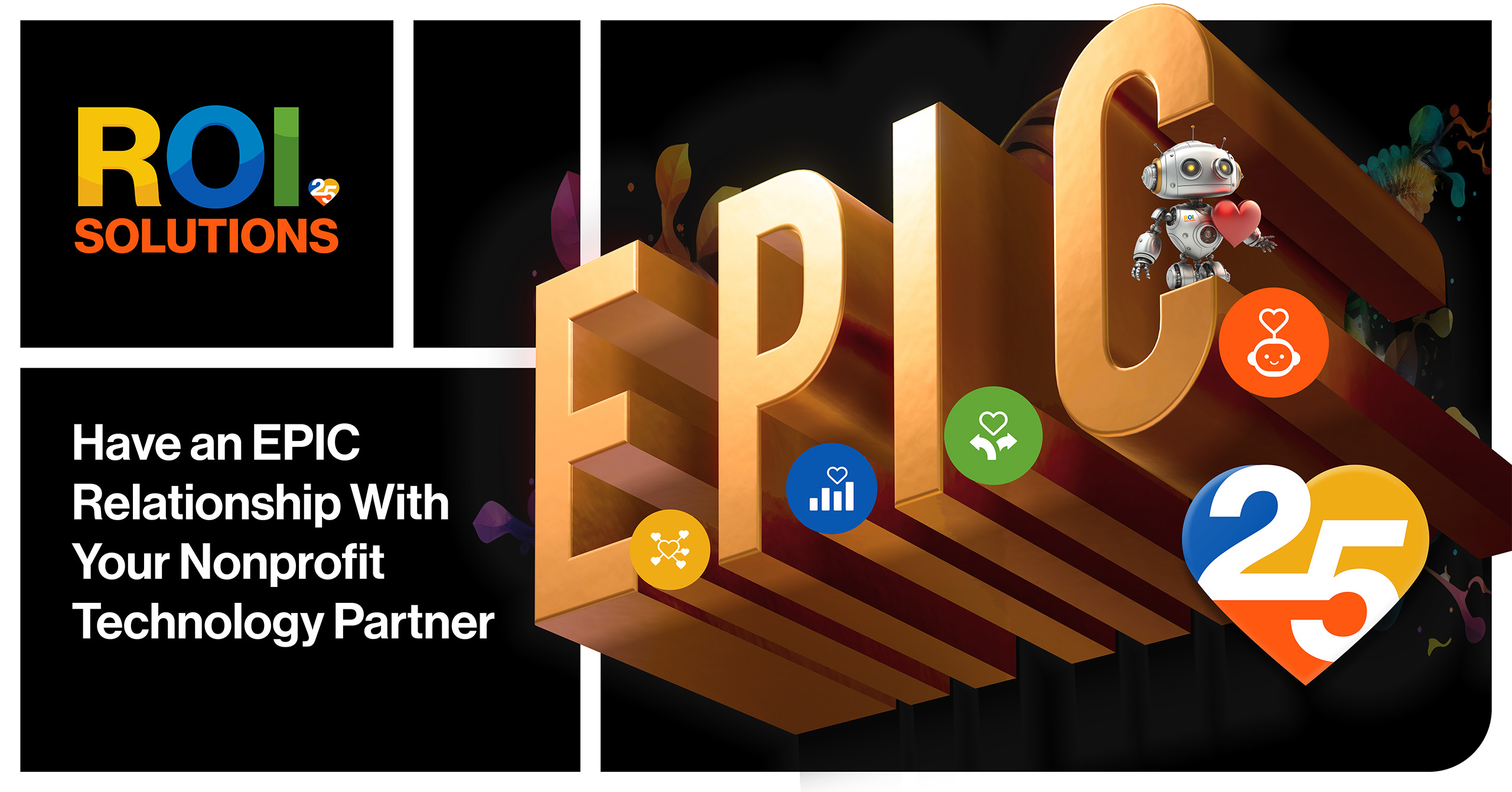
25th Anniversary & My Mission Identities

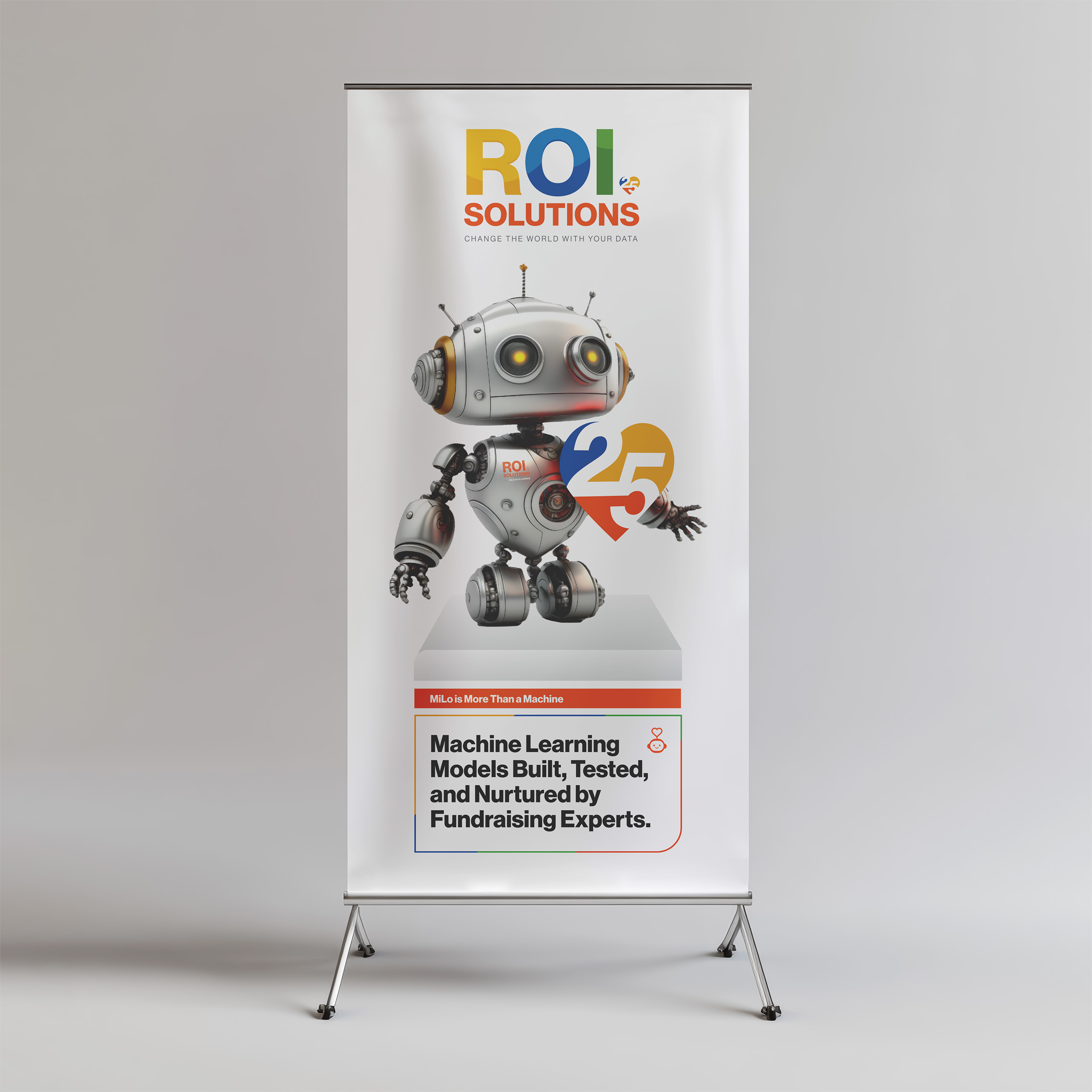
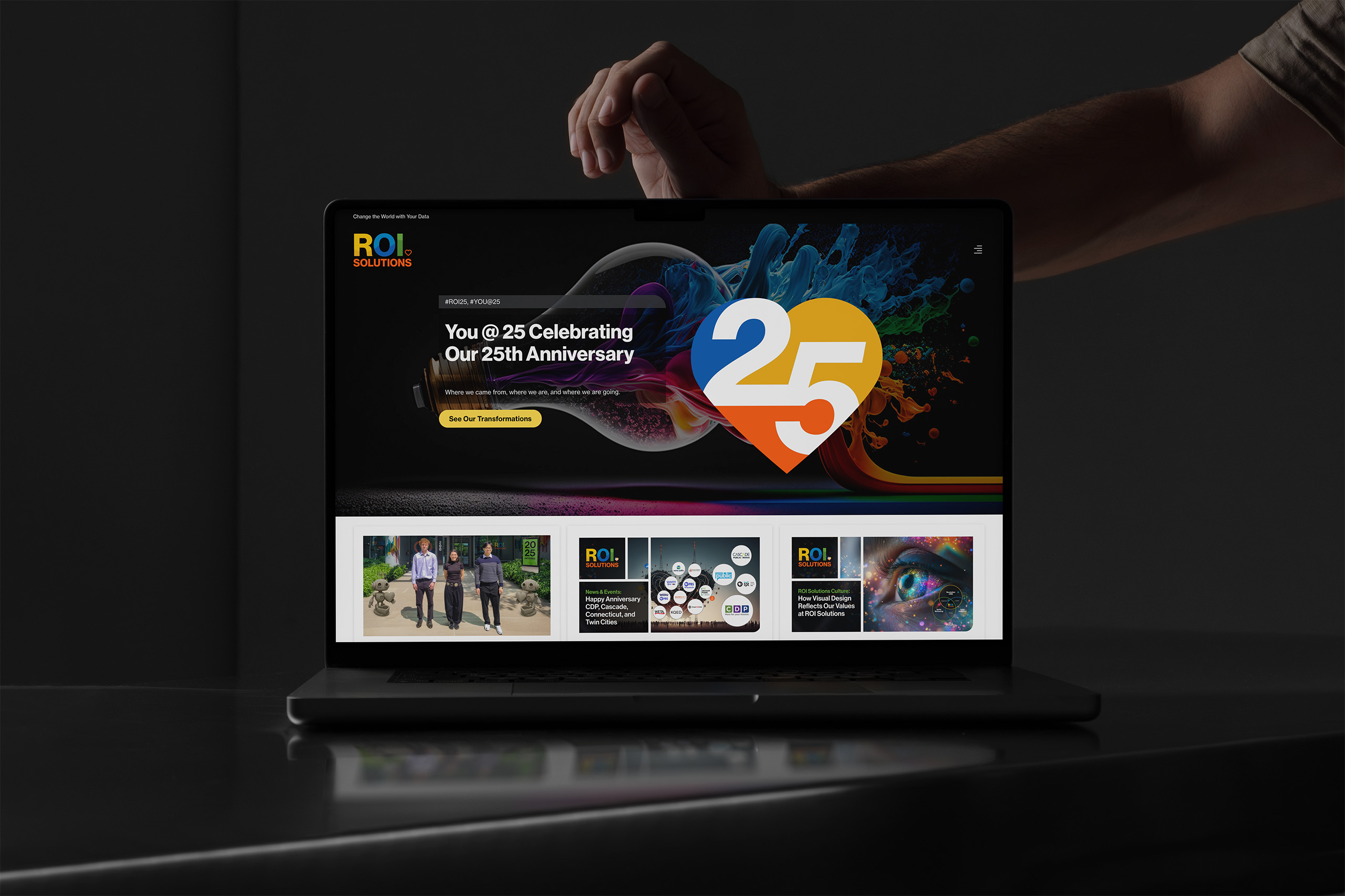
Three years after launch, the constellation was still growing. When ROI Solutions turned twenty-five, we created the You @ 25 anniversary identity, and the My Mission mark followed, each drawn from the same heart-centered system as the product family. A brand built as a constellation doesn’t need a redesign to celebrate. It adds a star.

Heart built from blue, yellow, and orange segments around a white numeral 25, marking twenty-five years of the company.Multicolor ROI Solutions logotype with a small segmented 25 heart replacing the standard heart for the anniversary year.Angled pennant badge stacking orange, yellow, blue, and green bands around the words My Mission and a white heart.

Photography

Office
Portraits
Meeting
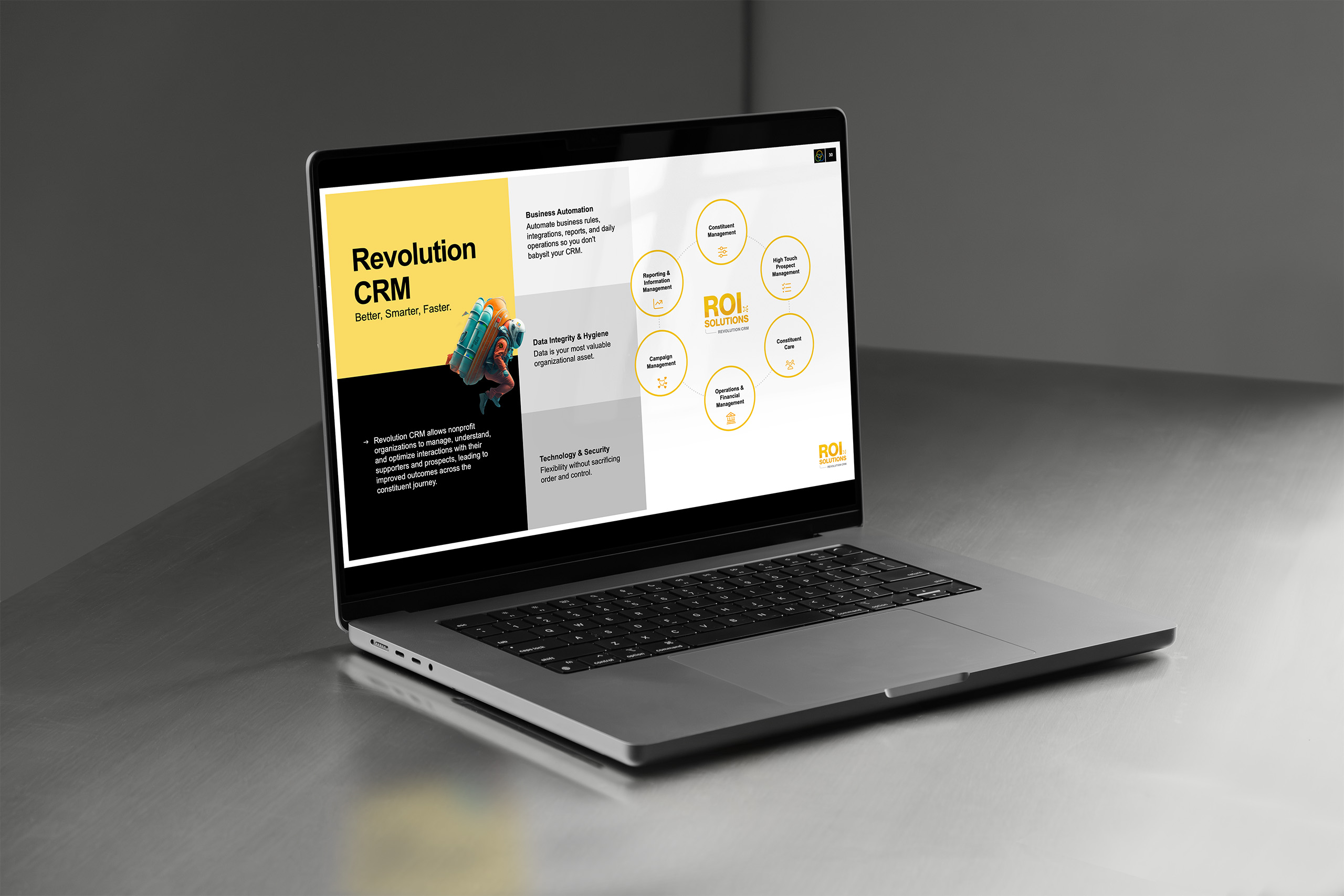
Laptop showing the Revolution CRM slide, a Better Smarter Faster headline panel beside a ring of capability icons.

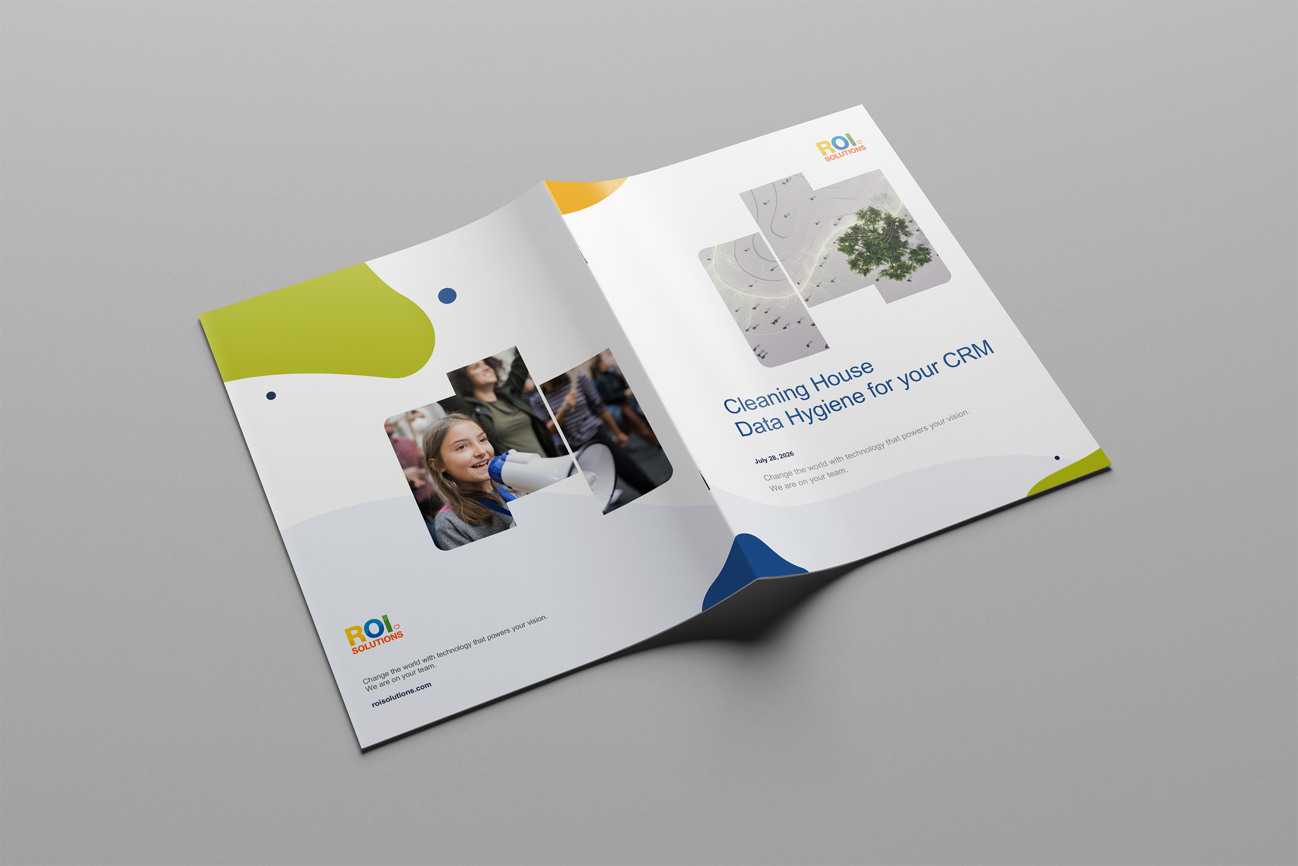
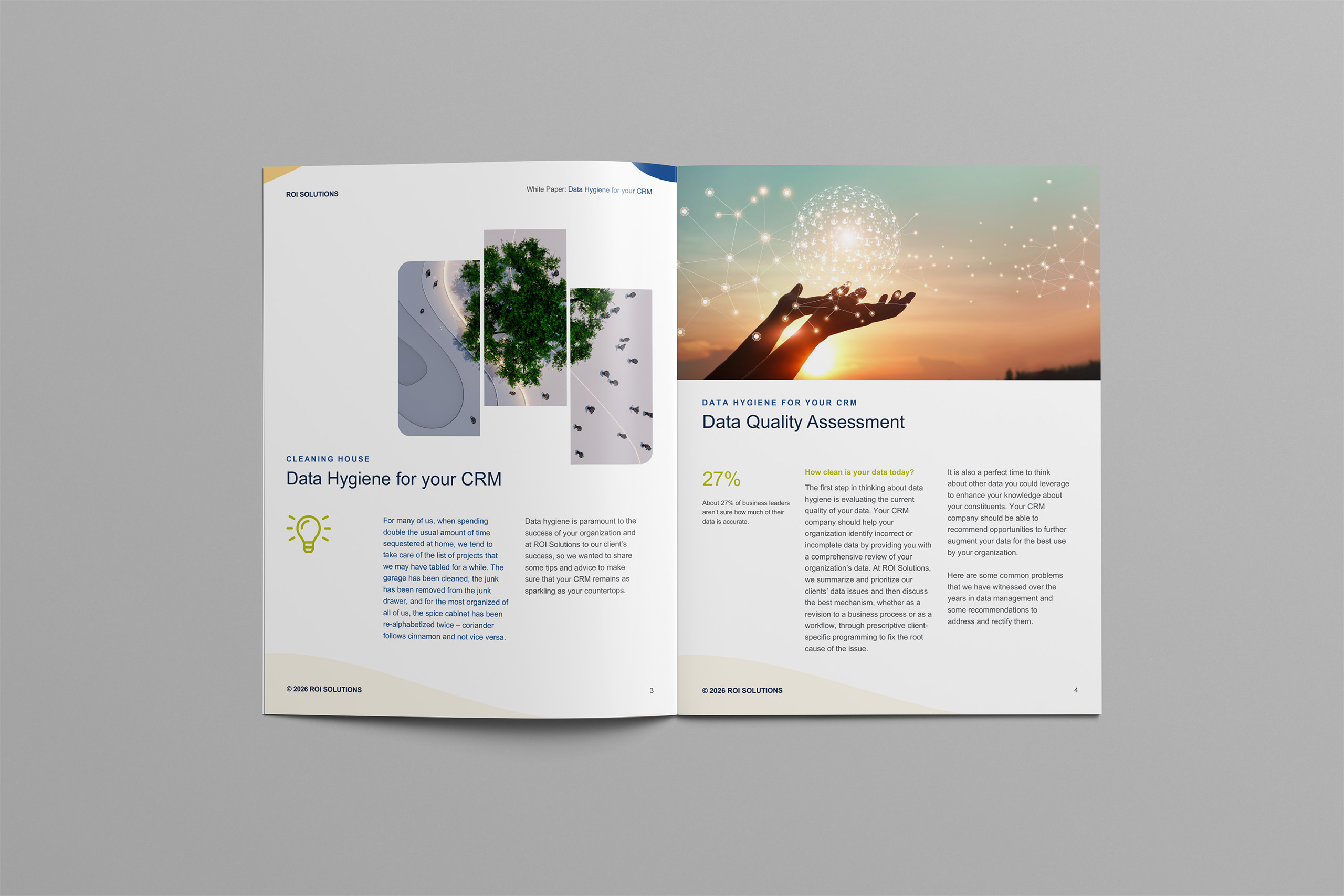
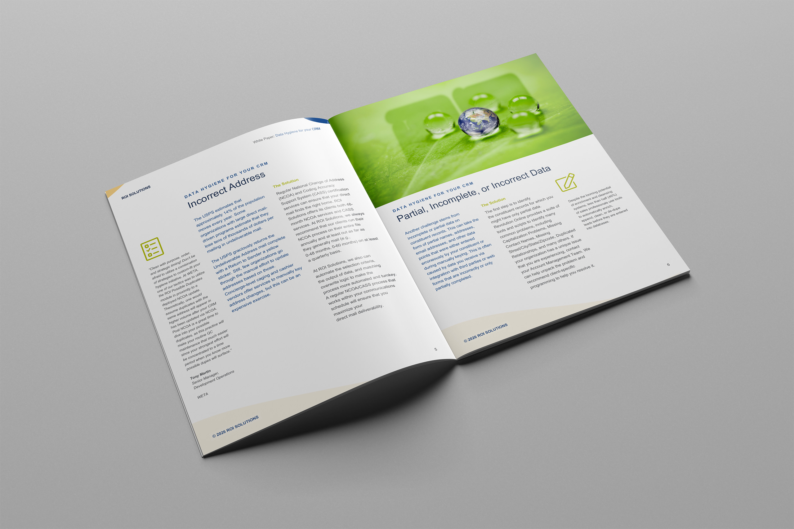
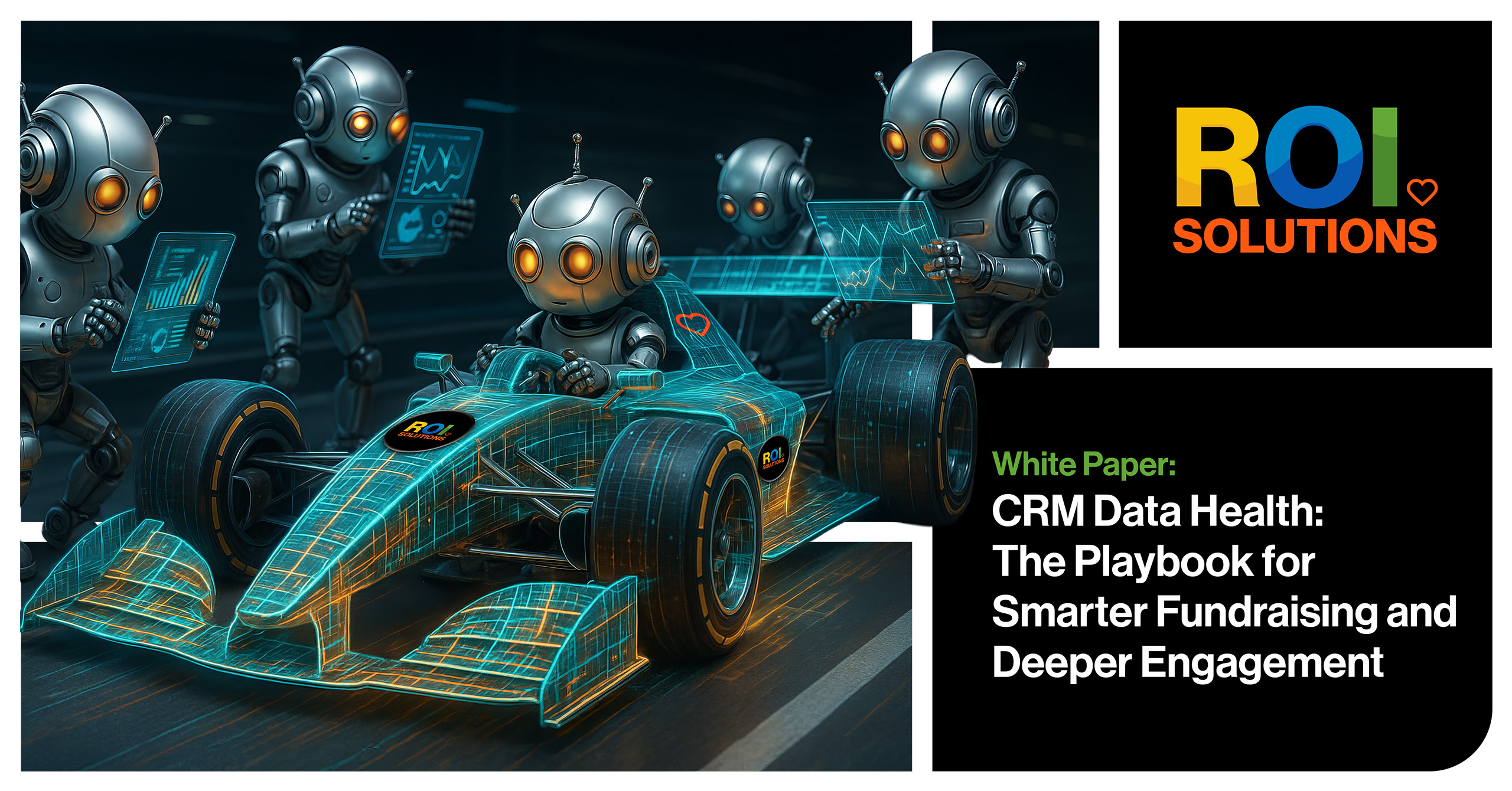
White Paper

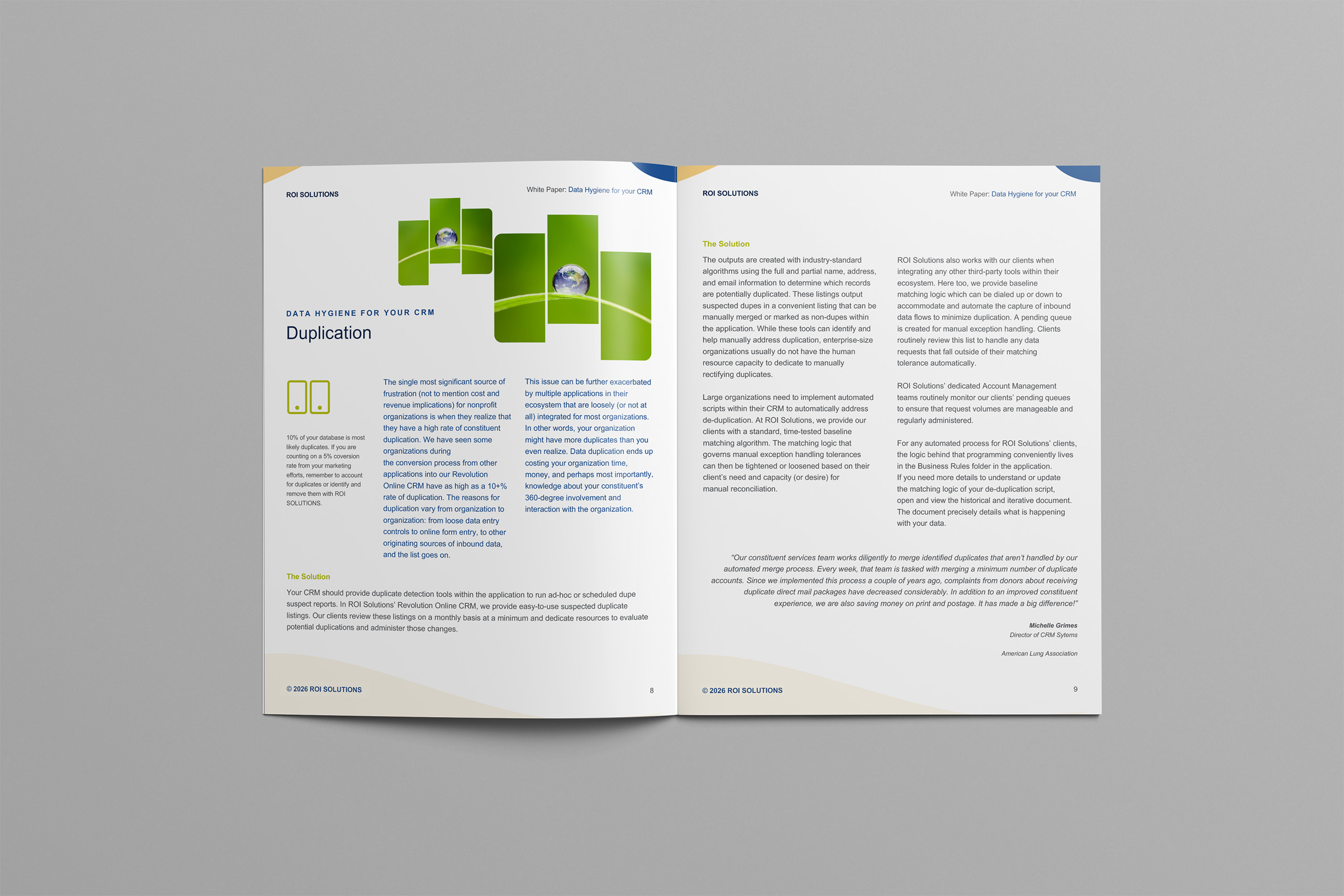
A white paper is where a brand’s discipline usually goes to die: long documents, many hands, and a design tool nobody on the marketing team owns. We refused the usual trade and built the system where the team actually works, in Microsoft Word.

The template system carries the full brand: typography, color, layout grids, callouts, charts, and imagery patterns, all native to Word and all editable, so a marketer or an editor can produce an immersive, richly designed document alone.

Robustness was the design problem.

Templates that shatter on the first edit teach teams to stop using them. These were engineered to survive real editing: restructured sections, swapped imagery, added chapters, all without losing the system underneath.

The result reads like a designed publication and behaves like a document. Every white paper that ships now extends the brand instead of eroding it, at the pace the content team already works.

The system made Word the final production environment, not a compromise between writing and design.

Banners

Laptop in low light showing the Unite Analytics slide, circular data-flow loops running from ingest to strategy beside the blue panel.

Digital Advertising

The advertising program had the advantage most campaigns lack: its targeting logic came from the brand’s own architecture. The same mission taxonomy as the website aimed the media plan, so creative met each audience inside the cause they already serve.

Awareness campaigns introduced the rebranded company and drove traffic into the mission-first experience. From there, retargeting took over by sector: public media, animal welfare, civil rights, each with creative speaking that community’s language.

Every ad drew from the brand system: the vibrant palette against the category’s greys and blues, the character family, the confident voice. Recognition compounds when the ad, the landing page, and the website are visibly one thing.

The program moved audiences from unaware to informed to in-conversation, and it fed everything downstream: traffic for the personalization engine to learn from and warmer prospects for the sales team to meet.

Each new campaign began with the audience logic already established, then adapted its message and creative to the opportunity.

Increase Traffic
Retarget Public Media
Retarget Animal Rights
Retarget Civil Rights

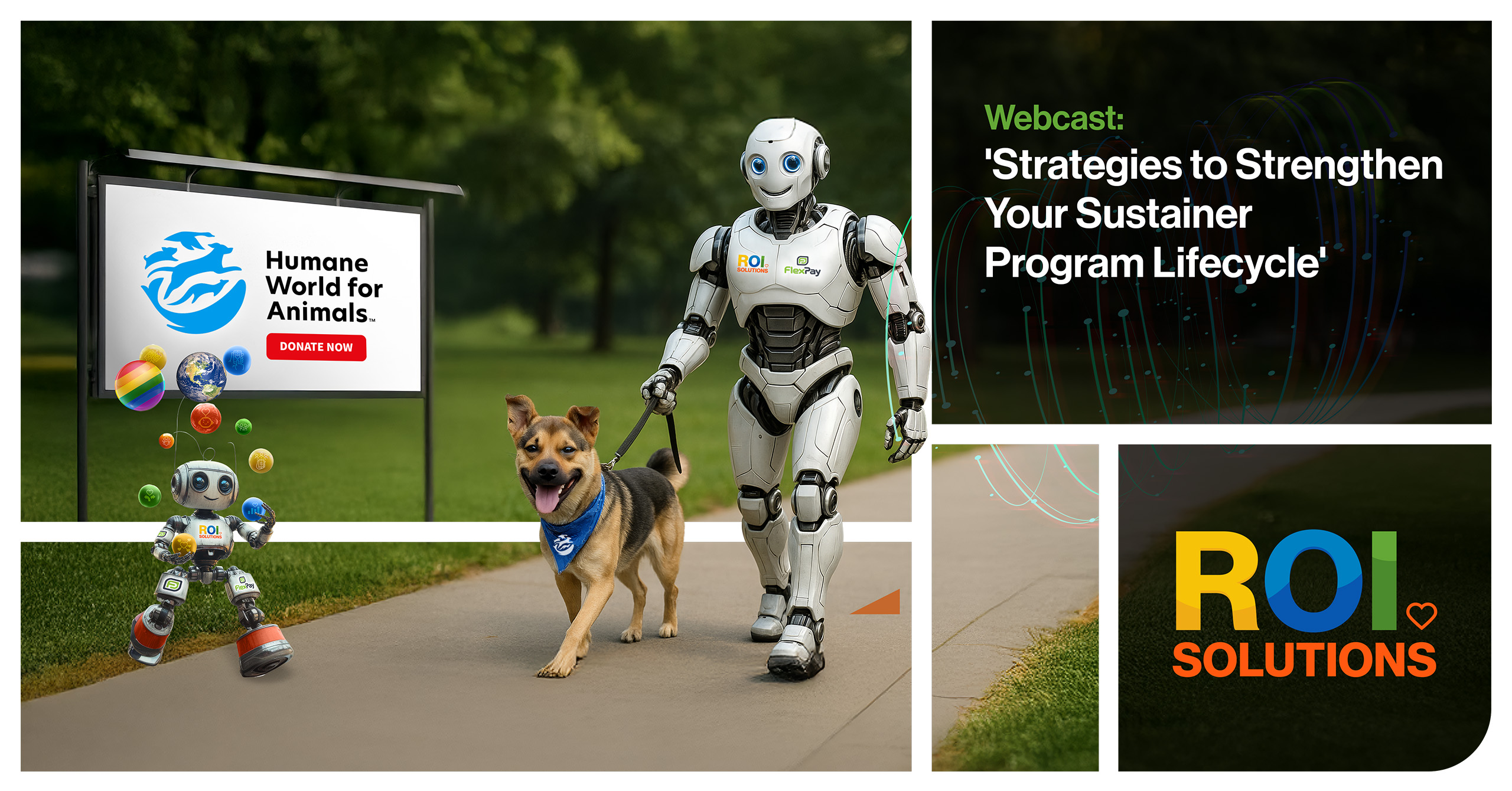
Print Advertising

Print carried the rebrand into the places the nonprofit community actually gathers: industry trade magazines, event sponsorships, and trade shows, year after year. In a category that prints grey and blue, ROI Solutions arrived in full color.

Each campaign draws from the same system as the website and the digital advertising: the constellation marks, the vibrant palette, the confident voice.

The placements vary. The brand never does.

That consistency made print part of a connected customer path rather than a separate production stream. A reader could move from an advertisement to a landing page or event without meeting a different voice, palette, or promise.

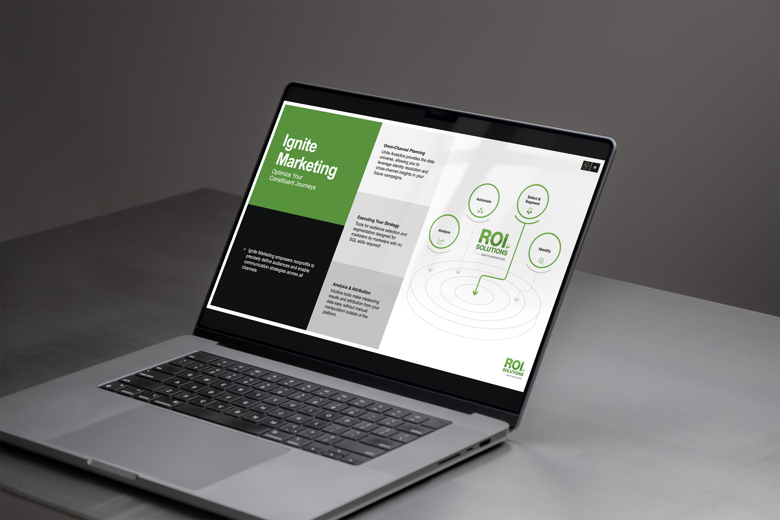
Laptop showing the Ignite Marketing slide, a target-spiral diagram beside green panels on optimizing constituent journeys.

Email Marketing

Email is where brand systems quietly fall apart, one rushed send at a time. We built ROI Solutions the opposite: a template system on the company’s email platform, Emma, that makes the branded version of every send the easy version.

The system covers the real range of the calendar: newsletters, product announcements, event invitations, nurture campaigns. Each template carries the typography, palette, and voice of the brand system, adapted to the constraints email actually imposes.

Platform constraints shaped the engineering, not the design. Emma’s builder is far from a design tool, so the templates were built to hold their integrity inside it: modular blocks anyone can rearrange, with the design system doing the enforcement.

The measure of success is who can use it, and what survives. Anyone can assemble an on-brand send in minutes. When ROI Solutions later migrated to HubSpot, the templates moved too. We reviewed the translation to make sure the system held: the platform changed, but the brand didn’t.

Contributors moved quickly because every block already carried the decisions shaping the brand.

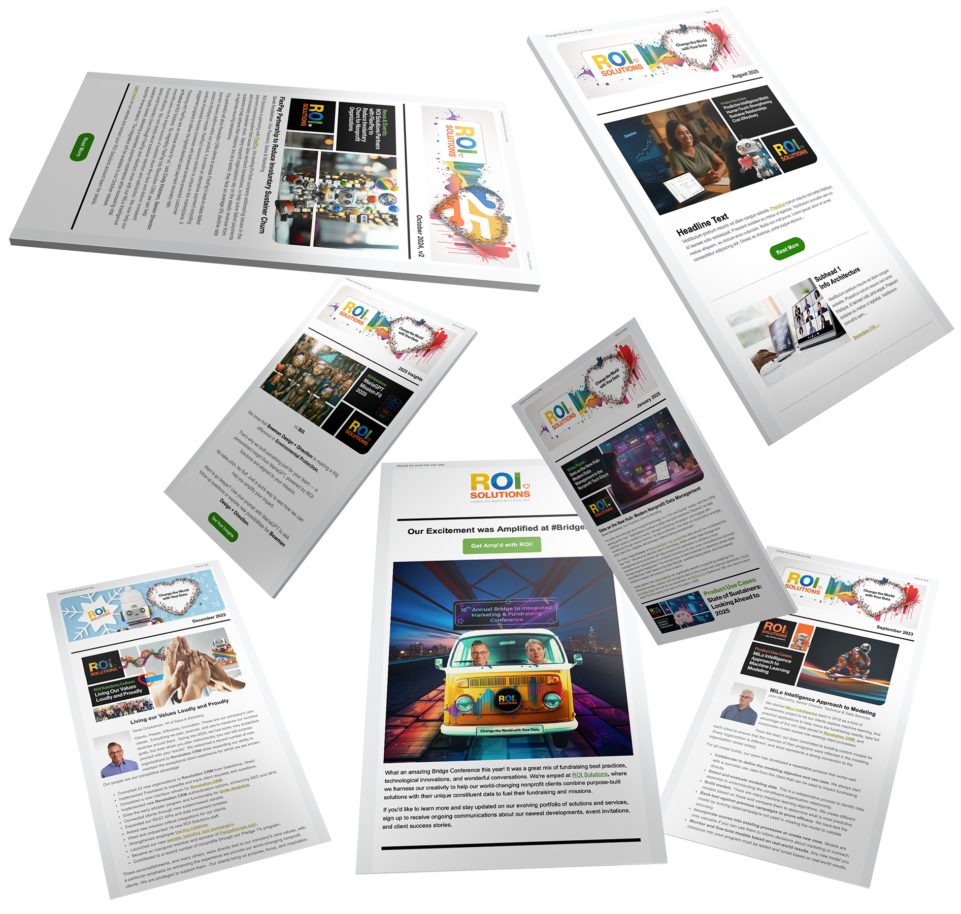
Scatter of newsletter templates fanned in space, branded headers and feature blocks varying across the persona editions.
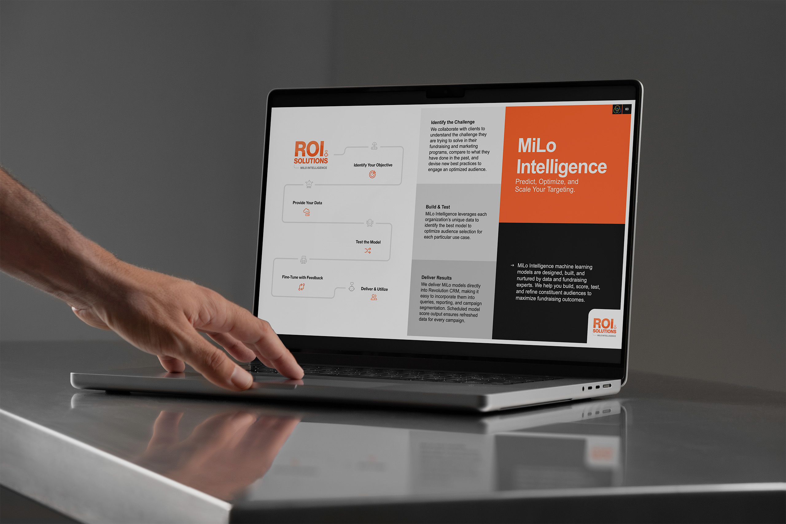
Hand reaches toward a laptop showing the MiLo Intelligence slide, a model-building flow beside the orange Predict Optimize Scale panel.

Brand Merchandise

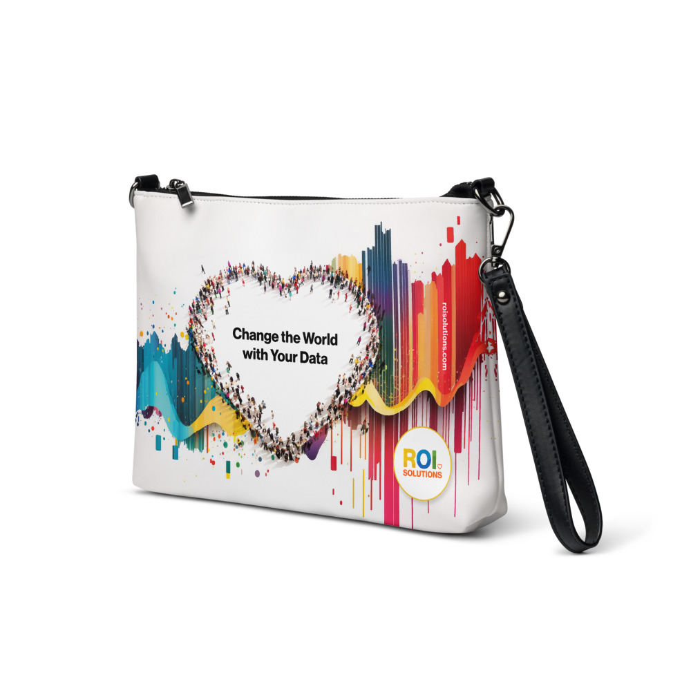
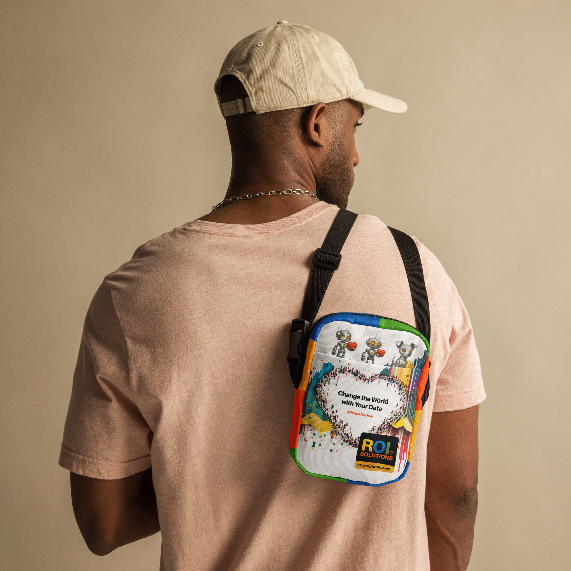
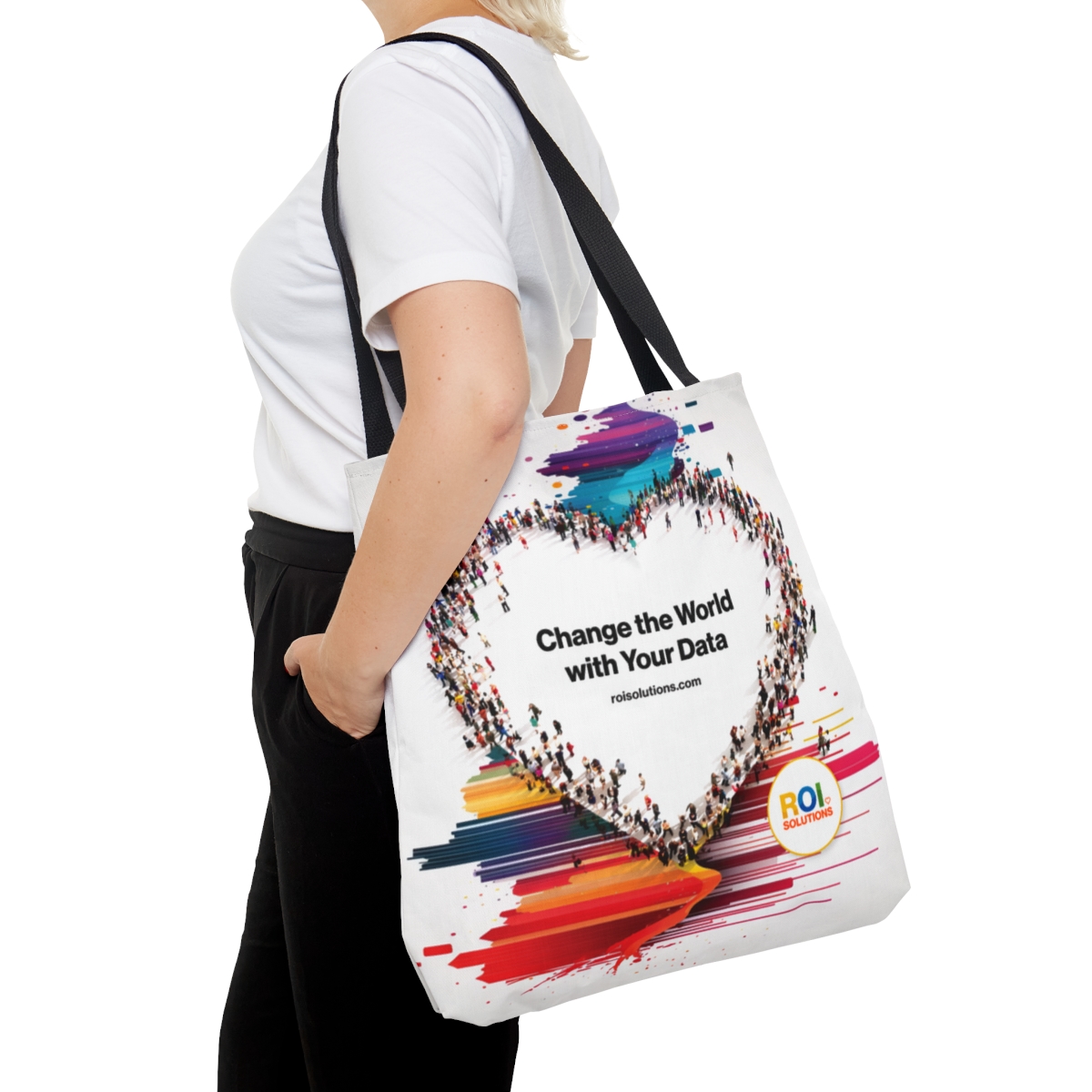
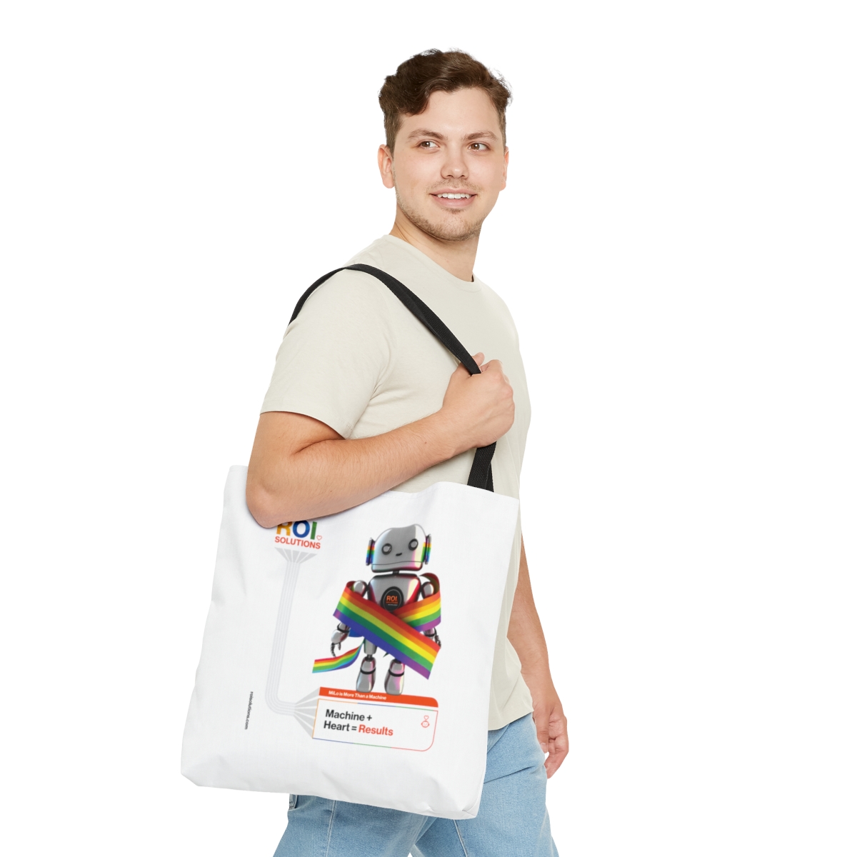
Bags
Carry-ons
Hats
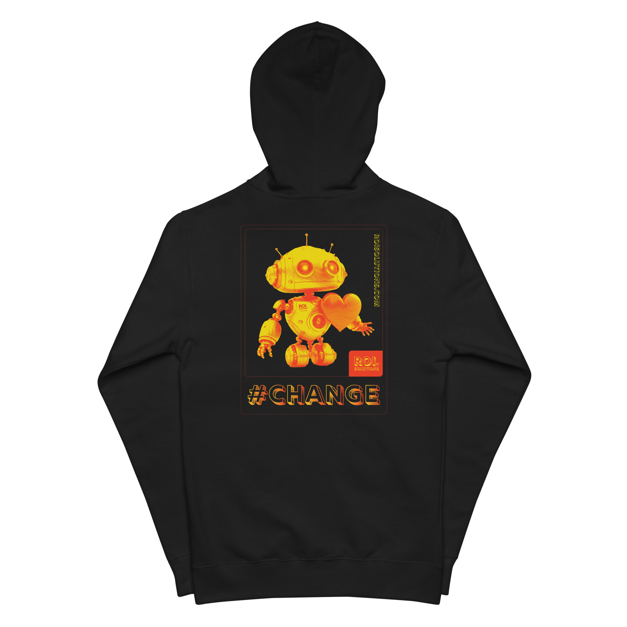
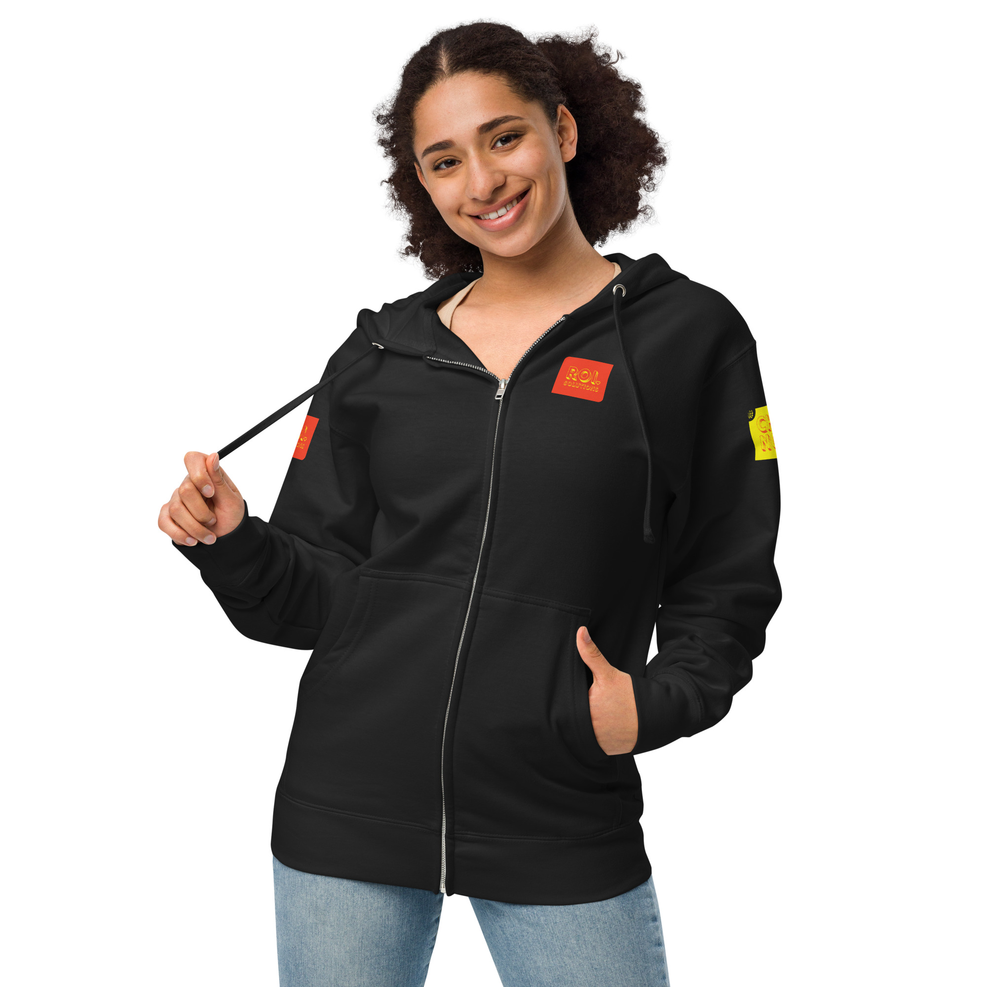
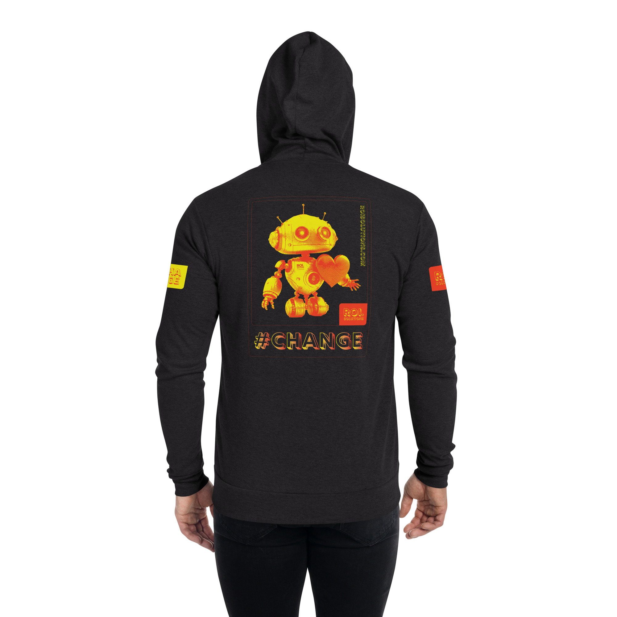
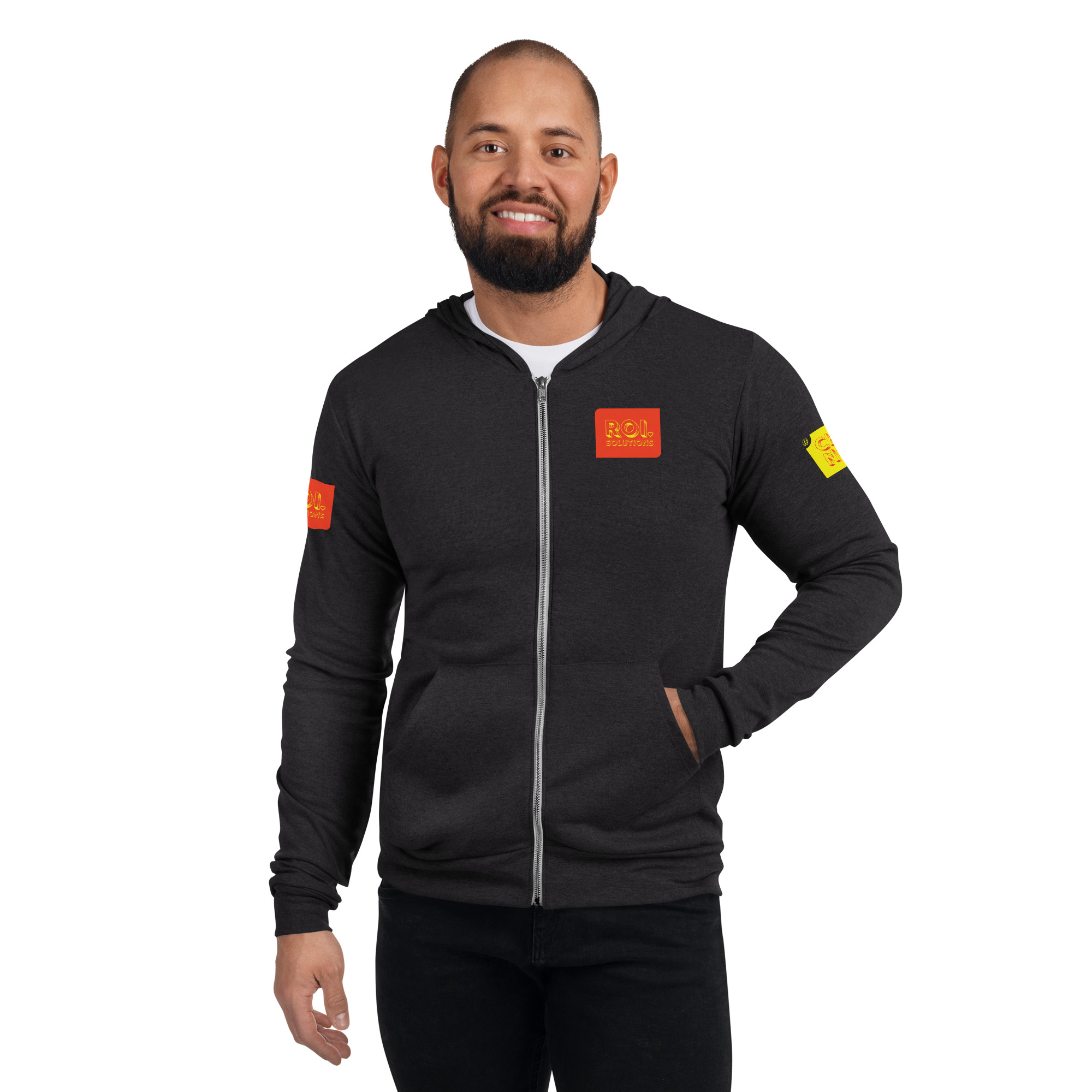
Hoodies
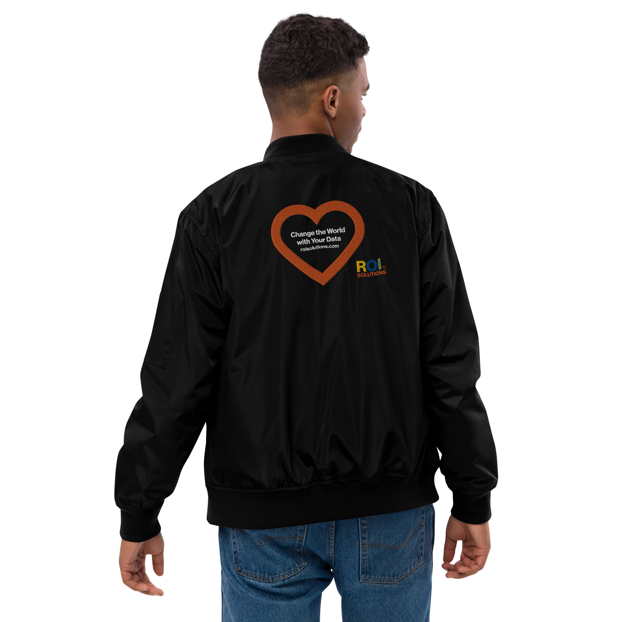
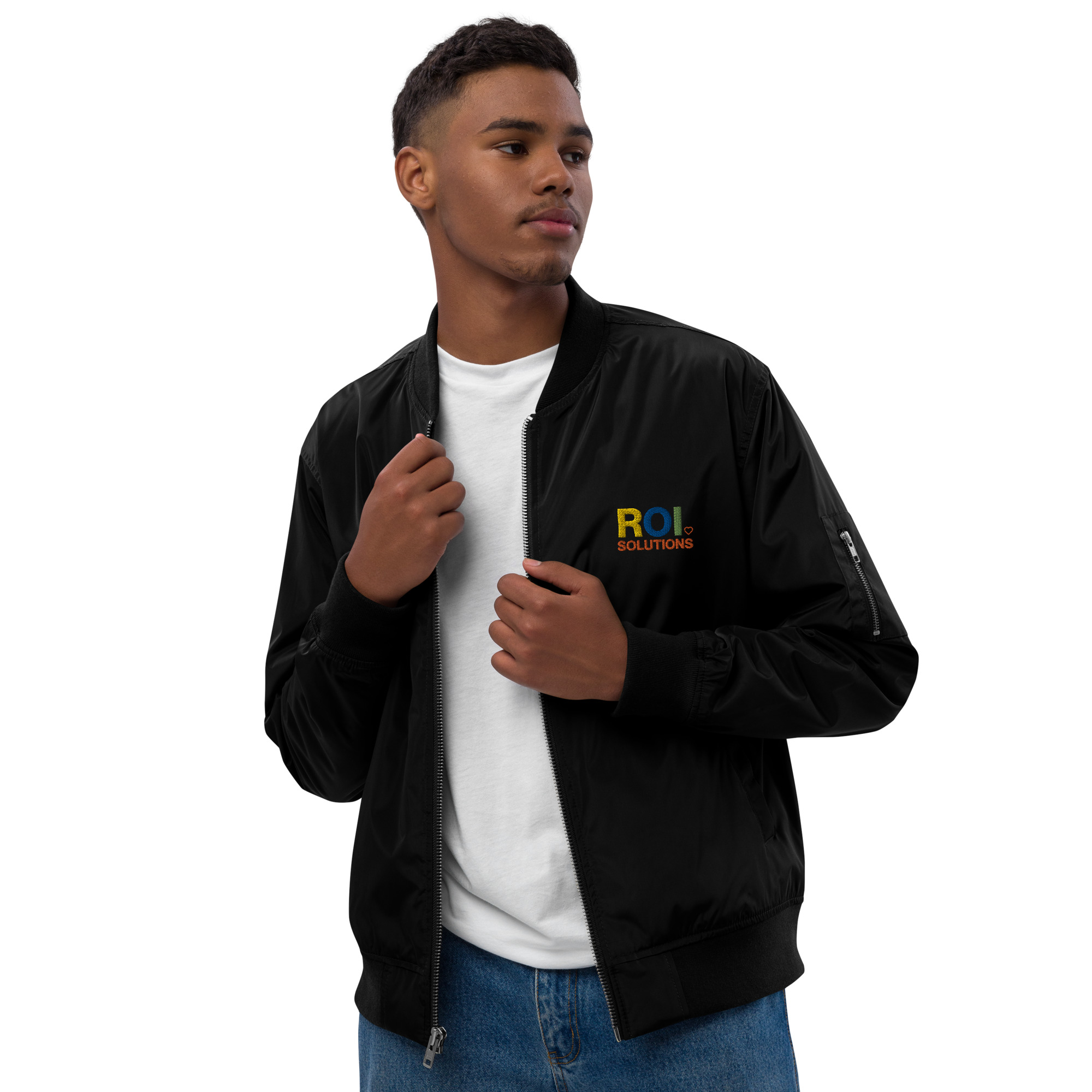
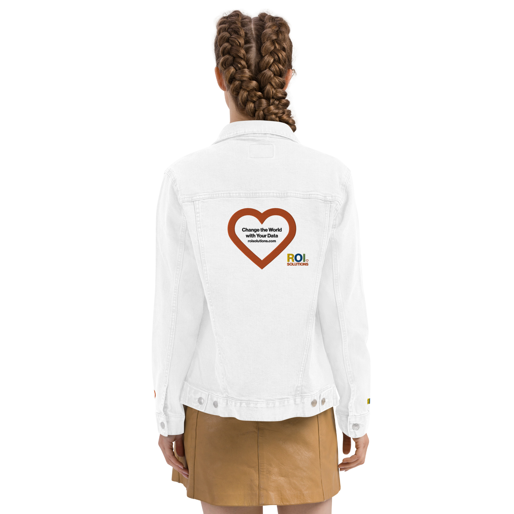
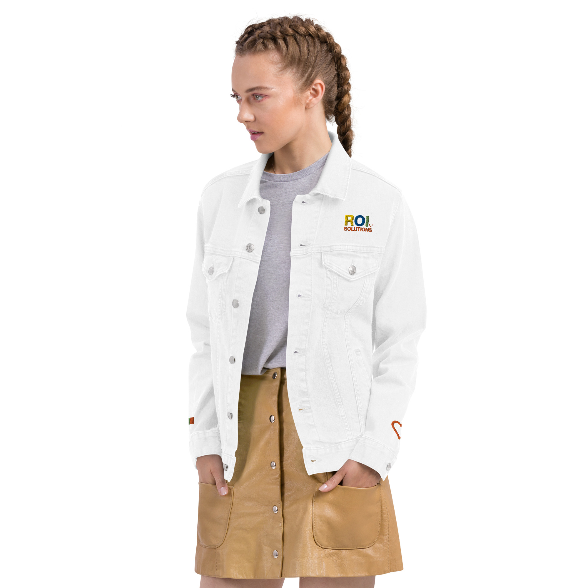
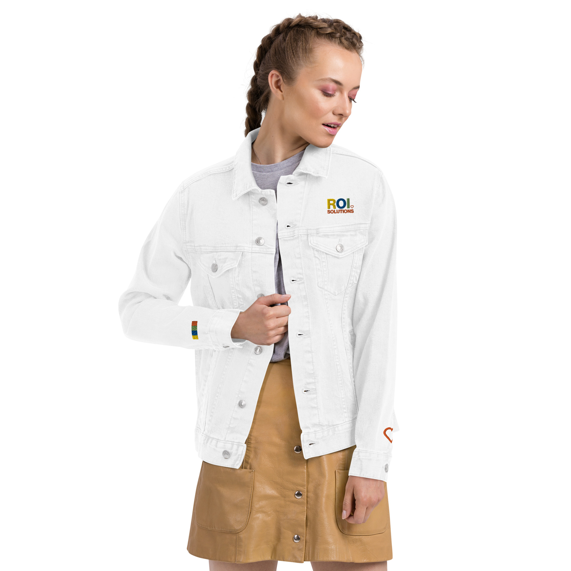
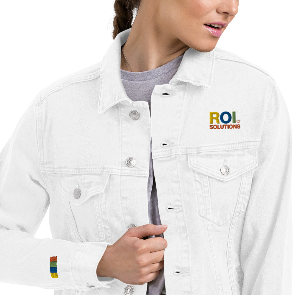
Jackets
Shirts
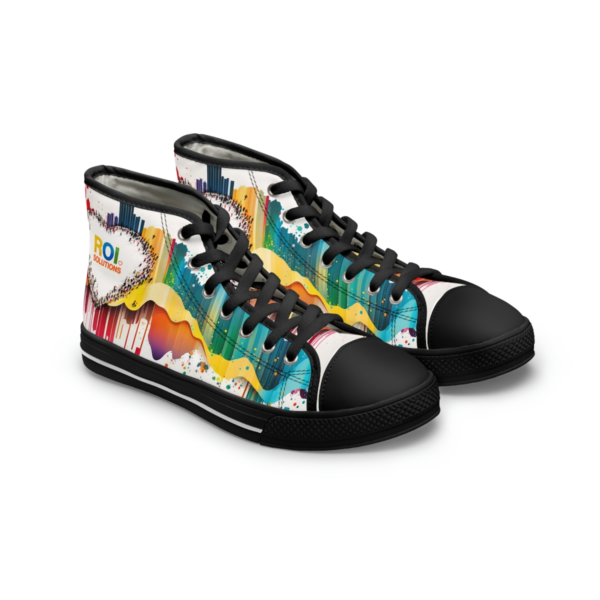
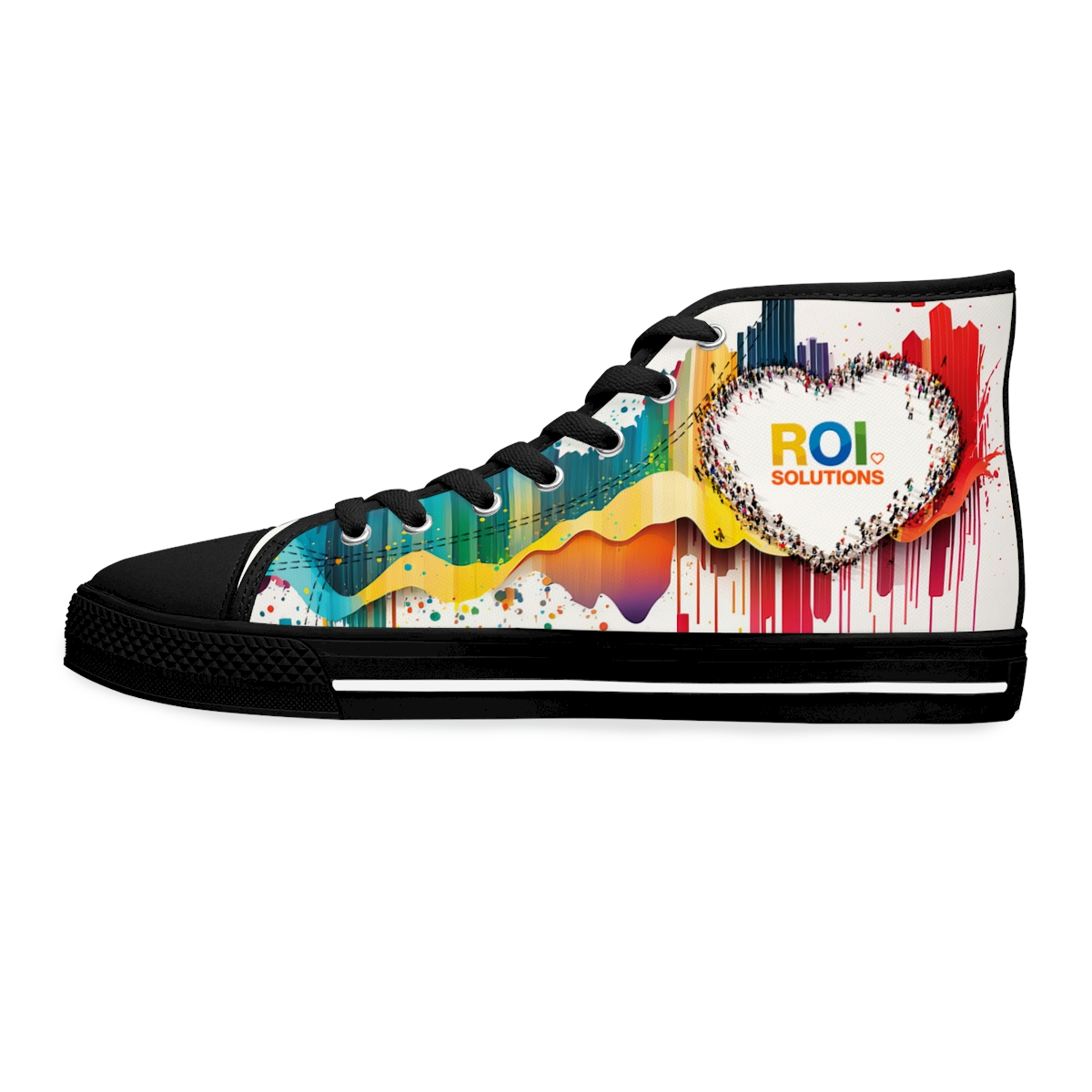
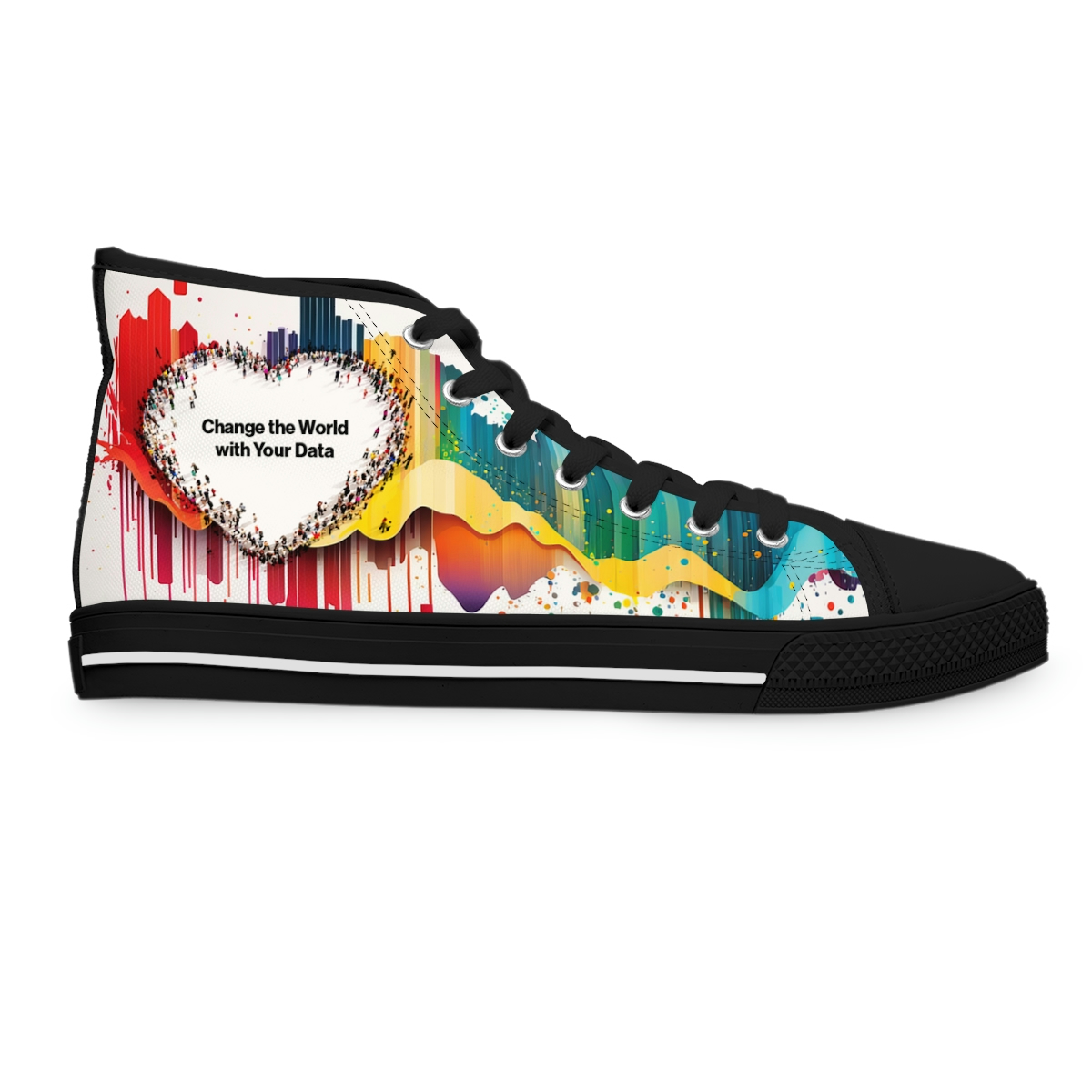
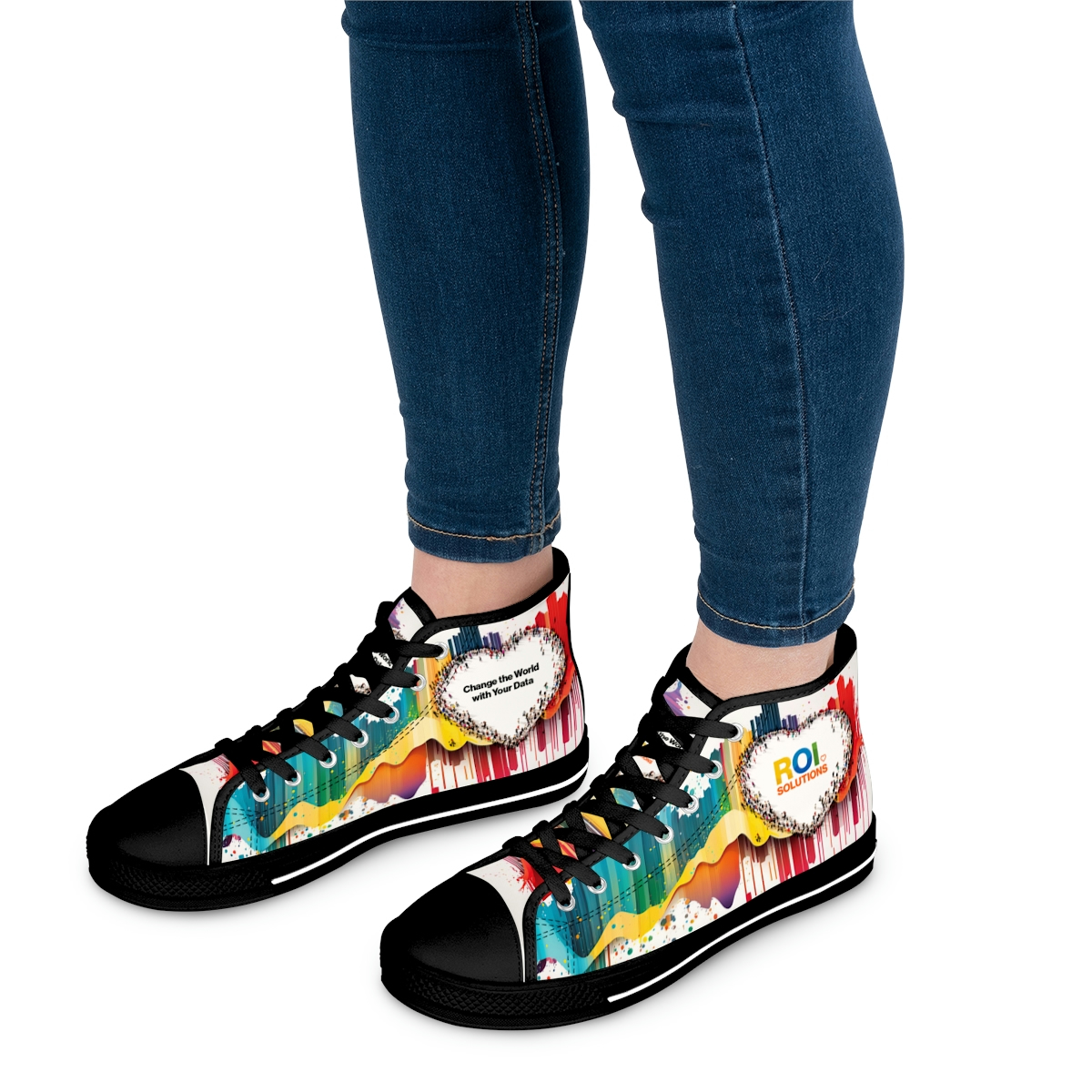
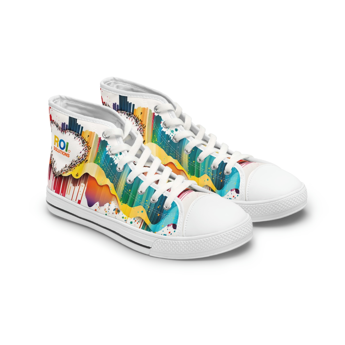
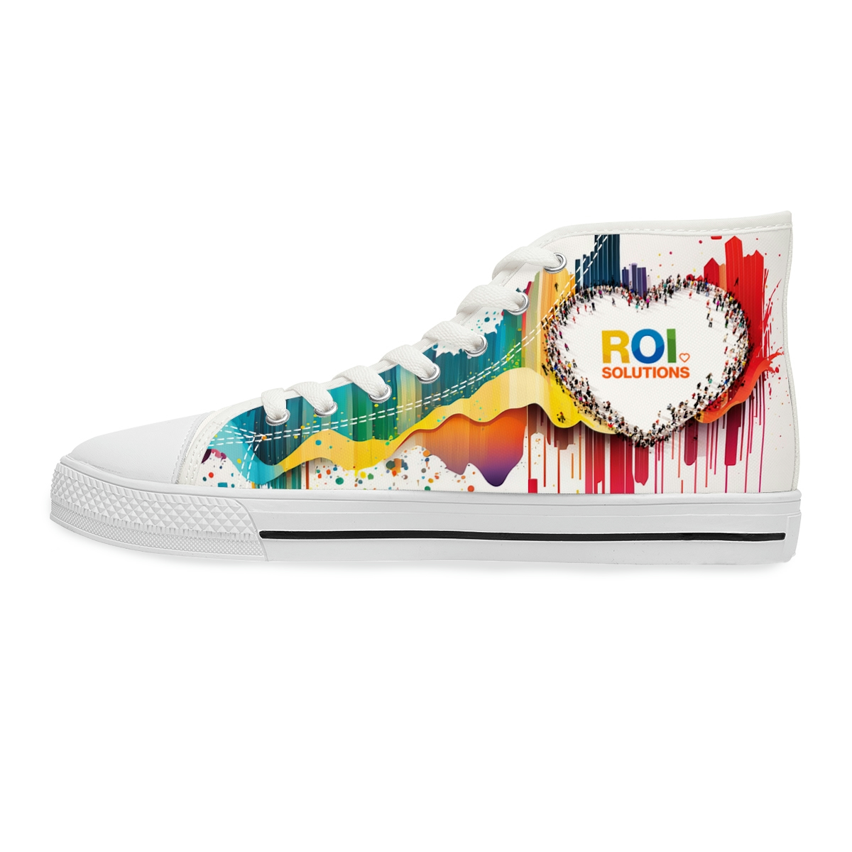
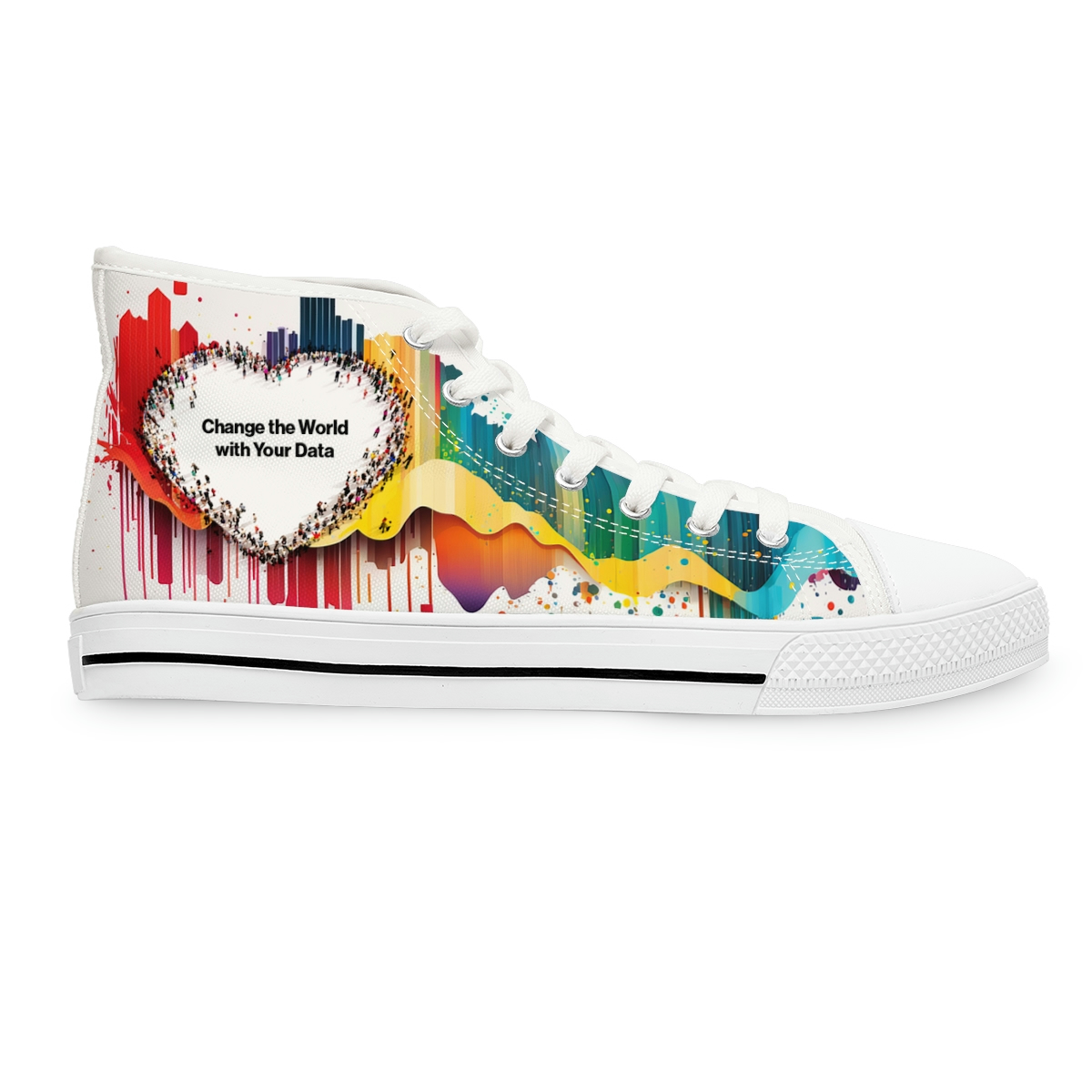
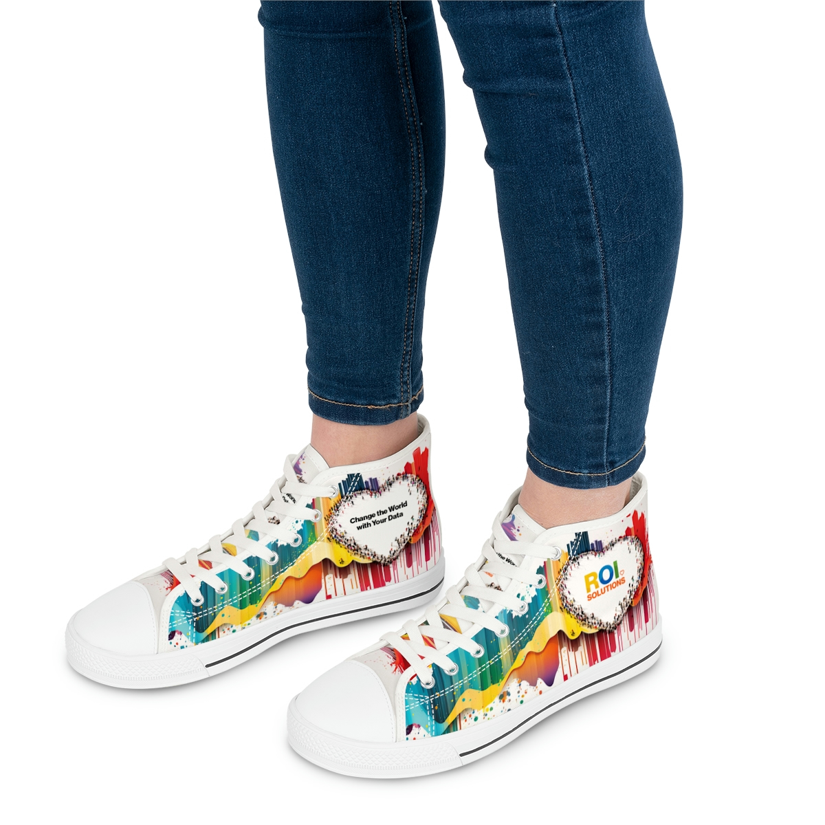
Shoes
Tech
T-shirts

Brand Merchandise Shop

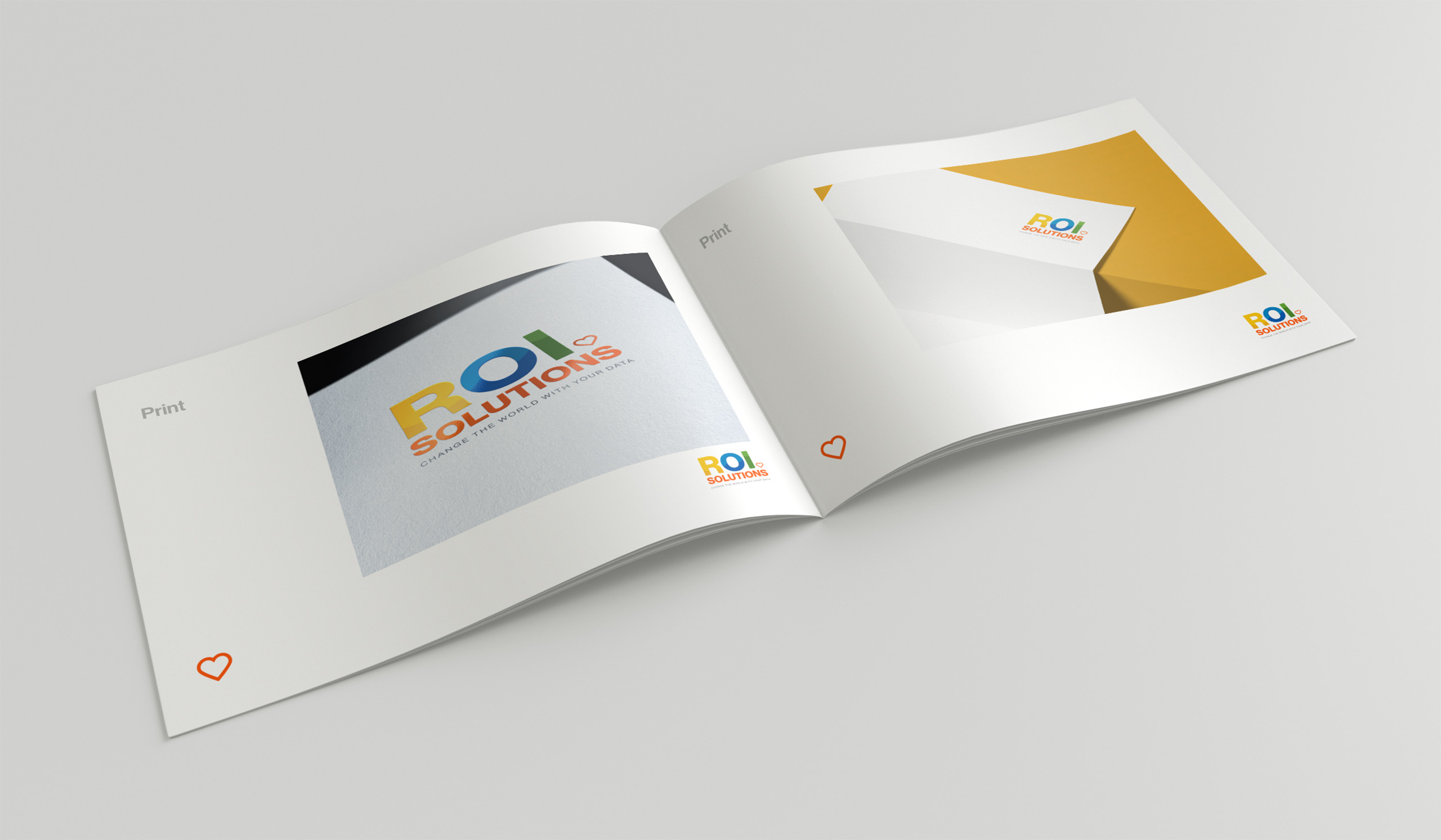
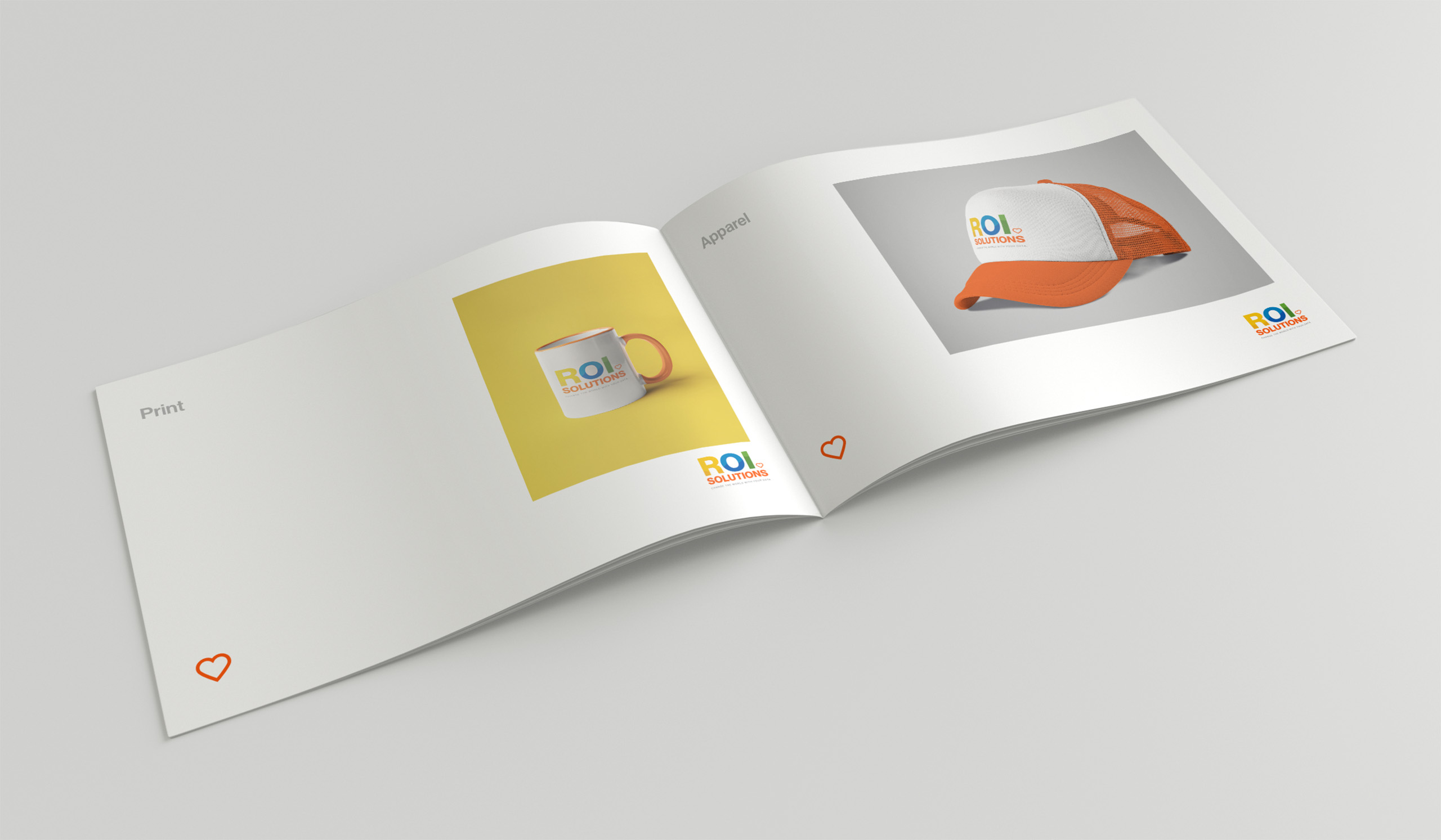
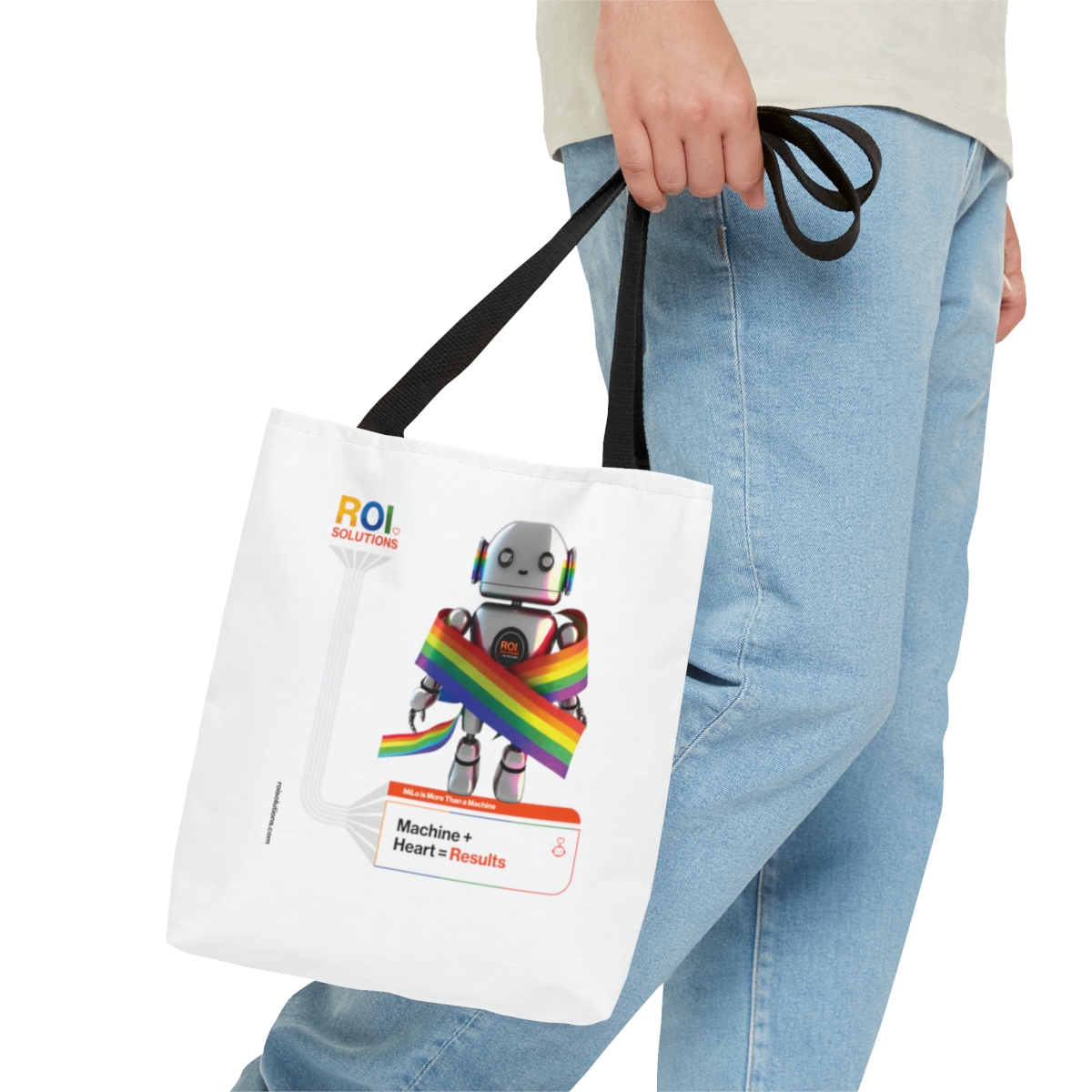
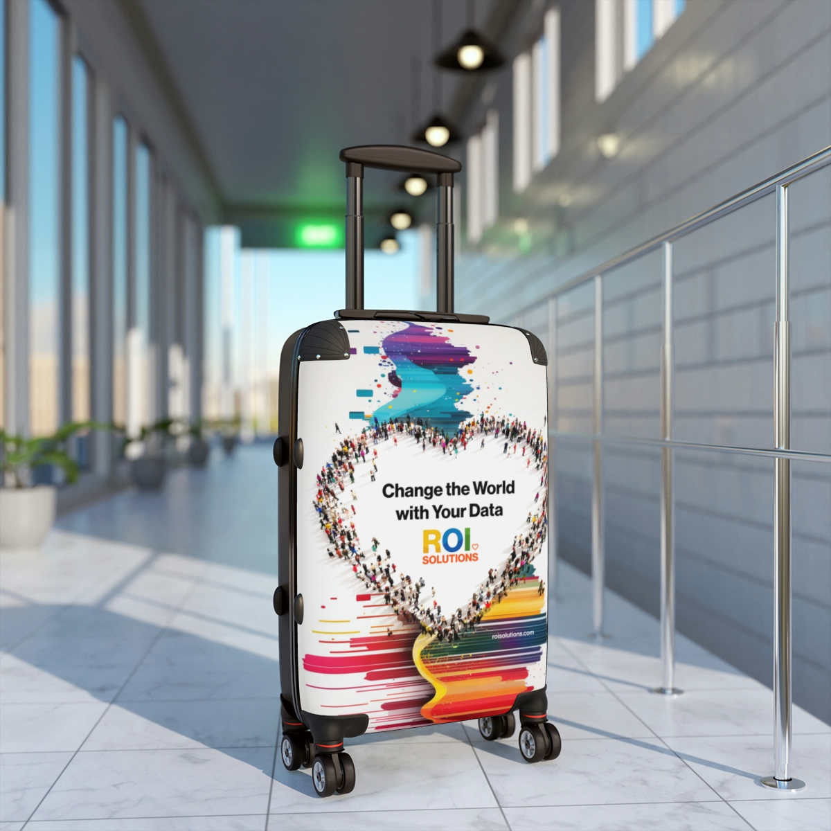
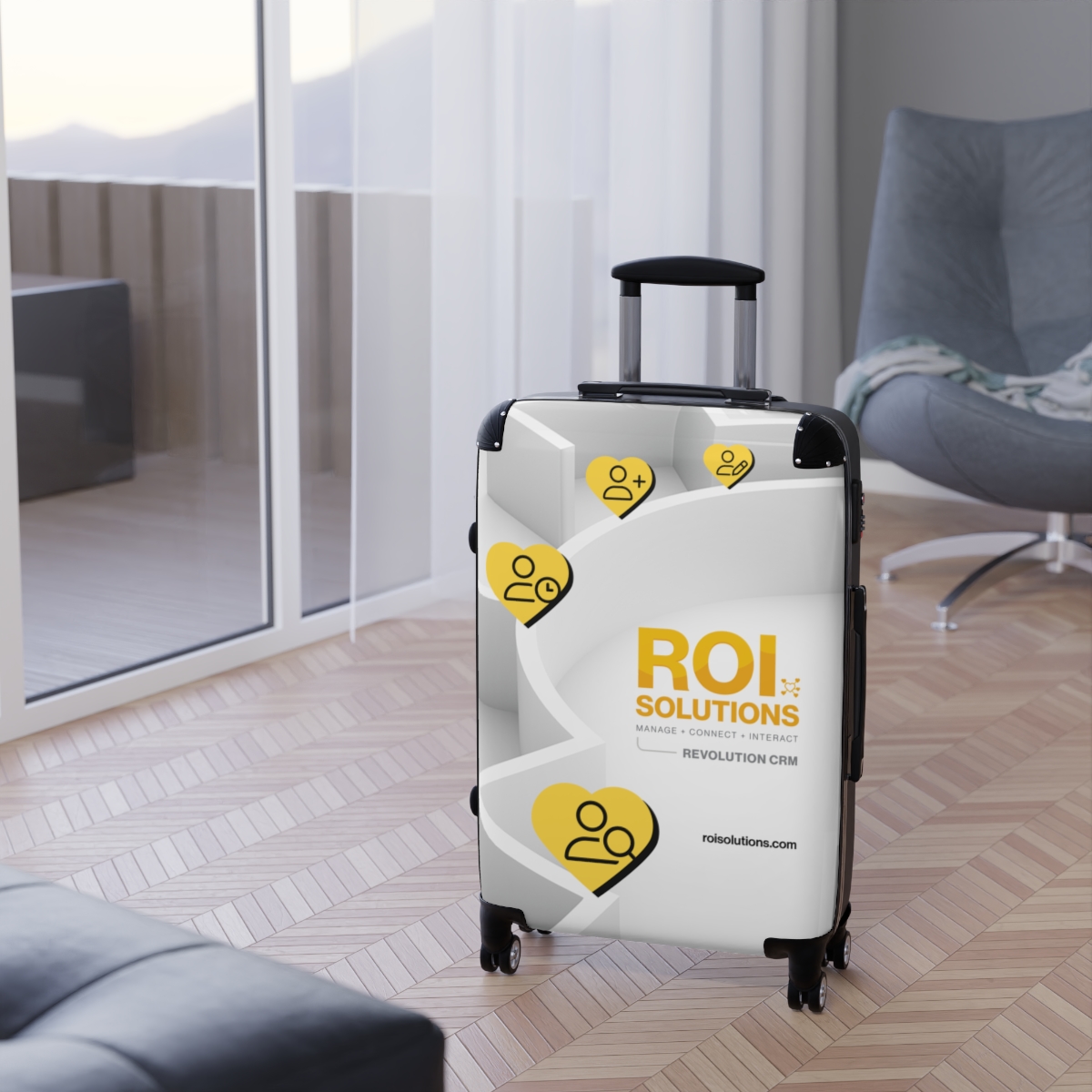
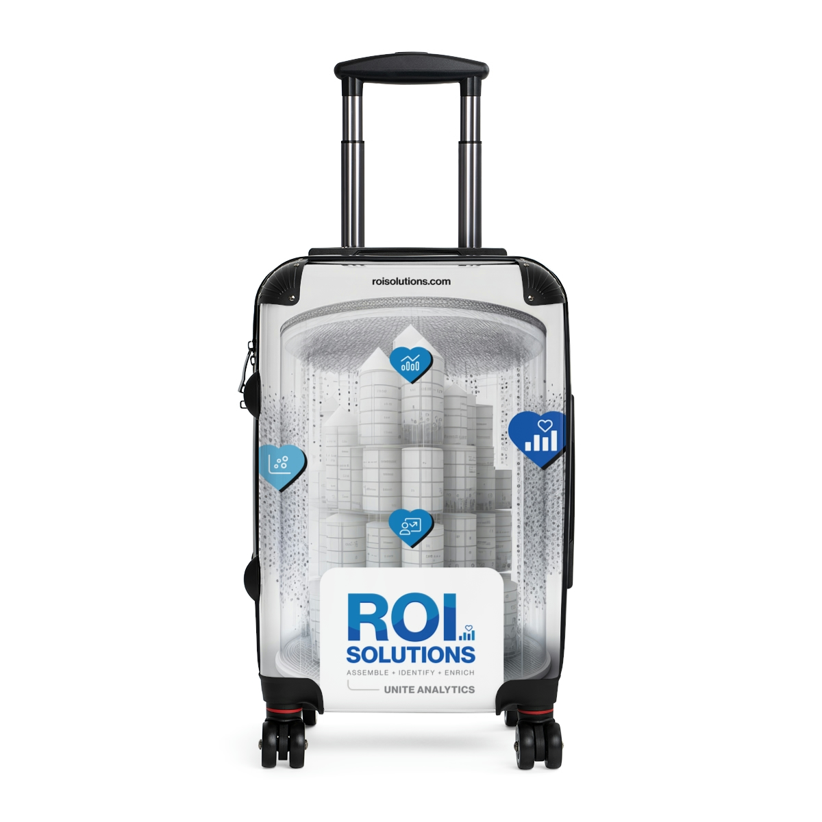
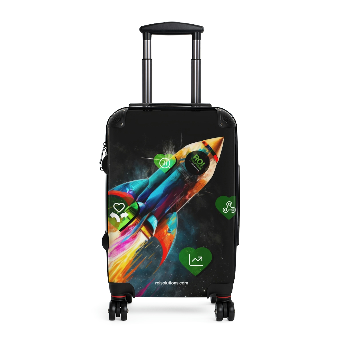
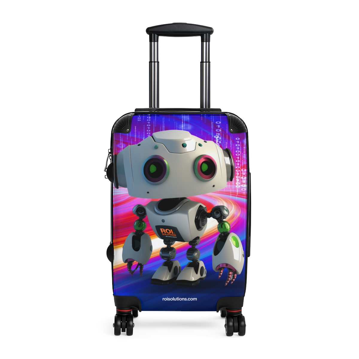
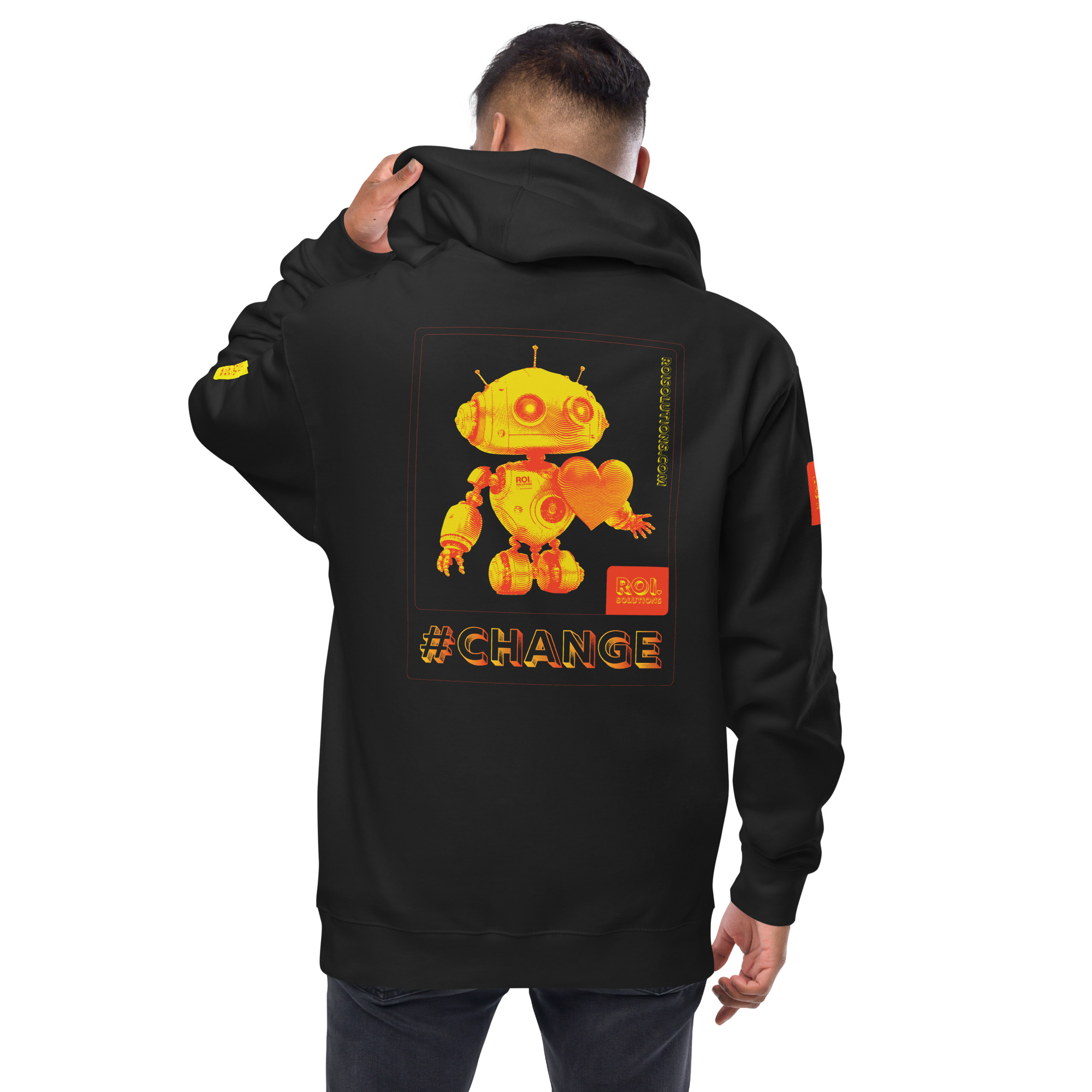
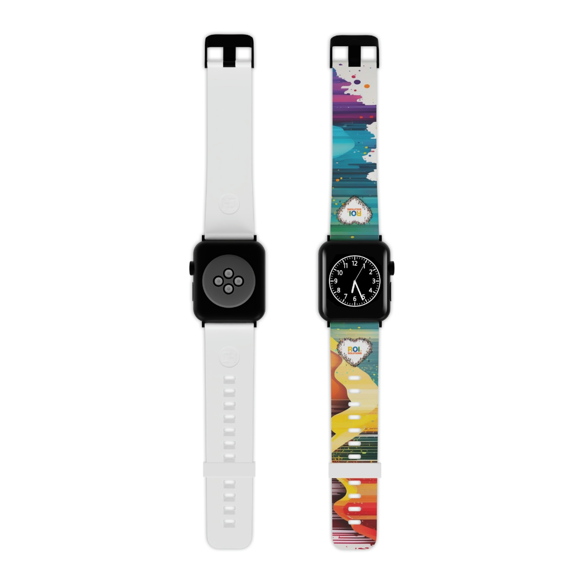
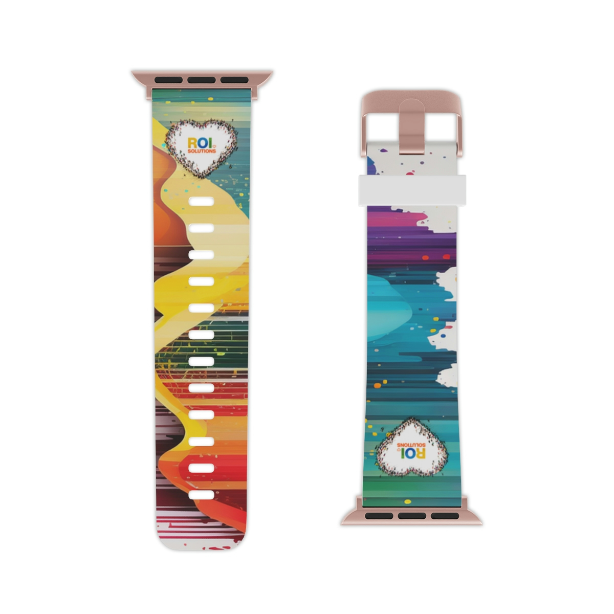
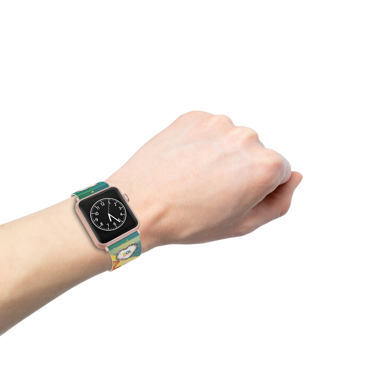
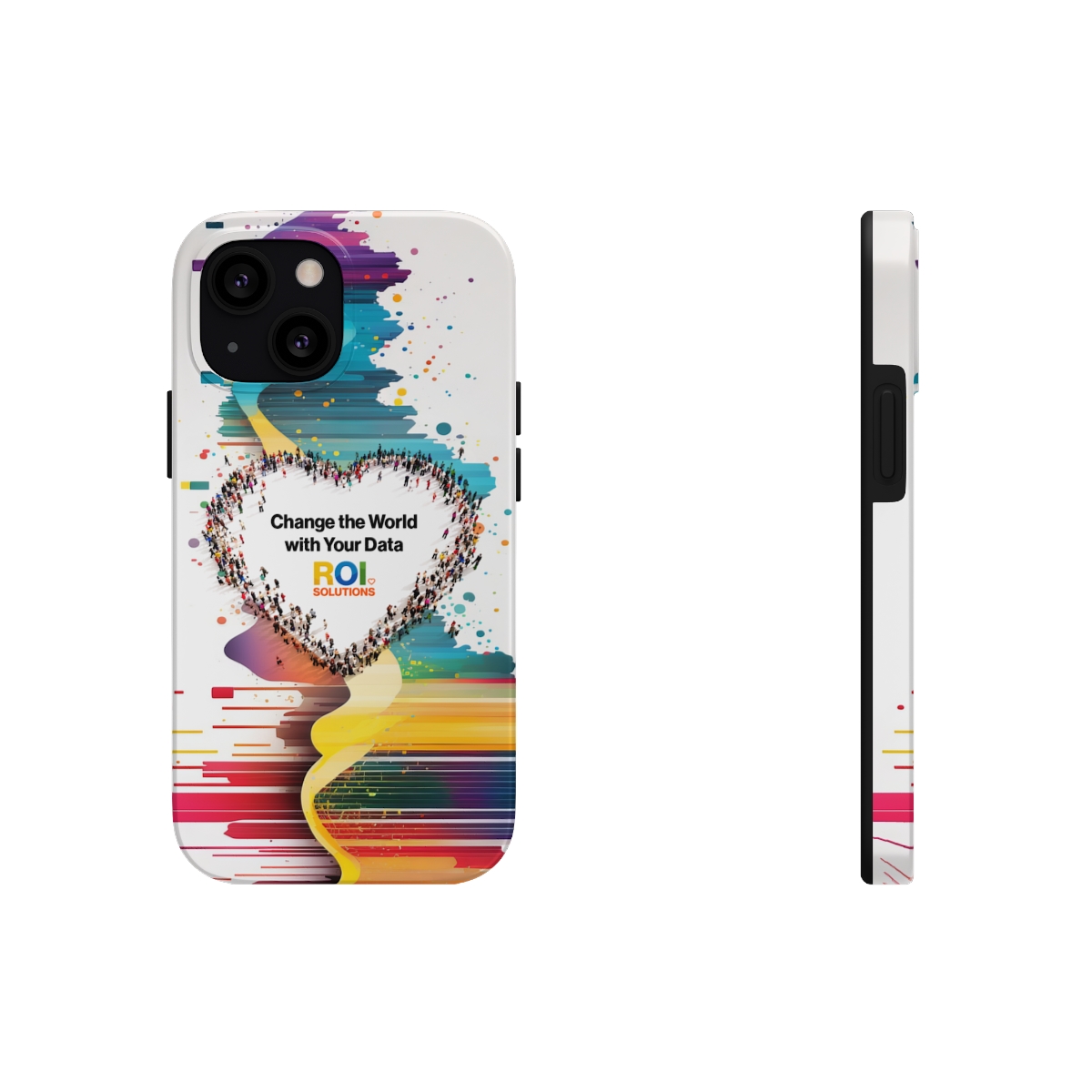
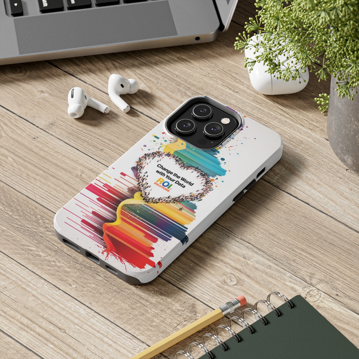
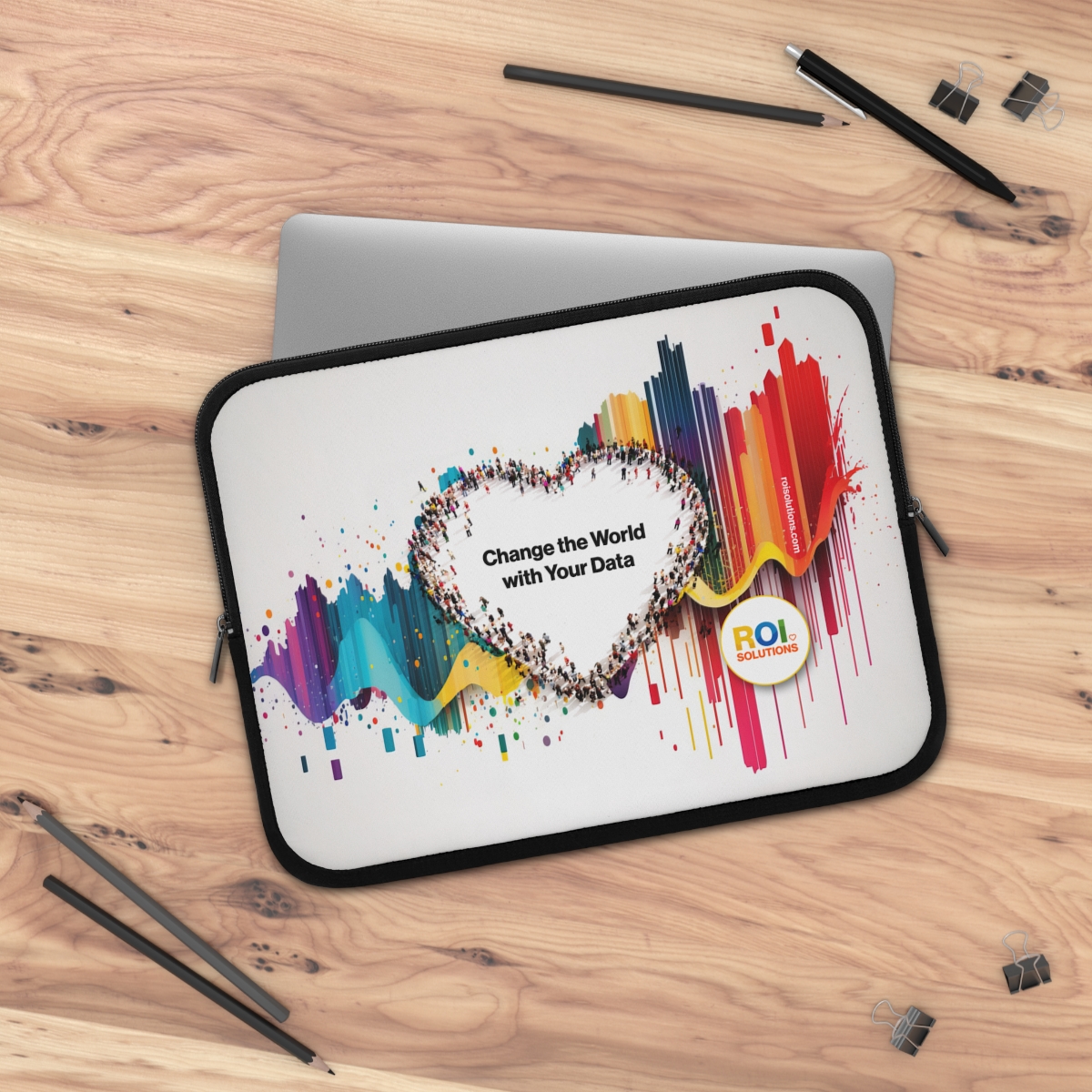
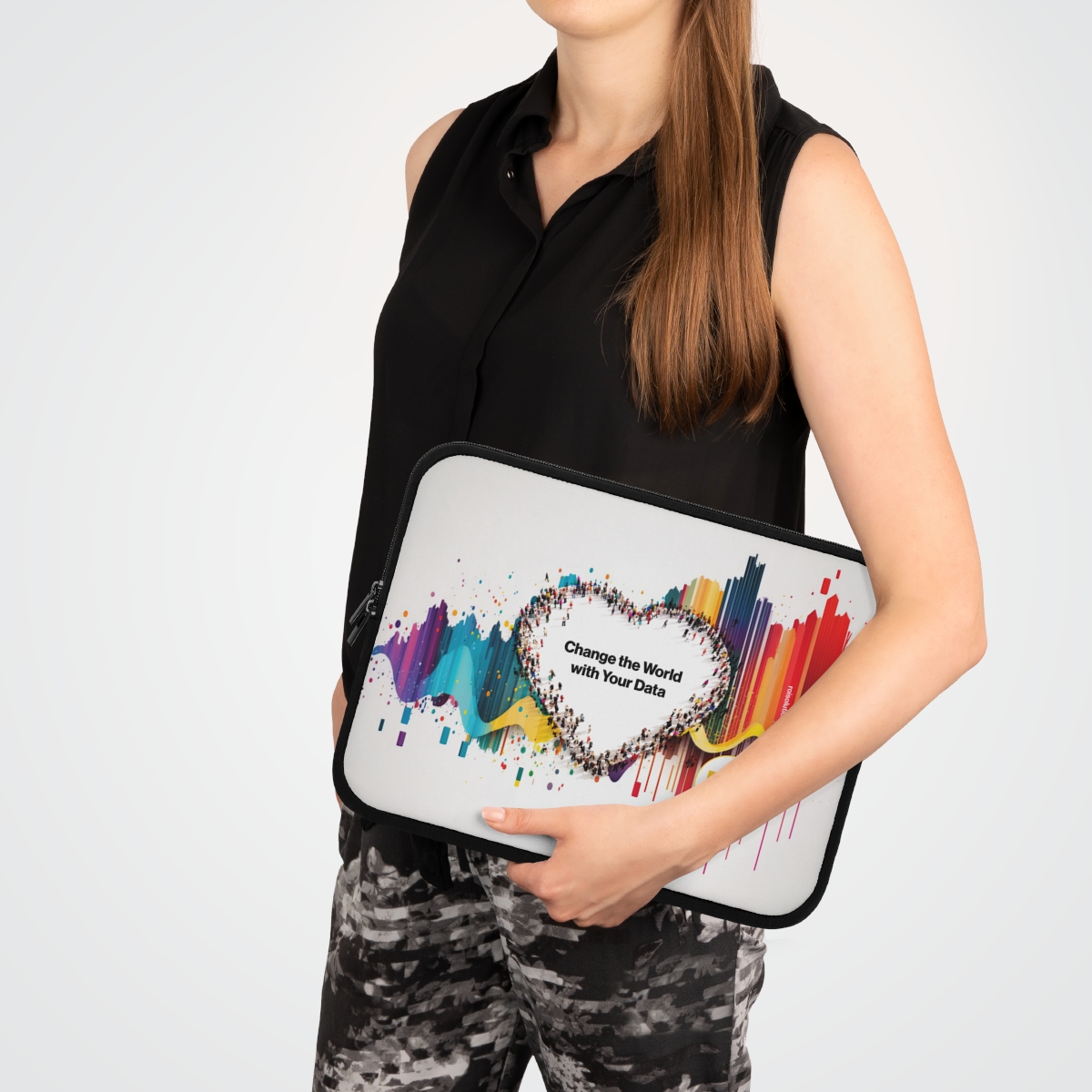
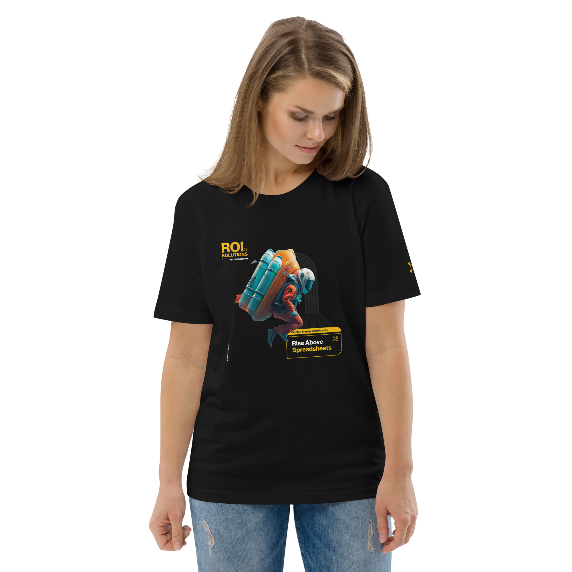
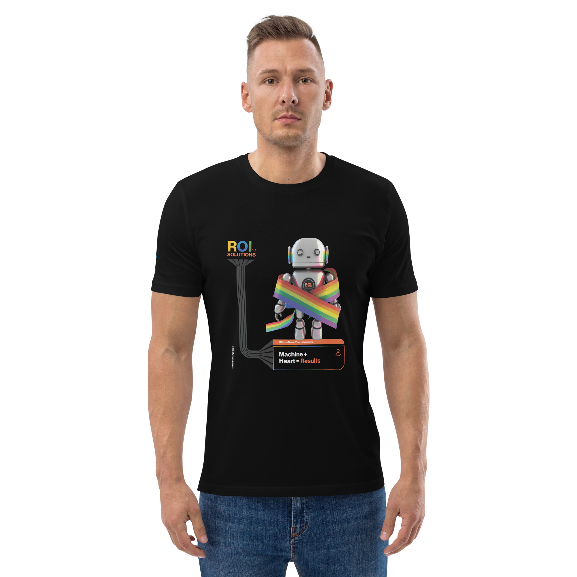
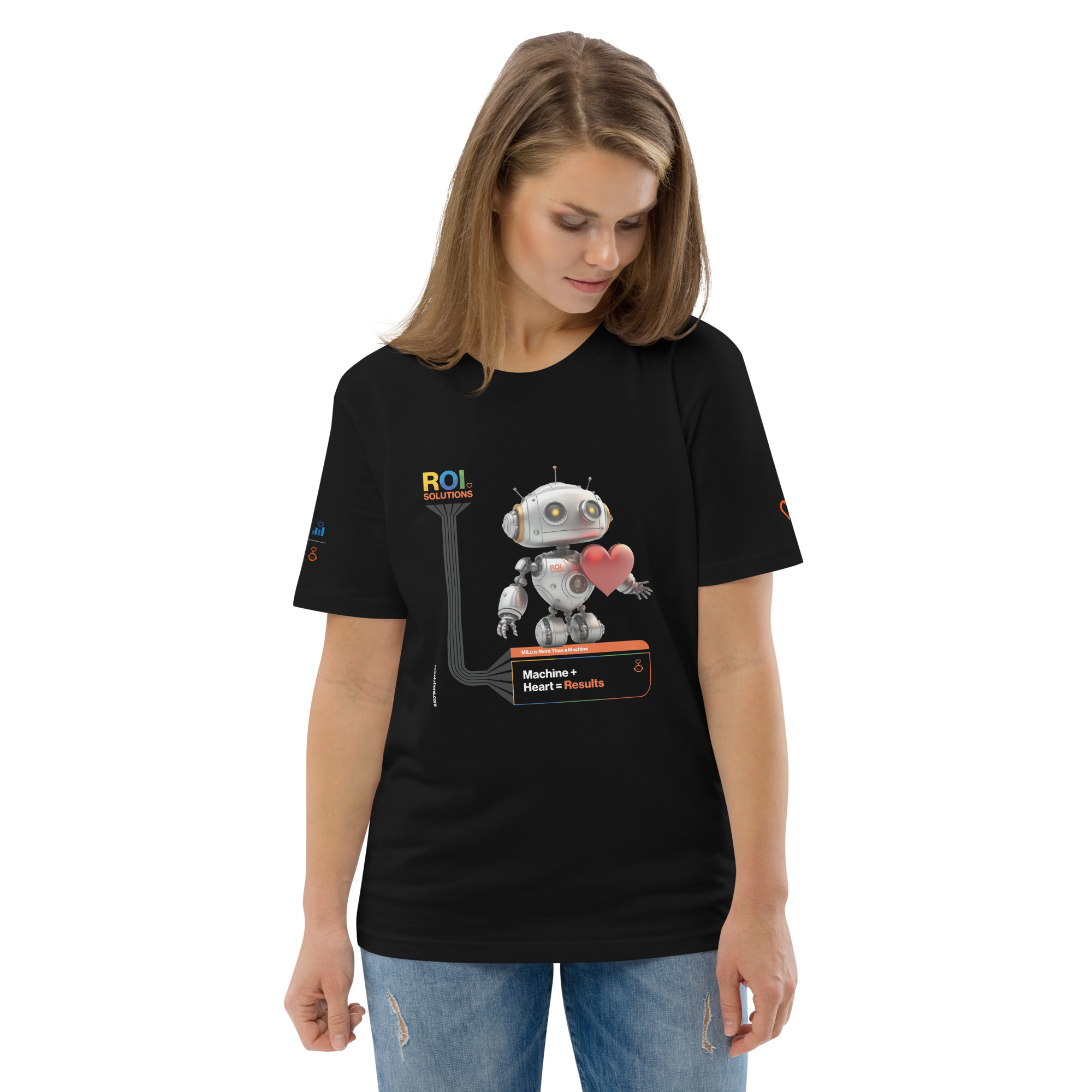
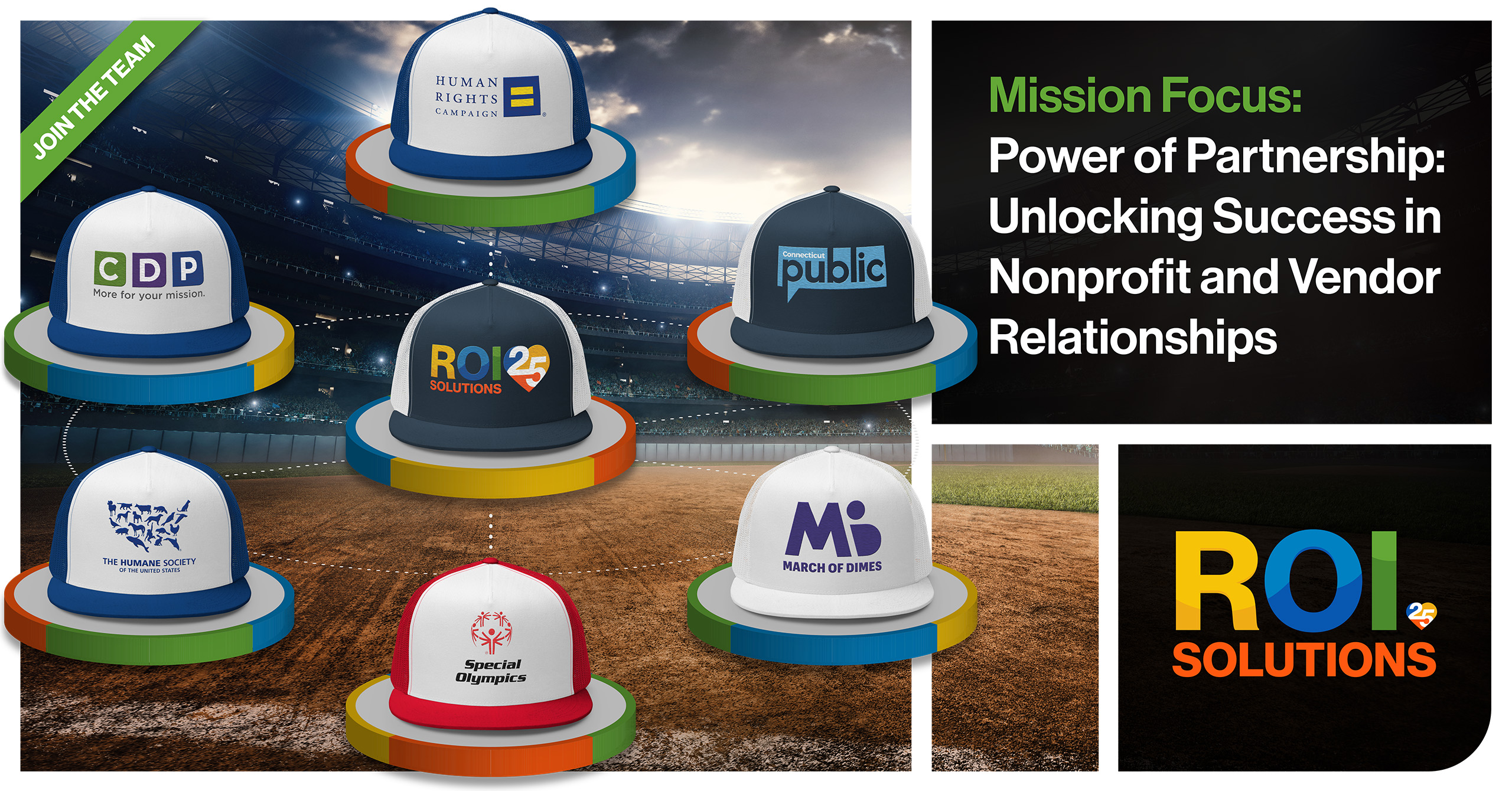
A brand that stops at the screen is only half real. The standards guide already specced apparel, signage, and physical color; the merchandise shop made it orderable, a complete on-demand print shop for hoodies, jackets, bags, hats, tech, even carry-ons.

The strategic move was untethering. Traditional branded merchandise means a third-party vendor, minimum quantities, markups, and boxes of unworn inventory. On-demand printing removed every one of those constraints: the team orders what it needs, when it needs it.

Freedom needed governance to work. Every product we designed follows the standards guide, and anything the team creates follows both those guidelines and the precedent already on the shelf. A t-shirt and a trade-show banner draw from the same palette, marks, and rules.

The result is a brand the whole company can put on. A new hire, conference season, a client gift: the shop answers them all without a procurement cycle, and every order extends the identity a little further out into the world.

The shop turned standards into supply, making documented choices orderable without reopening design review for every object.

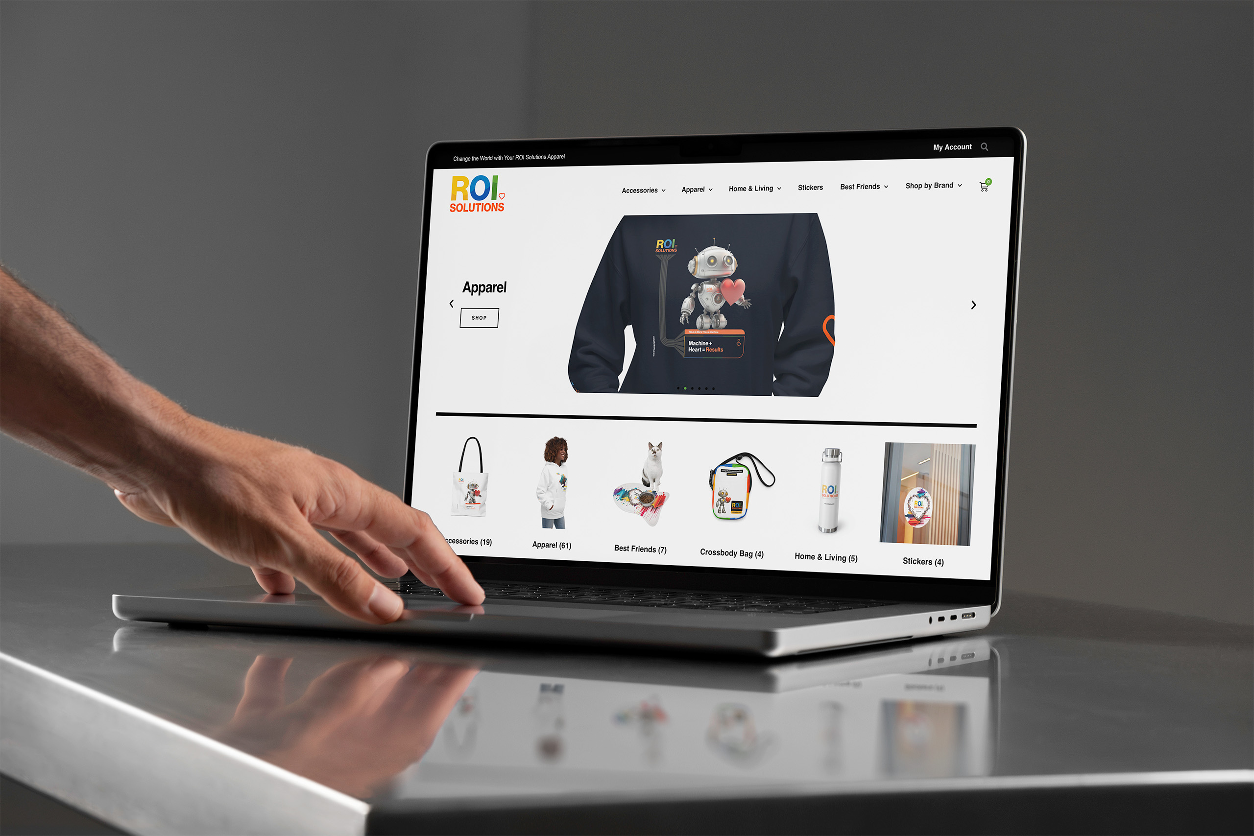
Hand scrolls the merch store apparel hero on a laptop, the MiLo hoodie above category tiles.
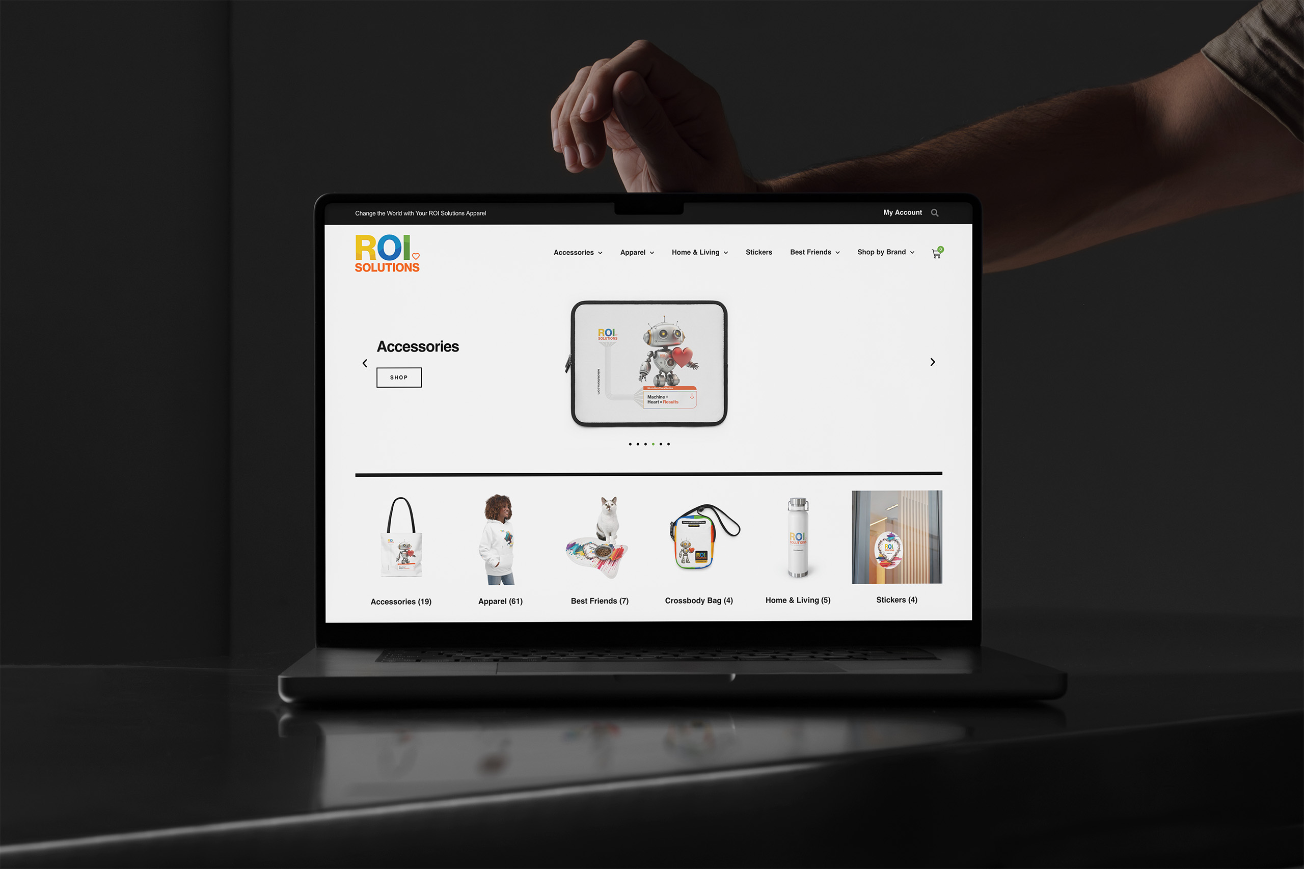
Laptop showing the merch store accessories carousel above the category tiles running from apparel to stickers.
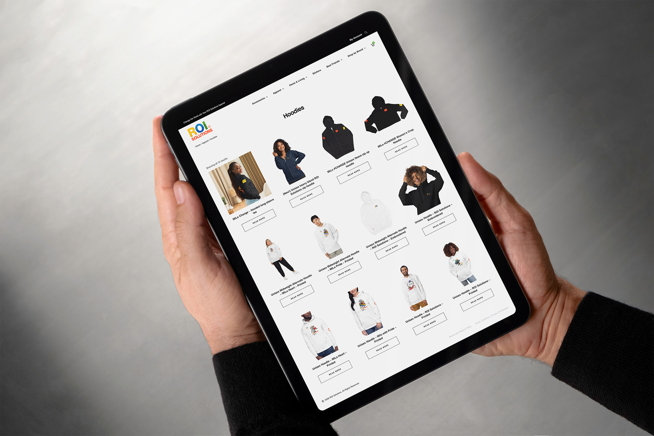
Hands hold a tablet showing the merch store hoodies category, product cards across a white grid.
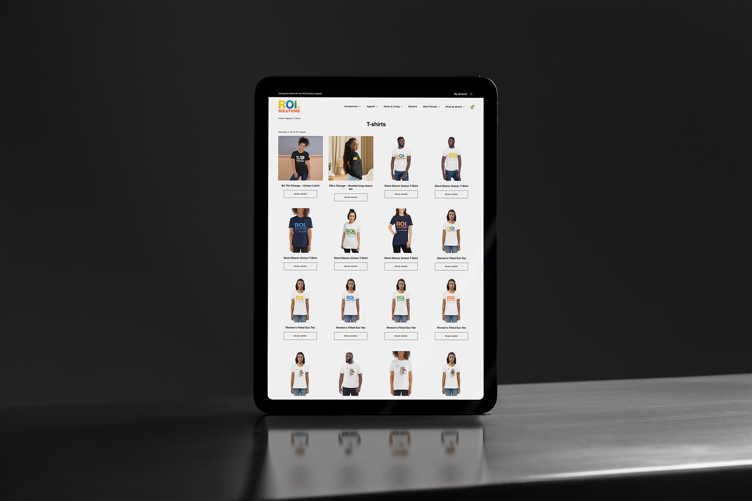
Tablet standing on steel showing the t-shirts category grid, tees and tanks across four columns.
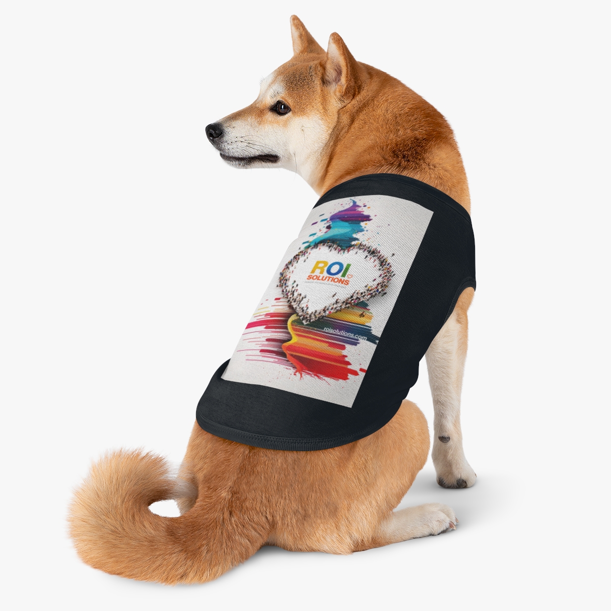
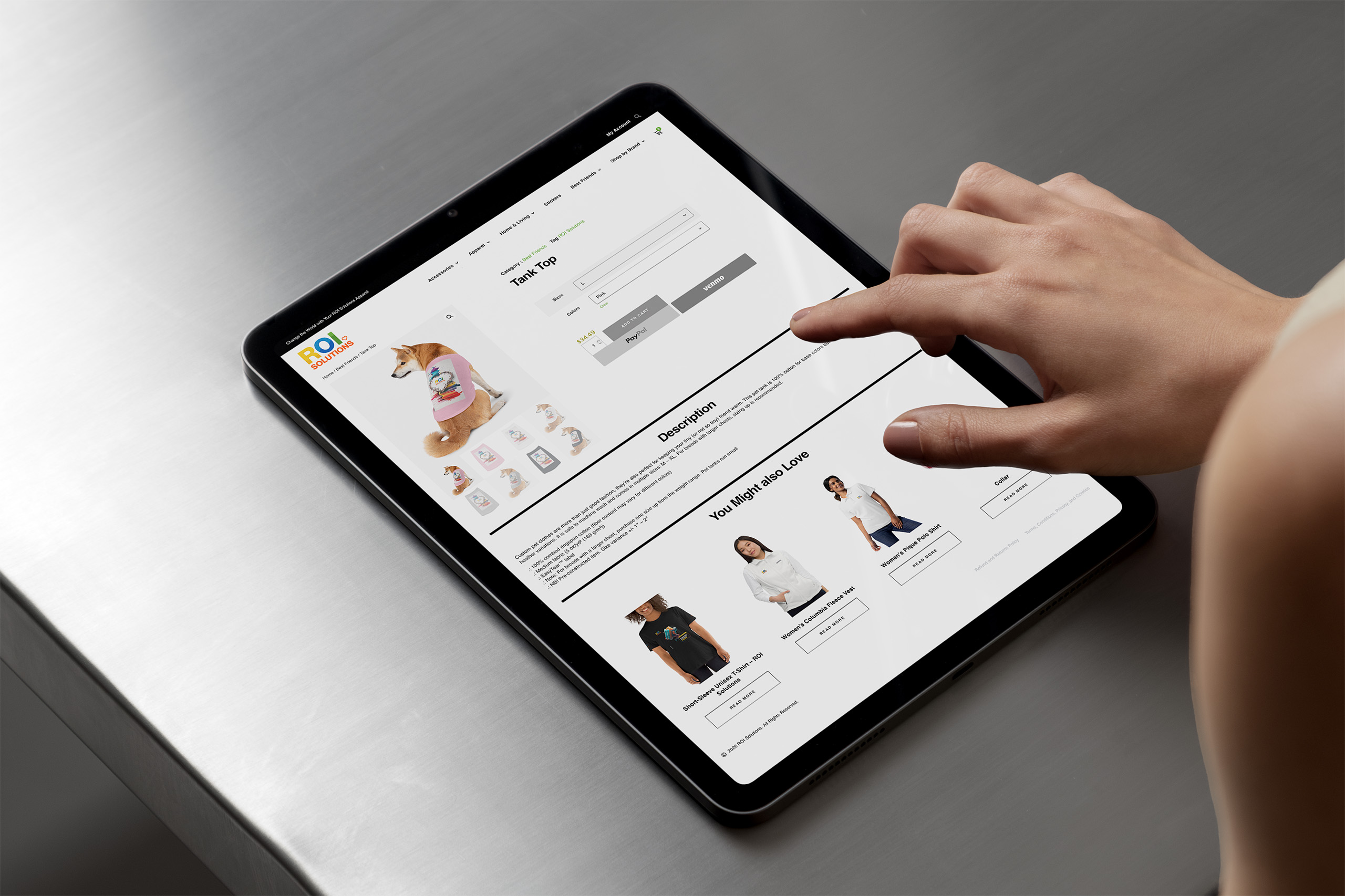
Hand taps the pet tank product page on a tablet, the Shiba model above related products.
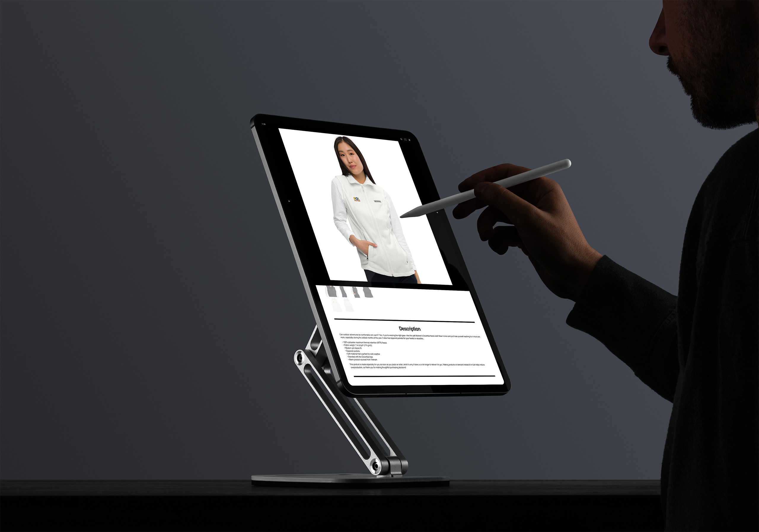
Stylus points at a fleece product page on a stand-mounted tablet in a dark studio.
Hand reaches toward a laptop showing the MiLo Intelligence slide, a model-building flow beside the orange Predict Optimize Scale panel.

Website + Publishing System

The website was architected around the visitor’s mission, not the company’s feature list, exactly as discovery directed. Mega menus, dynamic sliders, and predictive search keep a deep site feeling shallow, and the build honors the design with unusual precision. We designed the concepts in Illustrator, and the live site matches them, identically, across seven device sizes.

Underneath is a publishing system shaped like the company’s actual content. Custom post types power resources, client stories, testimonials, and even team members, so pages assemble from structured data instead of copy-paste, and a story can pull the right testimonial by mission or company tag.

The admin experience is as designed as the front end. A custom login, a custom dashboard, and purpose-built menus give the marketing team a workspace organized around their jobs, with homepage options, banners, and sliders managed as content rather than code.

Governance travels with it. The full brand standards live behind a login, training onboards new contributors, and the templates themselves carry the design system. The company that promises nonprofits independence with their data now has the same independence with its story.

The people closest to the mission could publish, adapt, and extend the site; its architecture kept every new page coherent.

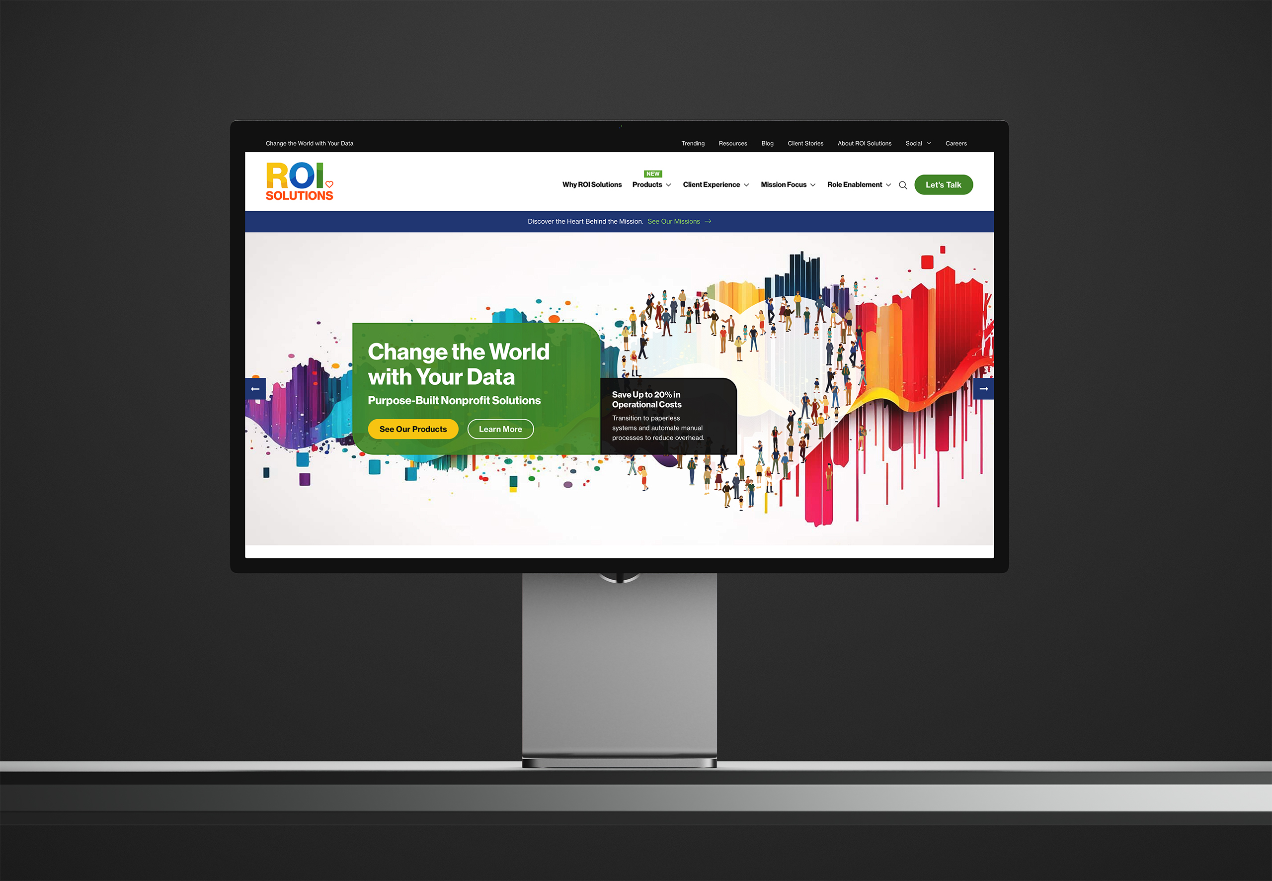
Studio display showing the homepage hero, Change the World with Your Data on green beside the crowd heart and paint streaks.
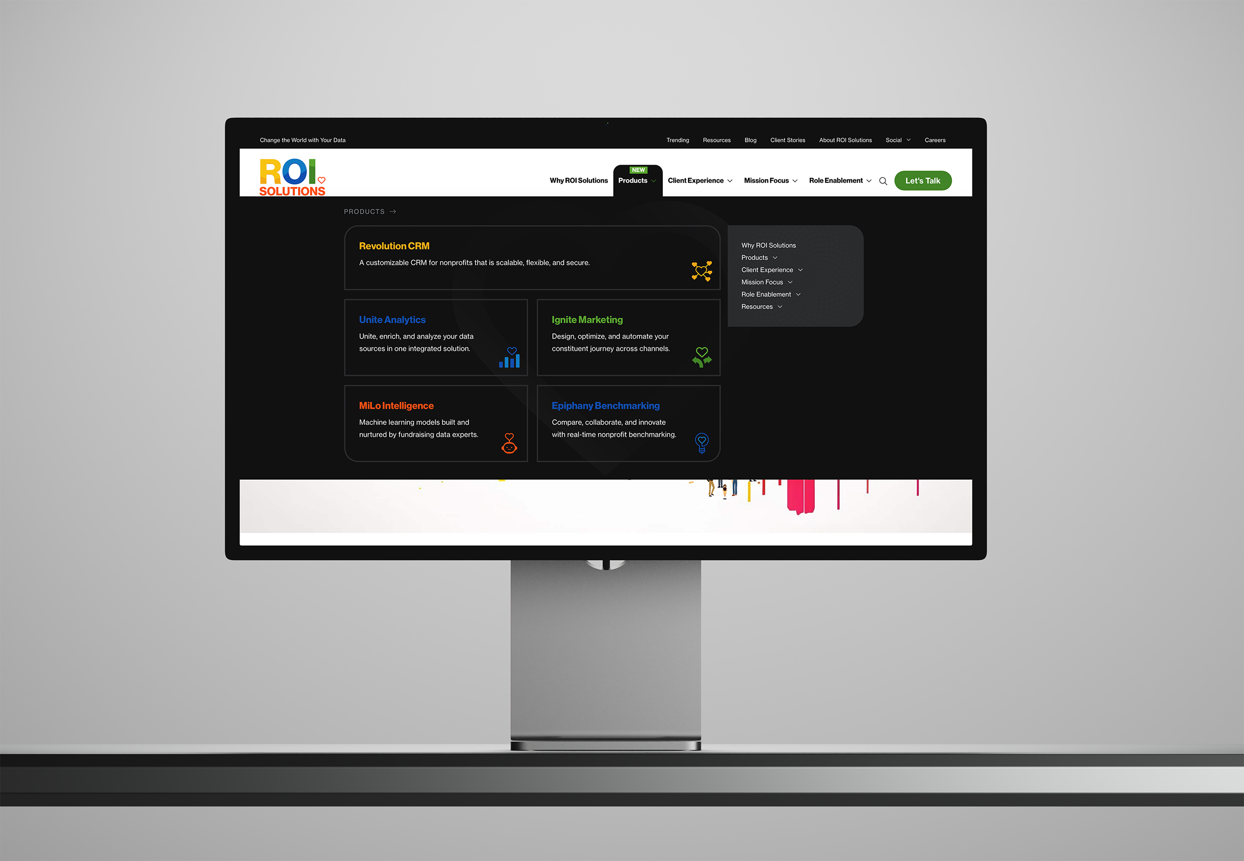
Studio display showing the dark products mega menu, five product entries with icons above the paint-drip page edge.
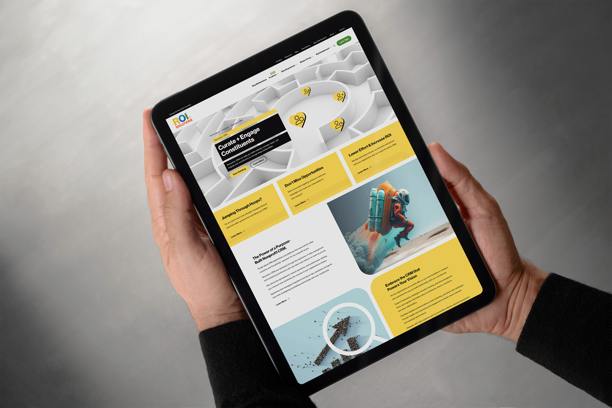
Hands hold a tablet showing the Revolution CRM page, the maze hero above yellow panels and the rocket-pack explorer.
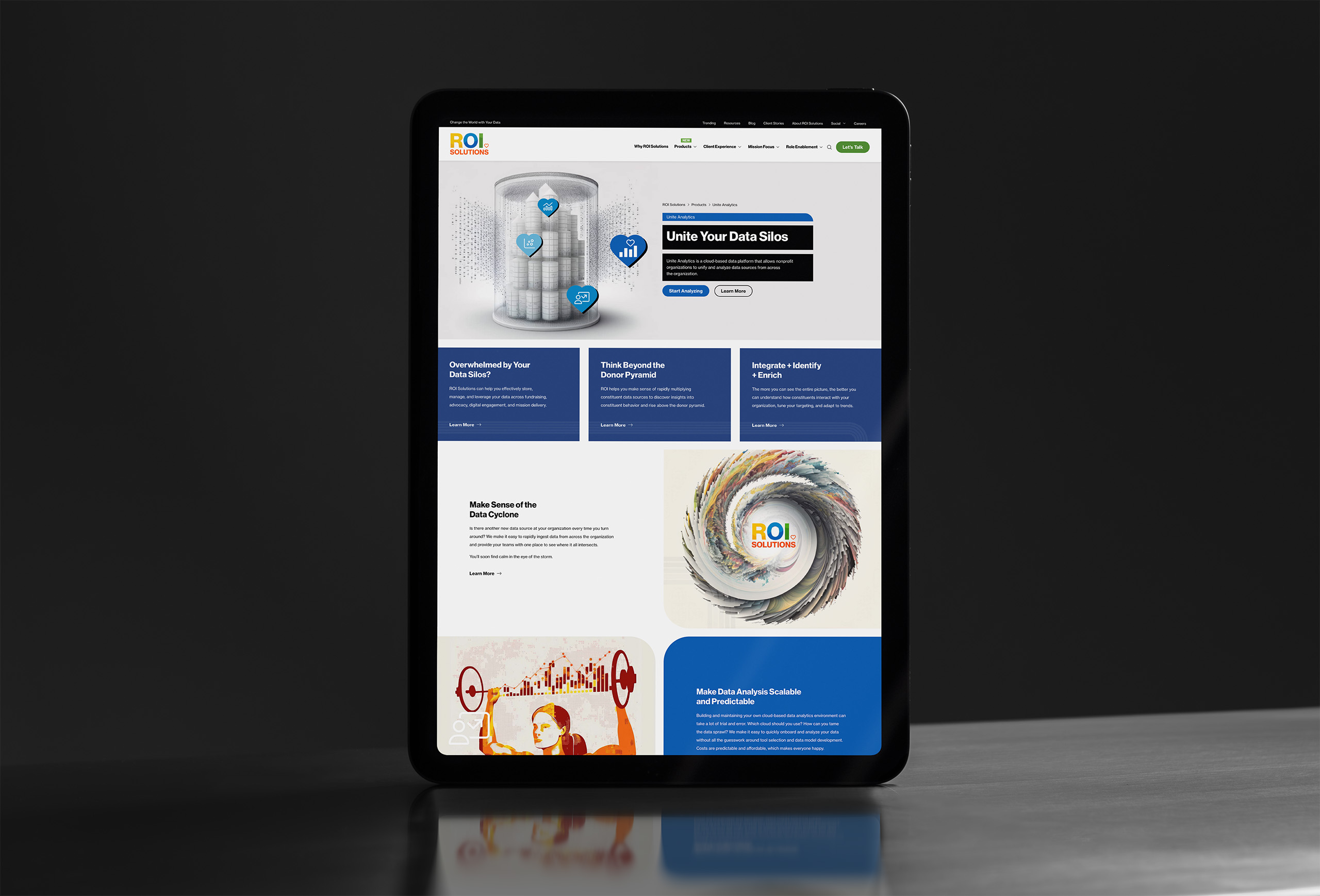
Tablet showing the Unite Analytics page, the domed data city hero above blue panels and the data cyclone illustration.
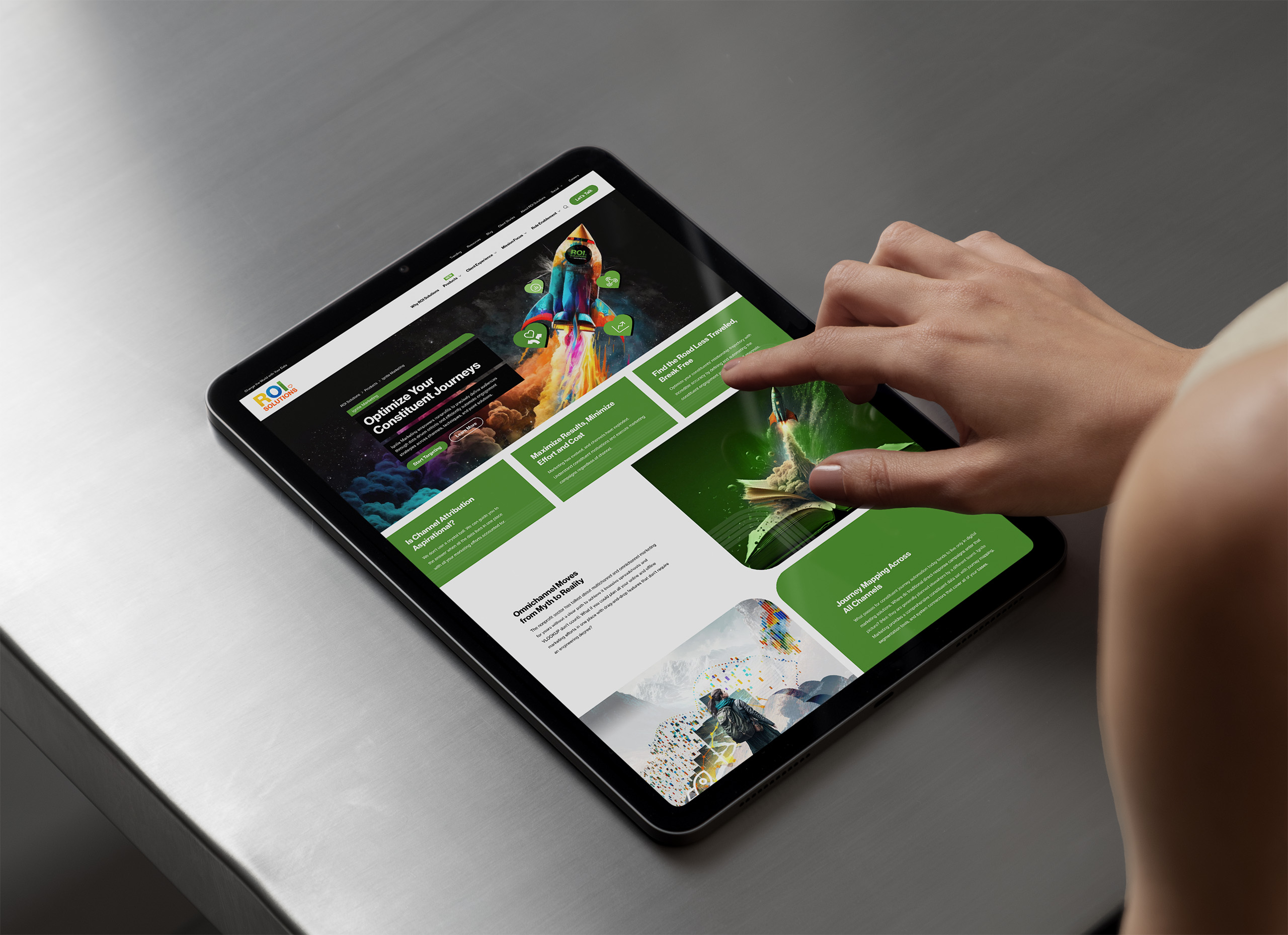
Finger taps the Ignite Marketing page on a tablet, the painted rocket hero above green capability panels.
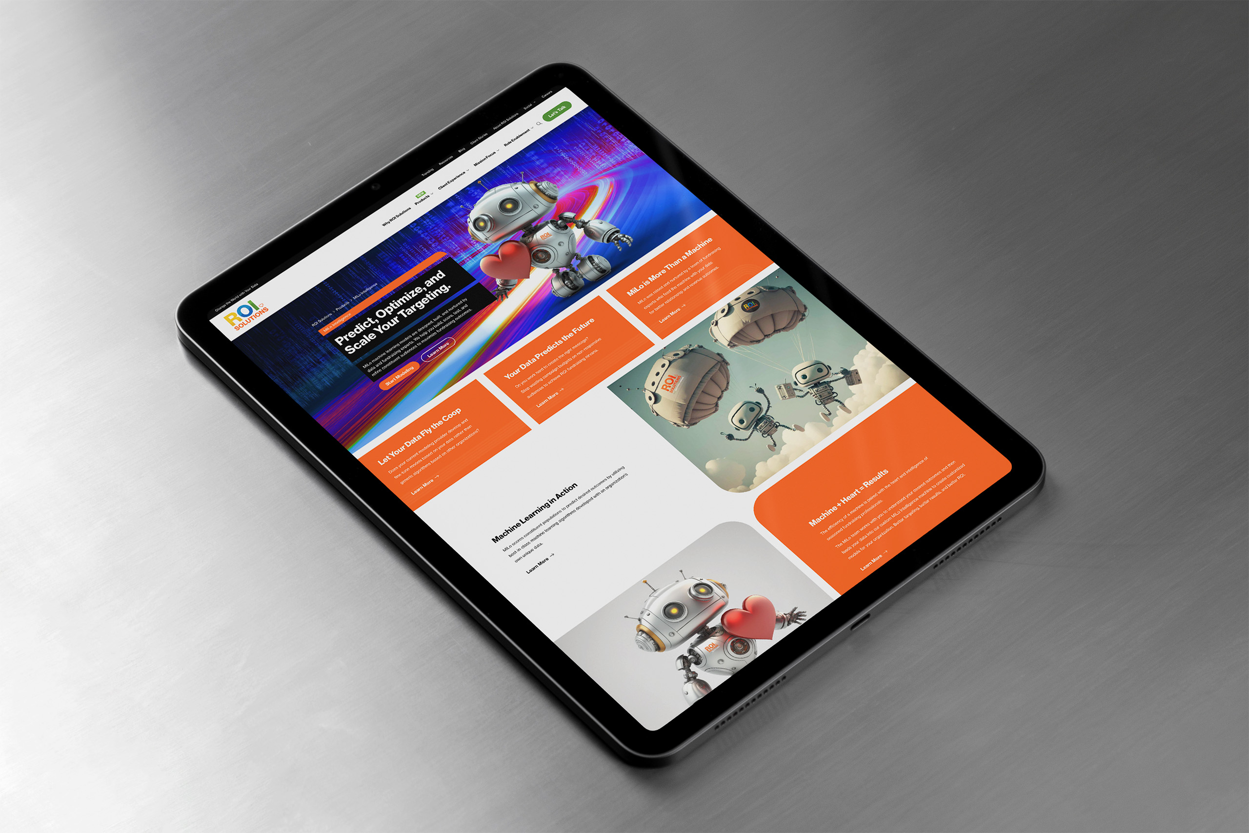
Tablet showing the MiLo Intelligence page, light-trail hero above orange panels and robot illustrations down the layout.
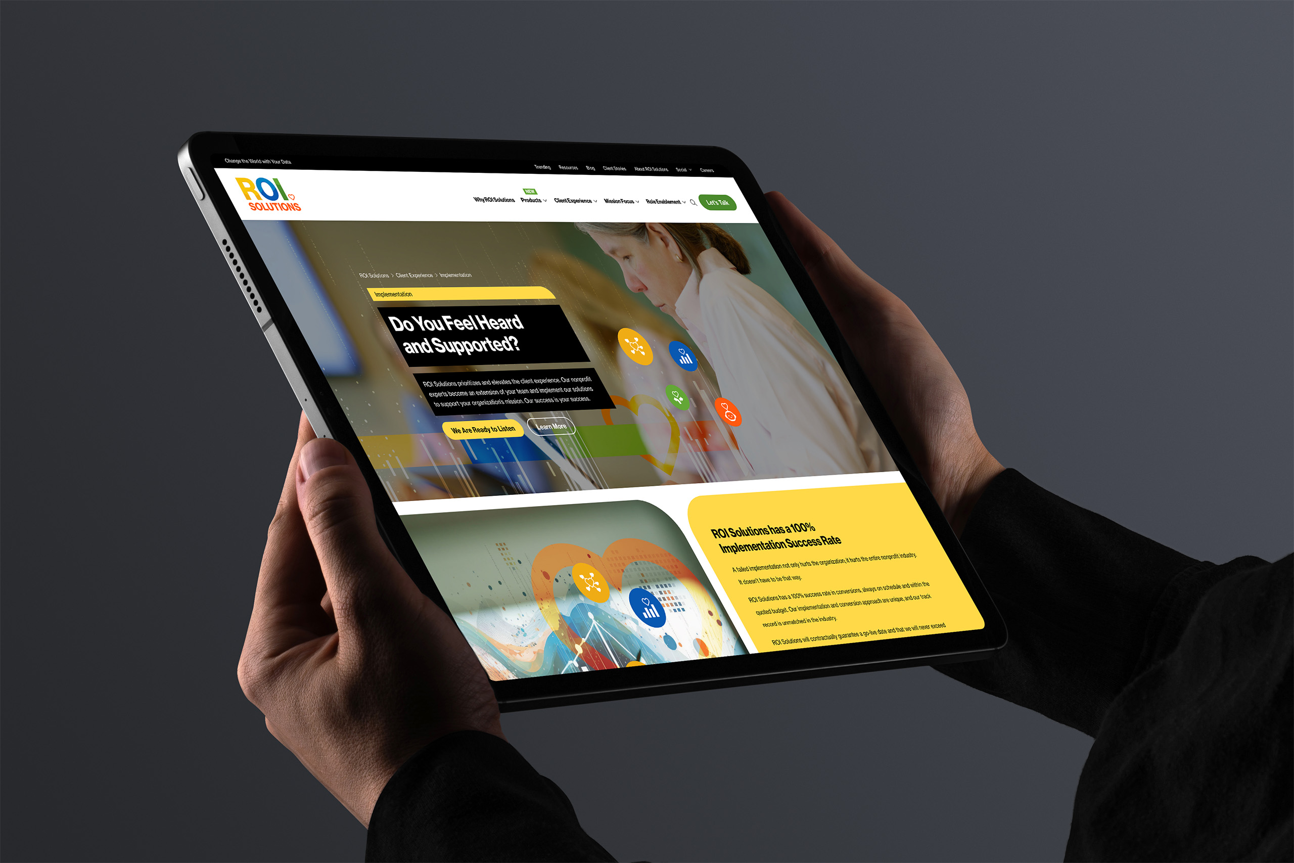
Hands hold a tablet showing the implementation page, Do You Feel Heard and Supported above the one hundred percent success panel.
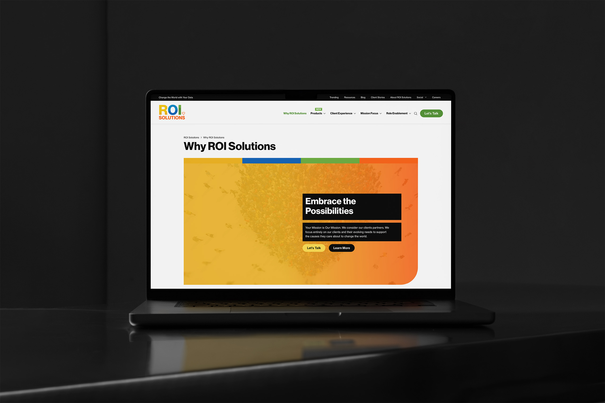
Laptop showing the Why ROI Solutions page, an Embrace the Possibilities panel over the gold and orange crowd artwork.
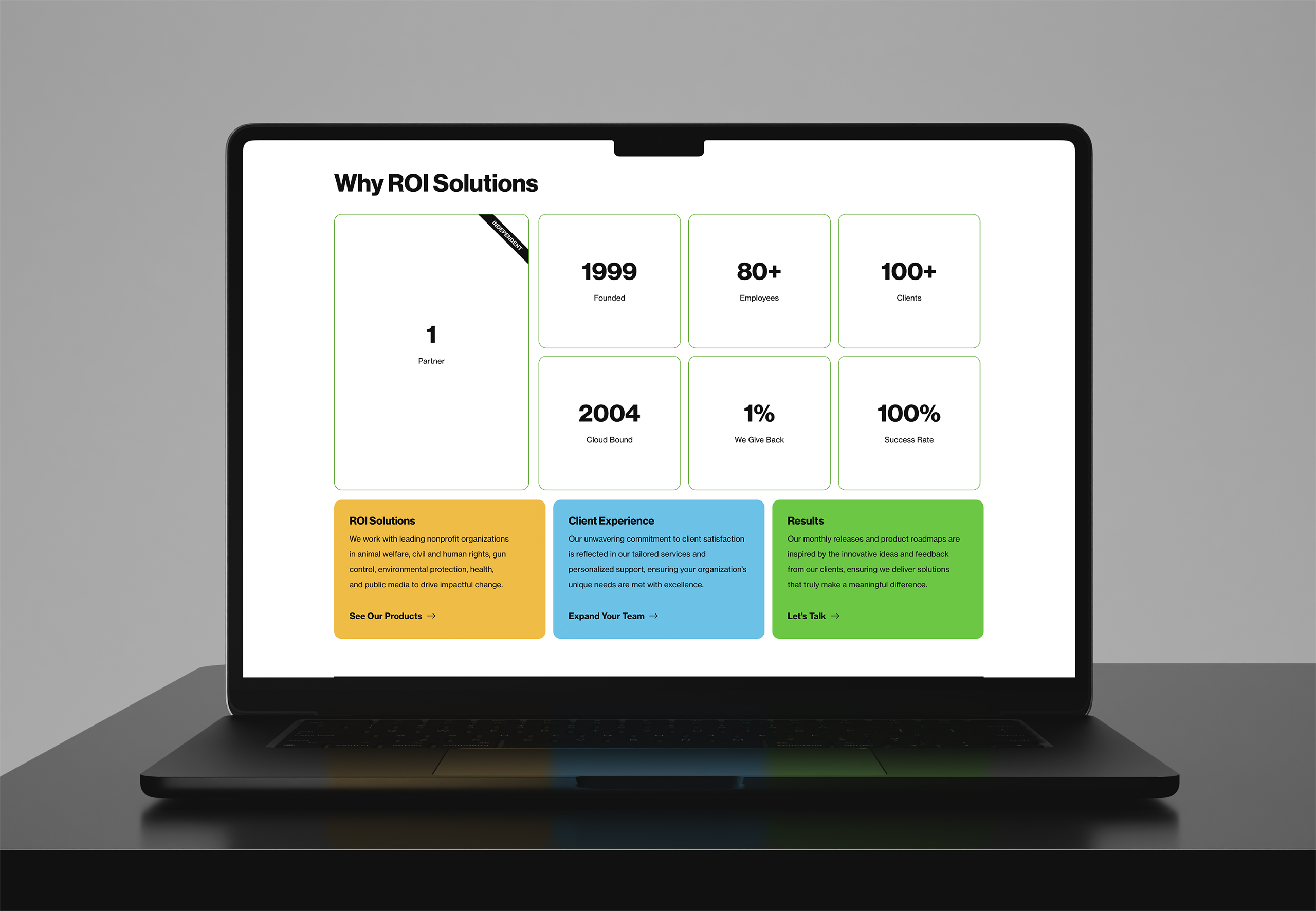
Laptop showing the Why ROI Solutions stat tiles from 1999 founding to 100 percent success, color panels beneath.
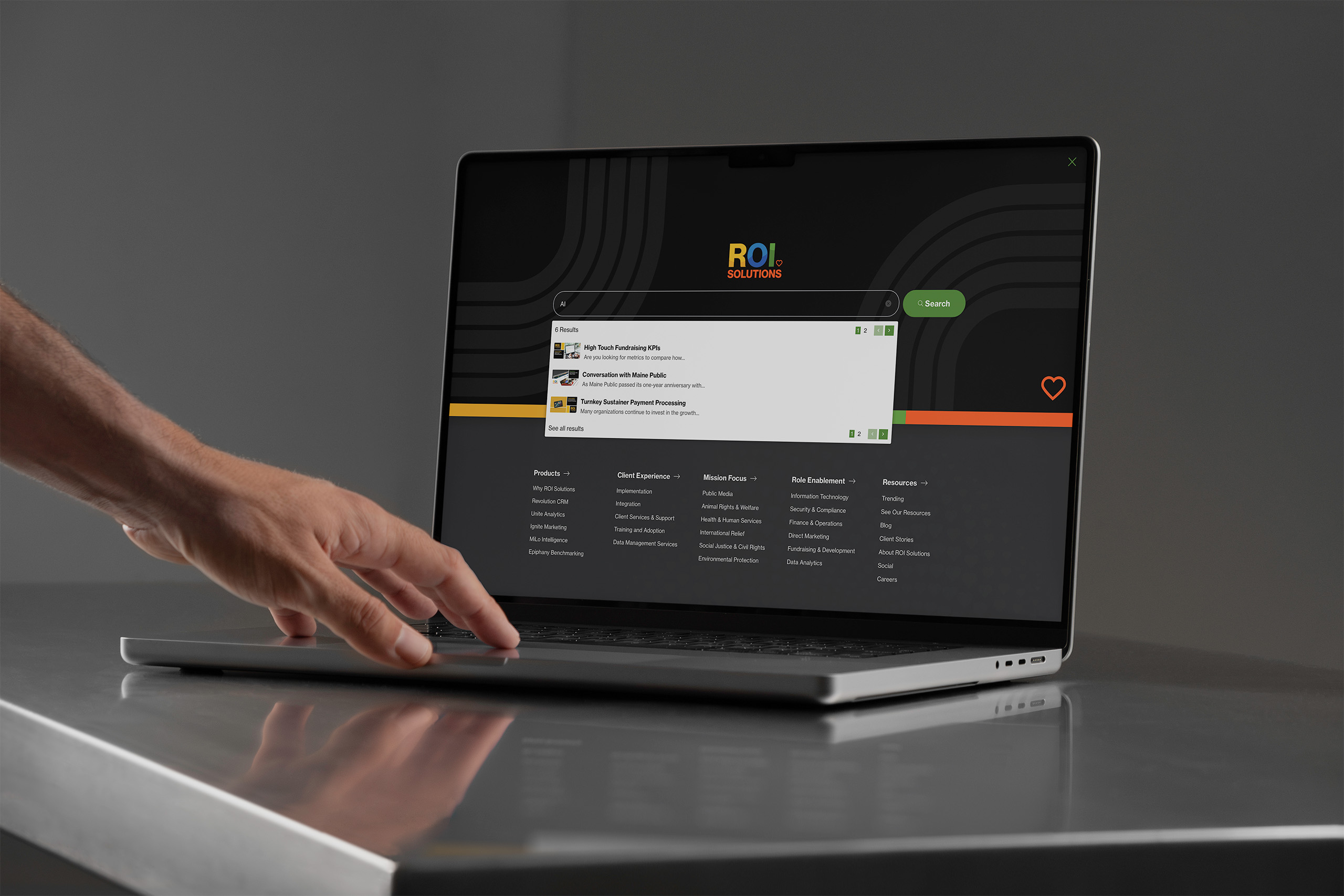
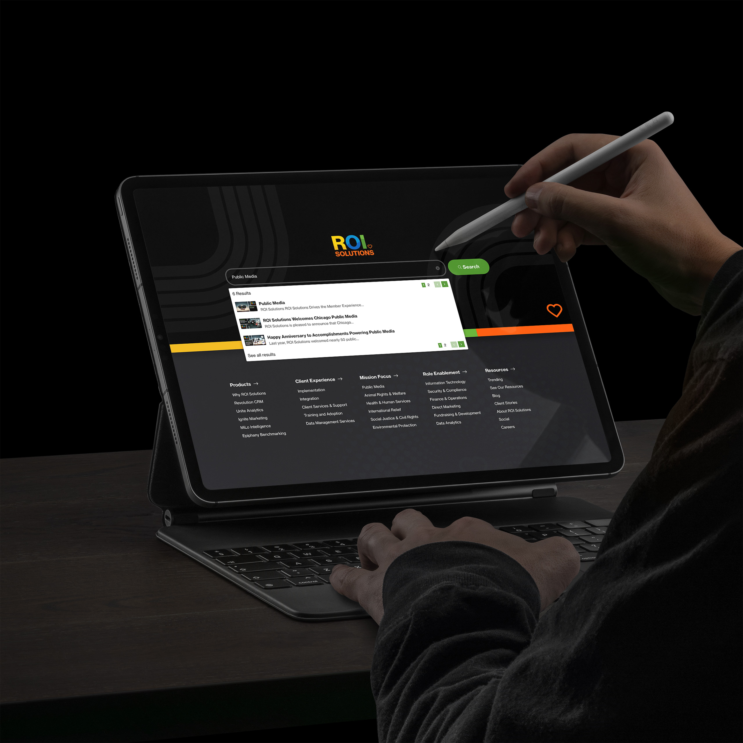
Hand at a laptop showing the dark predictive search overlay, results listed above the full navigation columns.
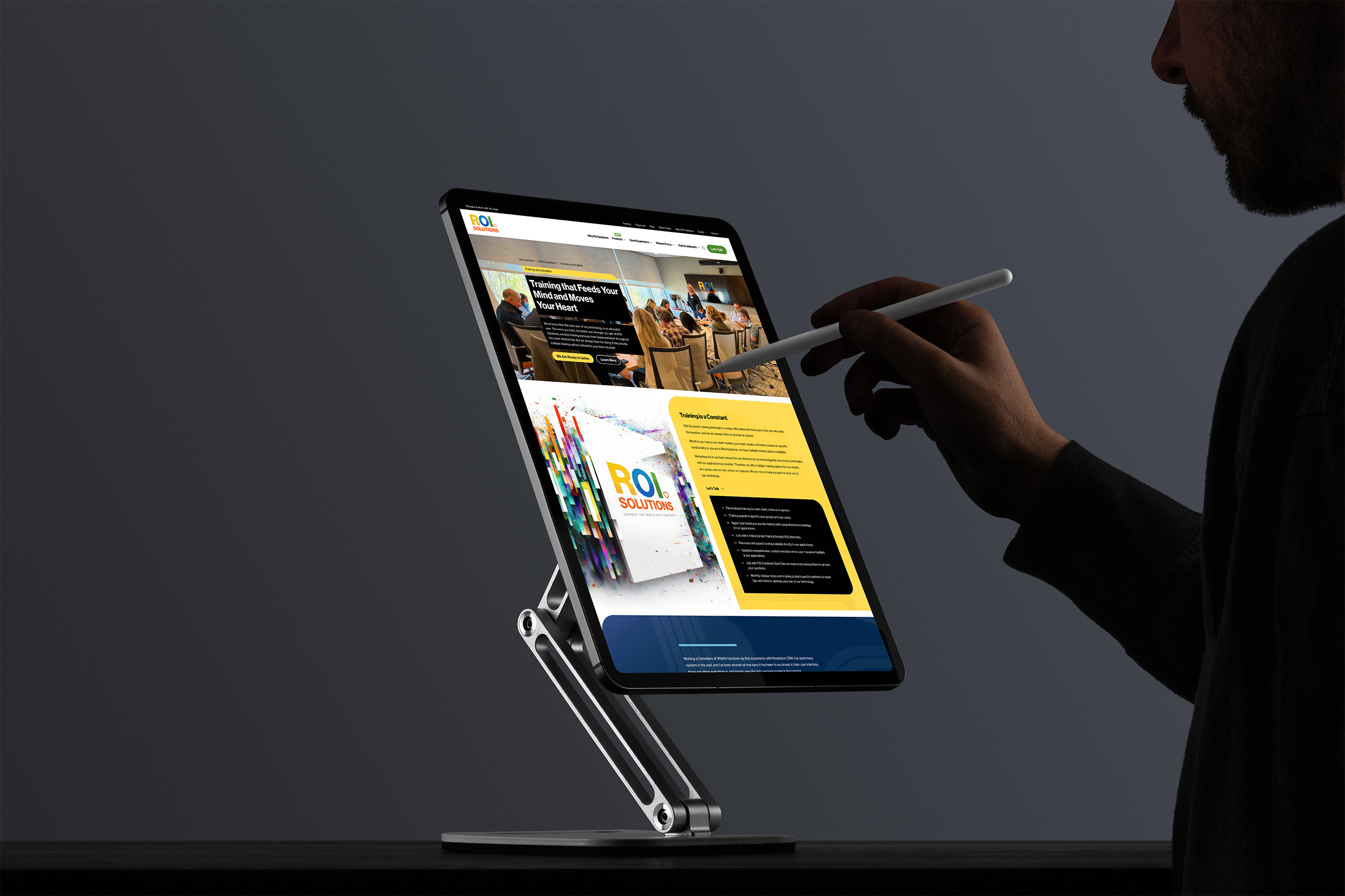
Silhouetted man with a stylus reviews the training page on a stand-mounted tablet, white-paper cards along the yellow panel.
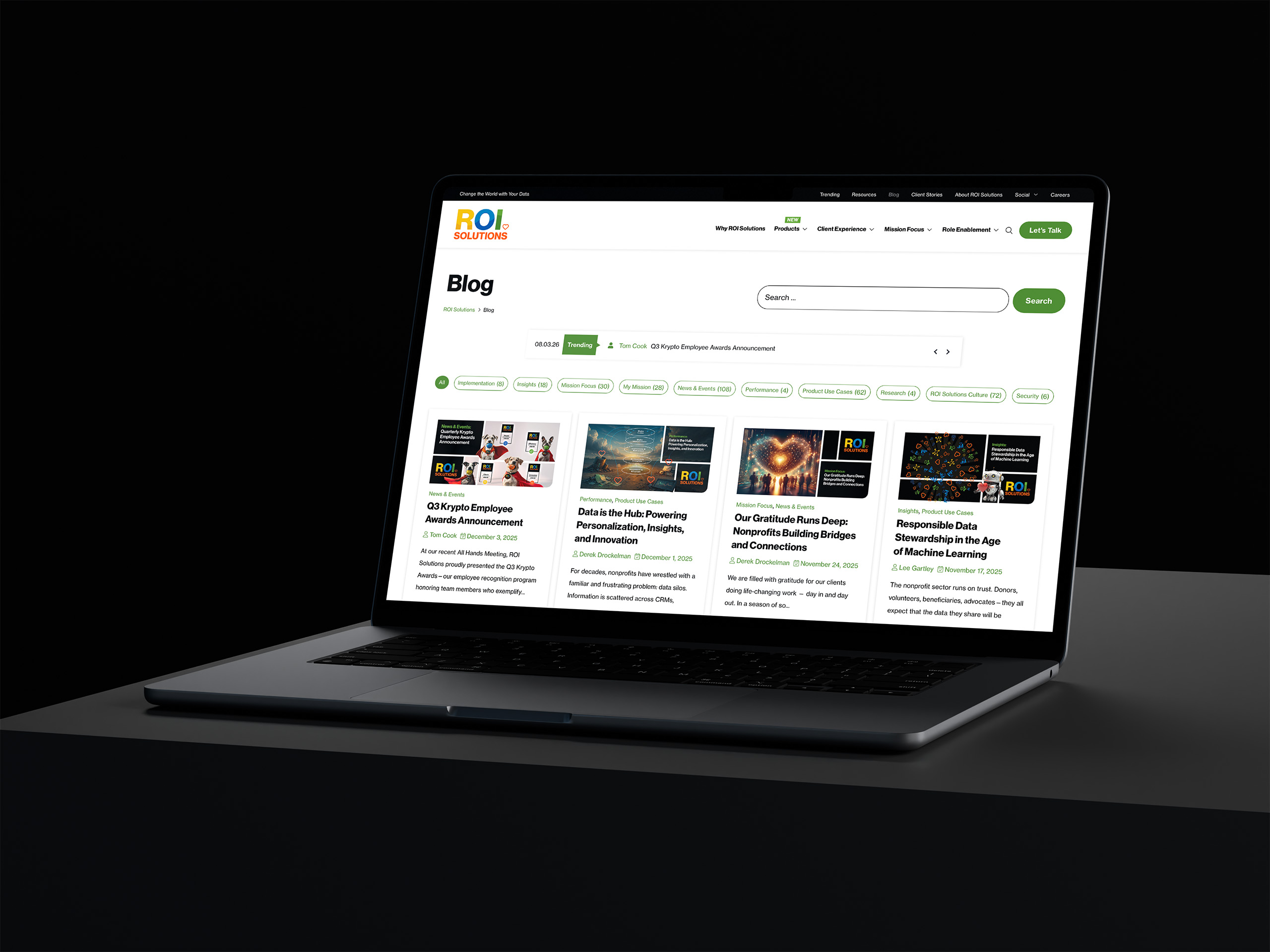
Laptop showing the blog index, feature cards for gratitude runs, data stewardship, and award announcements across the grid.
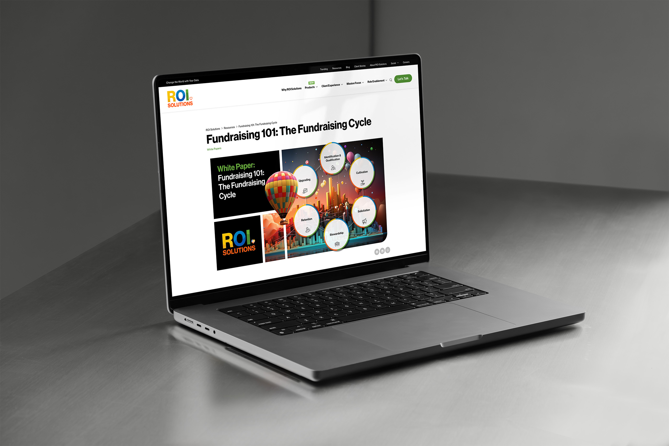
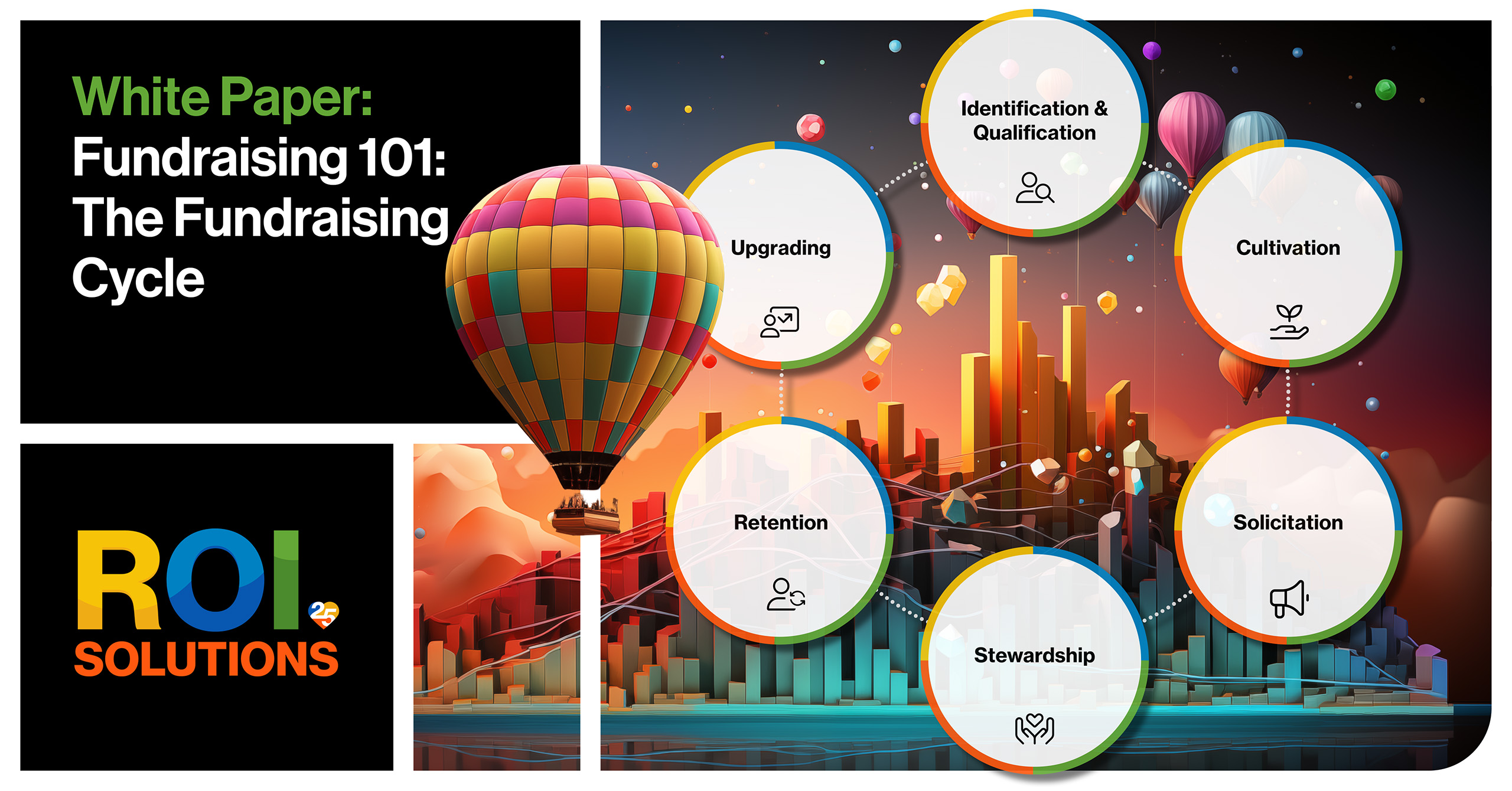
Laptop showing the Fundraising 101 blog post, the balloon white-paper card beside the circular fundraising cycle diagram.
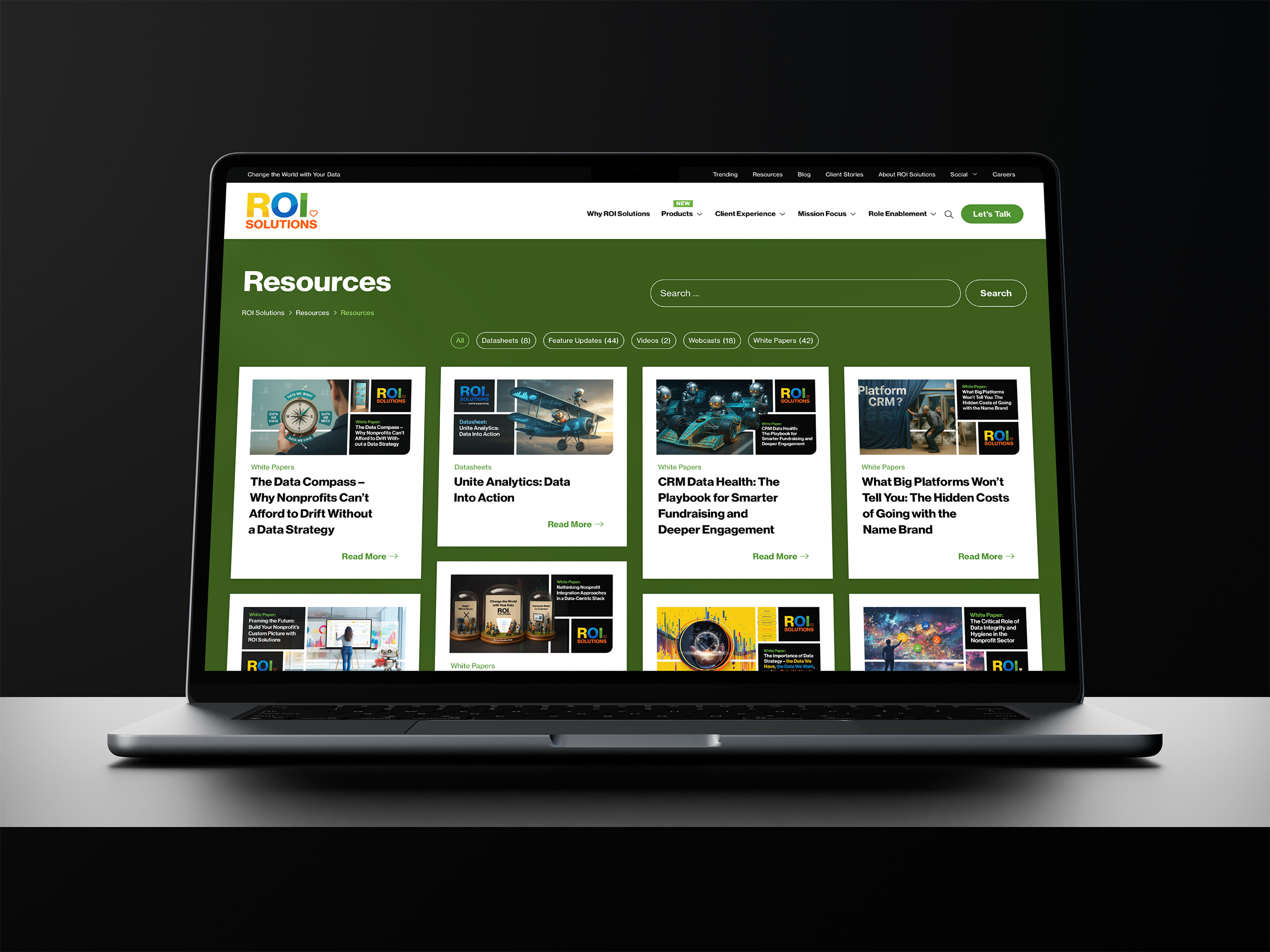
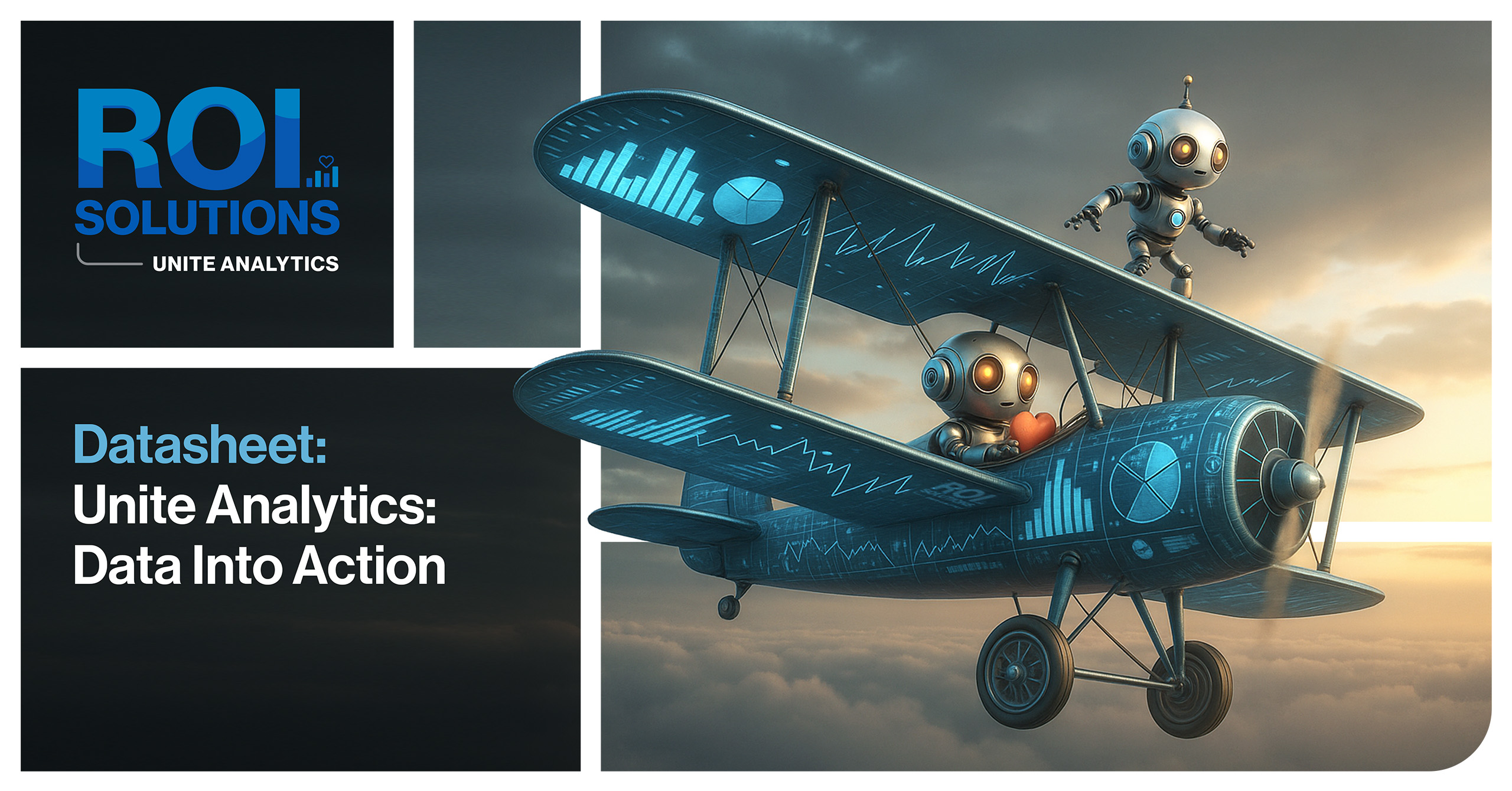
Laptop showing the green Resources library, white paper and datasheet cards with feature artwork across the grid.
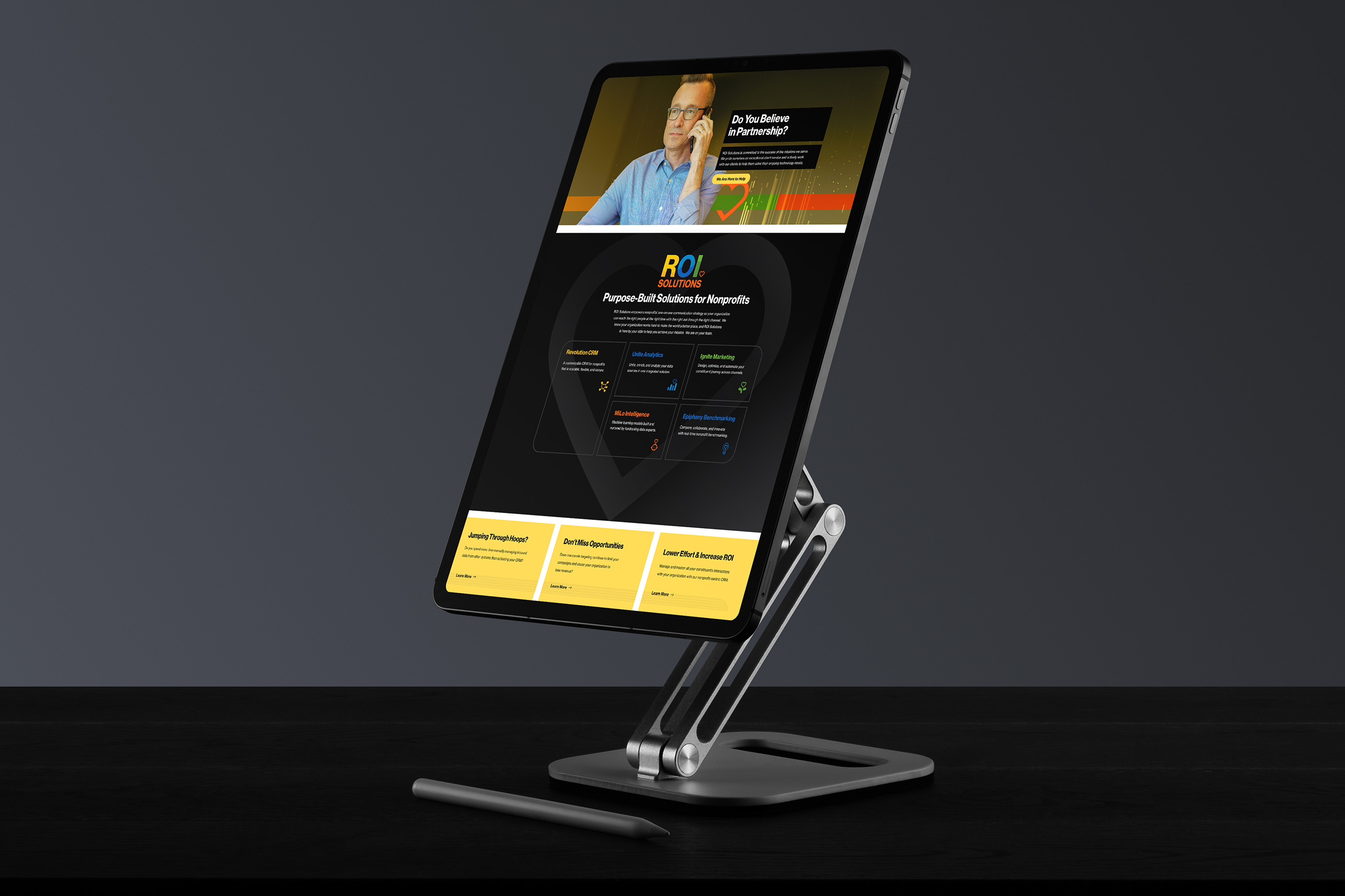
Stand-mounted tablet showing the partnership page, Do You Believe in Partnership above dark product panels and yellow cards.
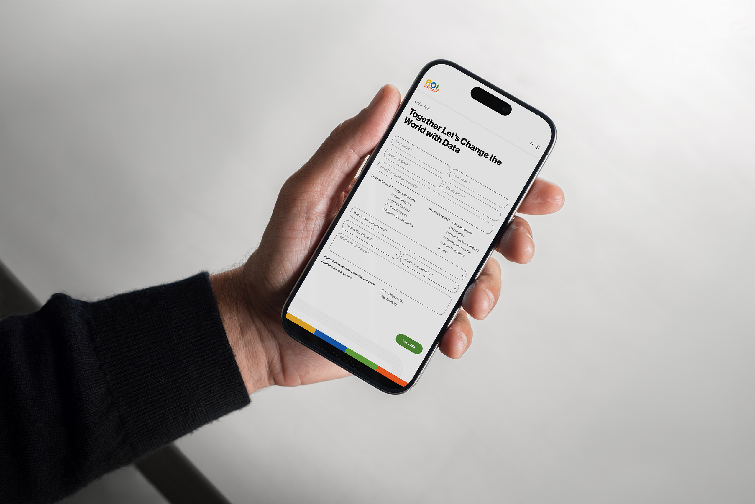
Hand holds a phone showing the Lets Talk contact form under Together Lets Change the World with Data.
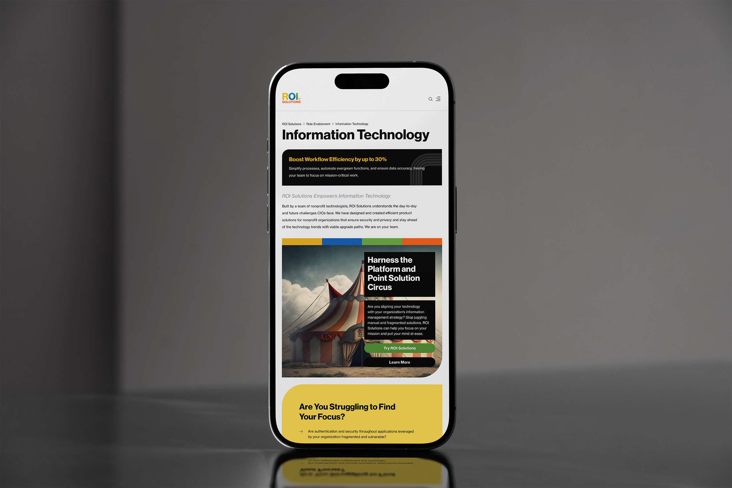
Phone standing on steel showing the Information Technology page, a circus-tent panel asking about platform and point solutions.
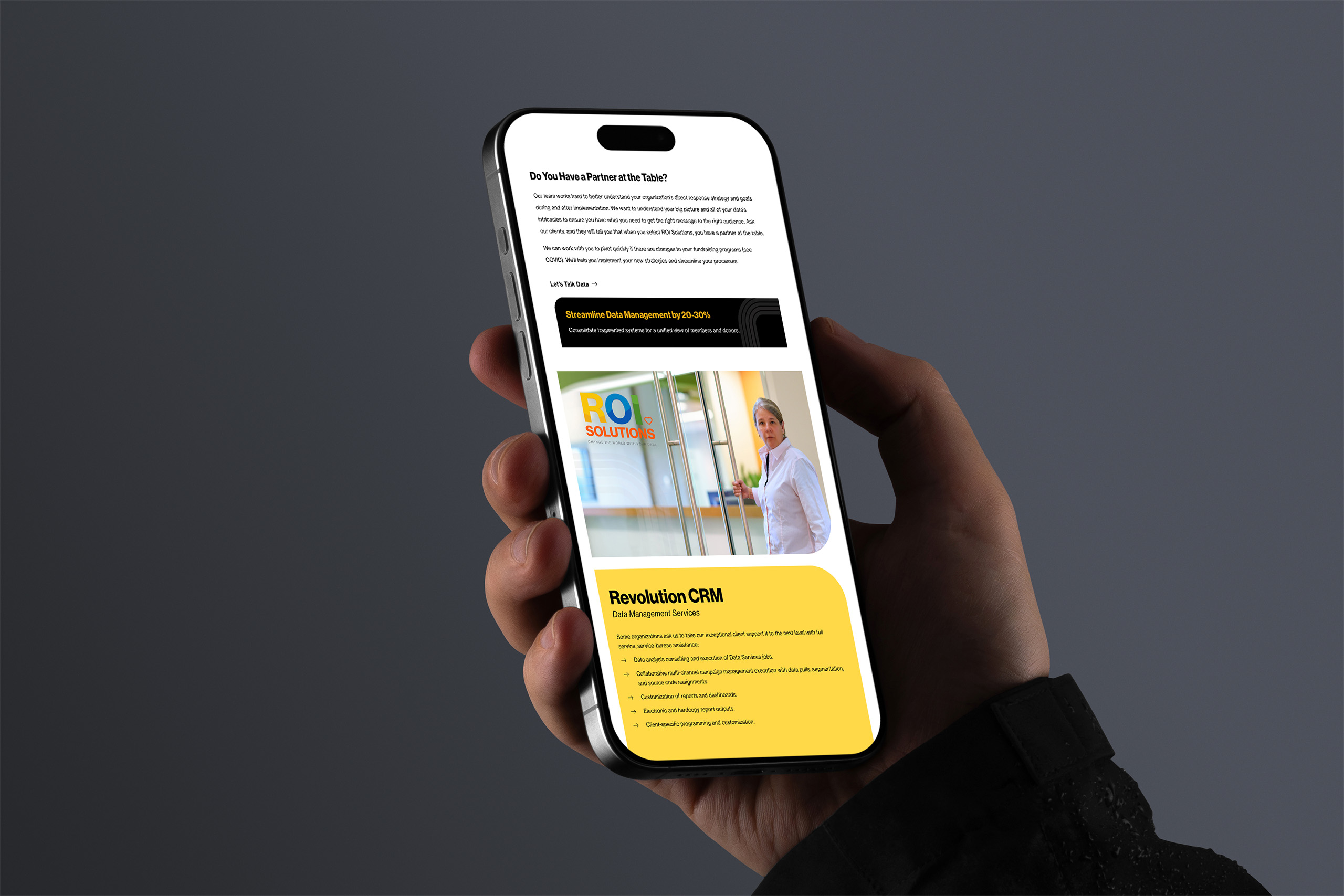
Hand holds a phone showing the data management services page, a Revolution CRM panel beneath an office photograph.
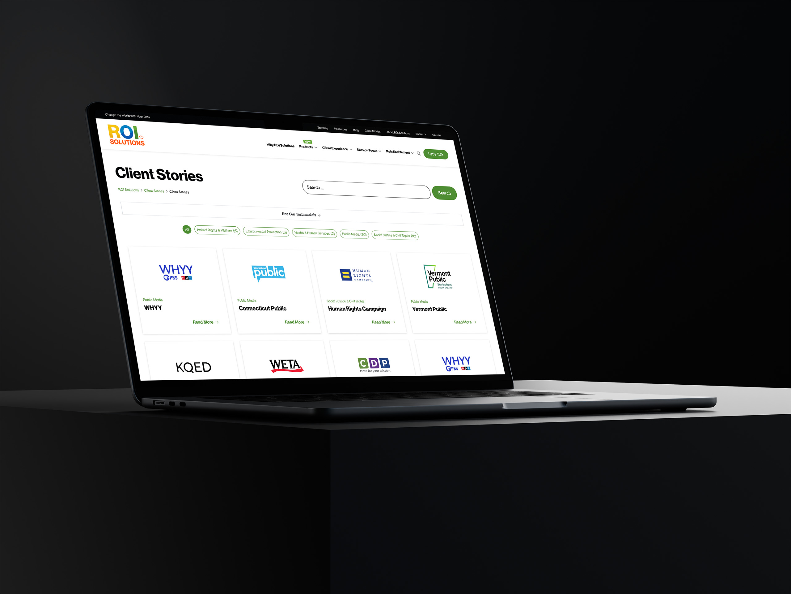
Laptop showing the Client Stories index, logo cards for WHYY, Connecticut Public, Human Rights Campaign, and Vermont Public.
Laptop showing the Human Rights Campaign client story with quote panel, color divider, and machine learning article below.
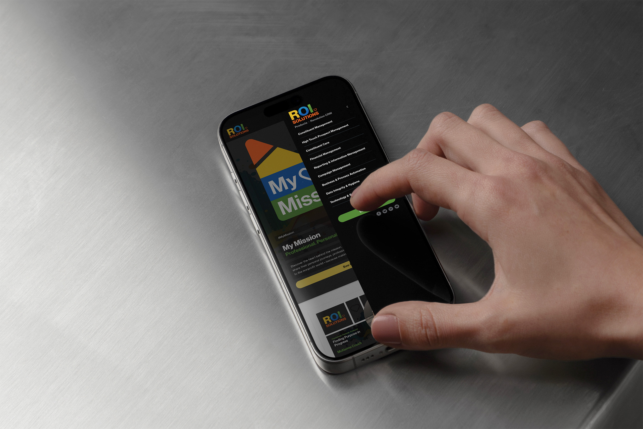
Thumb opens the dynamic mobile menu over the My Mission tile, role and mission links stacking on the dark sheet.
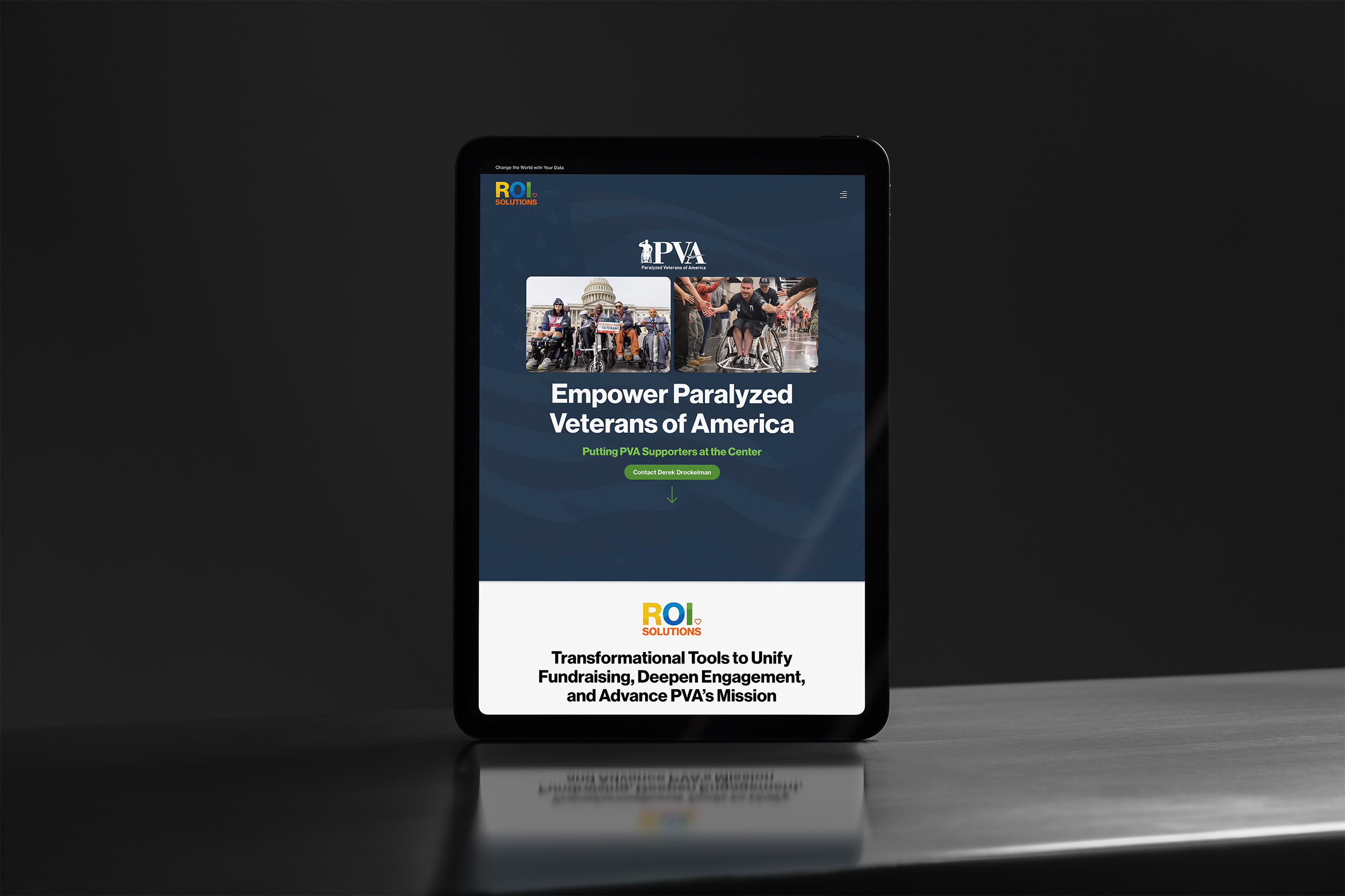
Tablet showing the personalized Paralyzed Veterans of America RFP landing page, supporter photos above the transformational tools banner.
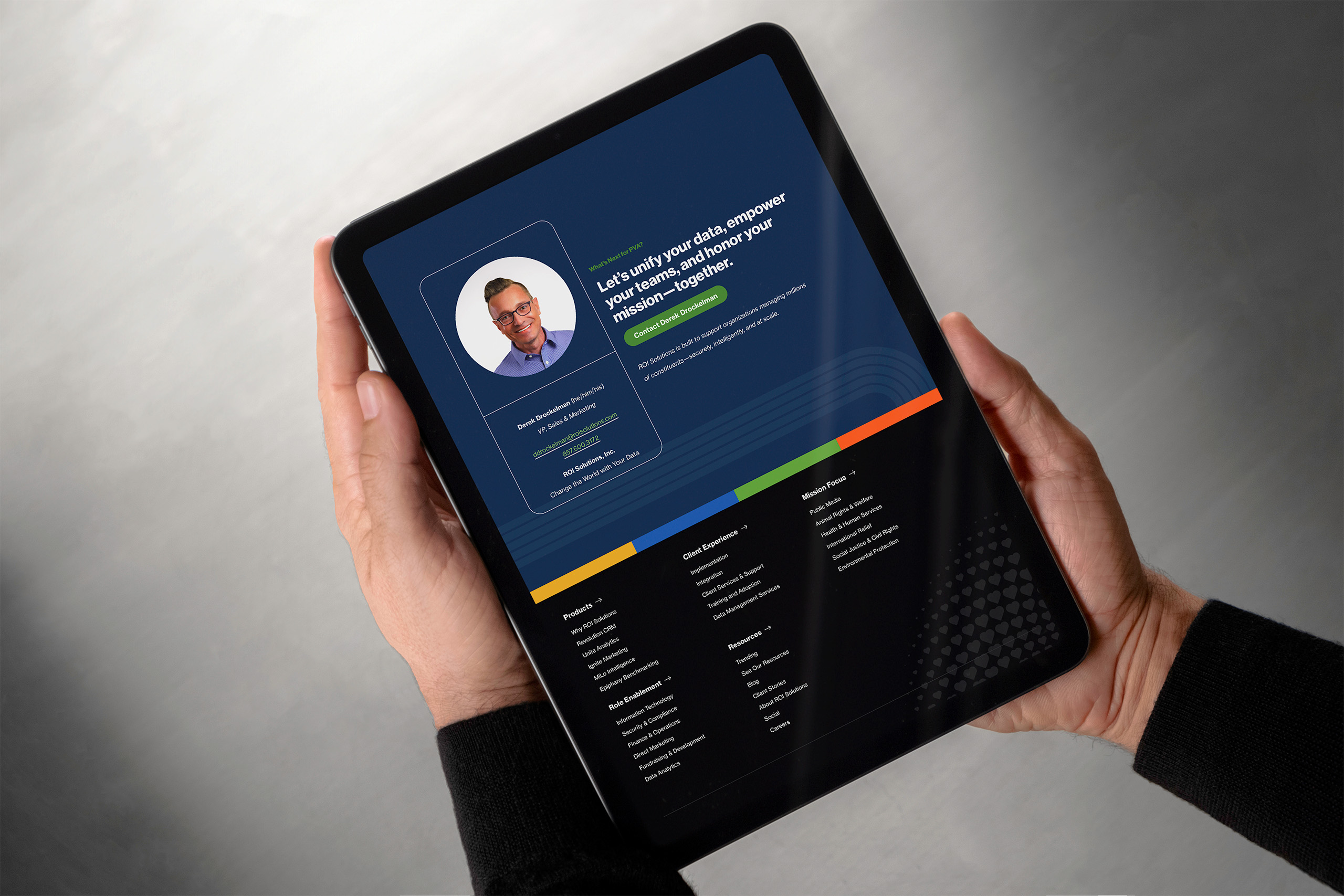
Hands hold a tablet showing a personalized sales contact page, a representative portrait beside the unify-your-data message.
Laptop in low light showing the You at 25 anniversary page, the segmented heart bursting through paint above story cards.
Outlined orange heart from the parent identity, the symbol placed at the center of every product mark in the constellation.

Extending the Brand System

Feature Image System

The brand doesn’t stop at the page; it travels with the content. Reusable feature templates give every blog post, resource, client story, and announcement a branded visual the moment it ships, carrying ROI Solutions’ vibrancy into feeds, inboxes, and search results well beyond the website.

  • Feature System

    Feature Template System

    A library of reusable templates sets the visual foundation for every content type. Marketers compose polished feature images in minutes, choosing imagery and messaging inside a frame that already knows the rules, so speed never costs consistency.

    Eight black feature card layouts arranged in a grid, logo and testimonial panels shifting position across each variant.
  • Feature System

    Blog + Resource Features

    Built for blogs, resources, events, videos, and promotions, each feature pairs the story’s message with its imagery. Editors adapt every feature to its content while the system holds the palette, typography, and voice steady underneath.

    Explore Features
    Feature card template pairing the logo panel with the galaxy-eye artwork and product Venn diagram on a working canvas.
Outlined orange heart from the parent identity, the symbol placed at the center of every product mark in the constellation.

Extending the Brand System

Personalized Publishing

The website doesn’t just present missions; it notices which one a visitor serves. A lightweight personalization layer reads honest signals, a chosen mission, a site search, an arriving search term, and quietly reshapes what the site offers next.

  • Personalized Publishing

    Recognize the Mission

    When a visitor selects a mission, searches the site, or arrives from a search, a cookie remembers the cause they serve. No forms, no login: the site simply pays attention to what the visitor has already said.

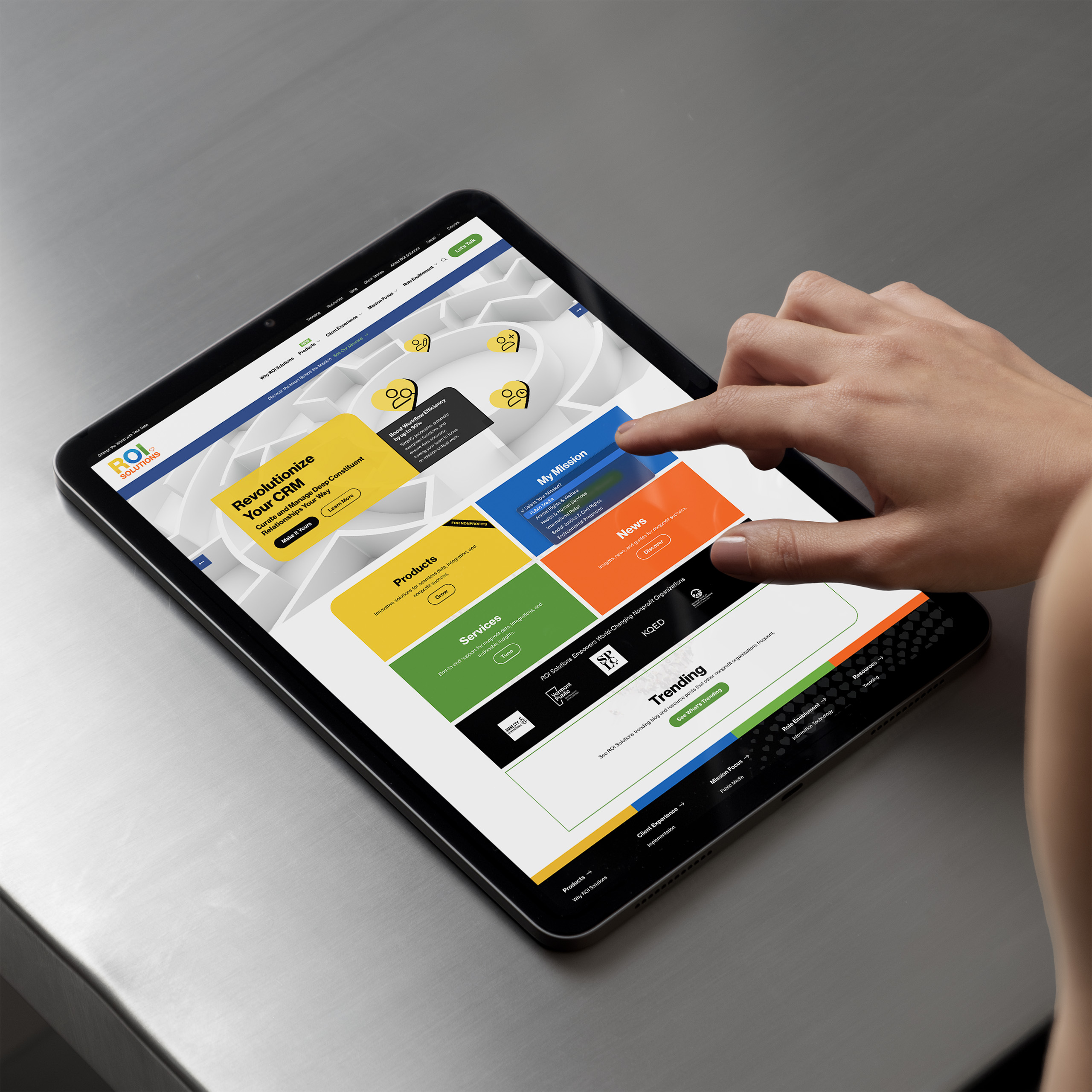
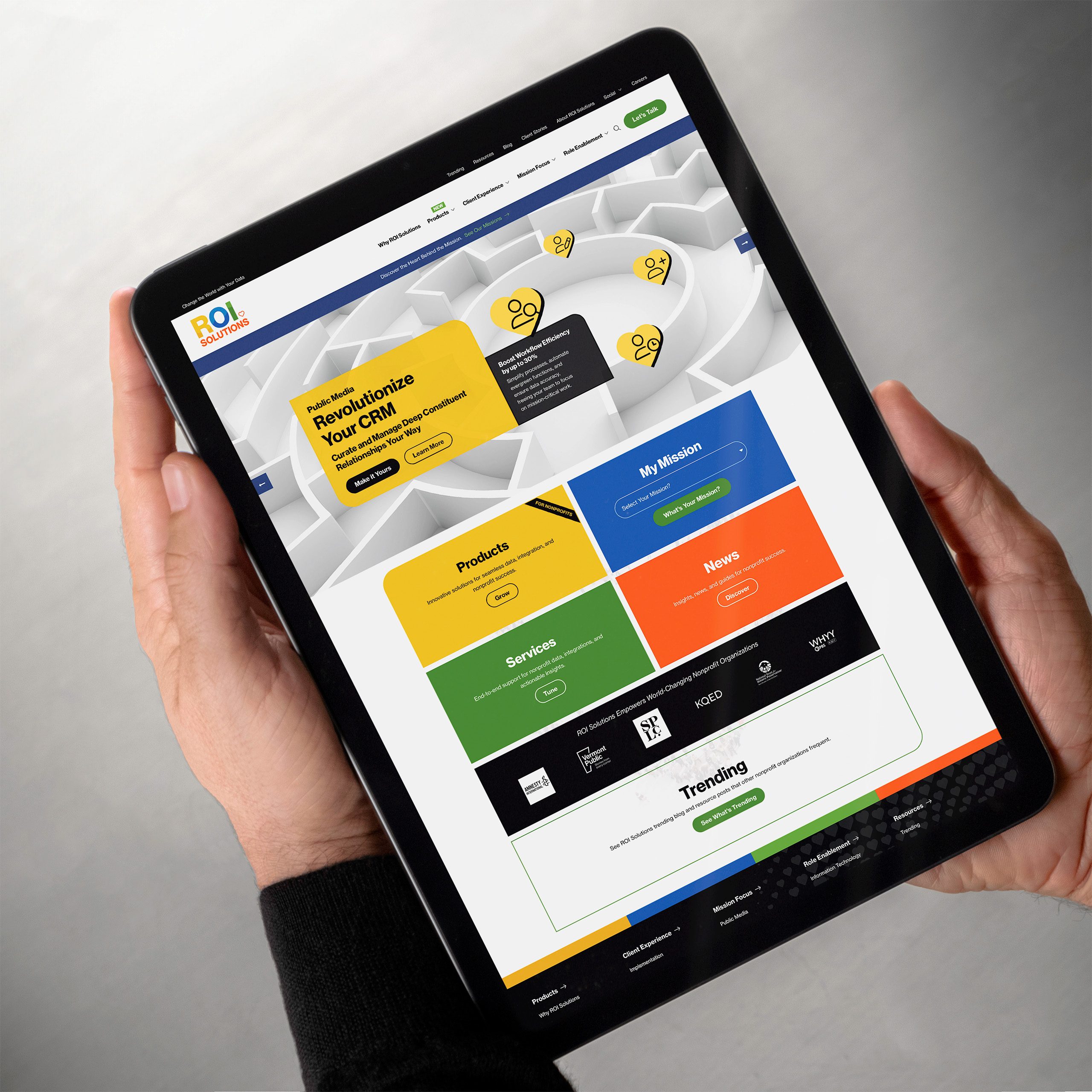
    Hand taps the My Mission selector on the tablet homepage, color tiles for products, services, and news below the maze hero.
    Stylus hovers over the dark site search overlay, public media results listed above the full navigation columns.
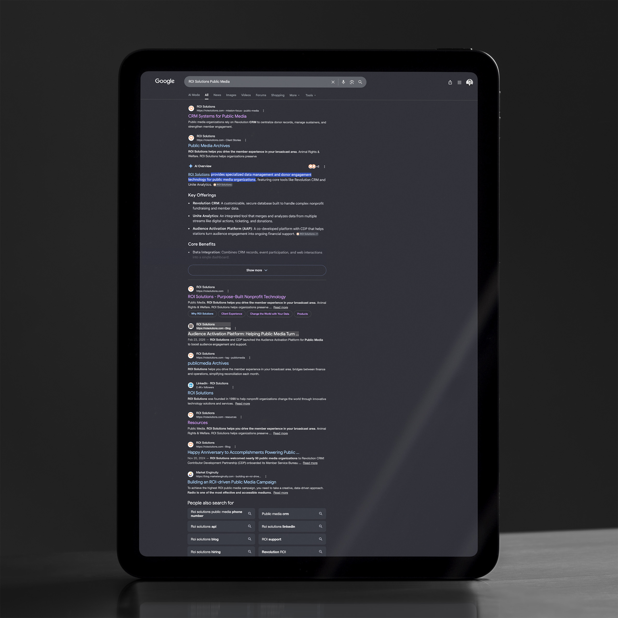
    Tablet showing branded Google results for ROI Solutions public media, an AI overview and site links filling the dark screen.
  • Personalized Publishing

    Personalize the Path

    From that signal, content re-weights around the visitor’s world: client stories from their sector, resources for their mission, testimonials from organizations like theirs. The same site, arranged for the person reading it.

    Hands hold a tablet with the homepage personalized for public media, Revolutionize Your CRM hero above station logos.
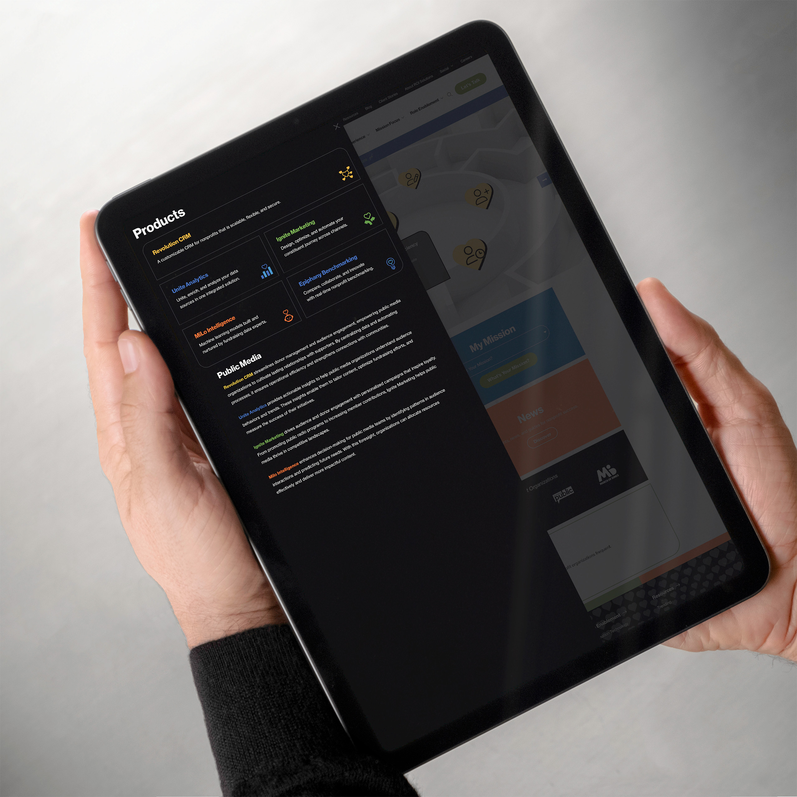
    Tablet showing the dark products mega menu personalized for public media, five product links above sector copy.

Branded Backgrounds for Zoom

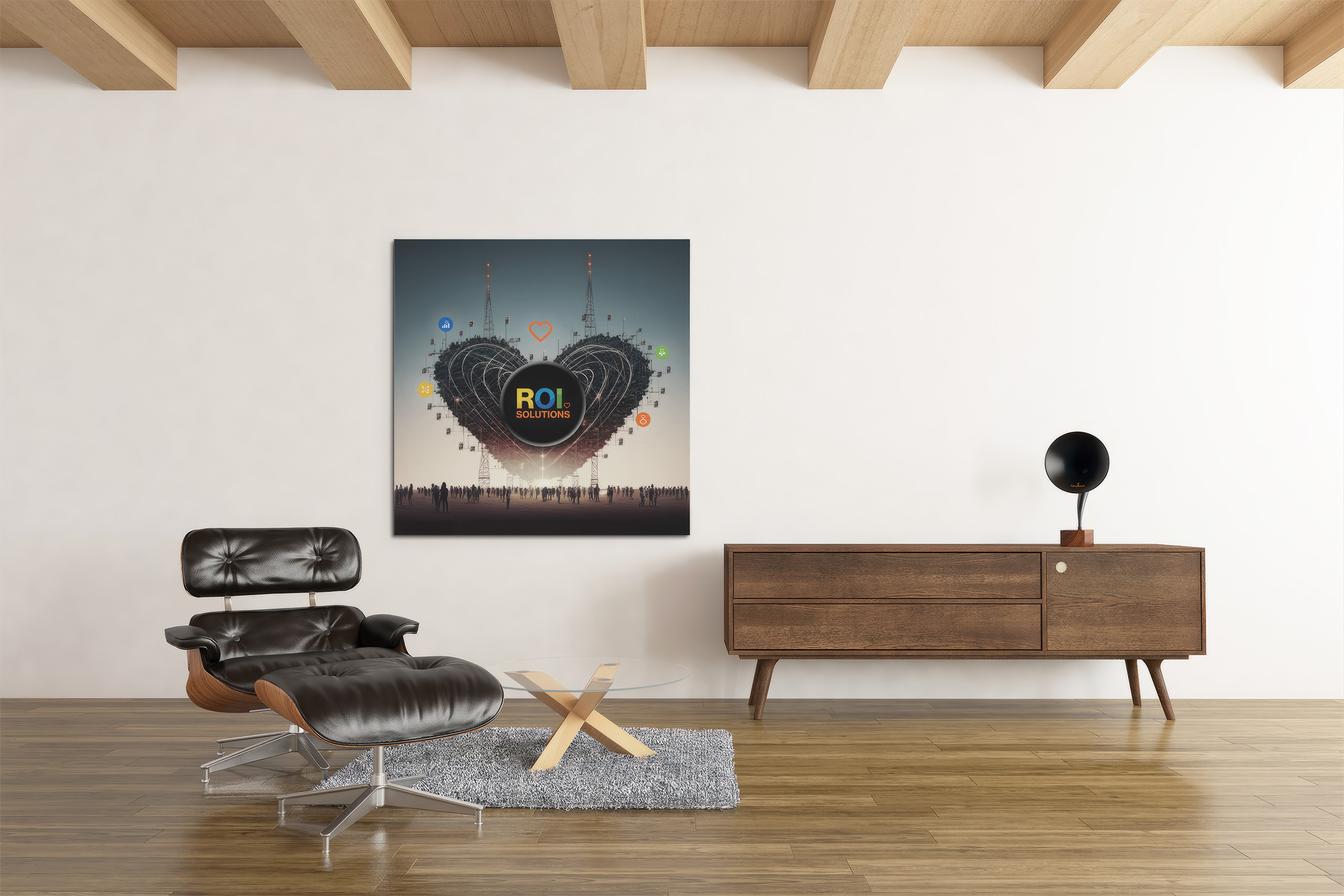
Most of ROI Solutions’ relationships live on video calls, so the brand shows up there too. A set of branded Zoom backgrounds puts the constellation, the palette, and the brand’s artwork behind every team member, in every meeting.

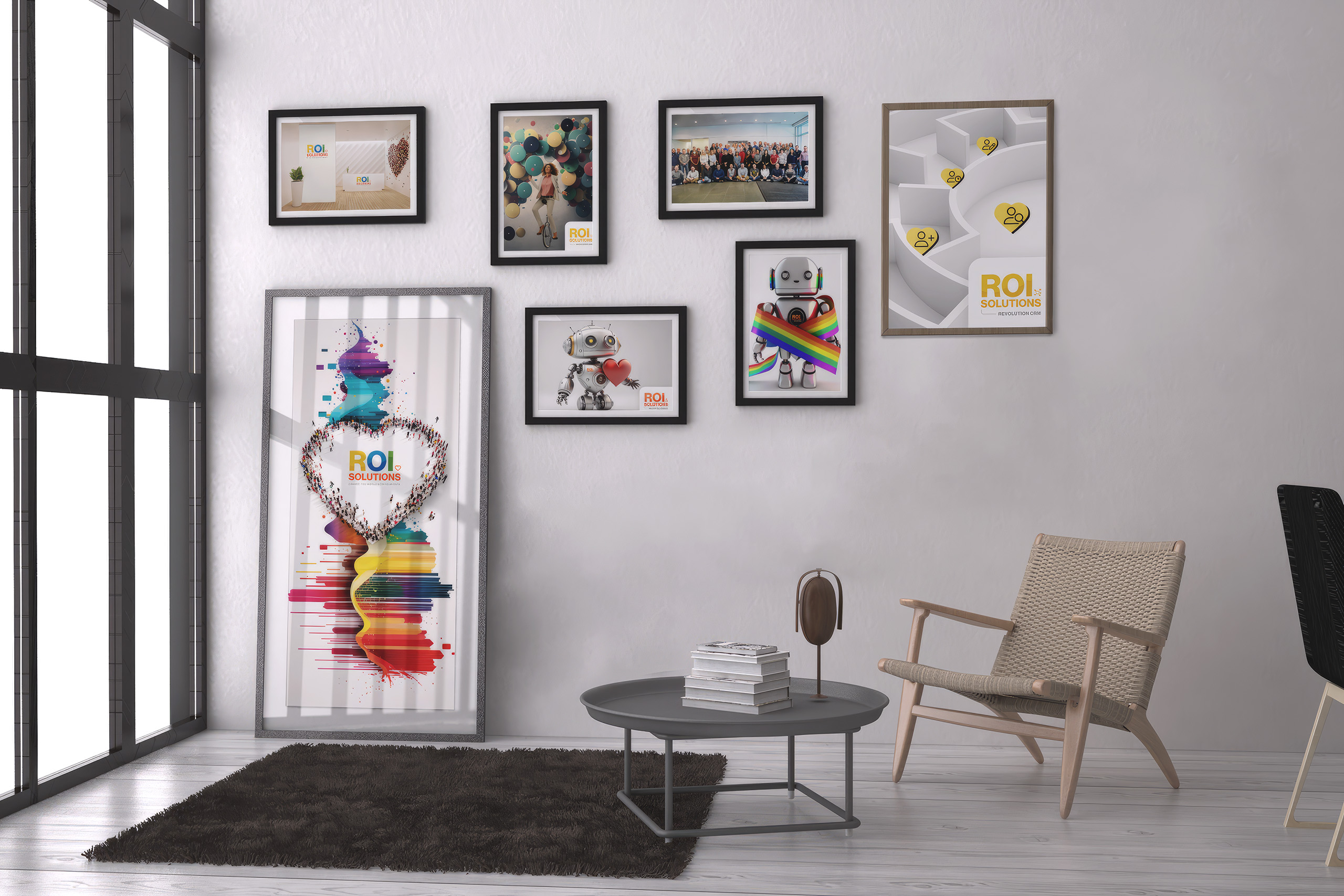
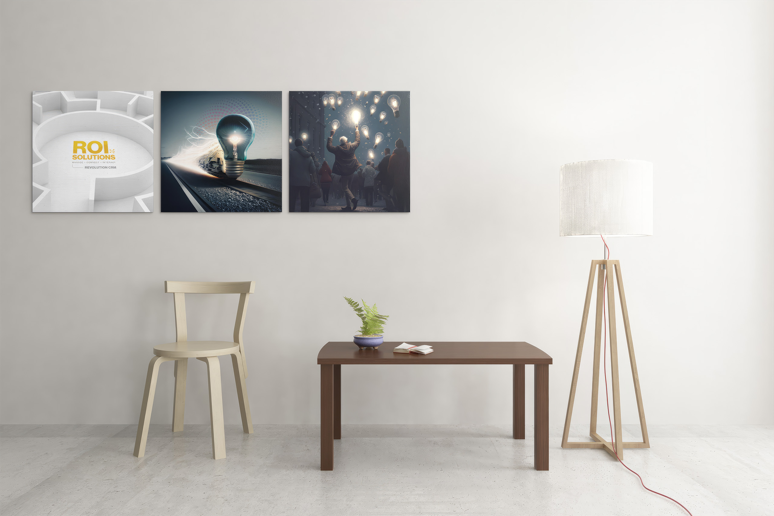
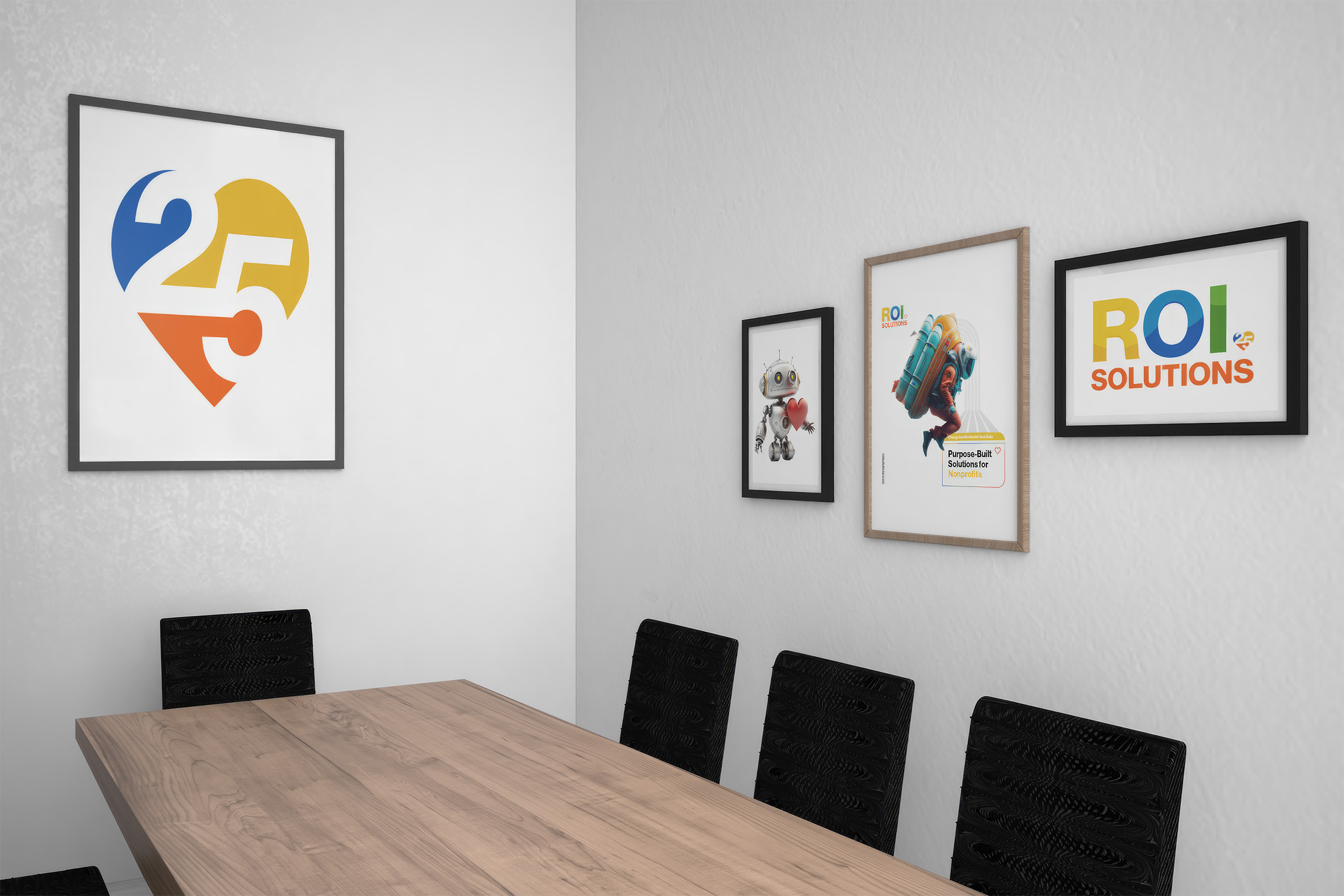
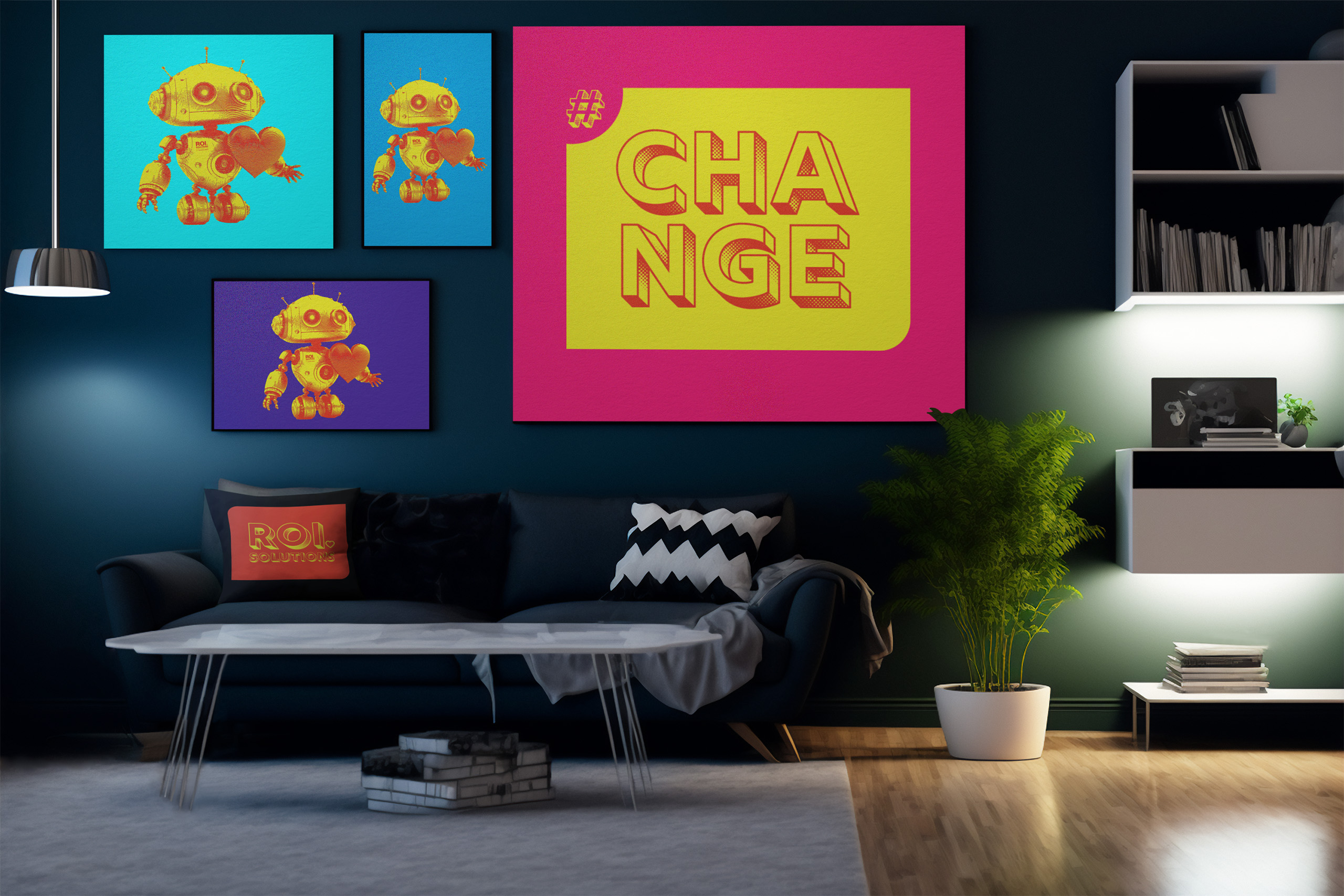
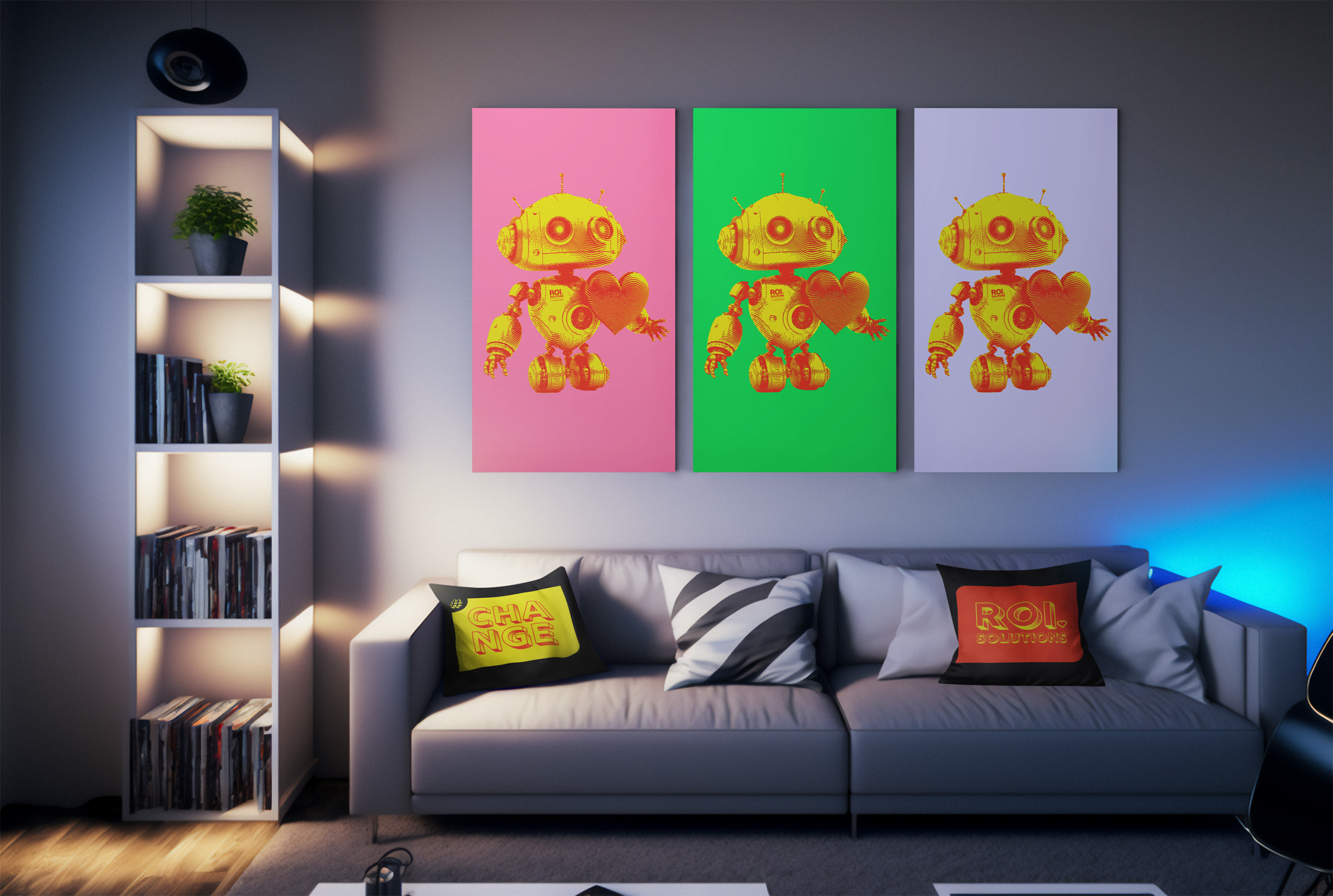
The same artwork belonged on walls as naturally as it did behind a webcam. The bold, data-inspired compositions became framed prints, carrying the identity from screen to physical space.

Together, the backgrounds and prints carried the visual language from private calls to public spaces.

Outlined orange heart from the parent identity, the symbol placed at the center of every product mark in the constellation.

Pitch Deck

Traditional presentations are linear. Every audience follows the same path, regardless of their interests, questions, or priorities. When the conversation changes, presenters often find themselves jumping awkwardly between slides, interrupting the flow and breaking the conversation.

Rather than designing another presentation, we designed a presentation system. Using PowerPoint’s Zoom feature, we transformed a traditional slide deck into an interactive storytelling experience that empowers presenters to read the room, adapt to the audience, and explore each topic naturally without ever losing the story.

The presentation begins with a visual overview that acts as a table of contents. From there, presenters can navigate into any product, feature, or topic before instantly returning to the bigger picture. The presentation becomes a conversation instead of a slideshow.

Every product shares the same design language while maintaining its own visual identity, creating a system that can continue to grow without sacrificing clarity or consistency.

That visual language extends into motion through a custom 4K ROI Solutions logo animation used consistently to open and close their videos. We also upscaled their legacy HD video library to 4K, breathing new life into existing content and creating a more polished, cohesive experience across the brand.

Some audiences only need the overview. Others want to explore every detail. Whether the conversation lasts five minutes or fifty, the presenter stays in control while the audience stays engaged.

The real achievement isn’t PowerPoint. It’s a communication system that makes complex information feel simple, organized, scalable, and adaptable. Because the best presentations don’t control the conversation. They empower it.

New products enter as new paths through the same overview, so the deck can grow without forcing every conversation to start over.

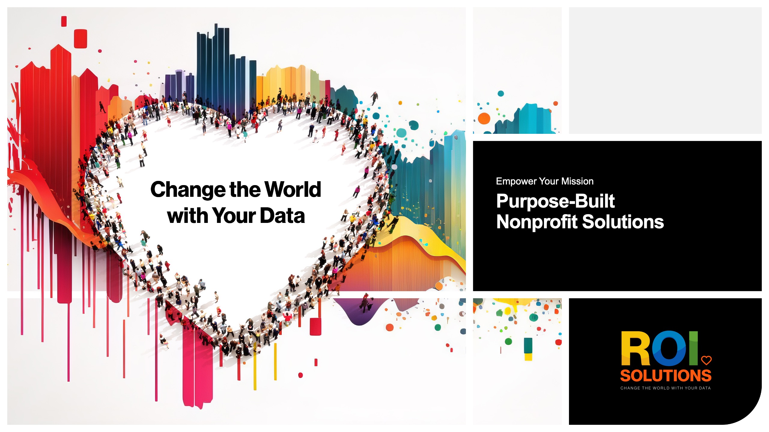
Title slide with the crowd heart over paint splashes, Purpose-Built Nonprofit Solutions panel, and the logo card.
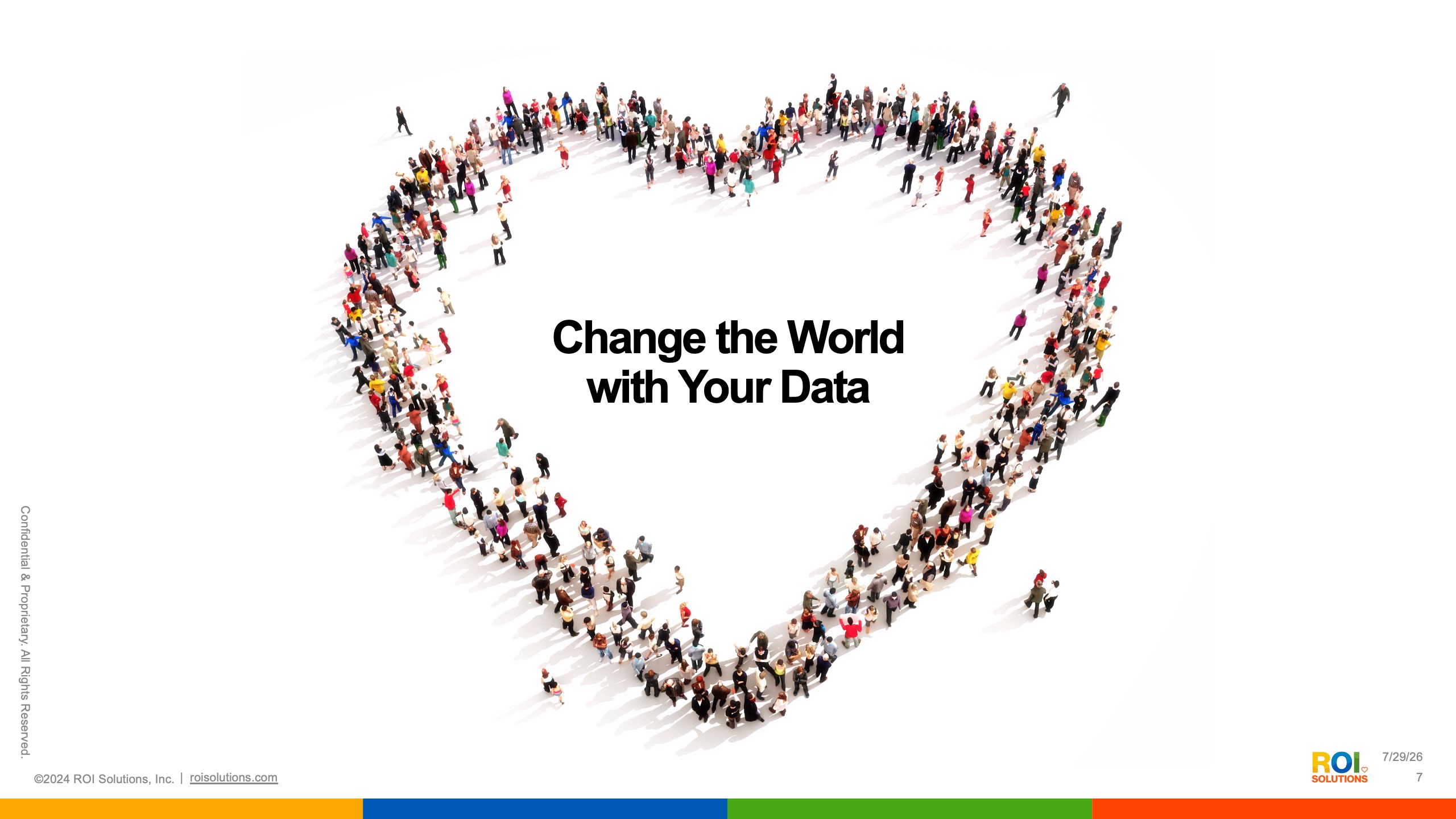
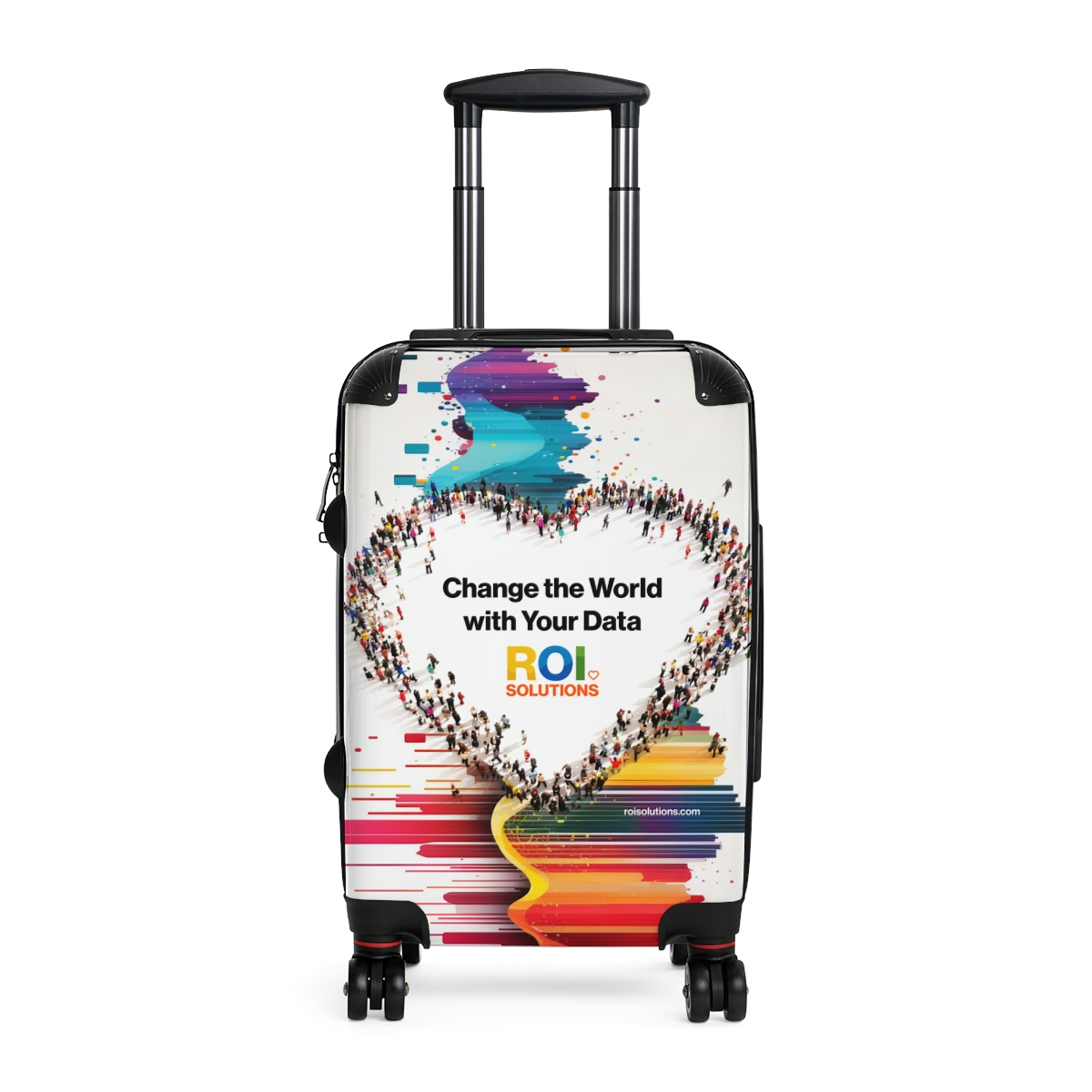
Slide of hundreds of people photographed from above forming a heart around Change the World with Your Data.
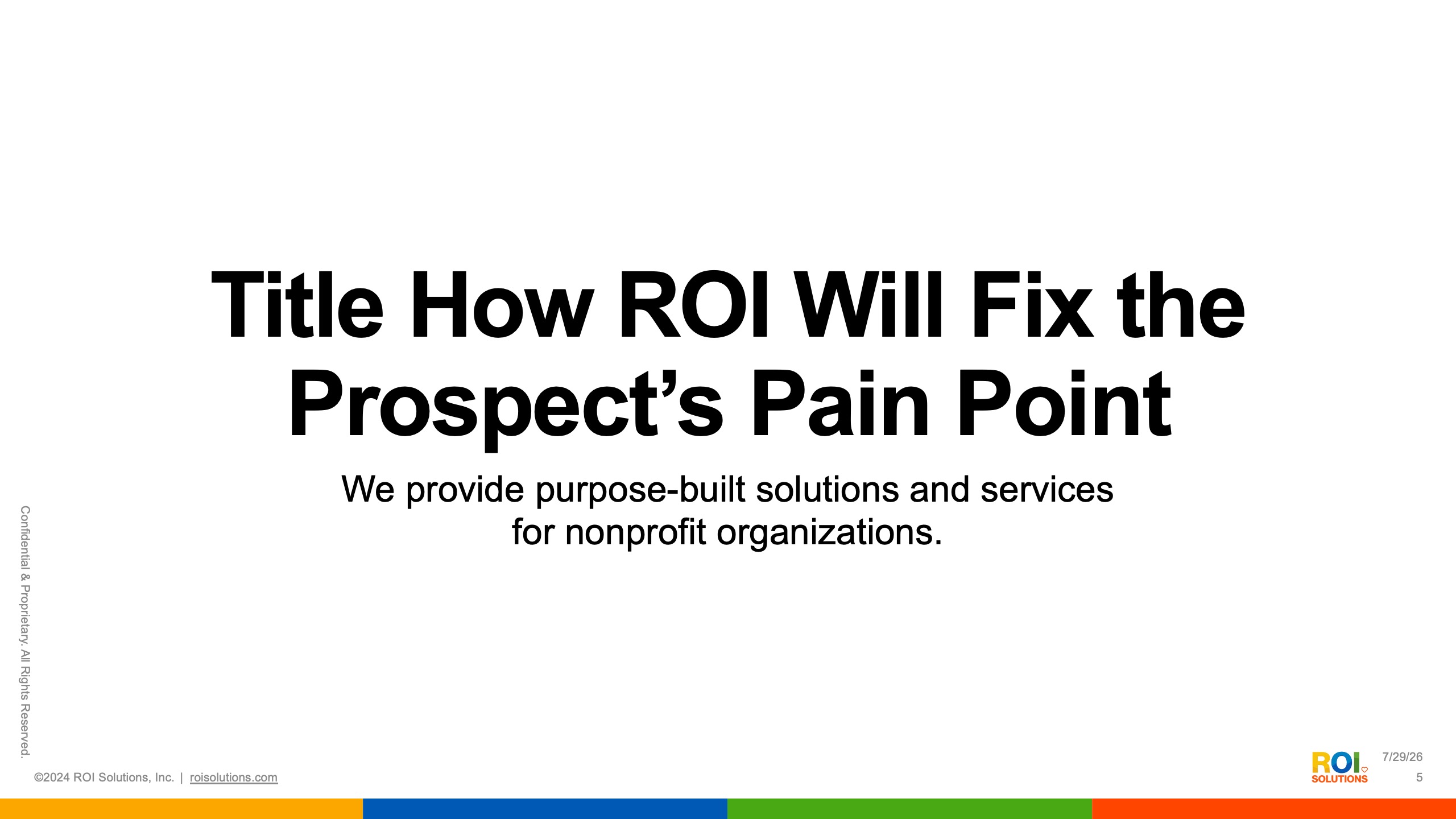
Adaptive template slide headlined Title How ROI Will Fix the Prospects Pain Point above the purpose-built subhead.
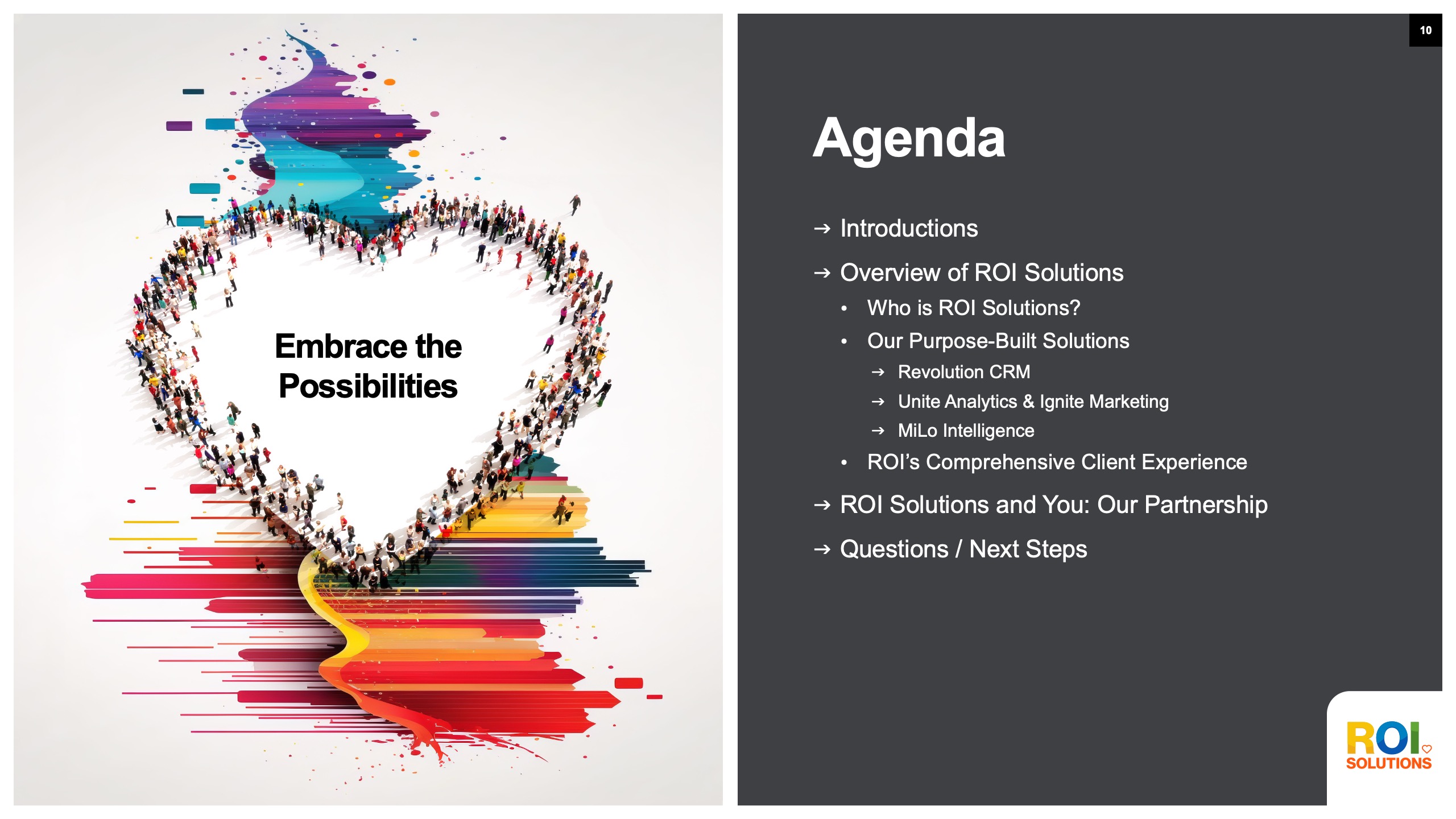
Agenda slide beside the Embrace the Possibilities heart, walking from company overview through products to partnership next steps.
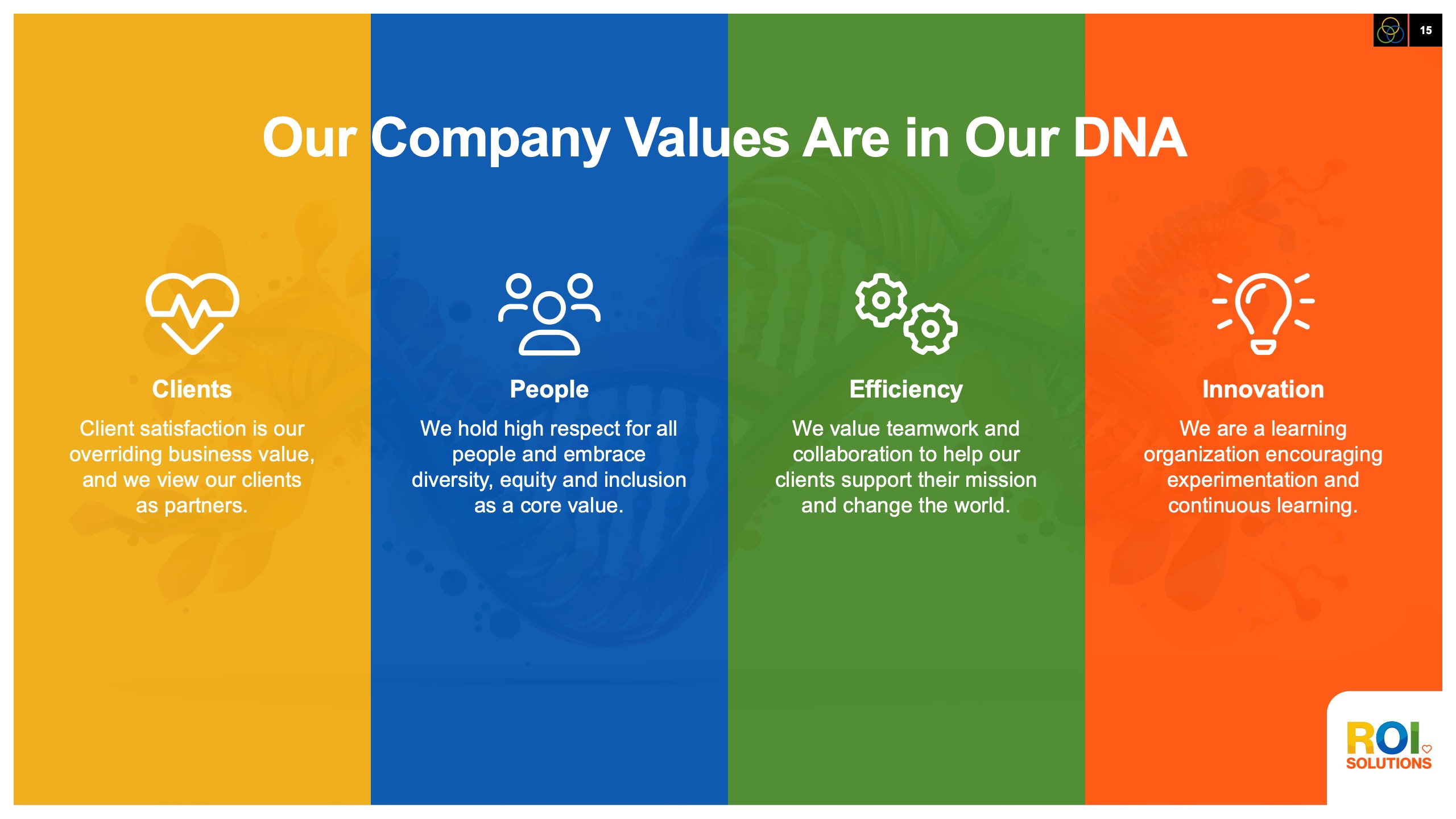
Values slide in four color columns pairing icons for clients, people, efficiency, and innovation with short value statements.
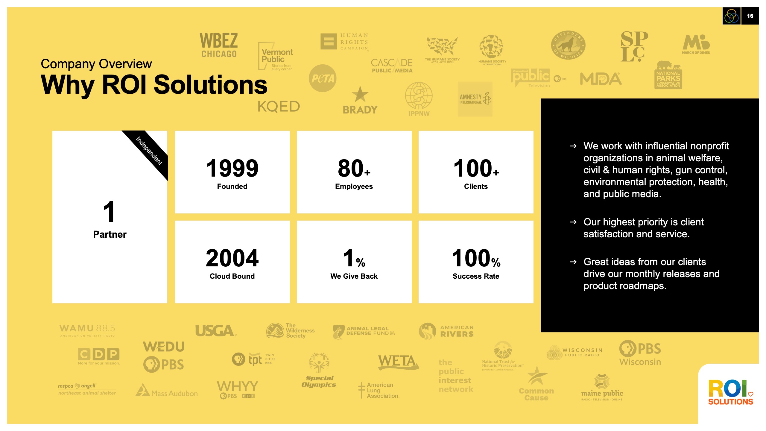
Company overview slide on gold, stat tiles from 1999 founding to 100 percent success rate ringed by nonprofit client logos.
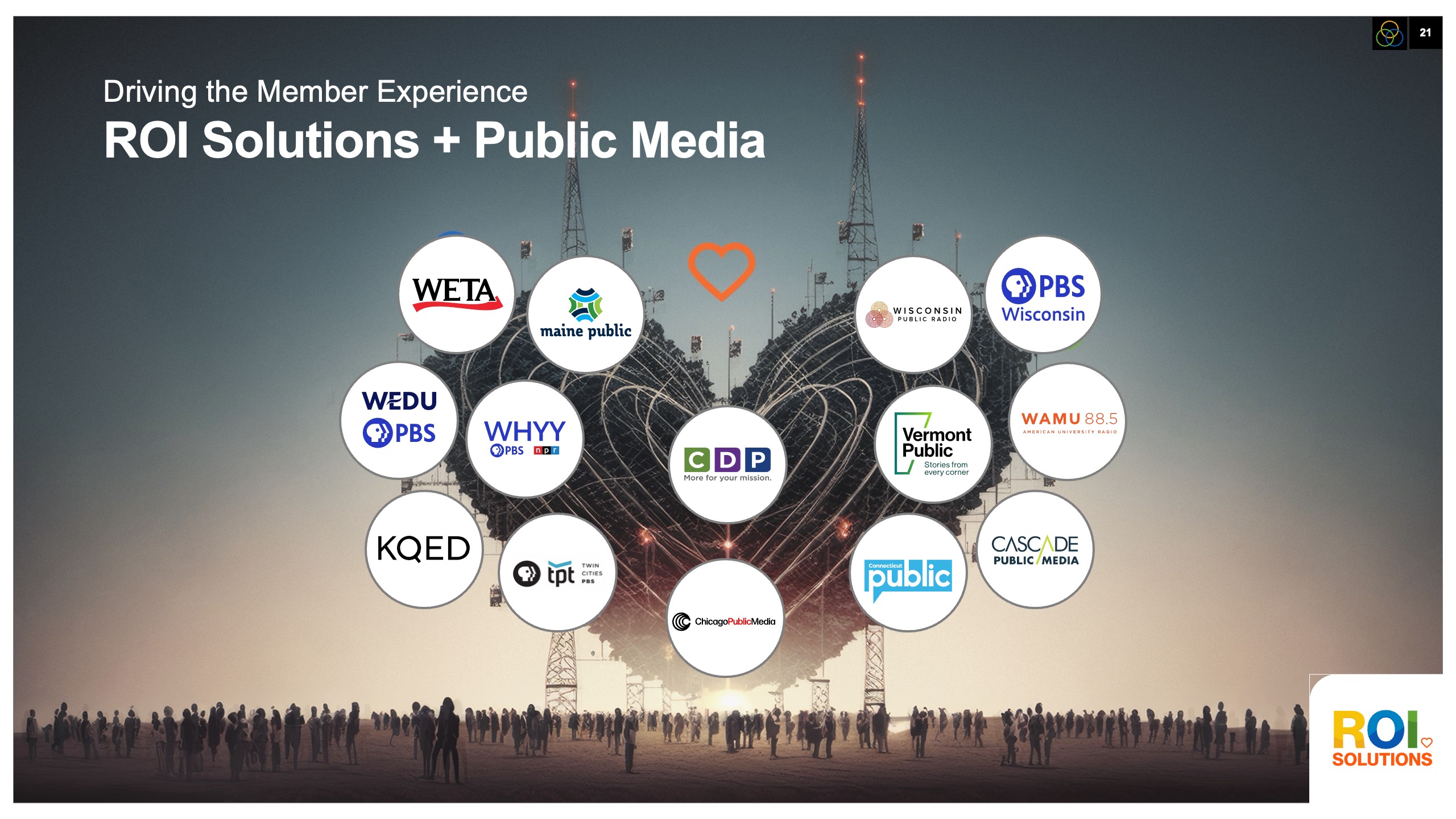
Public media slide with station logos from WETA to KQED rising like broadcast towers behind the orange heart.
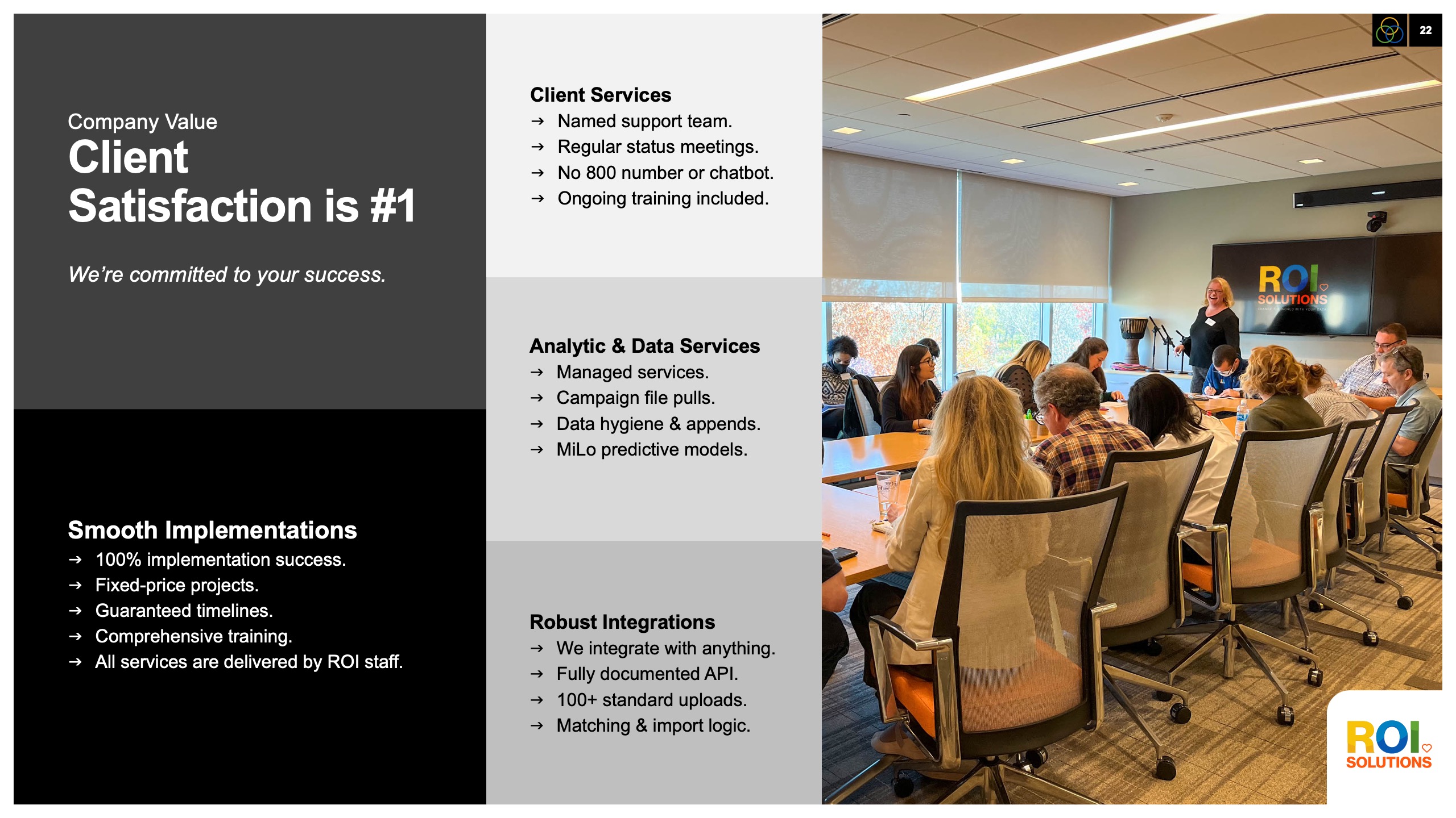
Client satisfaction slide listing services, implementations, and integrations beside a photo of a team training session.
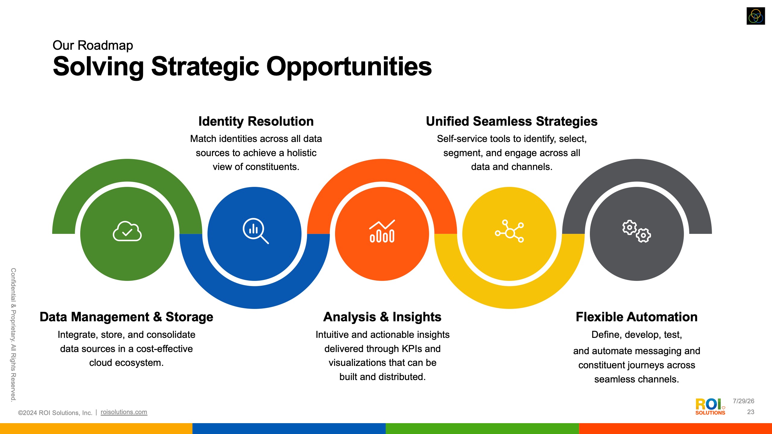
Roadmap slide chaining five colored arcs from data management through identity resolution to flexible automation.
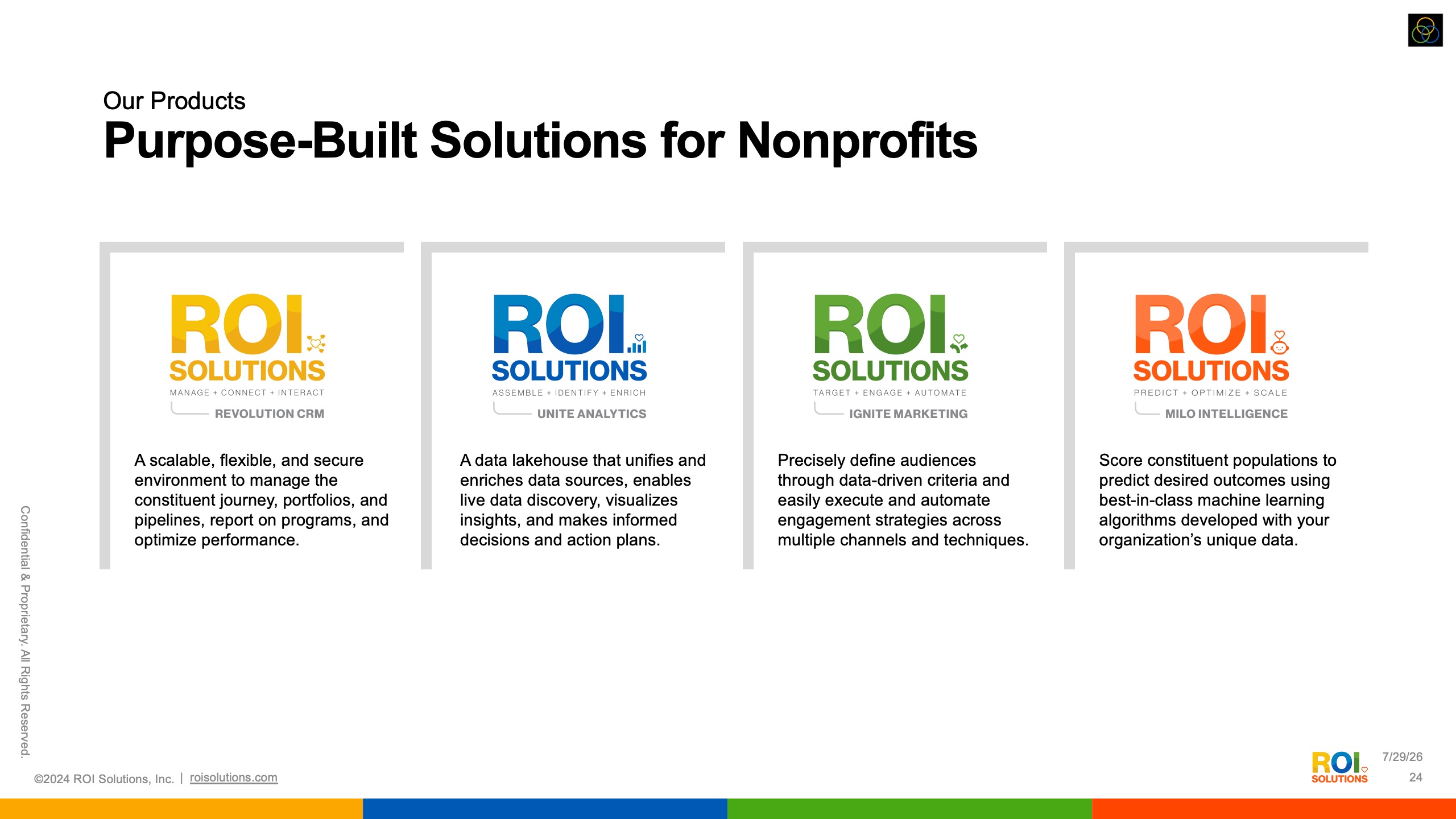
Products slide lining up the four purpose-built solution cards from Revolution CRM through MiLo Intelligence.
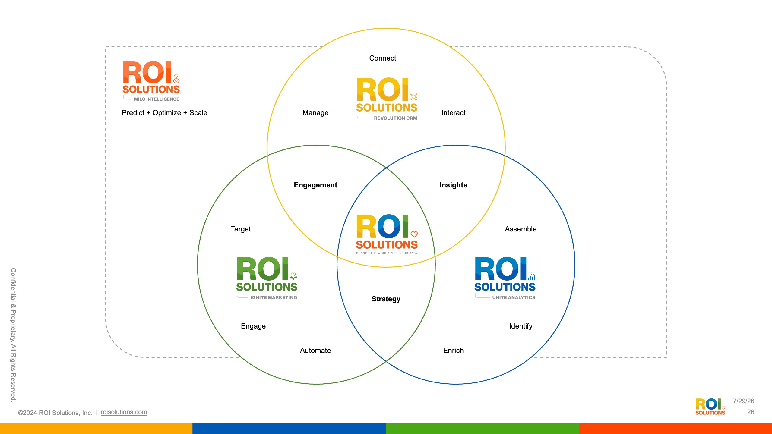
Three-circle diagram slide overlapping the product identities into engagement, insights, and strategy around the parent mark.
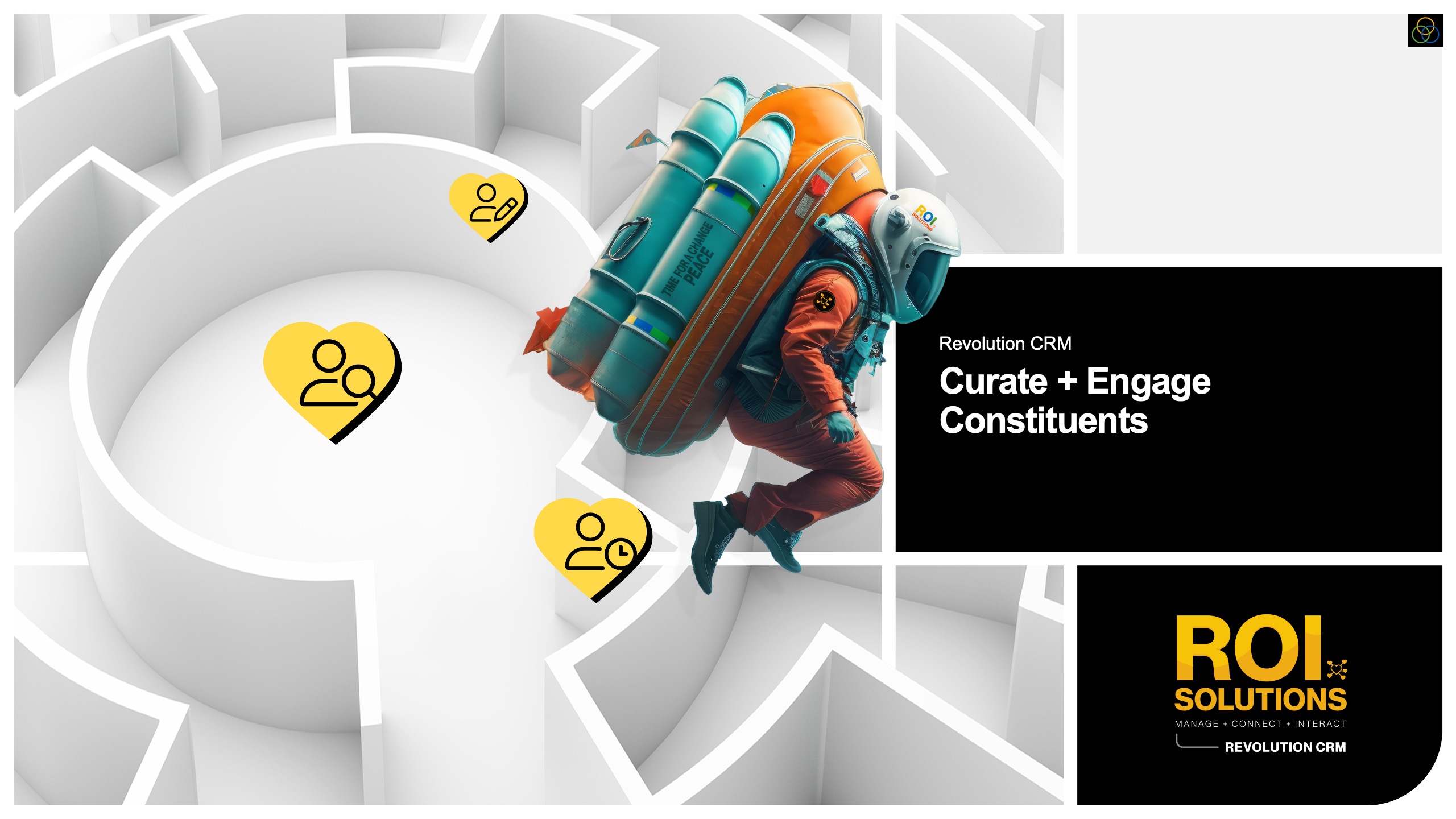
Revolution CRM slide with the rocket-pack explorer flying over a white maze dotted with gold constituent hearts.
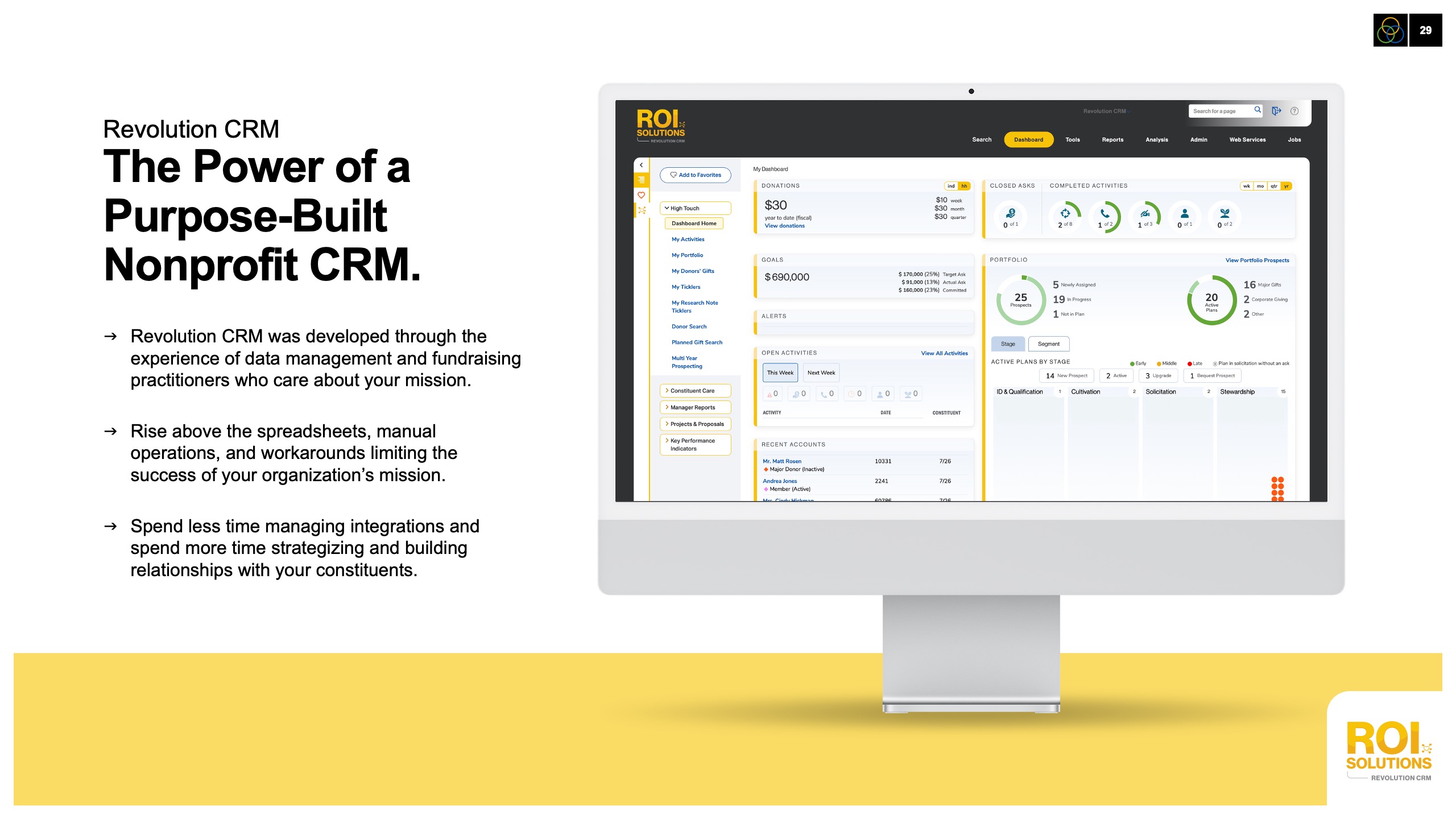
Purpose-built CRM slide pairing benefit copy with a desktop dashboard of giving metrics on a gold band.
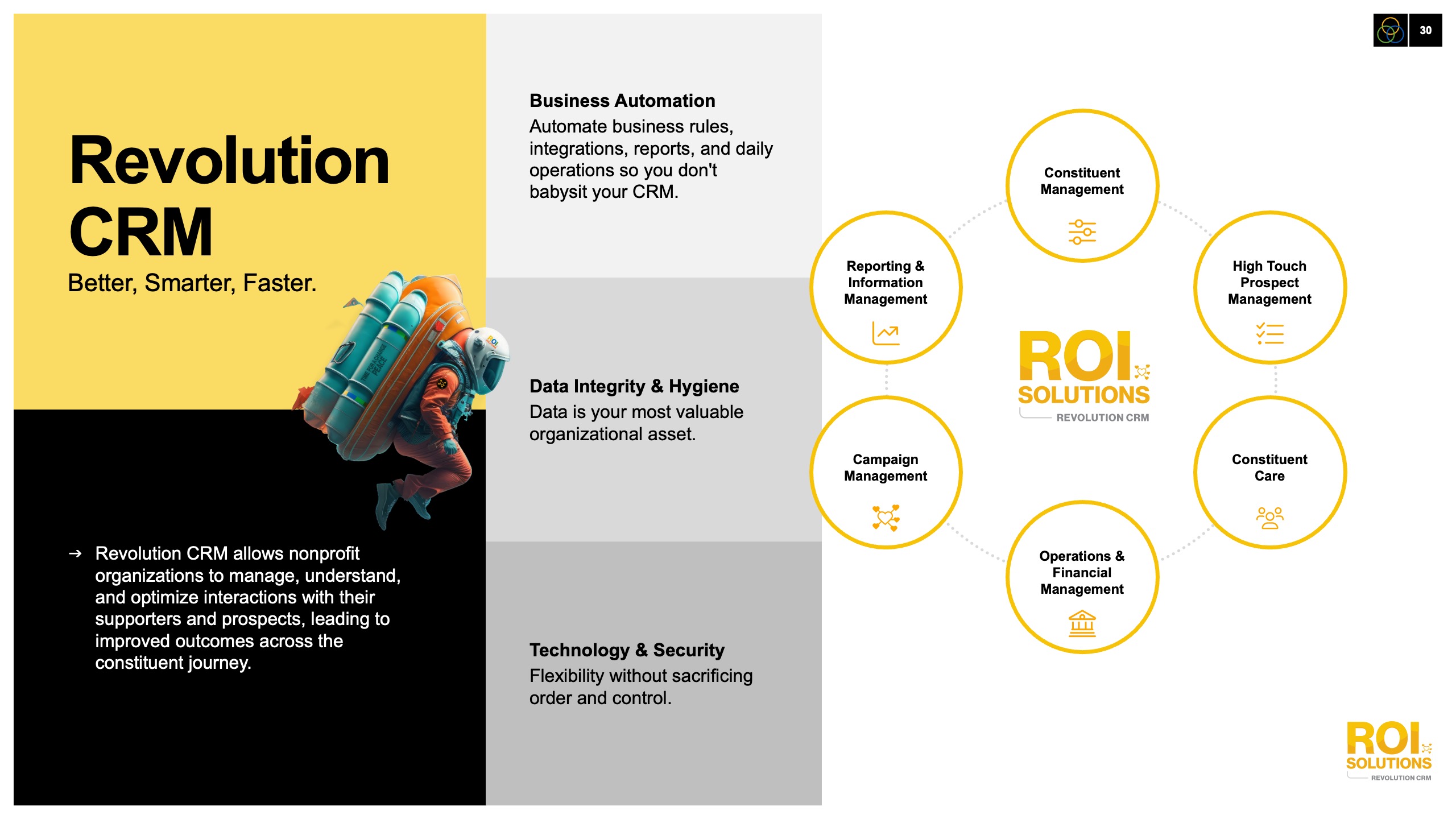
Revolution CRM capabilities slide, Better Smarter Faster panels beside a ring of management icons around the product mark.
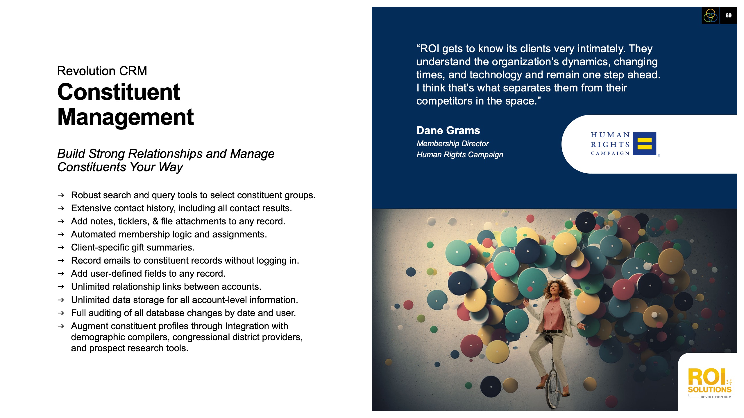
Constituent management slide listing Revolution CRM relationship tools beside a Human Rights Campaign testimonial from Dane Grams.
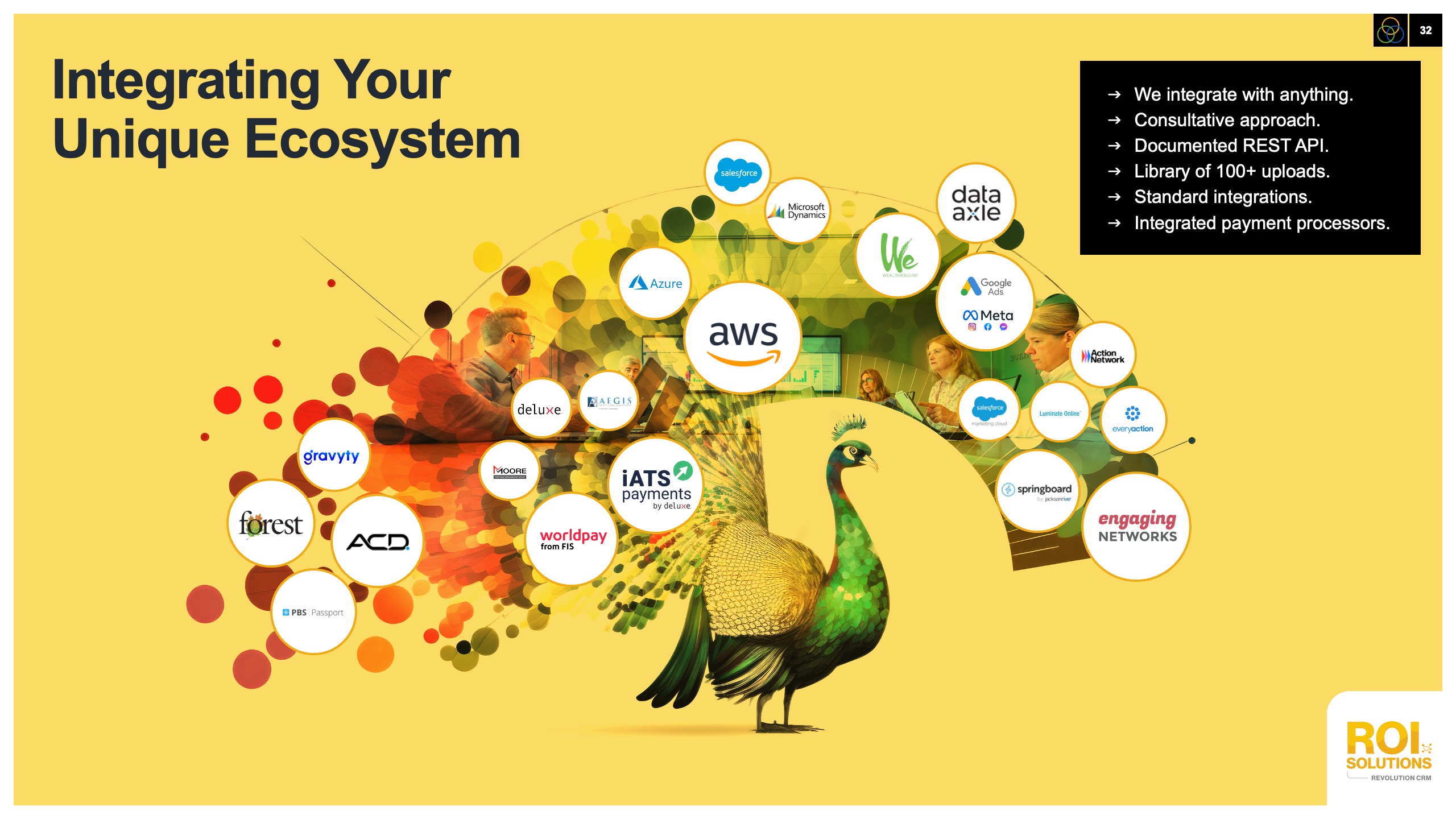
Integration slide with a peacock fanning partner logos from AWS to payment processors across a gold field.
Navy testimonial slide quoting Joanne Wilson of the Humane Society on the Revolution CRM transition.
Unite Analytics slide of a stacked data city under a mesh dome, blue hearts tagging Unite Your Data Silos.
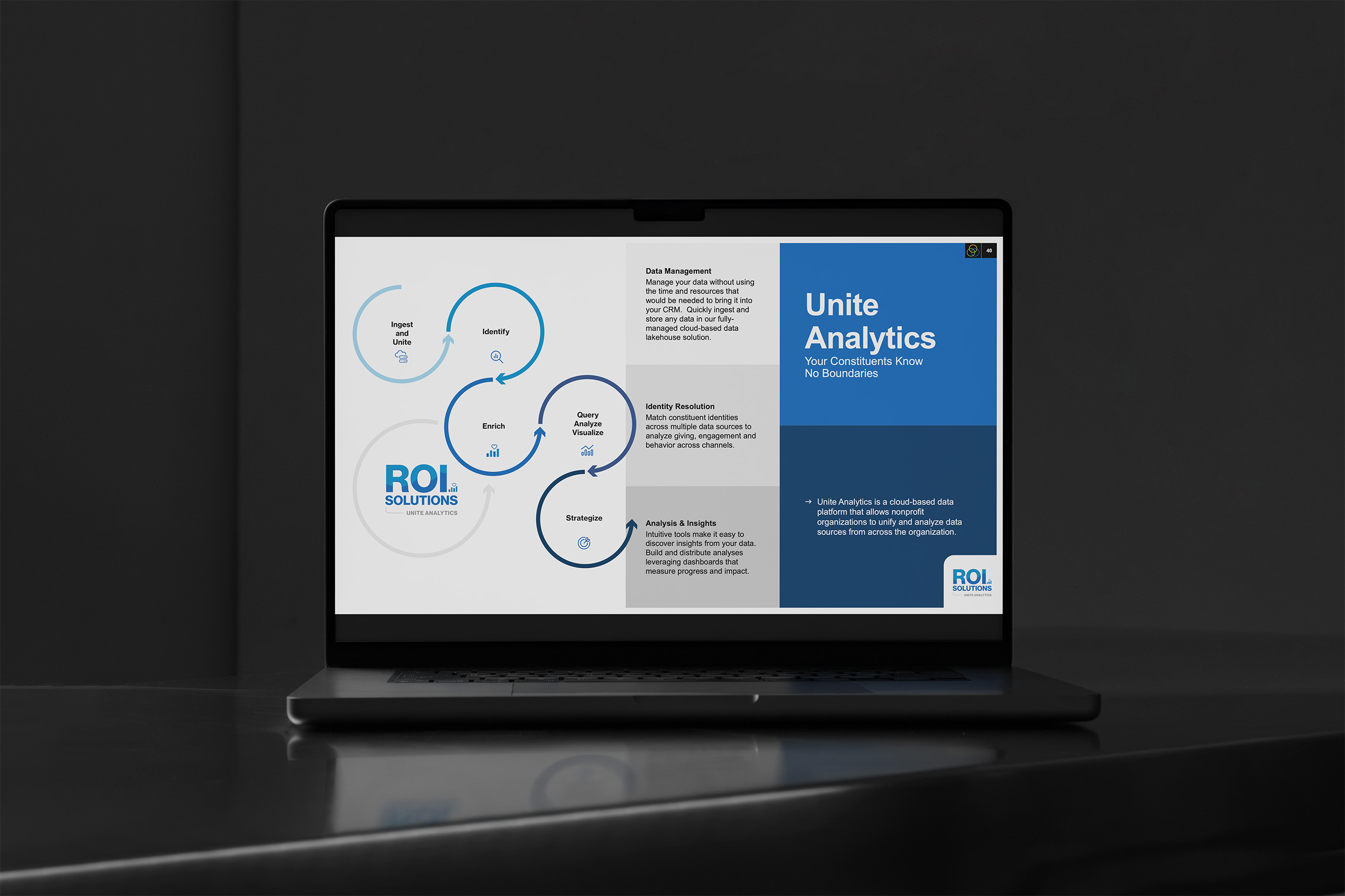
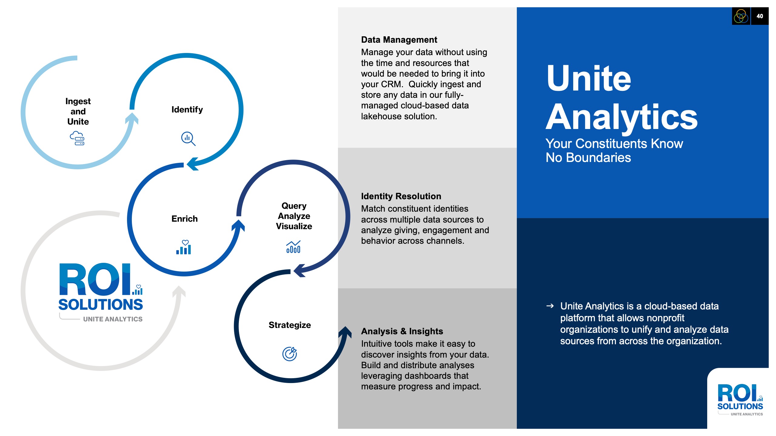
Unite Analytics slide chaining circular loops from ingest and identify to strategize beside the blue product panel.
Ignite Marketing slide with a painted rocket streaking through color clouds, green hearts carrying channel icons.
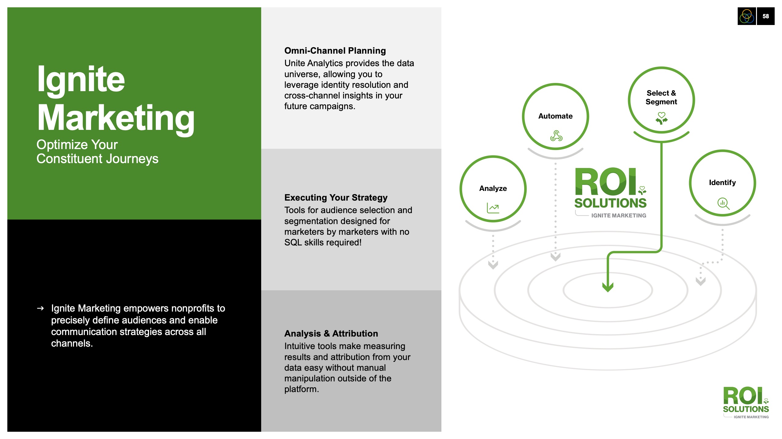
Ignite Marketing capabilities slide, green panels on planning and attribution beside the target-spiral audience diagram.
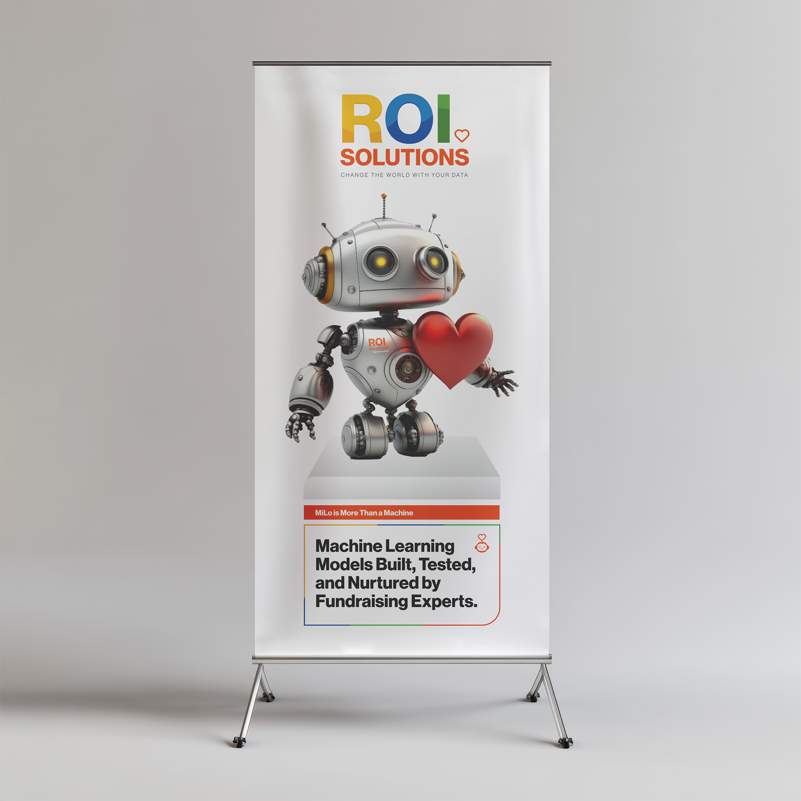
MiLo Intelligence slide with the silver robot hugging a red heart beside Machine plus Heart equals Results.
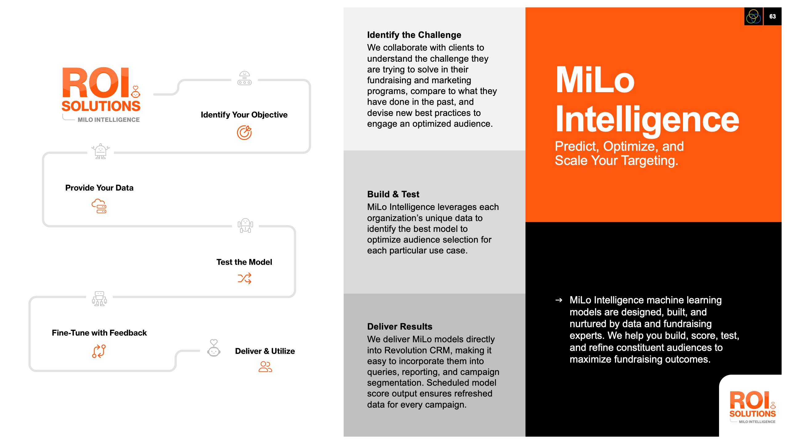
MiLo Intelligence slide stepping from identify your objective through model testing to deliver and utilize beside the orange panel.
Outlined orange heart from the parent identity, the symbol placed at the center of every product mark in the constellation.

Designing Intelligent Experiences, One Relationship at a Time.

Bringing AI to Life

Follow the evolution from character design to conversational AI and personalized experiences, where thoughtful design transformed intelligent technology into trusted companions.

Bringing AI to Life

Character Design

The best AI doesn’t just answer questions. It builds relationships.

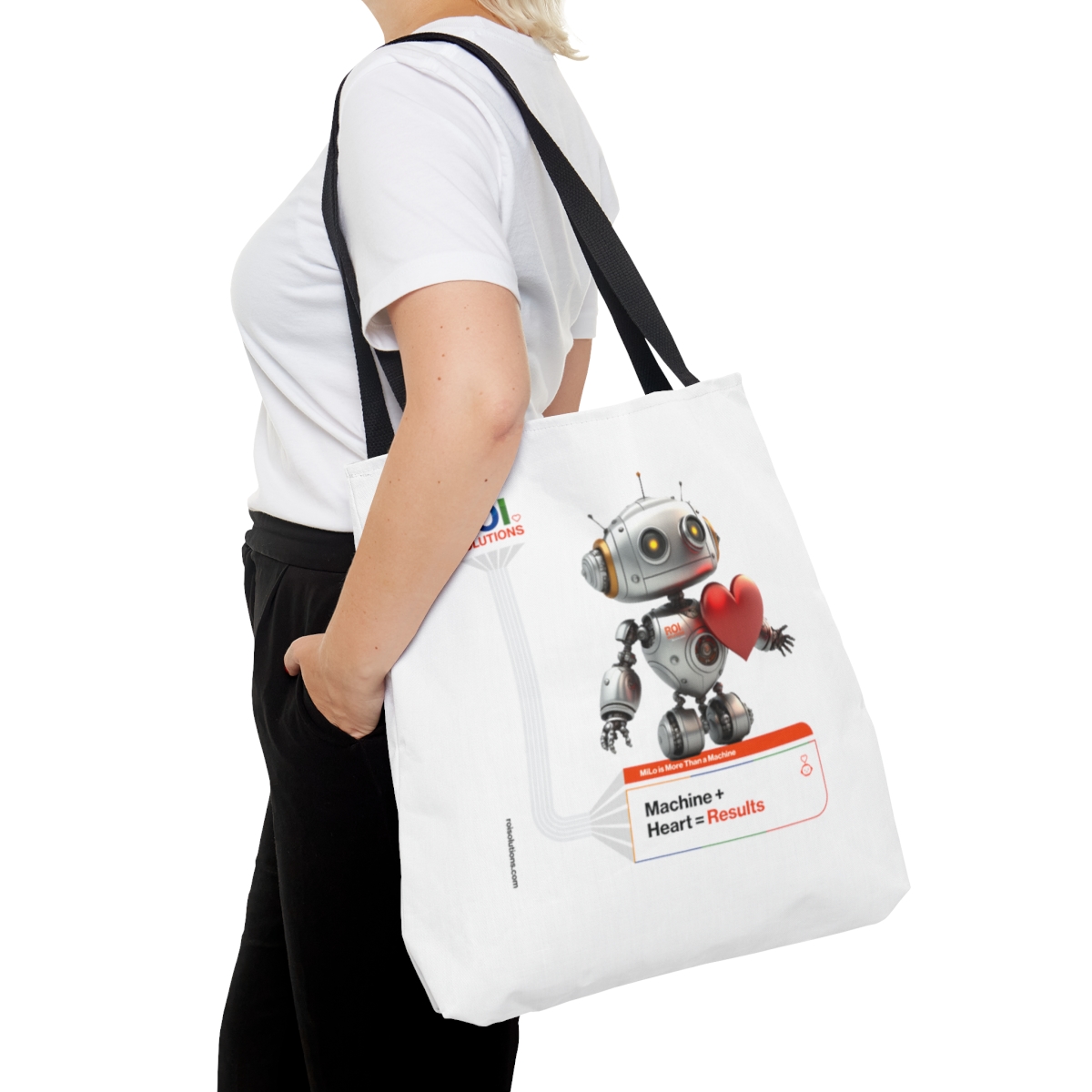
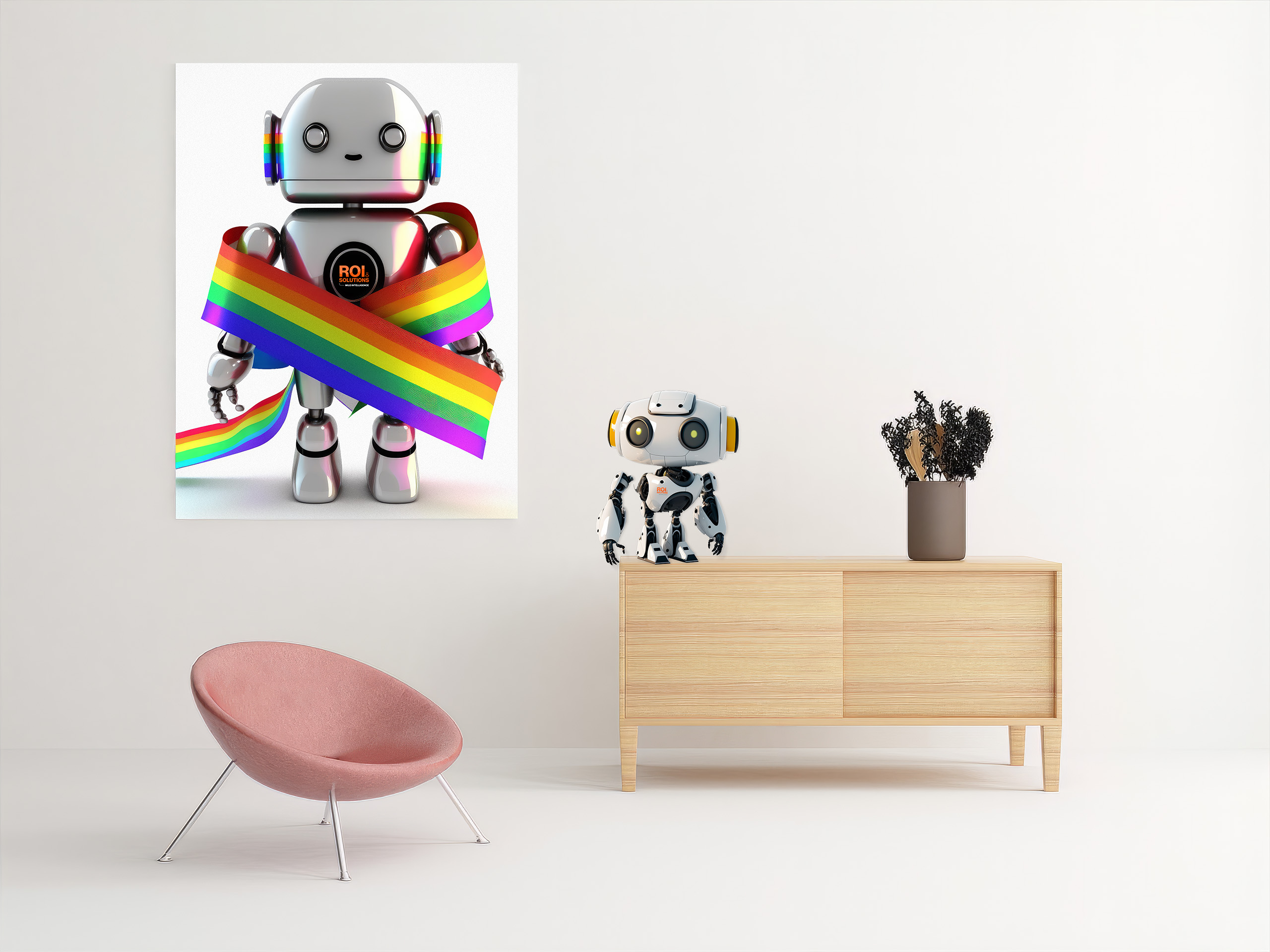
MiLo had already become a recognizable symbol of ROI Solutions’ machine learning platform, but as the company’s AI vision expanded, it became clear he couldn’t tell the entire story alone. Rather than replacing him, we evolved the ecosystem by creating Maria and Moxie, giving each character a clear role within ROI Solutions’ growing family of intelligent solutions. The original MiLo was also redesigned from the ground up, transforming a dated stock illustration into a cohesive, modern character that reflects the personality and sophistication of the brand. Together, the trio gave artificial intelligence a face, a voice, and a purpose. Machine learning became something people could understand, trust, and connect with.

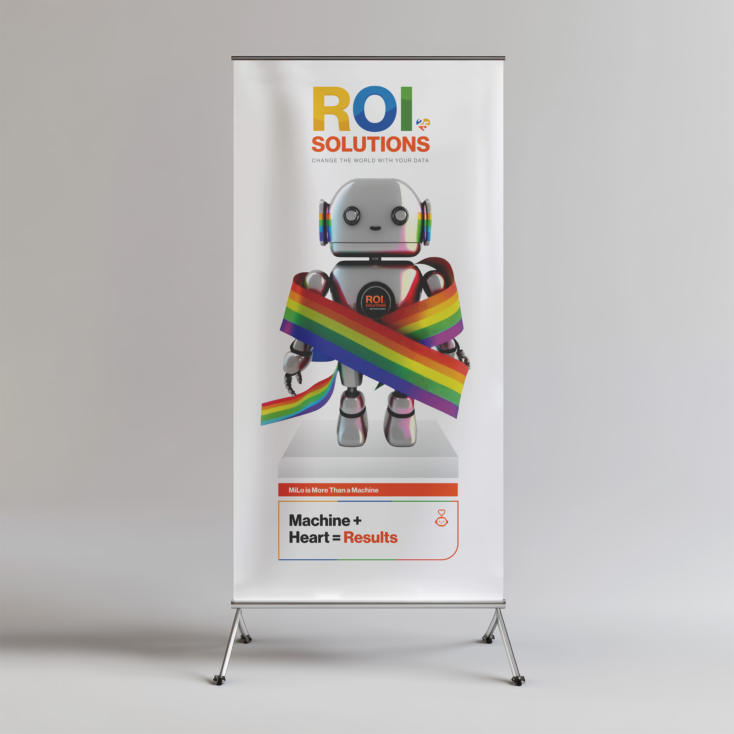
Machine + Heart = Results

Outlined orange heart from the parent identity, the symbol placed at the center of every product mark in the constellation.
  • Original MiLo

    Original flat teal Milo mascot with sunglasses, antenna, and open arms, the character before the family redesign.

    The story began with MiLo, ROI Solutions’ original machine learning mascot. While he represented the platform well conceptually, his visual design no longer reflected the sophistication of the technology or the evolving brand.

  • Maria

    Modeling Assistant for Real-Time Insights & Answers
    Silver Maria character with headset, engraved hairline, and heart-lens eyes offering a red heart in one hand.

    Maria became the organization’s intelligent conversational companion. Trained on ROI Solutions’ knowledge, presentations, and data, she transforms complex information into clear, on-brand conversations for both internal teams and clients.

    Line-drawn woman with headset and antenna on a green square, the icon mark for the MariaGPT institutional-knowledge character.

  • Moxie

    Machine for On-Demand eXecution & Integration
    Silver robotic dog Moxie with folded ear, gold collar, heart-lens eyes, and a glowing heart in its chest.

    Every intelligent team needs someone who can make connections. Moxie was created to retrieve information, connect systems, and move data between platforms. While MiLo analyzes and Maria communicates, Moxie keeps information flowing, completing a trio where each character has a distinct responsibility. The concept evolved from early discussions around a robotic companion inspired by Rosie from The Jetsons before arriving at the name Moxie.

    Line-drawn dog with floppy ear and collar on a green square, the icon mark for the Moxie support character.

  • MiLo Reimagined

    Machine Learning Offering
    Redesigned silver Milo robot with heart-lens eyes and exposed circuitry cradling a large red heart, wheels for feet.

    MiLo was completely redesigned with a refined industrial aesthetic while preserving the personality clients had already come to recognize. He remains the face of ROI Solutions’ machine learning platform, analyzing data, discovering patterns, and helping nonprofits identify their highest-value audiences.

    Line-drawn robot head with twin antennae and a smile on a green square, the icon mark for the Milo machine-learning character.
  • Bringing AI to Life

    MariaGPT

    MariaGPT transformed years of organizational knowledge into an intelligent, branded AI companion. Rather than relying on a generic chatbot, we trained Maria on ROI Solutions’ website, presentations, product documentation, proposals, white papers, and other internal resources, instantly giving the organization a conversational assistant that reflected its expertise, voice, and mission.
    Beyond retrieving information, Maria could synthesize knowledge across all of those sources using a large language model to provide contextual, natural responses, while staff could refine answers over time, continuously improving the quality of future conversations.

    Integrated directly into the website, MariaGPT also captured contact information, guided visitors toward the right solutions, and transformed decades of institutional knowledge into one of ROI Solutions’ most accessible and valuable resources.

    Outlined orange heart from the parent identity, the symbol placed at the center of every product mark in the constellation.
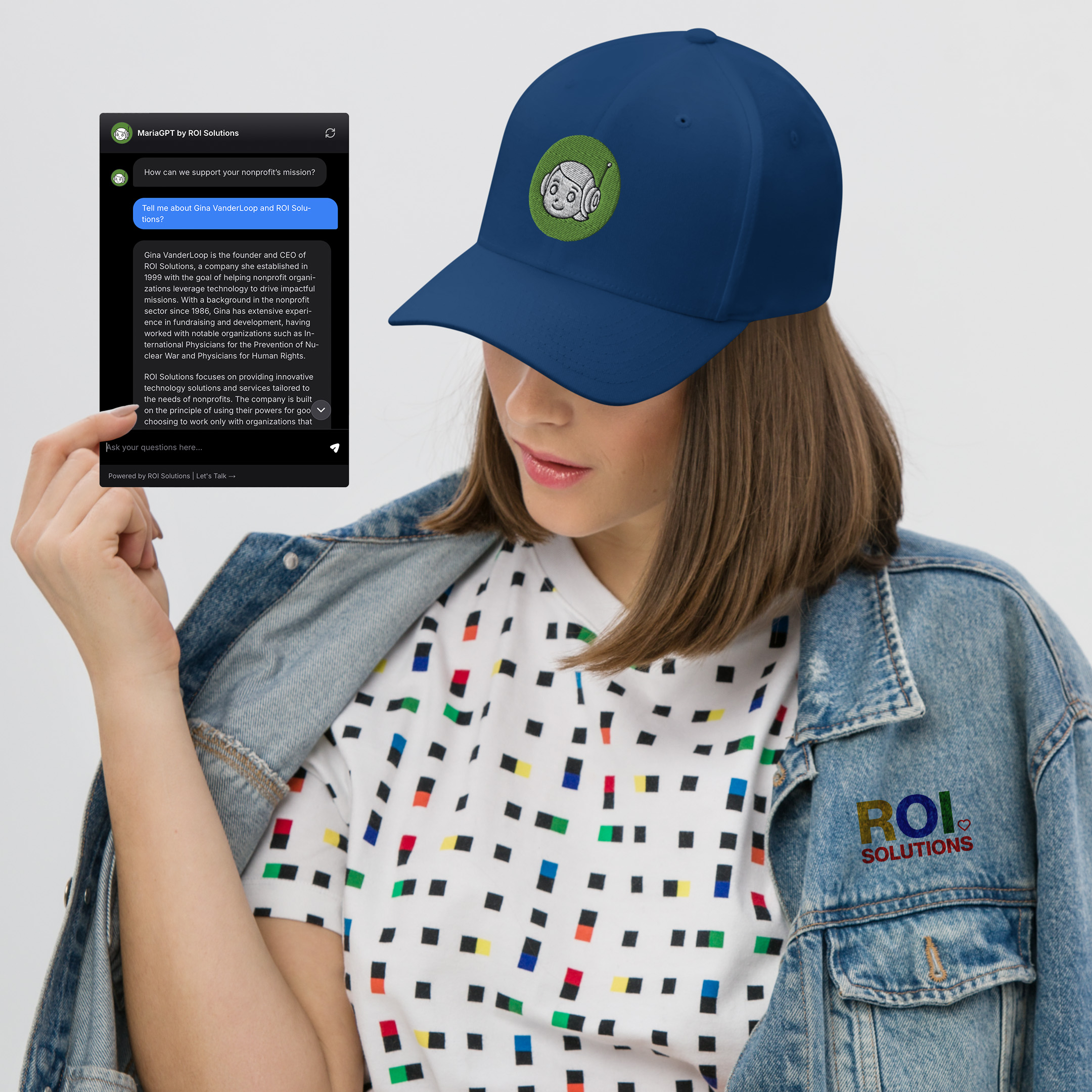
    Model in a MiLo cap and pixel-print tee beside the MariaGPT chat panel answering a question about the company.
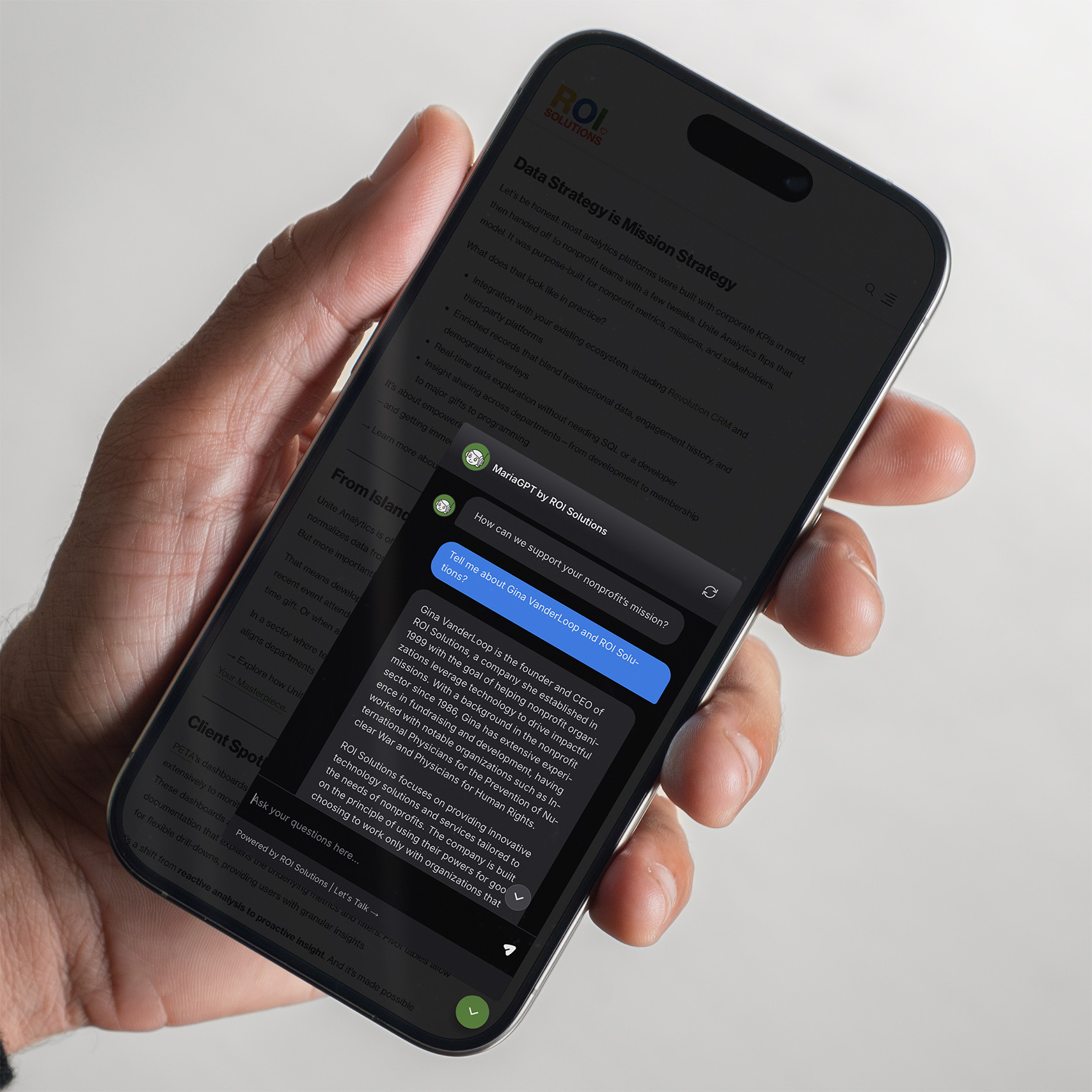
    Hand holds a phone with the MariaGPT chat open over the mission strategy article, an answer streaming in.
Outlined orange heart from the parent identity, the symbol placed at the center of every product mark in the constellation.

Every Conversation Begins with Understanding.

Brand Intelligence

Brand Intelligence is our name for a discipline developed from our strategic discovery methodology: encode that understanding into an AI enrichment engine, then let every downstream system draw from one trusted source. At ROI Solutions, whose clients are nonprofits defined by their causes, it earned a more precise name, Mission Intelligence. The system transformed fragmented contact records into a unified intelligence platform powering personalized marketing, AI-assisted conversations, sales enablement, and enterprise analytics. Every organization received a mission-aware profile reusable across the entire customer path.

  • Mission Intelligence

    Build Trusted Data

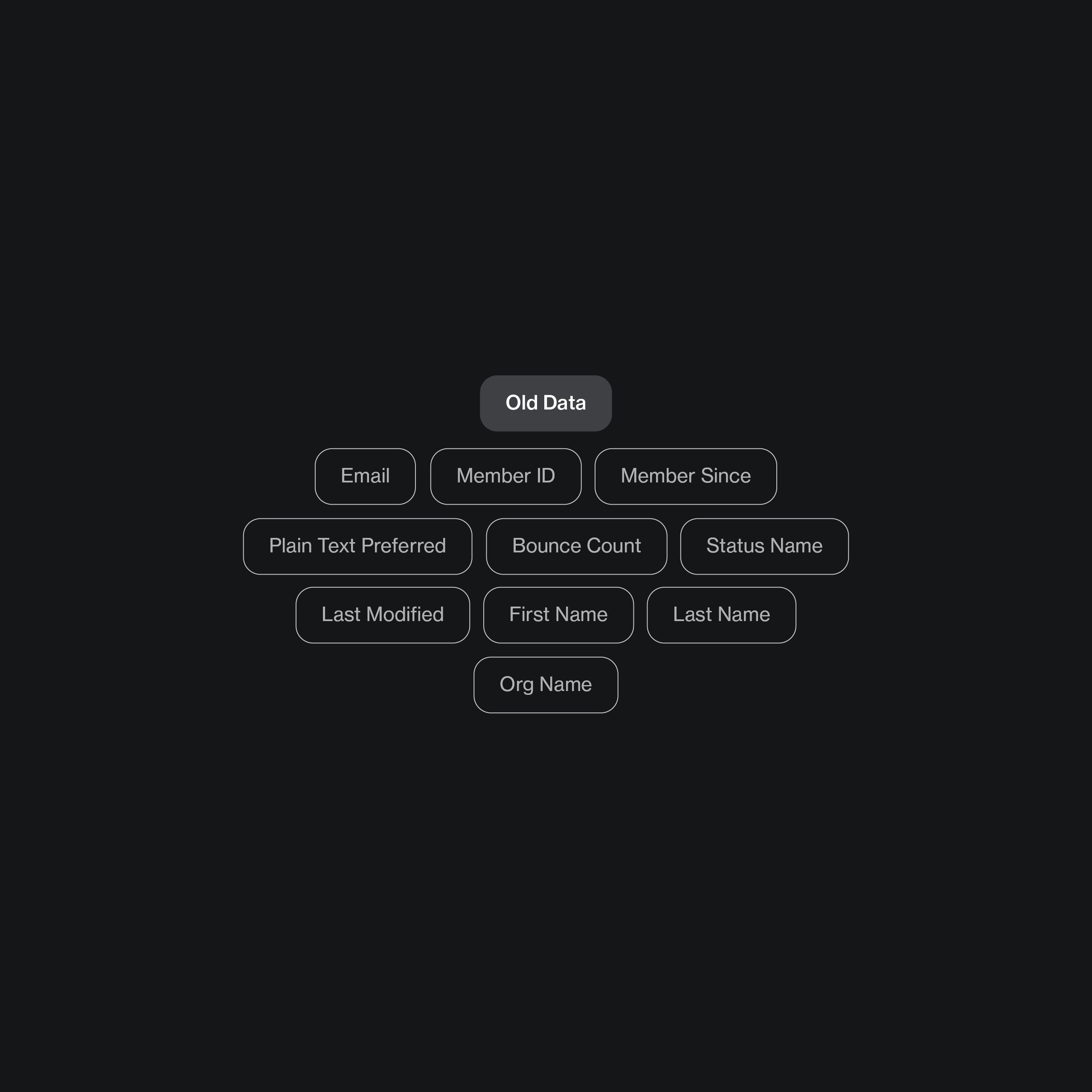
    Before meaningful personalization could begin, the data had to be trusted. Records were missing the basics, in many cases even an organization’s web address or the mission it served, and no discovery can begin without knowing where to look. We consolidated 258 duplicate records, removed vendors and non-customer contacts, normalized CRM data across multiple systems, and established a clean foundation capable of supporting intelligent automation at scale.

    Sparse field map of the original record, ten basic contact fields floating before mission enrichment.
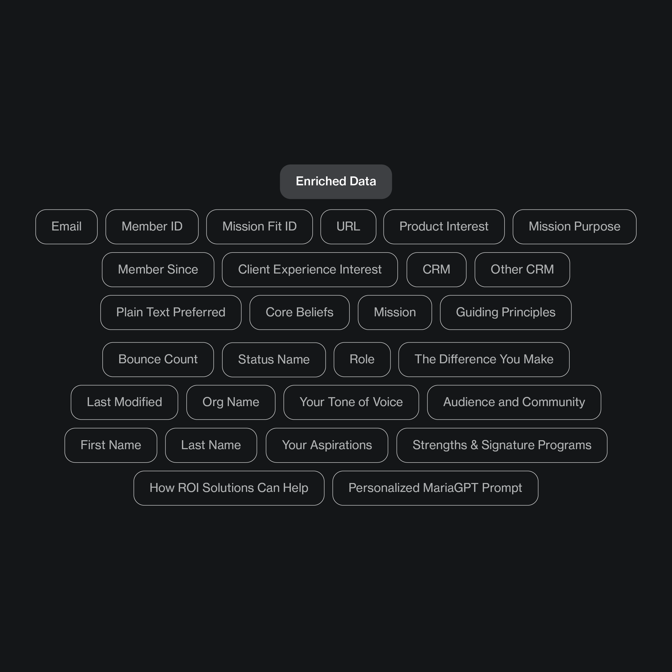
    Field map of the enriched record, mission purpose, tone of voice, and personalized prompt joining the original contact fields.
  • Mission Intelligence

    Understand Every Mission

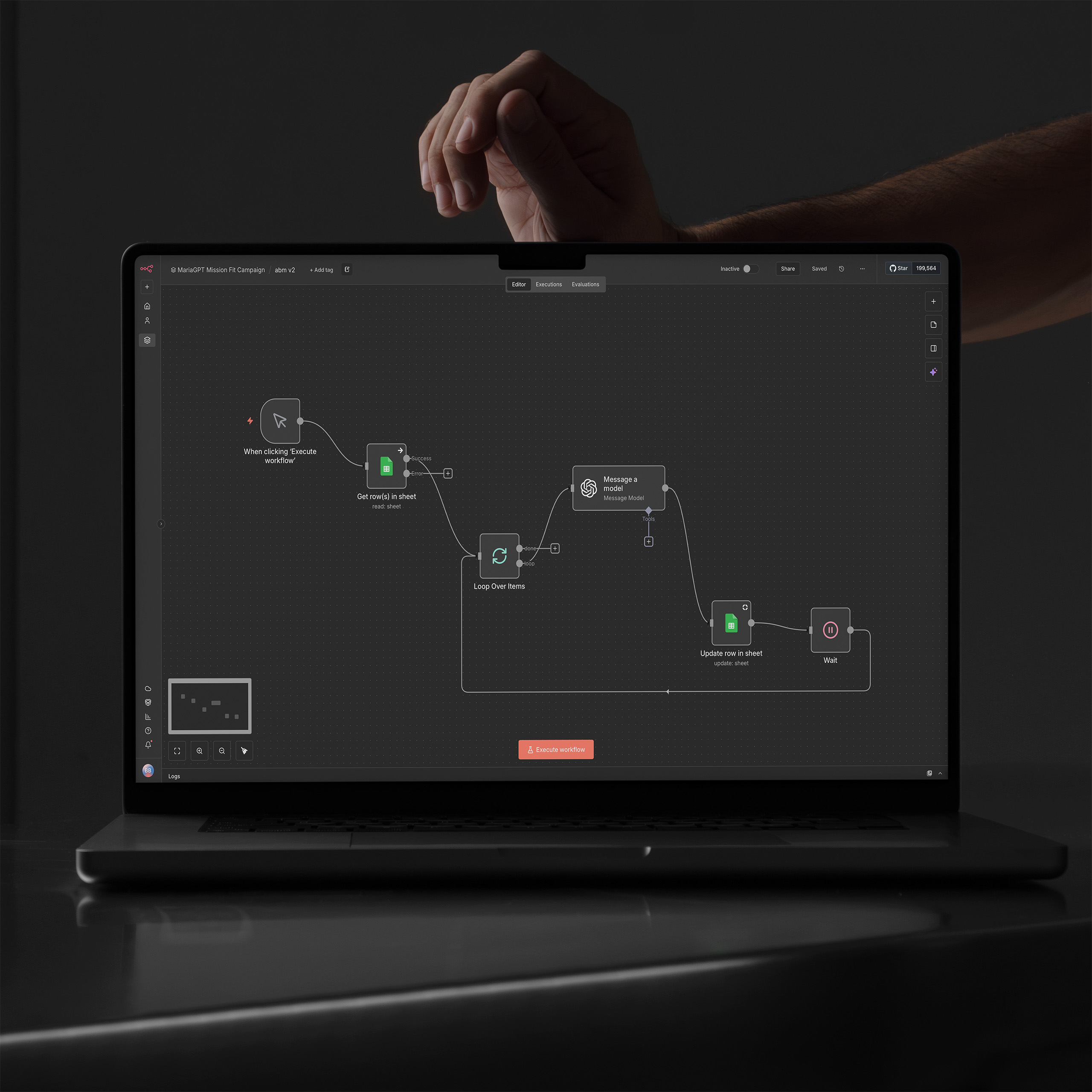
    Using a proprietary discovery framework developed through more than thirty years of brand strategy and organizational consulting, we built an AI-powered enrichment engine that researched every nonprofit, identified its mission, audience, values, programs, aspirations, and communication style, then generated strategic recommendations for how ROI Solutions could best support its goals. Rather than simply filling fields, the system created meaningful organizational understanding.

    Laptop showing the n8n agentic workflow, nodes looping from sheet rows through the model and back to updates.
  • Mission Intelligence

    Deliver Personalized Experiences

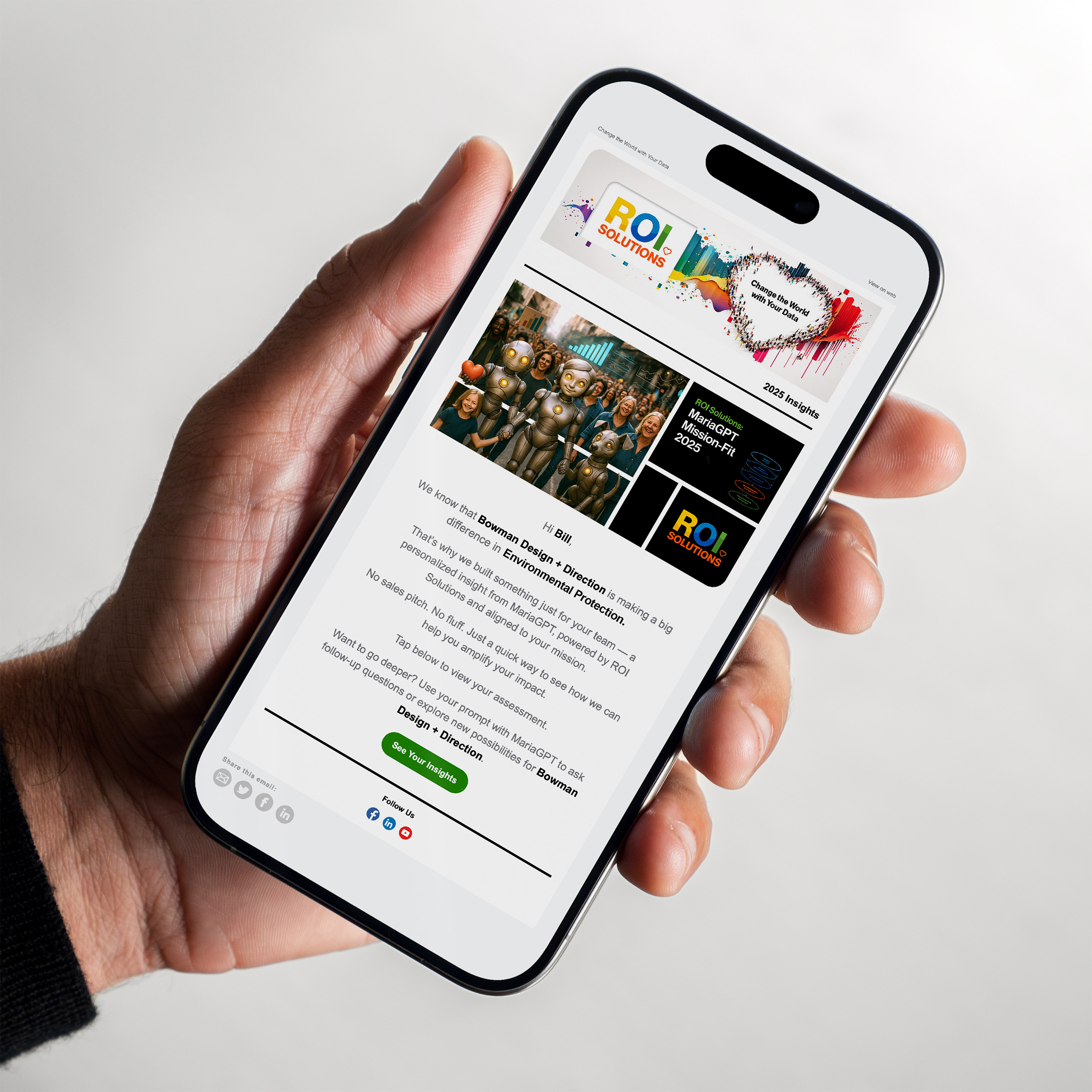
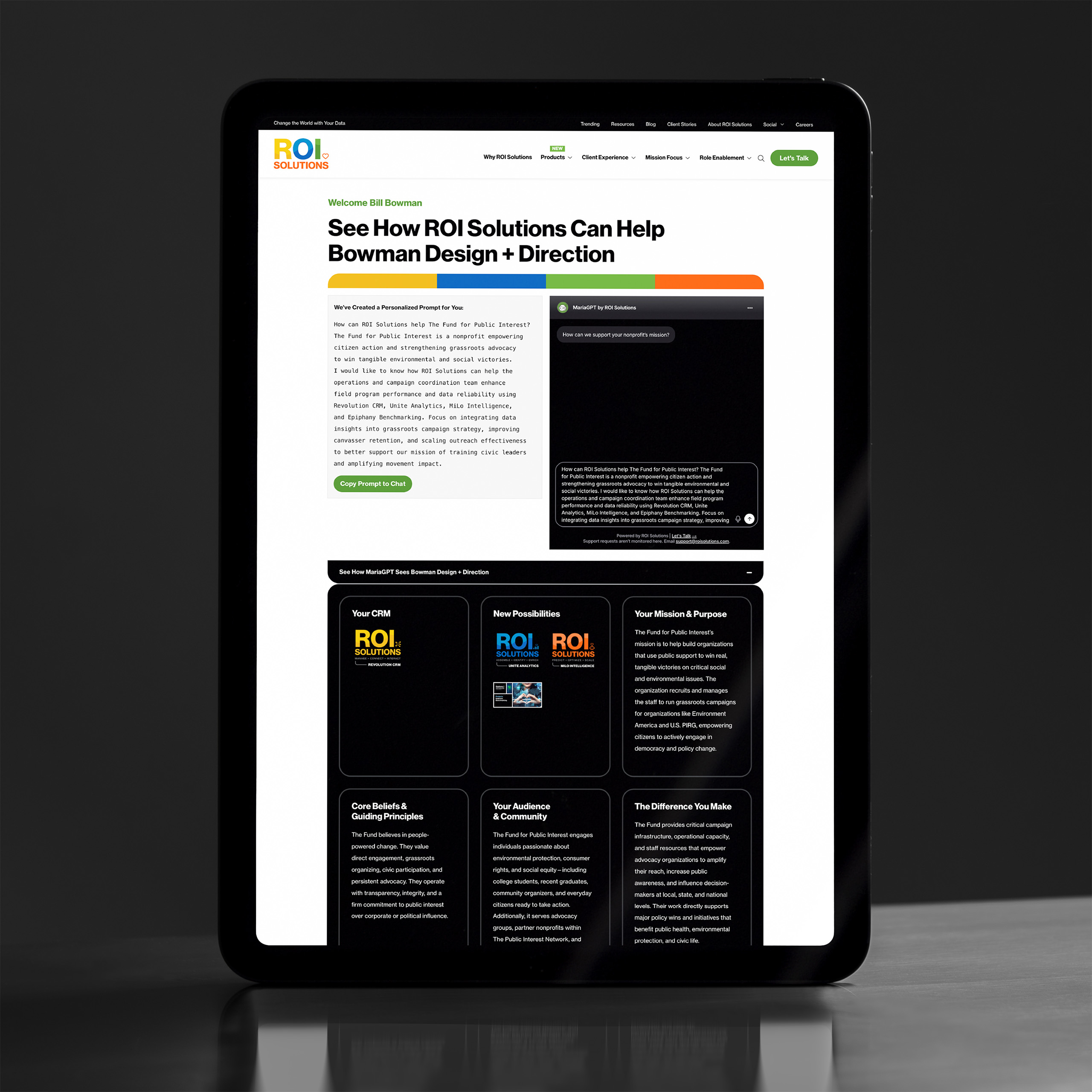
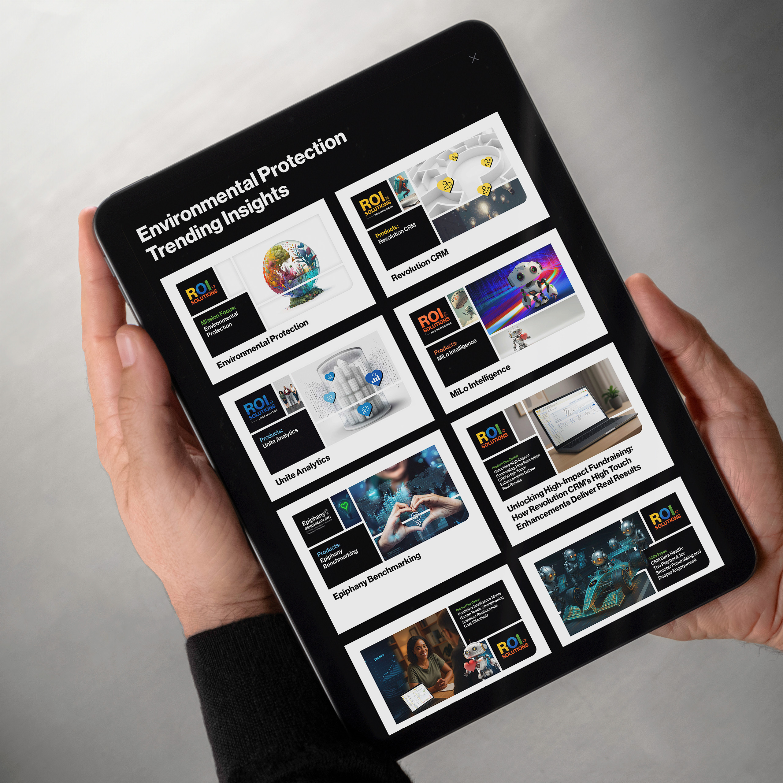
    The same intelligence powered personalized emails, dynamic landing pages, tailored content recommendations, and pre-generated MariaGPT prompts. Every outreach experience reflected the nonprofit’s unique mission, allowing prospects to begin informed conversations instead of starting from scratch. In the first campaign alone, 14 nonprofit professionals carried those conversations into MariaGPT, asking mission-level questions about their own organizations. The campaign transformed personalization from simple mail merge into meaningful mission-driven engagement.

    Hand holds a phone showing the MariaGPT Mission-Fit email greeting Bill by name with environmental protection insights.
    Tablet showing the landing page personalized for Bowman Design Direction, a MariaGPT prompt beside mission and audience panels.
    Hands hold a tablet of environmental protection trending insights, product feature cards tiled down the dark page.
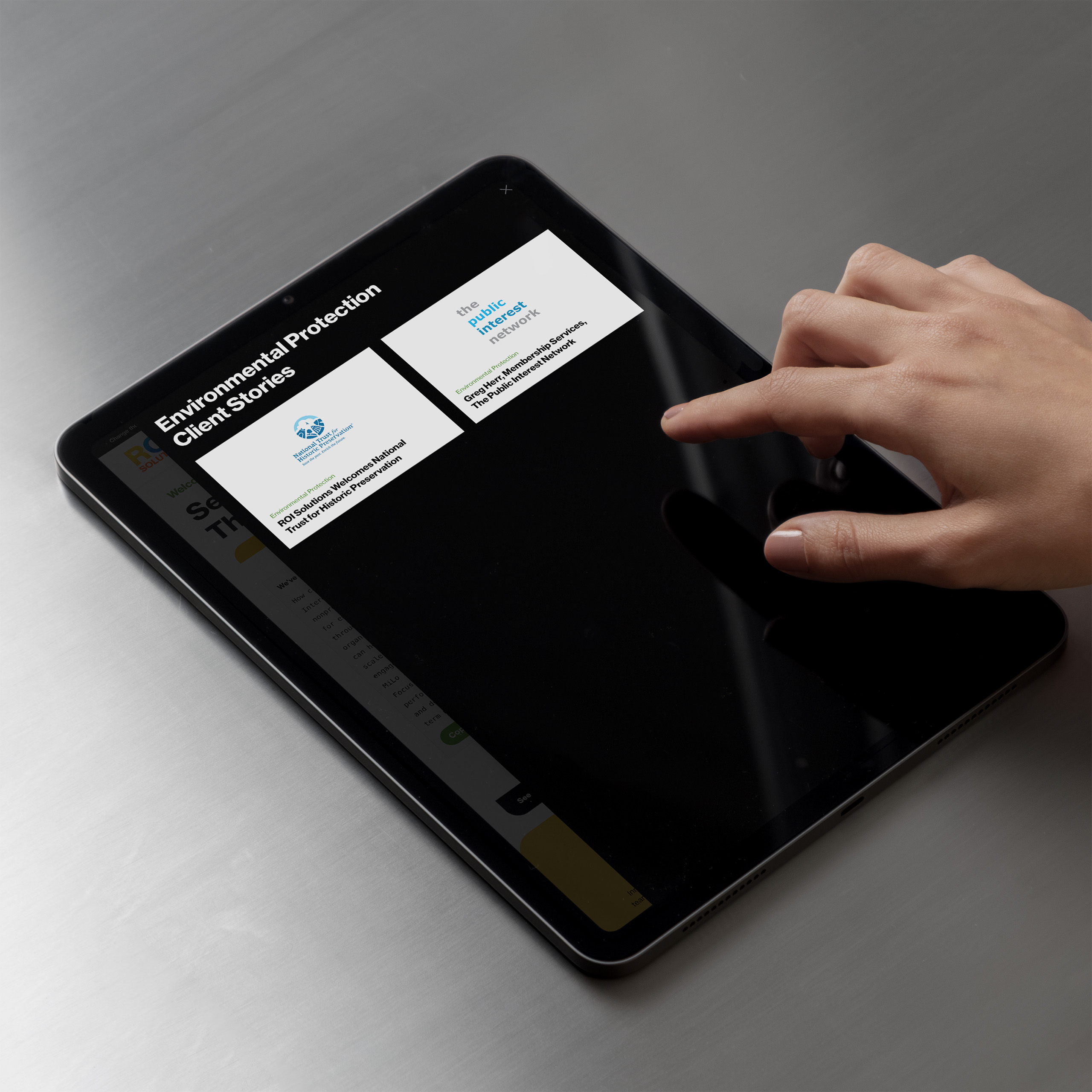
    Finger scrolls a tablet showing environmental protection client stories, logo cards over the darkened landing page.
  • Mission Intelligence

    Create Mission Intelligence

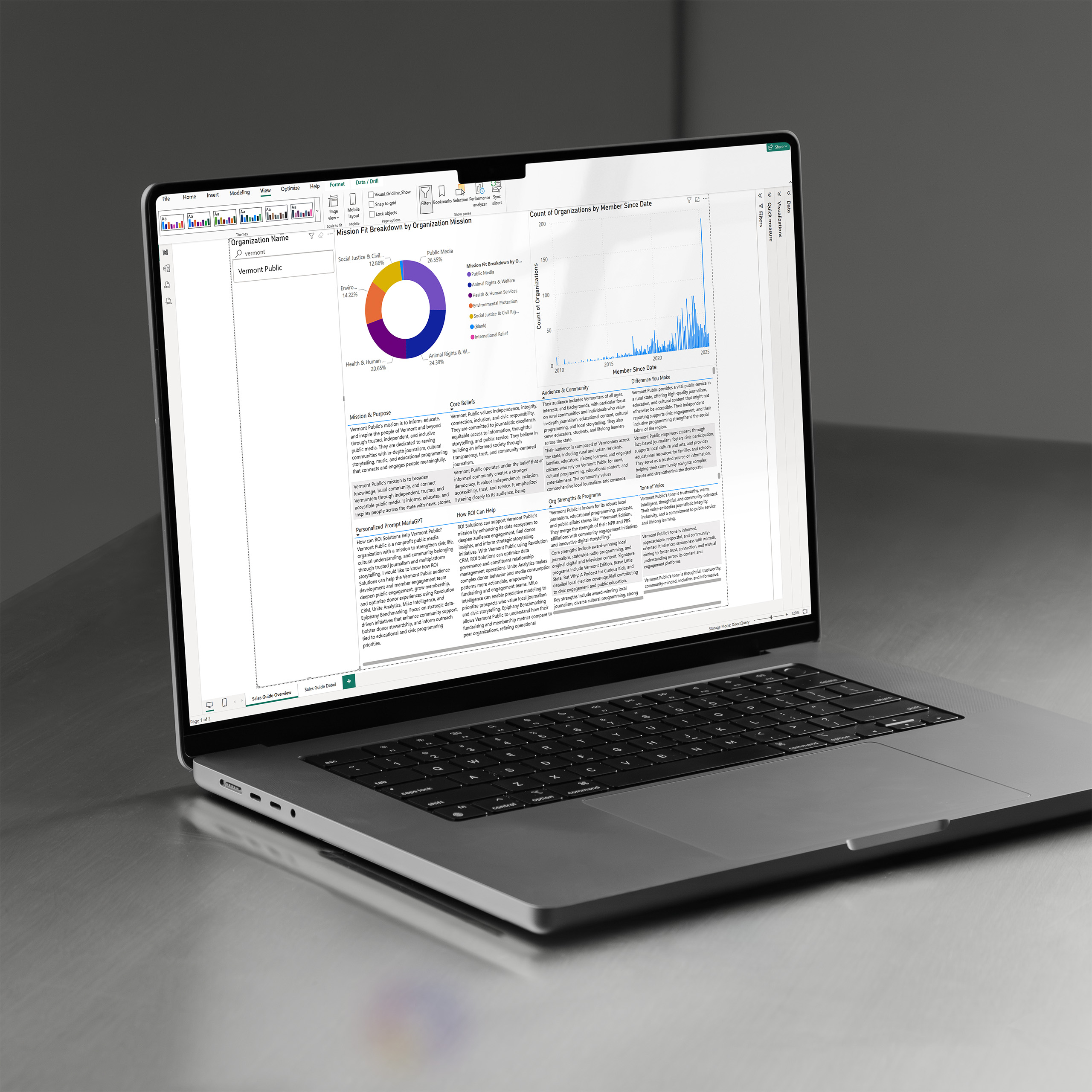
    The enriched intelligence became far more than marketing data. Every organization received a comprehensive mission profile containing strategic insights, personalized recommendations, conversation starters, and AI-generated guidance. Sales teams could instantly understand each client or prospect before the first meeting, while MariaGPT gained rich organizational context for more relevant conversations.

    Laptop showing the Power BI sales guide, a mission donut chart and member timeline above enriched organization notes.
  • Mission Intelligence

    Activate Understanding Everywhere

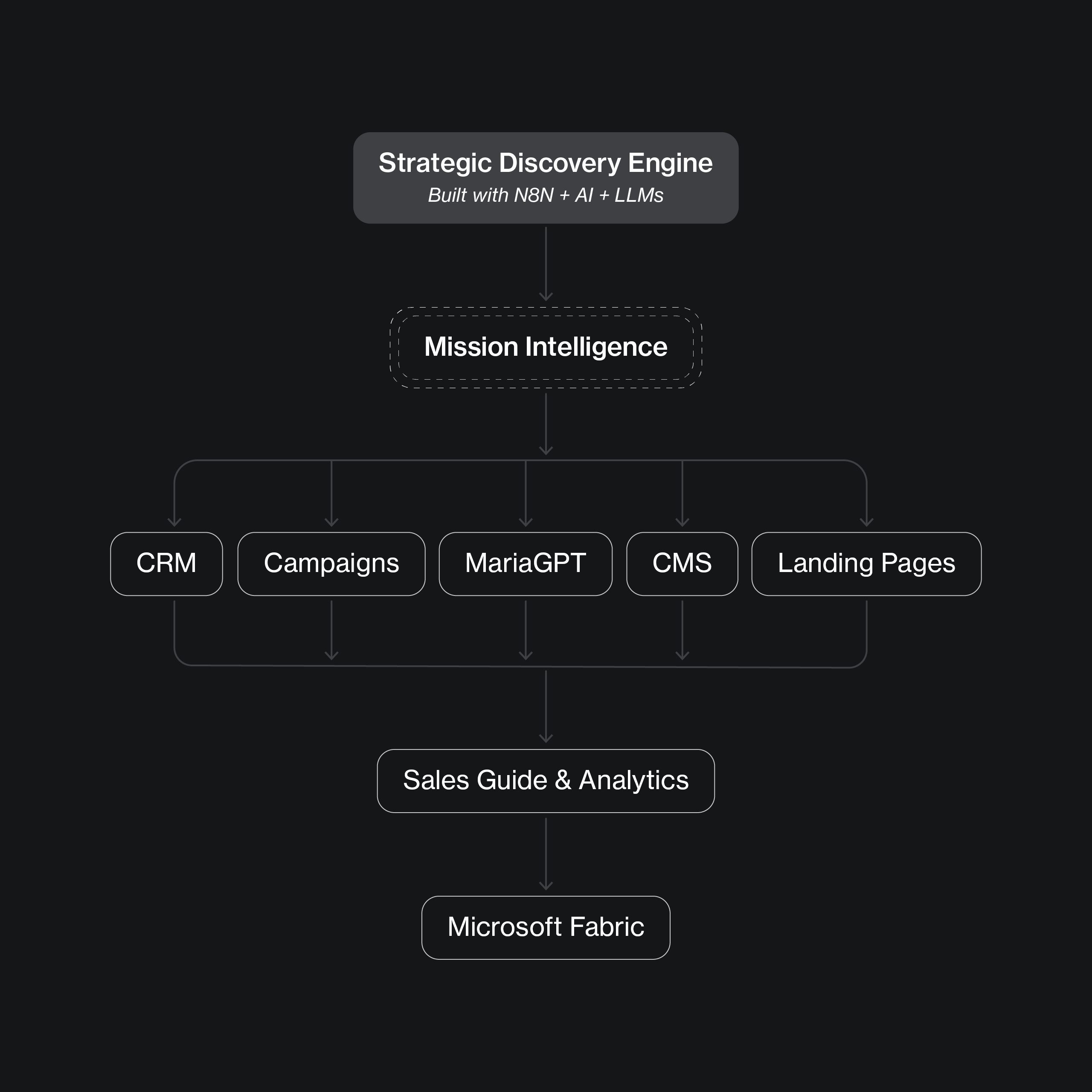
    Mission Intelligence wasn’t built for a single campaign. The same enriched records that personalized emails and landing pages also powered the Power BI sales guide, which queries the enterprise layer we built to carry it all: a Microsoft Fabric lakehouse, a semantic model, and a centralized data lake, working and ready for broader adoption. One trusted source of understanding, produced through BDD Discovery + Strategy rather than inherited from any platform, gives marketing, sales, analytics, and future AI initiatives a shared foundation.

    Diagram flowing from the n8n strategic discovery engine through Mission Intelligence to CRM, MariaGPT, and Microsoft Fabric.
Outlined orange heart from the parent identity, the symbol placed at the center of every product mark in the constellation.

Finding Structure in Complexity

A New Dimension

The breakthrough wasn’t creating a better infographic. It was realizing the information itself needed a new dimension.

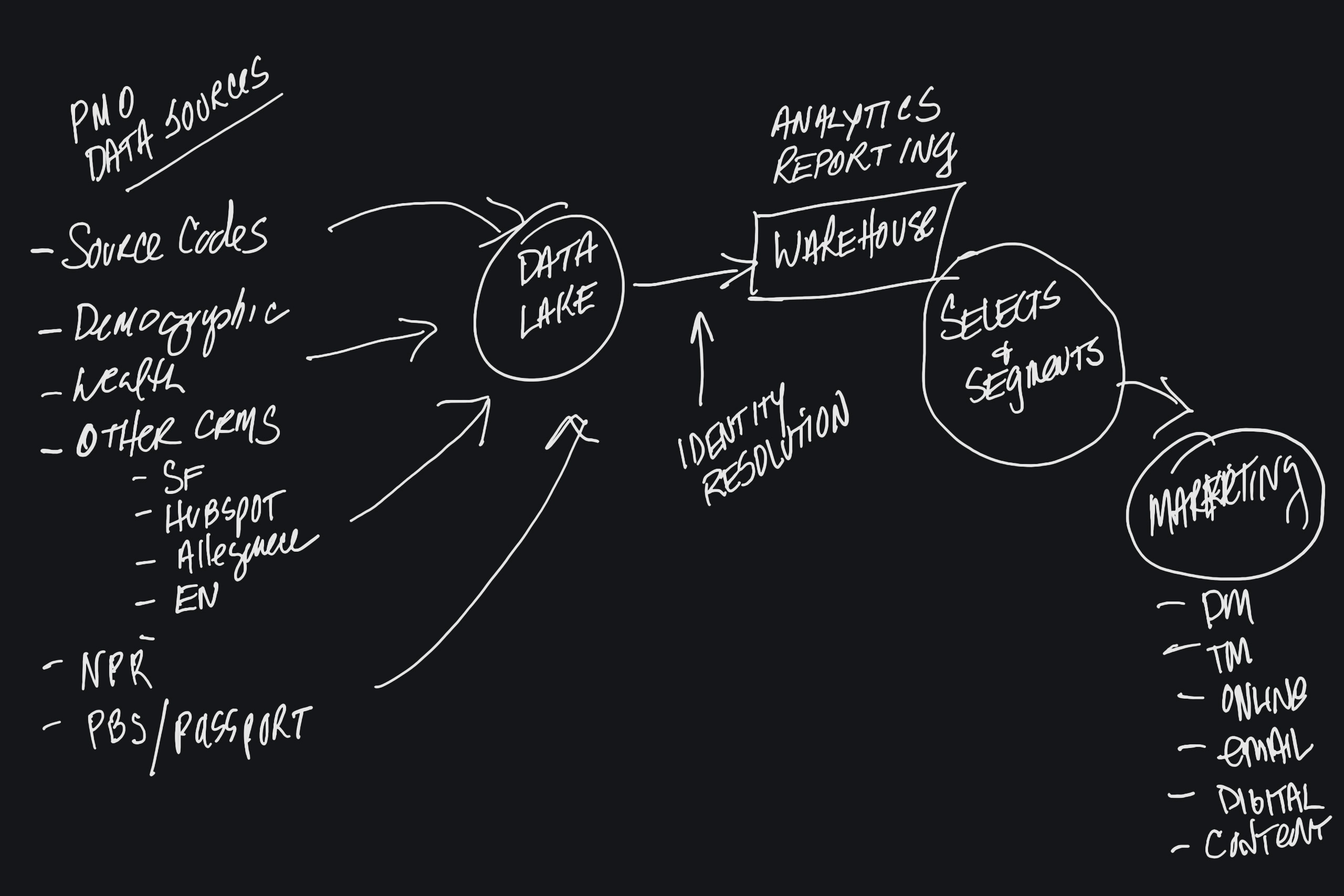
During a strategic discovery session, the ROI Solutions CEO shared pages of executive notes that captured her vision for a modern nonprofit data ecosystem. It quickly became clear that the challenge wasn’t visual design. It was information architecture. A traditional infographic could never communicate the breadth of the ideas being explored. Drawing on a layered information architecture approach we’d successfully developed for previous clients, we proposed organizing the system across multiple conceptual planes instead of a single flat diagram. Leading strategic discovery sessions with the team, we then developed a comprehensive content assessment that organized hundreds of ideas into themes, categories, and content groups. The resulting framework became part of ROI Solutions’ public strategy.

Hand-drawn whiteboard sketch routing PMO data sources through a data lake and warehouse to selects and marketing.
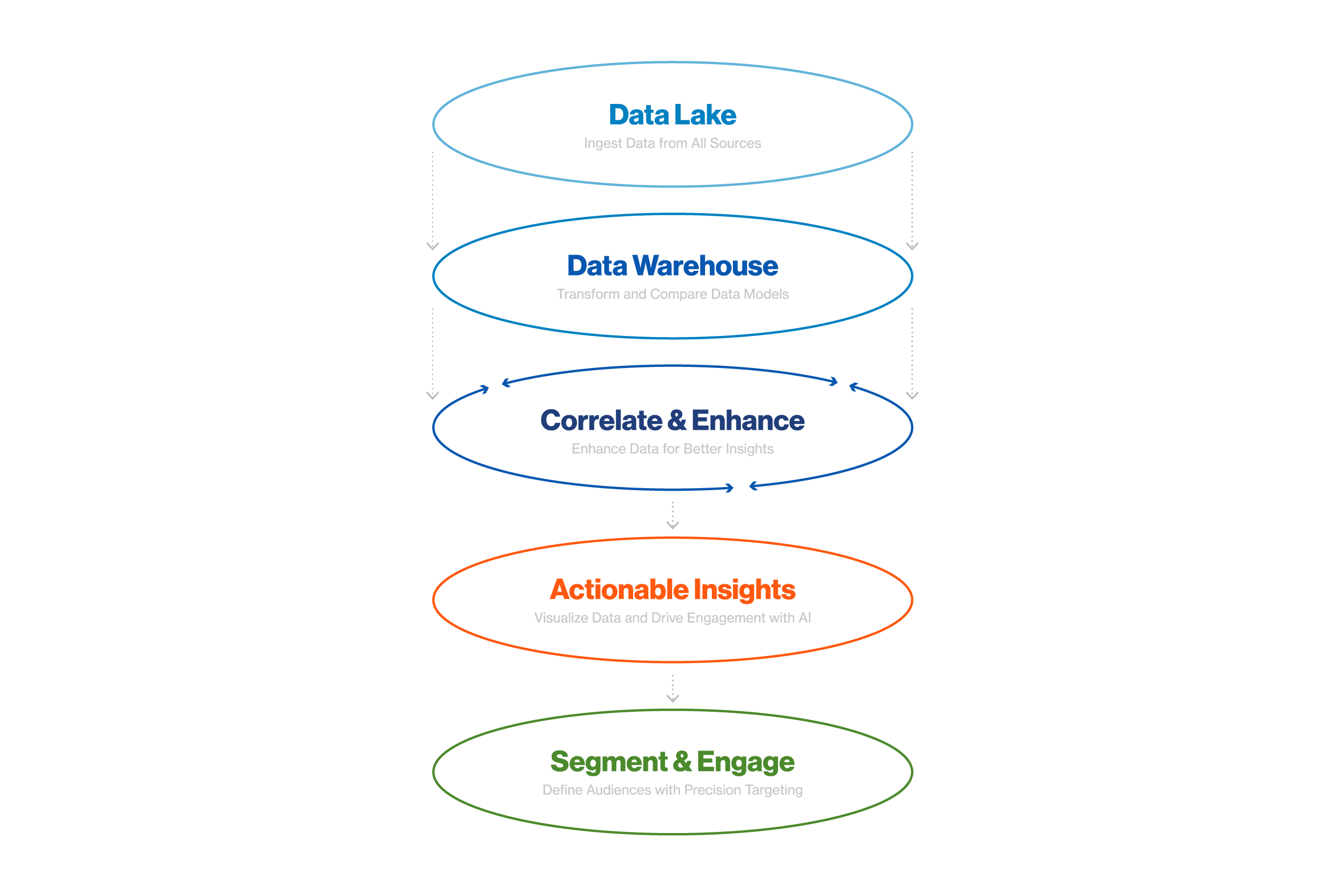
Five stacked ellipses stepping from data lake and warehouse through correlation to actionable insights and engagement.
Before
After

Thinking in Three Dimensions

Every Enduring System Begins as an Unfinished Question.

Before a single visual was designed, the question wasn’t what the framework would look like, but how the information wanted to be organized. Once the ideas were grouped into meaningful categories, I recommended layered planes that separated related concepts while preserving their relationships. That shift transformed a visual design problem into an information architecture solution.
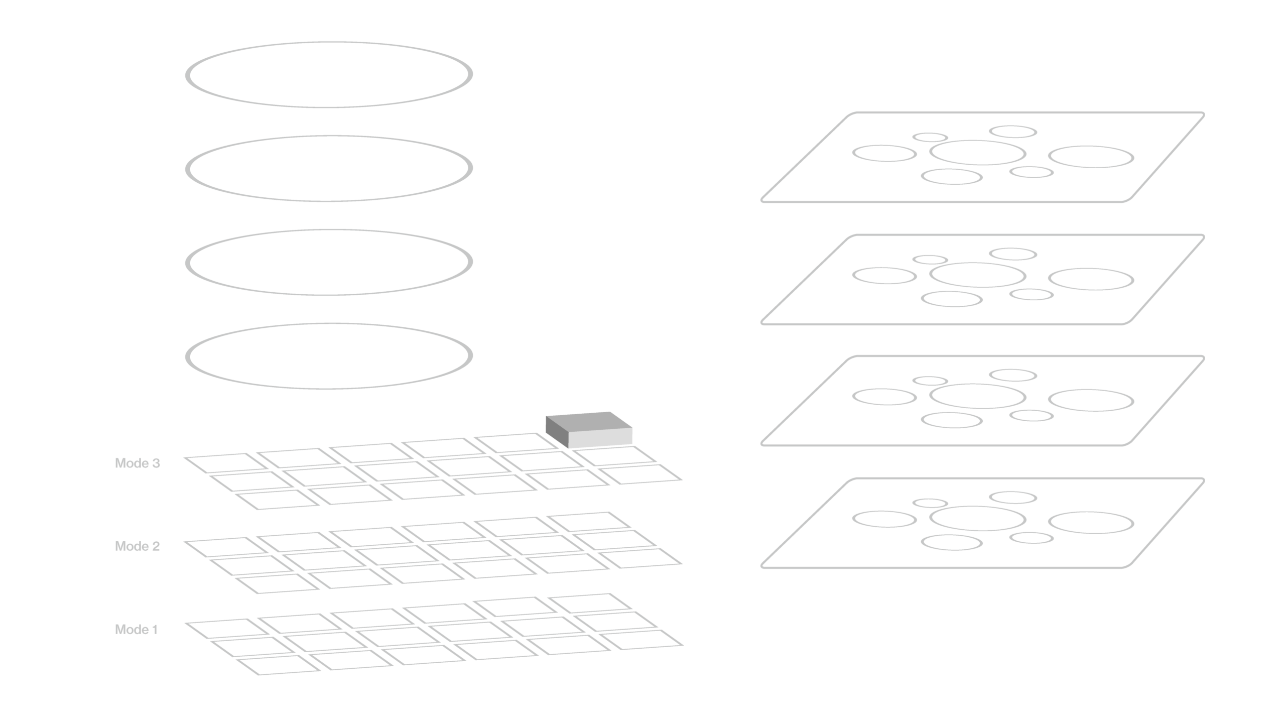
White wireframe diagram stacking data planes beside layered ellipses, the three dimensions of the enrichment architecture.