
Chockstone Pictures
Building a brand that holds. And a platform that publishes.
Steve and Paula Mae Schwartz built Schwartz Communications into one of the country’s leading public relations firms. Their next company would release art that moves you, in every sense of the word. The mission states it plainly:
Develop and produce films in the space where art and commerce meet.
Bowman Design Direction had already given Schwartz Communications its brand. The Schwartzes returned to us to brand Chockstone Pictures: an identity worthy of the films they would produce, and a website a family company could keep current beside the majors for decades.
Read the Story
Challenge
Movie marketing is built to expire. Every release gets its own campaign, its own spectacle, and its own budget, and the studios rebuild all of it for the next premiere. That rhythm assumes studio money and studio staff.
Chockstone Pictures is a family company producing films with directors like Terrence Malick and Ridley Scott. It needed the credibility to stand beside major studios, the means to publish news, trailers, and press for every film, and a presence that stays current between releases, all without an agency on retainer or a rebuild every year.
Direction
The strategy was hiding in the name. A chockstone is a round stone wedged between two opposing rock faces, the fixed point a climber trusts with full weight. Chockstone Pictures produces films in the space where art and commerce meet. The founders had already named the two opposing forces: art and commerce. The brand had no side to take. Its job was to hold the two together.
So nothing was designed for spectacle. The identity set the stone into the O of an elegant wordmark. We built an anchor instead of another campaign: a publishing platform that holds steady while films, trailers, news, and press move through it.
Outcome
For more than twenty years, Chockstone Pictures has published, promoted, and launched feature films from the same platform, without a redesign and without an agency. Nine pictures have moved through it, from The Road to Anniversary, including a Palme d’Or winner, with news and press live the day they happen.
Brands built as campaigns expire with them. This one has held its position between art and commerce since the beginning, still current, still publishing, still recognizably itself.
Takeaway
Most agencies would have dressed a small production company as a big studio and rebuilt its spectacle for every premiere. Campaigns expire. Anchors hold. The work translated the company’s own name into its infrastructure: a brand wedged where art meets commerce, and a publishing platform three people could trust with the company’s full weight.
What We Built
Brand & Identity
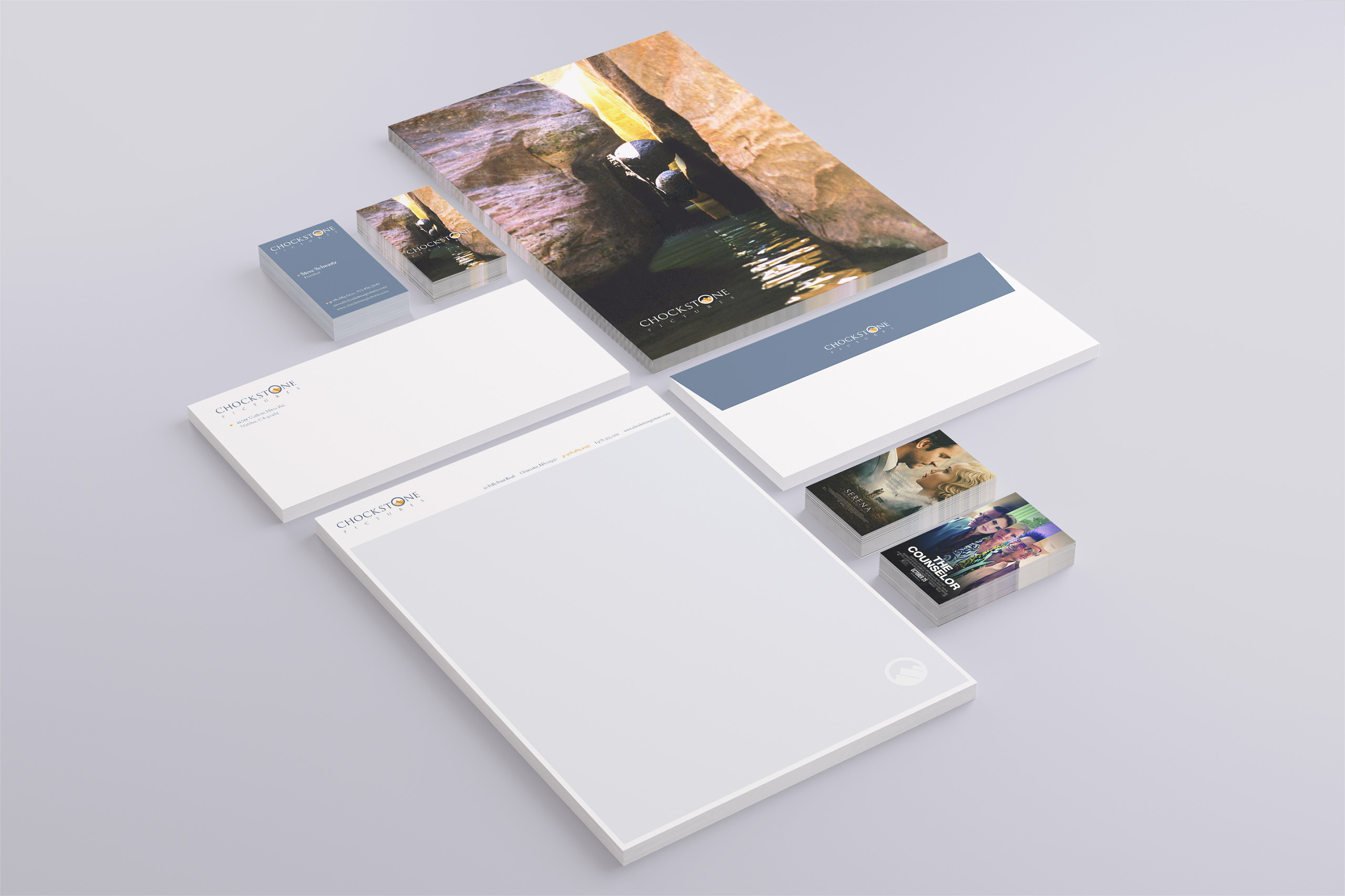
We designed the identity around the company’s namesake. A round stone sits in the O of an elegant wordmark, carried by rich, bold color. The mark reads as both anchor and lens, an insightful eye on peak performances, scripts, and production, made to sit beside major-studio logos without shouting.
Website
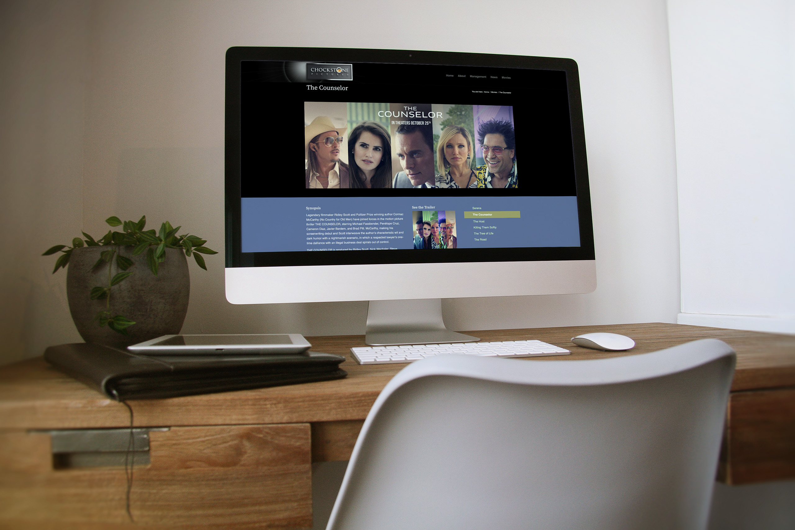
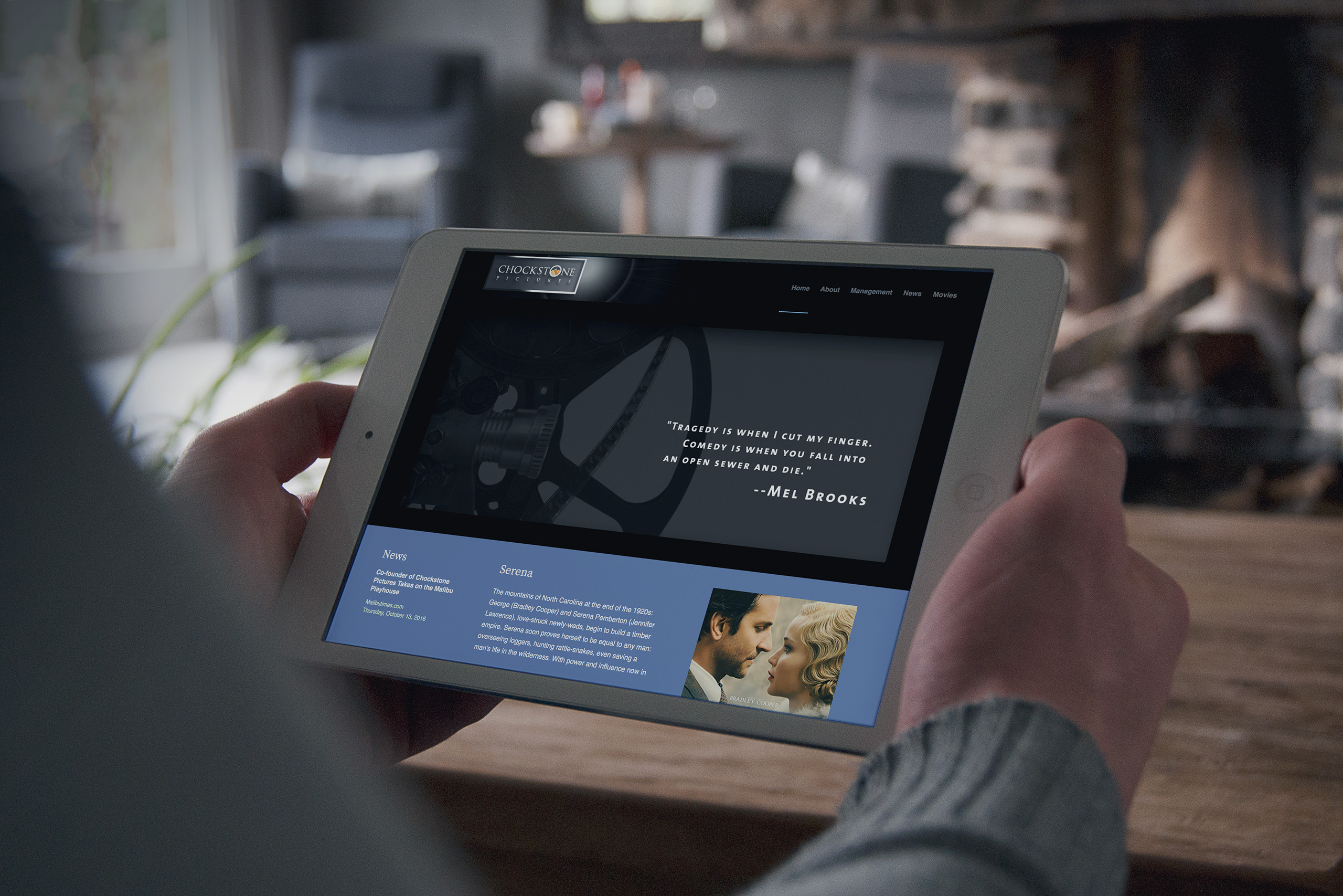
We built a site meant to be judged beside the majors and maintained by a family. The newest film leads, trailers play in place, and the design frames each picture’s own artwork instead of competing with it, so the site stays right as the slate grows.
Publishing System
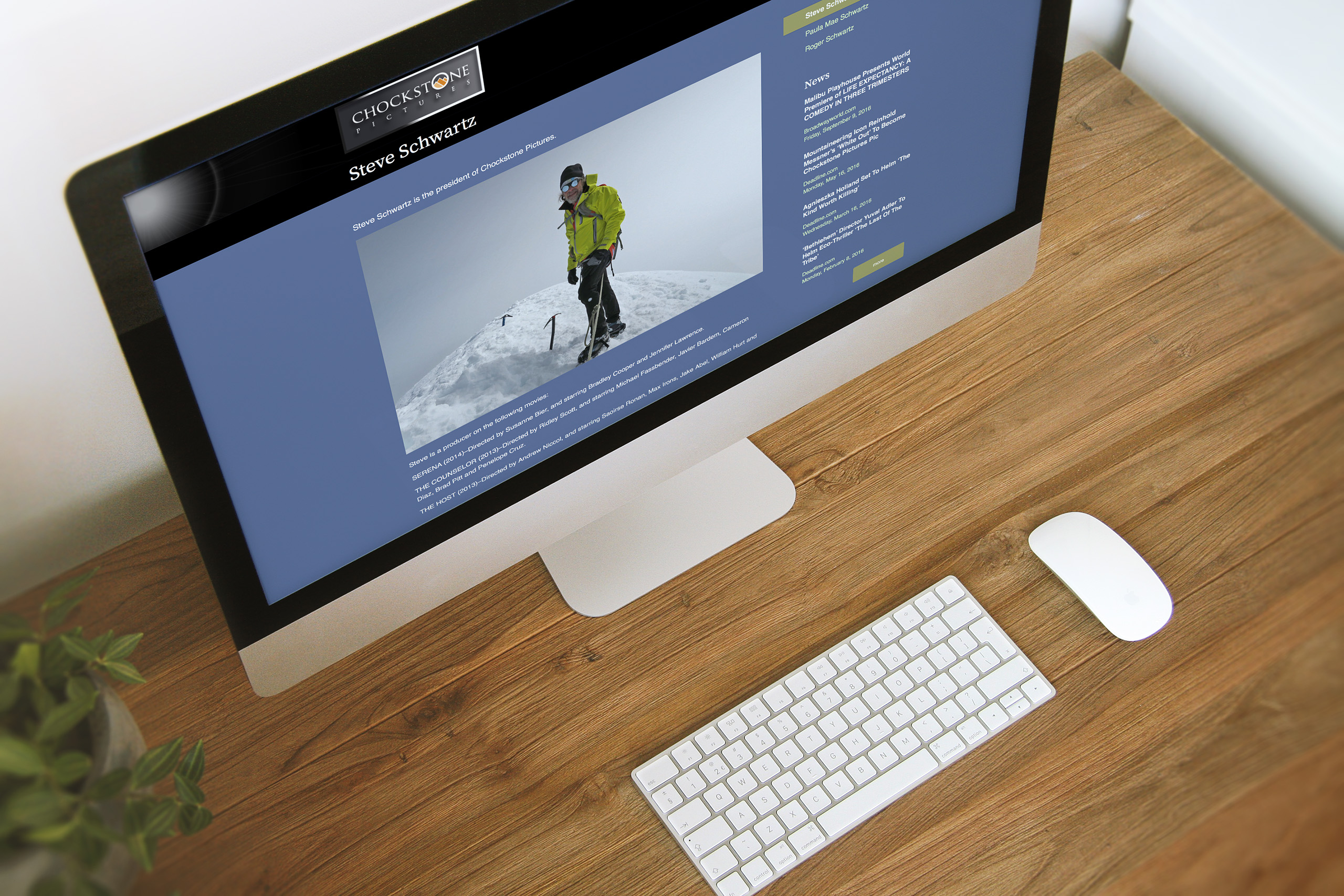
News, events, and press publish in minutes without a developer, which means a family company can operate like a major studio without depending on an agency. Twenty years of coverage, from Variety to The New York Times, reads as one continuous record of credibility.
Film Pages
Every picture gets a stage built from its own campaign assets: poster, trailer, synopsis, and the reviews it earned. Each release brings its moment of spectacle, and the brand holds steady underneath it.

The Through-Line
What began as a name borrowed from climbing became the fixed point that lets a family company hold its place among major studios.
The identity fixed a permanent mark: a stone set into the O, holding the same position on every poster, page, and press release, while film companies around it restyled themselves for whatever they released last.
Instead of chasing each premiere, the website frames every film’s own artwork and lets the brand stand still: elegant enough for Cannes, practical enough to publish from a kitchen table.
The publishing system placed Variety, Deadline, and The New York Times one click from every visitor, maintained in-house in minutes, where publicity usually means a retainer.
Most importantly: where art and commerce usually pull brands apart, this one was designed to be held by the tension. The job was never to make a small company look bigger. It was to set a fixed point nine films could hang their campaigns from.
Everything Changed Around It. The Strategy Never Did.
Discovery + Strategy
Before design, we found the strategy already wedged inside the name.
Business Roadmap
A production company’s site outlives every release. We planned for the long slate: a publishing operation three people could run for decades, not a campaign to rebuild each year.
Brand Architecture
The name was the brief. A chockstone holds between opposing faces and is trusted with full weight. We translated that single idea into identity, typography, color, and digital experience.
Audience Architecture
Producers, press, financiers, and filmgoers read the same site differently. We mapped what each needs to see to trust: the slate, the coverage, the management, the mission.
Publishing Strategy
News is proof of life. Event-driven publishing keeps the company current between premieres and turns twenty years of coverage into one browsable case for credibility.
Film Promotion System
Every release arrives with its own assets: posters, trailers, stills, reviews. We built the frame that turns each film’s campaign into the brand’s next chapter.
Competitive Positioning
Chockstone doesn’t outspend the studios; it outlasts campaigns. We positioned a family company as the fixed point in an industry of expiring spectacle.

Brand Identity
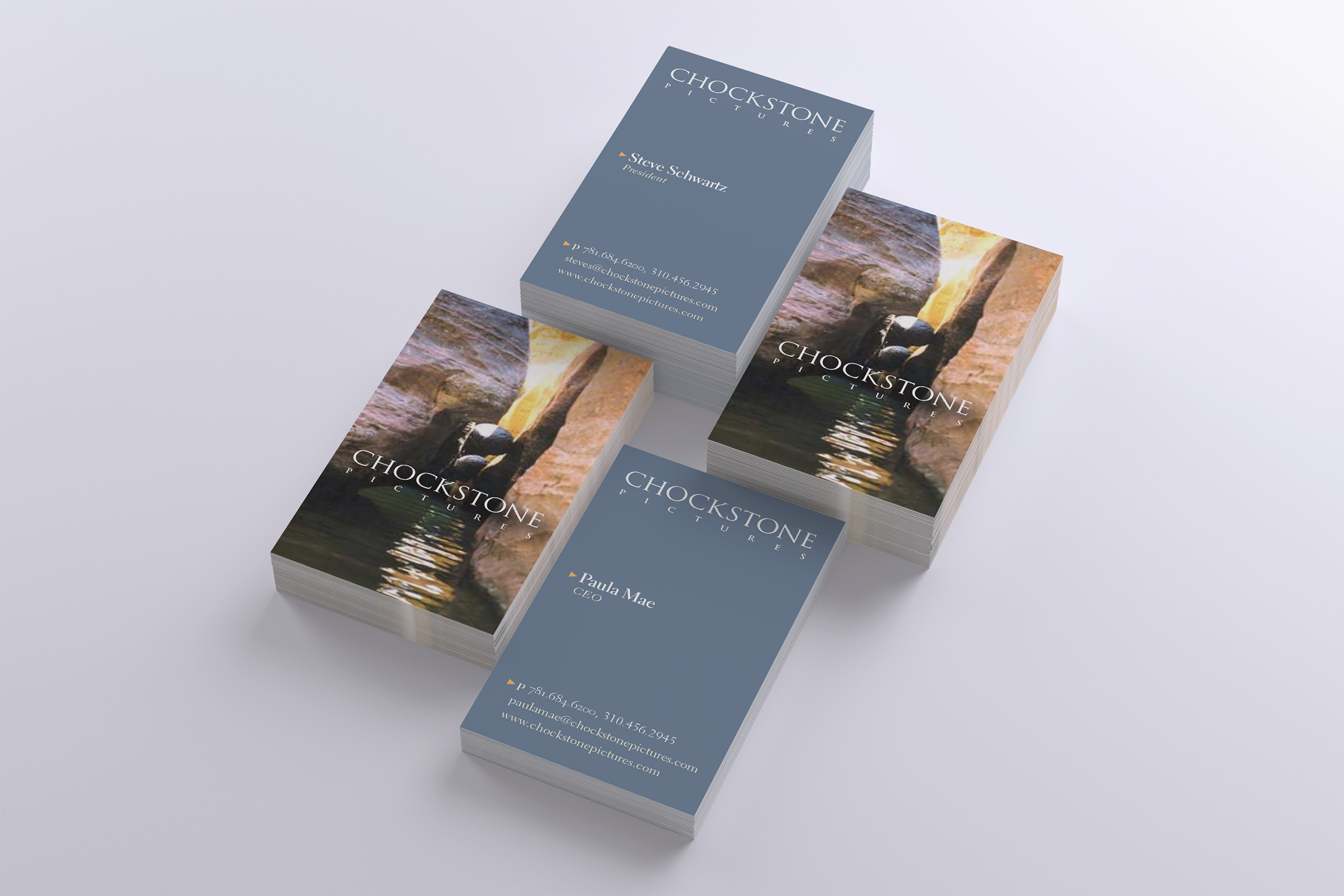
The Chockstone Pictures identity translates the company’s namesake into a visual system. A chockstone is a round stone wedged between two opposing rock faces, the fixed point a climber trusts with full weight. The wordmark sets that stone into the O, giving the company’s own two faces, art and commerce, a mark that holds between them.
The elegant typeface carries the stone quietly, and rich, bold color gives the mark presence beside major-studio logos without borrowing their noise. The roundness of the O doubles as a lens: an insightful eye on peak performances, scripts, and major motion picture production.
Restraint was the discipline.
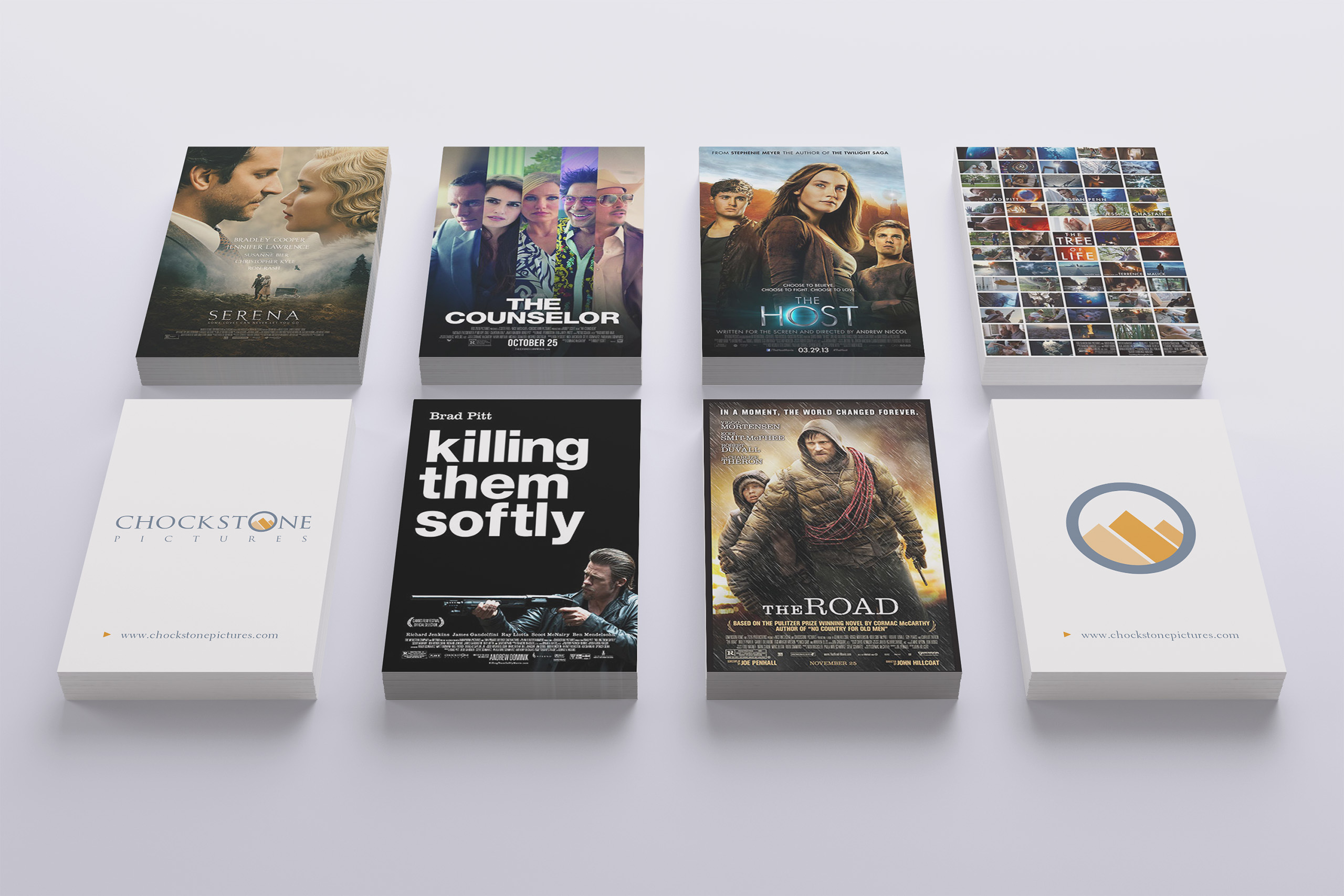
Movie branding leans toward spectacle, but a production company’s mark can have no favorite film. It must survive every genre it signs, from a Palme d’Or winner to a dystopian political thriller, without being recolored by any of them.
The result is an identity that behaves like its namesake. Posters change, campaigns expire, and the slate grows, while the mark stays exactly where it was set. That permanence is what makes it trustworthy.
The mark never needs to borrow attention from a film. Its job is to hold the company steady while every film creates a world of its own.
Color System

Business Cards

Creations
Chockstone Pictures
Motion Identity
Website
We designed the website around the two jobs a production company’s site actually has: prove the company is actively making films, and give each film a stage worthy of its campaign. The newest film leads with its trailer, then the design steps back and lets the filmography speak.
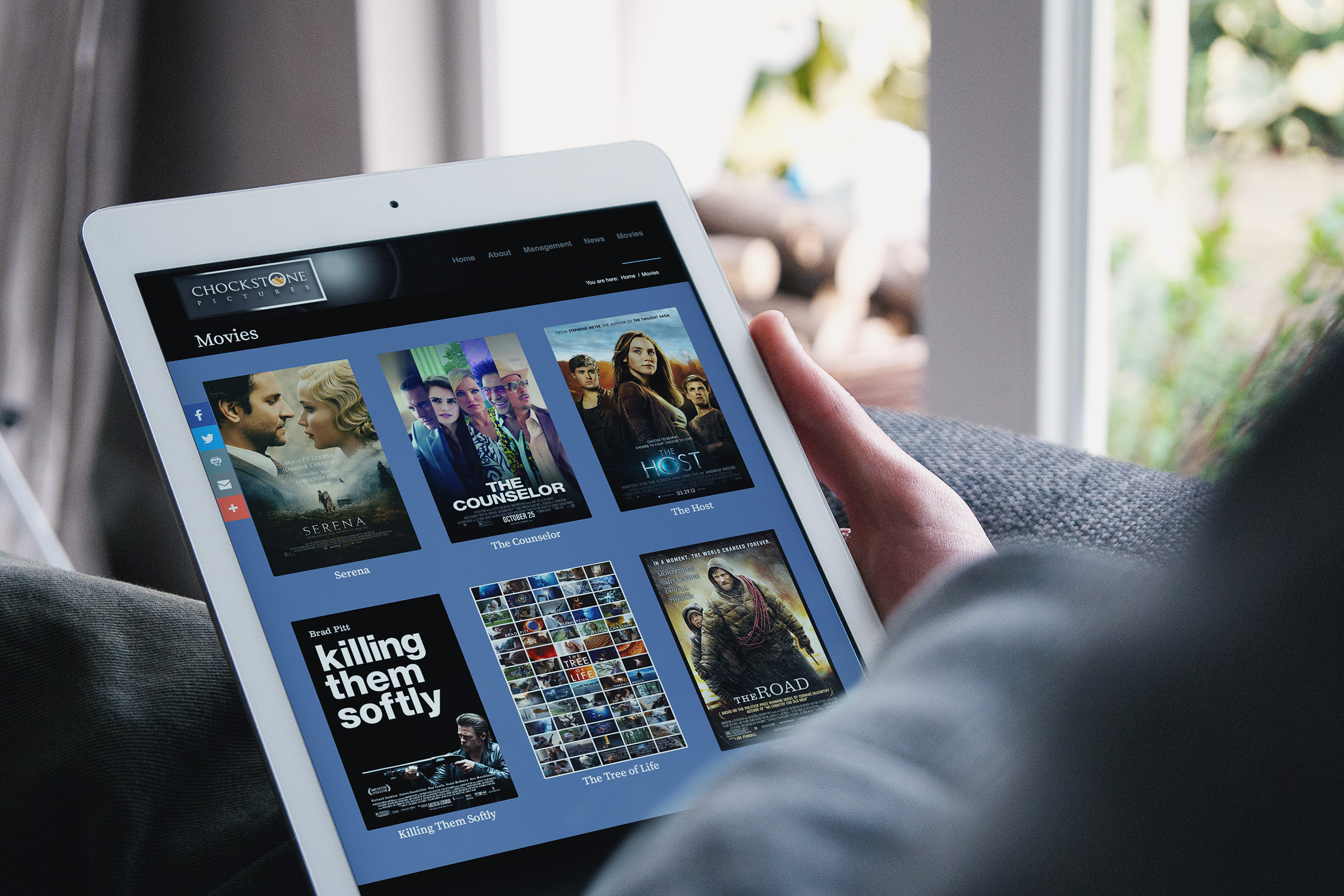
The filmography presents as a poster wall, each film opening to a page built from its own campaign: artwork, trailer, synopsis, and the press it earned. The brand frames each film without competing with it, so a slate that runs from The Tree of Life to Anniversary reads as one company.
News works as a press room in public, with coverage from Variety, Deadline, and The New York Times publishing in minutes and filtering by outlet. A visitor can watch two decades of credibility accumulate in one scroll.
Management and About stay deliberately simple: three people, one clear mission, and a name that explains the strategy. The site was built to be maintained by exactly those three people, which is why it still is. The platform still publishes. The brand still holds.
That balance keeps the company current without turning it into a news feed, and keeps each film distinctive without fragmenting the slate.