
Creations
Fairfield & Associates
Fairfield & Associates
A brand that feels like Maine. And a firm that works like one.
Fairfield & Associates had grown into one of southern Maine’s most trusted law firms, with twelve years of practice and a reputation built case by case. The brand told none of that story.
The firm’s greatest differentiator was never legal expertise. It was humanity.
Bowman Design Direction partnered with Fairfield & Associates to rebrand the firm, retell its story on film, and move sixteen years of casework into the cloud. One engagement changed how the firm looked, sounded, and worked.
Read the Story
Challenge
Law firm marketing promises the same three things everywhere: experience, aggression, and results. Fairfield & Associates had the experience, but nothing about the old brand showed what actually fills its waiting room with referrals: kind, approachable people who happen to be formidable attorneys.
There was a second problem the market never saw. Sixteen years of casework lived in legacy systems that kept attorneys tied to their desks and made collaboration slow. The brand needed to earn trust outside. The practice needed to move faster inside.
Direction
Attorneys are nearly impossible to schedule after the first meeting. We learned that early, so instead of building the story around interviews alone, we anchored it to something clients already trusted: Maine itself.
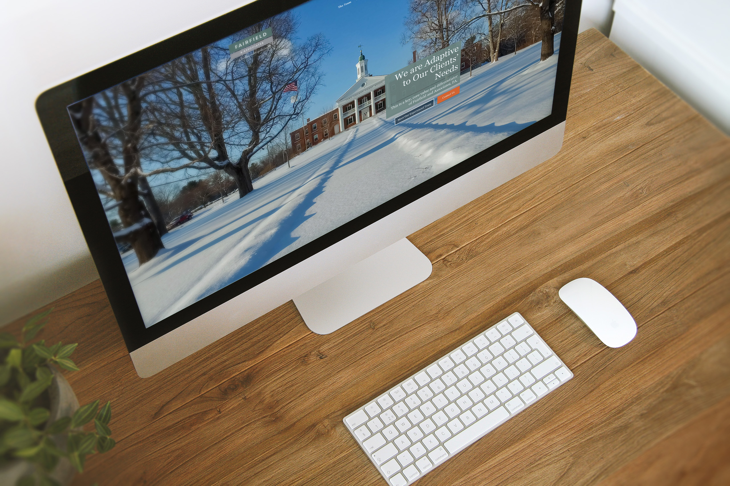
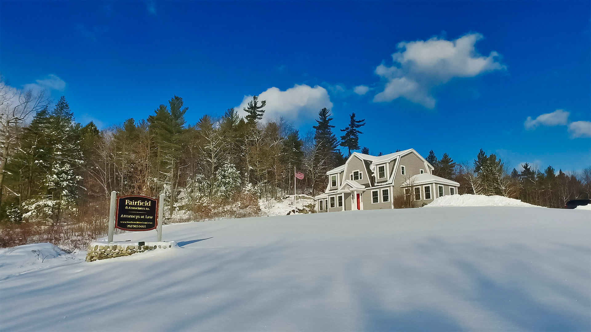
The beauty, openness, and kindness of the coast became the firm’s visual language. Drone film over Nubble Light and Goose Rocks Beach, photography of the York County Courthouse, and portraits of every attorney made Fairfield & Associates visually synonymous with the place it serves.
Outcome
Fairfield & Associates emerged with a brand that finally matched its people: warm, confident, and unmistakably Maine, carried across identity, stationery, signage, video, and the web.
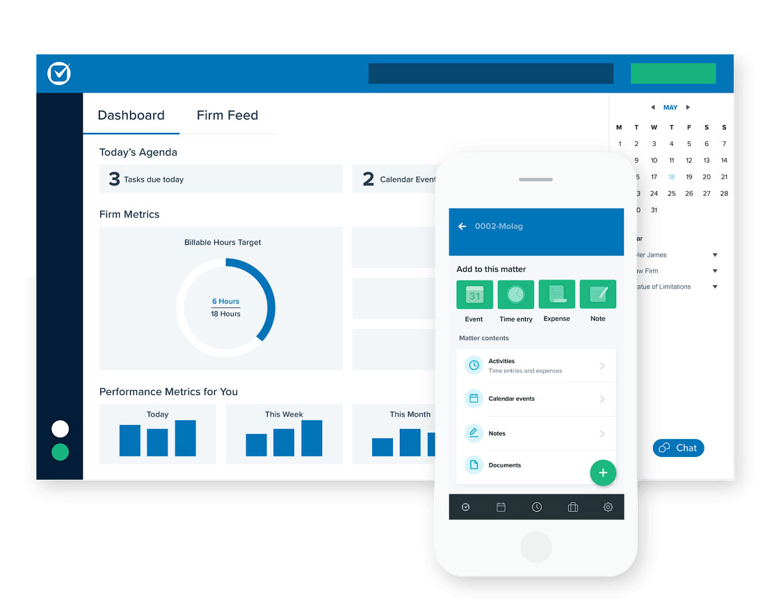
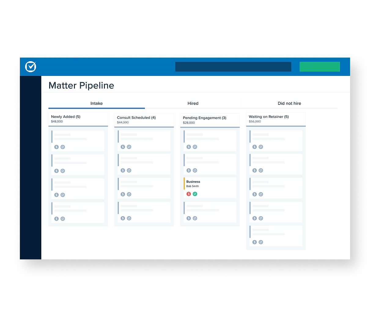
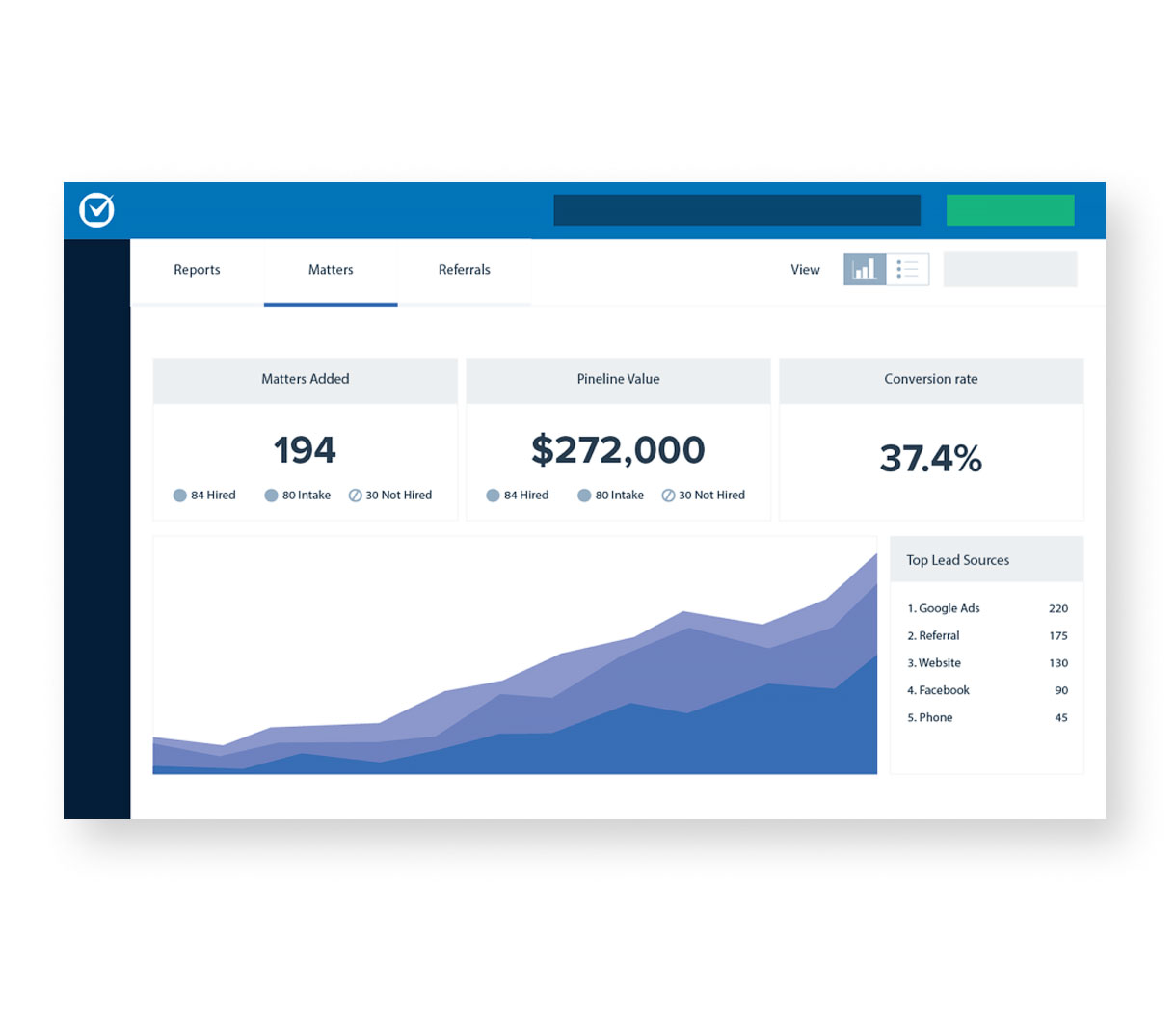
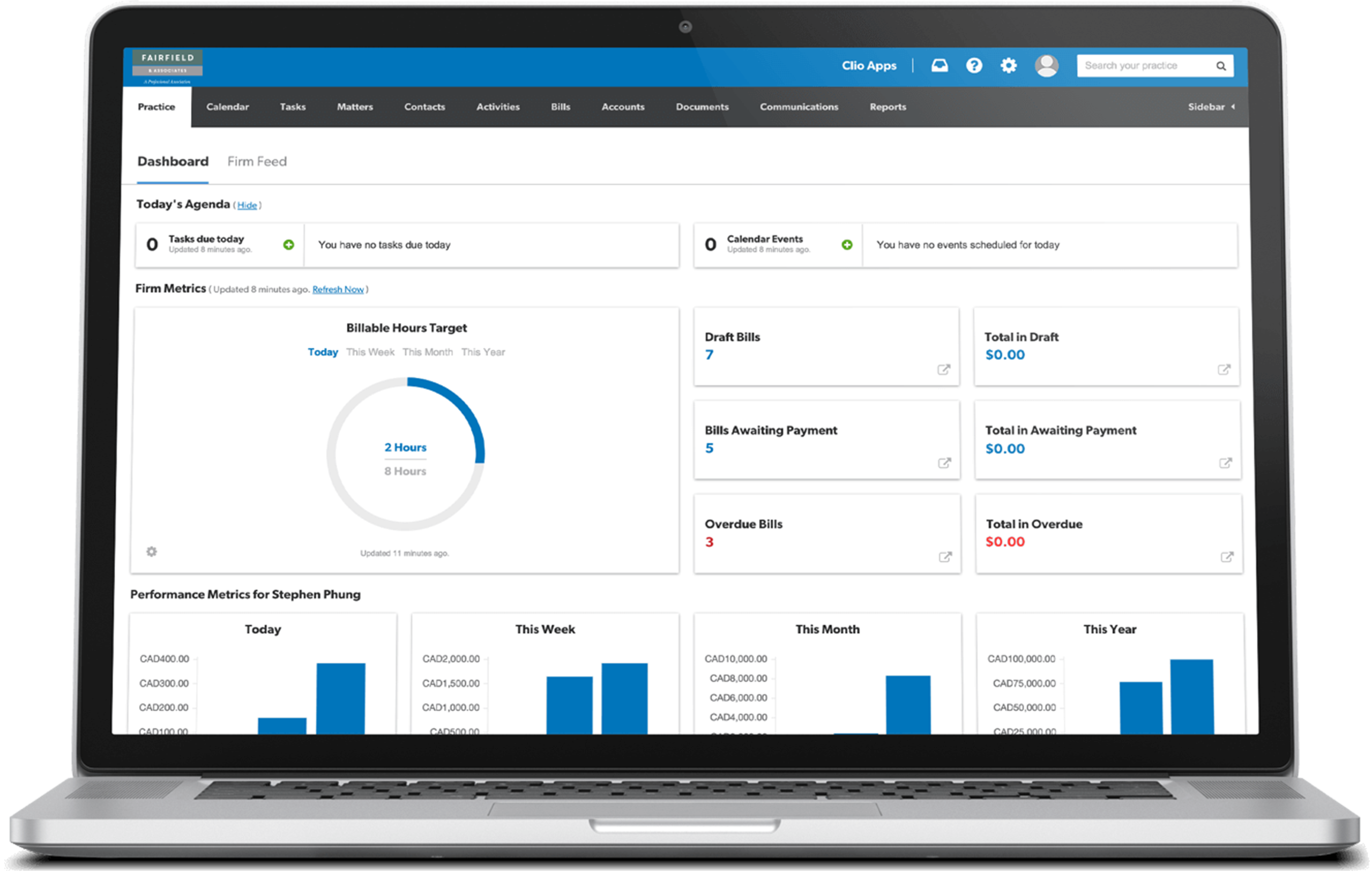
The deeper transformation was operational. We evaluated the legal software market, selected Clio, and moved sixteen years of legal data to the cloud. Client engagement rose 25%, operating costs fell 35%, and attorneys can now work their cases from anywhere.
Takeaway
Legal marketing leans on credentials because credentials are easy to list. The harder thing to show is character, and character was what clients were actually recommending when they sent their friends to Fairfield.
The work translated a place into a practice. Clients already trusted the coastline, the courthouse steps, the neighbor who holds the door. Maine was the brand Fairfield had been practicing all along. We made it visible, then rebuilt the firm’s foundations so the practice could keep the promise the brand now makes.
What We Built
Brand & Identity
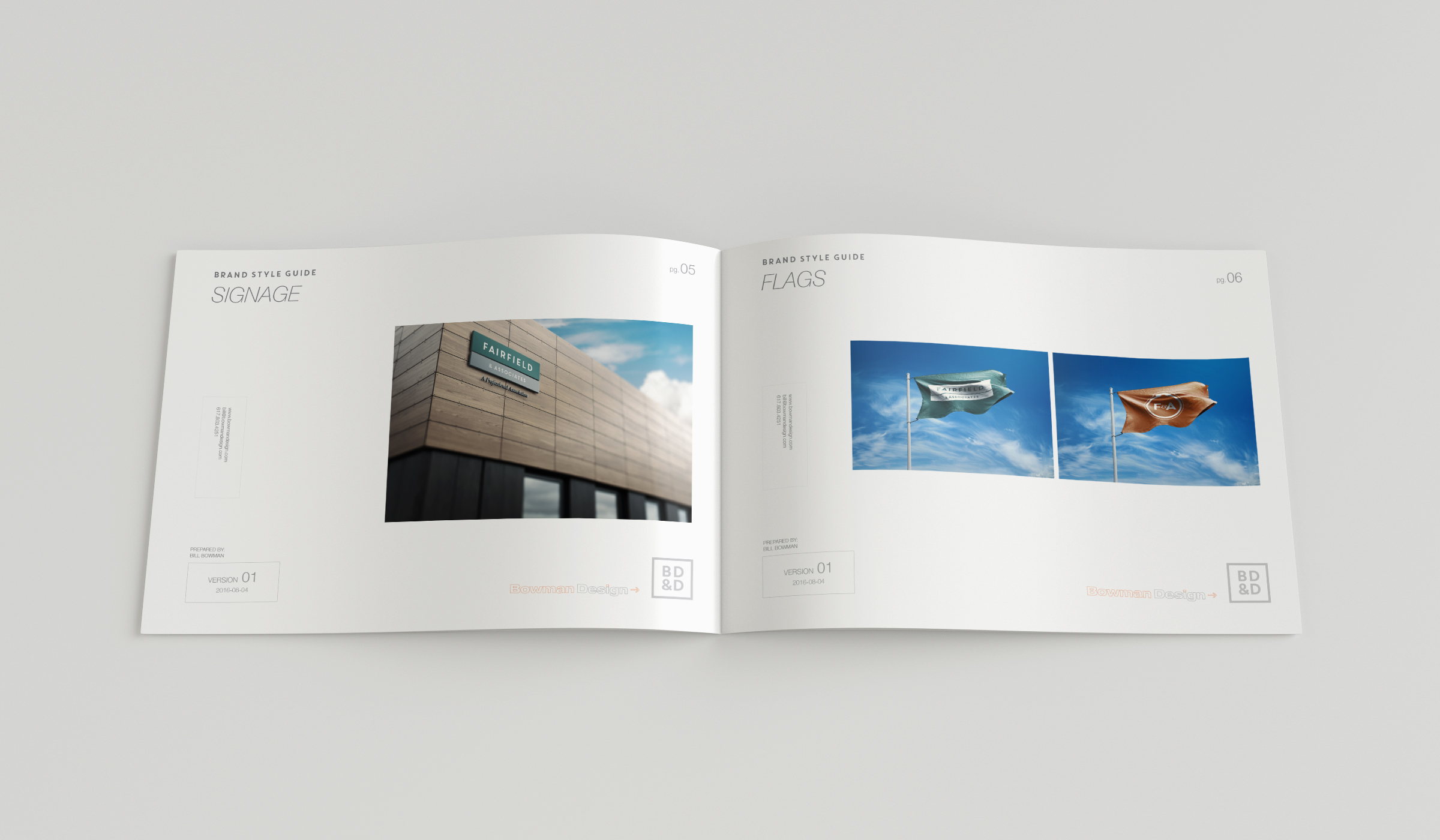
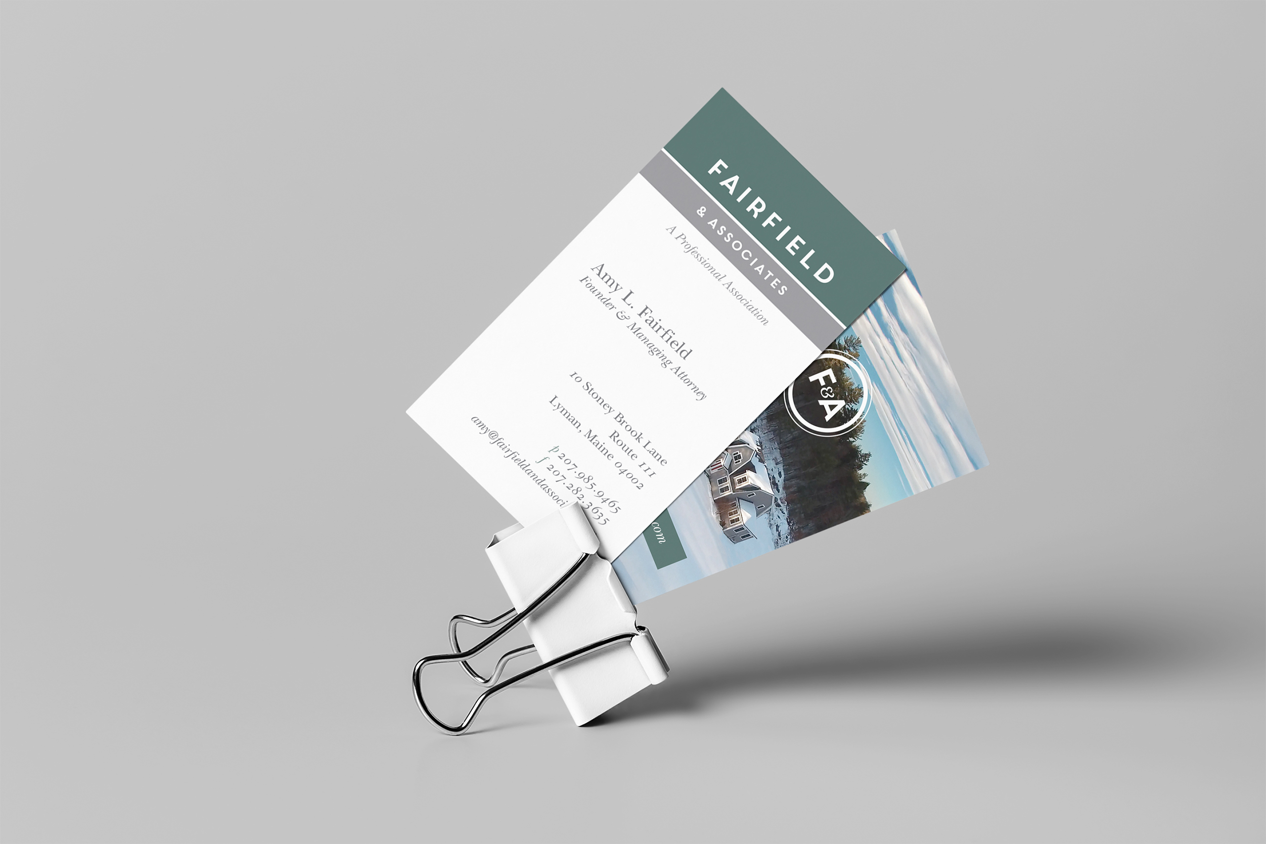
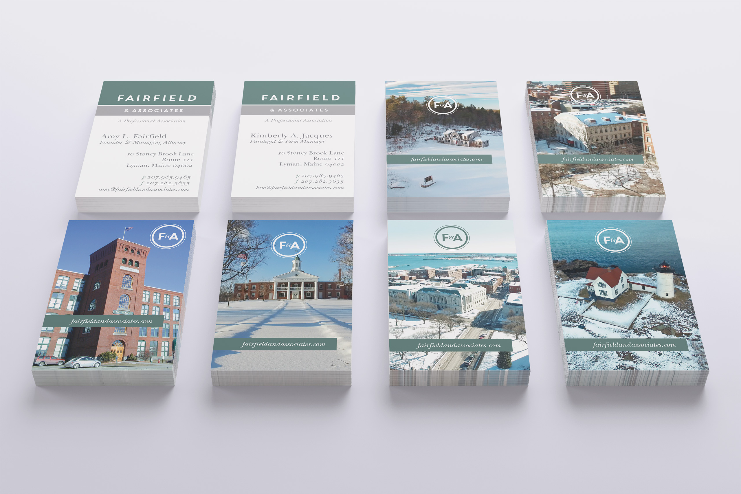
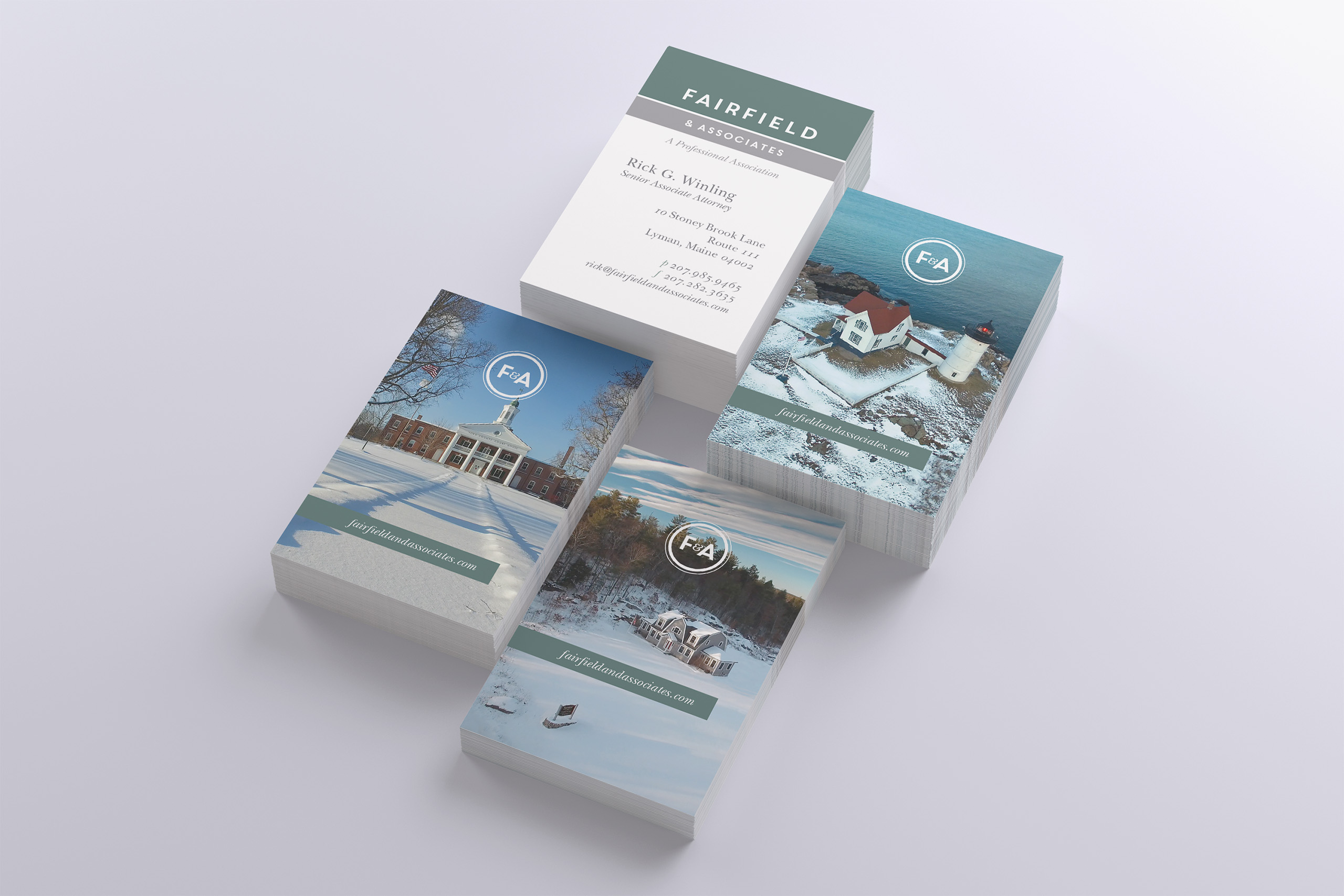
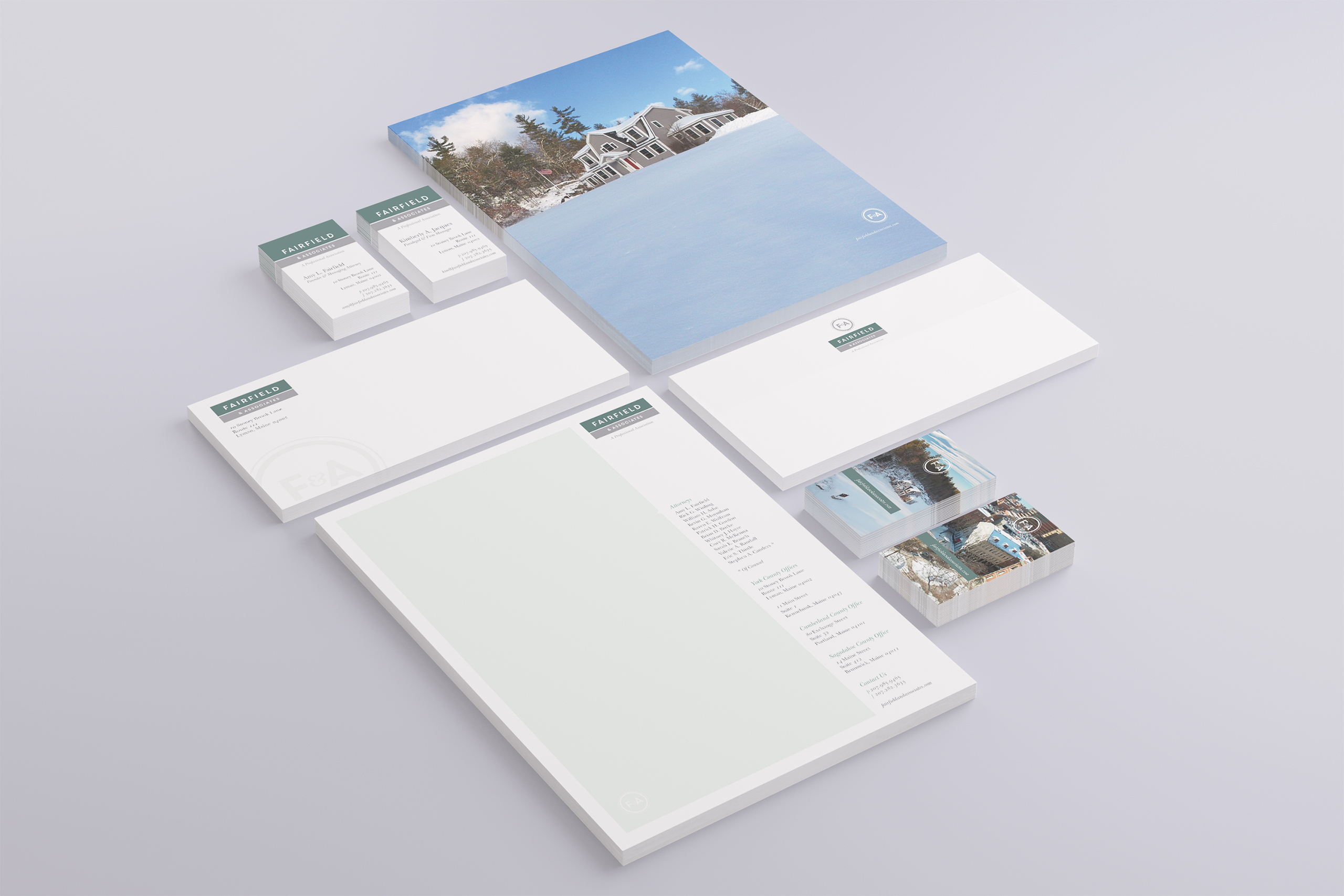
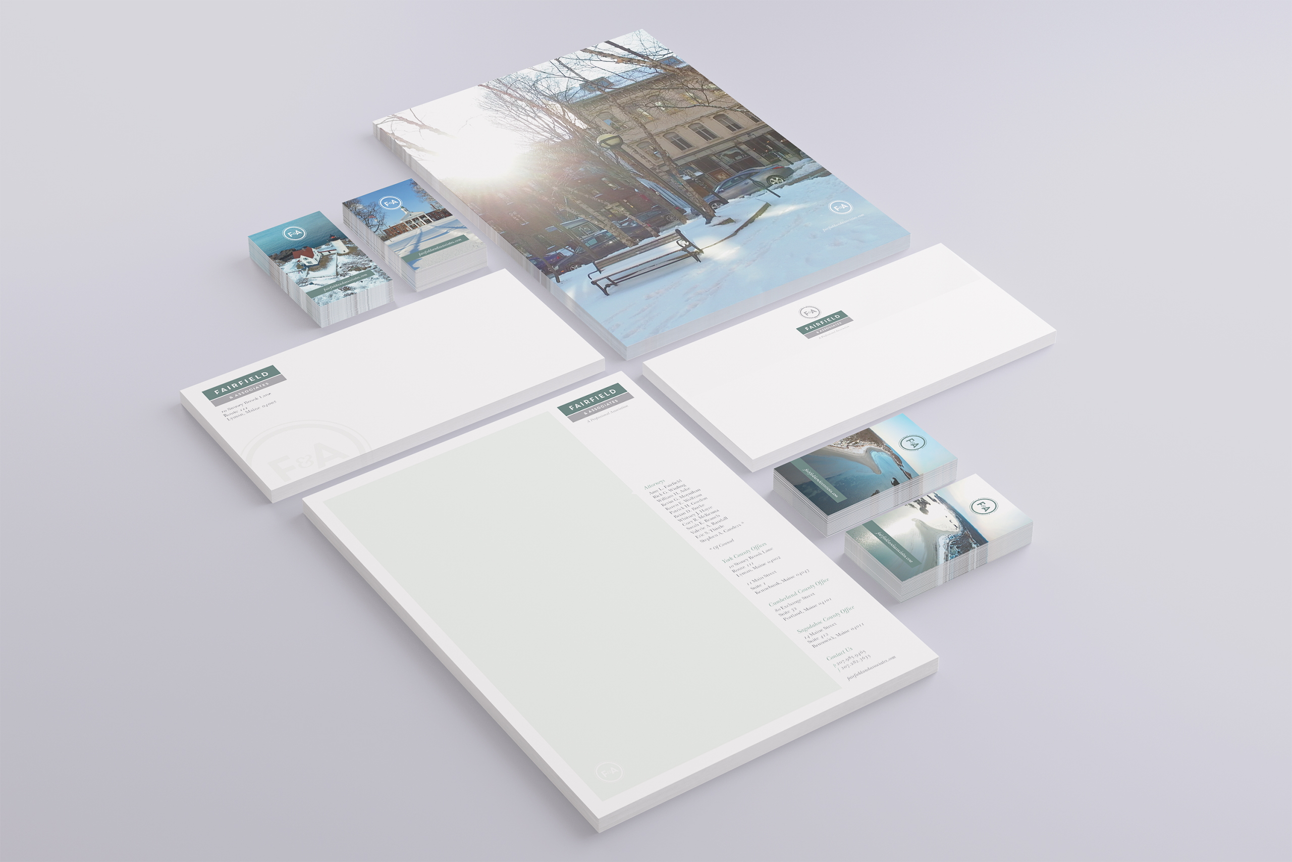
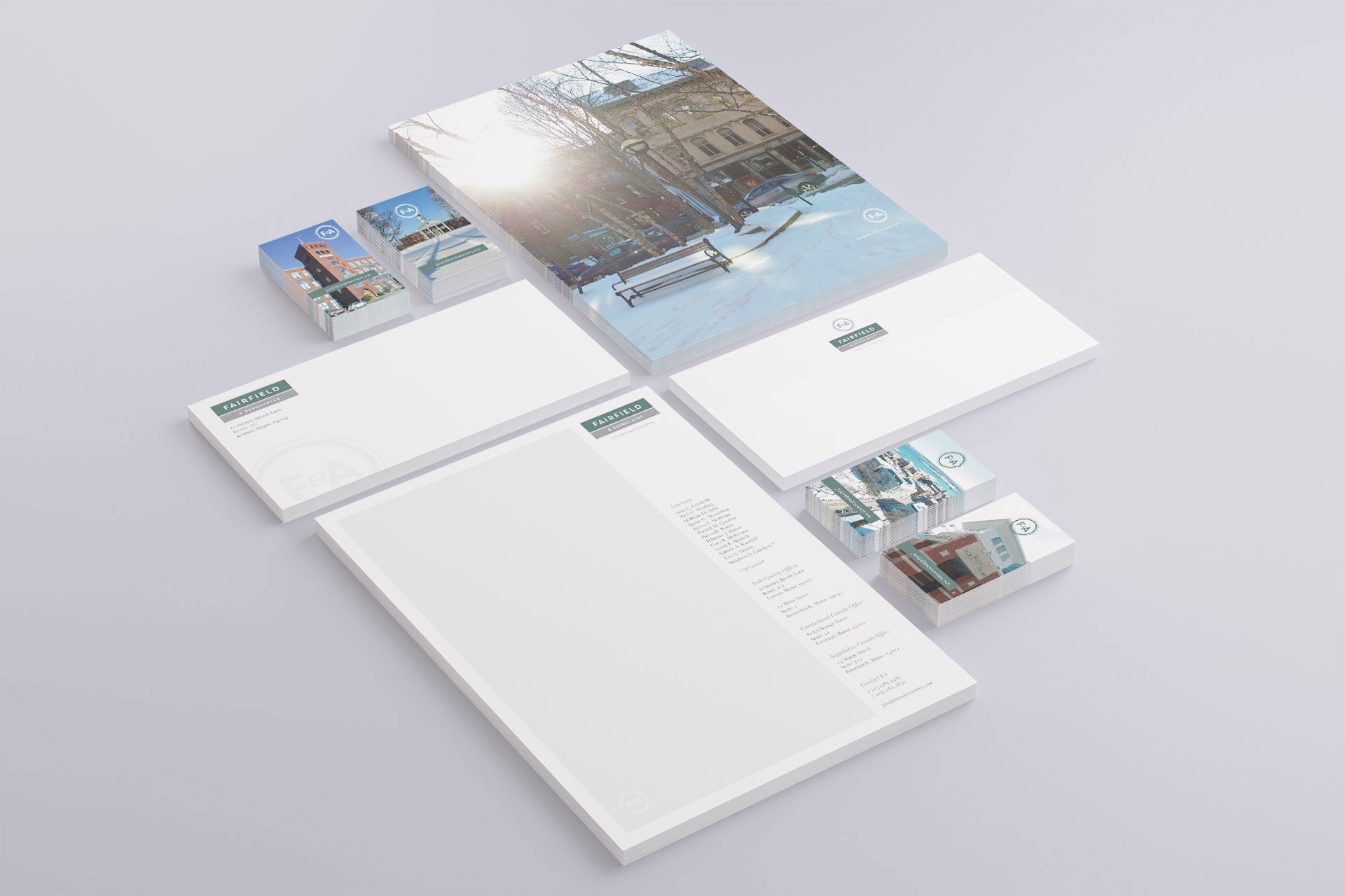
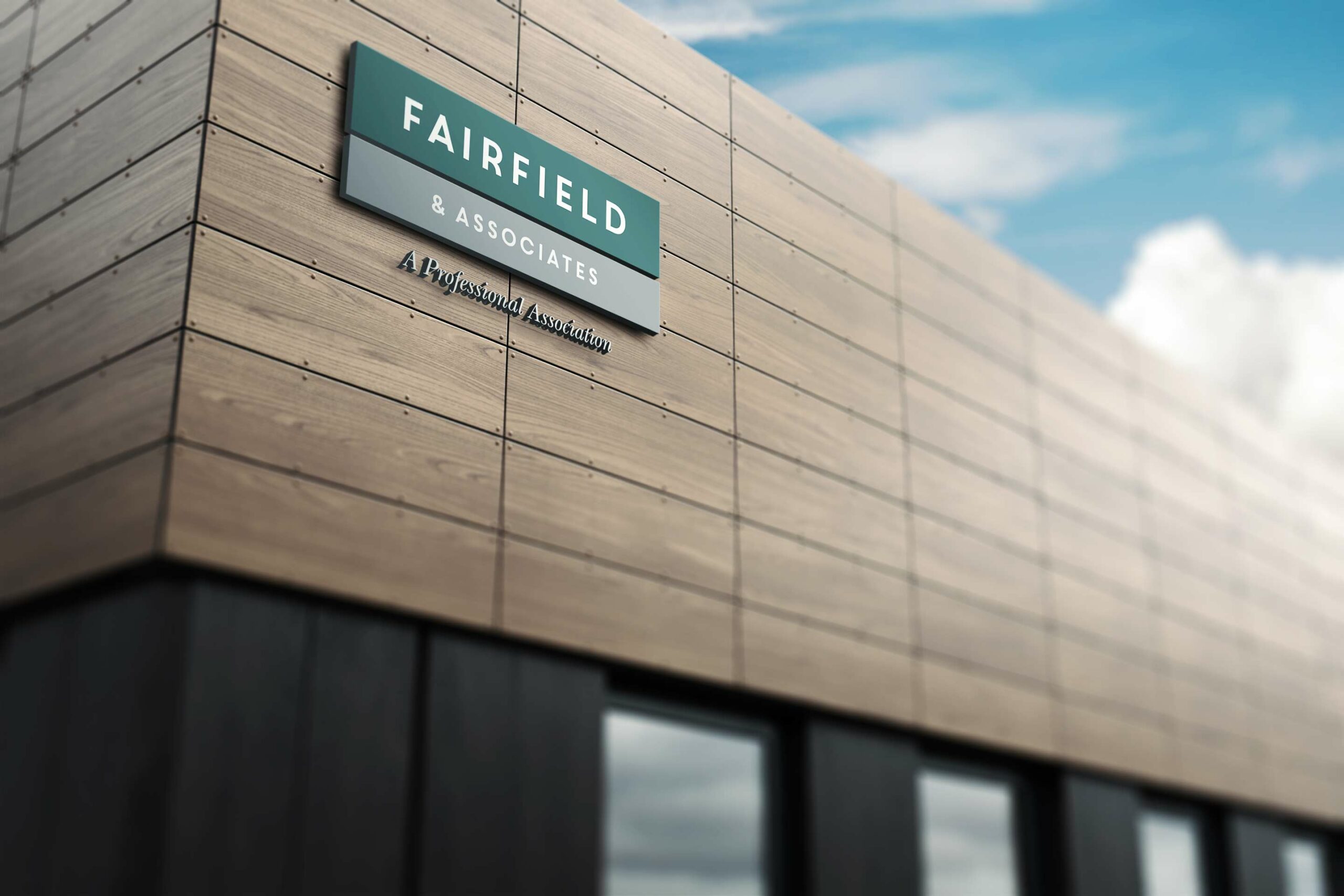
We designed an identity that carries the firm’s warmth without surrendering its authority: a circular F&A monogram, a coastal palette, and typography that reads established rather than aggressive. Stationery, business cards, and signage carry the brand from the office to the courthouse.
The Story on Film
Attorneys are hard to schedule, so we let Maine speak first. Drone cinematography over Nubble Light and Goose Rocks Beach, a firm story, and individual films for every attorney give clients a way to meet the firm before ever calling it.
Practice in the Cloud
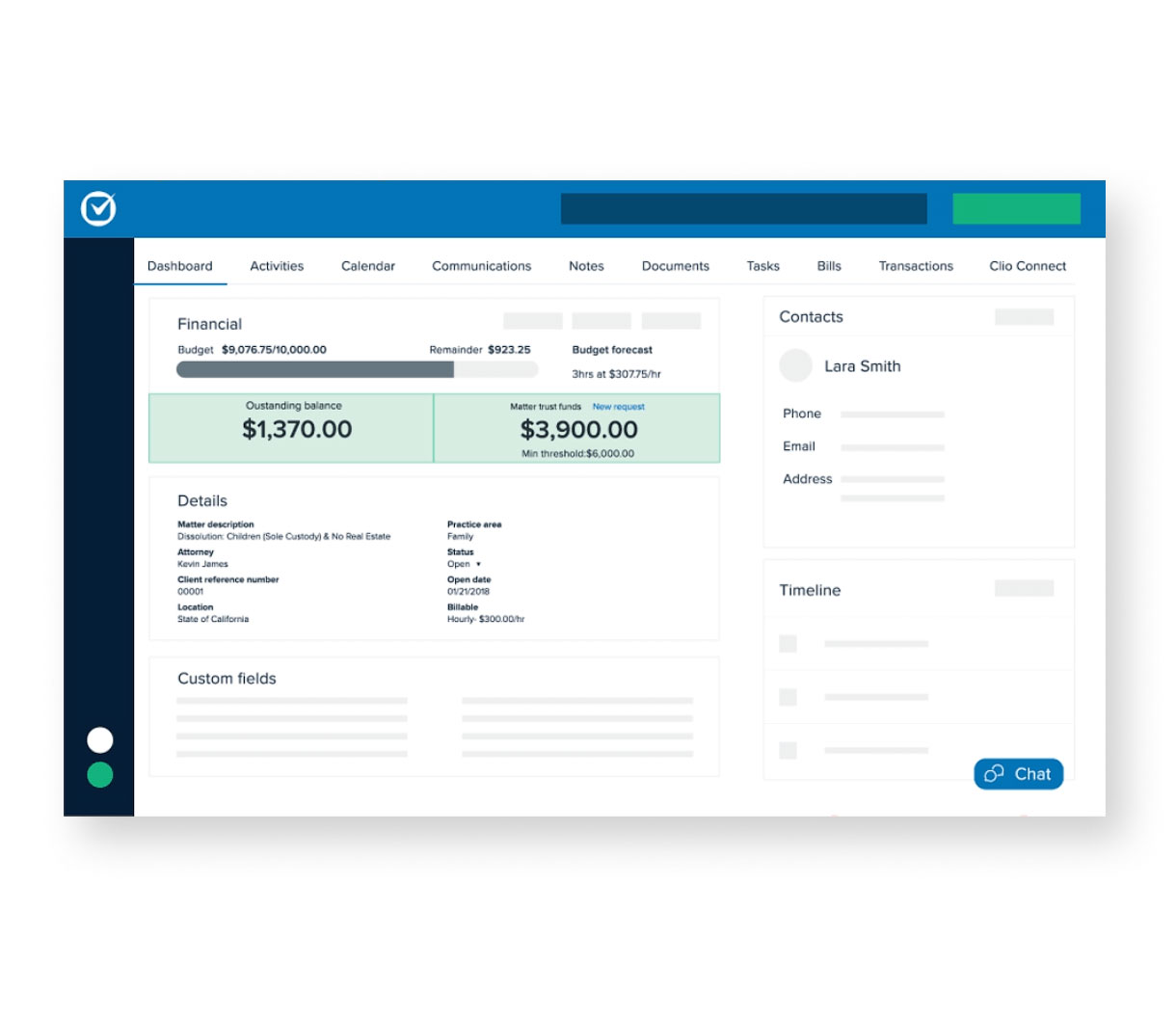
We evaluated the legal software market, selected Clio, and migrated sixteen years of casework to the cloud. Administrators, paralegals, and attorneys now collaborate on any case from any device, in the office or at the courthouse.
Website & Messaging
The new website puts the firm’s people and place forward, organizes five practice areas around the questions clients actually arrive with, and carries one voice through messaging, content, and social. Warmth on the surface, structure underneath.

The Through-Line
The firm that felt like Maine in person finally feels like Maine everywhere else.
Clients used to meet a generic law brand. Now they meet the coast, the courthouse, and the faces of the people who will answer the phone. Referrals used to arrive on reputation alone. Now the films confirm in three minutes what a recommendation could only promise.
The office used to close when the door did. Now sixteen years of casework travels with every attorney, from the conference room to the courthouse hallway.
The letterhead used to be paperwork. Now it carries the shoreline. The signage used to mark a building. Now it marks the firm’s place in its community.
None of these were separate projects. One insight, that people trust the place before the practice, decided every deliverable that followed.
Every Deliverable Made the Firm Easier to Trust.
Discovery + Strategy
Before design, we found the one thing the firm had that no competitor could copy.
Business Roadmap
The discovery came first: clients chose Fairfield for how it treated them, then stayed for how it fought for them. The roadmap simply took that truth seriously, aiming every investment at trust: brand, film, website, and the systems behind them.
Brand Architecture
If humanity is the differentiator, the brand cannot look like armor. The architecture translates warmth into structure, an established monogram for authority and coastal color for kindness, so both truths are visible at once.
Audience Architecture
Humanity means meeting people where their fear lives. A family in probate and a business in litigation need different reassurance, so each practice area answers its own audience in the same warm, plain voice.
The Maine Strategy
The insight needed a face, and the attorneys could not always be in the room. Maine could. The coastline, the courthouse, and the light became the firm’s stand-in: the place carrying the character until the people can.
Content & Marketing System
Film turned the discovery into something a stranger can feel. The firm story, the attorney films, and the social content all hand the same warmth forward, so every channel makes the first meeting easier.
Competitive Positioning
Every firm claims experience and results. None can claim this firm’s people or its place. We positioned Fairfield exactly there, on the one truth competitors cannot copy: the law firm that feels like Maine.
Brand Identity
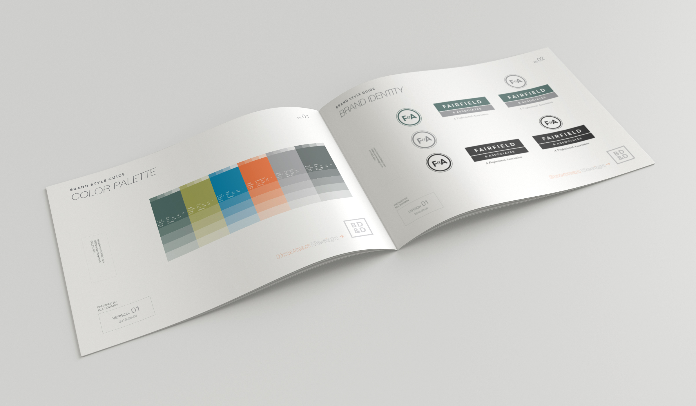
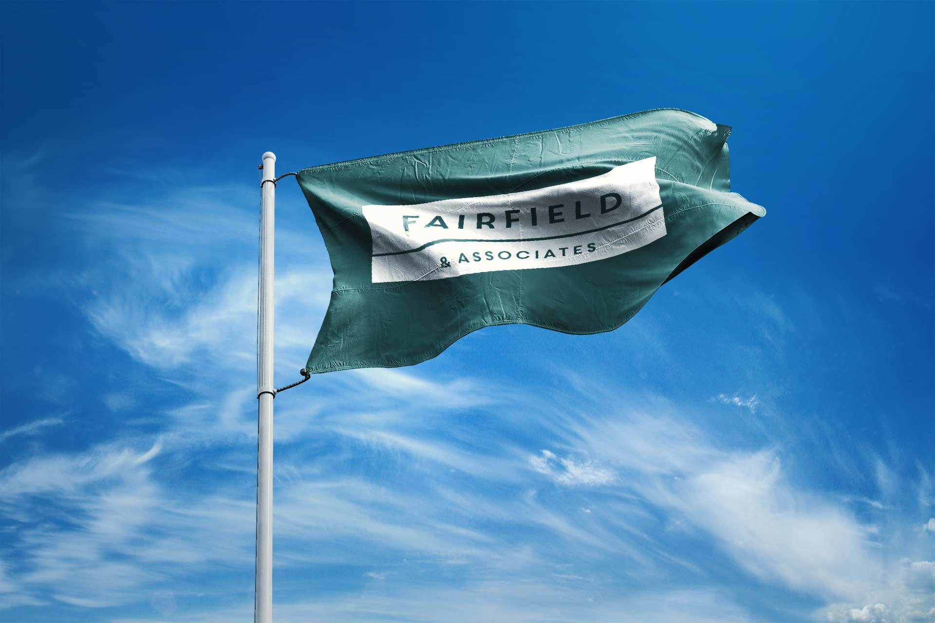
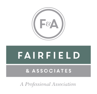
The identity is the first translation of the discovery. If the firm’s real differentiator is its humanity, the brand cannot posture; it has to welcome. A circular F&A monogram anchors the system, and the wordmark sits in a field of sea green with the quiet confidence of a firm that has nothing to prove.
The palette is Maine in winter light: sea greens, slate blues, granite grays, and one deliberate flash of buoy orange. Each of the five practice areas carries its own color, one family with five doors in.
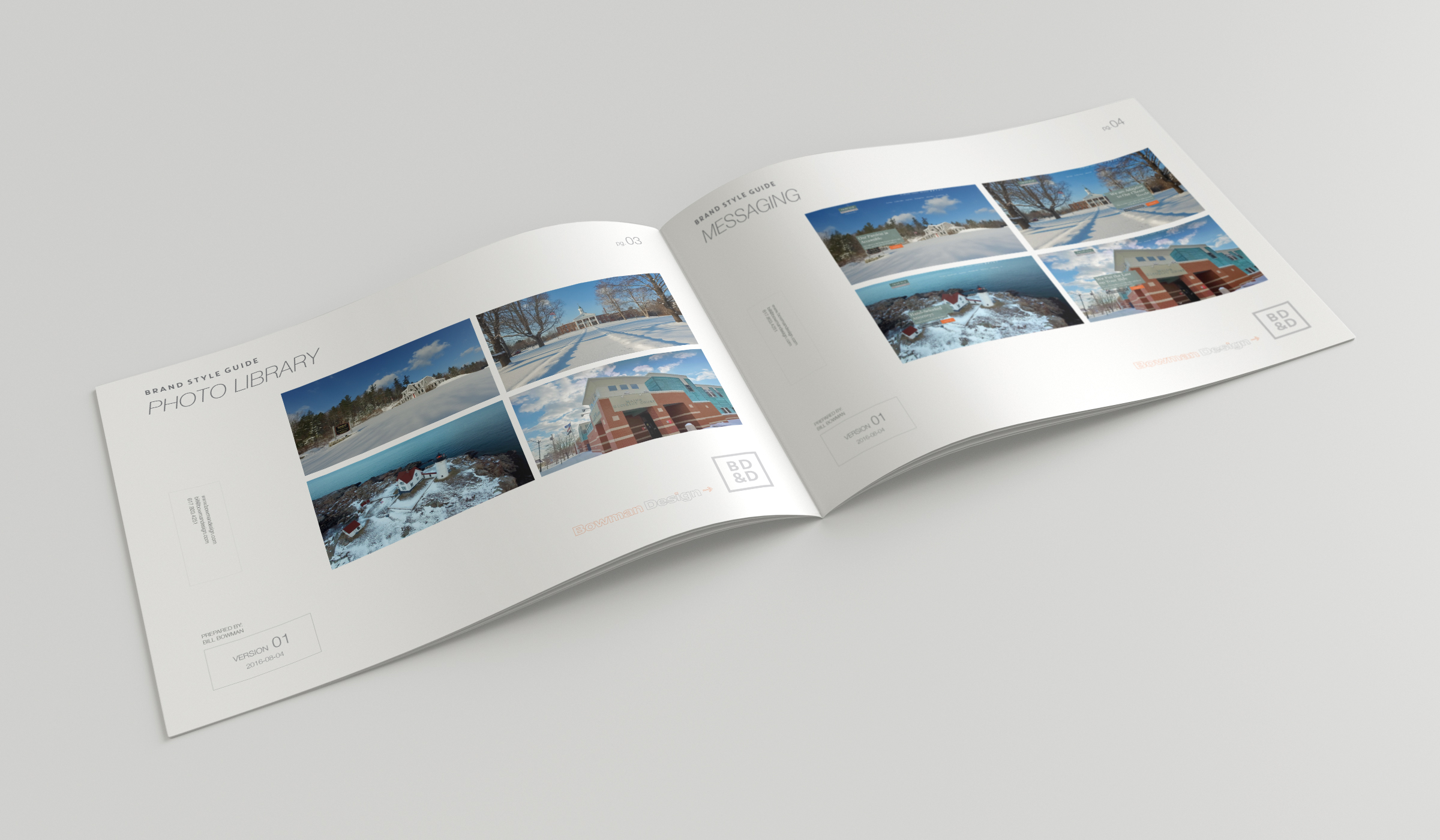
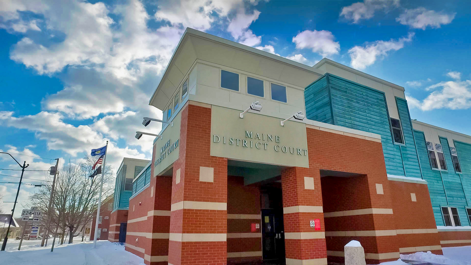
Photography completes the translation. Nubble Light, Goose Rocks Beach, and the York County Courthouse move across letterhead, business cards, and the web, so every touchpoint carries the place that taught the firm its manners. The imagery gives the identity a sense of belonging, grounding a growing practice in the communities, landscape, and institutions its clients already know.
The result reassures before it argues. Clients meet the coast, then the people, then the credentials, in that order. By the third step, the trust is already there.
Color System

Style Guide
Photography

Business Cards
Letterhead System

Flags
Signage
Marketing & Brand Awareness
Video Storytelling
The next translation had to solve a scheduling problem. Attorneys are nearly impossible to book after the first meeting, and humanity you cannot meet is humanity you have to take on faith. So we built the production plan around a single day and filmed everyone.
That one day became a library: a firm story, an individual film for every attorney, and the aerial footage that gives the brand its sense of place. Prospective clients now meet the attorney, hear the voice, and feel the kindness before they ever call.
The numbers carry the rest: 140 years of combined experience, 25,000 successful cases, 10,000 happy clients.
Marketing became the discovery extended into the public. Attorney films feed the social channels, the website turns attention into consultations, and print, digital, video, and the building’s own signage speak with one warmth.
Client engagement rose 25%. Not because the firm said more, but because every channel finally said the same true thing.
Back Office Transformation
This is where the story seems to change subjects, and does not. A firm’s humanity is measured in its responsiveness: the returned call, the answer at the courthouse, the file that is never out of reach. The old systems made kindness slow. So the same discovery that chose the coastline chose the software.
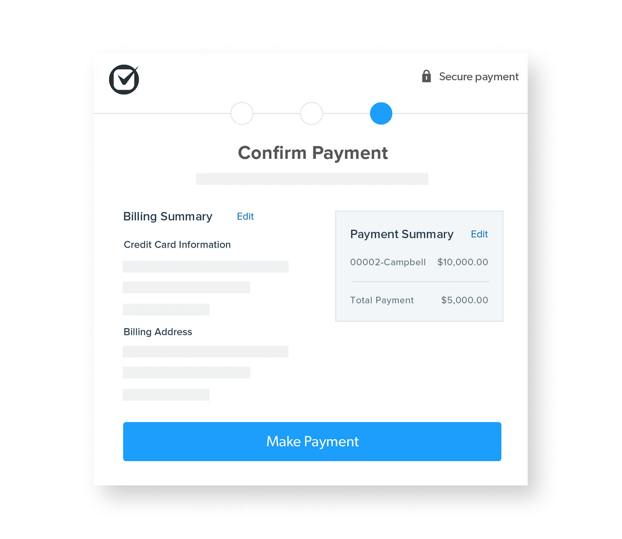
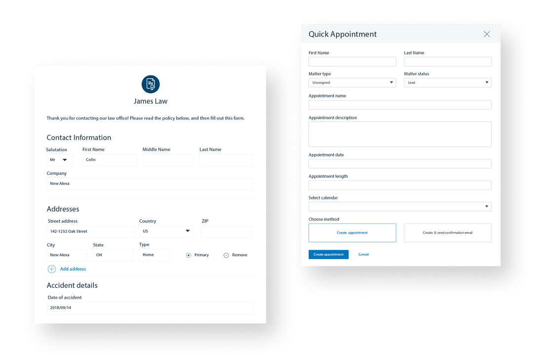
We evaluated the leading legal practice platforms against Fairfield’s real workflow, selected Clio, and migrated sixteen years of cases, contacts, calendars, and documents to the cloud. Administrators, paralegals, and attorneys now work the same live file from any device, intake moved online, and operating costs fell 35%.
We evaluated the leading legal practice platforms against Fairfield’s real workflow, selected Clio, and migrated sixteen years of cases, contacts, calendars, and documents to the cloud. Administrators, paralegals, and attorneys now work the same live file from any device, intake moved online, and operating costs fell 35%.
Website + Client Experience
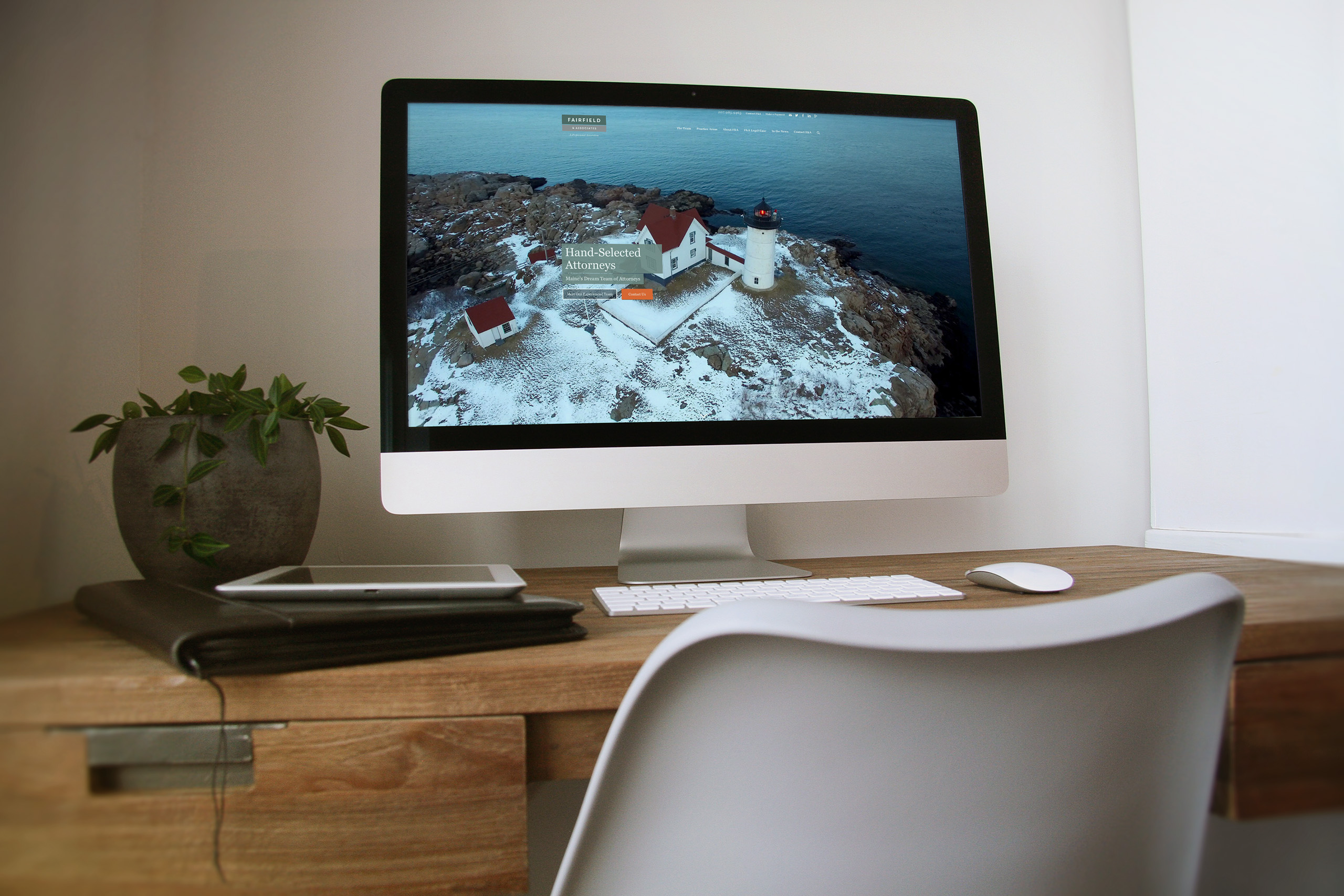
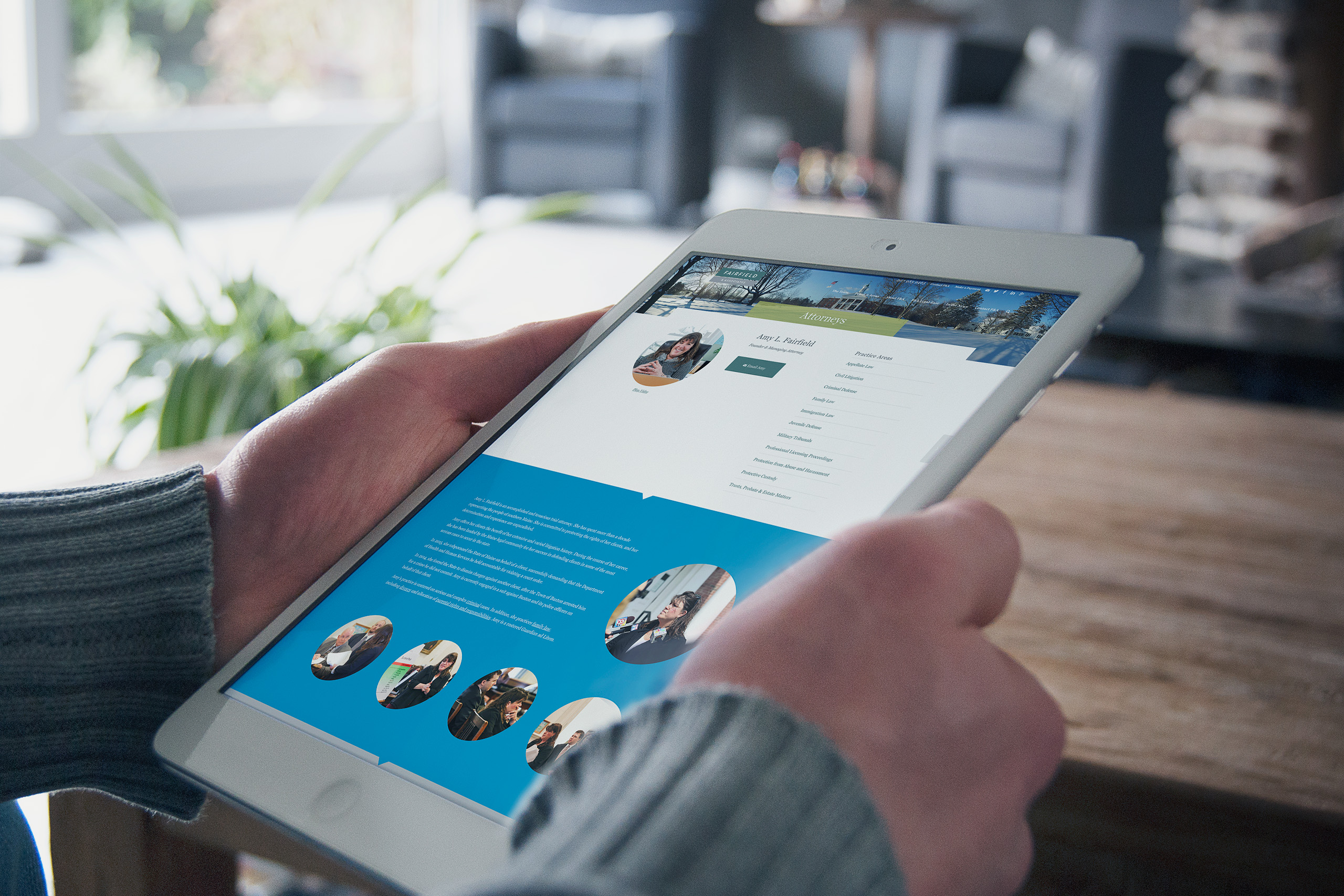
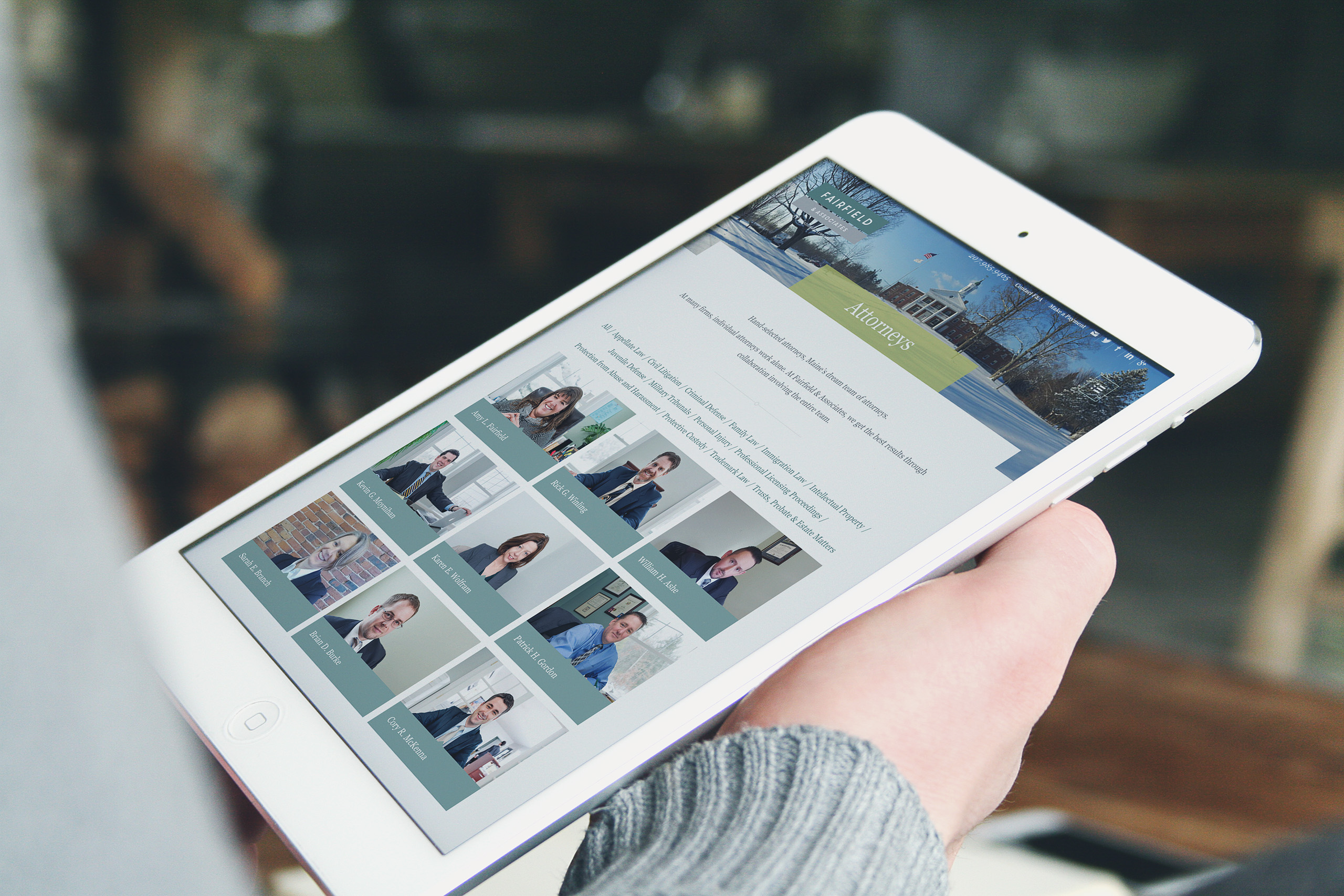
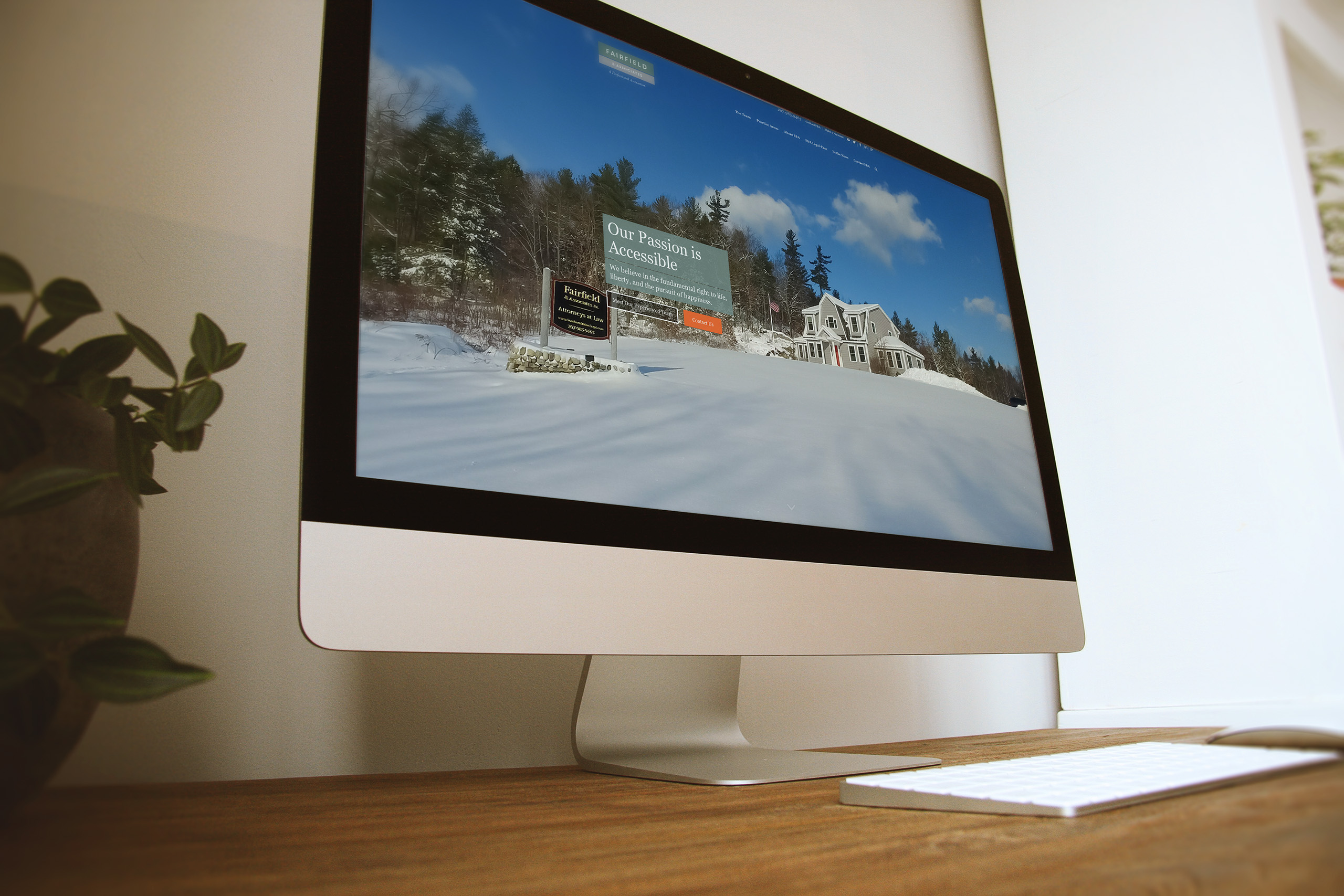
The website is where every translation meets the client. Maine fills the screen, the attorneys introduce themselves on film, and five practice areas answer the questions people actually arrive with, from criminal defense to trusts and estates.
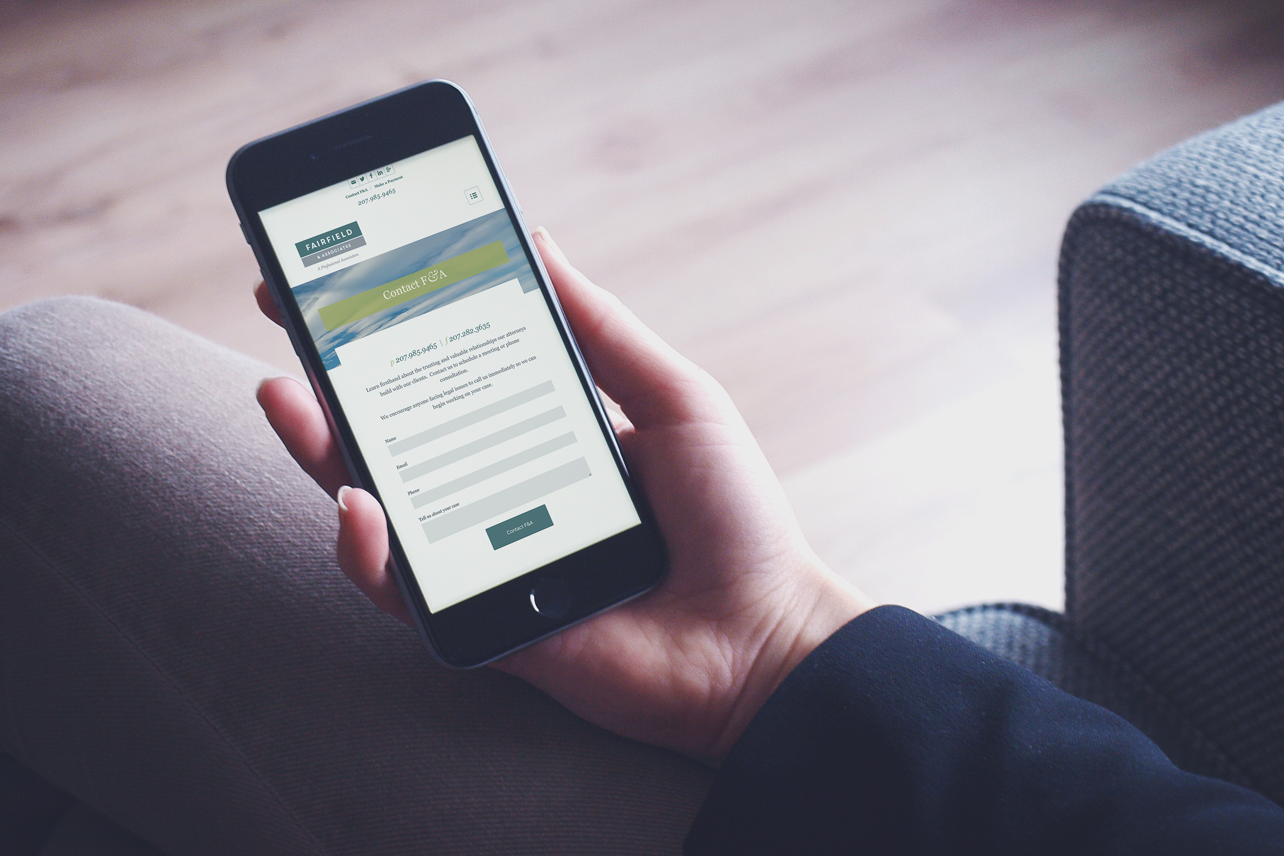
The warmth is backed by the operations work. A visitor can move from watching an attorney’s film to booking a consultation without friction, and the cloud practice picks the relationship up from intake to resolution. The outside promise and the inside reality finally match.