Step 1
Define the Message
Every page begins with a clear point of view. Headlines, supporting copy, and calls to action are developed first, ensuring every design communicates a consistent message before visual elements are applied.

Yellowbrick set out to reinvent the data warehouse so enterprises could modernize and manage their data anywhere, across on-premises and cloud, at their own pace. The brand promise was already sharp:
Your Data Anywhere.
Bowman Design Direction designed and built the Yellowbrick website end to end in about two months. Along the way we built what the website needed to exist: a design system elevated from mood boards, a comic-book layout engine invented for the story, and a publishing platform that put the brand in the hands of the people who run it. The website did not simply express the brand. It expanded it.
Yellowbrick had reinvented the data warehouse, and the category answered every buyer anxiety the same way: specifications, benchmarks, and fear. Enterprises stuck on legacy platforms did not need more of any of those. They were uneasy about costs they could not predict and migrations they could not control.
Inside the company, the story was just as hard to reach. The point of view lived in many heads and one long document. There were no wireframes to react to, no content pipeline to draw from, and a launch measured in weeks, not quarters.
The insight arrived by doing. When planning stalled, we built. The sitemap went up as live navigation the team could finally see and react to. The BDD IA Doc gave writers structured content frames to fill instead of blank pages. People react faster than they invent, and structure pulled the story out of the organization.
The comic-book direction came from something real: the CEO’s genuine affinity for comics. That affinity gave the brand an authentic reason to be daring and visibly different from a conventional industry. We forged the brand constellation around the recovery of control and named it Controlled Vertigo. Meet the uneasiness of legacy lock-in with humor and irony. Answer it with confidence and ease. Energy on the surface, control underneath. The BDD IA Docs and publishing system gave that expressive language the structure to scale.
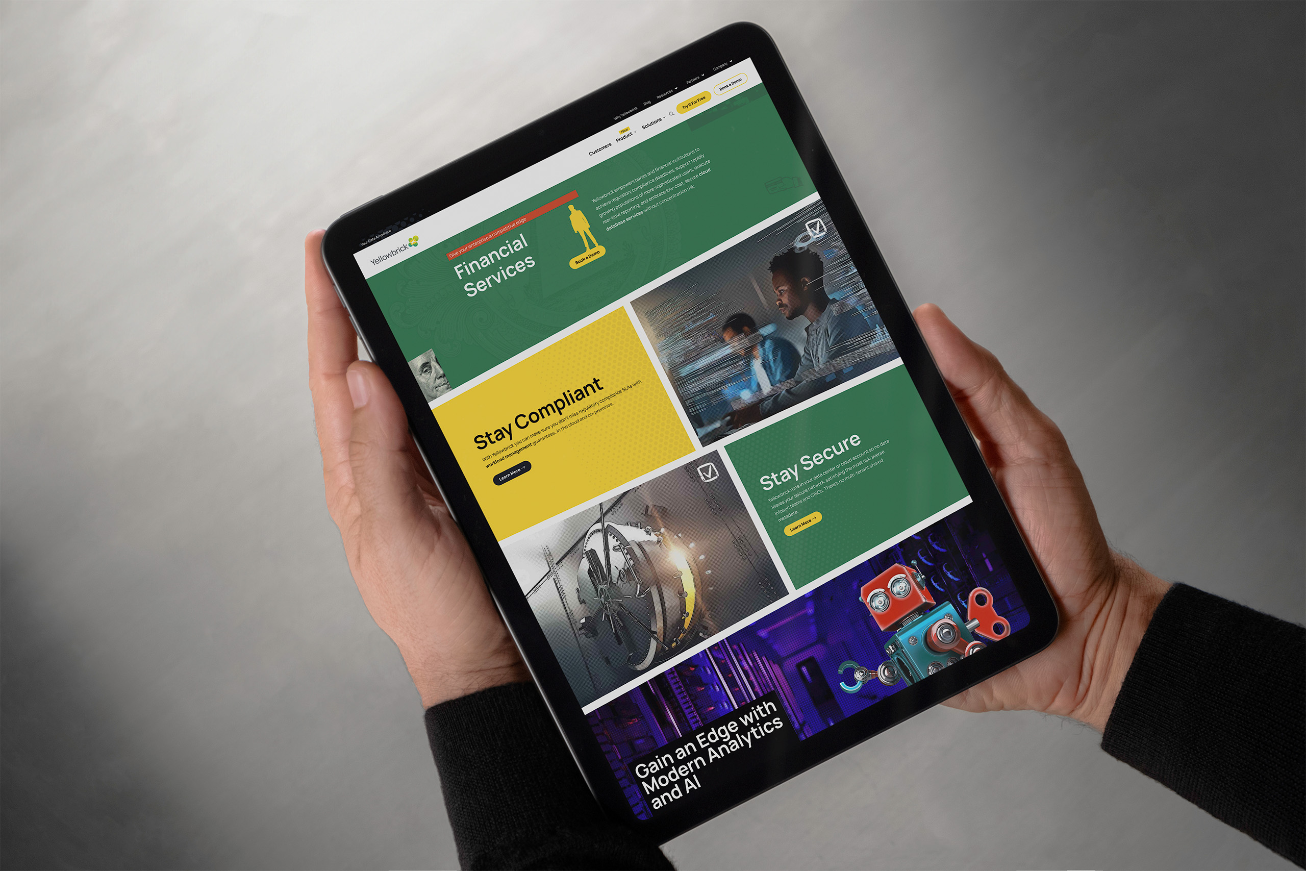
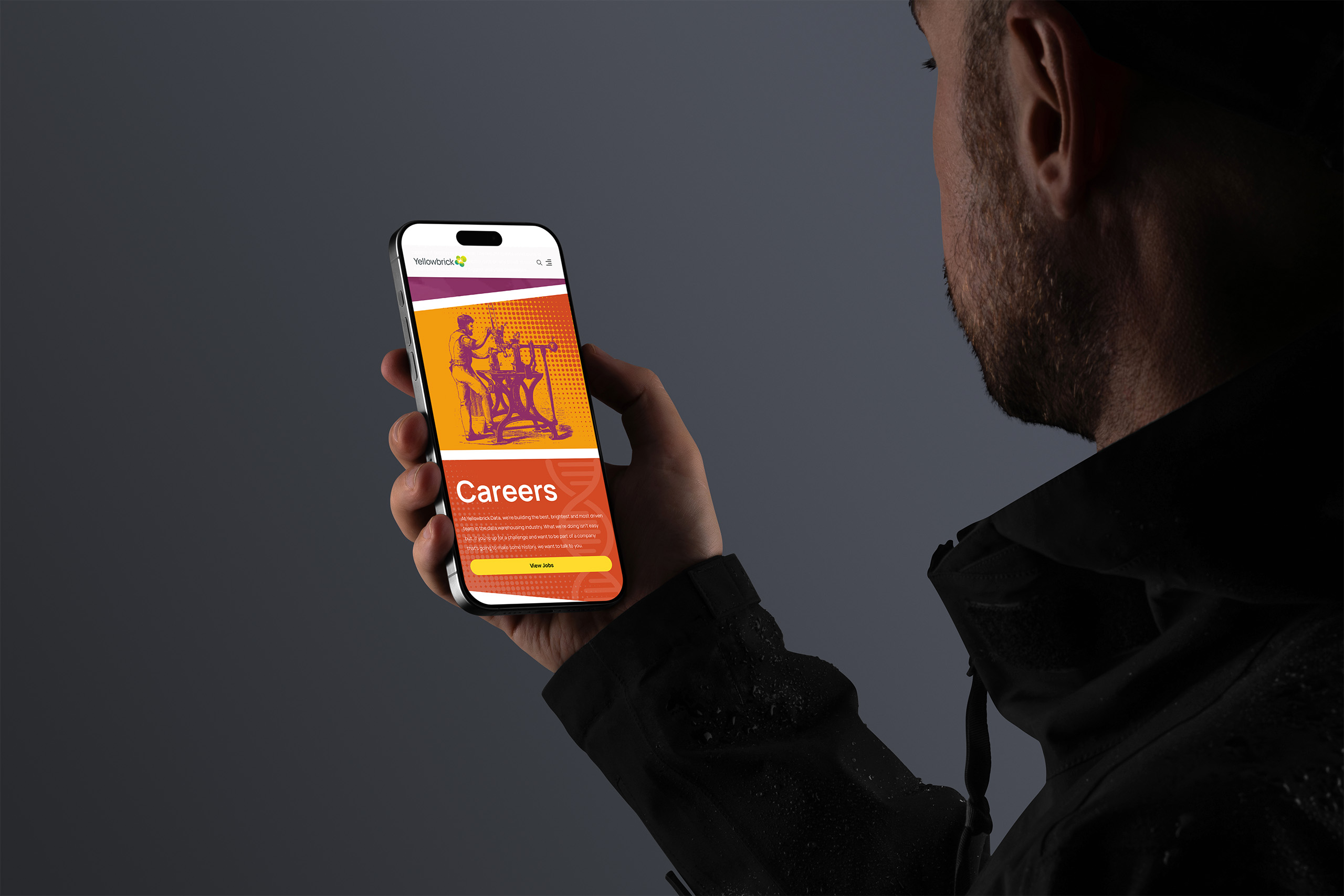
Yellowbrick launched with a website unlike anything in its category: a comic-book reading experience where every panel carries one direct message, personalized by persona and industry, from hedge funds to hospitality. The data company became the brand people remembered.
The system underneath changed how the company operates. Marketing publishes on-brand pages and campaigns without waiting on development. IT stays on the projects that need it. And the constellation keeps growing, from landing pages to trade show booths, datasheets, and t-shirts.
Enterprise technology brands keep their distance: serious, spec-led, safe. Yellowbrick could afford to be the memorable one because discipline made daring operable. A comic-book surface, personalized by persona, running on grids, templates, and type systems that keep every tilted panel on message. The daring is what people remember. The structure is why it worked.
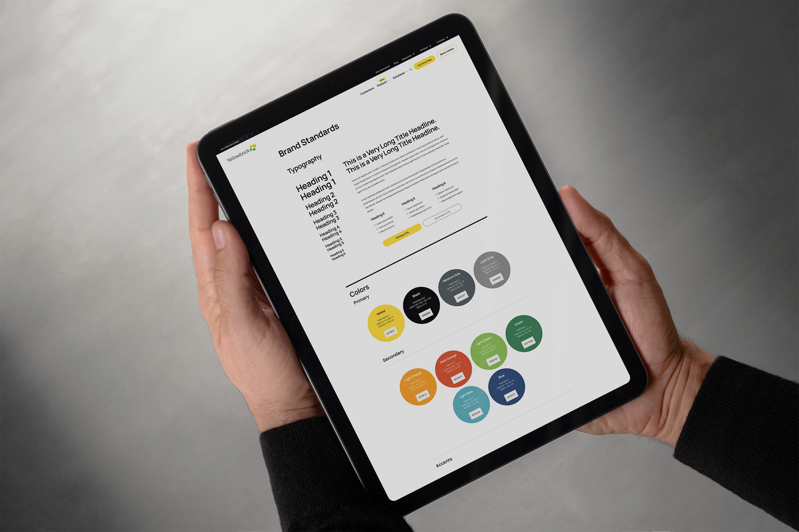
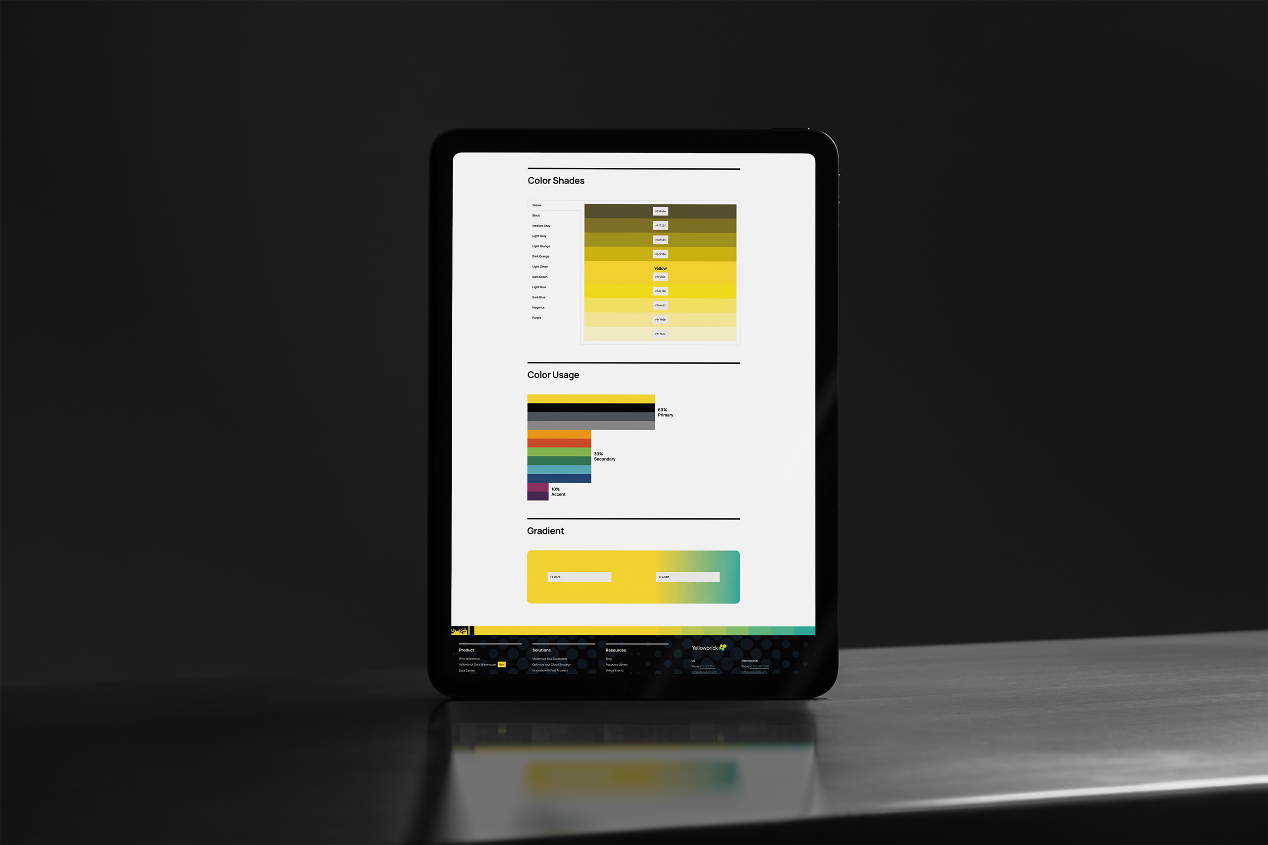
We expanded Yellowbrick’s existing logo into a complete digital brand system: a typography hierarchy formalized into stylesheets, a secondary palette, an illustration language inhabited by its own cast of characters, iconography, photography rules, and editorial patterns. Digital standards and a ready asset library made the system usable. The brand stopped being a mood and became a standard.
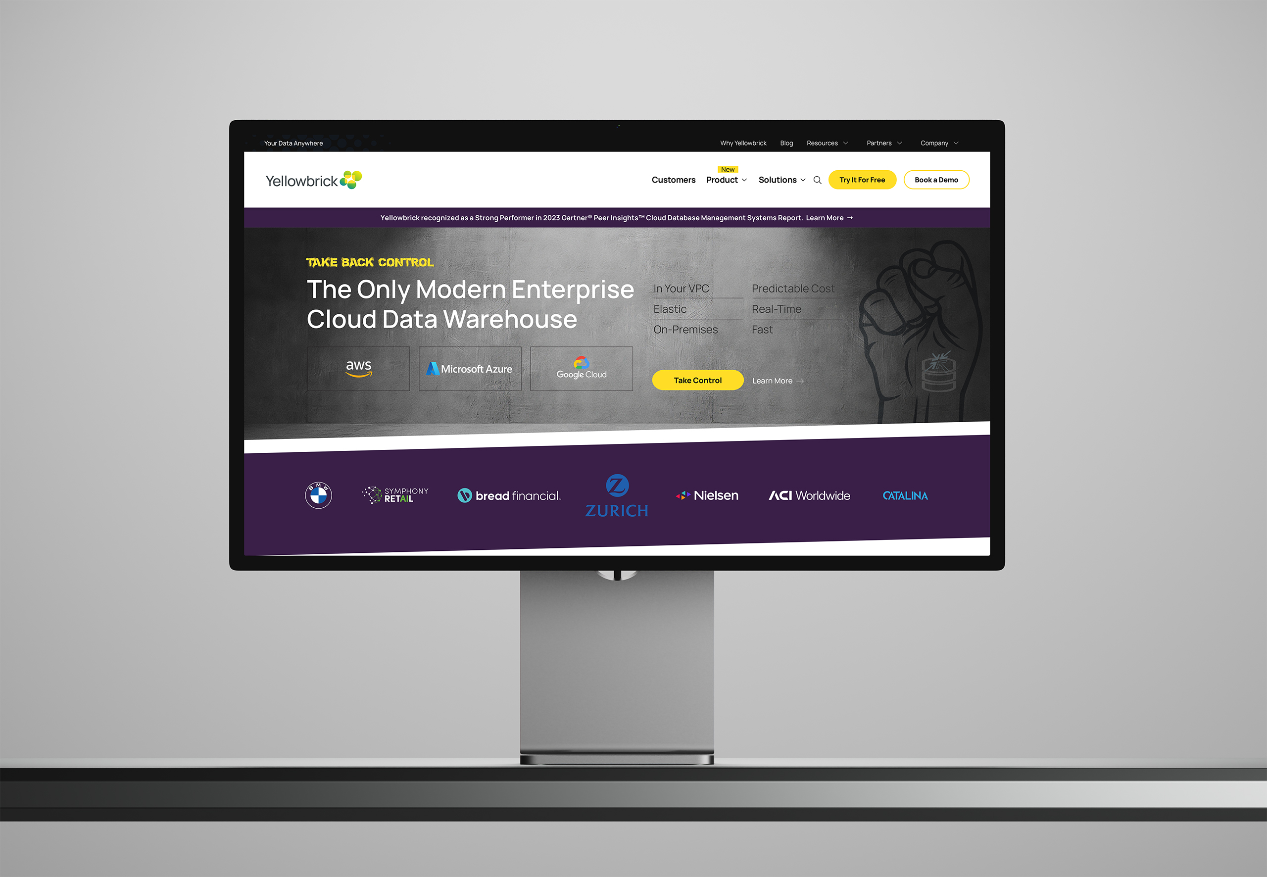
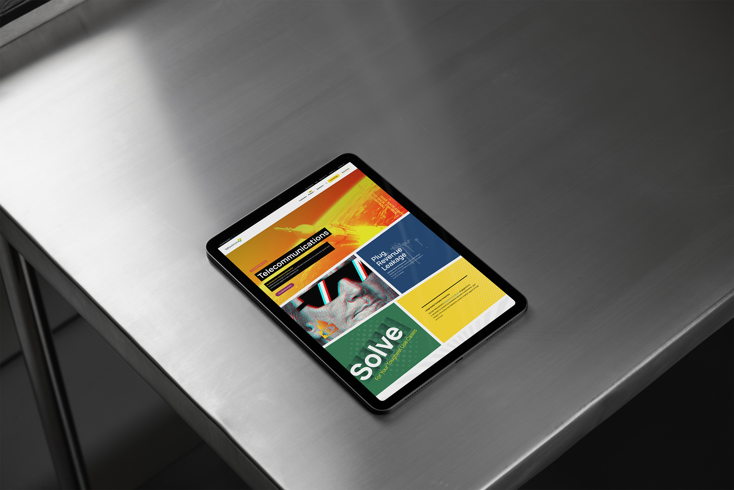
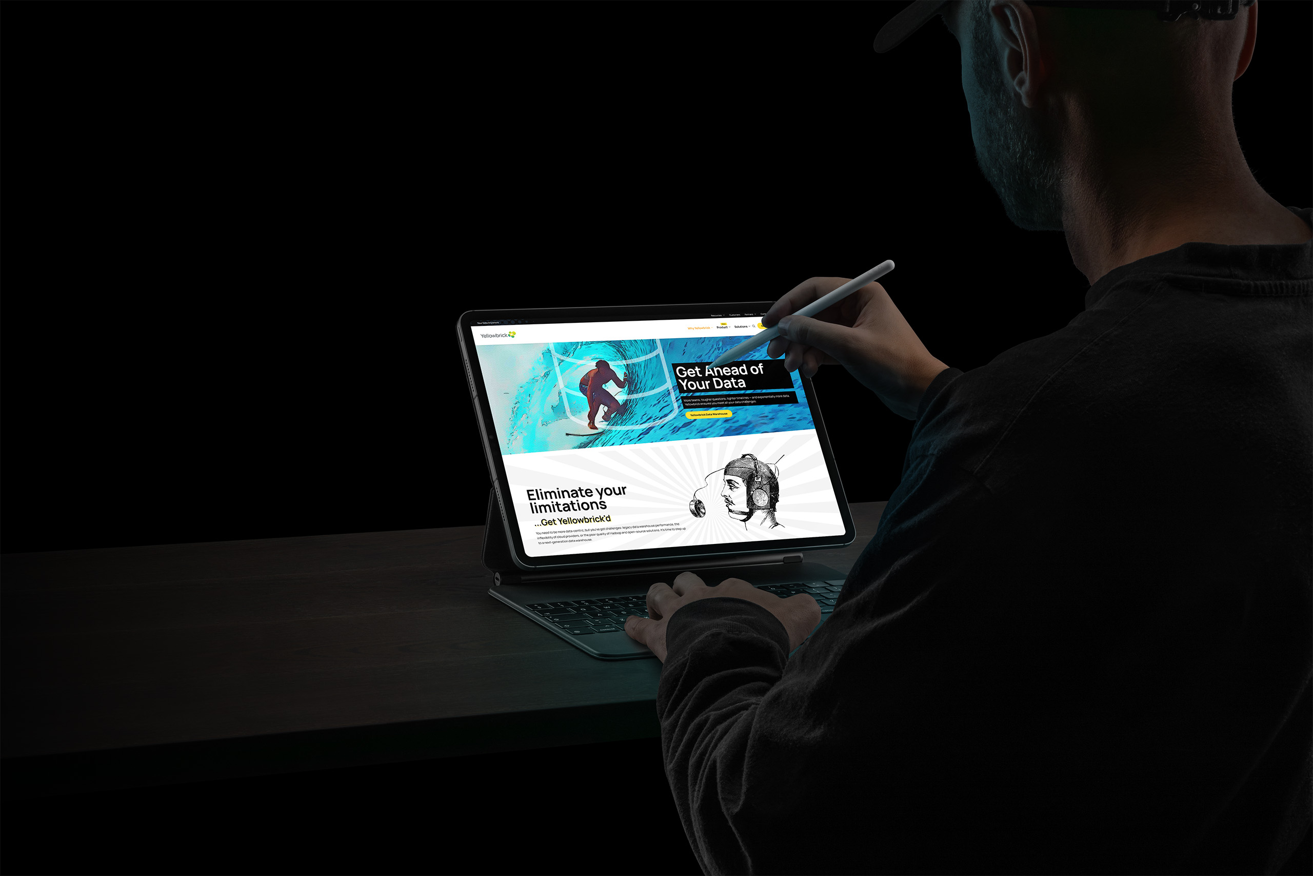
We designed and coded a rhomboid-based CSS framework that turns conventional grids into comic-book pages. Every rhomboid panel supports one direct message, so pages read as stories instead of scrolls. Energy in the composition, discipline in the system that renders it.
We extended the design system into a content management solution that both marketing and IT can operate. Marketing composes on-brand pages from grids, color systems, and typography without touching code. IT stays focused on bigger projects instead of day-to-day changes.
We built the templates that carry the brand beyond the website: feature images that travel with every blog post, datasheet, and white paper, landing pages personalized by persona and industry, and email signatures that put the brand in every inbox. The same identity now extends to trade show booths, video-call backgrounds, and t-shirts.
The design system set the terms: type in stylesheets, color as a governed palette, illustration invented instead of licensed. Every asset entered a library built for reuse, so consistency stopped depending on memory.
The layout engine put that discipline in motion. Comic-book panels tilt and collide on screen, yet every rhomboid is placed by a framework, sized by a grid, and typeset by a system. The energy is designed. Nothing about it is loose.
The publishing platform put the whole apparatus in marketing’s hands. Choose a grid, apply the color system and visual language, and ship a page that arrives on-brand by construction. Feature templates carry the same identity onto every blog post, datasheet, and white paper that leaves the building.
That is Controlled Vertigo as an operating principle. The brand leans as far as it likes, in any channel it likes, because the system underneath never loses its footing.
Before a page was designed, we built the structures that pulled the story out.
Discovery stalled, so we built the sitemap as live WordPress navigation. Stakeholders who could not imagine the architecture could suddenly see it, reorganize it, and react to it. Debate turned concrete, and the architecture settled in days.
The constellation Controlled Vertigo governed every brand decision. Humor acknowledges the uneasiness of legacy lock-in. Confidence and ease answer it. Emotional truth leads, and product proof follows close behind.
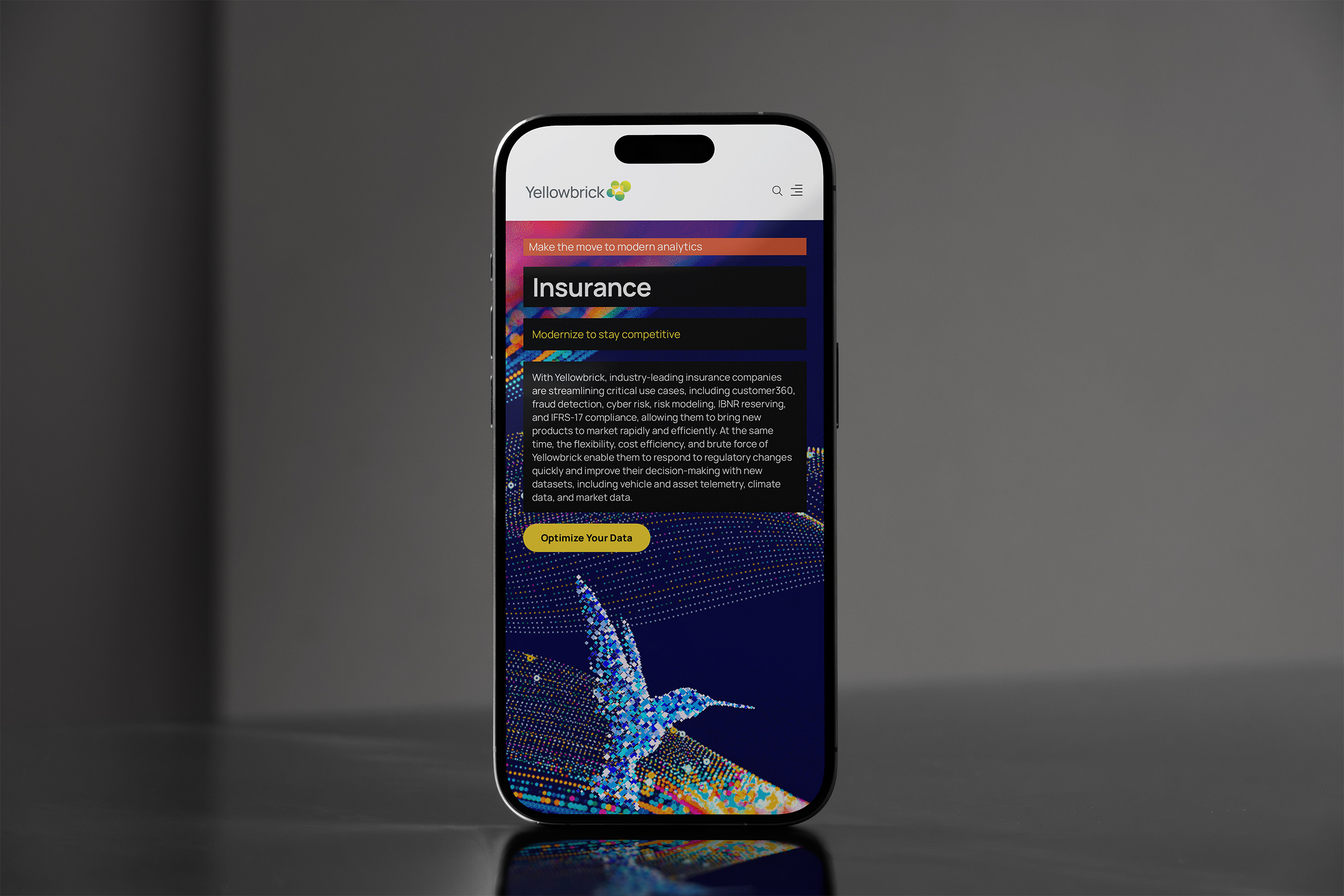
Financial services, hedge funds, insurance, telco, retail, hospitality. Each industry weighs risk differently. We mapped how each one hears the promise, so pages, features, and campaigns could speak to every persona directly.
Borrowed from Nashville session players, the BDD IA Docs used a number system for content. Every page declared its message boxes up front, so contracted writers could fill a clear structure instead of facing a blank page.
The brand had to outlive the engagement. We designed the workflow before the pages. Message, grid, layout engine, color, visual language, type. Six steps the team can run without us.
A category selling specifications and fear left the opening. We positioned Yellowbrick as the contemporary alternative, the platform that lets enterprises modernize at their own pace, anywhere their data lives.
Building a Scalable Publishing System
We developed a repeatable publishing workflow that enabled designers, marketers, and developers to collaborate efficiently. From strategy to publication, every step reinforced consistency, scalability, and brand integrity.
Step 1
Every page begins with a clear point of view. Headlines, supporting copy, and calls to action are developed first, ensuring every design communicates a consistent message before visual elements are applied.
Step 2
Choose from a library of reusable grid layouts designed for different storytelling needs. Each structure provides a flexible foundation that simplifies content placement while maintaining consistency across the site.

Step 3
Inspired by comic-book composition, a rhomboid-based CSS framework transforms conventional grids into dynamic editorial layouts while preserving a simple publishing workflow.

Step 4
Apply colors from the established brand color system to reinforce recognition and consistency. The palette adapts each layout to the organization’s identity while preserving a cohesive visual experience.

Step 5
Apply imagery, illustrations, textures, patterns, and editorial elements from a custom visual language designed specifically for Yellowbrick. Every asset reinforces the brand while enabling rapid, consistent page creation.

Step 6
The typography system applies hierarchy, spacing, and responsive styling to create a polished, readable layout. Once complete, the page is ready to publish with a consistent editorial presentation.

Extending the Publishing System
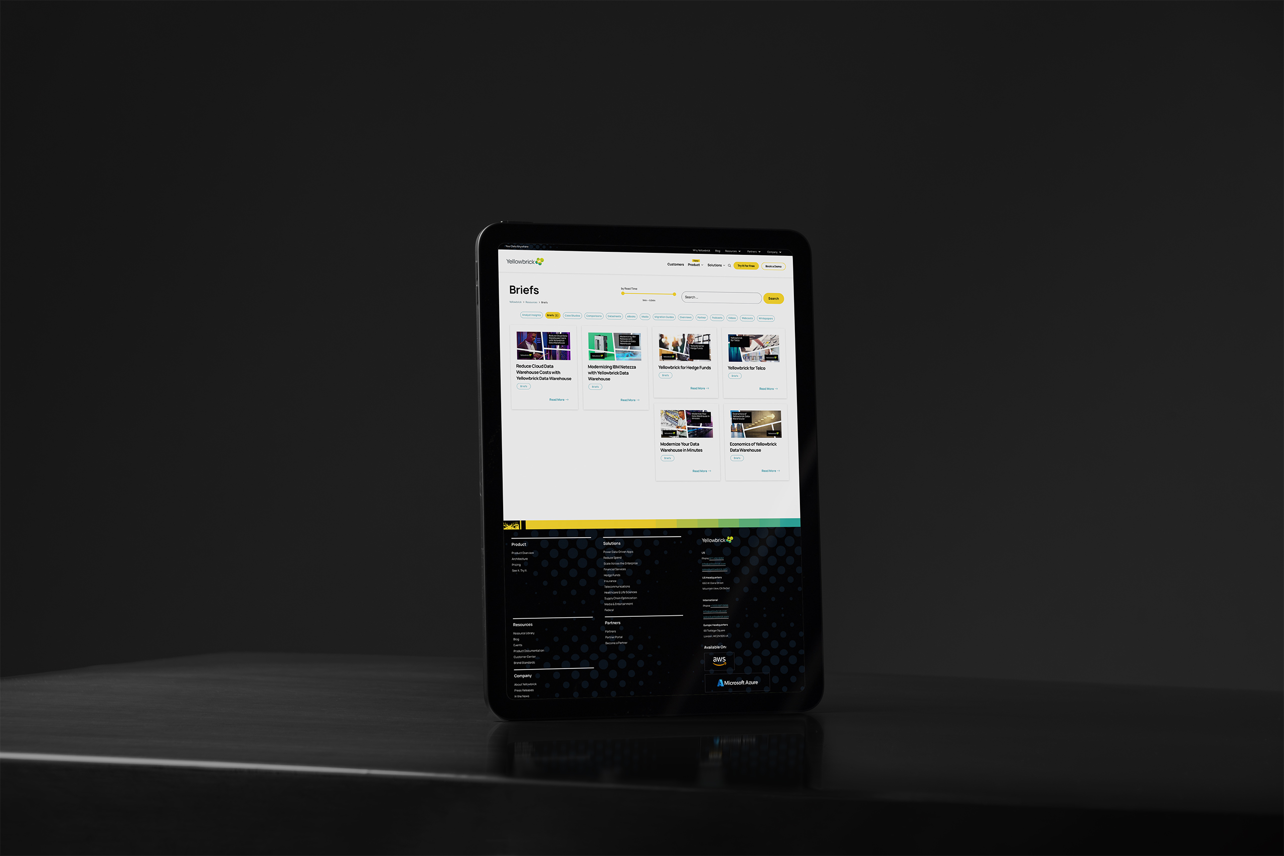
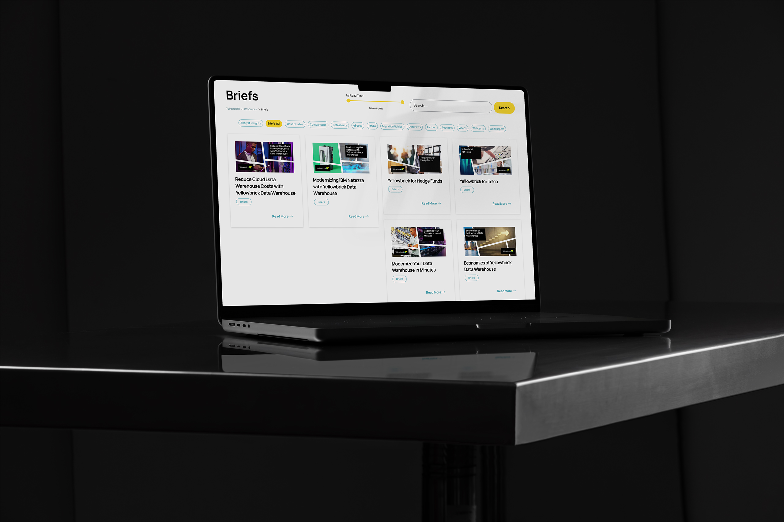
The same publishing system extended naturally to feature images, creating reusable templates that traveled with the content. Every shared blog post, event, datasheet, and white paper carried a consistent combination of messaging, imagery, and branding, extending the Yellowbrick identity far beyond its own website.
Feature System
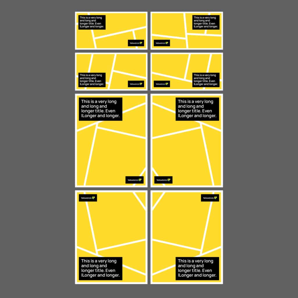
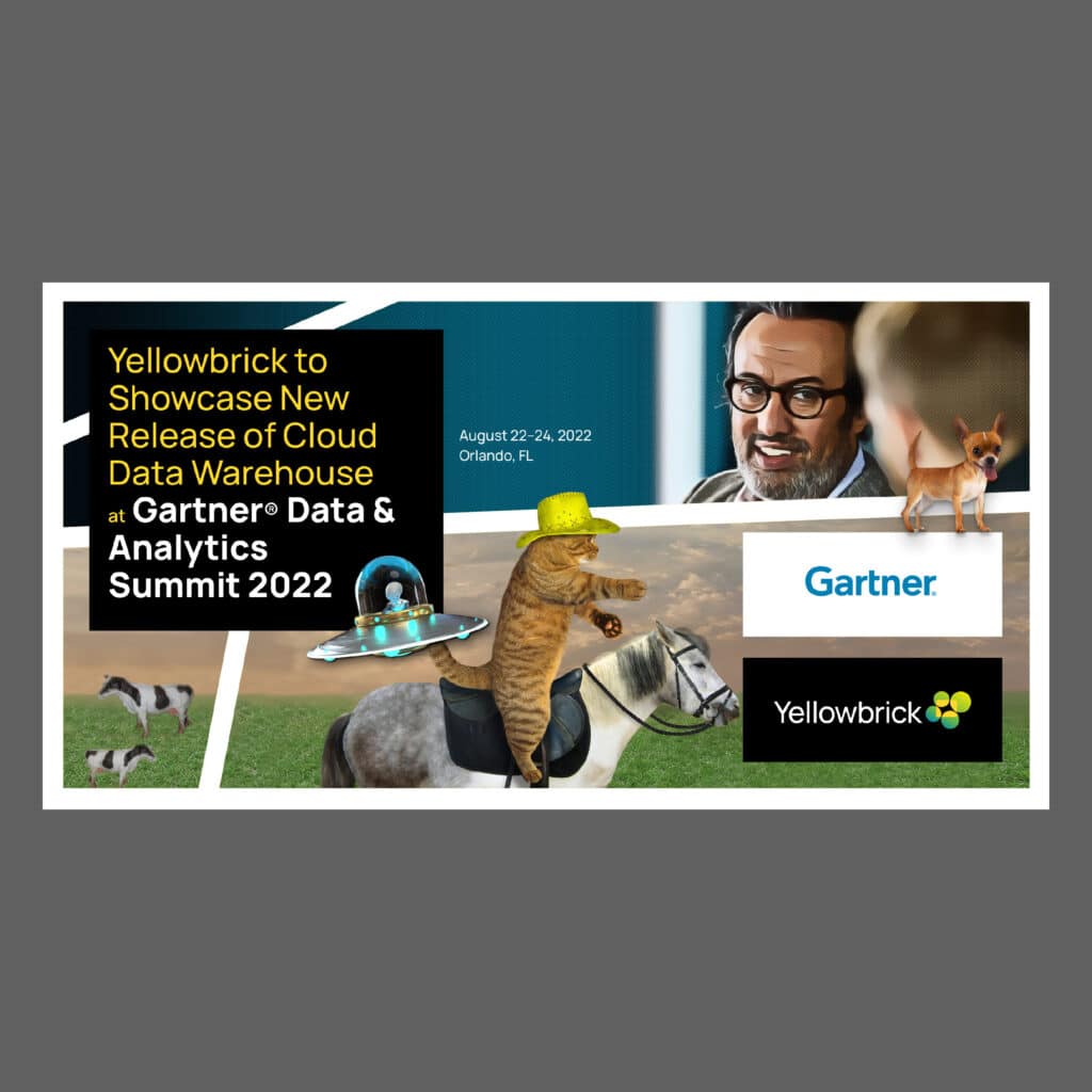
A library of reusable feature image templates established a consistent visual foundation for every content type. Each template balanced flexibility with brand consistency, making it easy to create polished marketing assets in minutes instead of hours.
Feature System
Landscape templates were optimized for blogs, resources, events, and promotional content. Editors could combine messaging, imagery, and branded visual elements within a consistent framework while adapting each feature image to its specific story.
Feature System
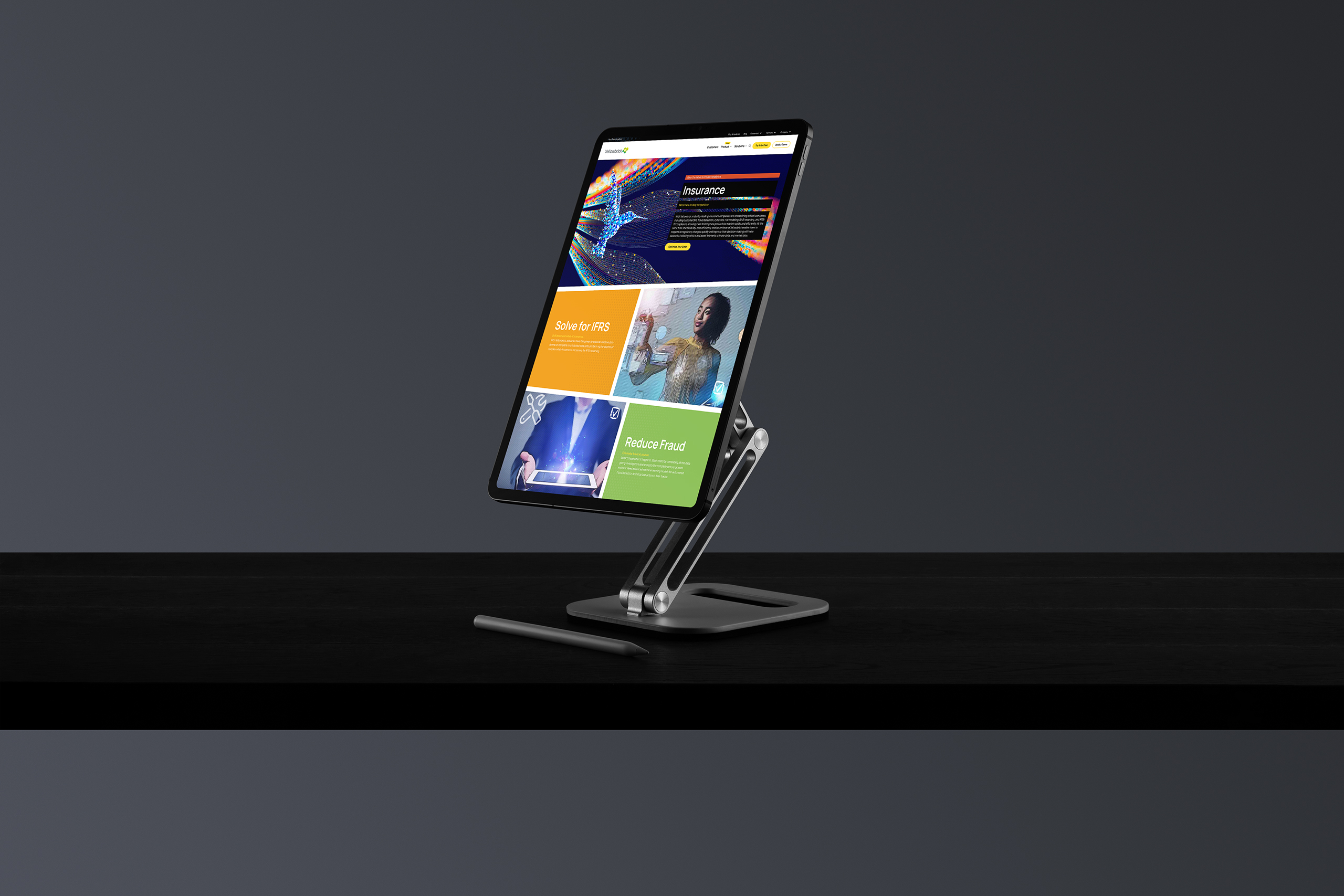
Portrait templates extended the same visual language to downloadable assets, including datasheets, white papers, and event materials. The shared design system maintained consistency across every customer touchpoint, regardless of format.

Extending the Publishing System
The publishing system made every page consistent. This layer aimed each one. Analytics quantified what readers valued, personas qualified who they were, and a curated, tagged, and faceted resource library let marketing send the right content to the right person, while readers filtered, favorited, and returned to their own. Publishing that behaves like a storefront: related, recently viewed, remembered.
Personalized Publishing
The content arithmetic: tags, UTMs, events, and saved reports turning top pages, resources, blogs, help docs, and keywords into "an informed story" that drives the calendar.

Personalized Publishing
Personas by job role, platform, and industry; twelve industries faceted. Content gaps do not get hidden. They become planned calendar entries. Even the holes are strategic.

Personalized Publishing
The unknown reader (IP, top of funnel) and the known reader (email, mid-funnel) each get their own experience: persona-led landing pages, recently viewed, "you may also like," and favorites that work without a login.

Personalized Publishing
Marketing sends curated filter links, nurture emails carry curated relevance, ads land on smart pages. The storefront behavior, pointed outward.

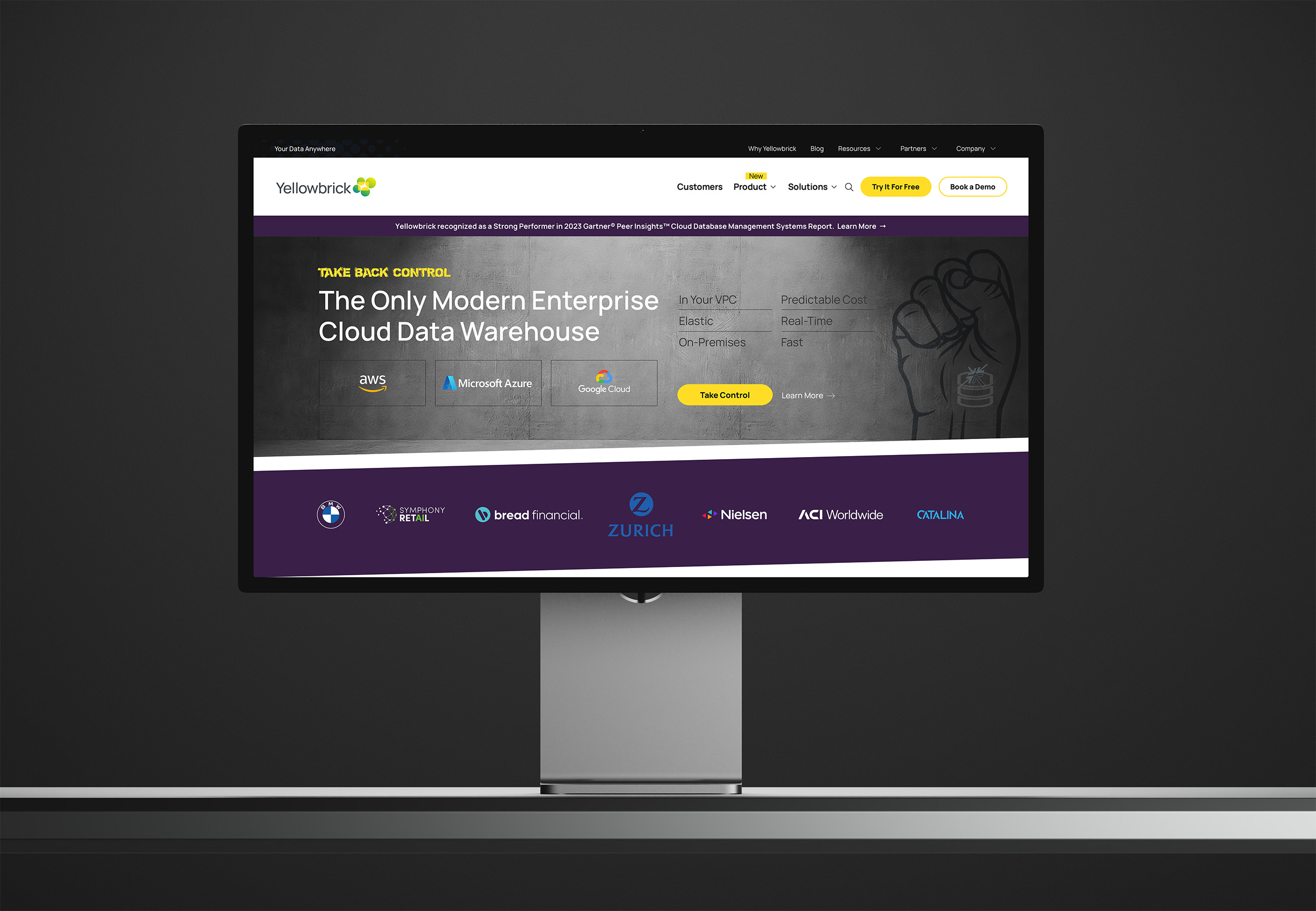
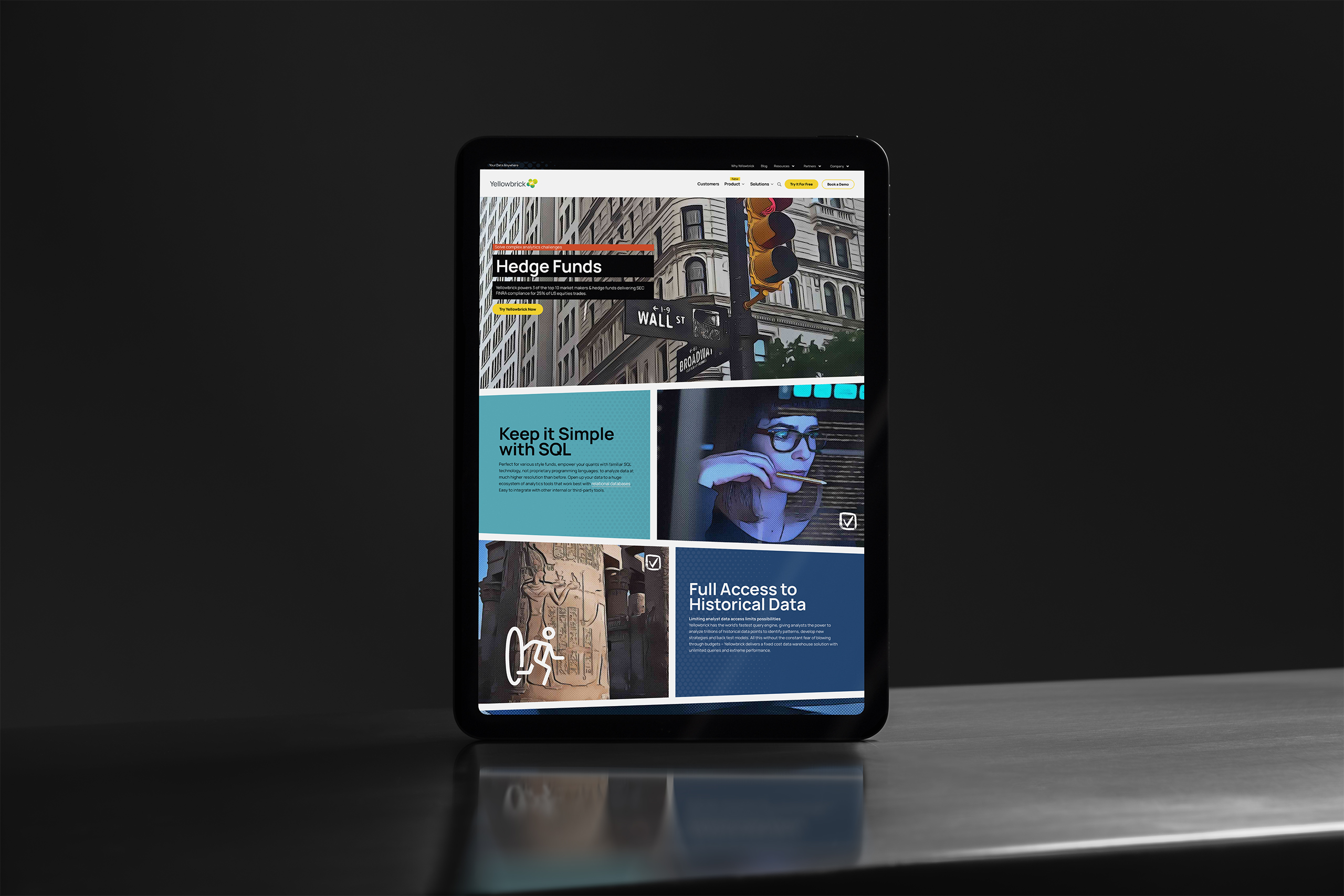
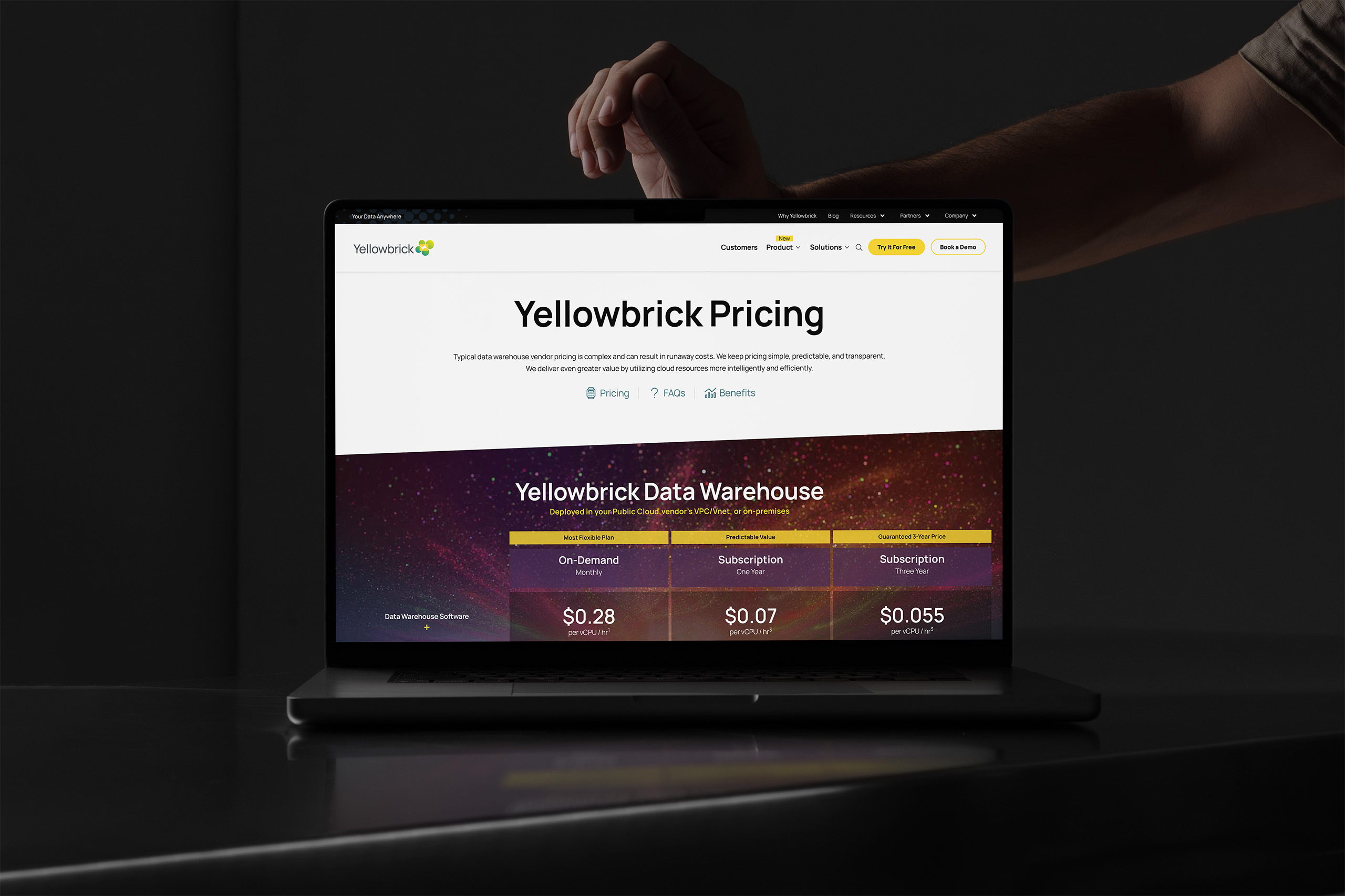
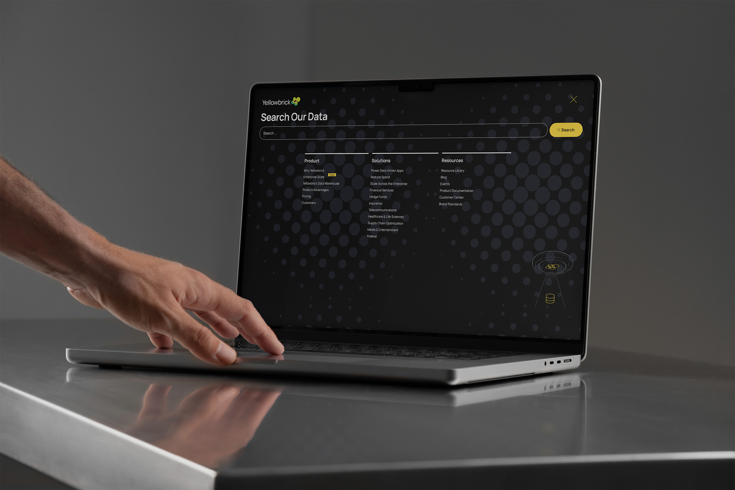
We designed the website as a comic-book reading experience for enterprise data. Pages open on bold rhomboid panels, each carrying one direct message: a headline, a supporting line, a next step. The reader is pulled down the page the way a story pulls, panel to panel, instead of scanning a wall of features.
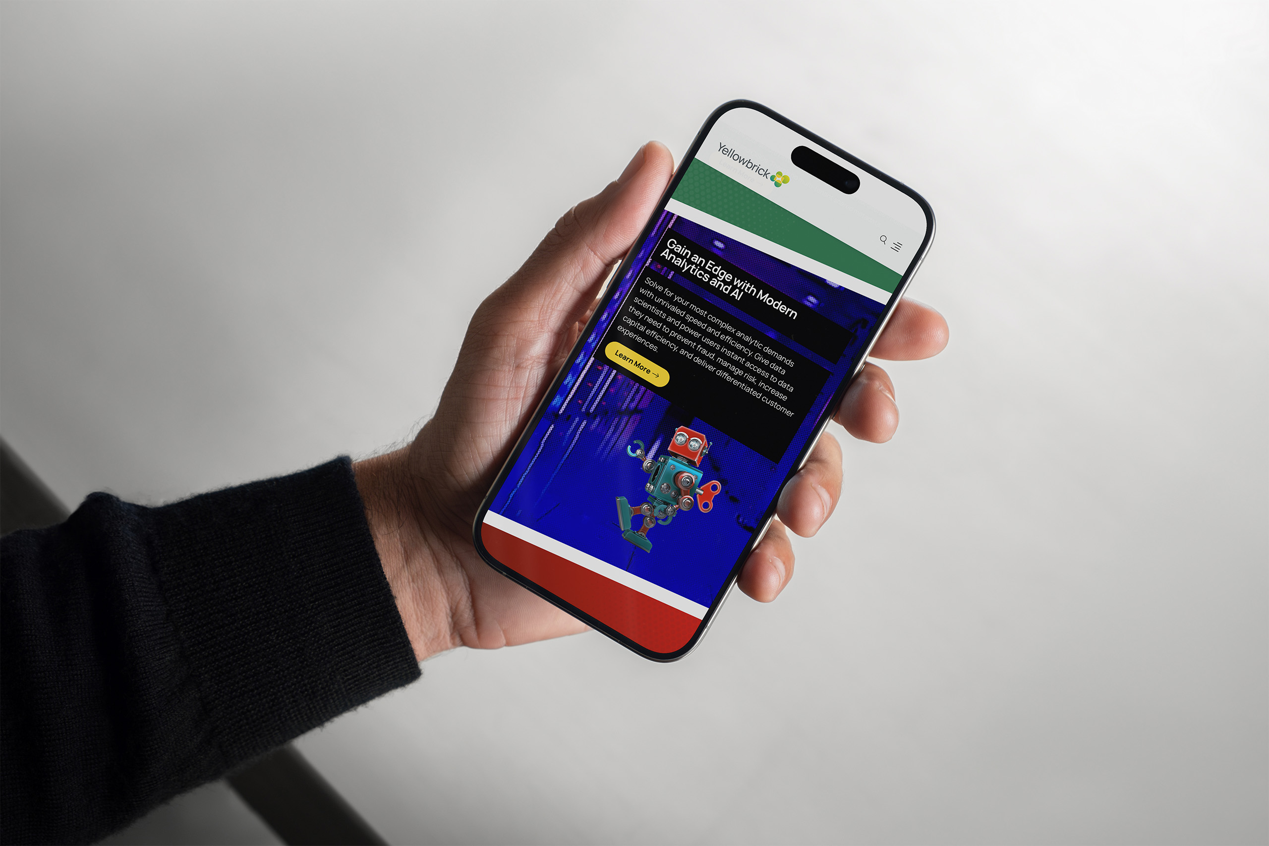
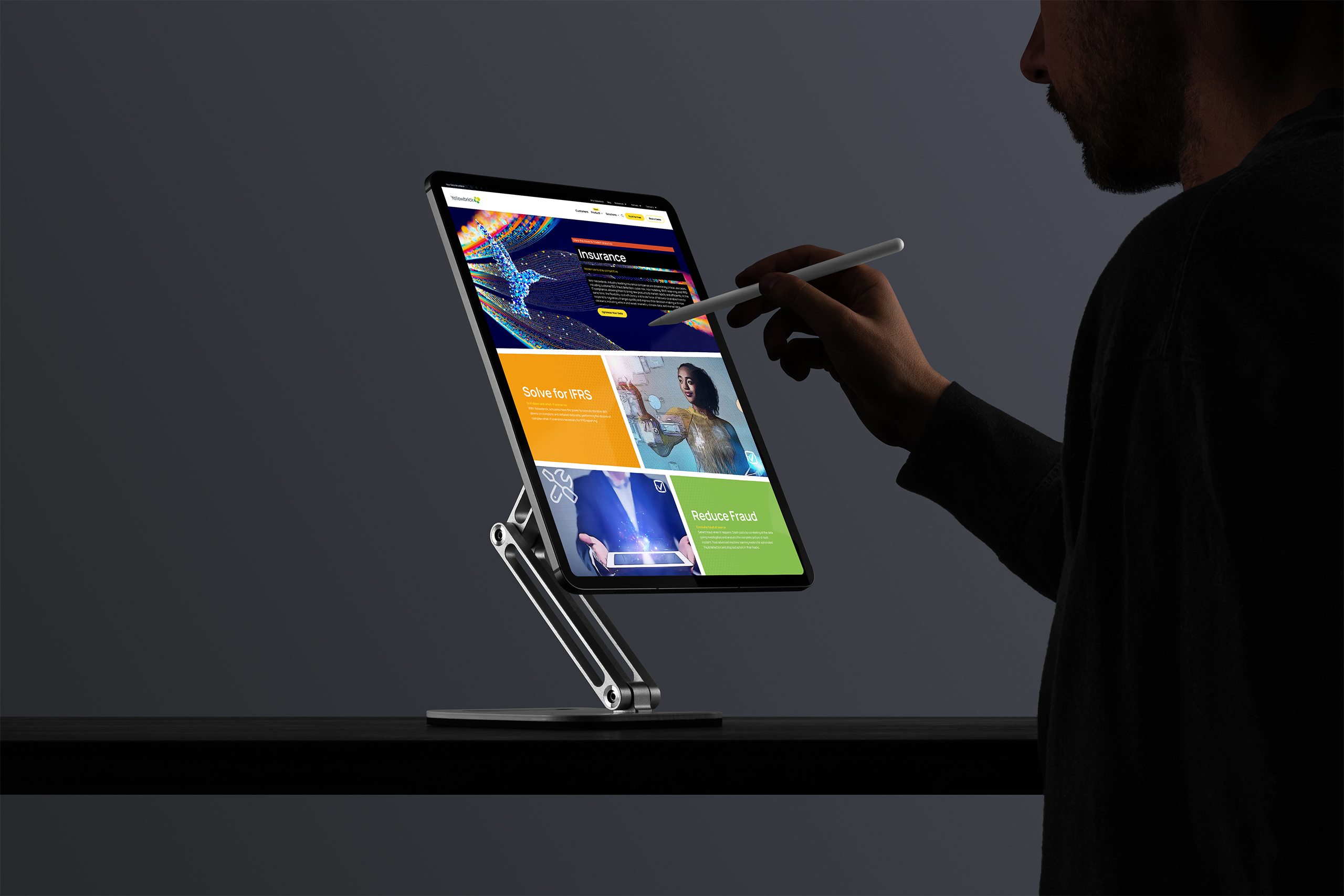
Landing pages personalize the same system by persona and industry. A hedge fund reads different proof than a casino, an insurer different urgency than a telco, while every page stays unmistakably Yellowbrick. Same grids, same palette, same wit.
The wit came from the strategy. The confidence came from the system. Both were built in parallel, the design system taking shape while the stack that would run it was coded, each informing the other.
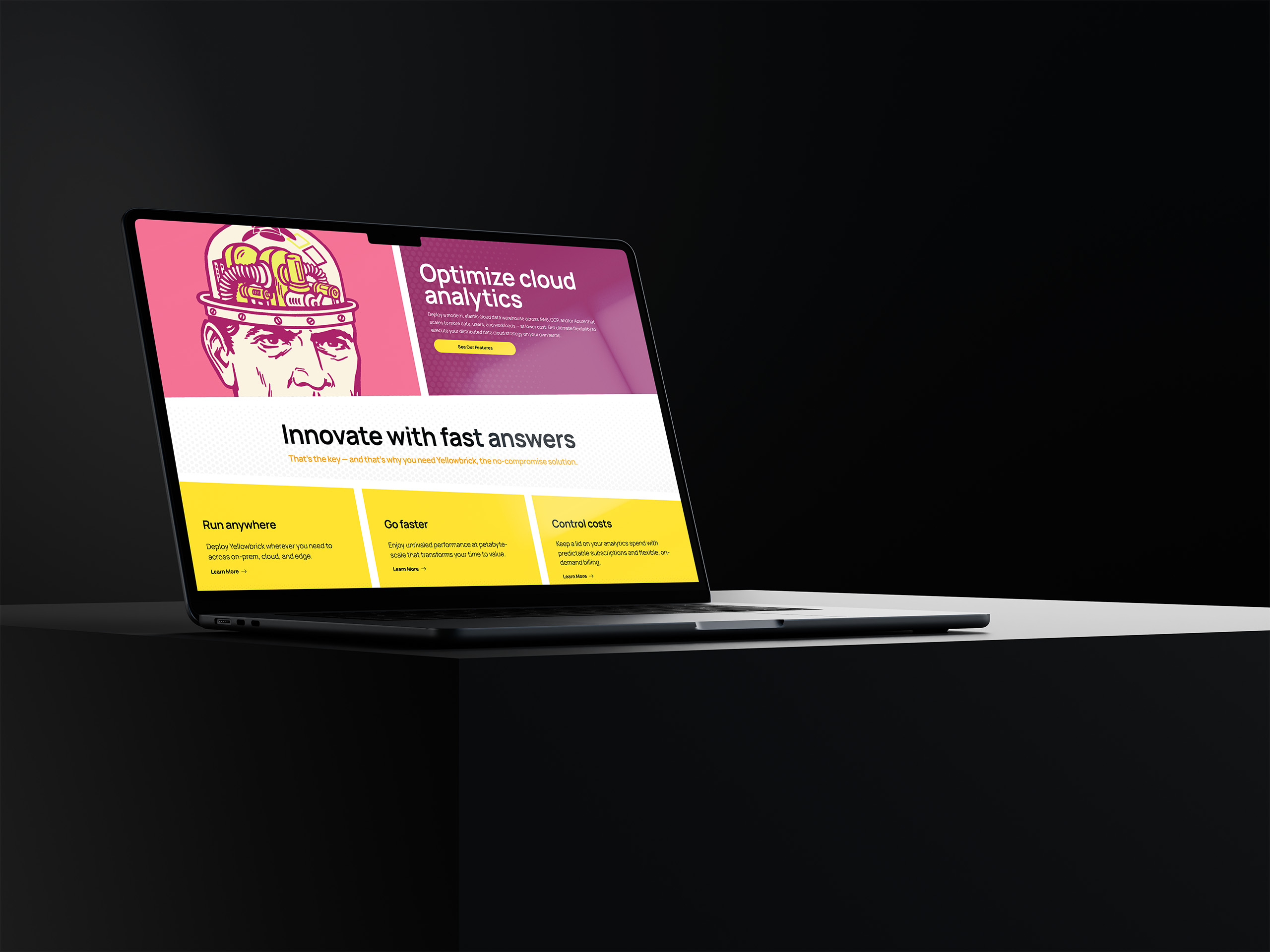
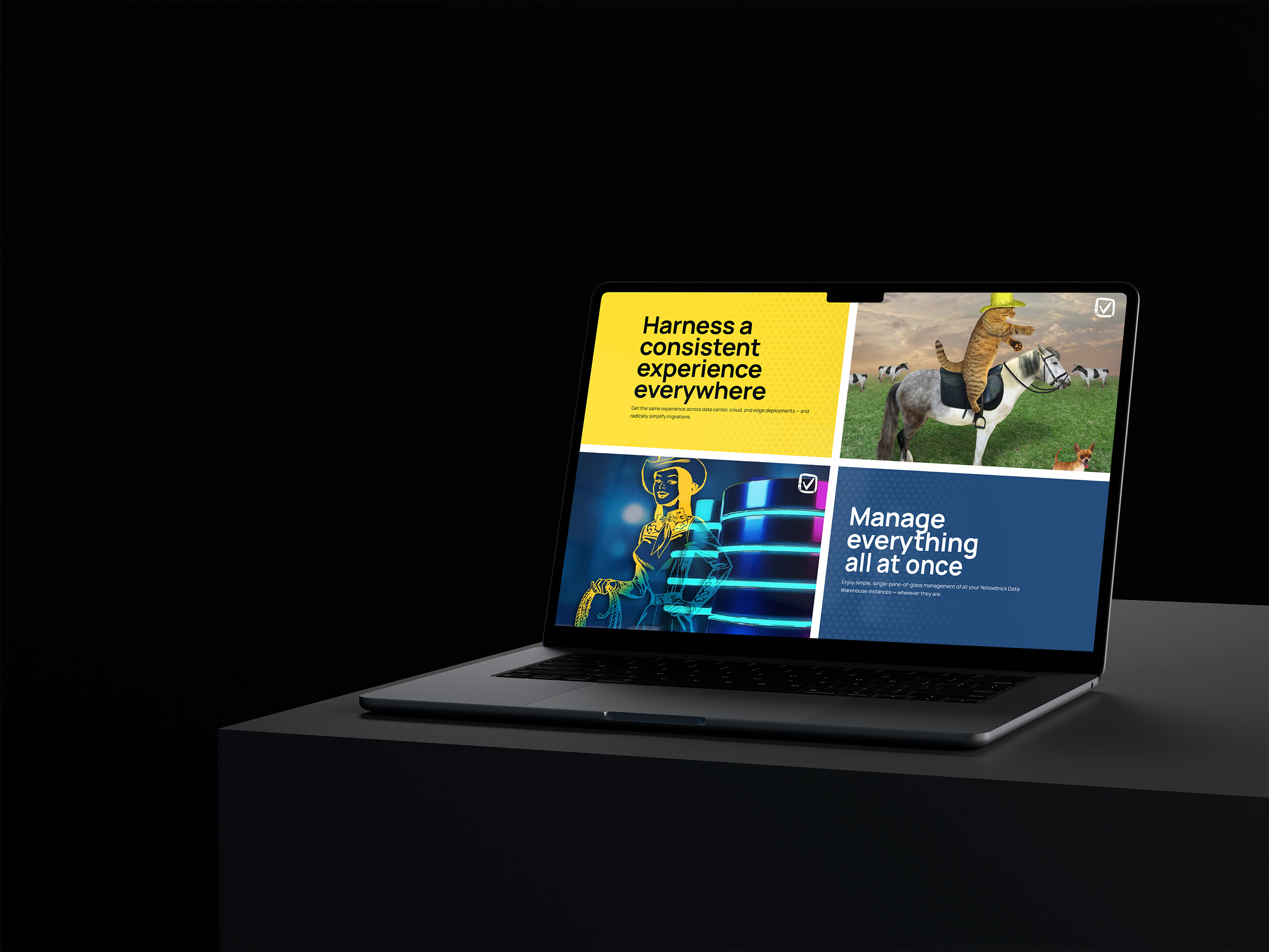

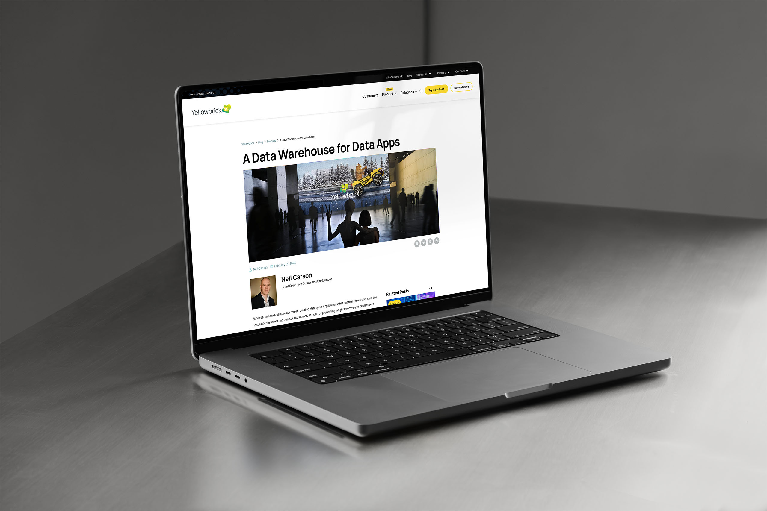
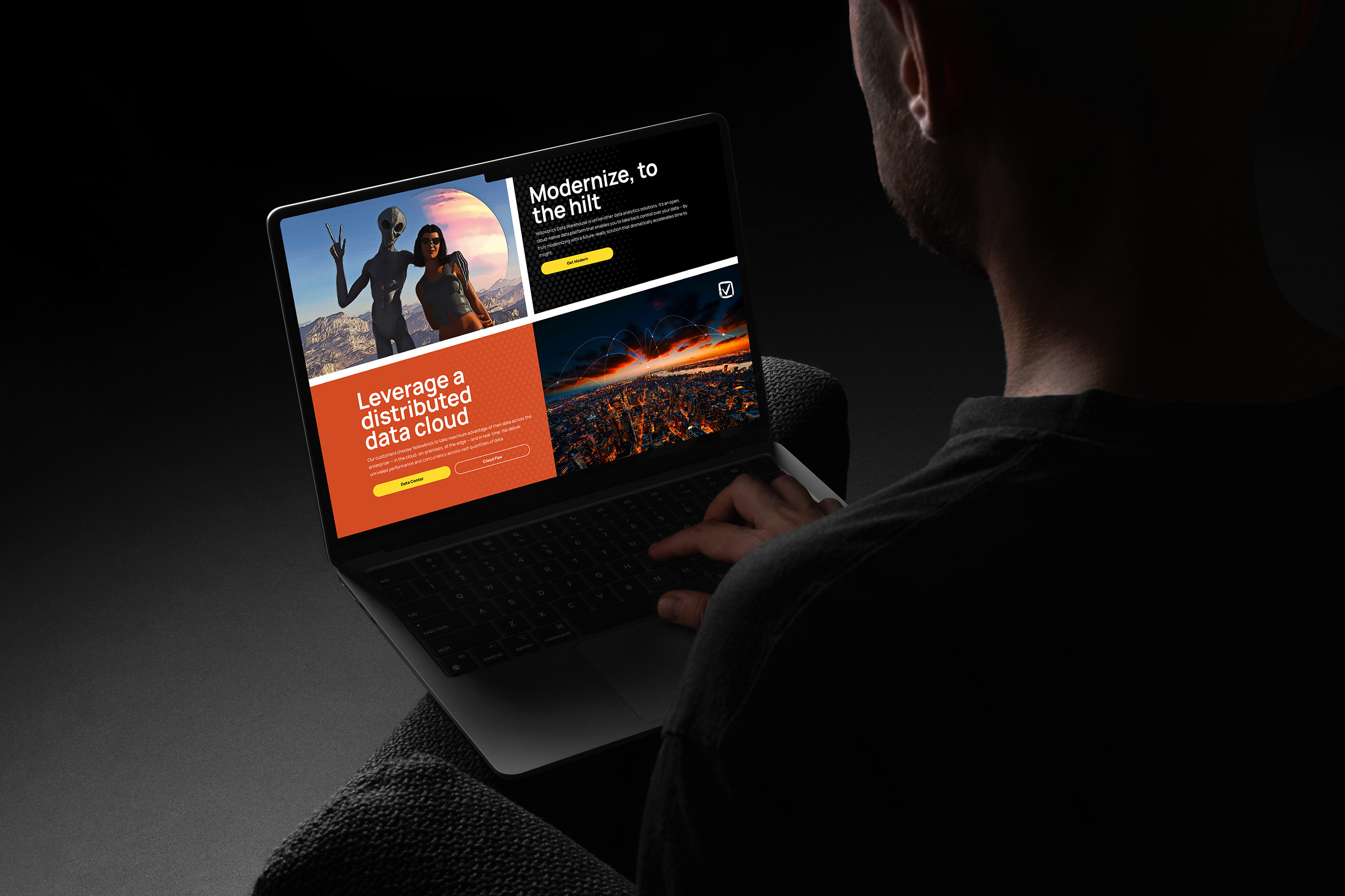
The visual language tells a story. From his home planet, an alien noticed the cat. He knew the cliché the cat lived under, the one enterprise software keeps reaching for: managing data is like herding cats. Yellowbrick made the opposite promise. It does not herd cats. It empowers them.
Empowered cats drive. This one speeds through the frame in a yellow car, out of a cold blue scene where the snow never stops falling. Anyone in the category knows which weather he is escaping, and what he is driving toward: management with ease, migration at speed, costs he can predict.
So the alien came down to help, because performance from another world deserves a character from one.
He saw what the cat could suddenly do and arrived not to take the wheel, only to help the cat drive faster. Even the most advanced being in the story takes no control away.
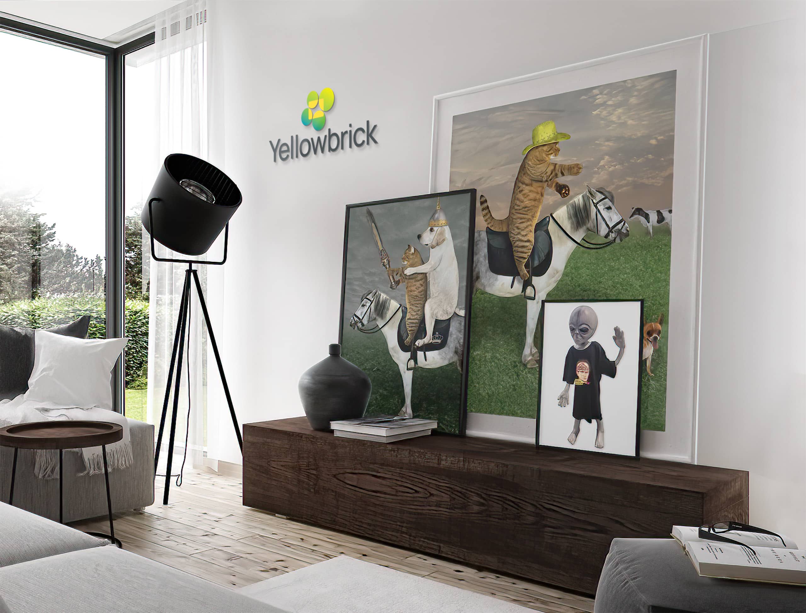
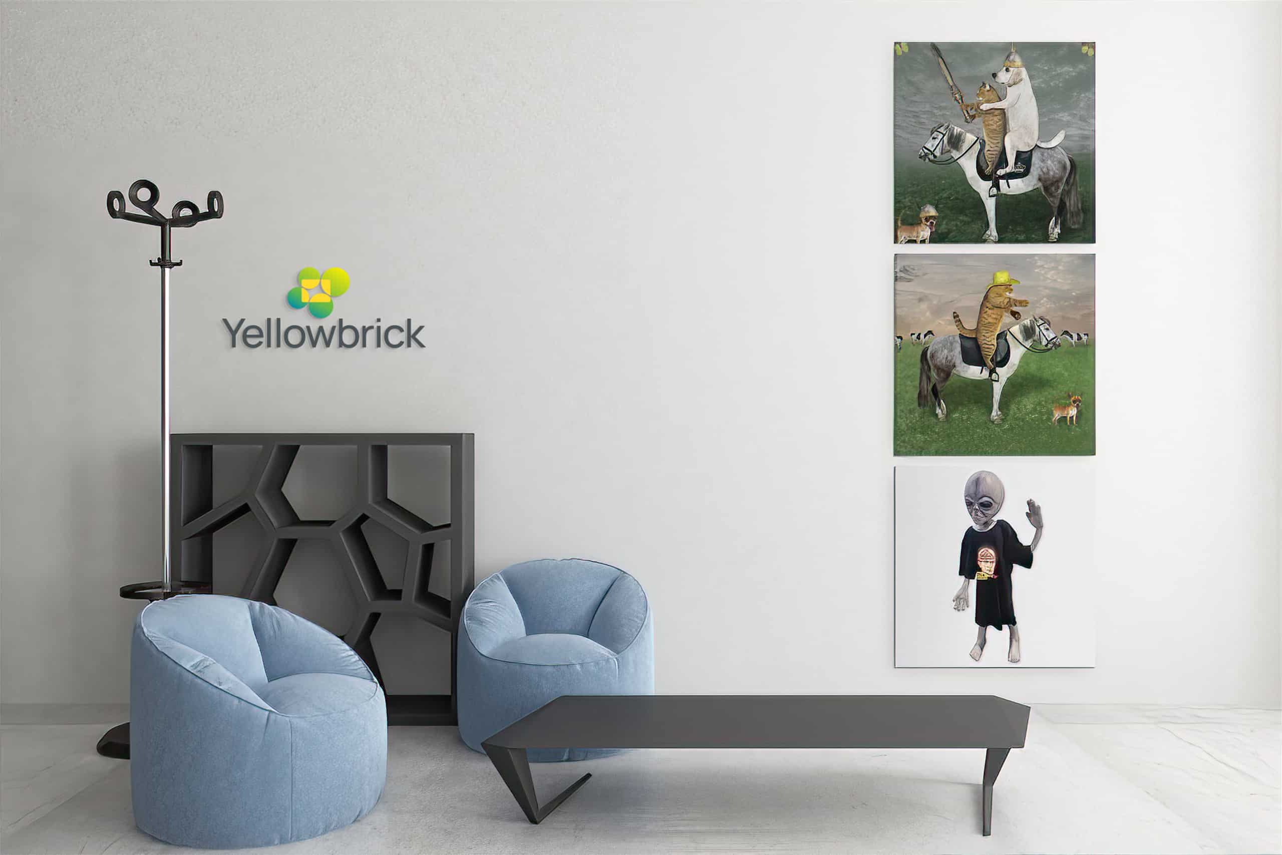
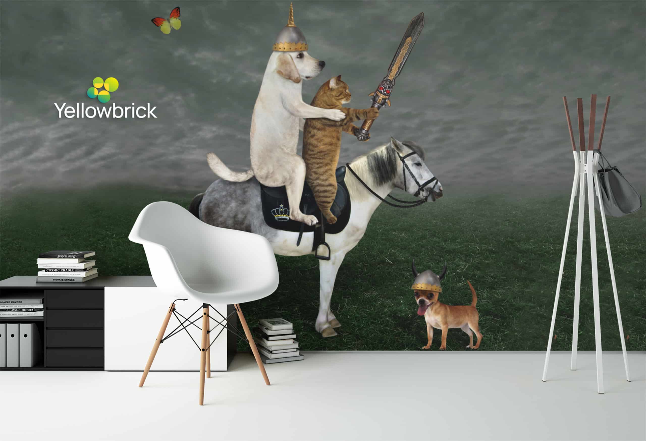
A cat and a cowgirl, an alien on a landing page, unlikely friends from faraway places sharing the frame comfortably. The humor is knowing. As video-call backgrounds, the unlikely friends now ride along to every meeting, carrying the same visual language from the website into every conversation.
The characters made a technical promise human and memorable, then carried its visual language through the platform, publishing system, and motion.