
Opens in a new tab

Dana-Farber CTRIO + Streamline

Making one of healthcare’s most complex systems visible. And navigable.

Dana-Farber Cancer Institute’s Clinical Trials Research Informatics Office came to Bowman Design Direction with what sounded like a straightforward request: front-end development support. Discovery revealed something different.

There wasn’t yet a product.

Years of operational knowledge had naturally evolved across spreadsheets, departmental workflows, and the expertise of the people running them. So we reframed the engagement around what the office actually needed. Before software could be built, the system itself had to be understood.

Challenge

Managing a clinical trial means coordinating physicians, hospitals, sponsors, researchers, regulatory milestones, patient recruitment, and activation across multiple organizations. Like many large healthcare organizations, Dana-Farber carried that knowledge in spreadsheets, departmental workflows, and years of institutional expertise, each serving its own team well.

What no one had was a unified way to visualize the complete lifecycle of a trial or to quickly see where progress had stalled. The challenge was not designing software. It was translating operational complexity into something immediately clear to physicians whose first responsibility is patient care, not software.

Direction

We anchored the work around a single, decisive idea: make the system visible before making it software. Understanding became the deliverable. The interface would be its proof.

Instead of reproducing spreadsheets inside a browser, we designed from patterns physicians already trusted. Search became the primary navigation. Trials became visual cards rather than database rows. Status could be read at a glance, before a single statistic.

Outcome

When the concepts were presented to physicians, researchers, and leadership, the response confirmed the translation had worked. One of healthcare’s most complex operational environments had become immediately understandable, and for the first time the department could see its own operational model.

The engagement gave the department a shared model of how its trials actually move, clearer front-end calculations and interpretation, and a communication framework ready to guide production development when the institution chooses to build.

Takeaway

CTRIO asked for a front end. What the department actually needed was a way to see itself. By translating years of operational knowledge into visual language, the work delivered what software alone could not: a shared understanding of the whole system, carried into a framework ready for development.

What We Built

Discovery & Information Architecture

We analyzed the spreadsheets, audited the content, and traced how a trial actually moves from proposal through activation. User roles, workflow dependencies, milestones, and approval paths were mapped before a single screen was designed, so the interface could model how trial management really fits together.

Identity & Naming

During early strategy sessions, a member of the team coined the acronym CTRIO. The identity work revealed what the name could carry: a second reading, Control I/O, that turned an internal acronym into a visual metaphor for the office’s role. We named the application Streamline, a promise as much as a product name. Names establish expectations long before interfaces do.

The Streamline Experience

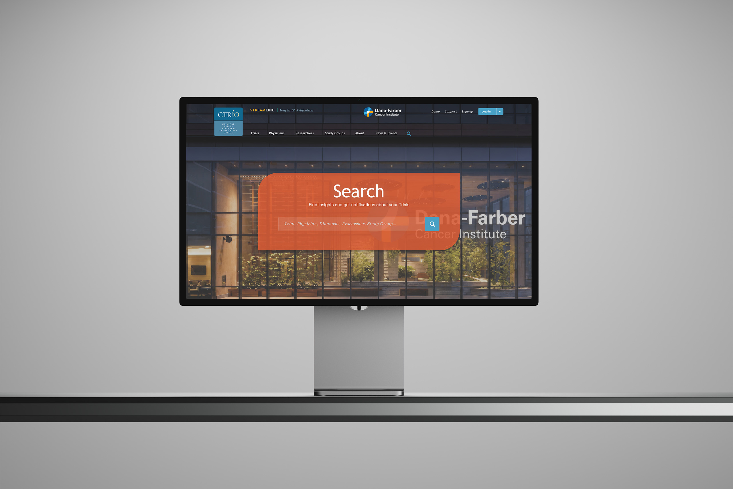
Search became the front door, returning trials as visual cards with circular completion rings, color-coded hospital activation badges, and the days-to-milestone numbers administrators track. Timeline views turned lengthy approval histories into narratives a physician can read in seconds.

Dashboards & Insights

Physician dashboards rolled hundreds of active studies into a single visual summary of overall performance, while analytics views aggregated initiation averages and portfolio status across the office. Every interface decision reduced cognitive load while increasing situational awareness.

CTRiO identity badge in two blues, the acronym set above the words Clinical Trials Research Informatics Office, its italic i and O carrying the Control I/O double reading.

The Through-Line

What began as years of operational knowledge became a system physicians could search, see, and trust at a glance.

Where the office’s expertise had no public face, the identity gave it one worth recognizing: a name, a mark, and a sign on the door. Where enterprise software leads with database rows, Streamline led with search, the familiar pattern people already trusted.

Where status once meant reading, the interface made it visible. Circular completion rings, color-coded hospital badges, and status timelines let a physician understand where a trial stood before reading a single number.

Where hundreds of studies once scattered across tabs and inboxes, the physician dashboard converged them into one summary, so a doctor’s entire research portfolio could be understood as quickly as a single trial.

The work began before software: making a complex system understandable enough to build. Strategy became navigation. Navigation became confidence.

Every Screen Began with the Same Discovery: The Problem Was Understanding.

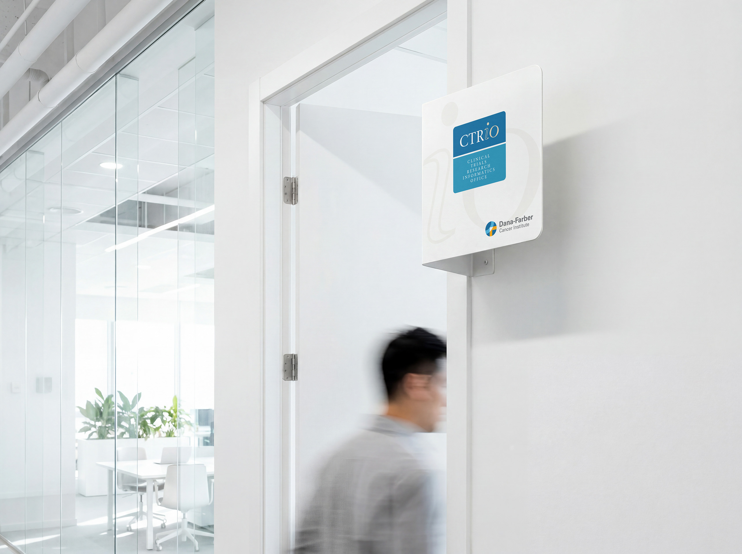
Door-mounted CTRiO blade sign paired with the Dana-Farber Cancer Institute lockup in a bright white office corridor as a staff member passes below.

Discovery + Strategy

Before a single screen, we mapped how a clinical trial actually moves.

  • Workflow Discovery

    Understanding precedes interface. We analyzed spreadsheets, audited content, and traced how trials move from proposal through activation, drawing the operational model together in one place for the first time.

  • Information Architecture

    Complexity has a structure. We mapped roles, dependencies, milestones, and approval paths, revealing how the pieces of trial management relate before deciding how any screen would look.

  • Audience Architecture

    Physicians, researchers, and administrators read differently. We mapped how each role searches, scans, and decides, then shaped one experience that serves all three without a manual.

  • Department Identity

    The team coined CTRIO. We revealed what the name could mean: a second reading, Control I/O, turning an internal acronym into a visual metaphor for the office’s role.

  • Product Naming

    A product name is a promise. We named the application Streamline for exactly what physicians and administrators wanted the software to accomplish: making an extraordinarily complex process feel understandable.

  • Experience Strategy

    Familiar patterns beat training sessions. We borrowed the interaction language of modern web applications, search-first and card-based, so physicians could navigate the system on first contact.

CTRiO identity badge in two blues, the acronym set above the words Clinical Trials Research Informatics Office, its italic i and O carrying the Control I/O double reading.

Brand Identity

The CTRIO identity began with a contribution from the department itself: the acronym, coined by a member of the team during early strategy sessions. The identity work revealed what the name could carry. At first glance, CTRIO is the Clinical Trials Research Informatics Office. Read again, and it is Control I/O, the office’s actual role: orchestrating the flow of complex clinical trial information in and out of the institution. That second reading became the foundation of the identity system.

Subtle color differentiation within the mark reinforces the reading without explaining it. The identity does not decorate the department. It communicates what the department does, turning an internal acronym into a visual metaphor that colleagues recognize before anyone defines it.

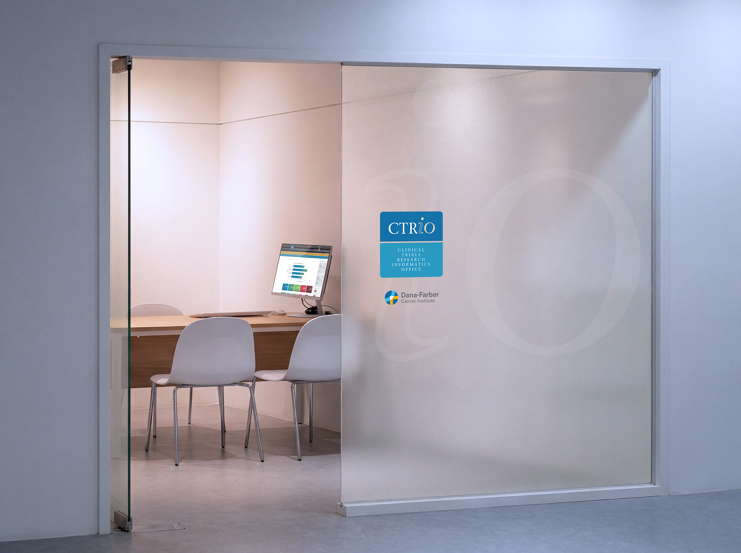
In the wayfinding program, the identity works at the scale of the building. Door and directional signage pair the CTRIO badge with the Dana-Farber Cancer Institute lockup, giving the department its own recognizable presence while remaining unmistakably part of the institution.

The same discipline continues into the product. Streamline carries the identity’s calm institutional palette through every dashboard and detail view, so the brand and the software read as one system rather than a logo applied to an application.

Like the interface it lives beside, the identity translates complexity into recognition. It helps physicians, researchers, and administrators see the office the way the office needed to see its own trials: clearly, and all at once.

Frosted sliding glass door carrying the CTRiO badge and Dana-Farber lockup, opening onto a small meeting room with a Streamline dashboard on the monitor.

Application

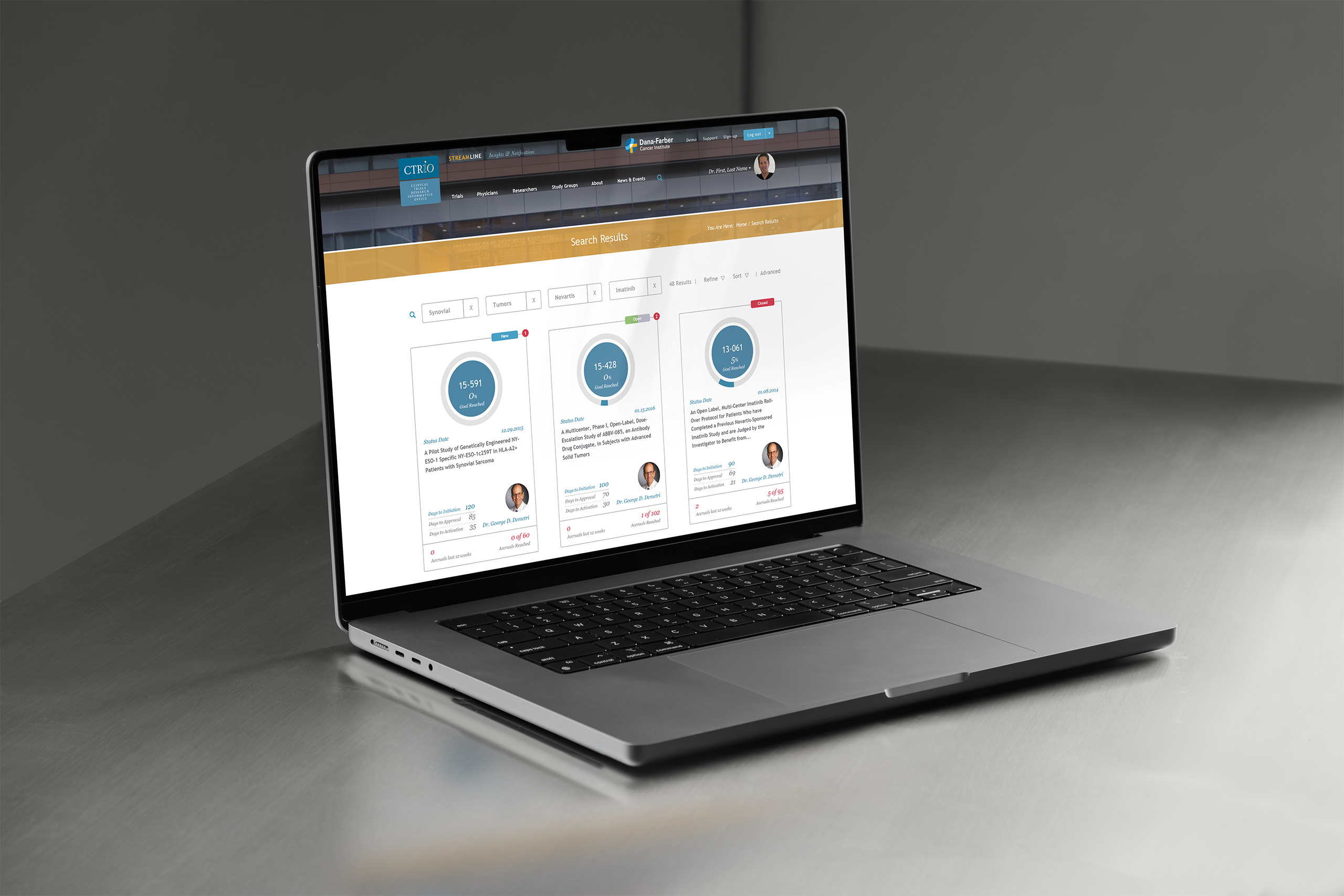
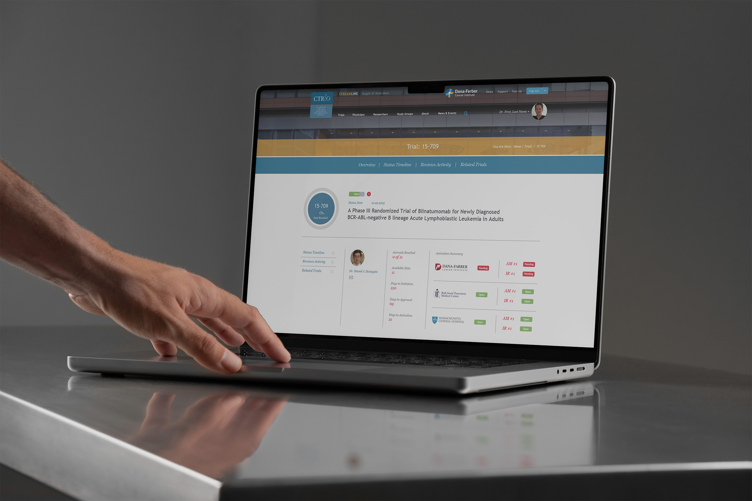
We designed Streamline around the moments that matter in trial management: finding a trial, understanding its status, and knowing what needs attention. Search returns trials as cards, each synthesizing activity across participating hospitals. Circular completion rings show calculated progress, color-coded badges show each hospital’s activation state, and days-to-milestone numbers reveal what needs attention. Trial pages turn approval histories into status timelines.

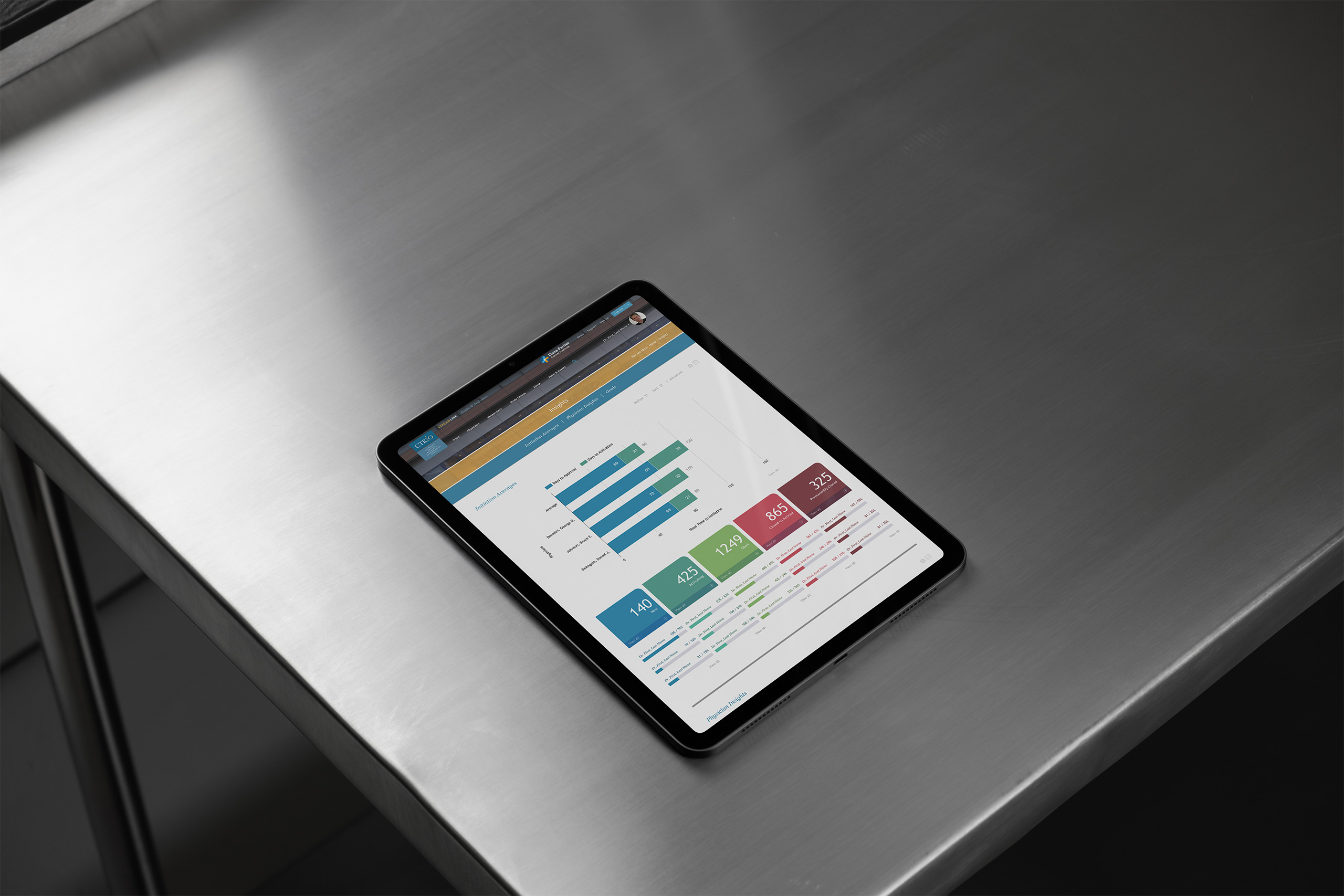
Physician dashboards roll hundreds of active studies into one performance view, pairing goal progress with the full distribution of trial statuses, while insights views aggregate initiation averages across the office.

Before software could streamline clinical trials, people first needed a shared understanding of how those trials moved. That understanding became the model. The application turned it into something physicians could search, read, and act on.

Streamline’s search-first front door on an Apple Studio Display, an orange search panel inviting trial queries above imagery of the Dana-Farber campus.
Streamline search results on a MacBook Pro, trials returned as visual cards with circular completion rings, investigator portraits, and color-coded status badges.
Streamline trial detail page on a MacBook Pro showing a Phase III study’s completion ring, status timeline tabs, and hospital activation states in one summary.
Streamline analytics view on an iPad resting on brushed steel, aggregating trial initiation bar charts with color-coded portfolio status tiles.
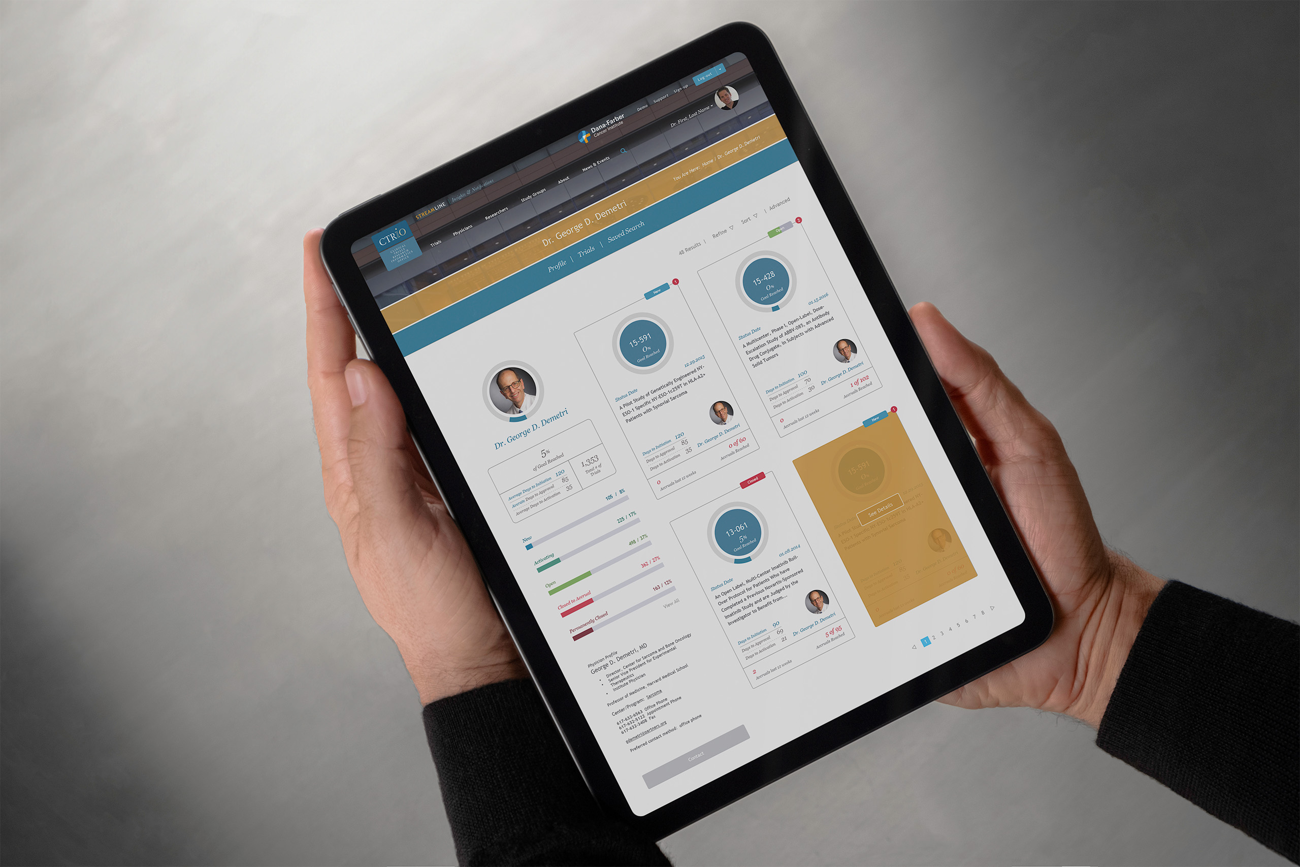
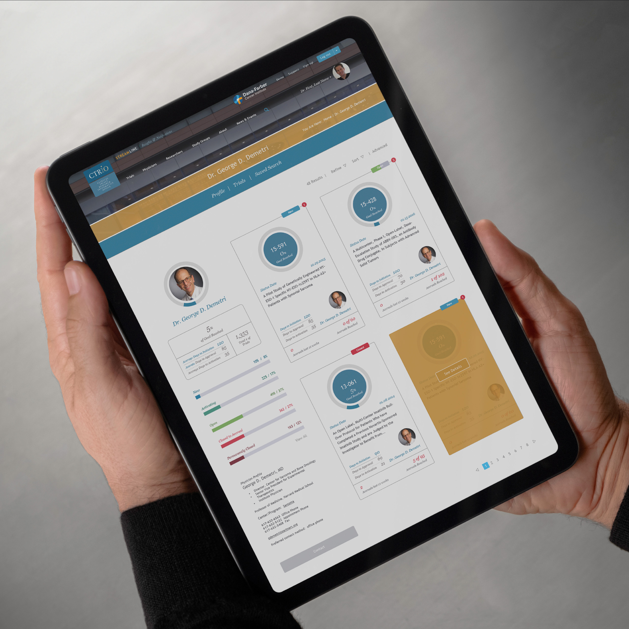
Physician profile in Streamline held on an iPad, pairing the doctor’s portrait and goal progress bars with trial cards carrying circular completion rings.

Seeing the System

From Records to Intelligence

Nothing in the source records changed. What the application could derive from them did. Streamline aggregated activity across hospitals, calculated progress, and turned distributed status into a trial a physician could understand at a glance.

  • Before

    A Window into Raw Tables

    This is what trial management looked like: database rows rendered as long, linear lists. Key fields sat empty, categories disagreed, and one trial’s status was distributed across participating hospitals. There was no search, faceting, or dashboard to surface what needed attention. The records were all there. Reading the system was the work.
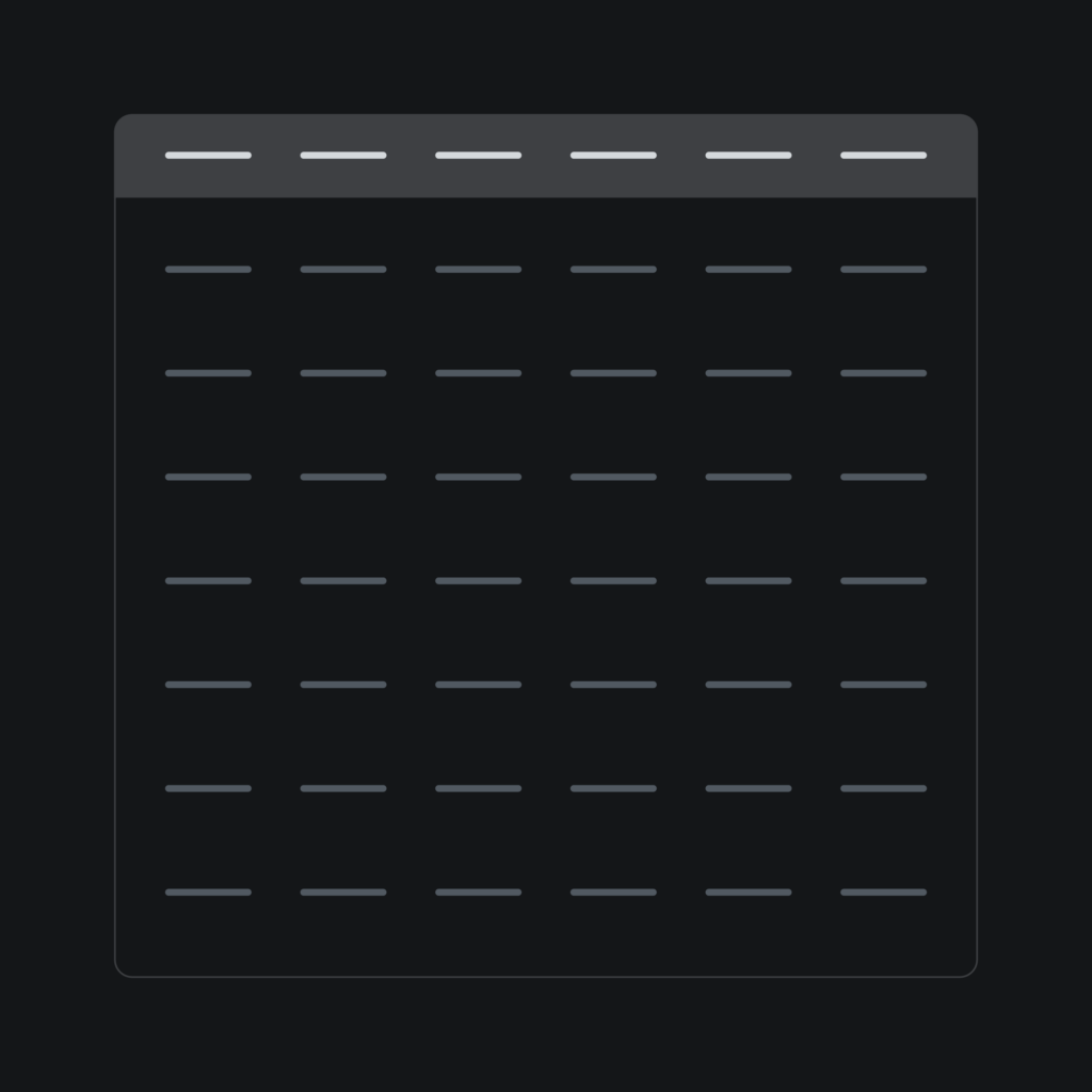
    Dark screen of a plain database table, rows of unlabeled fields, representing the raw data before Streamline.
  • After

    A System You Can Read

    The same source records, interpreted. Streamline aggregated hospital-level accruals and status, calculated trial progress, and returned each study as a visual card. Completion rings and hospital badges made each trial’s state visible at a glance; dashboards and timelines turned activity across records into a story a physician could read in seconds. The database supplied the records. The application turned them into intelligence.

    Hands holding a tablet showing the Streamline physician dashboard with trial cards, completion rings and progress bars.
CTRiO badge and Dana-Farber Cancer Institute lockup on a frosted conference room wall beside a wood-slat hallway, a silhouetted figure passing behind the glass.