











Creations
Responsive Retail
Responsive Retail
One script. Unlimited campaigns. No developers.
By 2012, ecommerce was growing 15% a year, but the platforms behind it had left merchandising standing still. After twenty-one years of building for retailers, we stopped waiting for the platforms to fix it:
Give marketers the power to publish campaigns as fast as retail moves.
Responsive Retail was not client work. It was our own venture: a patent-pending, single-page web application invented, designed, and funded by Bill Bowman, with sixteen developers led through every release. We built the brand, the product, and the company around one promise, and Lancôme, Caché, and Jeanne Beatrice ran their campaigns on it.
Read the Story
Challenge
Enterprise ecommerce platforms had mastered transactions and fulfillment, and stopped there. System integrators launched homepages with a single generic content slot, then billed anything better as professional services after launch. The storefront became a boundary dispute: the platform ended at the slot, the agency began after it, and every campaign in between waited on a developer.
Marketers lived with the consequences. Homepages froze while ecommerce grew 15% a year. Campaigns meant for an afternoon took a release cycle. Re-platforming was unaffordable, offsite landing pages sent traffic to unproven destinations, and the people who set the retail calendar had no way to act on it.
Direction
Everyone in the fight treated the empty slot as the end of their product. We read it as the beginning of ours. One injection script placed in that slot turned the platform’s dead end into a publishing surface, on any ecommerce platform, with no re-platforming and no allegiance to any vendor.
Behind the script we built the tool the retail workflow had been asking for: a drag-and-drop campaign builder for sliders, hovers, video, and rich retail layouts, publishing unlimited campaigns and versions directly into the storefront, with results sorted by clicks and revenue. Merchandising finally moved at the speed of the merchandiser.
Outcome
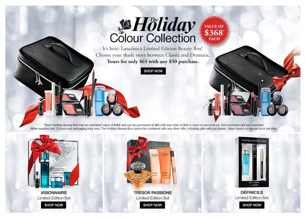
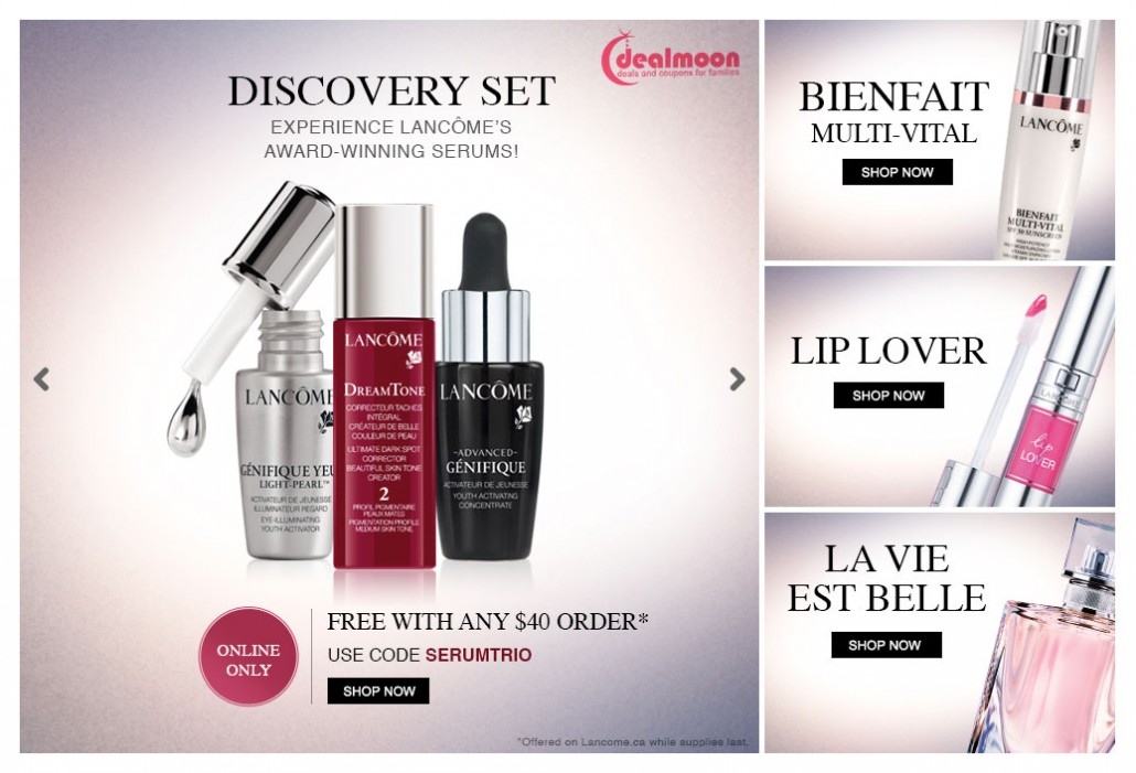
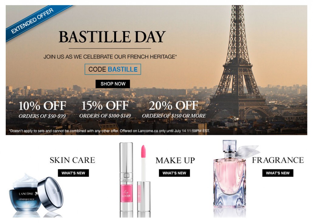
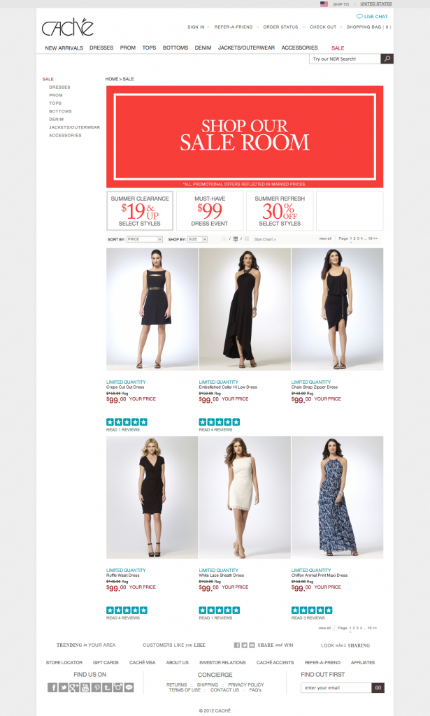
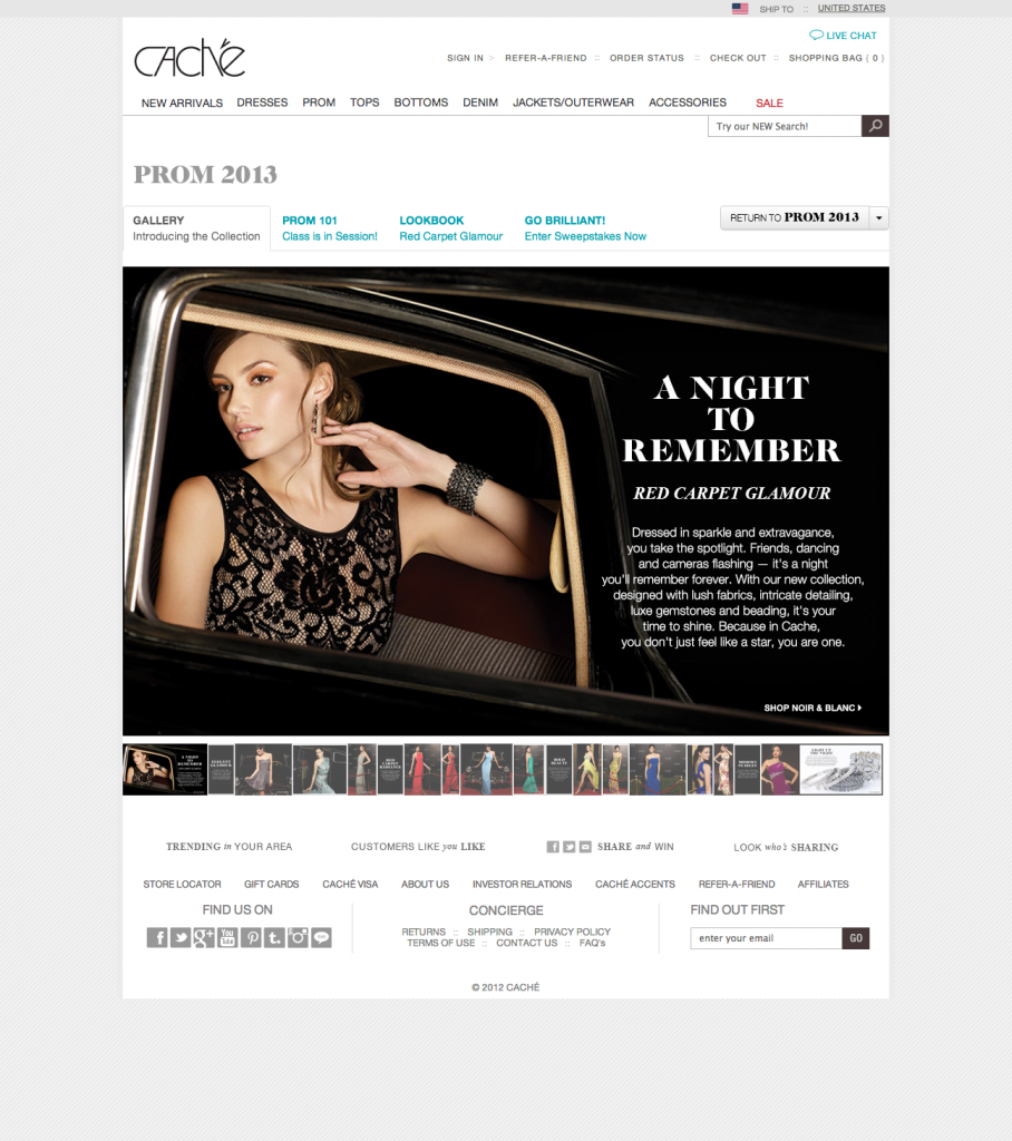
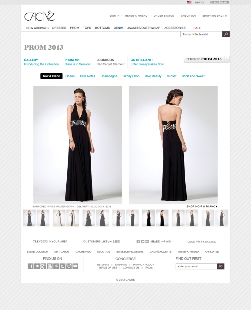
Retailers stopped waiting. Caché, Lancôme, and Jeanne Beatrice published campaign after campaign into their own storefronts, and the numbers followed: transactions up 128%–132%, revenue up as much as 266%, operational costs down 41% on average.
What Responsive Retail proved never stopped being true. The industry spent the next decade building toward it: today, drag-and-drop publishing inside the storefront is simply how retail works.
Takeaway
Every platform drew its boundary at the same empty slot, and every integrator billed by the hour to fill it. Twenty-one years inside that fight pointed somewhere better. When the same friction appears on every engagement, it has stopped being a service problem. It is a product waiting to be built.
What We Built
Brand & Identity
A product asking for a place on the homepages of Lancôme and Caché has to look like it belongs there. The Responsive Retail identity carried that credibility: a confident black wordmark that reads as infrastructure, a Venn diagram with three overlapping circles marking where customer intent, merchandising opportunity, and inventory priorities agree, and a promise stated plainly: The Power to Promote and Engage.
The Injection Script
The entire integration was one line of code. Drop the script into the platform’s content slot and that slot becomes a destination Responsive Retail can publish to forever, on any ecommerce platform, with no re-platforming budget and no developer in the loop. The industry’s hard line became our front door.
The Campaign Builder
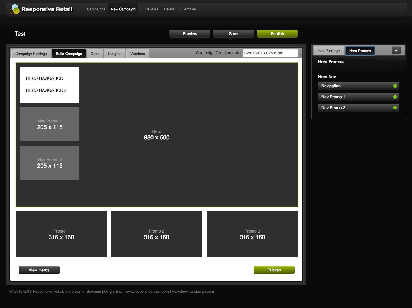
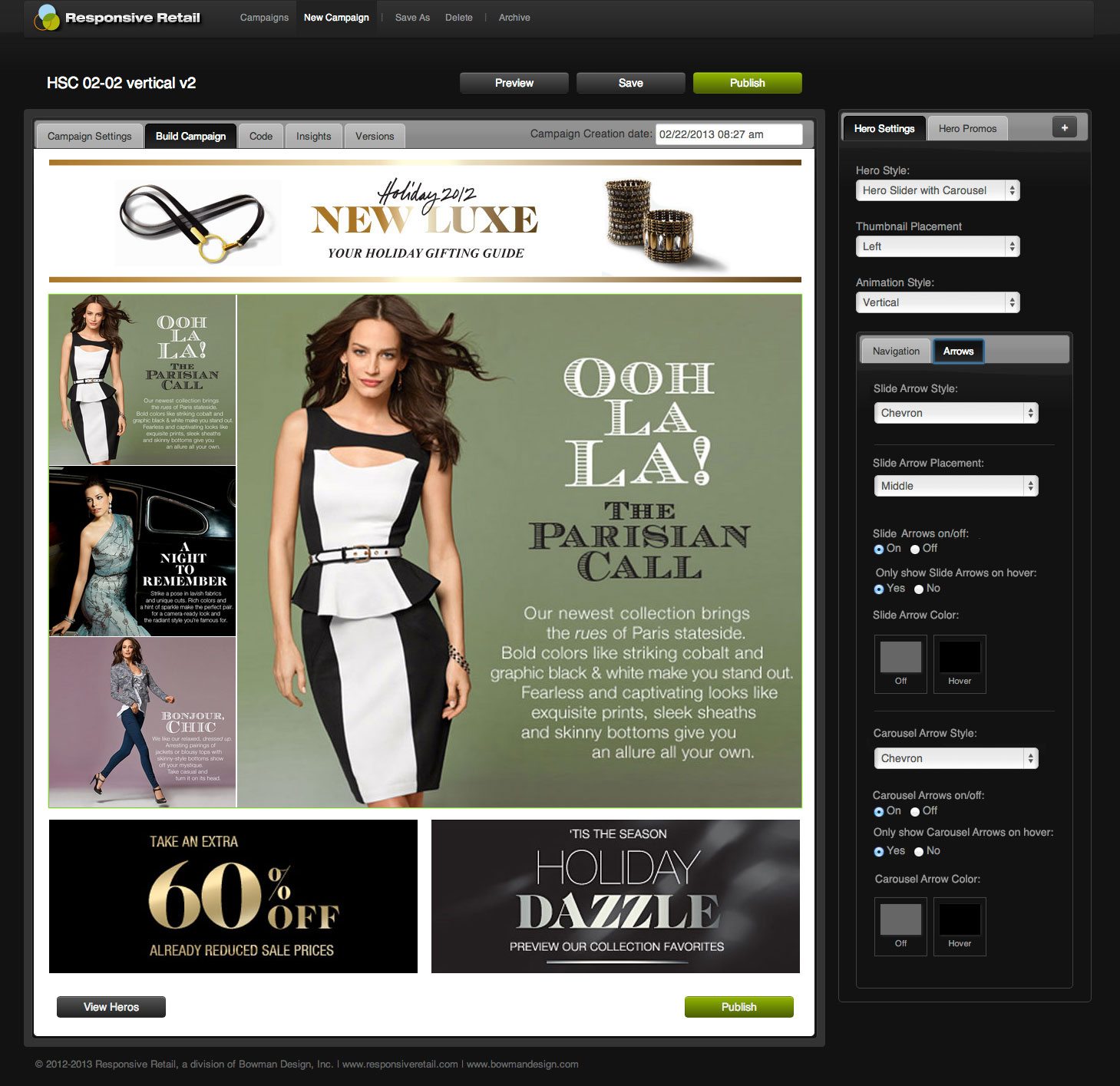
A patent-pending, single-page web application built for the retail workflow. Merchandisers dragged their assets into layouts that already knew retail, sliders, hovers, video, and full landing pages, and published as many campaigns and versions as a season demanded, without waiting on a release cycle.
Results Without Overhead
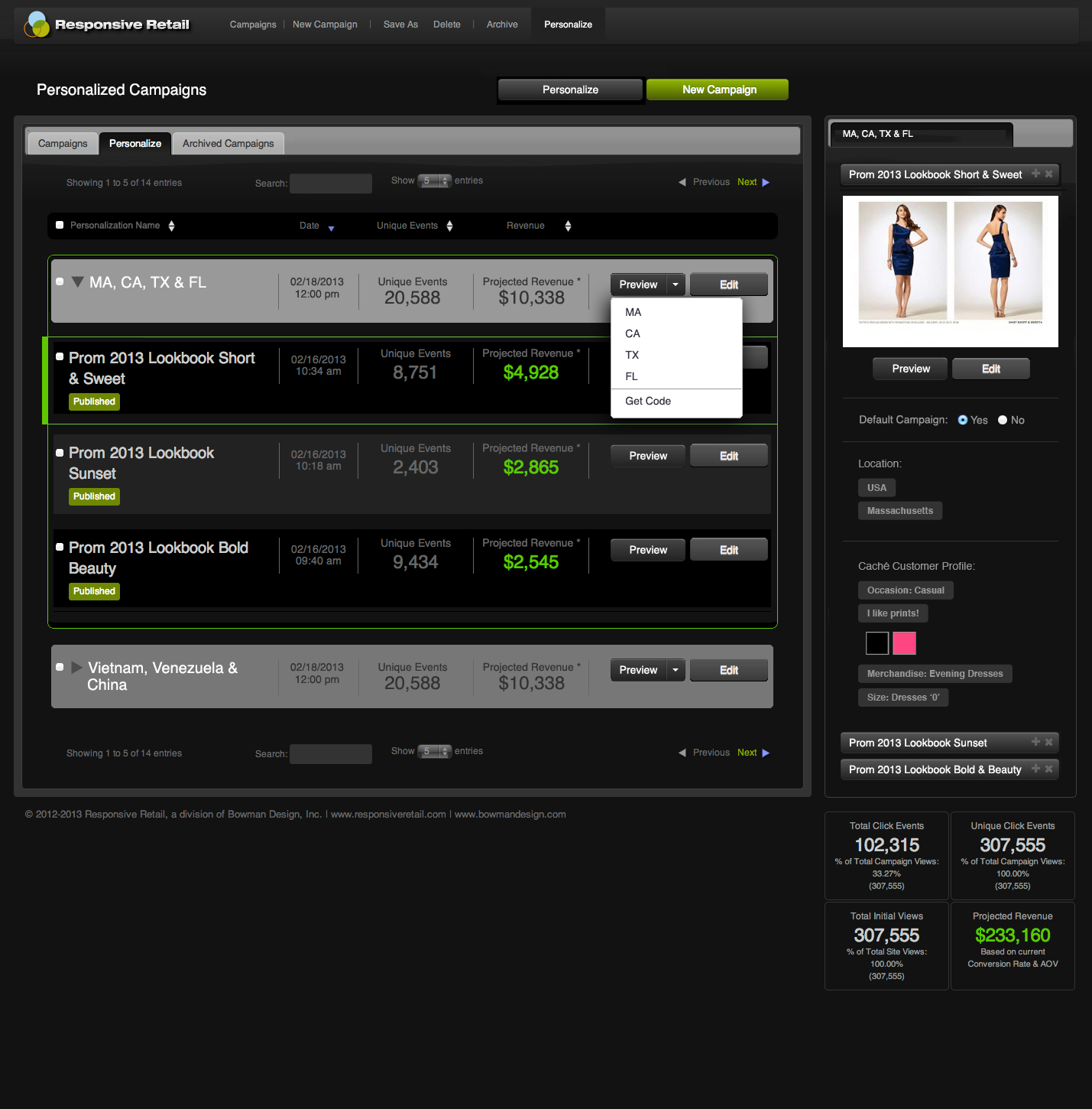
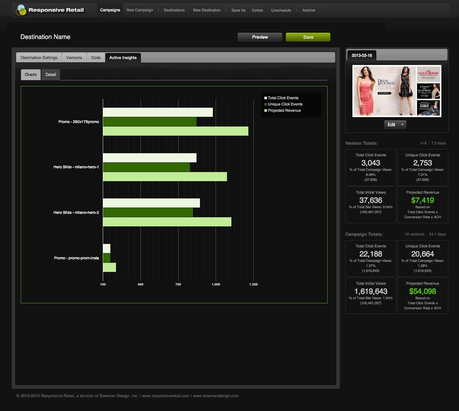
Every destination, campaign, and version reported its own clicks and revenue, sorted so the winner was obvious. Merchandisers got the benefit of A/B testing without its cost or ceremony, and the next campaign started from evidence instead of opinion.
The Through-Line
What began as a fight over an empty slot became a publishing system the marketer owned end to end.
The identity made a one-script startup read as infrastructure, so enterprise teams would trust it inside their storefronts. The injection script turned the industry’s hard line into a doorway, one line of code that made any platform publishable.
The builder gave that doorway a workflow. Drag, compose, version, and publish at the tempo of the retail calendar, while the interface stayed dark and quiet so the campaigns could carry the color.
The analytics finished the transfer. Once every version reported its own clicks and revenue, the merchandiser no longer needed permission or a developer to act; the next campaign justified itself.
The product never decorated the platform’s empty slot. It moved the power to fill it, permanently, to the people whose job it had always been.
Everything We Built Handed the Storefront to the Marketer.

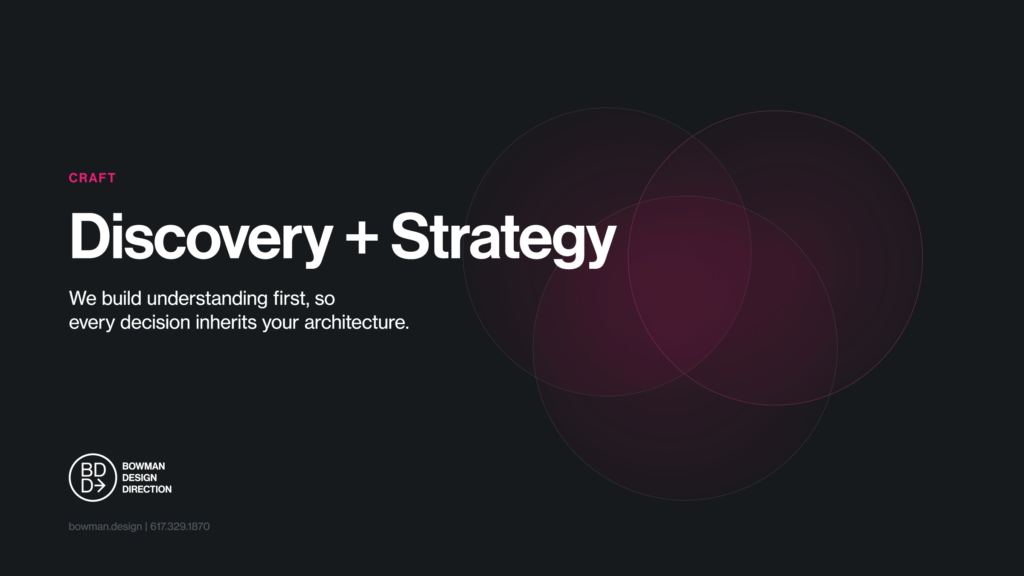
Discovery + Strategy
Before the product, we mapped the workflow the platforms left behind.
Business Roadmap
A product is a business, not a feature. We funded, priced, and staffed Responsive Retail as its own venture: a SaaS division with a patent filing, a sales pipeline, and sixteen developers shipping to enterprise retail.
Merchandising Intelligence
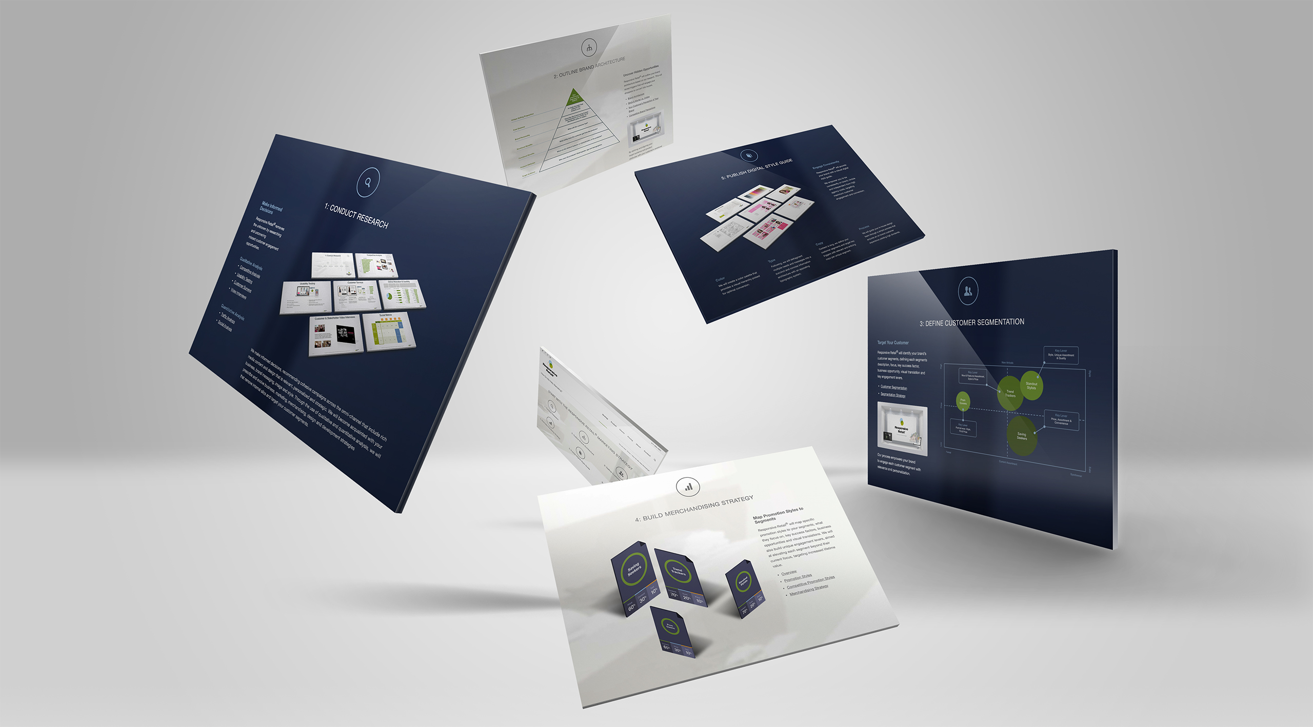
Better campaigns begin with better understanding. Discovery identified where customer intent, inventory priorities, and promotional opportunity aligned before a single campaign was built, so Responsive Retail translated merchandising strategy into publishing decisions and marketers started from evidence instead of intuition.
Audience Architecture
The user and the buyer were different people. We designed for the merchandiser who publishes daily and sold to the ecommerce owner who signs, so the tool had to be loved by one and defensible to the other.
Injection Strategy
Integrate, never replace. One script in an existing content slot meant no re-platforming fight, no vendor allegiance, and a sales conversation that started at yes.
Retail Workflow
Retail runs on a calendar, not a backlog. Campaigns, versions, and holiday timing were first-class objects in the product, so publishing matched the tempo merchandisers already lived by.
Competitive Positioning
Not a platform, not an agency. Responsive Retail was the layer between: faster than professional services, cheaper than re-platforming, and published directly into the retailer’s own site.
Brand Identity
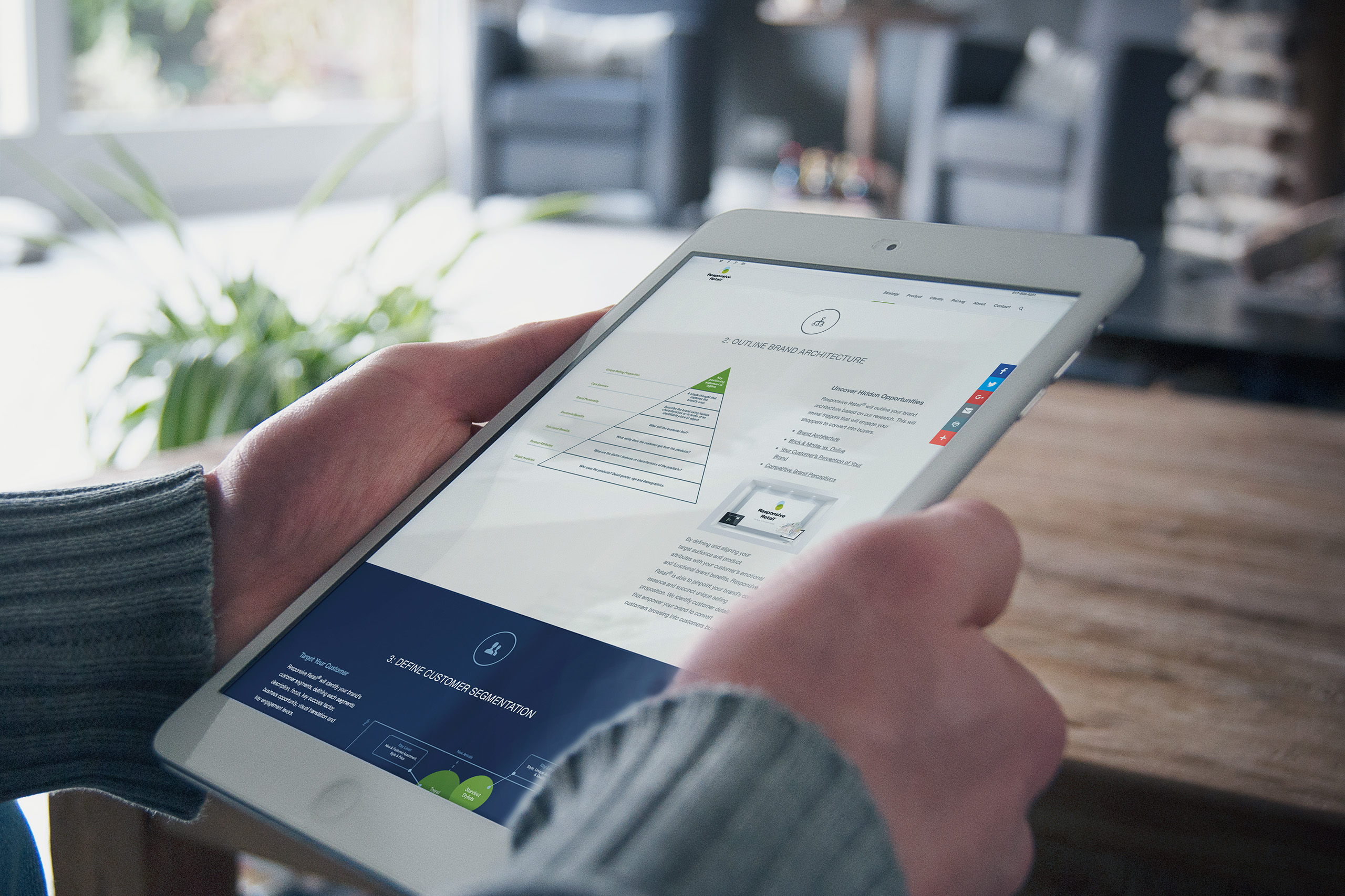
Responsive Retail began long before the first campaign. Discovery came first. Analytics, merchandising strategy, customer behavior, inventory performance, and creative direction all pointed toward the same question: who is this campaign really for? The product could publish in minutes, but its argument to retailers was never speed alone. It was knowing which campaign deserved to exist. The identity had to carry that thinking before the software ever loaded.
That question became the identity itself. Three translucent circles form a Venn diagram representing the three discoveries every successful retail campaign depends on: understanding the customer, understanding the merchandise, and understanding the strategy that connects them. The strongest campaigns rarely emerge from any one of those disciplines alone. They emerge where all three overlap.
The mark became more than a logo. It was the product’s operating philosophy in one symbol: discover where customer intent, merchandising opportunity, and inventory priorities agree, then build the campaign from that intersection. Better campaigns begin with better understanding. The wordmark provided the counterbalance, heavy black letterforms with the confidence of enterprise infrastructure, because the application asked retailers to trust one script inside their storefront.
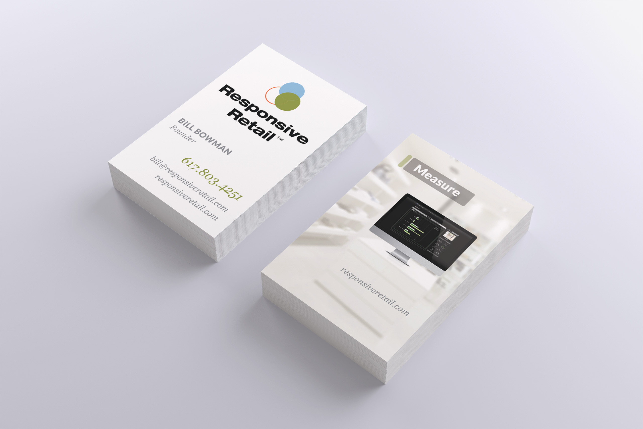
The tagline completed the promise. The Power to Promote and Engage described a transfer of authority from developers and release cycles to the people closest to the customer. Across the application, the sales deck, business cards, and the marketing site, the identity kept dark confidence for the frame and saved the color for the campaigns. Every touchpoint repeated the same sequence, discover, merchandise, then promote, and the mark opened each one with the same three circles: the strategy signing its own work.
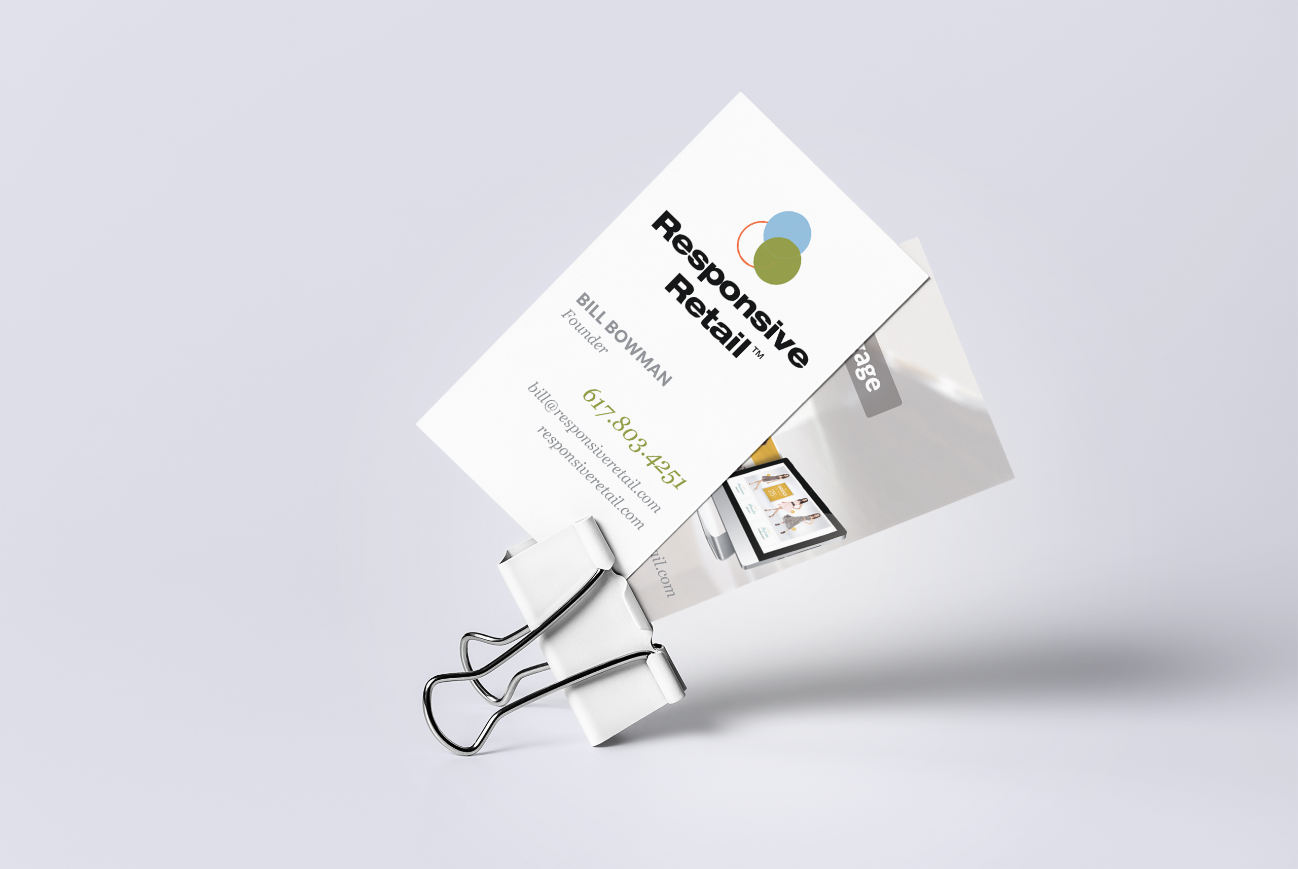
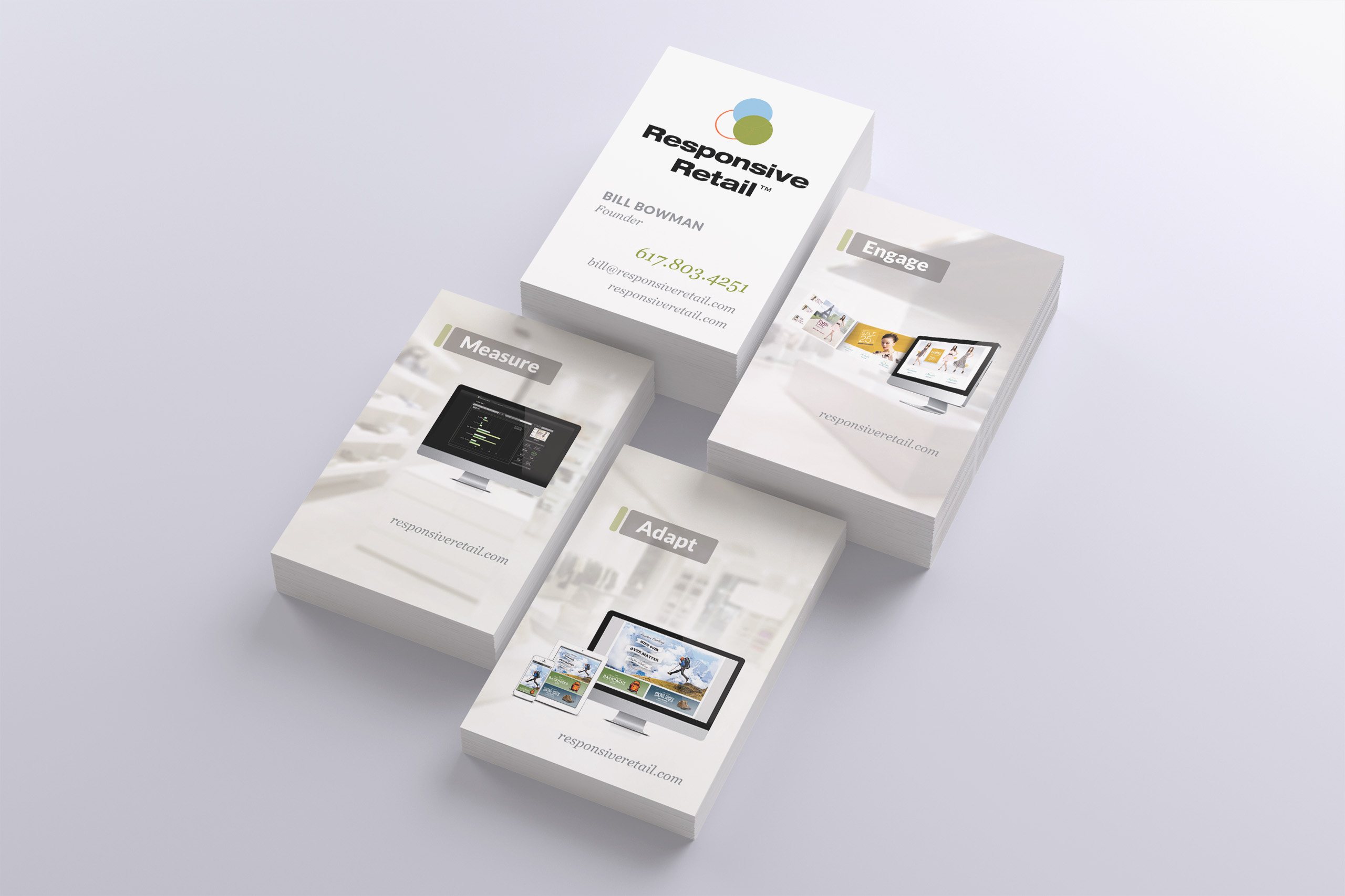
Business Cards
Application
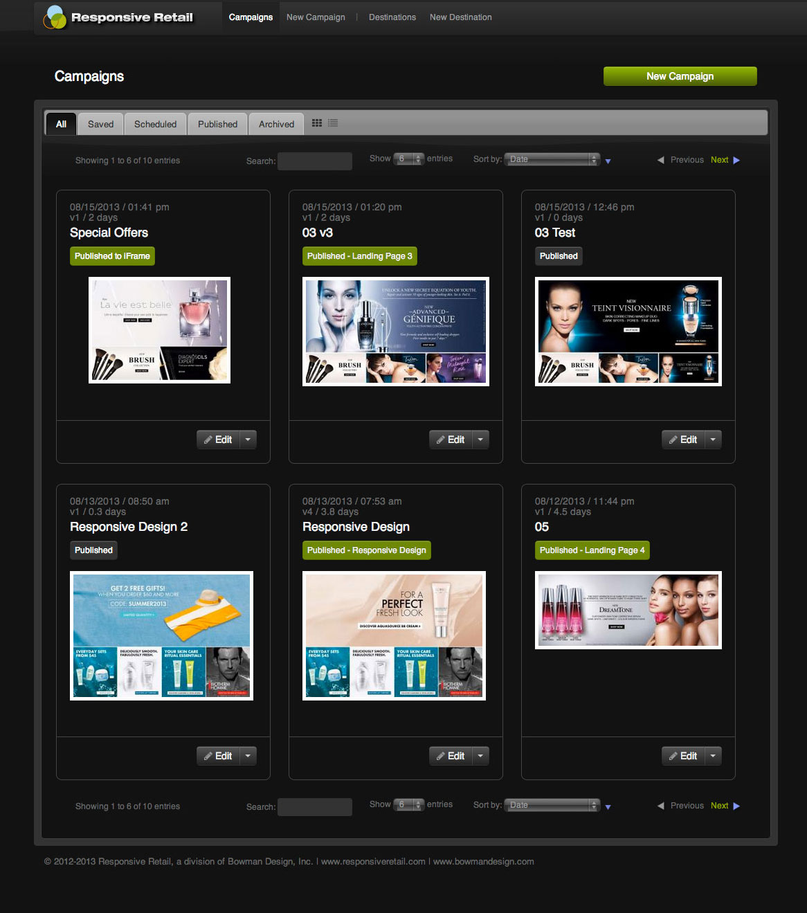
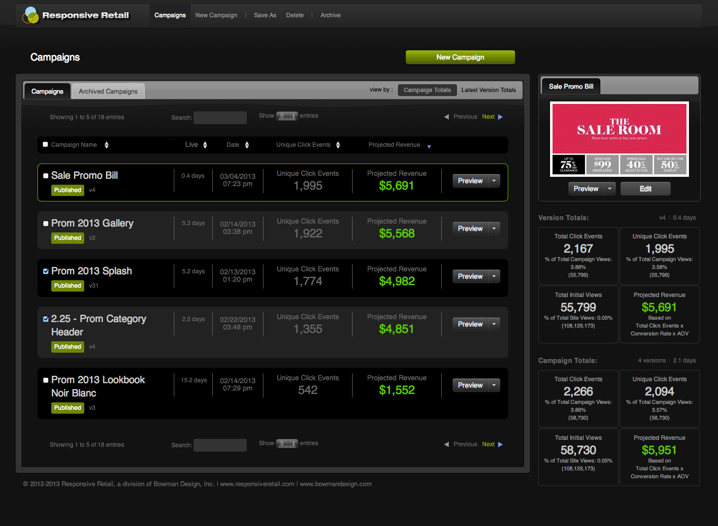
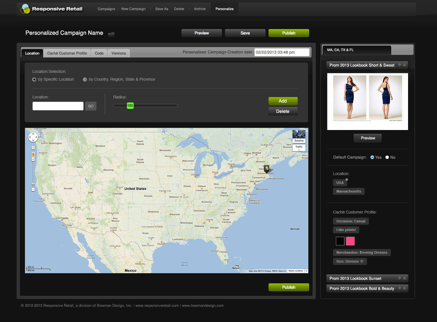
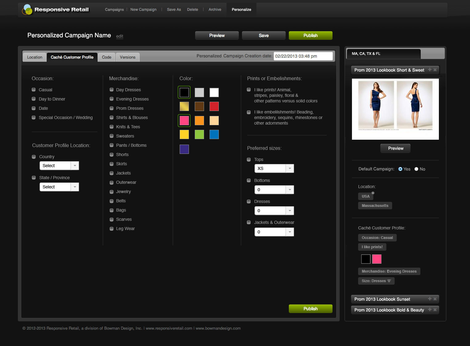
The application opened on a dashboard, not a document. Destinations, campaigns, and versions sat in one dark workspace where a merchandiser could see everything currently published and everything waiting for its moment. Built as a single-page application in 2012, it behaved like desktop software running in the browser: immediate, direct, and fast enough to keep up with a merchandiser mid-thought. Nothing about it asked a marketer to think like an engineer.
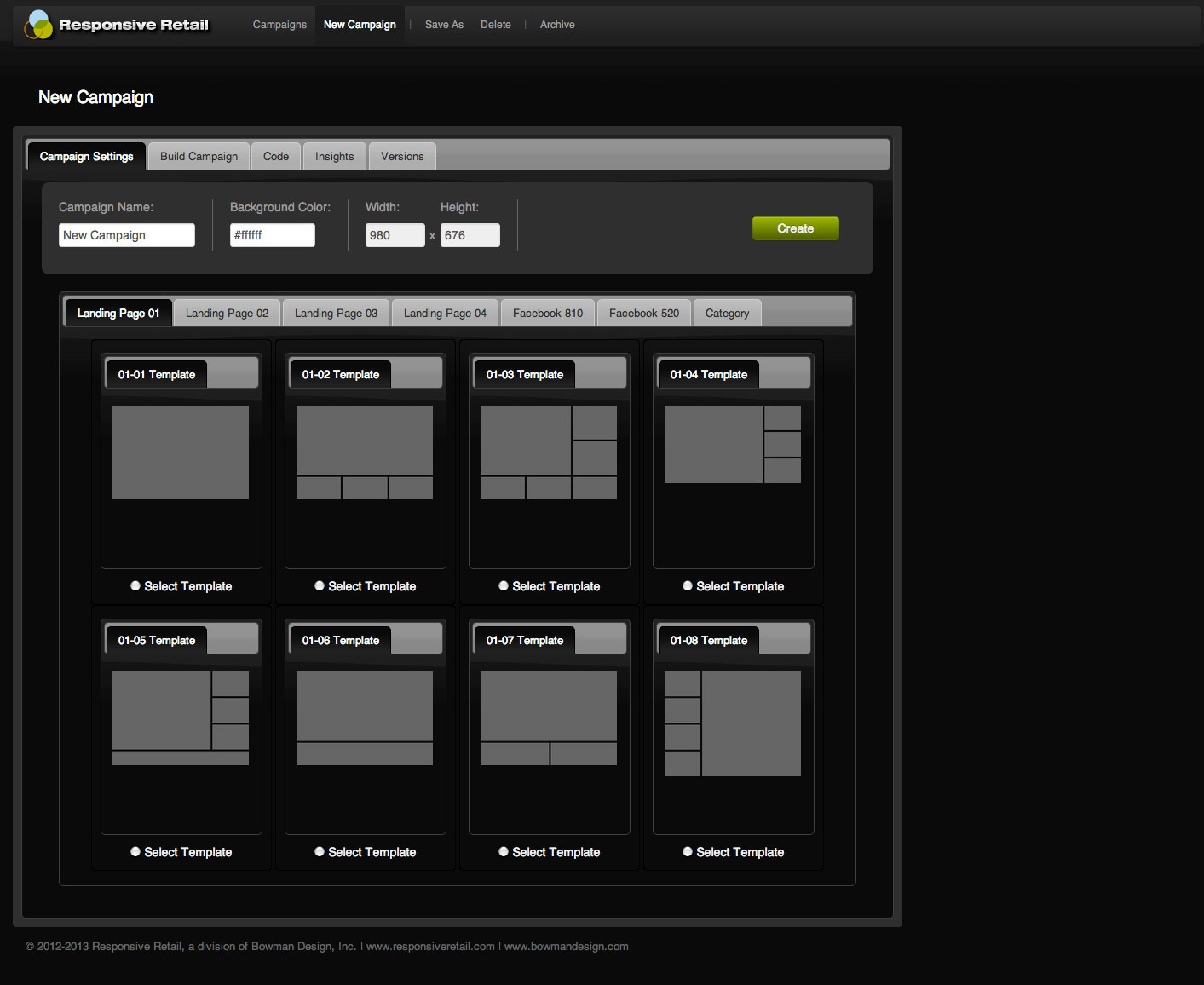
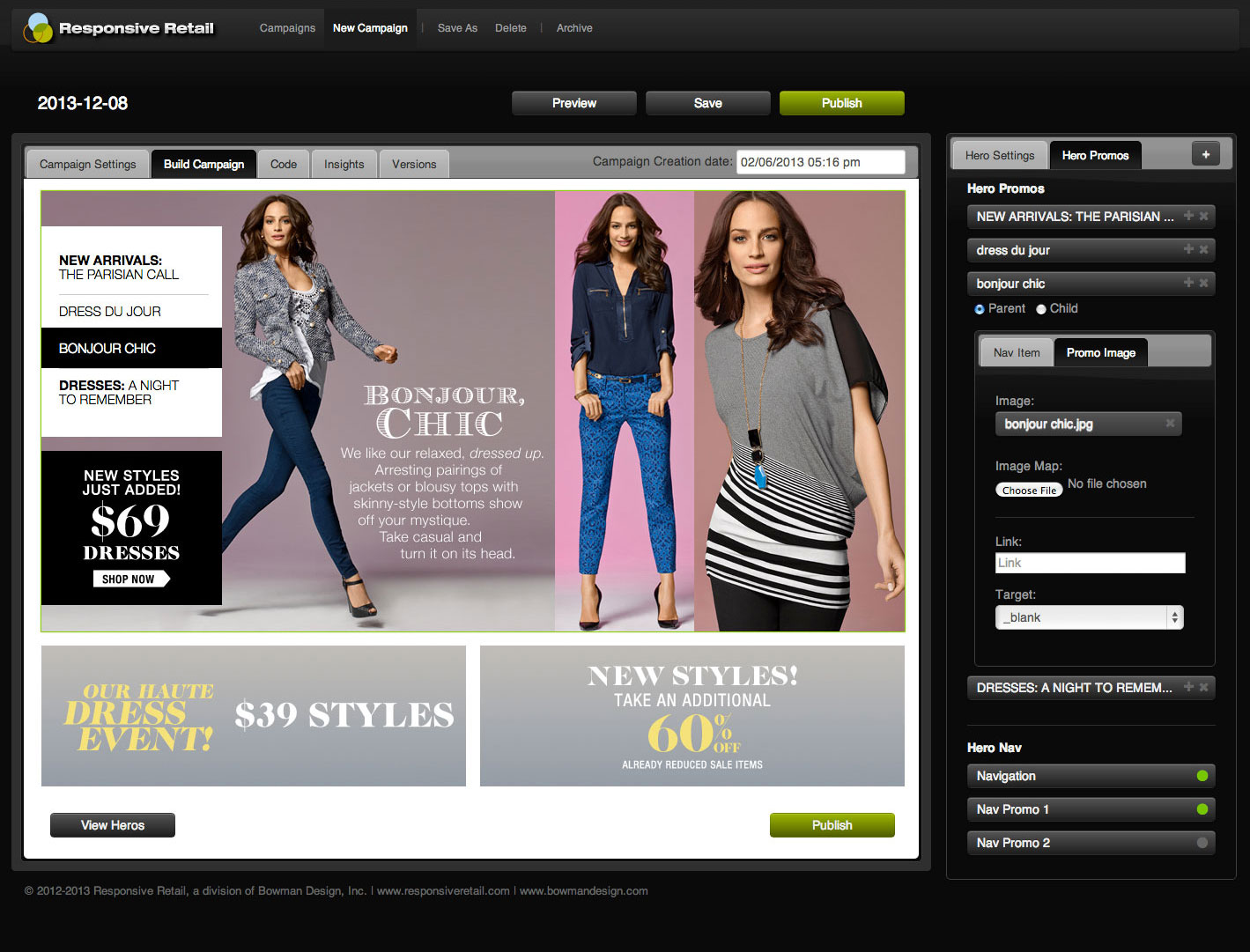
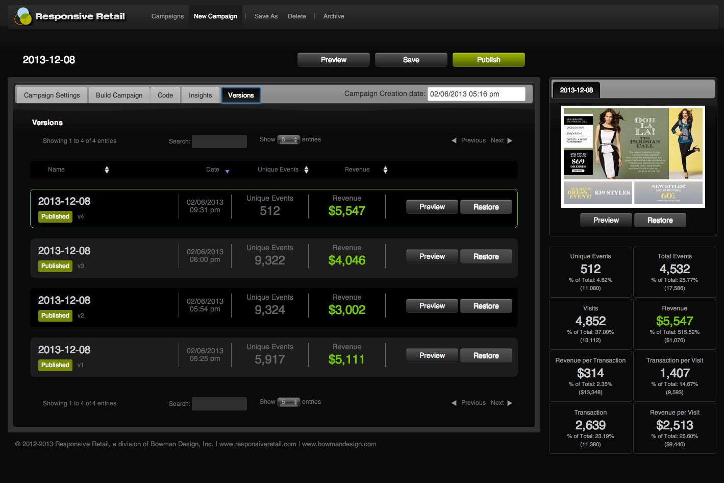
Building a campaign meant dragging merchandising assets into retail layouts that already knew their job: heroes, category grids, lookbooks, sliders, hover states, and video, composed on the canvas and previewed exactly as the storefront would render them. Every campaign could carry as many versions as the merchandiser wanted to try, and every version stayed on brand because the layouts carried the rules with them.
Publishing became what it should be: easy enough that merchandisers could focus on merchandising strategy instead of mechanics.
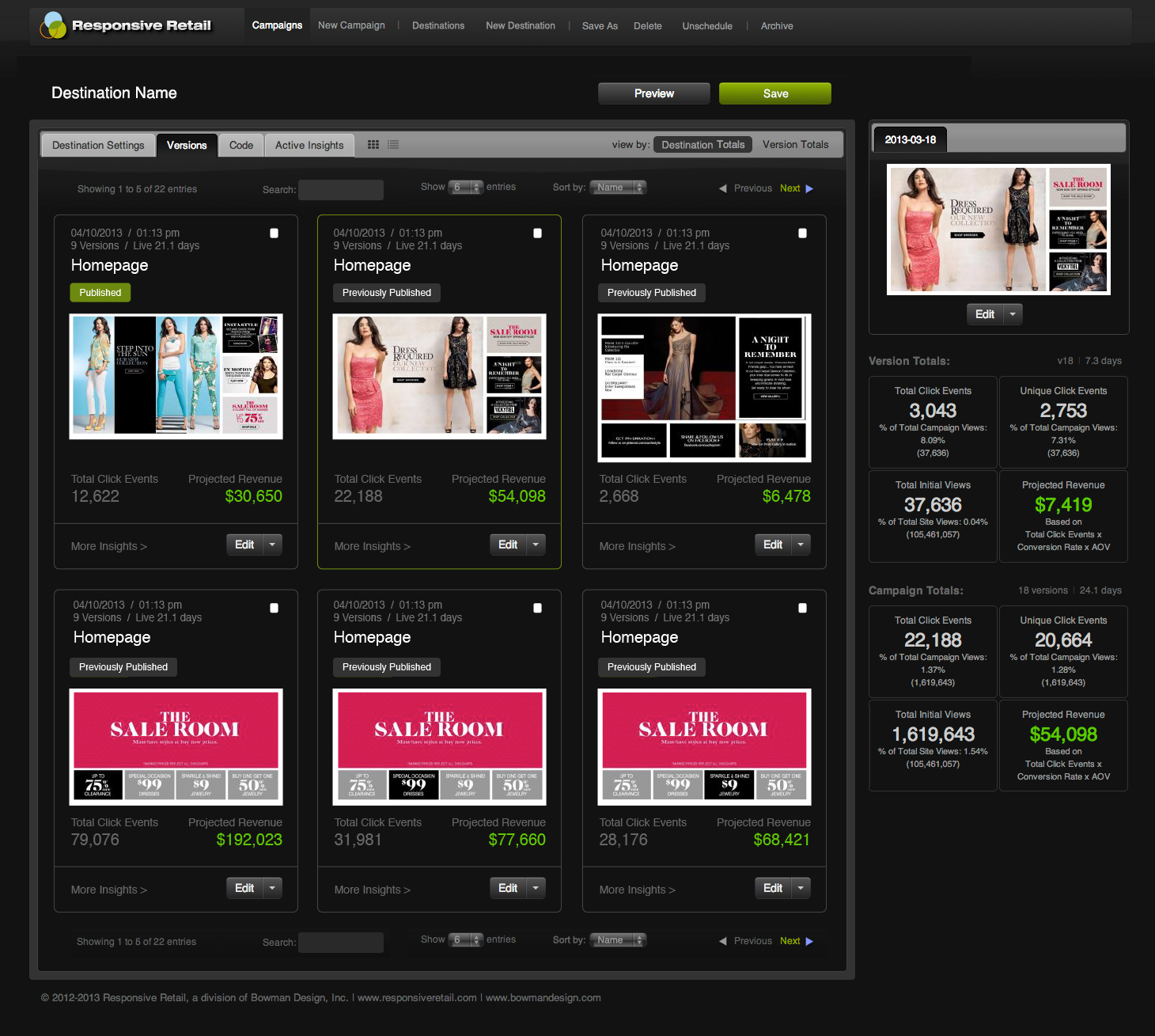
One click sent the campaign through the injection script into the live site, on any platform the retailer already ran. Campaigns could be staged and timed in advance, so a holiday weekend went live from a calendar days before the traffic arrived. Versions could run side by side on the same destination, letting a merchandiser try the bolder idea without betting the weekend on it.
Measurement closed the loop. The results view sorted every destination, campaign, and version by clicks and revenue, with everything tracked in the Google Analytics reports retailers already trusted. None of it required a developer or a manual. Lancôme’s ecommerce team and a boutique owner used the same tool the same way, and the next campaign started from what actually worked.
The interface did more than accelerate production. It transferred control of the retail calendar to the people responsible for the customer and the merchandise.

Merchandising System
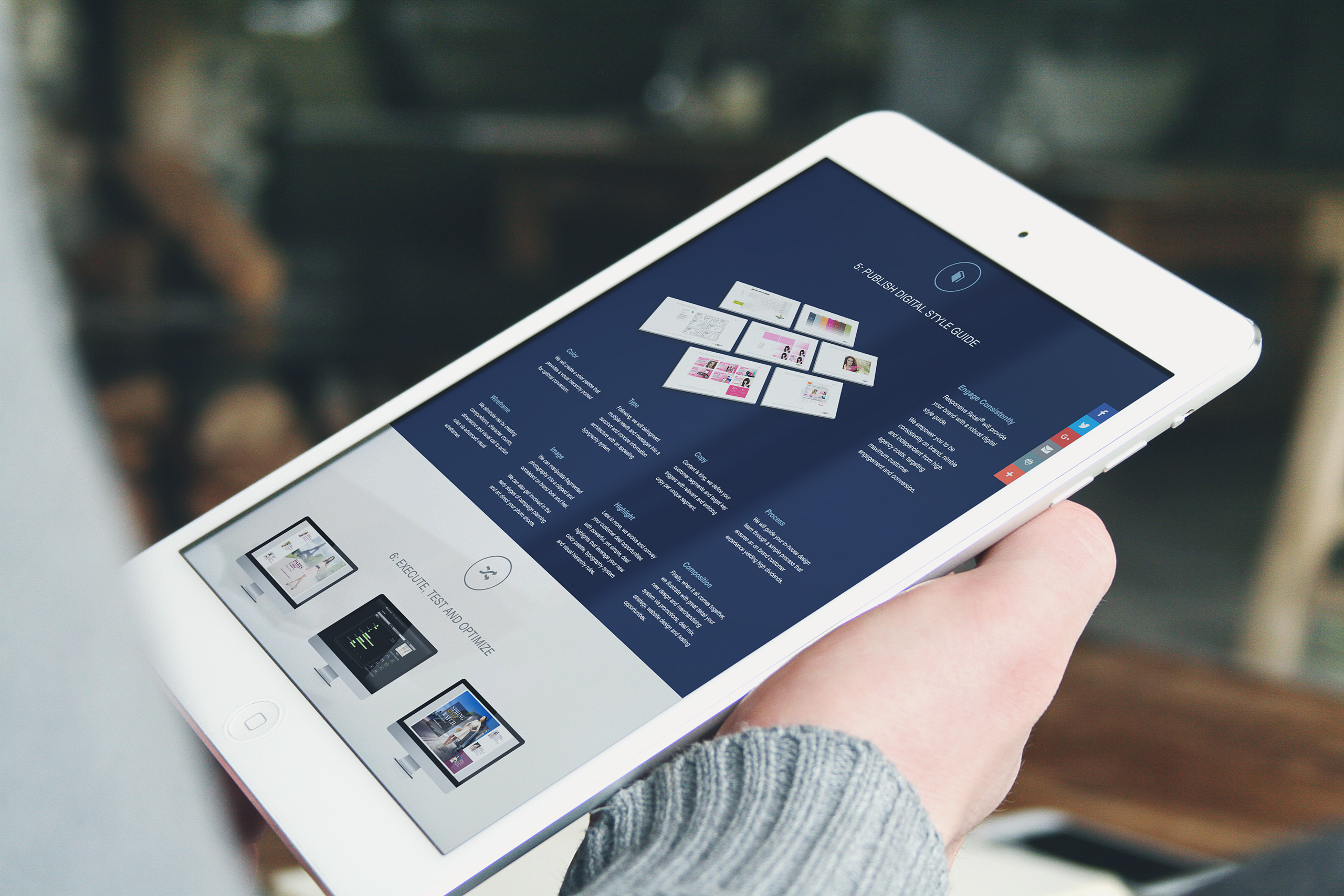
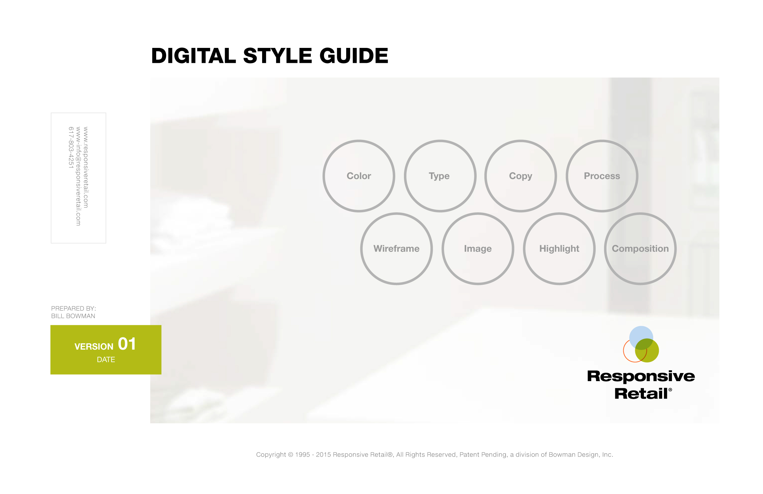
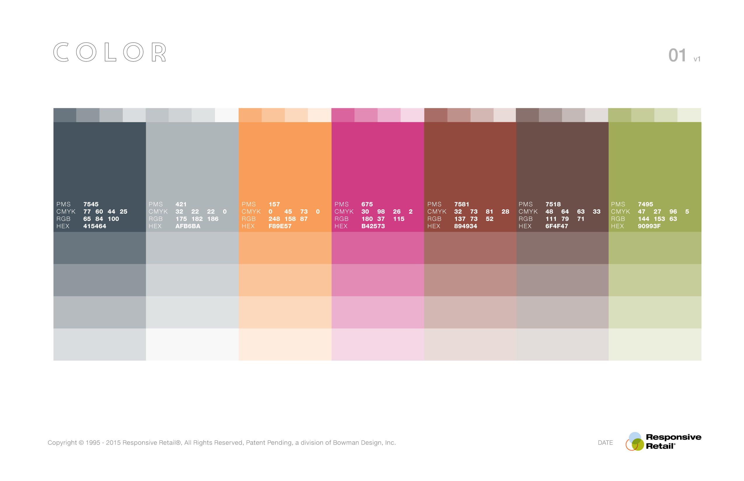
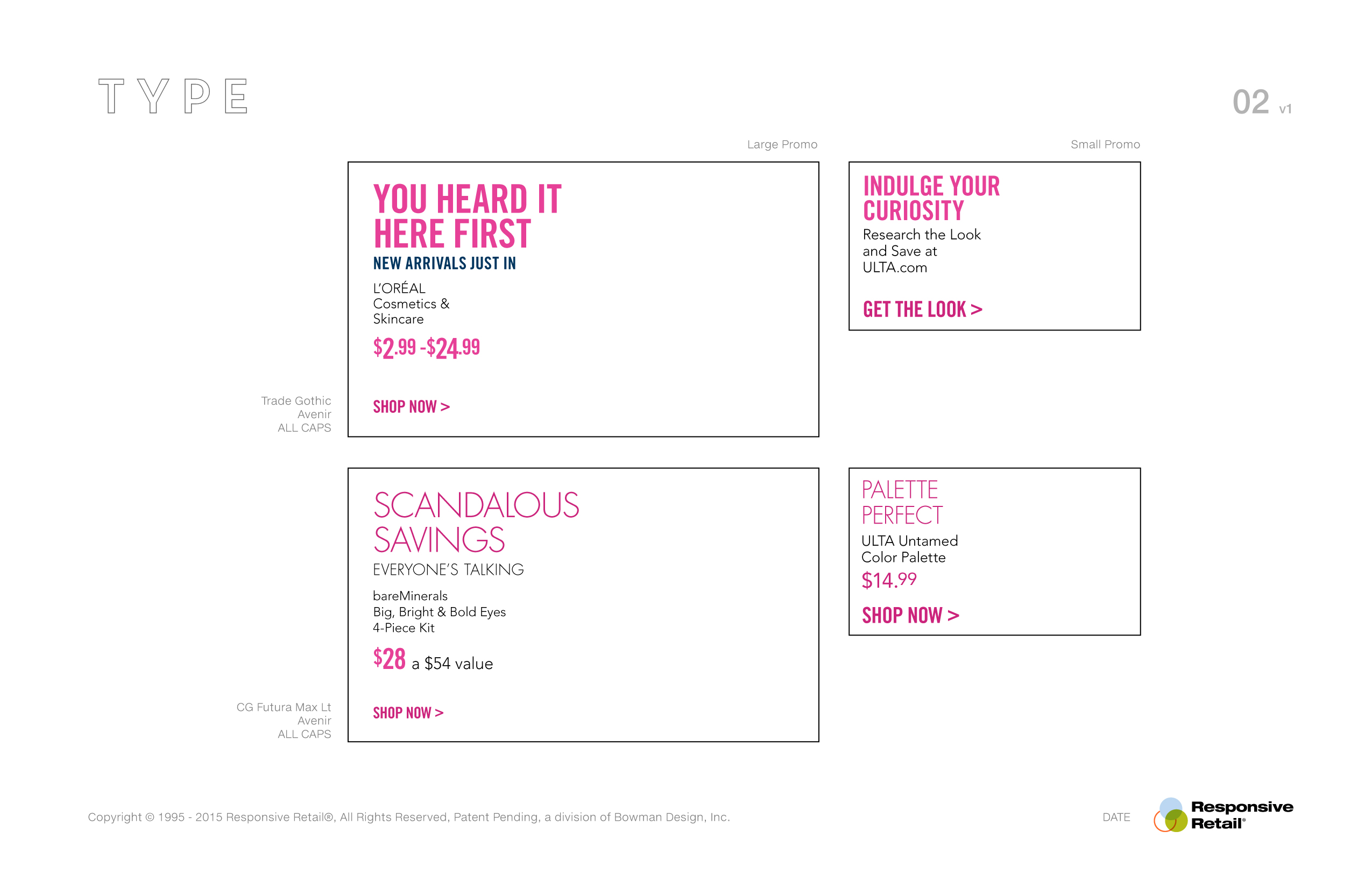
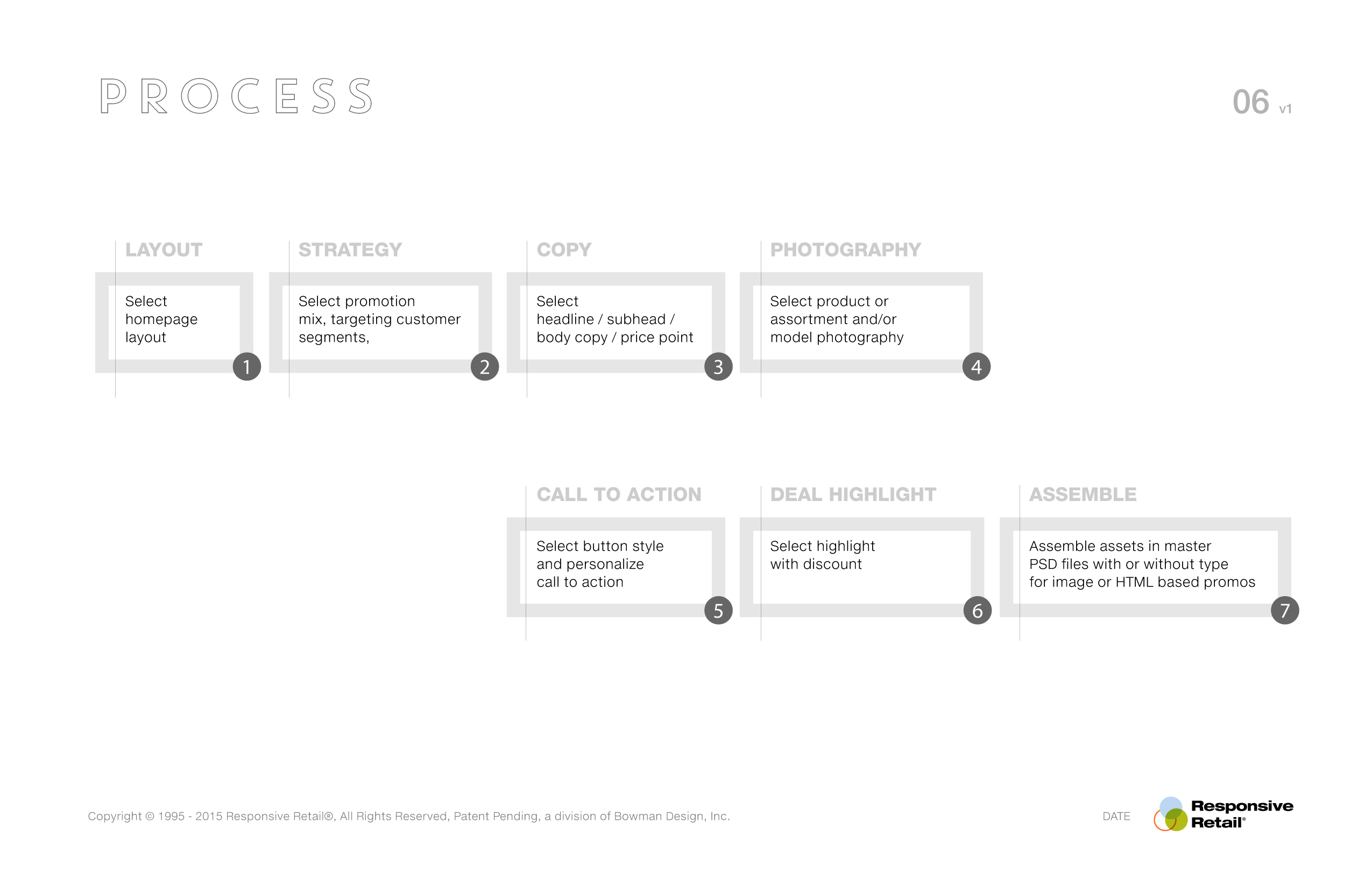
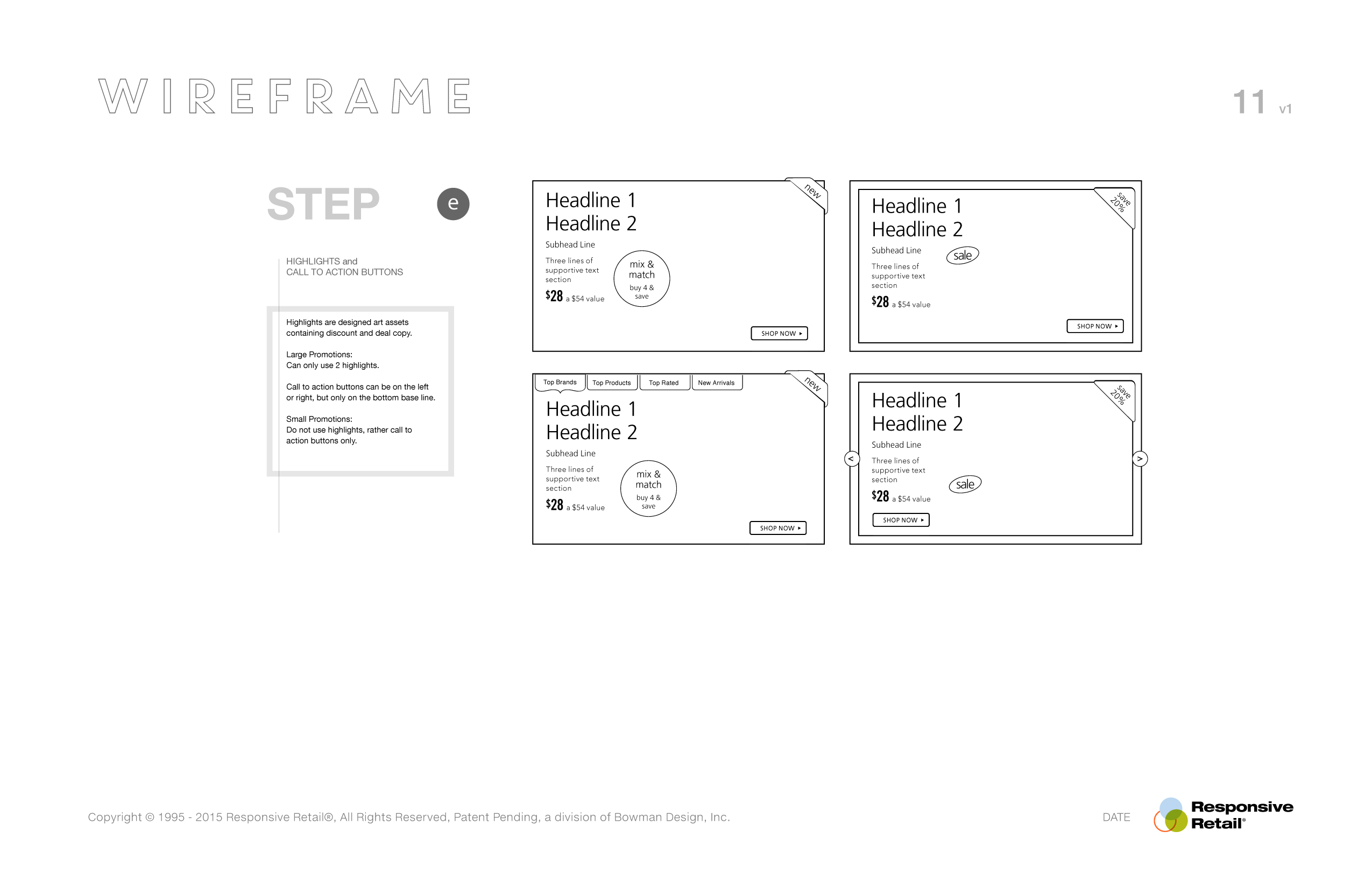
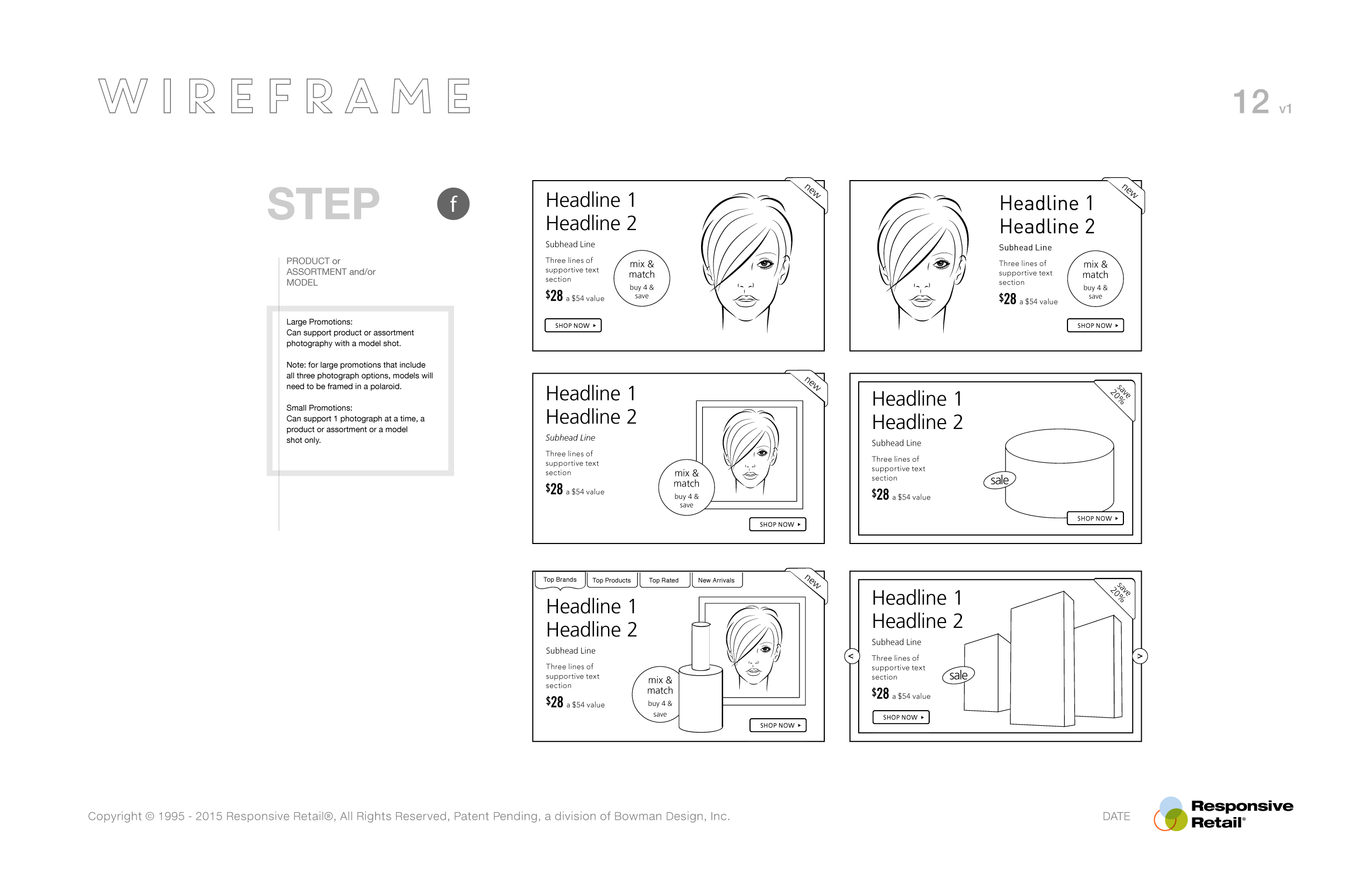
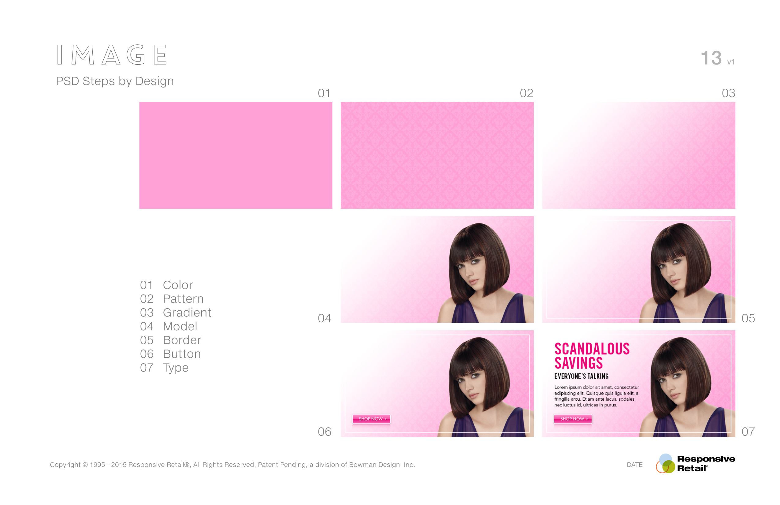
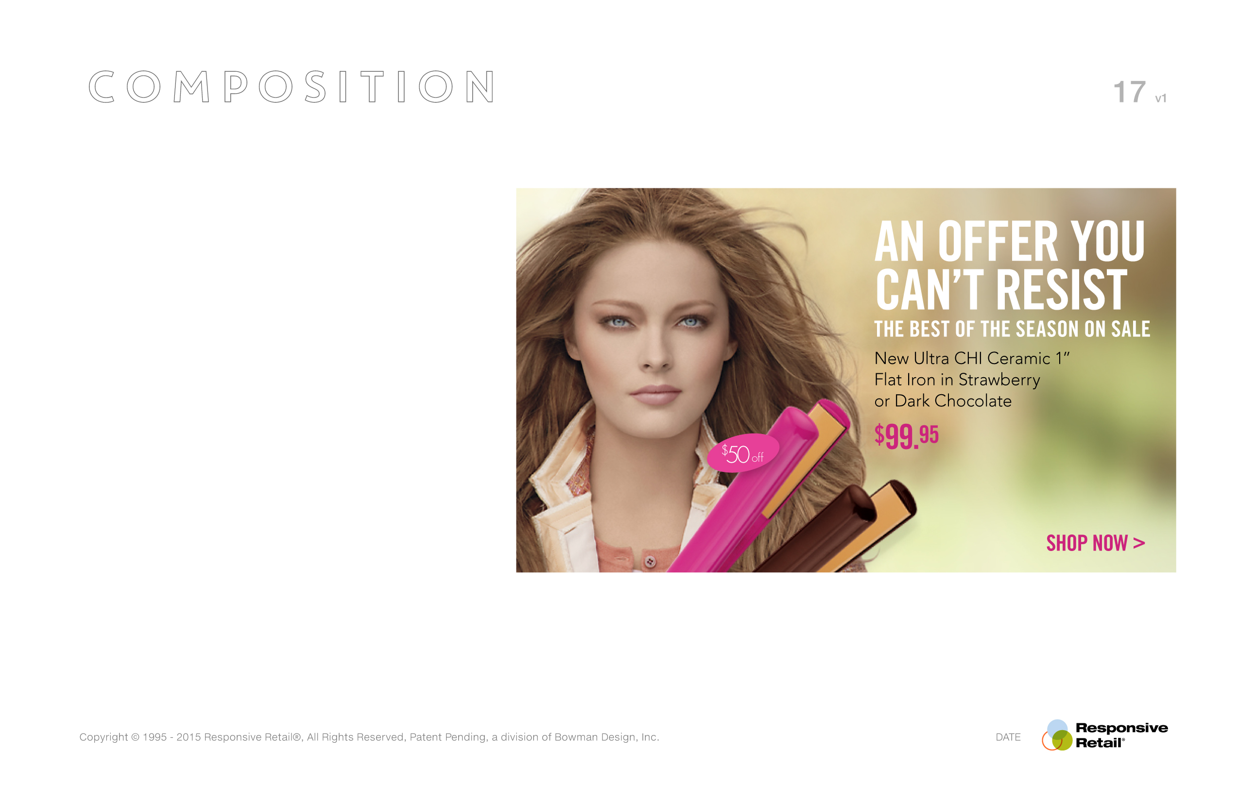
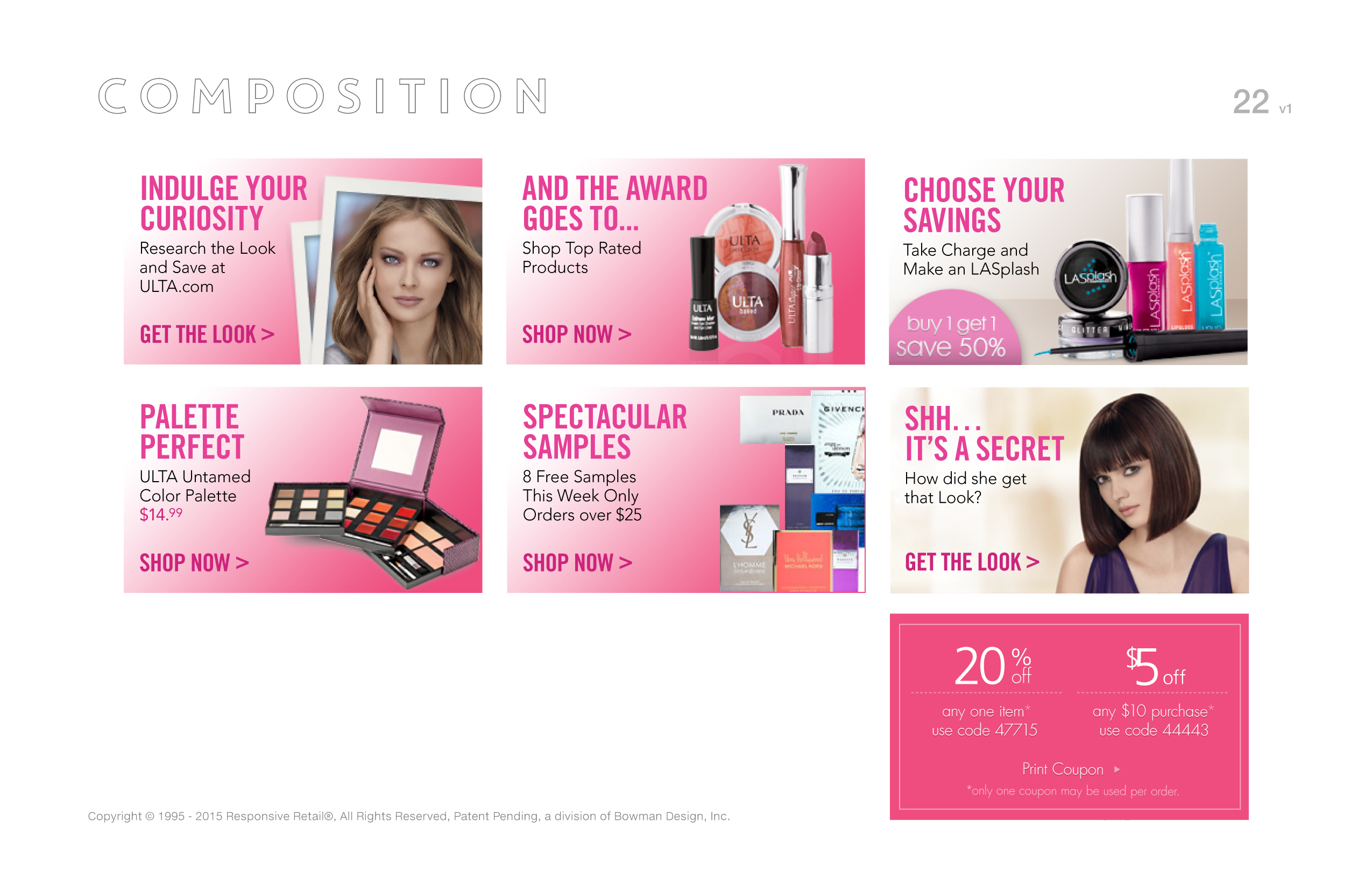
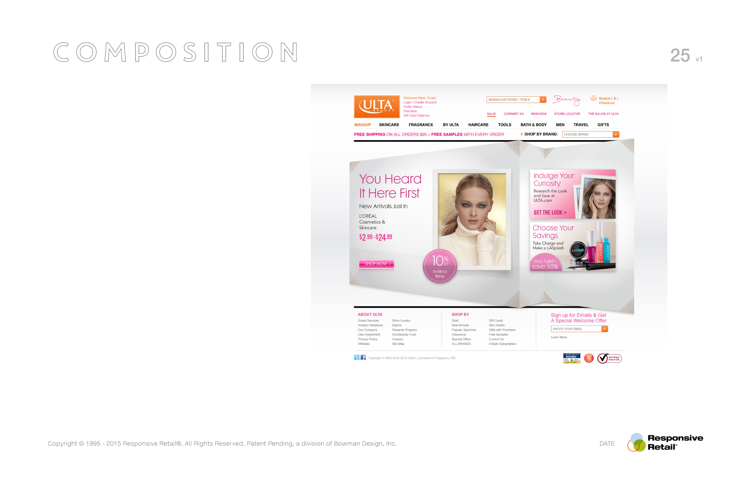
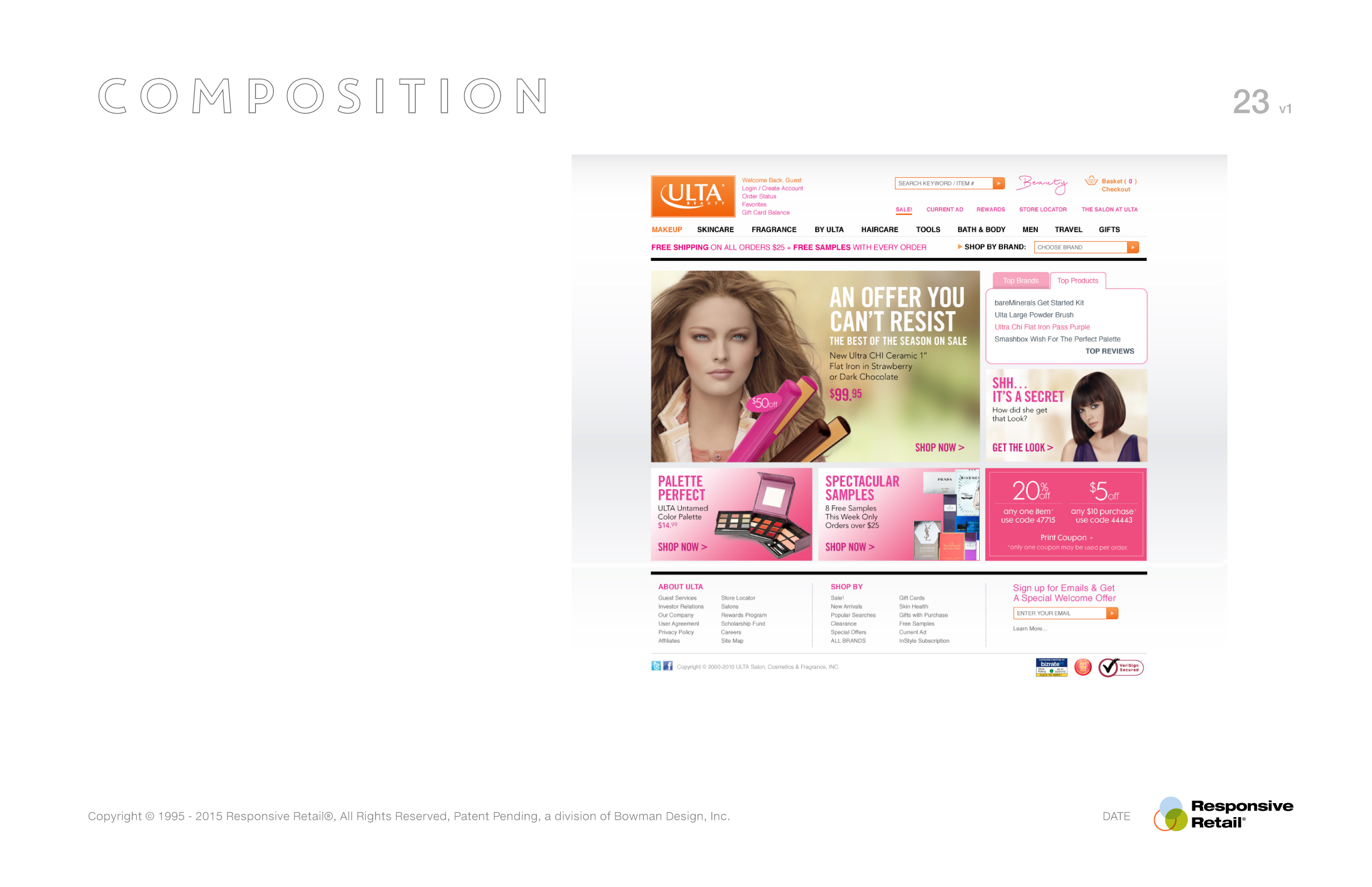
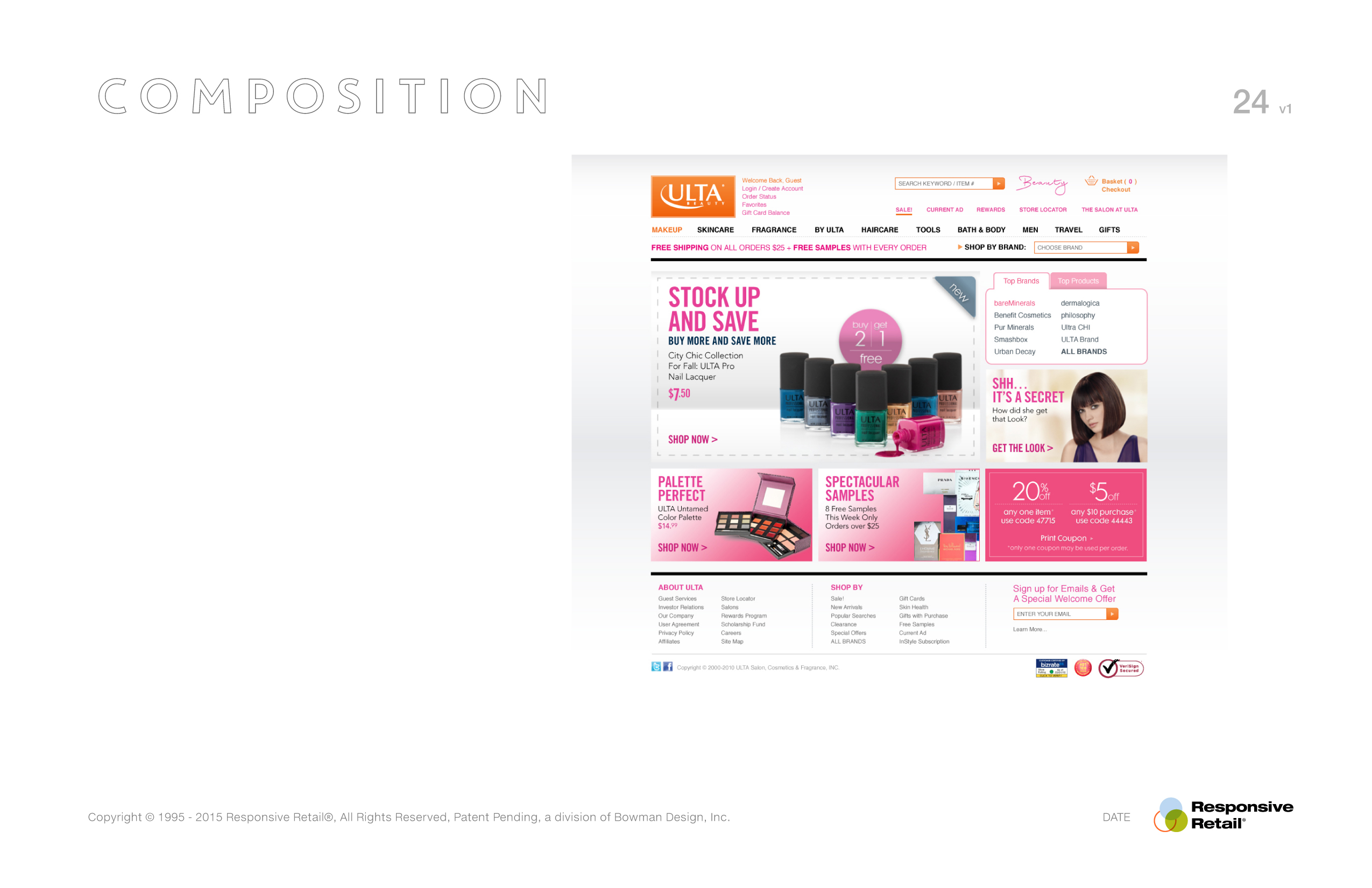
The application solved only half the problem. Retailers also needed a repeatable way to build campaigns that remained on brand, merchandised consistently, and could be assembled quickly by any team. We developed merchandising logic that transformed homepage promotions from one-off creative exercises into a repeatable publishing system. Every campaign followed the same strategic language while remaining flexible enough to support new products, promotions, and seasonal initiatives.
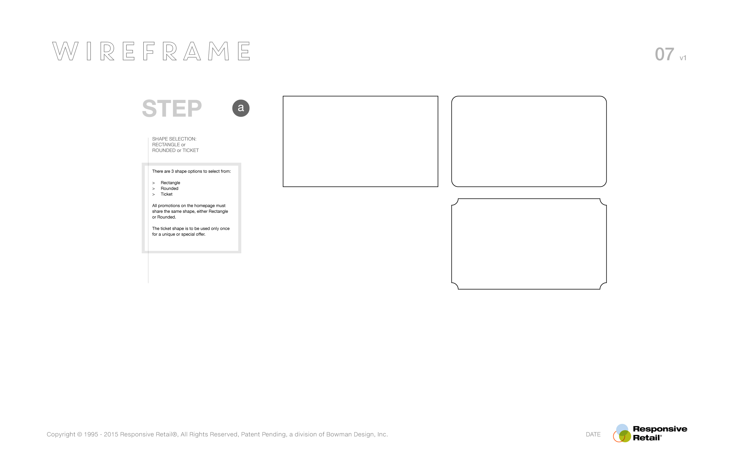
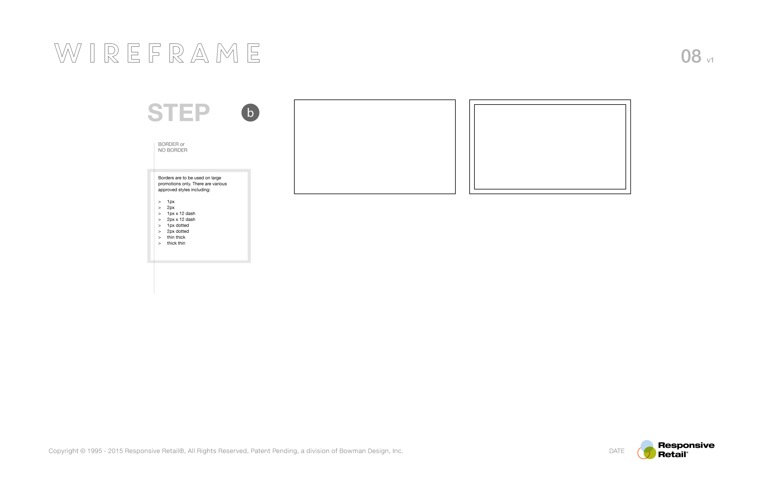
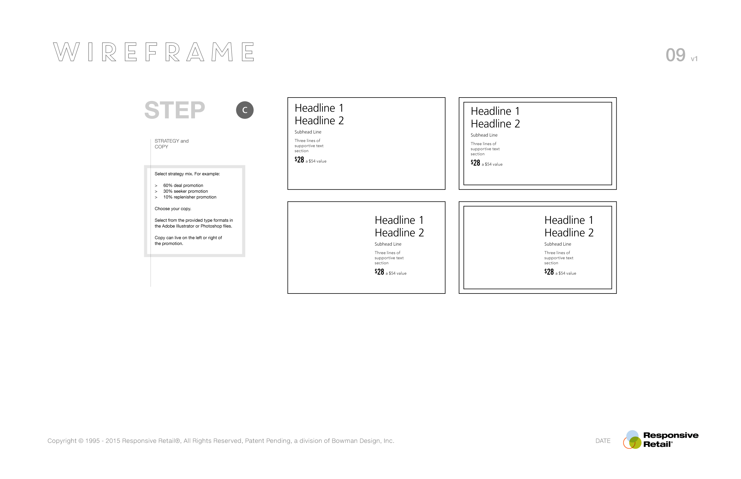
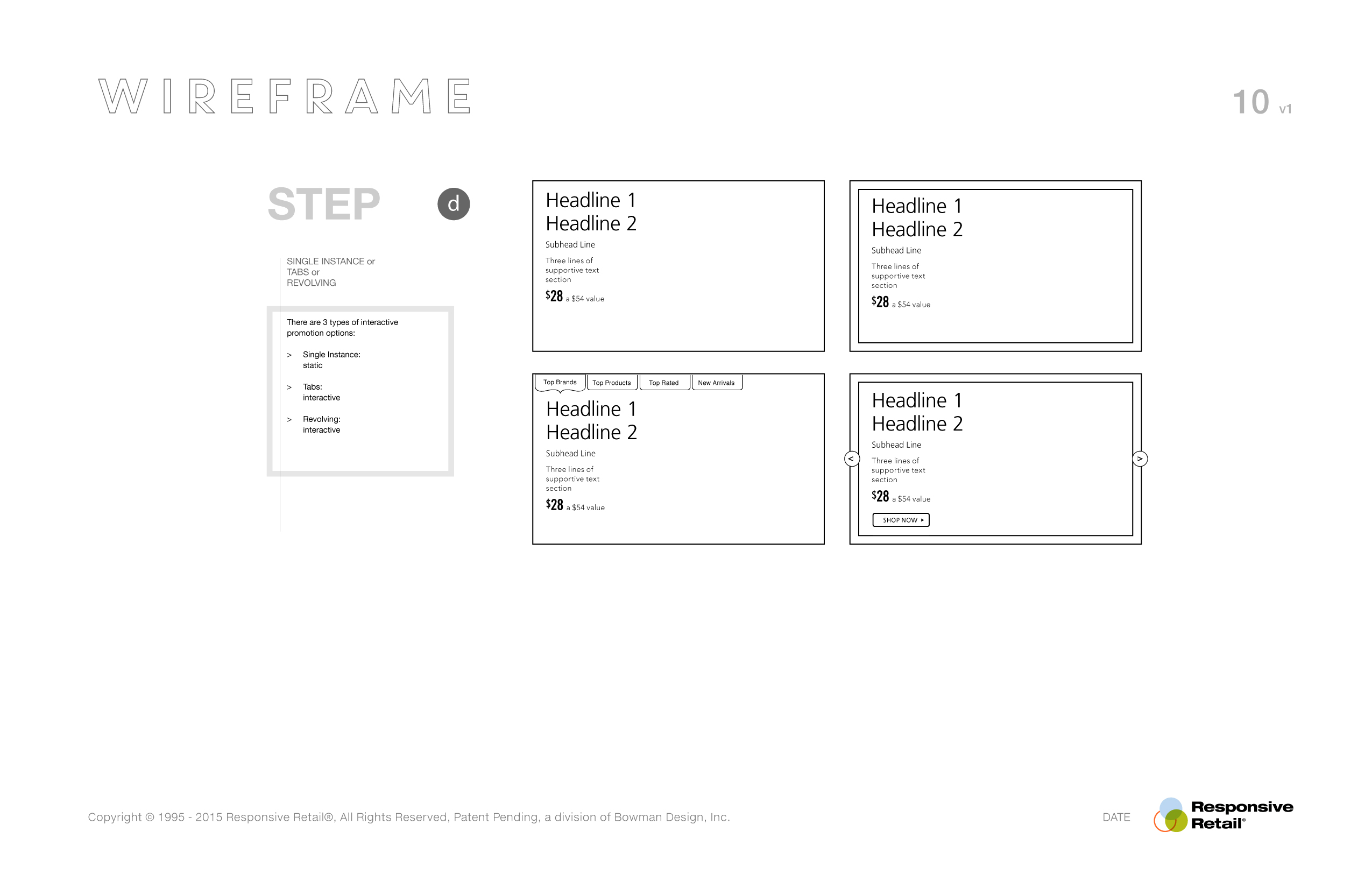
The logic broke every promotion into a series of intentional decisions. Merchandisers selected a customer strategy, copy style, photography, promotional highlights, calls to action, interaction patterns, and composition from a defined library of approved options. Rather than beginning with a blank canvas, every campaign started with a proven framework that dramatically reduced production time while improving visual consistency across hundreds of promotions.
The system balanced freedom with governance: creative teams retained the ability to produce unique campaigns, while the underlying rules protected typography, color, spacing, composition, interaction, and merchandising priorities. New employees could build sophisticated promotional experiences in days instead of months because the design language had already been translated into a clear visual operating system.
What emerged was far more than a style guide. It became the publishing methodology behind Responsive Retail itself. The application accelerated production, while the merchandising system ensured every campaign maintained the quality, consistency, and strategic intent expected from premium retail brands. Together they transformed homepage merchandising from a handcrafted process into a scalable publishing platform. Hundreds of campaigns later, every one still looked like the same brand.
The methodology made quality repeatable. Each campaign could respond to a different moment while remaining part of one governed retail system.
Client Campaigns
- Lancôme
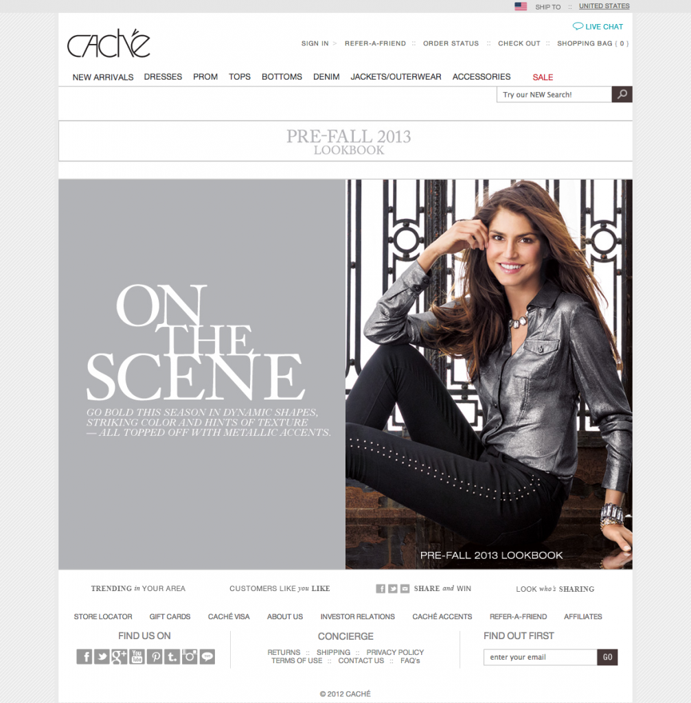
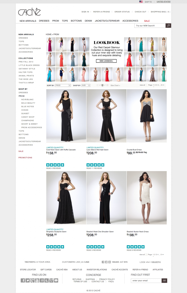
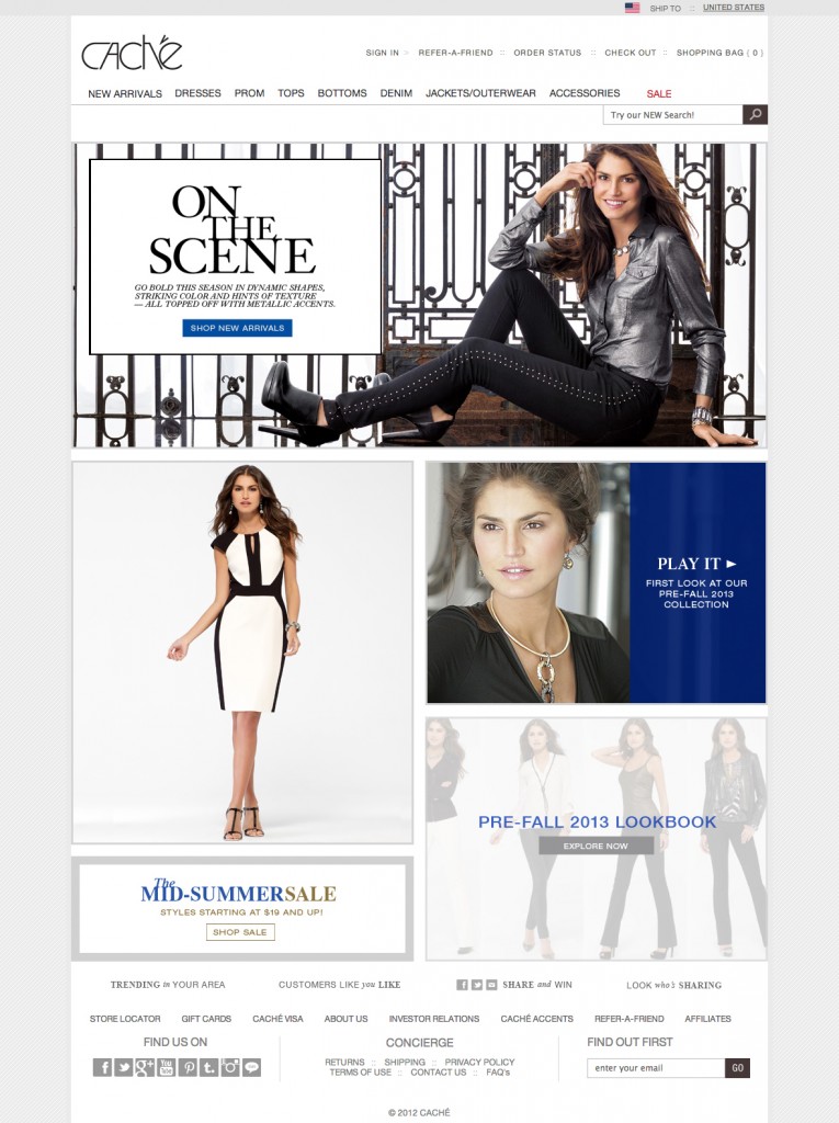
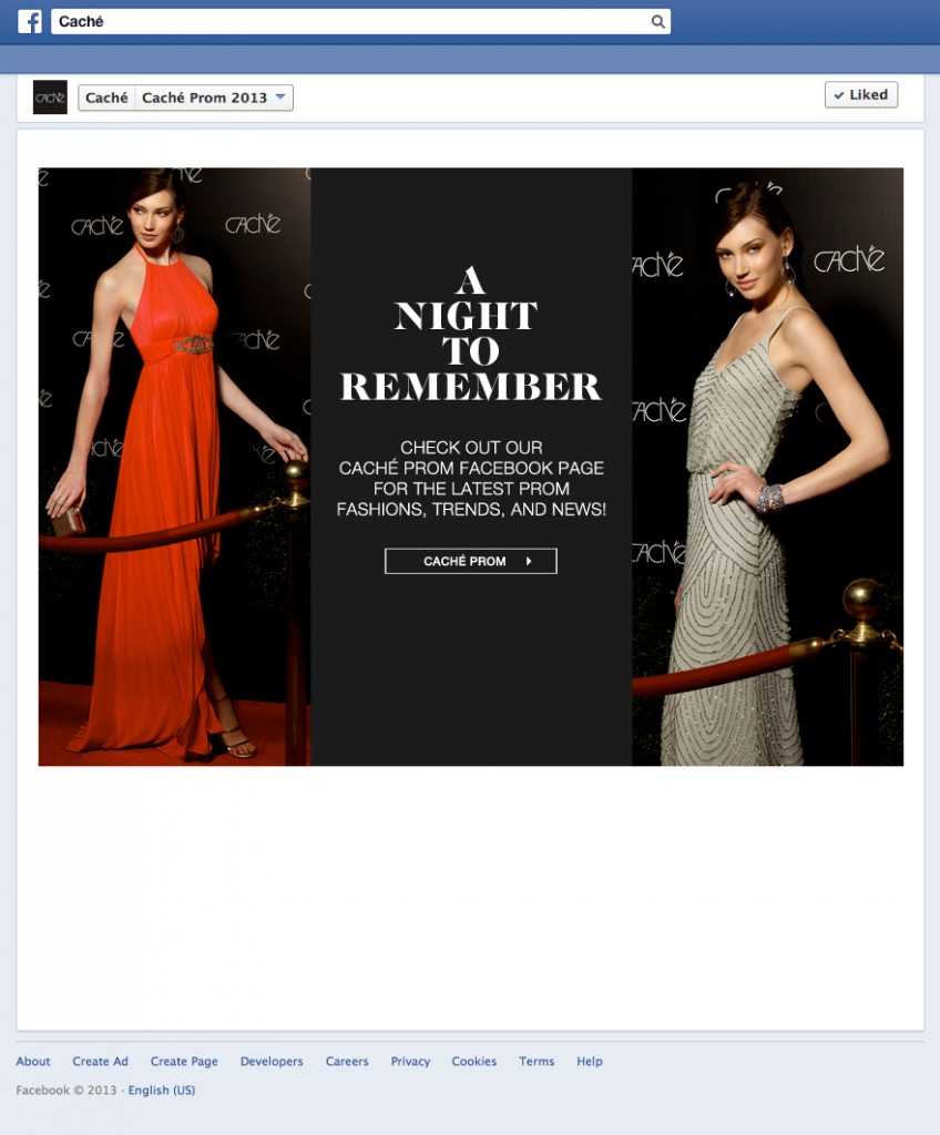
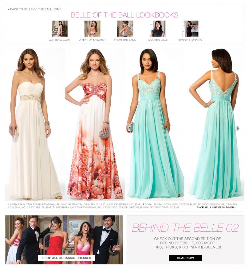
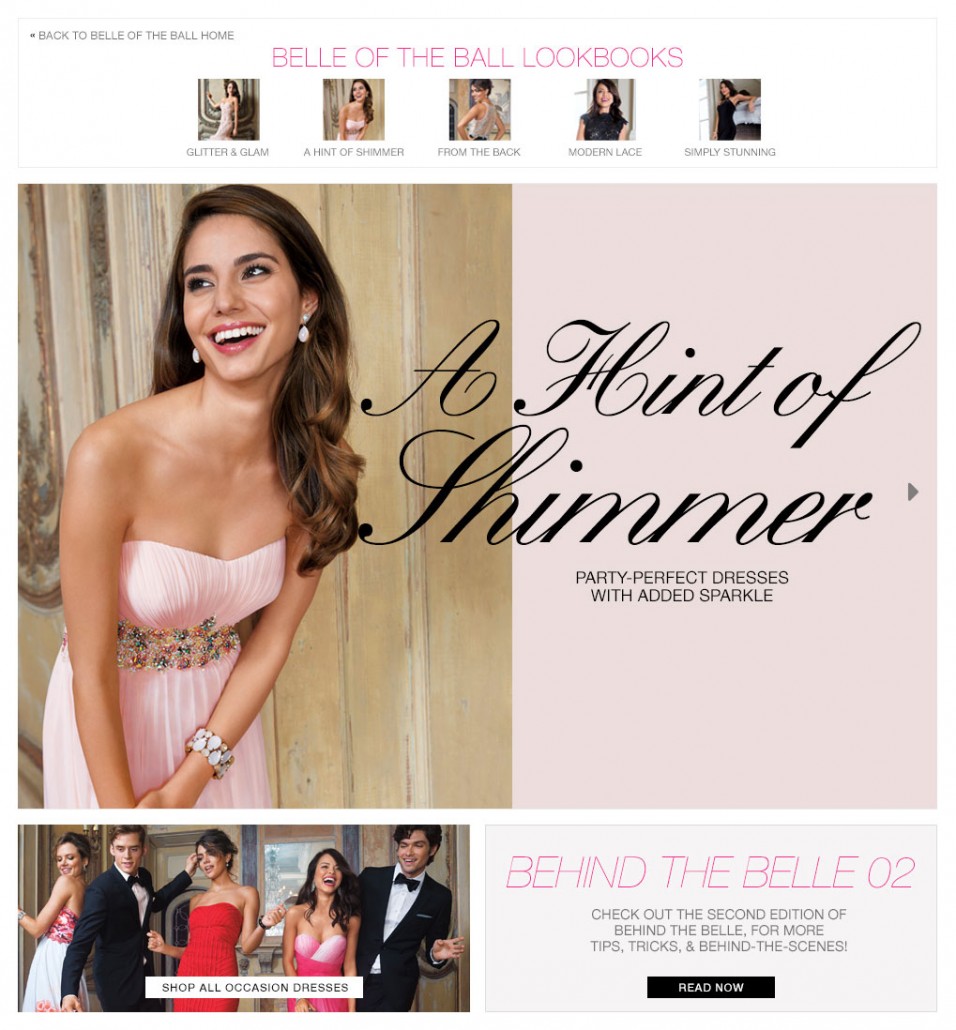
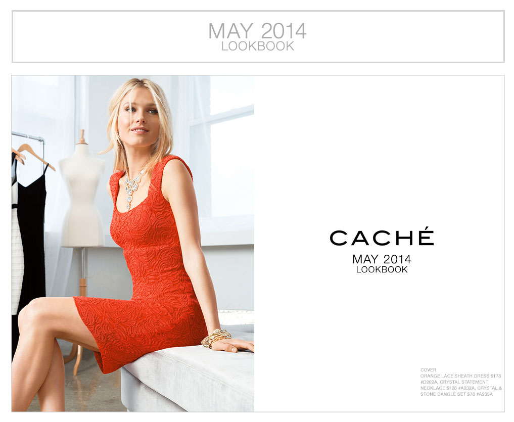
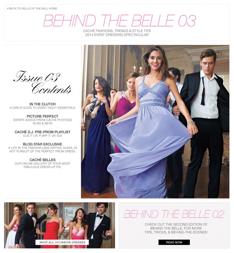
- Caché
Lancôme
Caché
Website
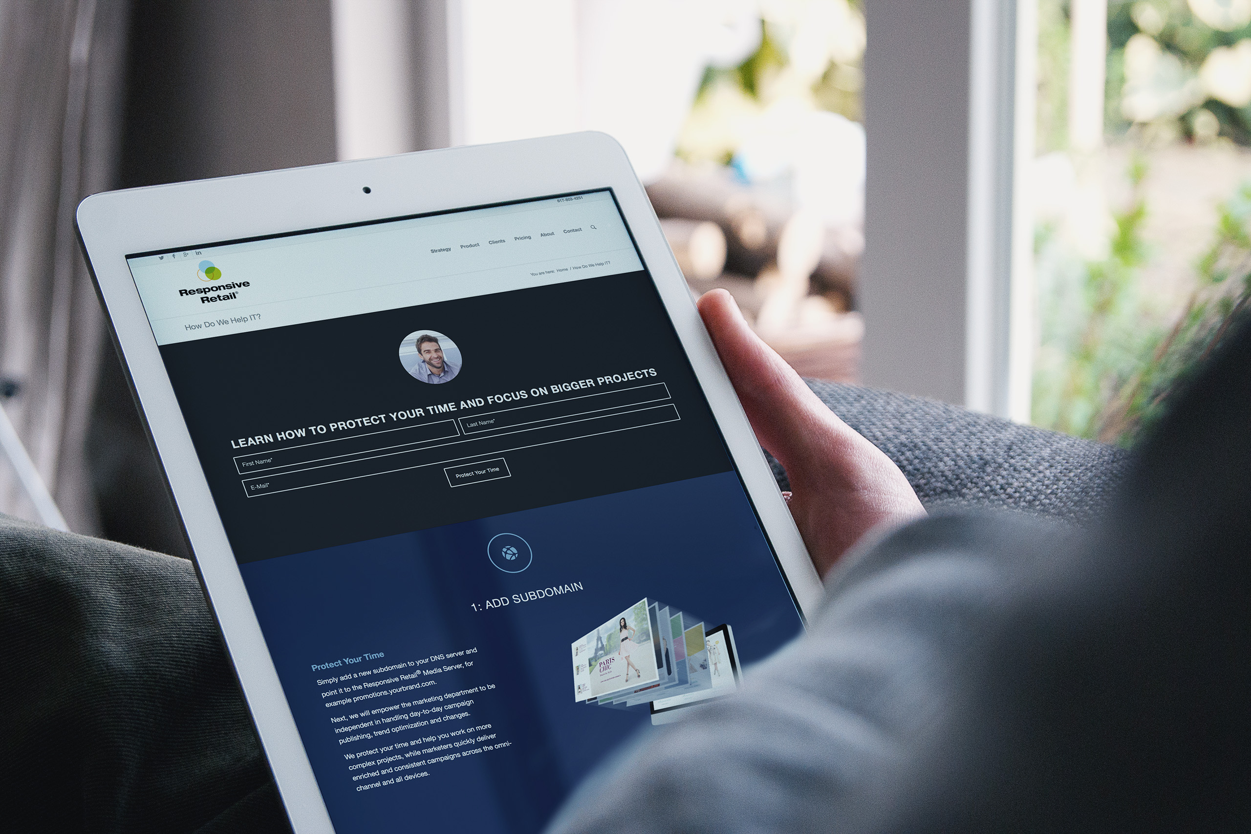
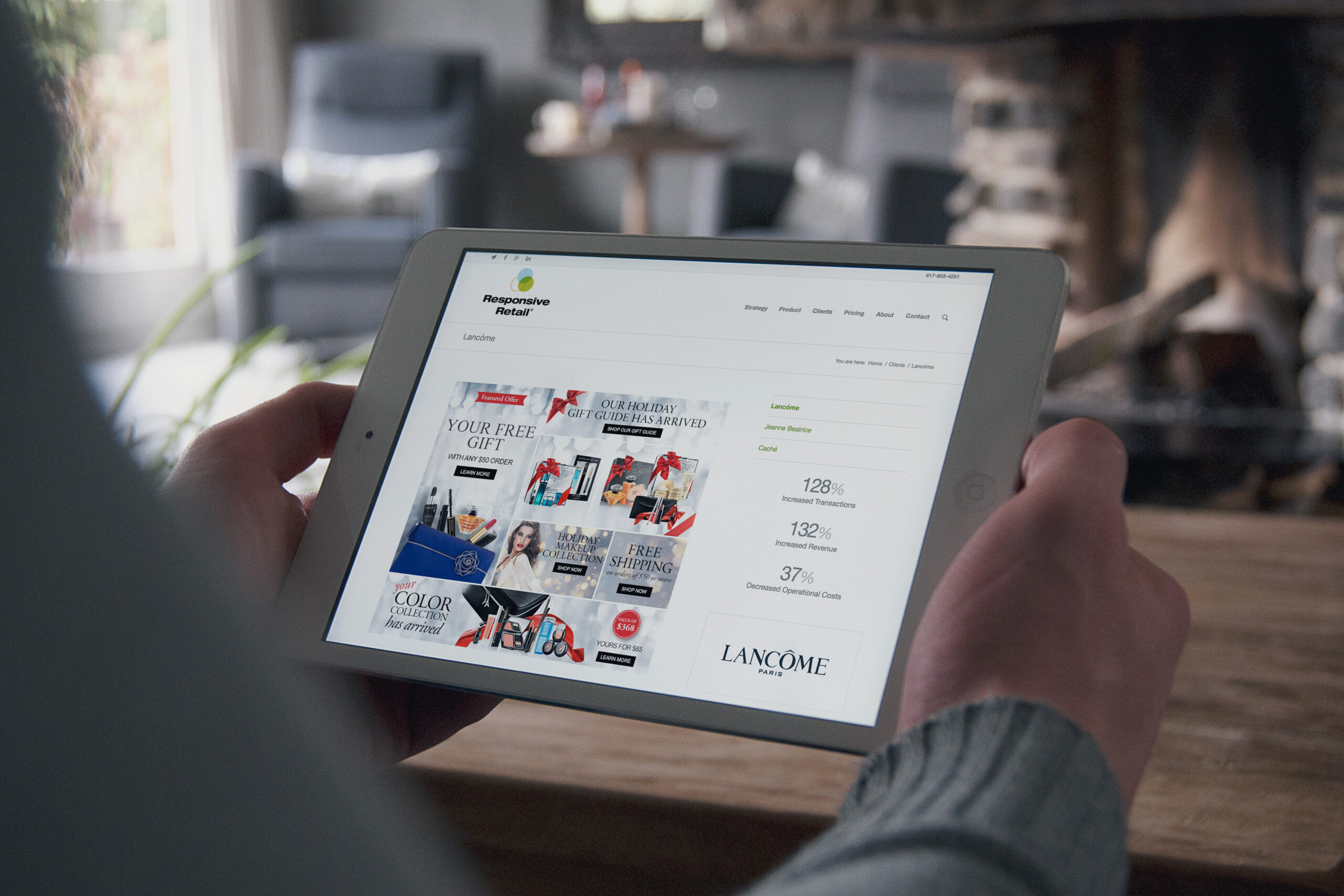
The marketing site had to sell software the way the software sold merchandise: quickly, visually, and with proof. It opened on the question every retail marketer was already asking, whether their site was still engaging anyone, and answered with real campaigns from Caché, Lancôme, and Jeanne Beatrice.
Evidence carried the argument. Client campaigns sat beside their numbers, transactions up triple digits and operating costs cut nearly in half, and a four-step walkthrough made the mechanics feel as simple as they were. Place the script, build, publish, measure.
Testimonials closed the loop in the customers’ own words, from Lancôme’s ecommerce team to a boutique owner managing her homepage alone. The same tool, credible at both ends of retail.