Opens in a new tab

An Identity System That Conveys What Motivates You to Be in Business.

Brand Identity

We believe corporate identity is the harmony among strategy, naming, style, mood, meaning, design, illustration, color, and typography, conducted into an identity your customers recognize at a glance. We help you uncover, define, refine, and promote what motivates you to make a difference.

The Story of Every Identity

Style in Congress with Meaning

Meaning gives identity something stronger than style to carry.

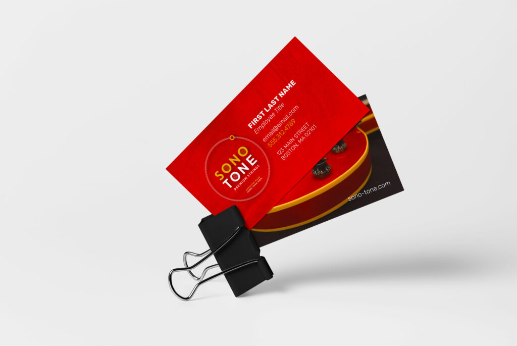
SonoTone business card front built from a warm guitar-body texture with a translucent palette-color overlay and the logo in bold type.
  • Build Meaning Before Style

    Most identities are designed from style alone. A mark chosen because it looks current, a palette because it looks safe, a typeface because it came with the template. Style without meaning ages fast, and customers file generic under generic.
  • Recognition That Compounds

    An identity your customers recognize quickly and your team applies without debate. Every satellite, campaign, and page it touches reinforces the same story, so recognition compounds instead of resetting.

  • The Story Wearing Its Own Face

    A logo can be replaced in an afternoon. An identity built on what motivates you cannot, because it is the story wearing its own face. That is the difference between artwork and an asset.

  • Identity Designed from Discovery

    We design from discovery. The direction from your discovery sessions targets a brand mark built on style in congress with meaning, strategy, and your story. Six guitar strings hidden in a wordmark. Level meters angled into architecture.

What You Receive

What a Real Identity Buys You

Recognition grows when every expression begins from the same identity.

  • Pride at the Front Door

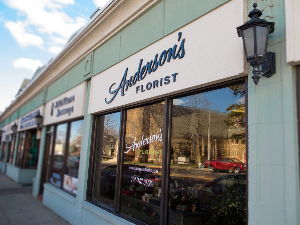
    The mark on the door, the card in your hand, the deck on the screen. All of it finally looks like the company you actually are.

  • Recognition That Compounds

    Customers identify your logotype, symbol, and mark quickly, and every impression reinforces the last.

  • Every Format, Ready

    Square, portrait, and horizontal lockups. Black and white and color. Negative and positive renditions. Delivered complete.

  • Color That Persuades

    A custom legend of families, complements, and shades with Pantone, RGB, CMYK, and HEX values. Color built to differentiate.

  • Type in Harmony

    Logotype, headline, subhead, quote, body, button, and caption styles that work as one system your audience learns to recognize.

  • Rules Your Team Can Follow

    A style guide that keeps everyone on brand and publishing consistently long after we leave the room.

In Practice

Three Ways This Craft Goes to Work

Three identity situations, each resolved through one coherent system.

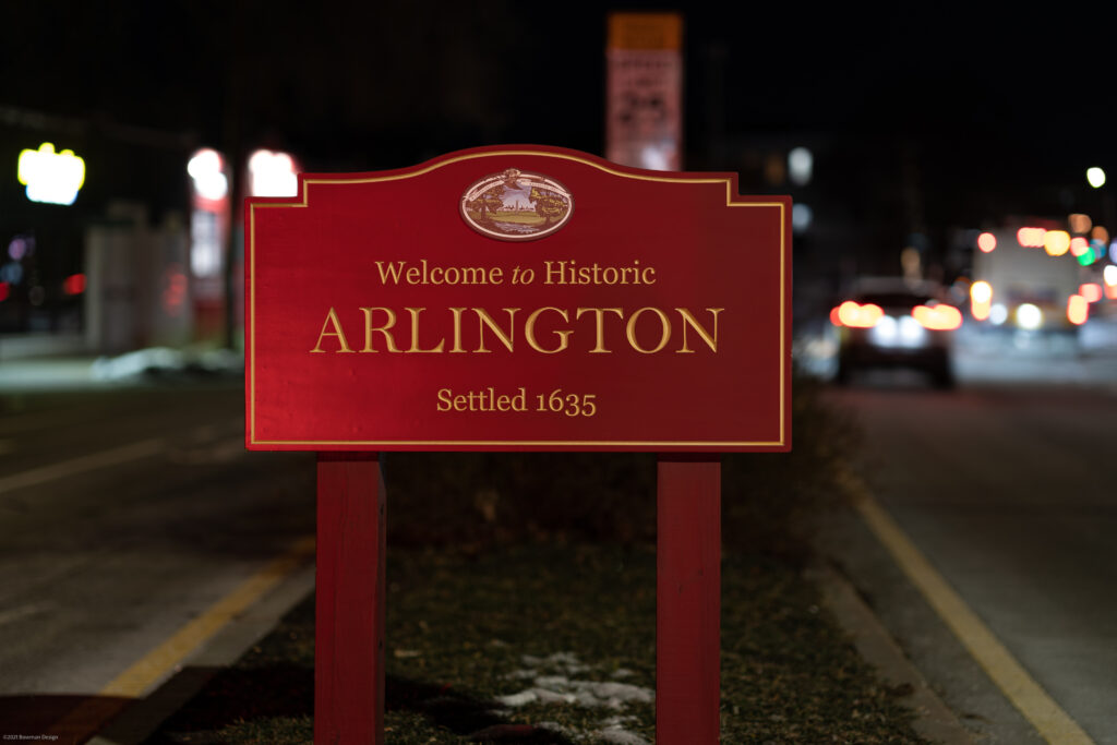
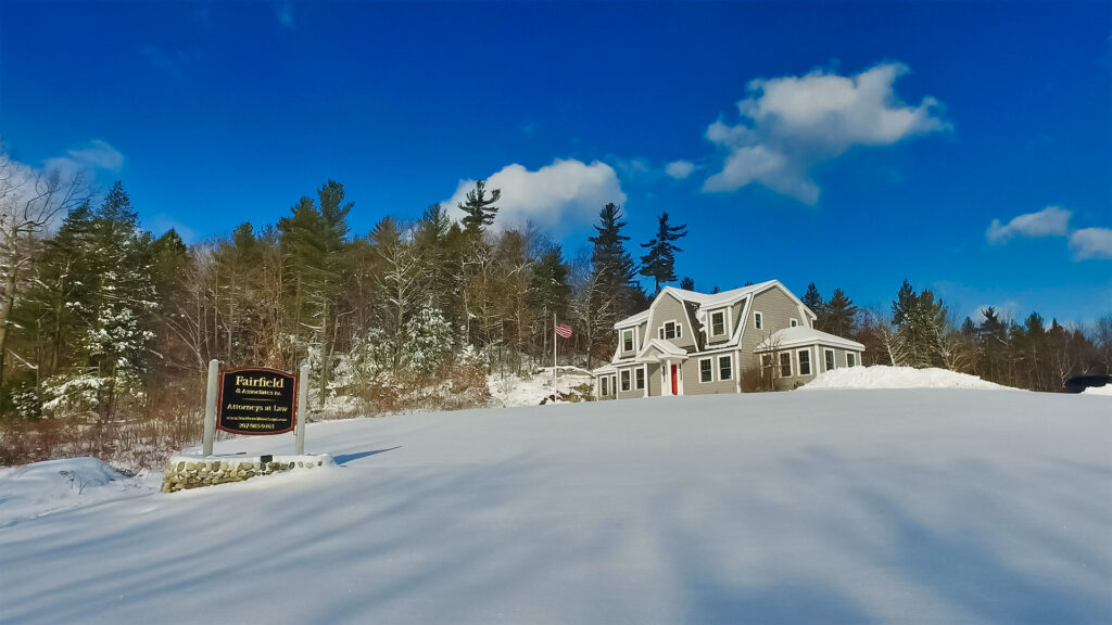
  • Fairfield & Associates’ gambrel-roofed Lyman office in deep snow, roadside sign and American flag standing before the gray shingled building with its red door.

    The Outgrown Identity

    A founder built twelve years of success on a brand that still looks like year one. We rebuild the identity to match the tenacity and experience the work already proves.

    See It in Fairfield
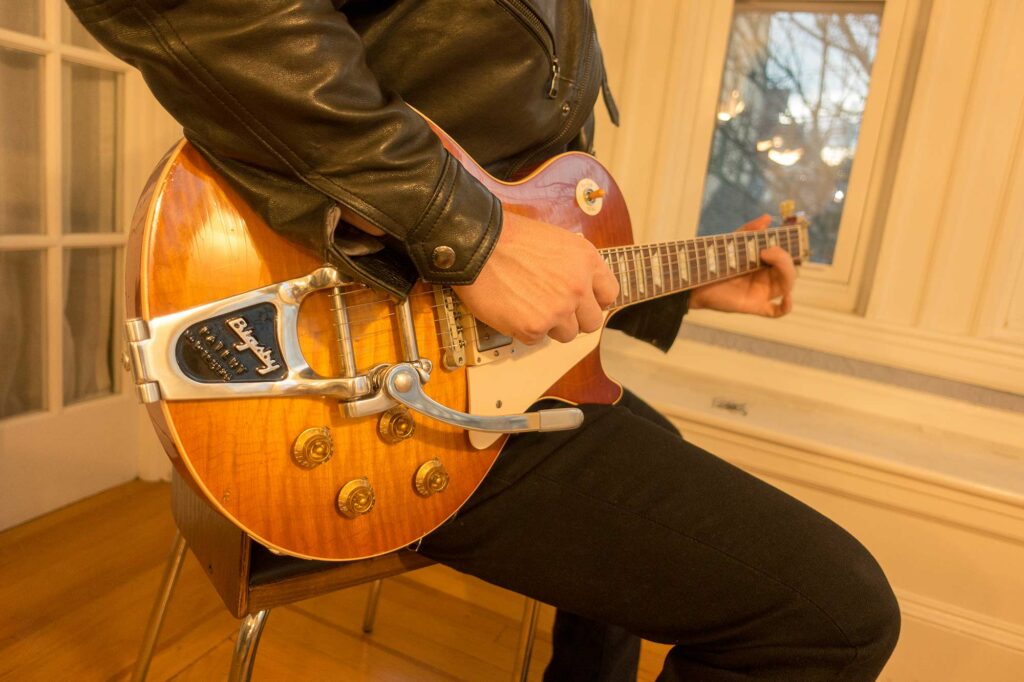
  • Player cradling a sunburst Les Paul with a Bigsby vibrato, the flame-maple top glowing in golden afternoon light.

    The Ground-Up Brand

    A new venture needs naming, mark, palette, type, and voice, and needs them to agree. One discovery, one architecture, one identity delivered ready for every channel.

    See It in SonoTone
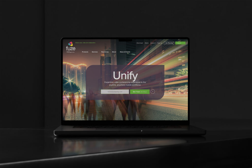
  • Fuze homepage on a MacBook in the dark, the Unify hero glowing over long-exposure city motion with a Get Fuze signup.

    The Consolidation

    Two companies merge, or a portfolio of sub-brands blurs. We design the hierarchy so one brand carries many offerings without confusion.

    See It in Fuze
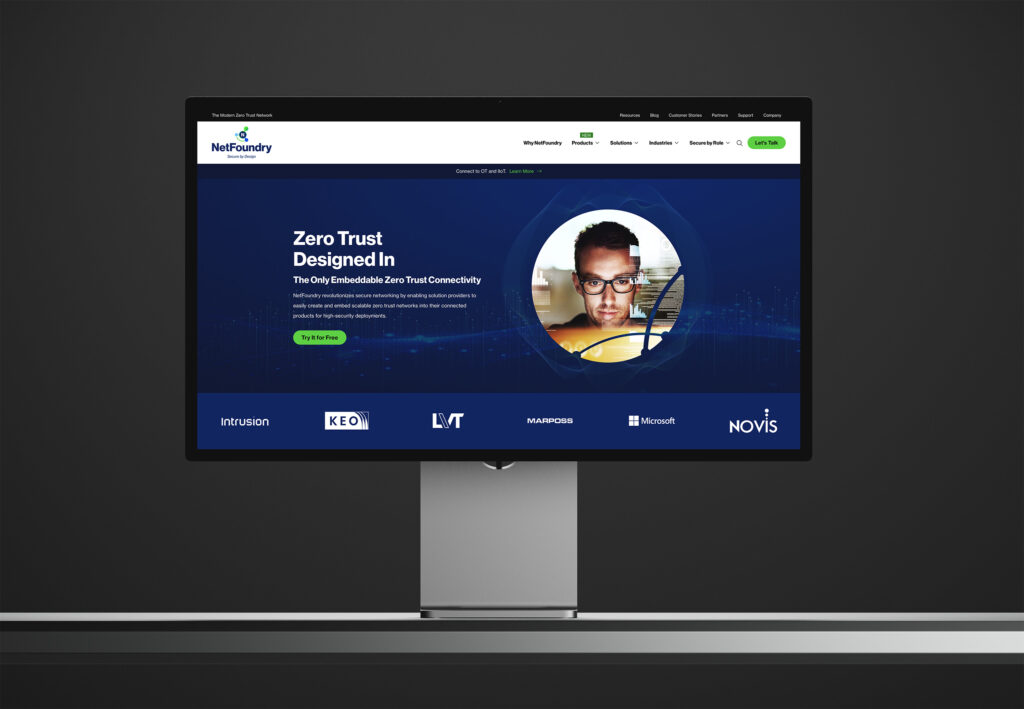
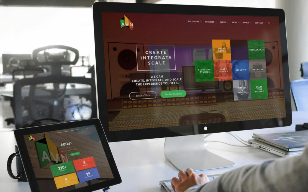
  • Engineer at a control desk viewing the Studio Monitors page on the main display with the About page on a second screen.

    The Engineered Identity

    Acoustic science became an identity built to signal precision, authority, and elegance before anyone heard the product.

    See It in Symphonic Acoustics

Inside the Craft

The Working Parts of Identity

Naming, marks, color, type, and rules work together as one identity system.

  • Naming

    Explored in discovery, formalized here. Company and product names built to be remembered, finished alongside the mark they belong to.

  • Brand Mark

    A logotype, symbol, and mark designed from your story, meaningful yet straightforward, delivered in every format your channels will ask for.

  • Tagline

    A hierarchy-of-needs exercise that produces the perfect shorthand. Your essence and goals, informing customers at a glance.

  • Color Palette

    Invented color families, complements, and shades in a well-organized legend, detailed in Pantone, RGB, CMYK, and HEX.

  • Typography System

    Headline to caption in harmony. A type system that differentiates your brand and engages your audience with recognizable ease.

  • Style Guide

    After presentation and approval, the rules that keep your team on brand across every marketing channel.

Next Step

Build a Brand Worth Advertising.

Let us compose the identity your motivation deserves.