

Anderson's Florist
Planting a brand for a local florist. And growing it street by street.
Anderson’s Florist had spent years earning the neighborhood’s trust, with a sign out front that never said so. The rebrand had one goal:
Make the brand as good as the work, everywhere the work goes.
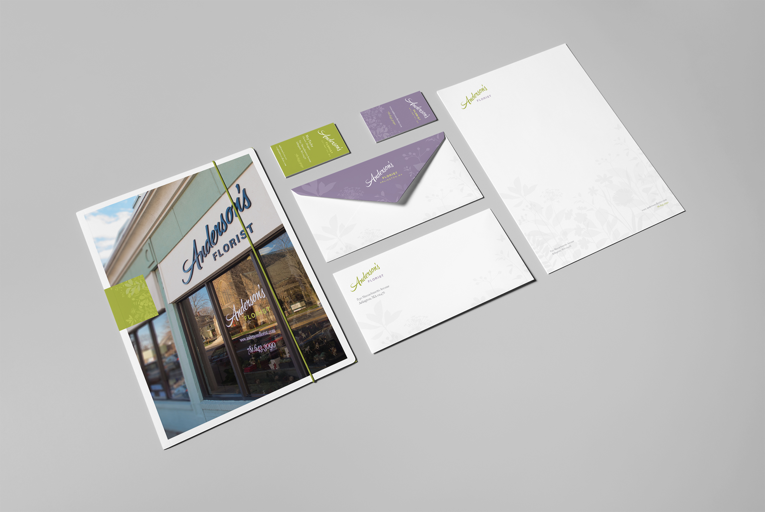
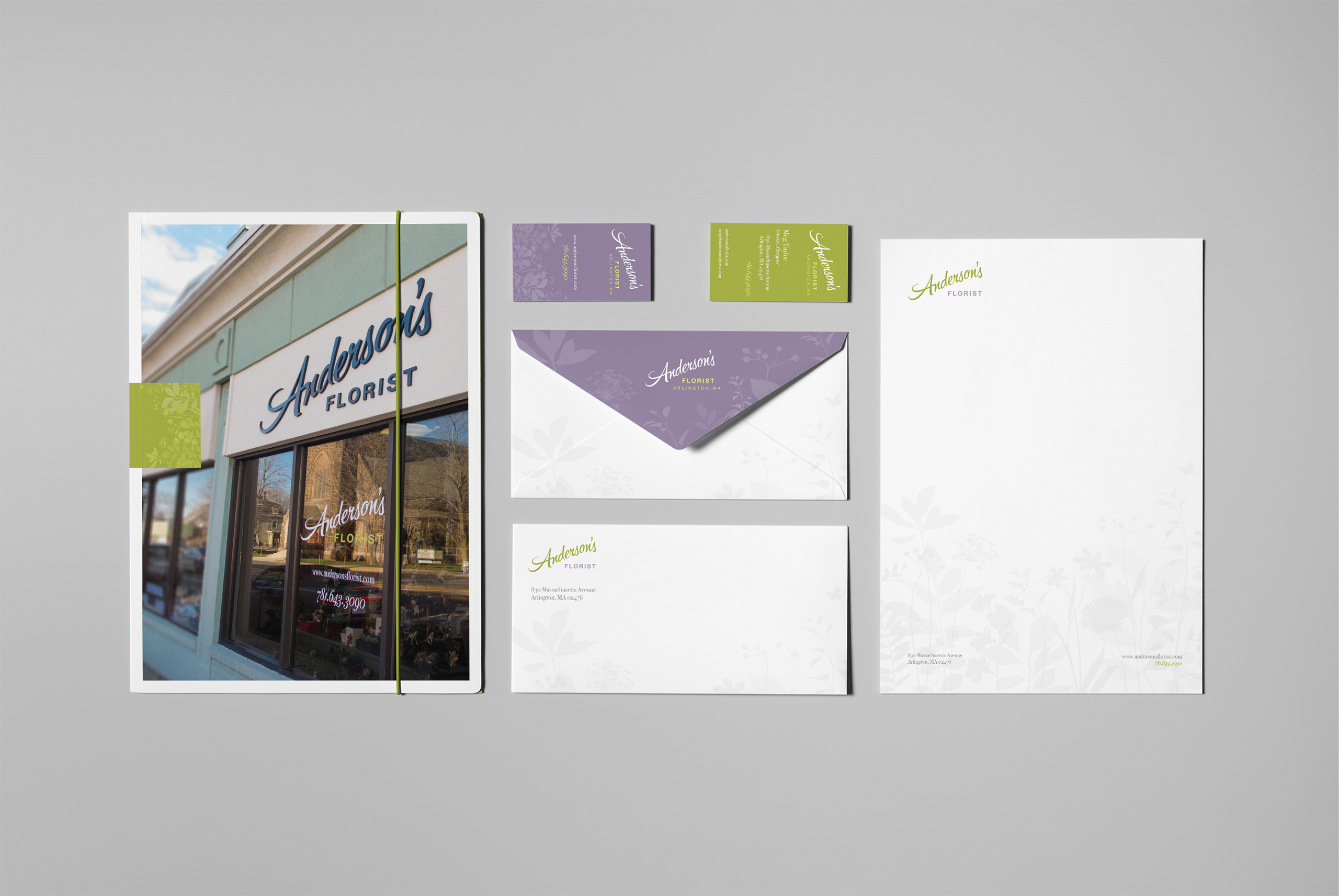
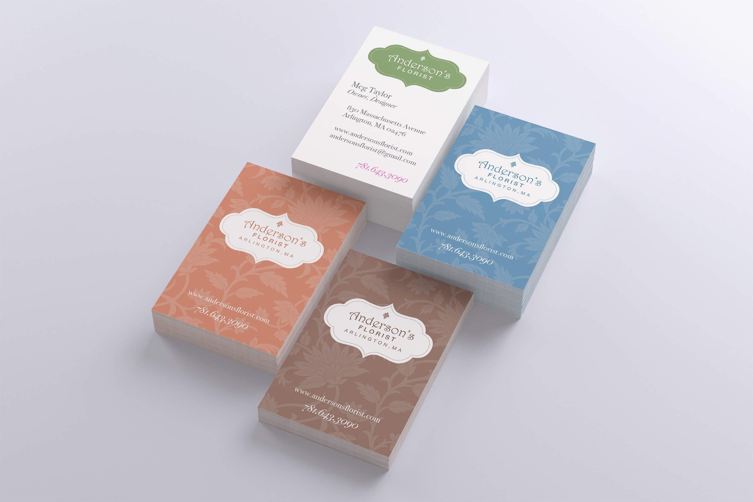
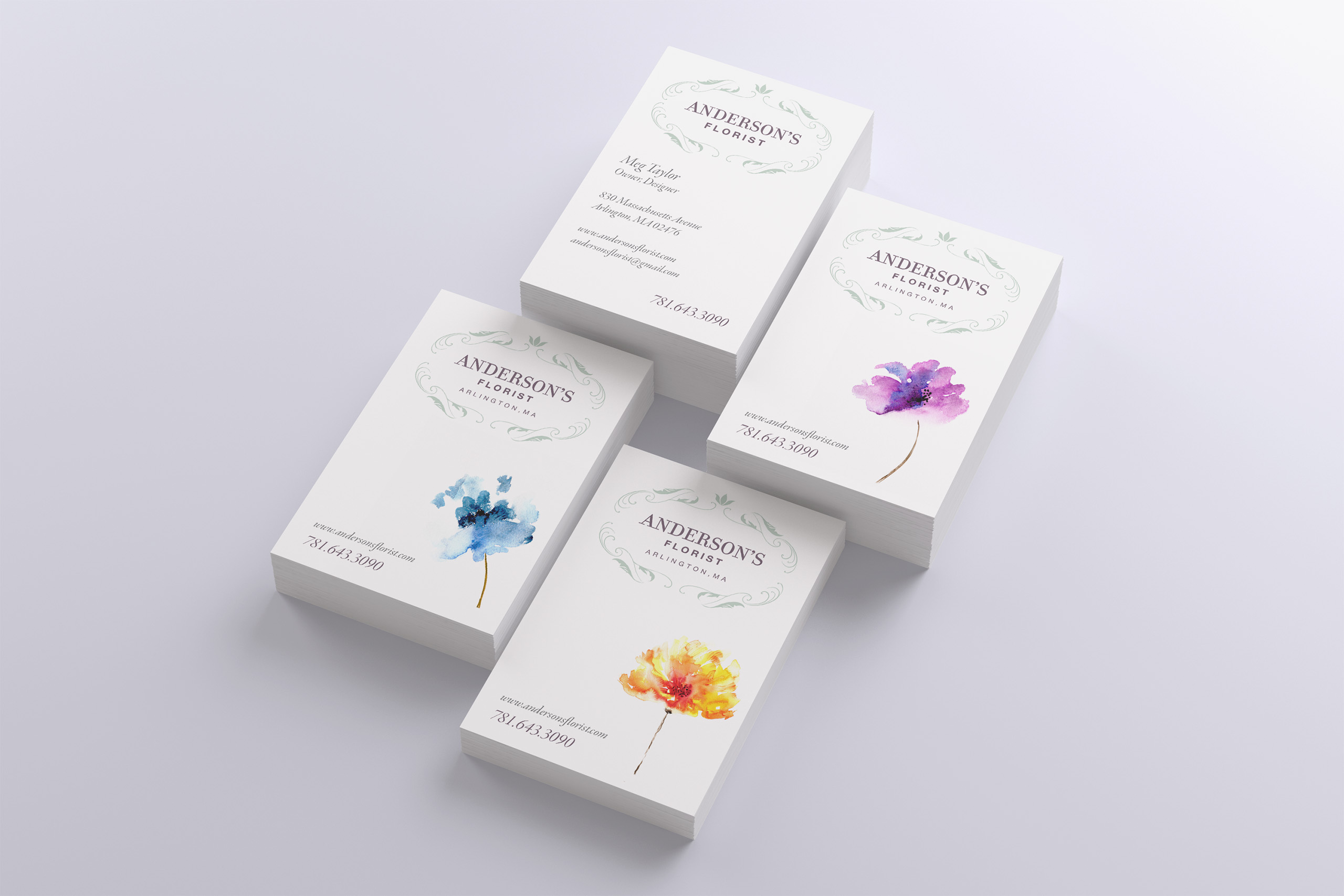
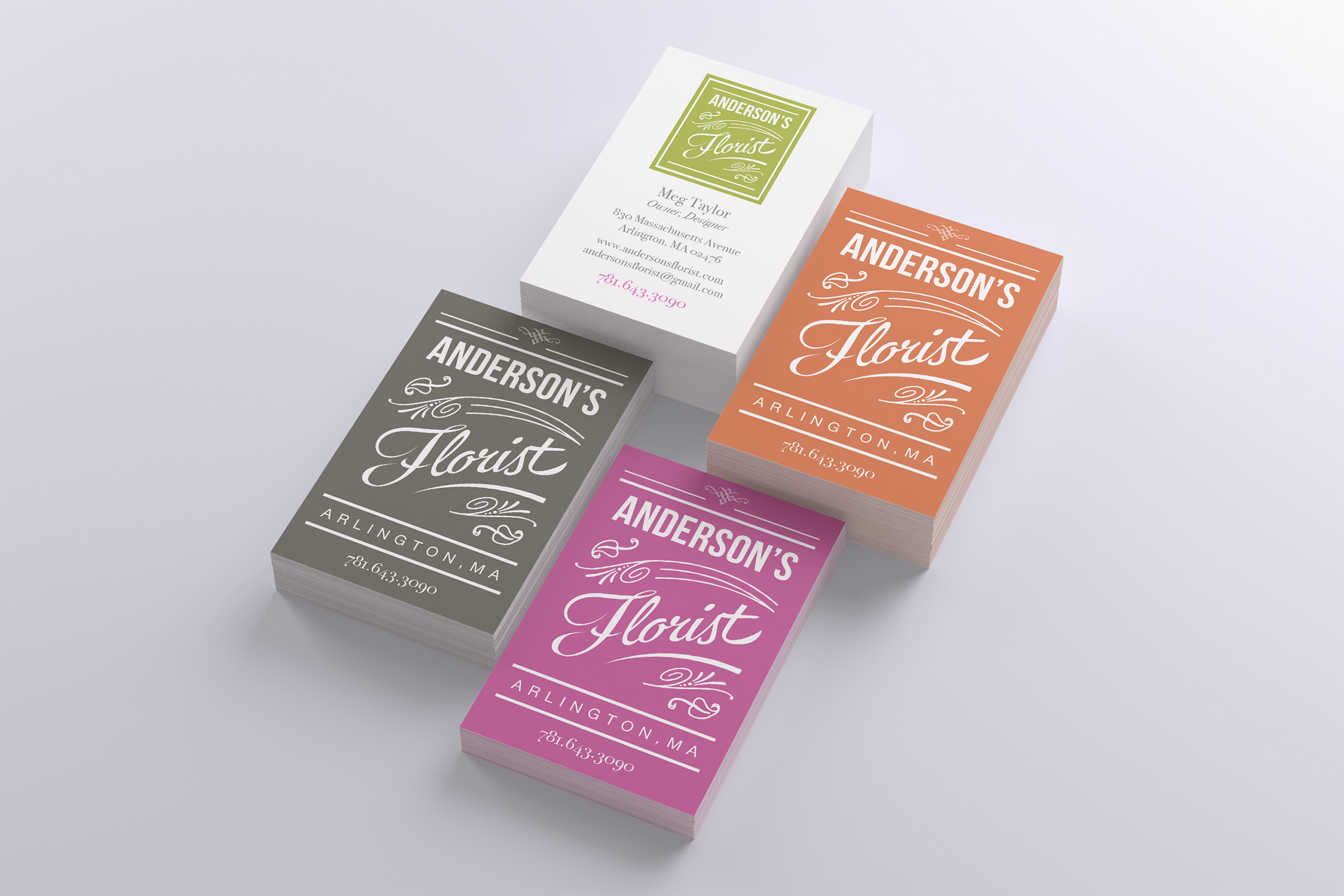
Bowman Design Direction rebranded Anderson’s Florist from the ground up: a new mark, type and color palettes, and a system designed to extend across signage, stationery, vehicles, packaging, and other customer touchpoints. The identity moved from the design system into the physical storefront through realized exterior signage and window graphics.
Read the Story
Challenge
Anderson’s Florist had the kind of reputation a local business spends decades earning: quality work, loyal customers, real dedication. The brand said none of it. The identity had fallen behind the workmanship, and the storefront read plainer than the arrangements inside.
A florist’s business also moves. Every day the work left the shop in vans and boxes, arriving at doorsteps across the neighborhood with nothing to say who made it. The shop’s best advertising was leaving the building unsigned.
Direction
We anchored the work on a single observation: a delivery florist’s brand doesn’t live at the shop. It travels. The storefront is one impression; the van makes dozens a day; the arrangement at the door is the one customers photograph and neighbors ask about.
So we designed the identity as a system that rides along: mark, type, and color built to hold on a sign, a letterhead, a card, and the side of a van, so every route the shop drove extended the brand’s reach.
Outcome
Anderson’s finally looked like Anderson’s. The new identity elevated the shop’s presence to match its work, and the realized signage announced from the street the quality customers had always found inside.
Beyond the storefront, the brand system showed how the identity could extend across stationery, vehicles, packaging, and other customer touchpoints, giving Anderson’s a coherent framework for wherever the brand appeared.
Takeaway
A florist’s brand should be designed for everywhere the work can travel: the window, the vehicle, the doorstep. Anderson’s quality had outgrown its sign, so we created a system with enough range for every route while carrying the realized identity into the storefront and signage. The work showed how the reach of a local shop could extend to every place its customers encountered it.
What We Built
Brand & Identity
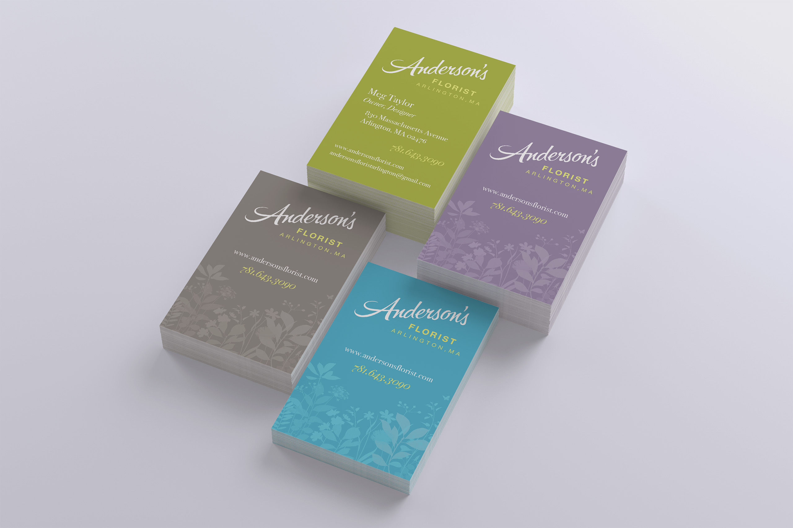
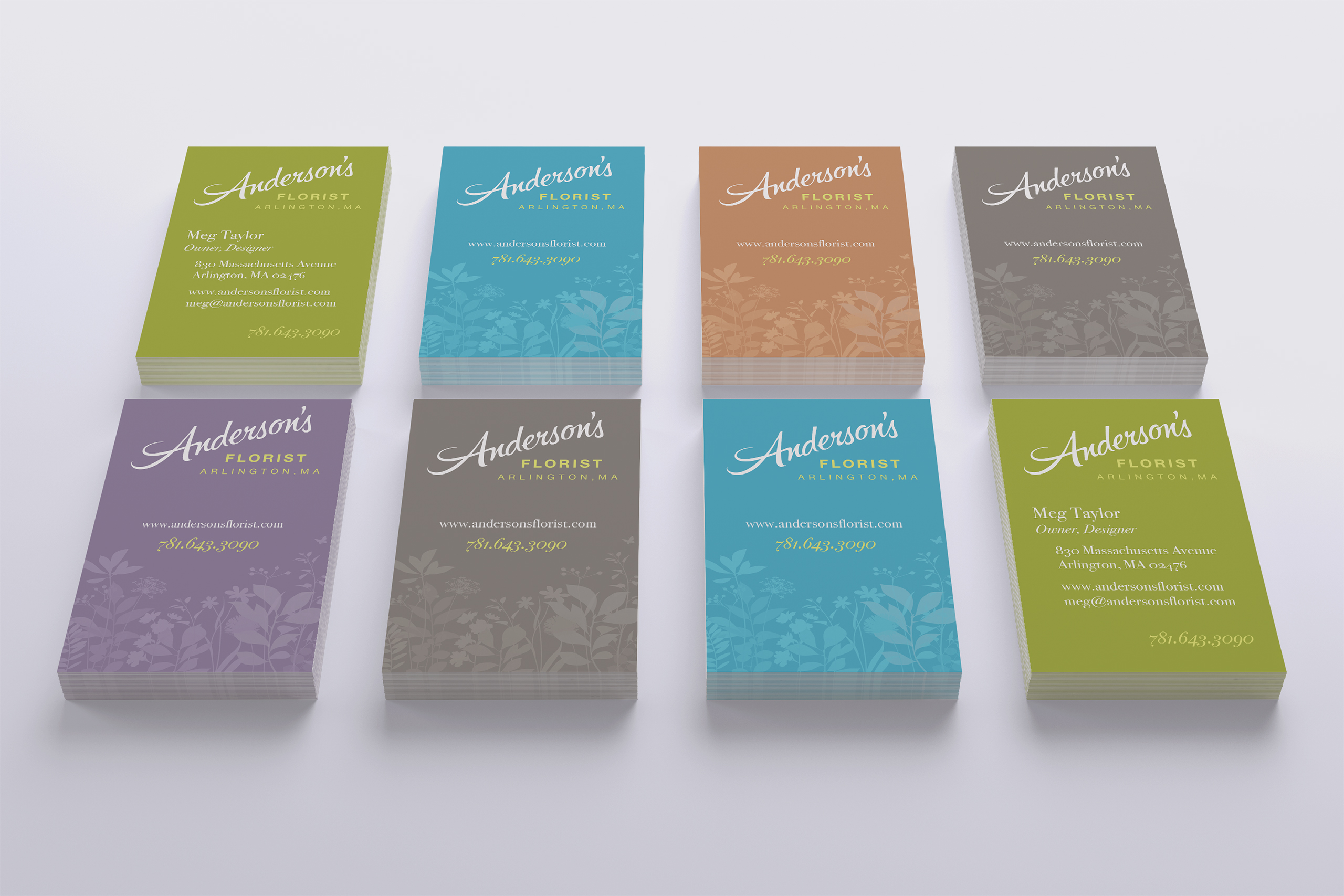
We created a new mark for Anderson’s with type and color palettes drawn to feel established, not trendy: an identity for a business built on years of dedication, designed to look like it had always been there and could stay forever.
Signage System
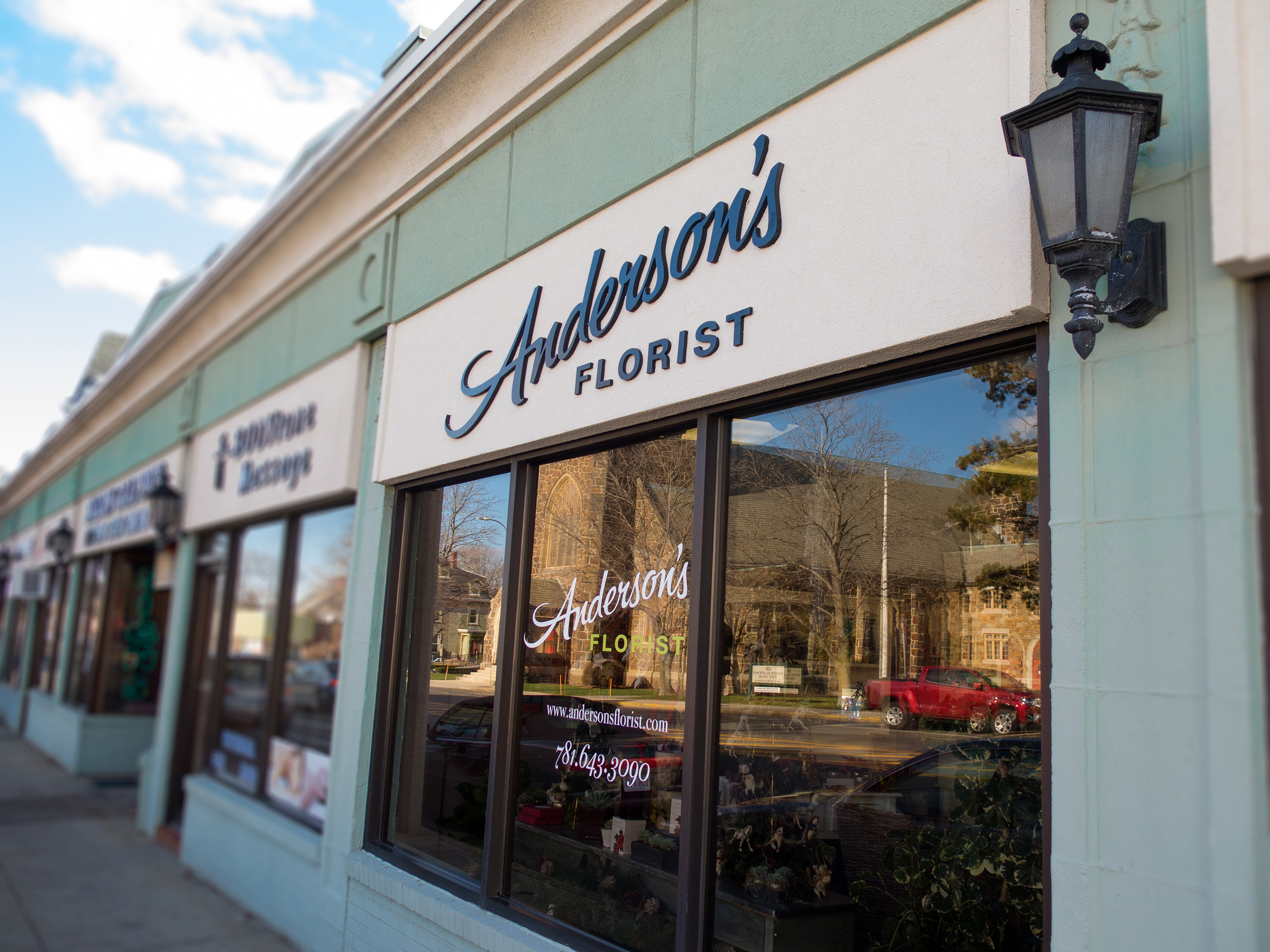
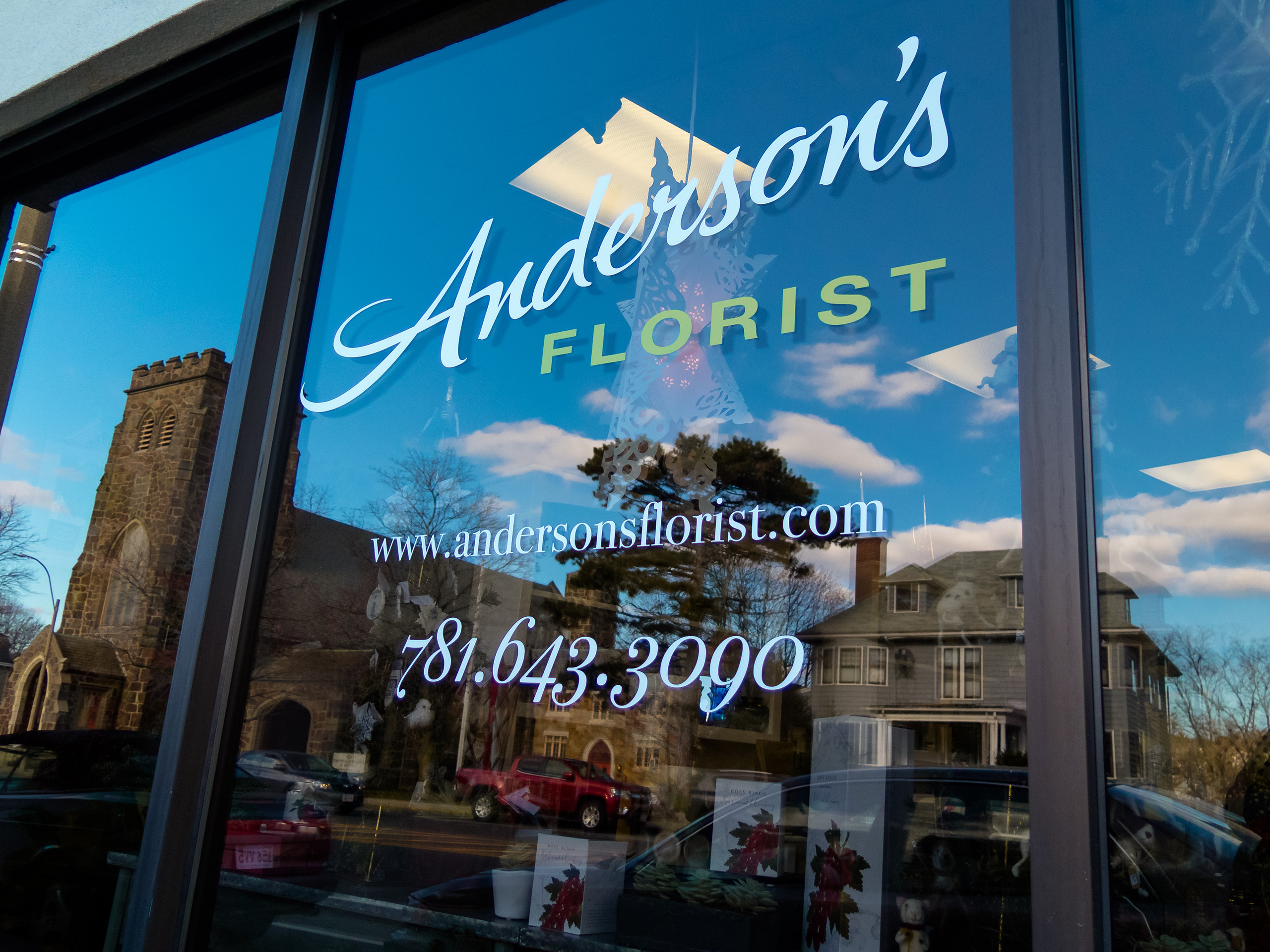
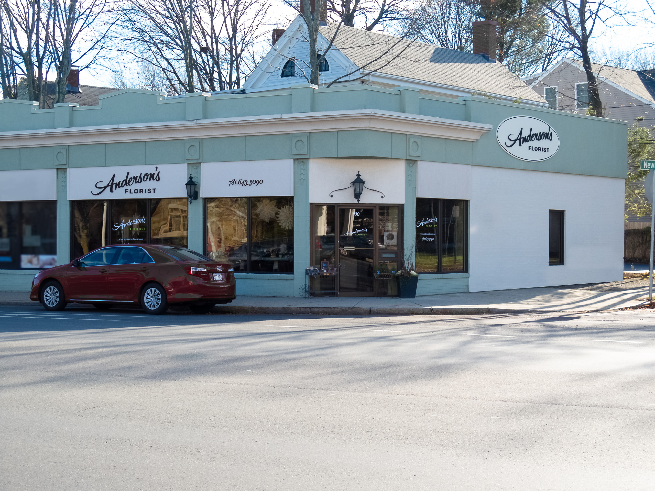
We designed the signage that announced the rebrand to the street: storefront, window, and wayfinding pieces that gave the shop a presence equal to its arrangements and made the quality visible before the door ever opened.
Delivery Livery
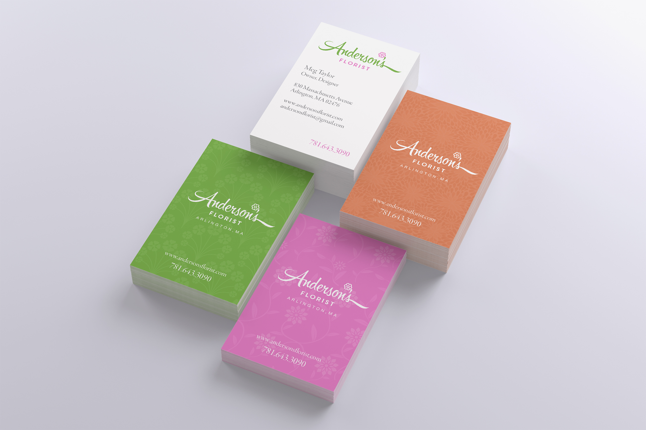
We designed the brand for the road. The van concept showed how each delivery run could become the shop’s farthest-reaching advertisement, while cards and packaging extended the same system to the doorstep.
Stationery System
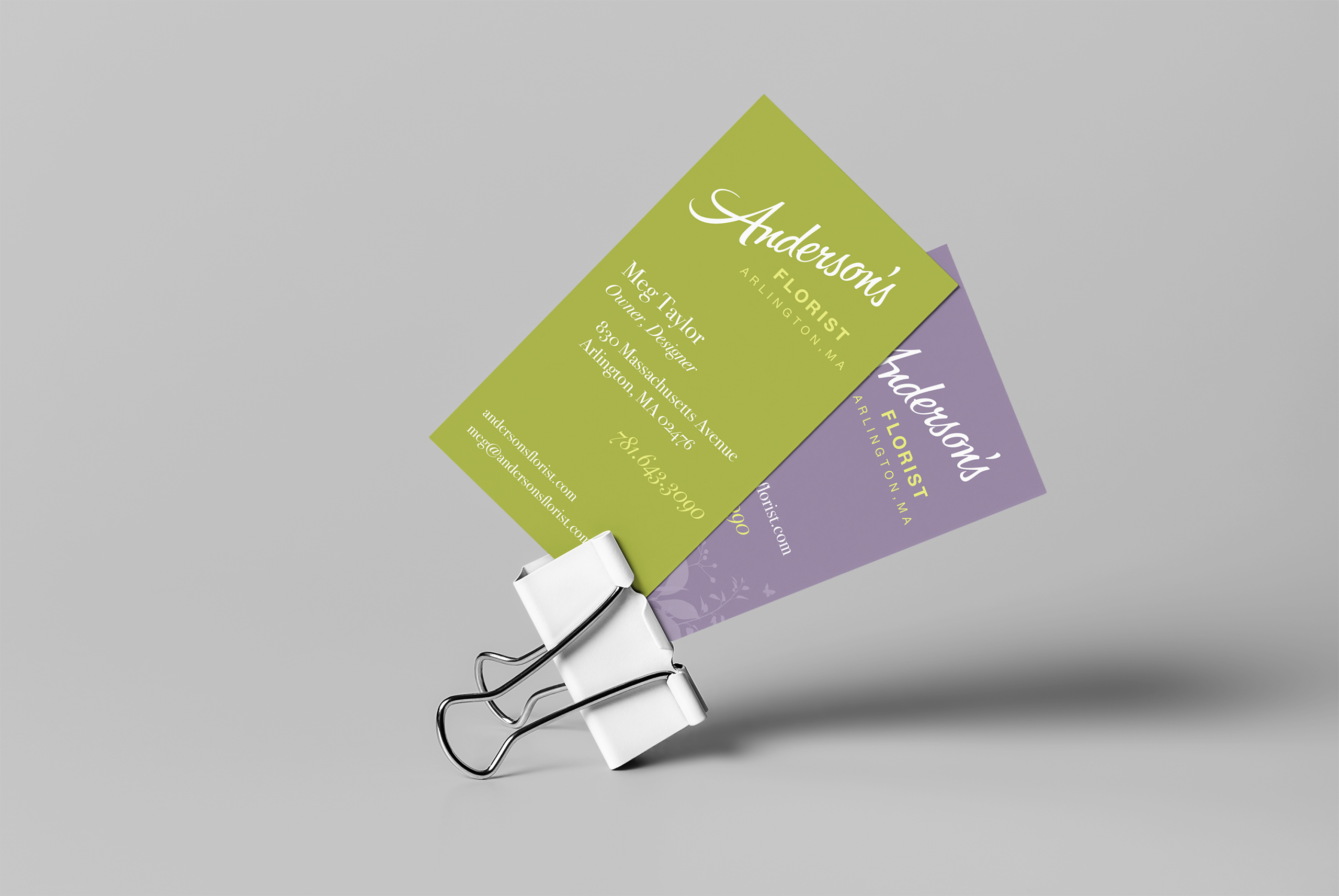
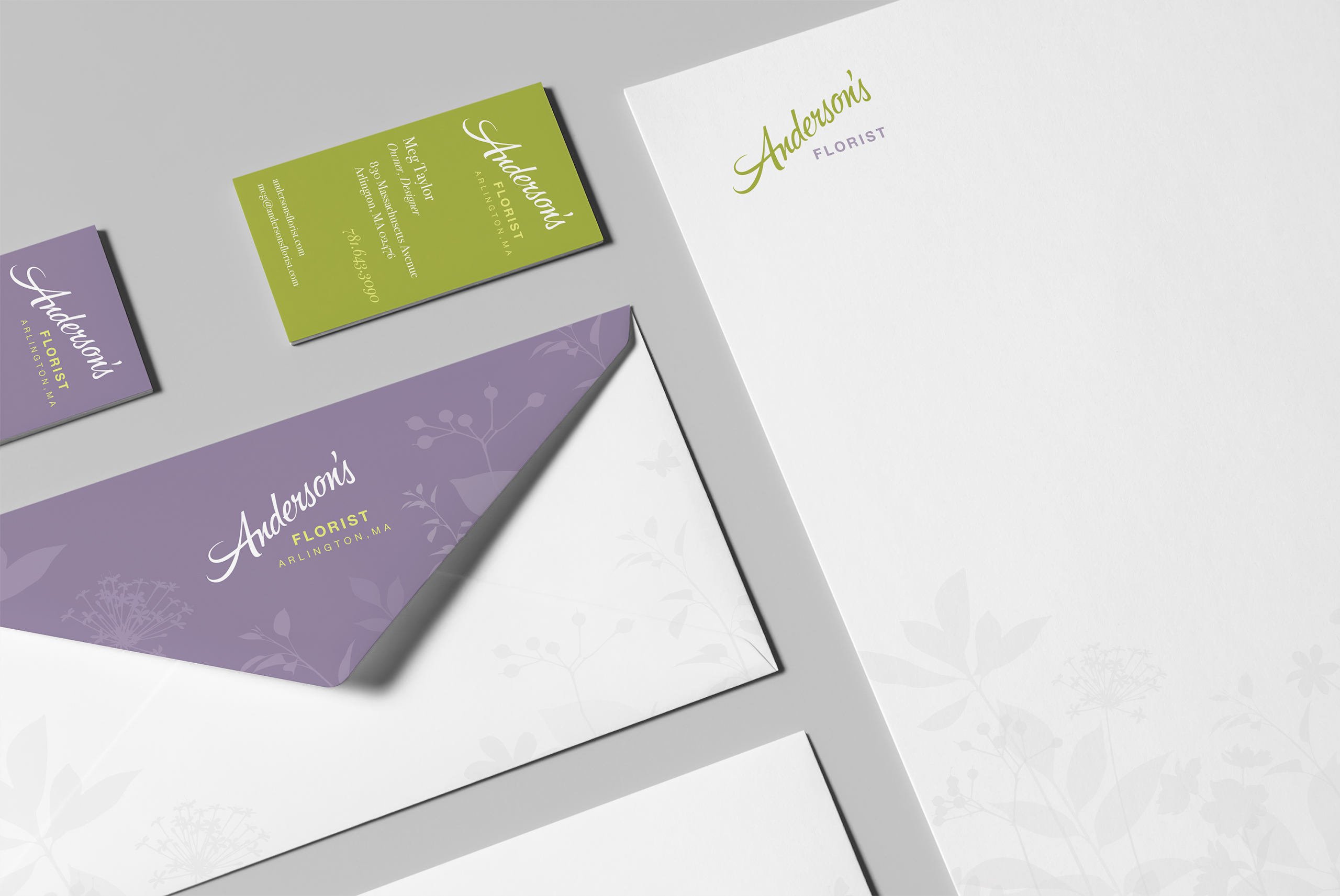
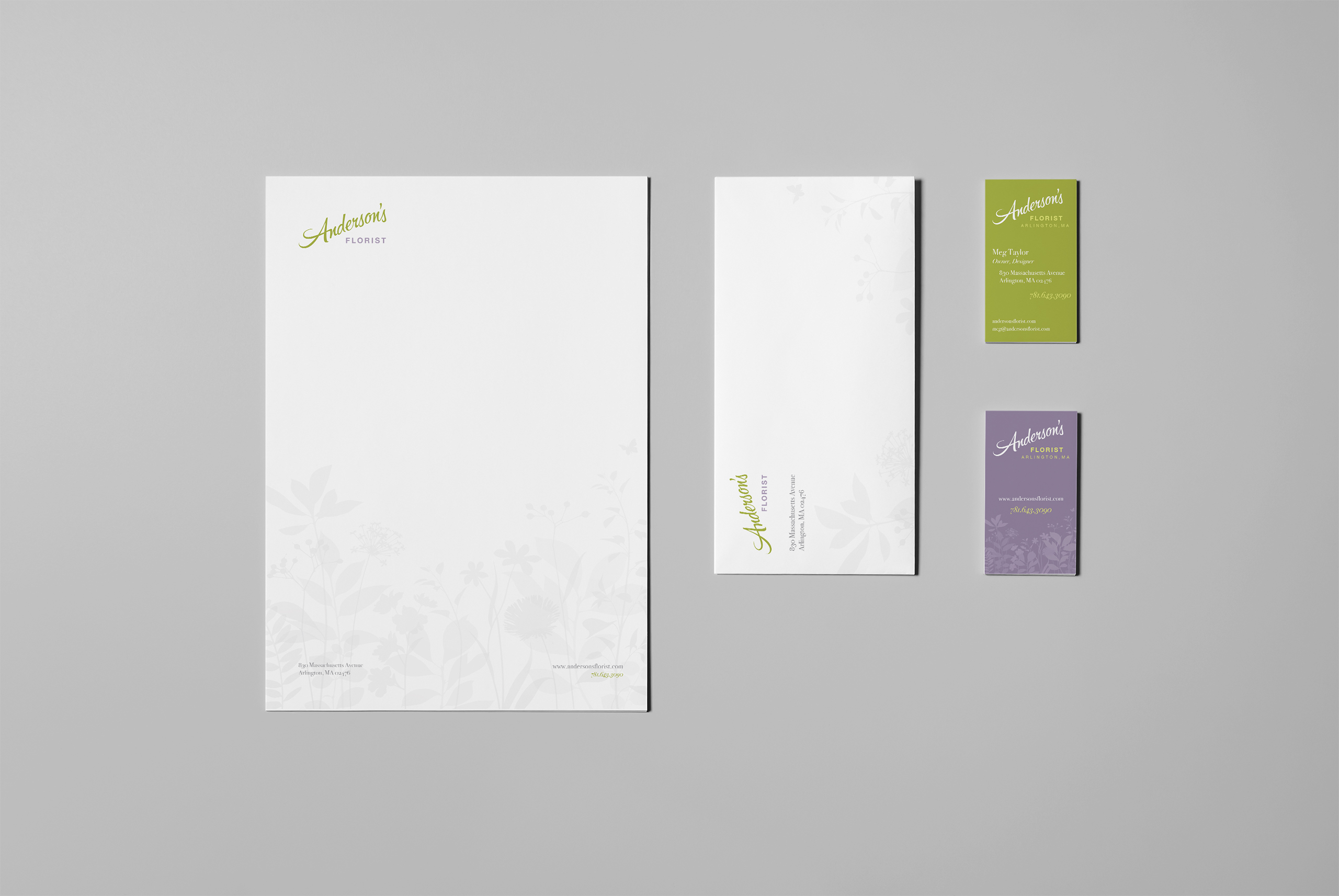
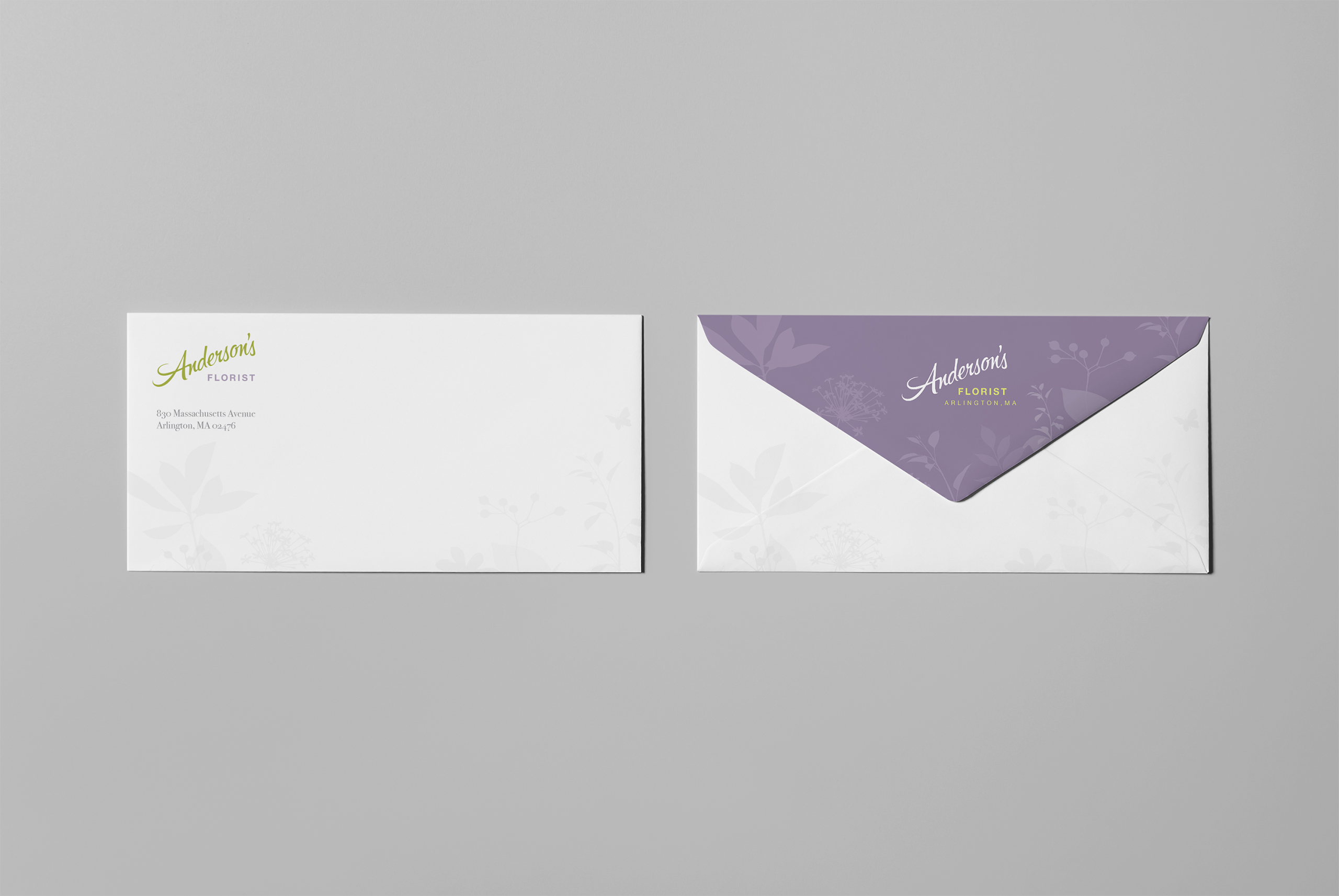
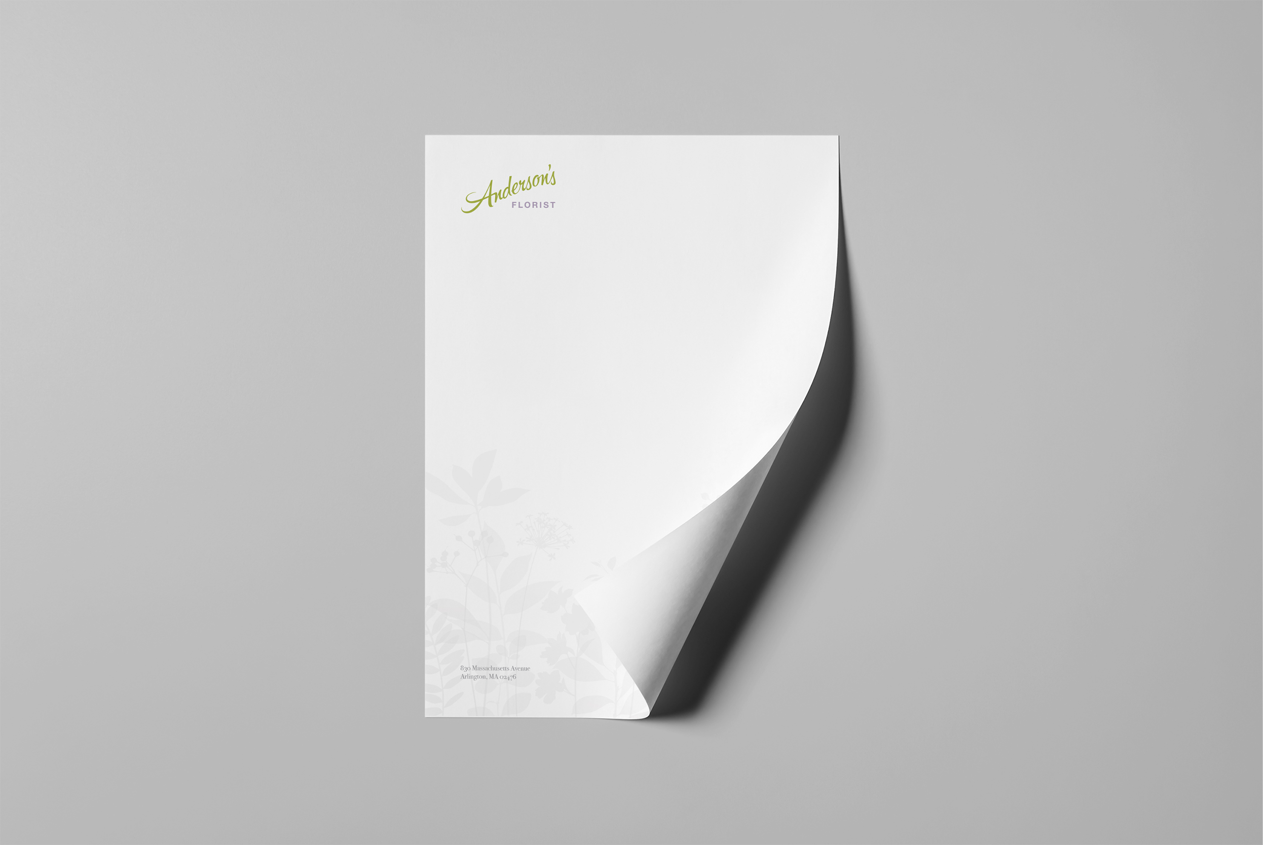
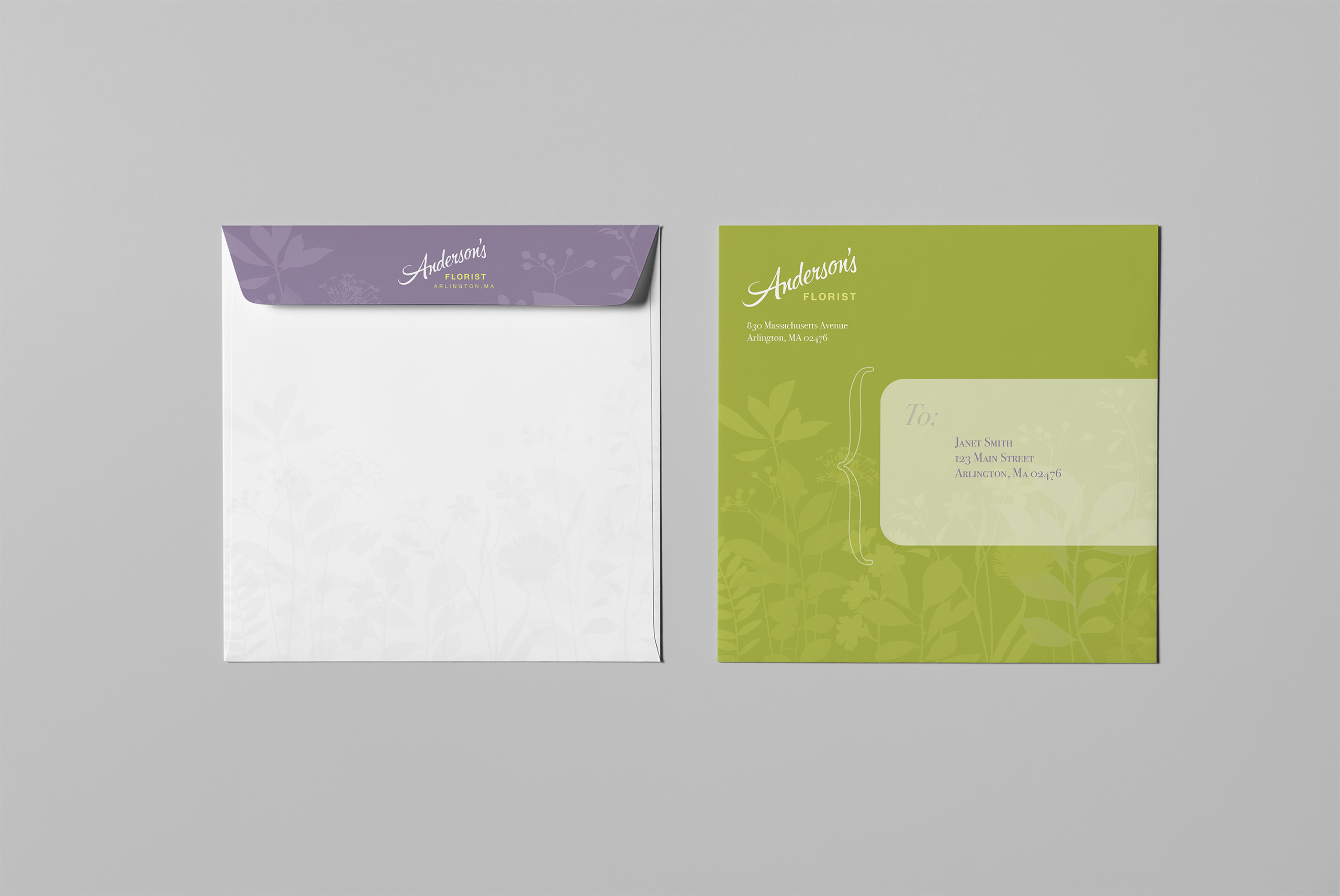
We designed a complete letterhead and stationery system so the brand could hold in every transaction: invoices, notes, and cards carrying the same mark, type, and color as the sign above the door.
The Through-Line
What began as a new sign for a storefront became a system designed for every place the neighborhood could meet it.
Where local rebrands usually stop at the logo, this one was drawn for the places it had to live: legible on a letterhead, bold on a storefront, unmistakable at forty feet on the side of a moving van.
Where the old identity undersold years of dedication, the new one matched the work: established, confident, and consistent from the sign to the smallest card.
The storefront made the new identity physical: exterior signage and window graphics carried it into the street at full scale.
Beyond the realized shop, the system showed how the same mark could travel through vehicles, packaging, stationery, and the doorstep without changing character.
Every Piece Extended the Brand One Step Farther from the Shop: Window, Street, Doorstep.
Discovery + Strategy
Before design, we listened: stakeholders, customers, and the routes the business actually ran.
Stakeholder Discovery
Every rebrand starts with listening. We interviewed stakeholders and customers to learn what Anderson’s meant to the people who kept coming back, and built the brief from their words.
Brand Architecture
Years of dedication deserved better than a dated sign. Emotional and functional truths shaped the identity: established, warm, and confident enough to match the work.
Audience Architecture
Loyal customers already believed; new ones had never been given a reason to look. We shaped the system so regulars felt confirmed and passersby felt invited.
Route Strategy
A delivery florist’s reach is its routes. We treated the van, the box, and the doorstep as media placements the shop already owned, and designed the brand to ride them.
Alternates Method
We presented possibilities, not ultimatums. Stakeholder needs became two to three rendered compositions, a visual dialogue that let Anderson’s choose its brand with confidence.
Signage Strategy
A storefront is a promise made at street speed. We planned the signage system to elevate the shop’s prestige and say quality at a glance, from the facade to the window to the walk.
Brand Identity
The Anderson’s Florist identity translates years of earned reputation into a visual system: a new mark, type, and color chosen to feel established rather than fashionable, warm rather than precious. It looks like the business your neighborhood already trusts.
Florist branding tends to drift delicate. This identity stays sturdy: it holds its weight on a storefront sign and keeps its warmth on a gift card, because a working shop needs both in the same brand.
The system was drawn for both distance and closeness. The same identity reads at forty feet on a moving van and at arm’s length on a letterhead, without redrawing itself for either job.
Color and type do the quiet work: a palette that flatters the flowers instead of competing with them, and typography with enough history in it to honor the years behind the name.
Presented as alternates, chosen in dialogue: the final identity came from two to three rendered compositions built on stakeholder and customer interviews, so the shop picked its brand knowing exactly what each choice said.
Color System

Brand System
Signage
Alternates
Creations