


Creations
Delta Generators
Delta Generators
A brand as tight as the band. And a system that plays every channel at once.
The Delta Generators earned their reputation the honest way: onstage, across the international blues circuit. The brand behind the band had a simpler goal:
Look as tight everywhere else as the band sounds on stage.
Bowman Design Direction built more than a look. We designed the identity, the templates, and the publishing system that let a working band run a label’s worth of marketing: one click, every channel, always on brand.
Read the Story
Challenge
The Delta Generators had real momentum: international blues recognition, a loyal fan base, a signature sound. What they did not have was a brand that kept up. Every announcement, poster, and post was built from scratch, and every channel had its own look.
A working band lives between shows: new dates, new merchandise, new songs, giveaways for fans. Each one meant hand-made promotion across every channel, and the more the band published, the less consistent the brand became.
Direction
We anchored the work on a single idea: the band could publish the brand the way they play a song. Once, together, tight. Nobody onstage stops to rework the arrangement, and nobody announcing a show has to redesign the poster.
So the brand was built as an instrument, not an artwork. An identity with a comprehensive style guide, templates for everything a band actually ships, and a publishing platform where one click carries a show, a song, or a photo to every channel at once.
Outcome
The Delta Generators became as consistent offstage as on. A show announcement that once meant a night of cut-and-paste became one click: website, Twitter, Instagram, YouTube, and Bandsintown, all in the same voice, all on brand.
The brand stopped restarting itself with every announcement. The band sold music and merchandise from their own store, kept fans in the know without an agency on retainer, and carried one visual system from CD to beer glass to t-shirt without breaking it.
Takeaway
A band that plays tight together already has the discipline a brand needs. What they were missing was the instrument. The work translated stage discipline into publishing discipline: a full style guide, a template for everything a band ships, and a single click that plays every channel in tune. The brand became one more instrument, and the band already knew how to play.
What We Built
Brand & Identity
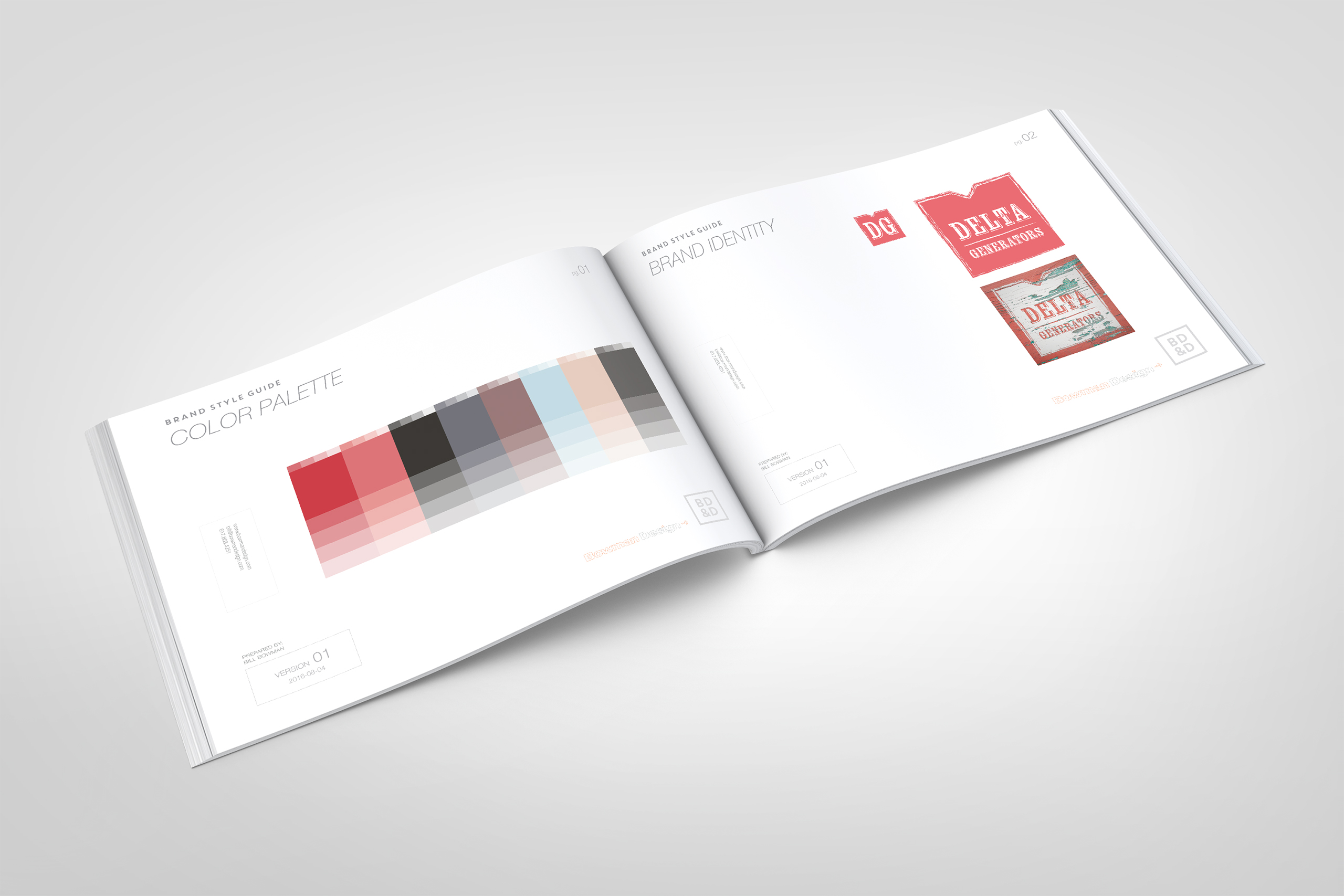
We created a rich, road-worn identity for the band: deep color, classic typefaces, stylized photography, and distressed detailing that carries the blues without costuming it. A comprehensive style guide keeps every future piece, made by us or by the band, unmistakably Delta Generators.
Publish-Once System
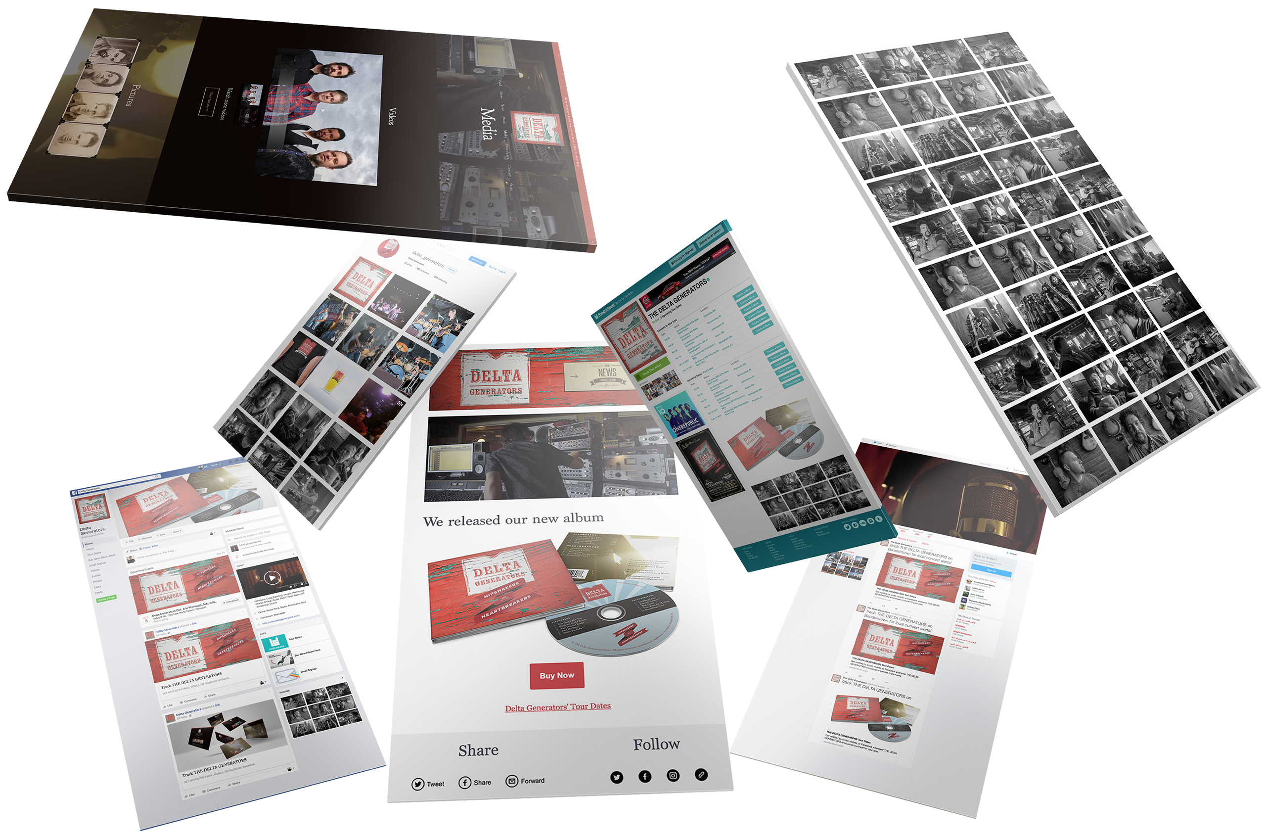
We connected the band’s website to every channel their fans live on. One click publishes a show, a song, a photo, or a product to the site, Twitter, Instagram, YouTube, and Bandsintown at the same moment, in the same voice and look.
Commerce + CMS
We built the band a store of their own: music and merchandise sold directly from the website, on a content management system a musician can run from the van. SEO-friendly metadata and full social integration came standard, part of the platform’s design.
Template Library
We designed the recurring work once, as templates: posters the band edits for each new show, email outreach that keeps fans in the know, social formats for every announcement. The brand stays consistent because the templates do the maintaining.
The Through-Line
What began as a look for a blues band became a system a blues band could run: publish once, and every channel sounds like the Delta Generators.
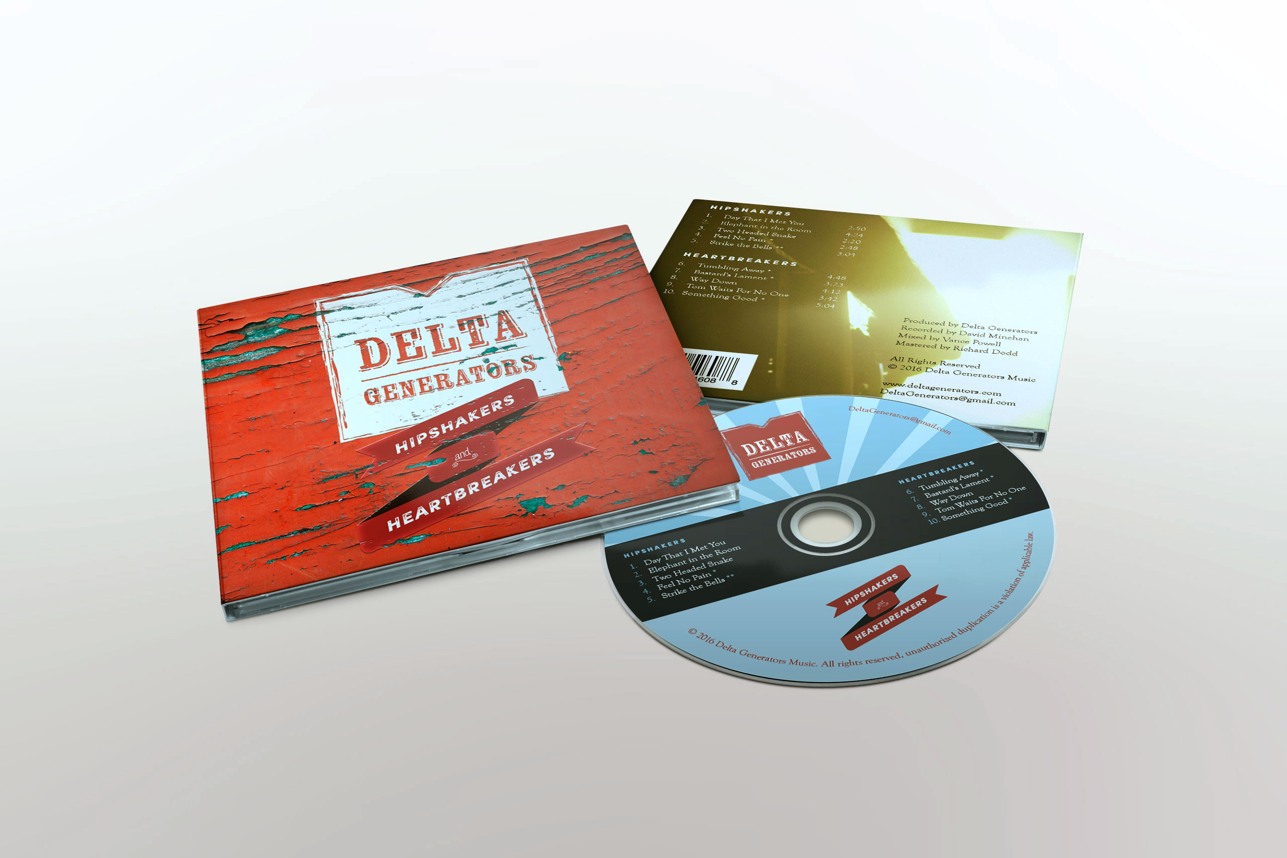
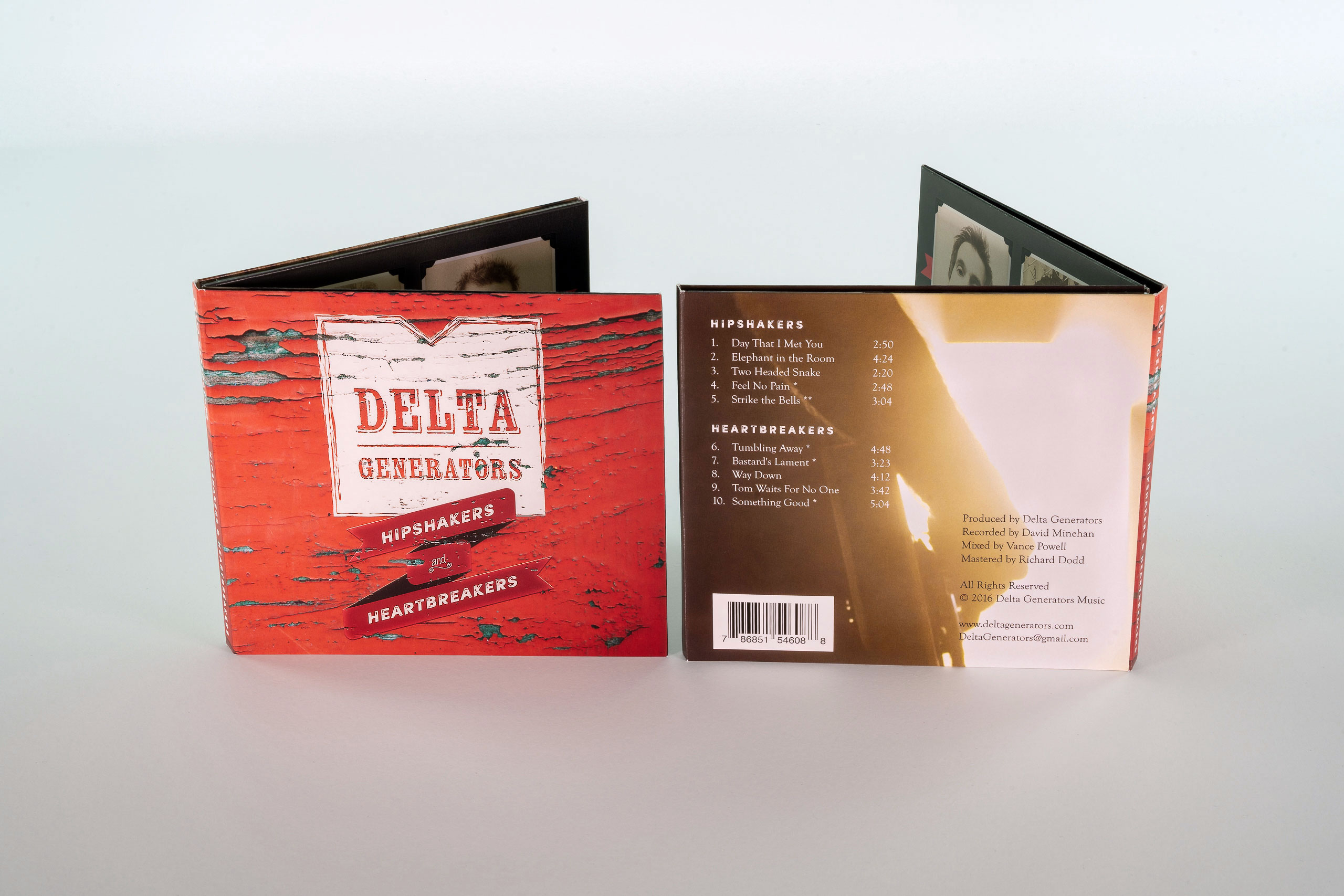
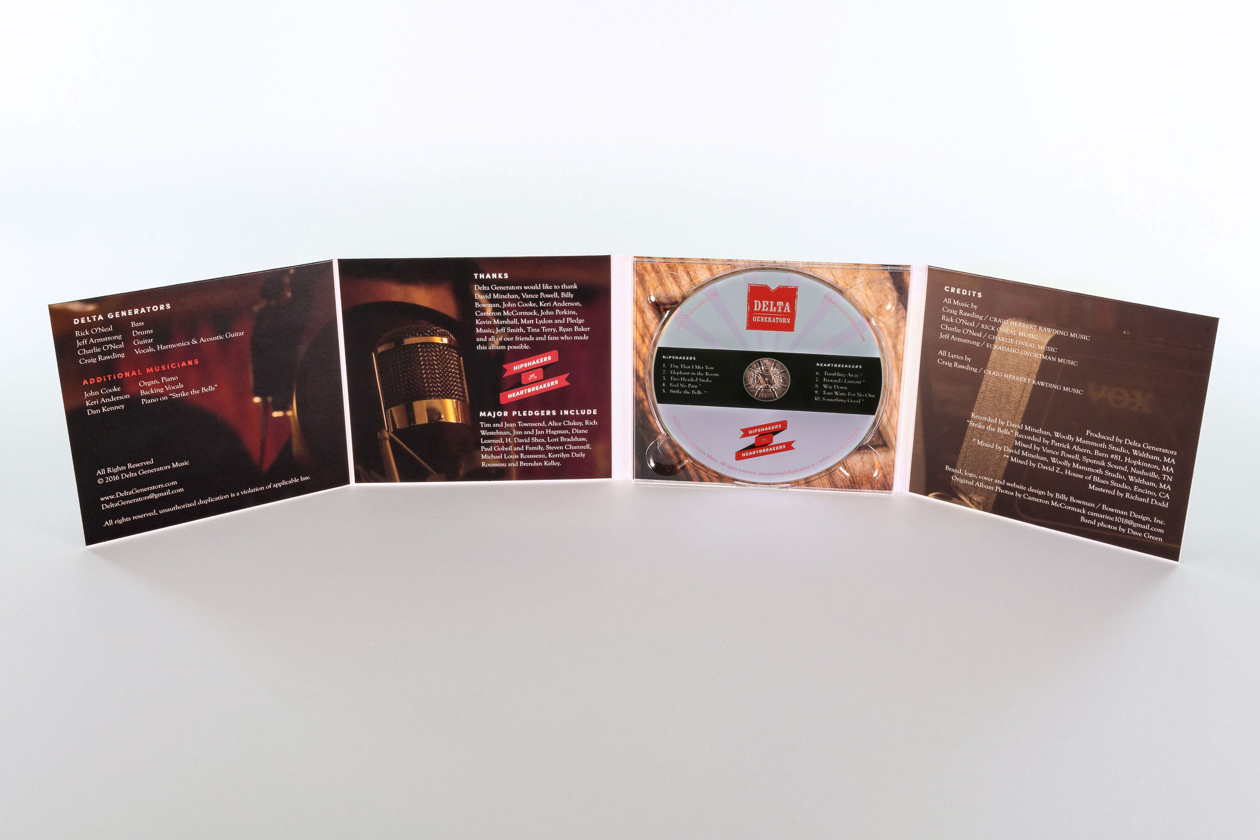
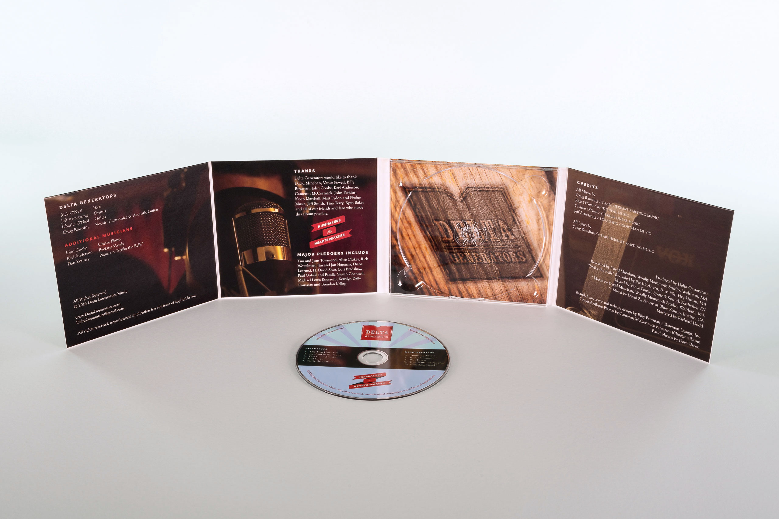
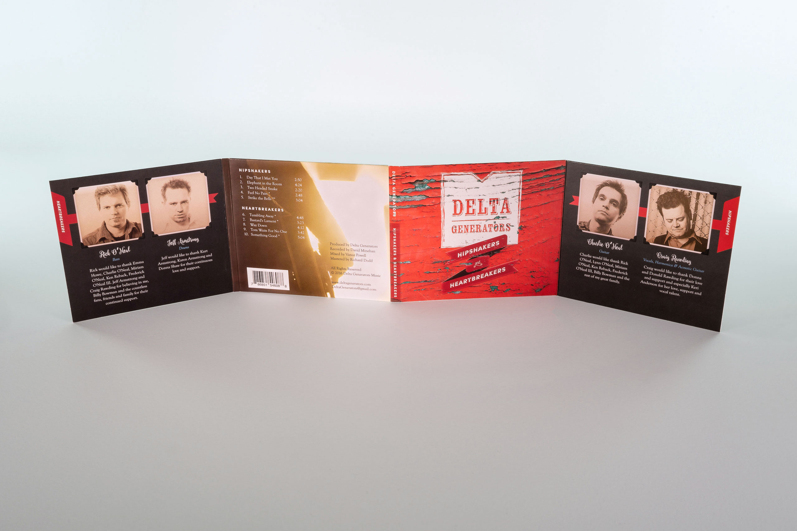
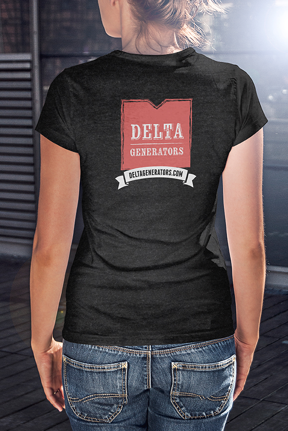
Where band merchandising usually scatters styles, one identity carried from the Digipak CD to the poster wall to the t-shirt, so everything a fan takes home looks like the same band that played the show.
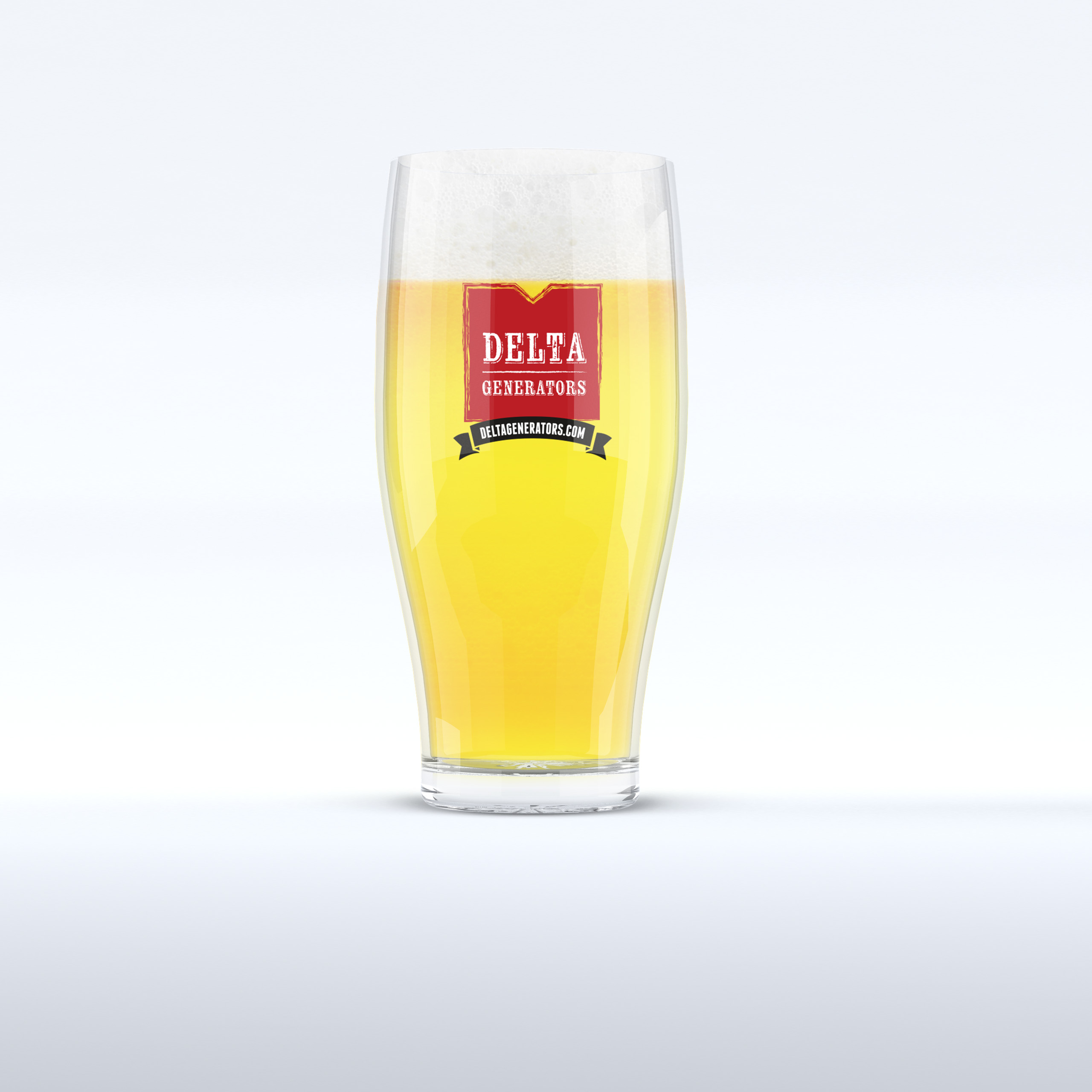
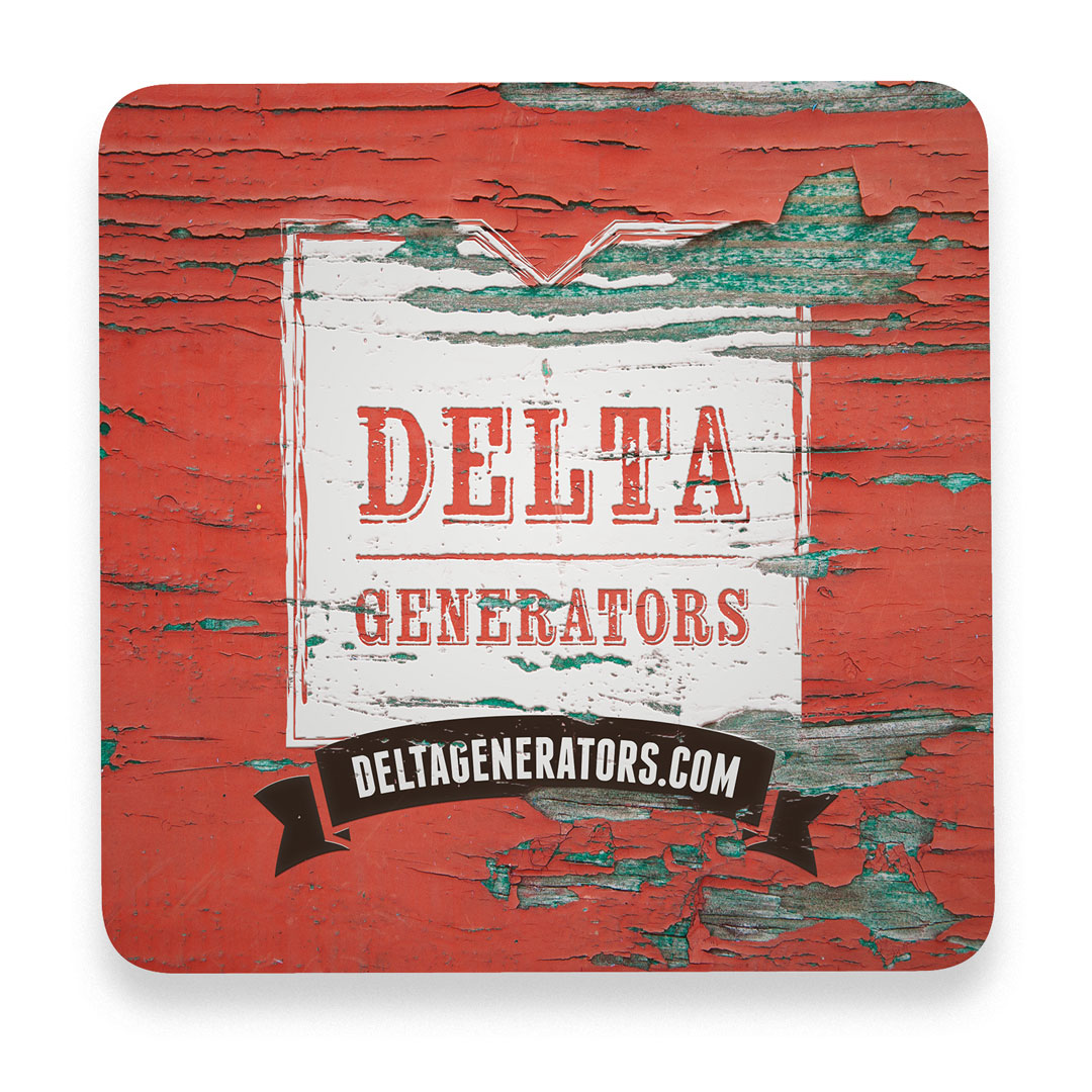
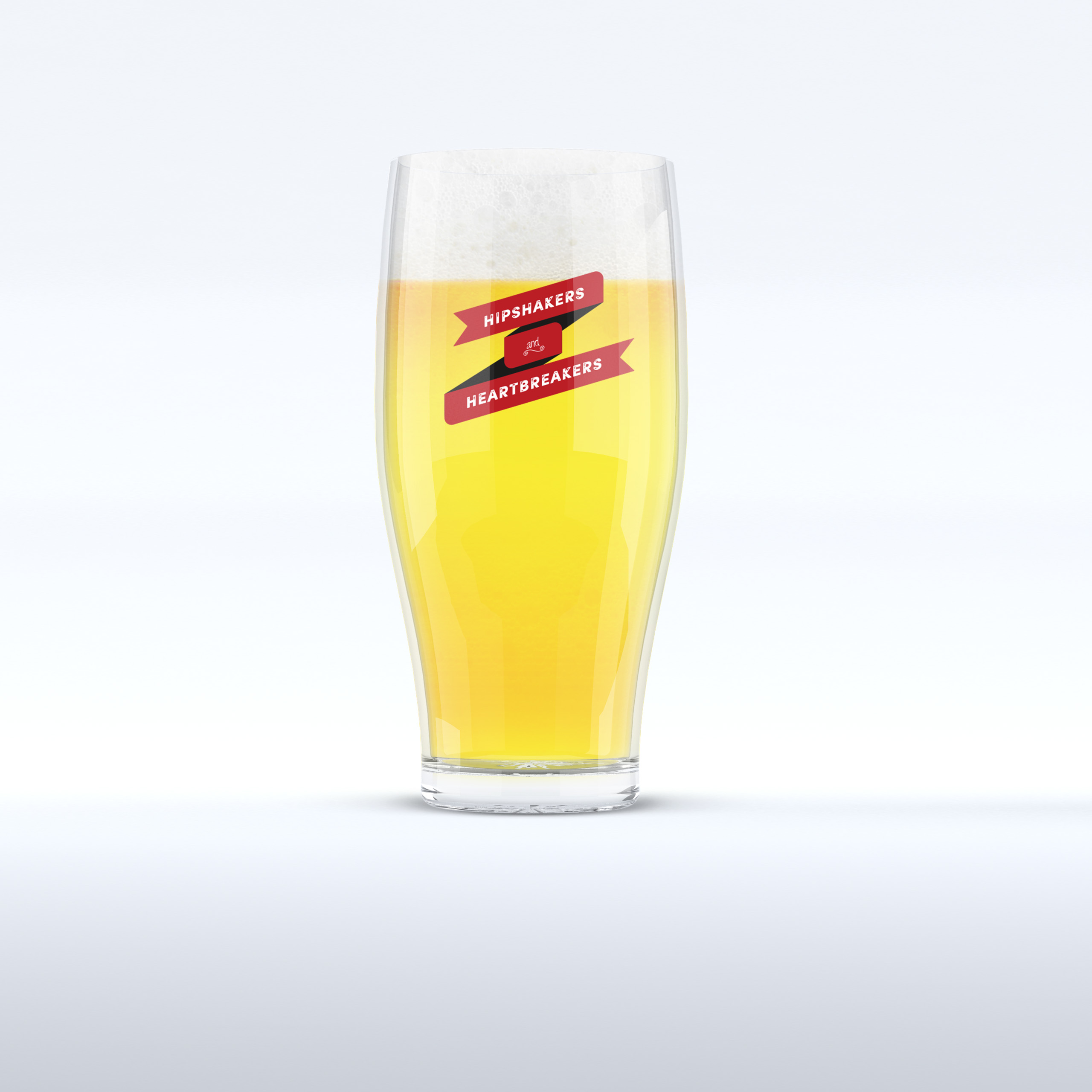
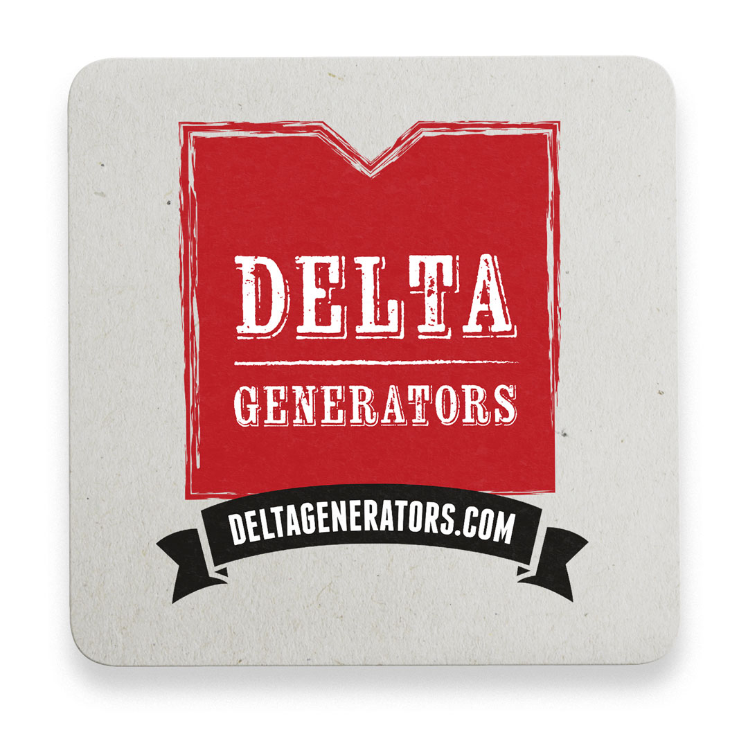
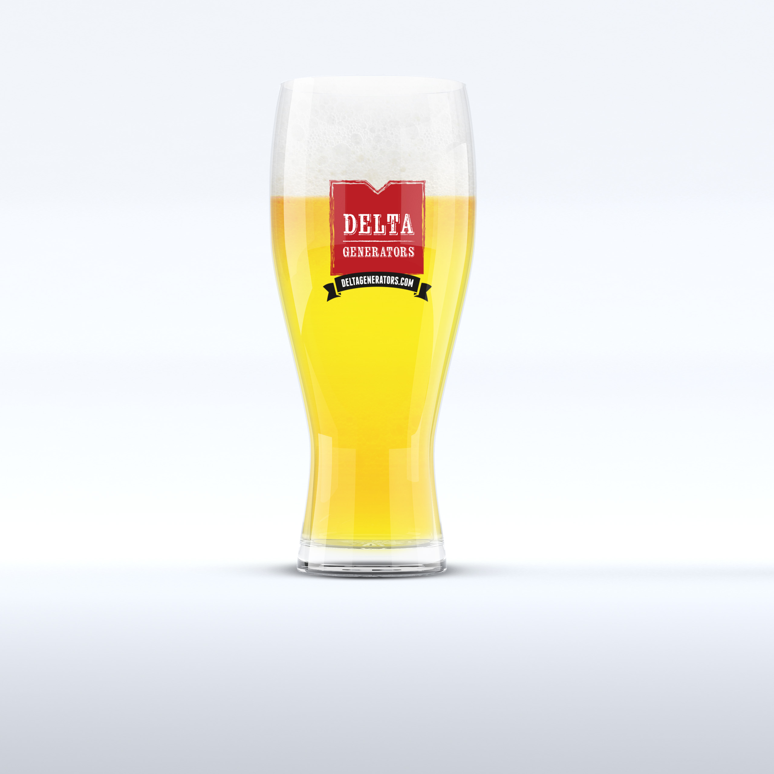
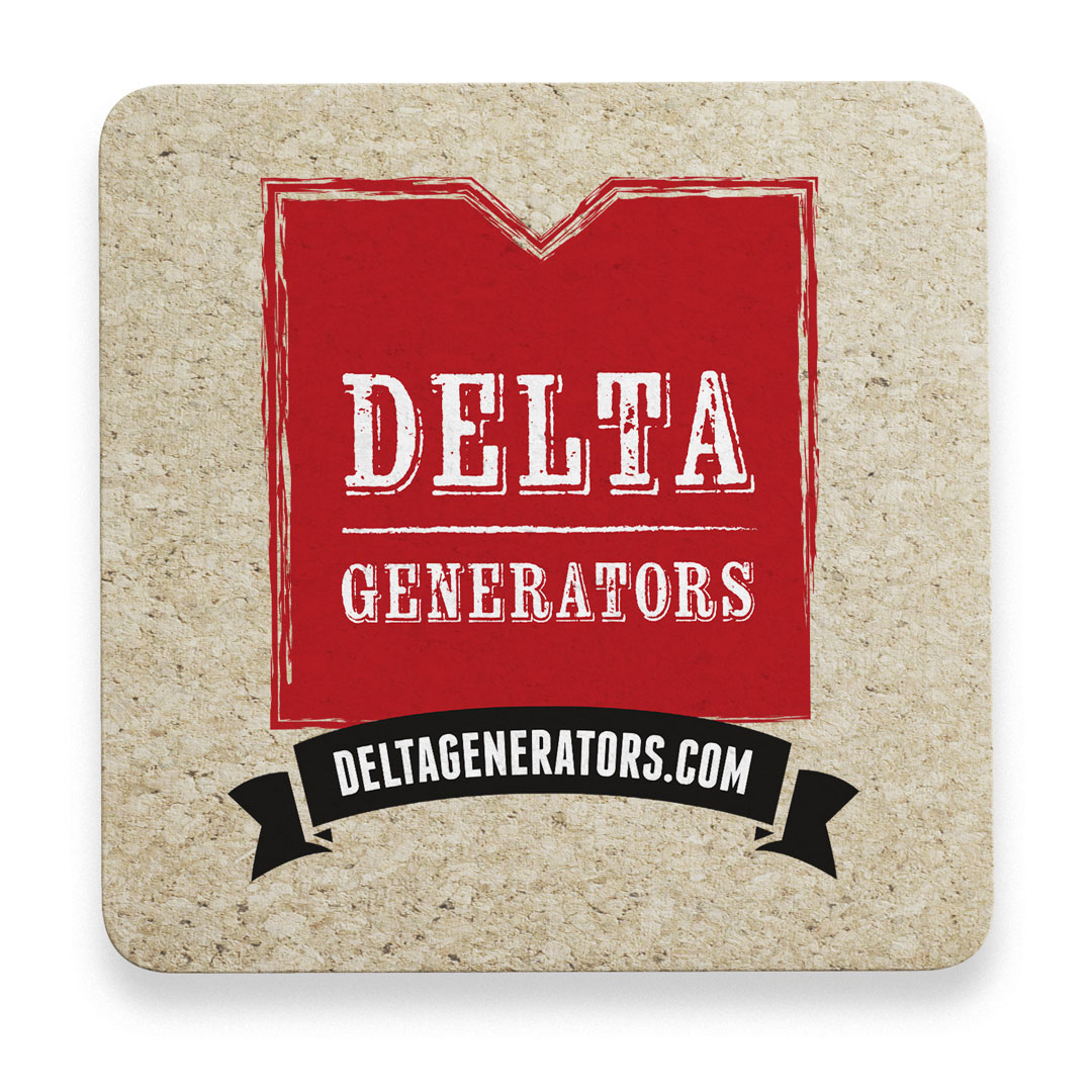
Where most brands stop at print and pixels, this one poured: a custom brew invented with a local brewery for the CD release party, served in branded glasses and coasters fans carried home as gifts.
Where most bands rebuilt every announcement by hand, the templates and style guide made consistency the default: a new show, a new song, a giveaway, each published once and carried everywhere at the same moment.
That was the work: not decorating a band, but tuning the brand until the band could play it themselves.
One Brand, Played the Way the Band Plays: Once, Together, Tight.
Discovery + Strategy
Before design, we mapped how a working band actually publishes, sells, and keeps fans close.
Engagement Roadmap
A band’s business is attention between shows. We aligned announcements, merchandise, and fan giveaways into one publishing rhythm built to grow the base and fill the room.
Brand Architecture
The blues is a discipline, not a costume. Deep color, classic type, and distressed detail shaped an identity system with the band’s signature sound and quality built into every piece.
Audience Architecture
Blues fans follow closely and show up. We mapped where they listen, which channels they trust, and what keeps them in the know, then aimed every template at exactly those moments.
Publish-Once Strategy
Announce once, appear everywhere. We designed the single-click flow that carries shows, songs, products, and giveaways from one platform to every channel, identically on brand.
Content & Marketing System
Content is not a tactic for a band; it is the relationship. Email outreach, social formats, and inbound strategy worked as one system to keep fans close and seats full.
Merchandise Strategy
Merchandise is the brand fans volunteer to carry. T-shirts, the Digipak CD, and the release-party brew turned the audience into advocates and the venue into a channel.
Brand Identity
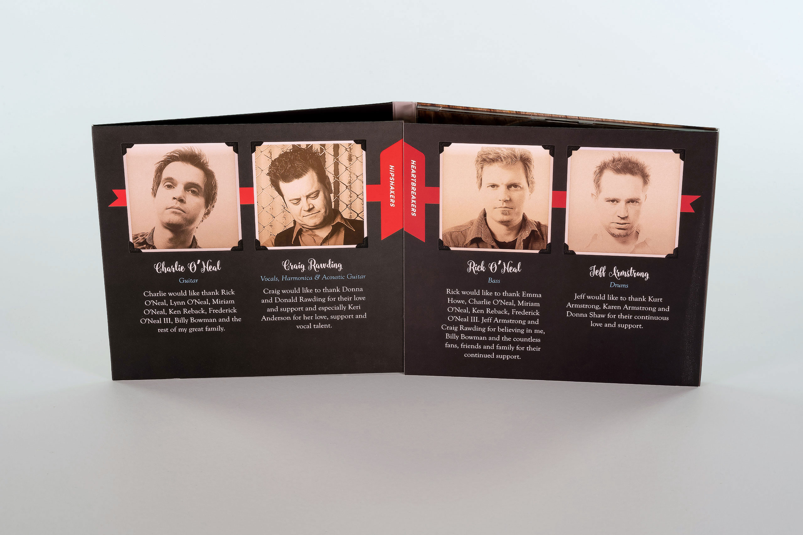
The Delta Generators identity translates the band’s signature sound into a visual system: rich, saturated color, classic typefaces, and stylized photography set against distressed textures that feel road-worn rather than costumed. It reads the way the band sounds: authentic, seasoned, tight.
Blues branding usually reaches for the souvenir shop. This identity earns its wear instead, drawing from the genre’s honesty rather than its clichés, so the system flatters the music without imitating it.
The identity was built to travel. The same system holds on a Digipak CD, a show poster, a t-shirt, a beer glass, and a website header, keeping everything a fan touches unmistakably Delta Generators.
A comprehensive style guide makes the identity operational: color, type, photographic treatment, and usage rules documented for print and digital alike, so work made next year matches work made today.
Most band identities depend on whoever designed them. This one was documented to outlive the engagement: the guide gives the band the authority to publish on brand without asking anyone’s permission.
Identity Treatments
Color System

Style Guide
Photography
CD
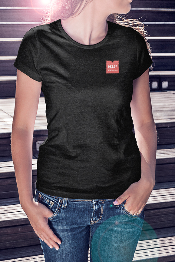
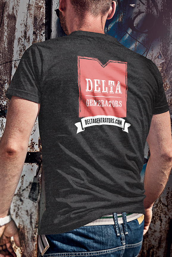
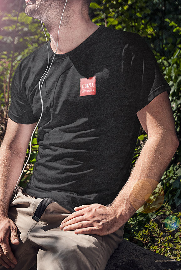
Brand Merchandise
Beer Glasses and Coasters

Posters
Website + Shop
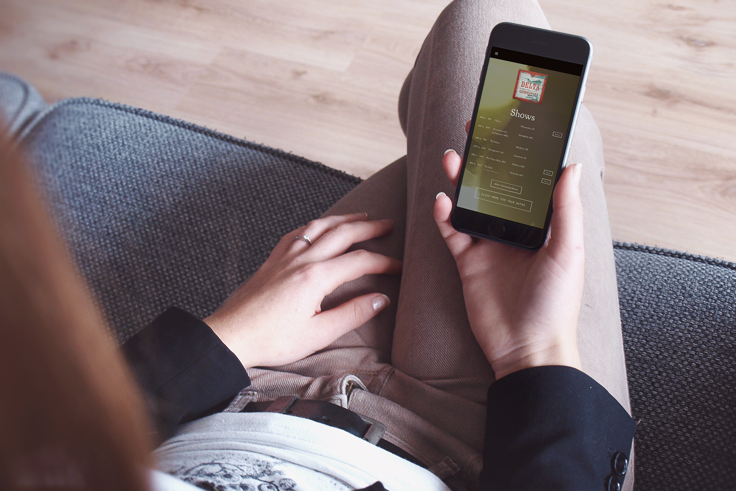
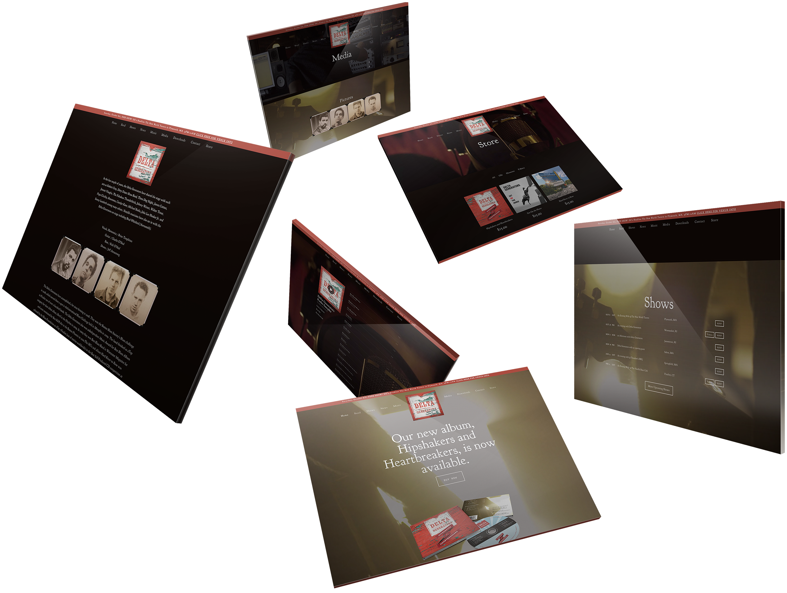
The website does what a band’s site rarely does: it works as the band’s own label. Music and merchandise sell directly from the store, news publishes in minutes, and the whole experience carries the identity at full strength. The website becomes another stage for the band, one they own and can change whenever the story moves.
We prioritized powerful design, an intuitive user experience, and dynamic functionality, with SEO-friendly metadata and full social integration built into the system from day one. Nothing was treated as a separate marketing channel. The website, store, music, news, and social presence were designed to work as one connected experience.
Publishing is the system’s real instrument. The band announces a show, posts a photo, or releases a song once, and the platform carries it to Twitter, Instagram, YouTube, and Bandsintown at the same moment, identically on brand. One act of publishing keeps the entire digital presence moving together, giving the band more time to make music instead of maintaining channels.
The content management system was chosen for the van, not the studio: simple enough to update between soundcheck and doors, structured enough that nothing published ever drifts off brand. The technology stays backstage, where it belongs, while the band controls what its audience sees.
The store turned fans into customers without a middleman. Giveaways, new releases, and merchandise all live where the fans already are, and every sale belongs to the band.
Email + Social Media