Opens in a new tab

Symphonic Acoustics

Engineering a brand as precise as the sound it produces.

Symphonic Acoustics builds custom studio monitoring systems for recording engineers, producers, and world-class studios where accuracy is everything. The challenge wasn’t simply designing a logo or website. It was translating decades of acoustic engineering expertise into a brand that felt as refined, deliberate, and uncompromising as the products themselves.

The task wasn’t to invent a brand. It was to translate decades of engineering into one.

Bowman Design Direction created a complete identity system spanning brand strategy, messaging, visual identity, product visualization, trade show graphics, print collateral, and digital experience. Every touchpoint was designed to communicate the same idea: engineering excellence without unnecessary complexity.

Challenge

Professional studio monitors occupy one of the most technical categories in professional audio. Customers expect engineering precision, yet most manufacturers communicate through specifications, diagrams, and dense technical language.

Symphonic Acoustics needed a brand that balanced scientific credibility with visual elegance, helping engineers appreciate the craftsmanship behind every system while giving newcomers an approachable introduction to an exceptionally technical product.

Direction

Rather than treating engineering and branding as separate disciplines, we positioned them as expressions of the same philosophy.

Every visual decision reflected the product itself: refined geometry, purposeful restraint, carefully considered proportions, and an emphasis on precision over decoration. Complex acoustic concepts were translated into an approachable visual language without sacrificing credibility with experienced professionals.

The result was a brand that felt engineered rather than merely designed.

Outcome

The finished identity unified every customer touchpoint into a cohesive experience.

Entering a market often defined by commodity positioning and dense technical language, Symphonic Acoustics presented itself with uncommon clarity and confidence. The visual system established engineering authority before a single specification was read and proved flexible enough to evolve across future product generations without requiring reinvention.

Takeaway

Precision instruments can’t be sold with imprecise branding. Symphonic Acoustics needed an identity as engineered as the products behind it, so decades of acoustic science became a visual system that signaled authority, elegance, and intent before anyone heard a note. The engineering didn’t get simplified. It got a form people could read.

What We Built

Brand & Identity

We designed an identity system rooted in acoustic engineering rather than decorative symbolism. The logo, typography, color palette, and supporting graphics created a visual language that felt manufactured rather than merely drawn, each element reflecting the discipline of the products themselves.

Messaging & Positioning

Technical expertise was translated into language that remained credible with experienced engineers while becoming accessible to new audiences. The messaging emphasized engineering philosophy over marketing hype.

Product Visualization

High-end visualization and photography direction presented complex products with clarity and elegance. Rather than overwhelming viewers with specifications, imagery highlighted the craftsmanship and proportion that distinguished Symphonic Acoustics from commodity competitors.

Digital Experience

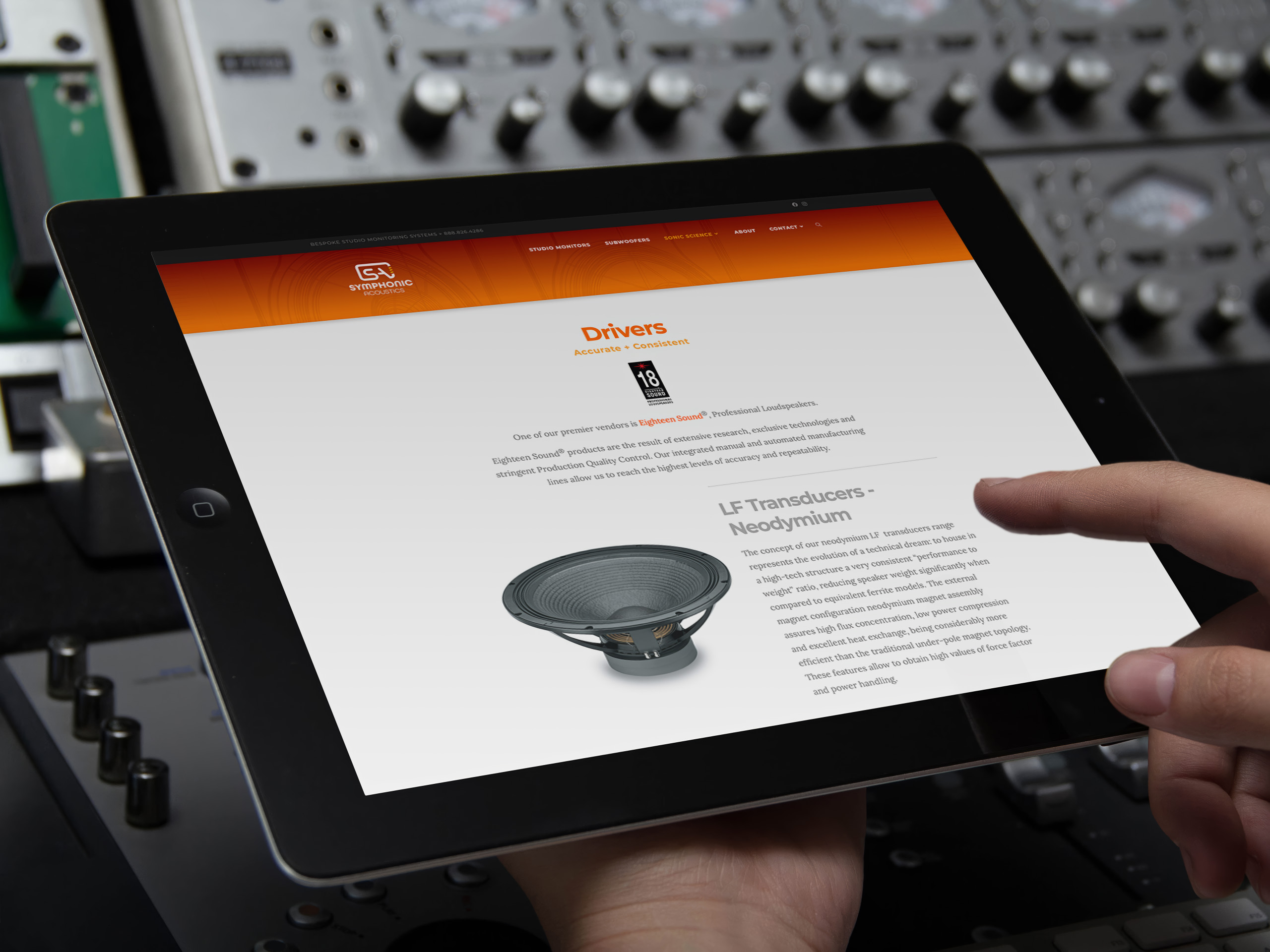
The website combined immersive visuals with deep technical content, helping customers explore products without sacrificing usability. Responsive layouts, structured information architecture, and modular content created an experience that supported both storytelling and technical education.

Reversed white version of the Symphonic Acoustics S/A monogram for dark backgrounds, the loudspeaker-enclosure mark and three projection bars knocked out in a single color.

The Through-Line

Decades of acoustic science took visible form: authority a customer could read before hearing a note.

Precision in the mark: a logo built from geometry, not decoration. Restraint in the system: color, typography, and proportion held to the same tolerances as the products they represent.

Clarity in the messaging: engineering philosophy stated plainly, credible to a studio engineer and readable to a first-time buyer.

Elegance in the imagery: visualization that presented complex monitors the way they were built, craftsmanship leading and specifications in service of the story. Depth in the digital experience: immersive visuals over a structured architecture that let customers go exactly as technical as they wanted.

The same discipline the company machines into its monitors now runs through everything a customer sees, reads, and clicks.

Every Element Was Engineered to the Same Tolerance as the Product.

Engineer at a control desk viewing the Studio Monitors page on the main display with the About page on a second screen.

Engineering the Position

Discovery + Strategy

Discovery established where Symphonic Acoustics could stand apart: acoustic science expressed with authority, elegance, and restraint.

  • Returning-Client Discovery

    The work began with years of understanding already in place. Years of discovery across SonoTone Strings and AVN | SYS meant most questions were already answered; a conversation confirmed what the work had already taught us.

  • Brand Architecture

    Symphonic could not borrow its siblings’ voice. Symphonic needed authority rooted in acoustic science: engineered, elegant, and uncompromising, distinct from SonoTone’s craft warmth and AVN’s integration confidence.

  • Audience Architecture

    Studio engineers, producers, and facility designers each judge precision differently. We mapped how each evaluates a monitoring system and shaped messaging credible to the most technical reader in the room.

  • Competitive Positioning

    In a category sold on specifications, elegance is the differentiator. We positioned Symphonic where engineering discipline meets visual restraint: precision you can see before you hear it.

Symphonic Acoustics primary logo: an S and A merged into a single continuous mark that also reads as the silhouette of a loudspeaker enclosure, with three ascending gold bars suggesting sound projecting from the cabinet.
Reversed white version of the Symphonic Acoustics S/A monogram for dark backgrounds, the loudspeaker-enclosure mark and three projection bars knocked out in a single color.

Brand Identity

The Symphonic Acoustics identity was designed to express the science of sound rather than simply represent a company name.

At its core, the mark combines the initials S and A into a single continuous form that also evokes the silhouette of a loudspeaker enclosure. Rather than relying on a literal speaker icon, the logo abstracts the engineering behind professional studio monitors into a clean, modern symbol.

The rounded geometry reflects the smooth curves of sound waves while creating a visual language that feels both precise and approachable. The mark suggests both the exterior and interior of a loudspeaker, as though a section of the cabinet has been opened to reveal the engineering within. Every curve and proportion was intentionally simplified so the identity remains unmistakable whether reproduced on a business card, a website, or a trade show booth.

Three gold bars introduce movement into the geometric mark. Their progressive spacing and upward angle suggest sound leaving the enclosure, echoing the expanding geometry of a horn while conveying projection, airflow, and acoustic energy. Rather than illustrating a horn literally, three simple lines capture its essential behavior, transforming a static monogram into a mark that feels as though it is performing.

The accompanying typography reinforces the same philosophy. Its rounded forms echo the geometry of the symbol, creating a cohesive identity system equally at home in recording studios, engineering environments, and premium audio applications.

Although inspired by high-performance studio monitoring, the mark was never intended to represent a single product. It captures broader principles of acoustic engineering, precision craftsmanship, and sound in motion. That abstraction has given the identity lasting relevance, allowing it to endure as technologies, products, and product generations continue to evolve.

Hands complete the mobile contact form in front of a laptop showing the gradient We Are Bespoke homepage hero.

Color System

Symphonic Acoustics brand color palette of layered neutral grays and warm off-whites anchored by a vivid rose-red accent.
Tablet held before rack gear showing the Drivers page, an Eighteen Sound neodymium LF transducer photographed beside the technical copy.

Brand Merchandise

Engineer at a studio desk with the We Are Bespoke hero on the main screen and the client logo grid on a side display.

Tradeshow

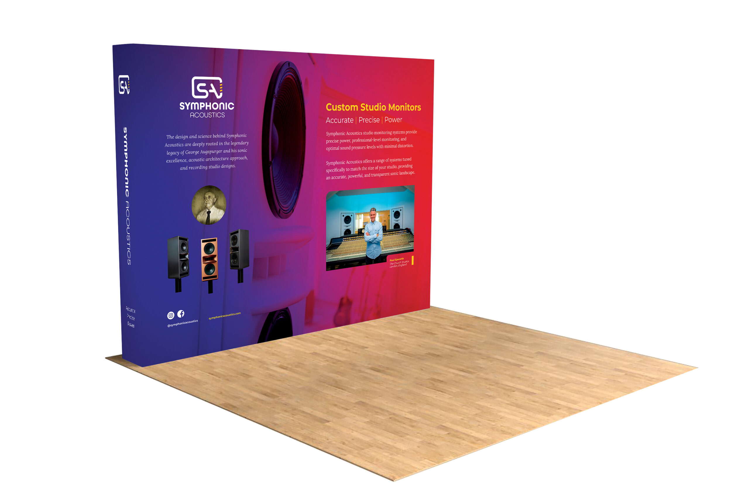
We designed a modular exhibit system that extended the brand into physical space, allowing Symphonic Acoustics to present its products with the same confidence and precision found throughout the identity. Scalable graphics, immersive environments, and consistent messaging ensured the brand remained recognizable across multiple event formats.

Symphonic Acoustics modular trade-show booth with a curved backwall in a purple-to-magenta gradient, extending the brand identity into physical exhibit space.