



Creations
Schwartz Communications
Schwartz Communications
A new brand for the firm that made other brands famous.
Schwartz Communications was one of the country’s leading independent public relations firms, trusted by technology, healthcare, security, and software companies to tell their stories. Its own story lagged behind, and its owner knew it:
Give the firm a brand as compelling as the client list it represented.
Backbone Media, the SEO and development firm on the account, brought in Bowman Design Direction to strengthen the brand and design side of the work. What began as a single website in 2004 became seven years of translation: print, environments, and offices on two continents, ending in the acquisition the brand was built to earn.
Read the Story
Challenge
Schwartz Communications had earned its reputation the hard way, representing technology, healthcare, security, and software companies that led their categories. The firm’s own presence told none of it: a flat blue mark, dated collateral, and a website that undersold the firm behind it.
The deeper problem was the mismatch. A firm whose entire product is relationships looked static and institutional, and every prospective client could see the gap between the stories Schwartz told for others and the one it told about itself.
Direction
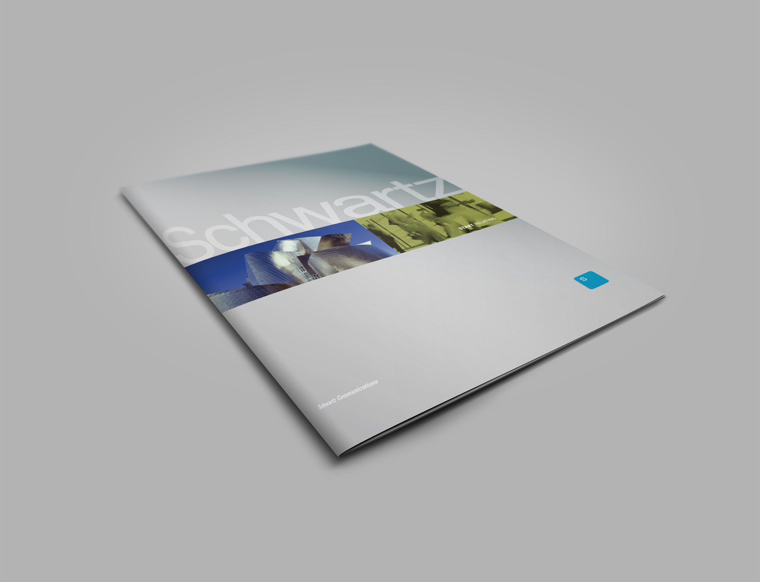
Discovery with Steve Schwartz surfaced the idea the firm had been living but never saying. Its product was relationships, plural and fluid, across industries that had nothing else in common. We gave the insight its language, a new tagline that told the market exactly what a public relations firm exists to create: Start Relating.
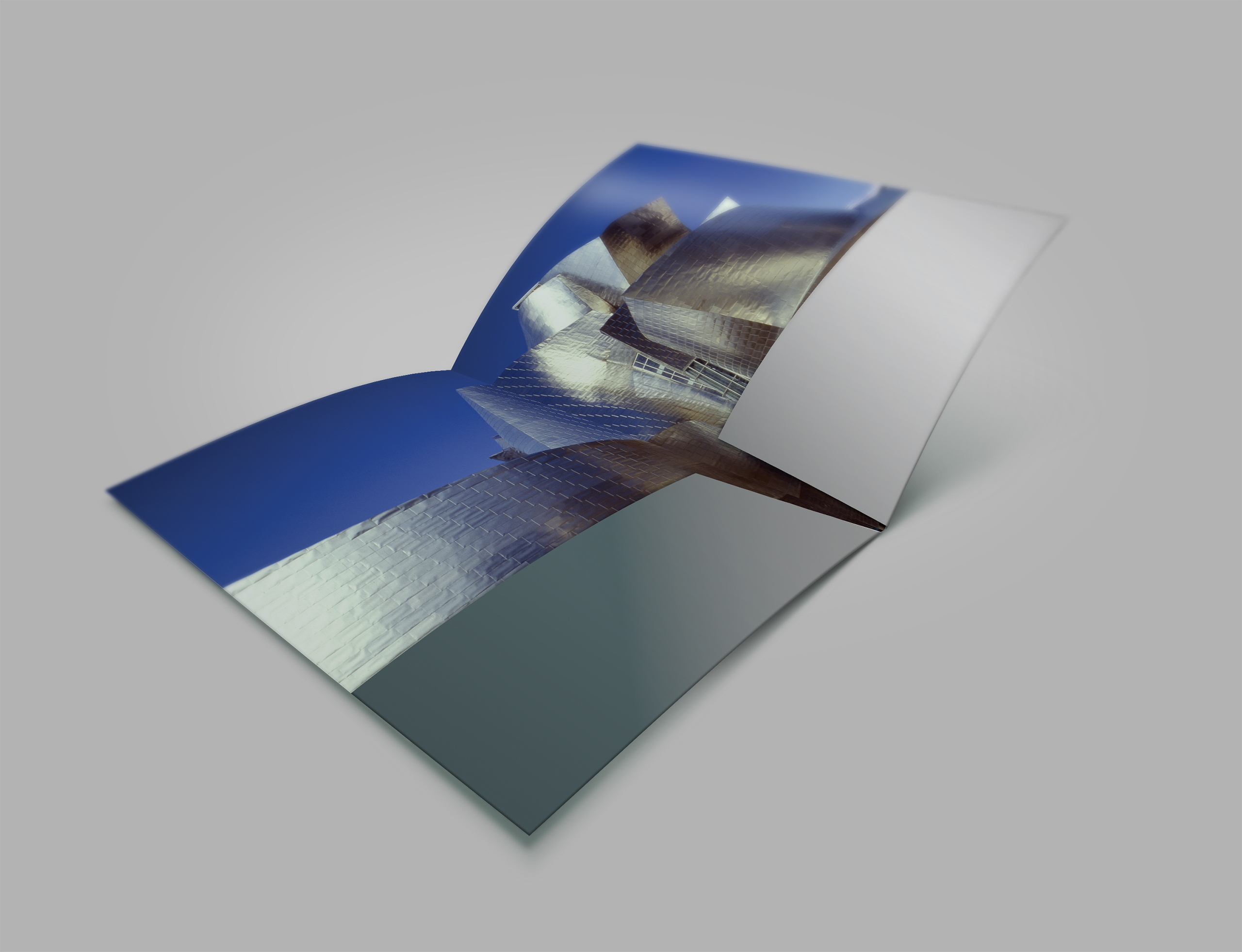
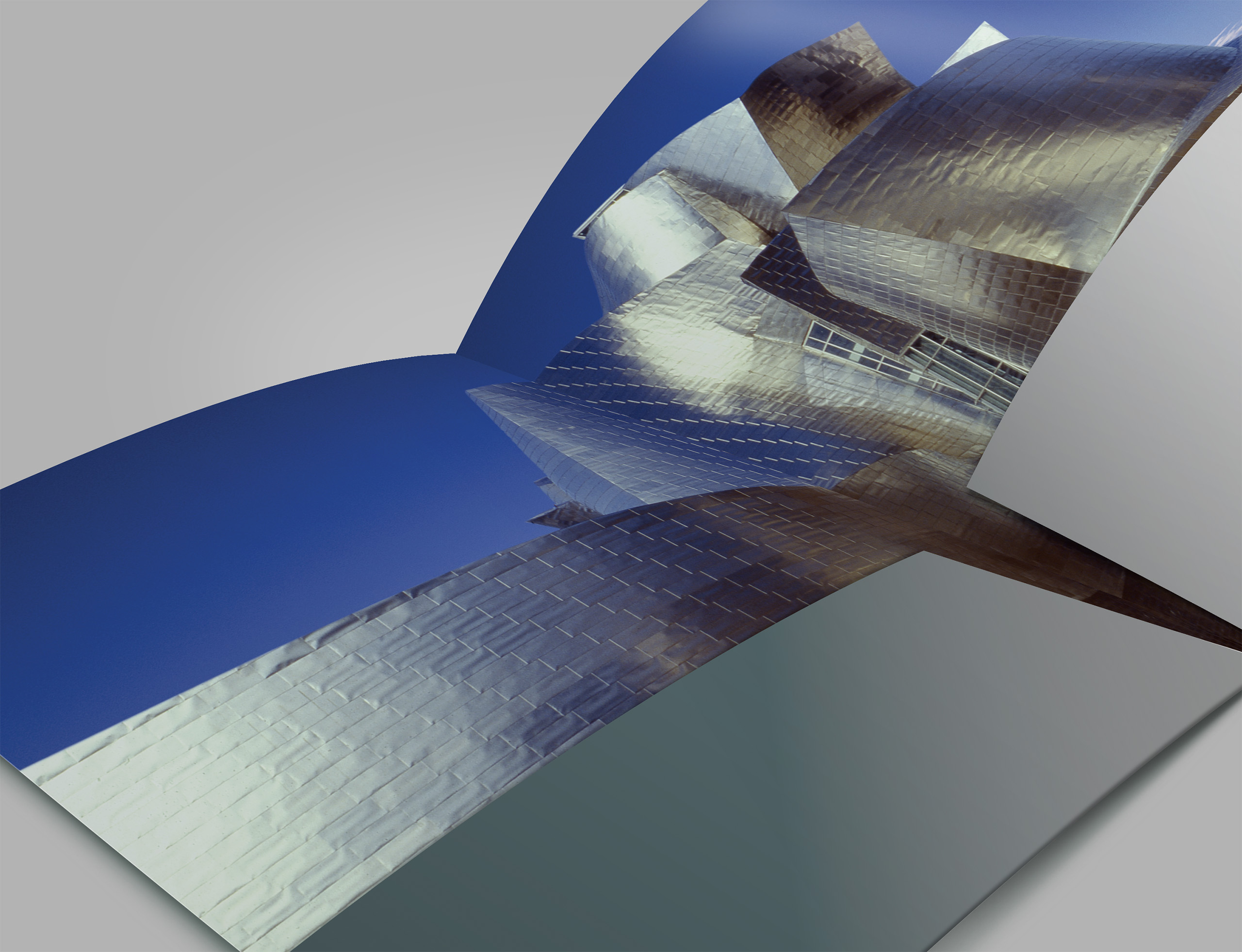
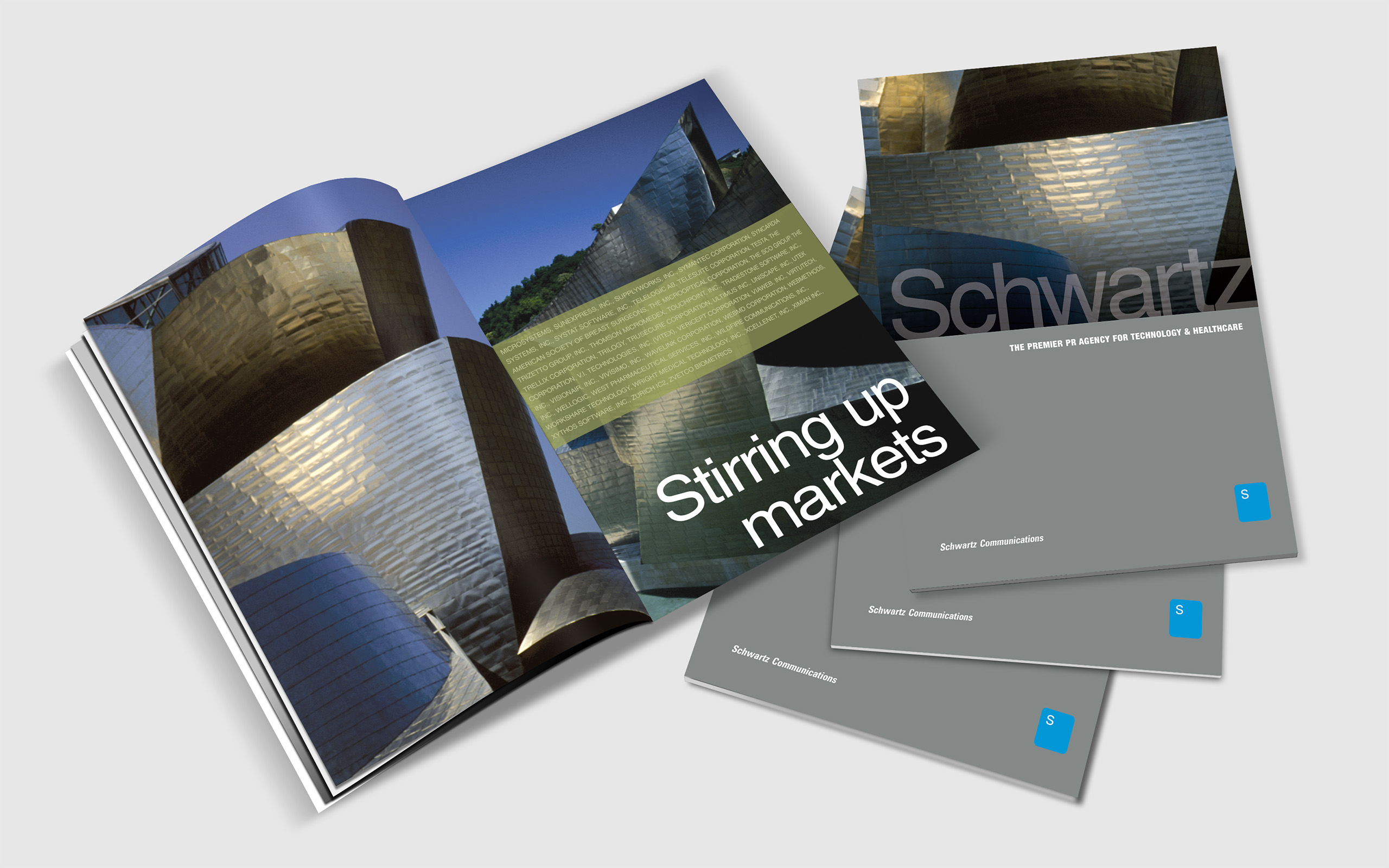
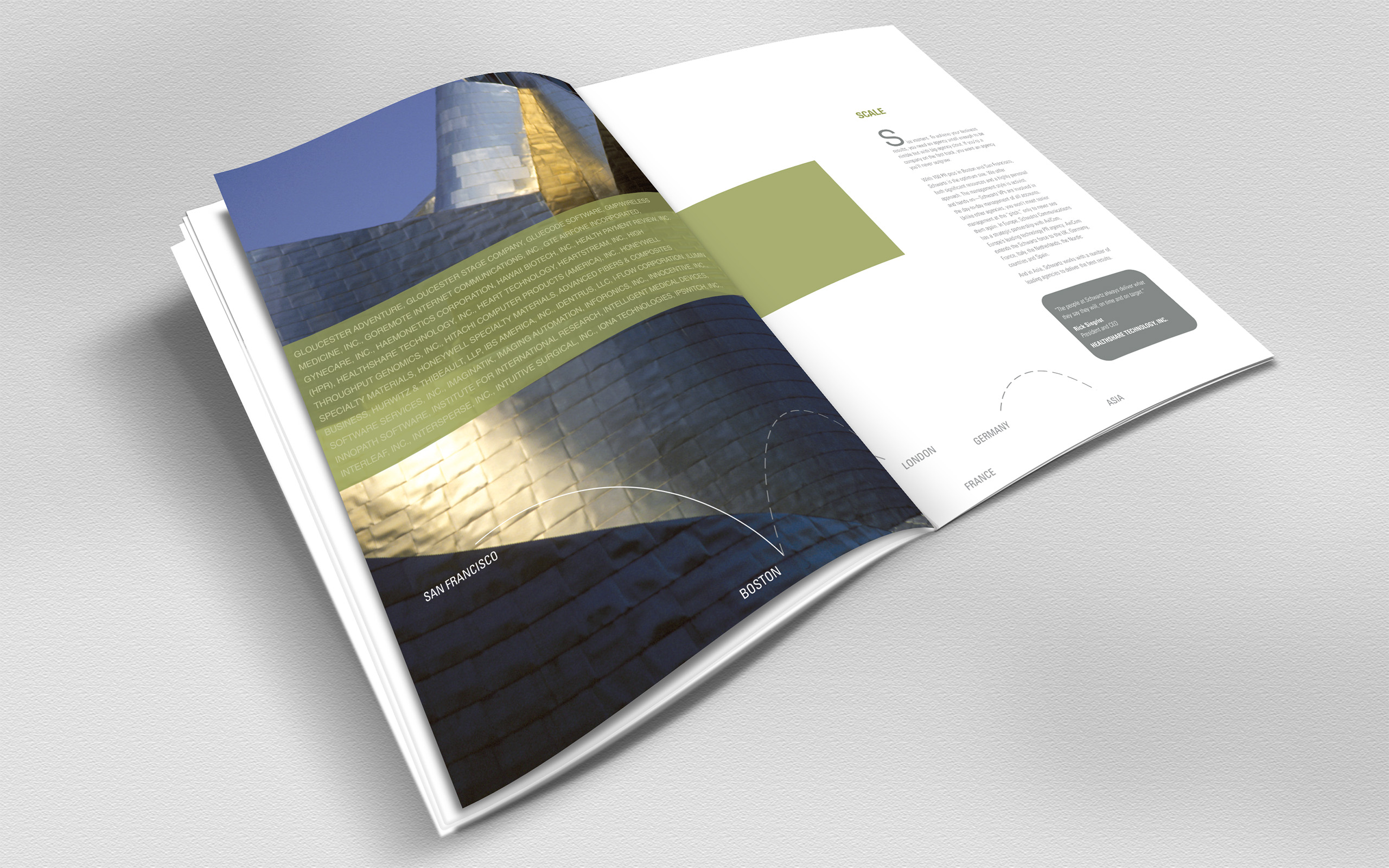
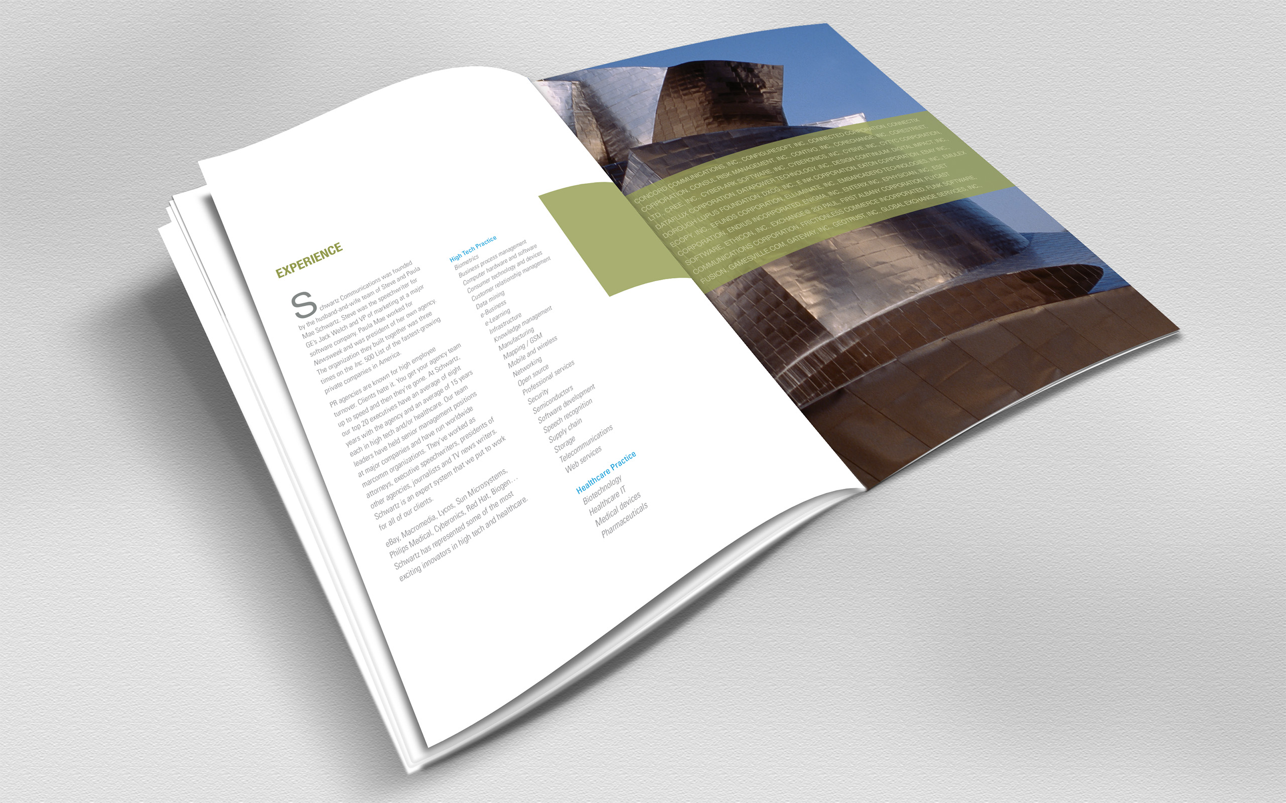
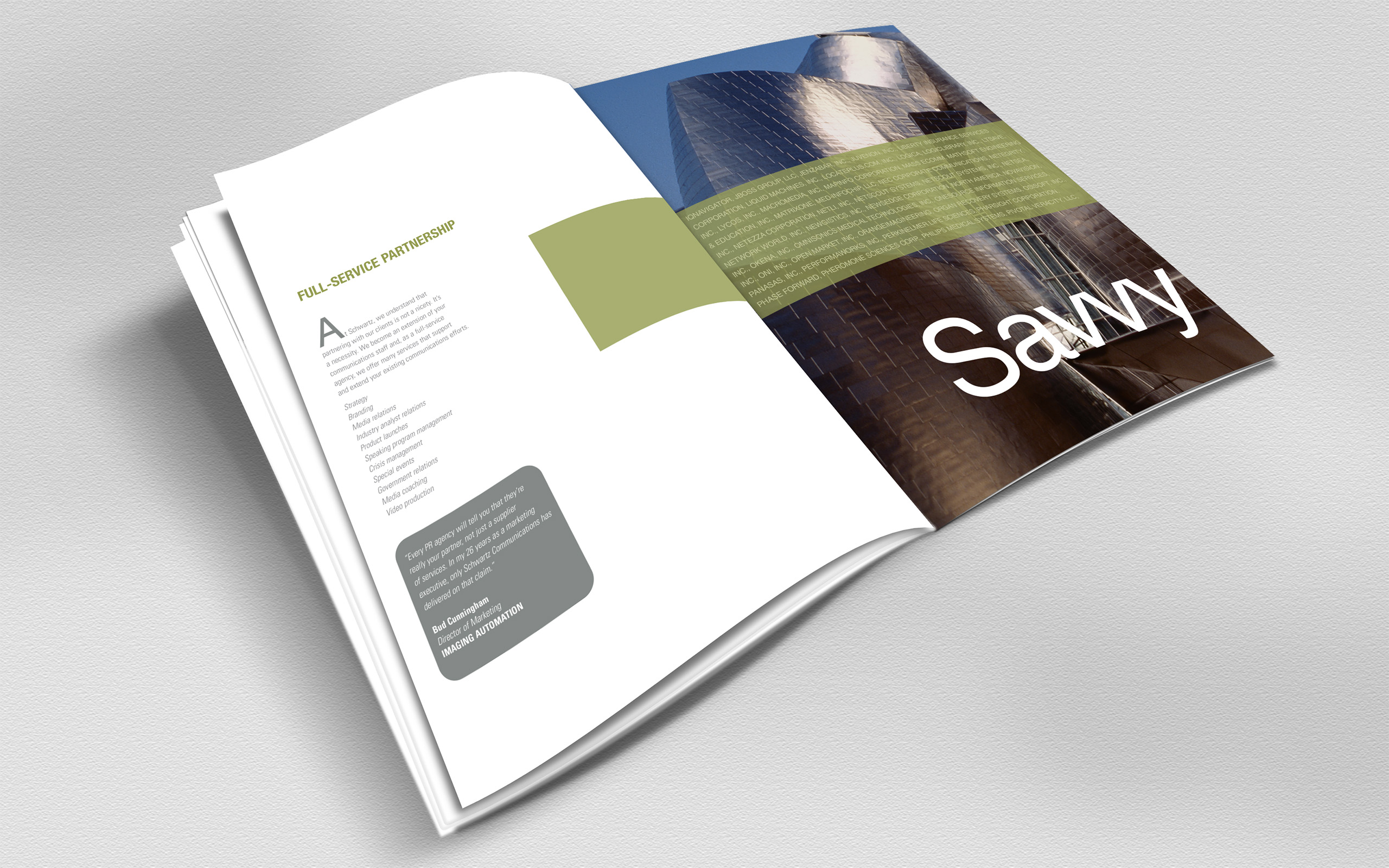
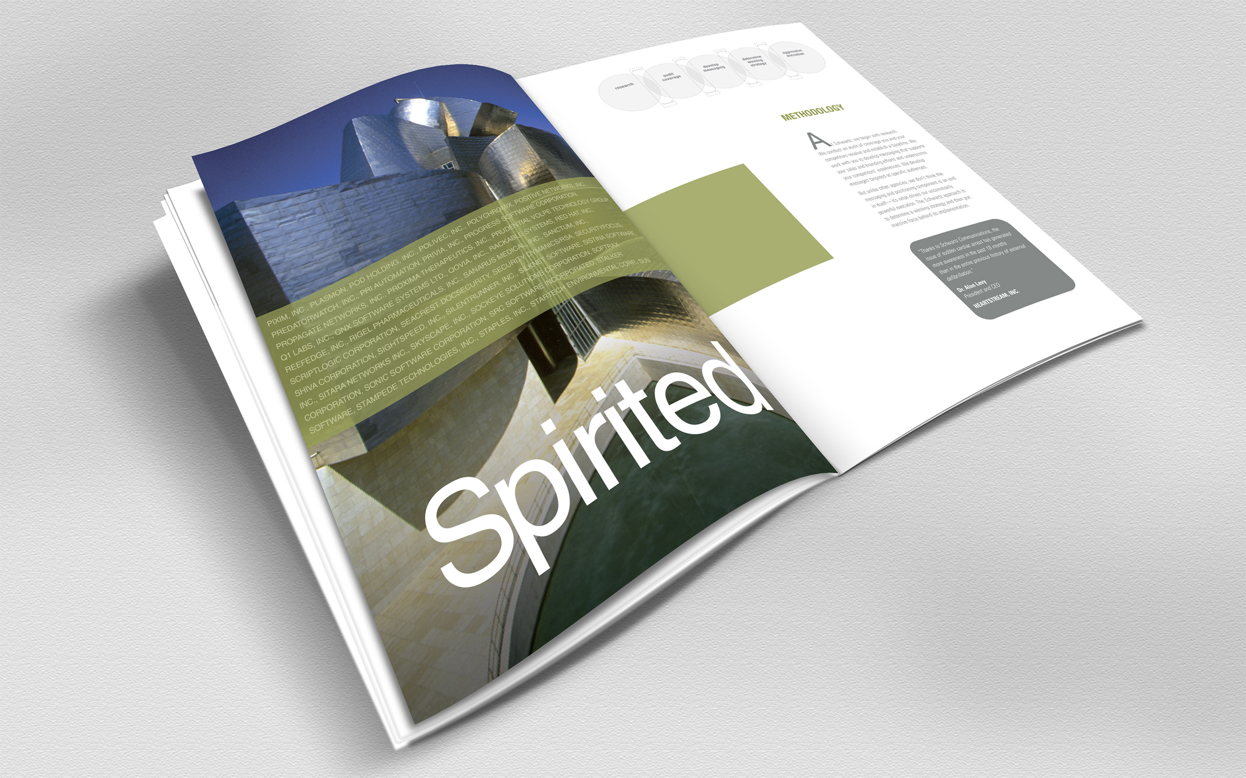
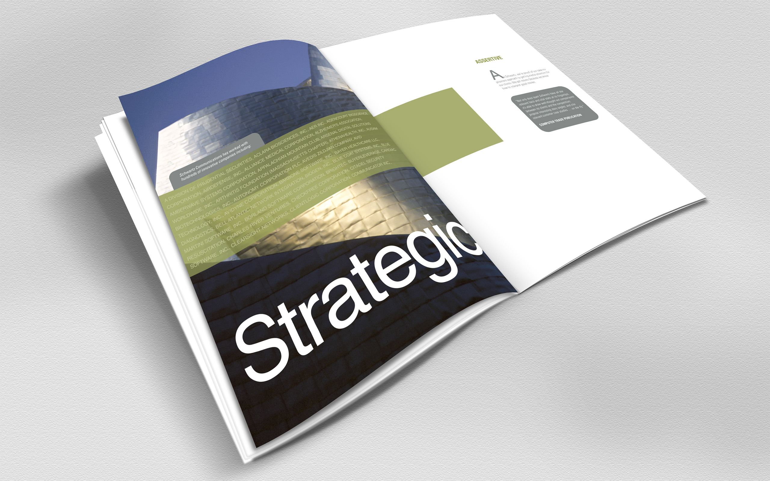
The design followed the same discovery. Steve’s love of Frank Gehry’s Guggenheim Bilbao gave the brand its visual argument, fluid forms for a firm that changes shape by market, and the clients themselves became the lifeblood, streaming through the brochures and the lobby concept. The website came first, in 2004, and set a standard the rest of the company was rebuilt to match.
Outcome
Lead generation rose 400% after the award-winning site launched, and Steve’s response set the scope for everything that followed: he asked us to carry the new brand through the entire company. Print, environments, advertising, and new offices in London and Stockholm all spoke the language the website had established.
In September 2011, Publicis Groupe acquired Schwartz Communications and folded it into MSLGROUP. The brand had done the job it was hired for: presenting one of PR’s strongest independents at its true value, all the way to the closing table.
Takeaway
PR firms spend their days making clients look established, credible, and worth choosing, and almost none of them turn that discipline on themselves. Schwartz’s missed opportunity was its own method. The work translated the firm’s relationships into a brand you could see, fluid, connected, and alive across every market it served. Schwartz had spent years making its clients visible. The work returned the favor.
What We Built
Identity Refresh & Color System
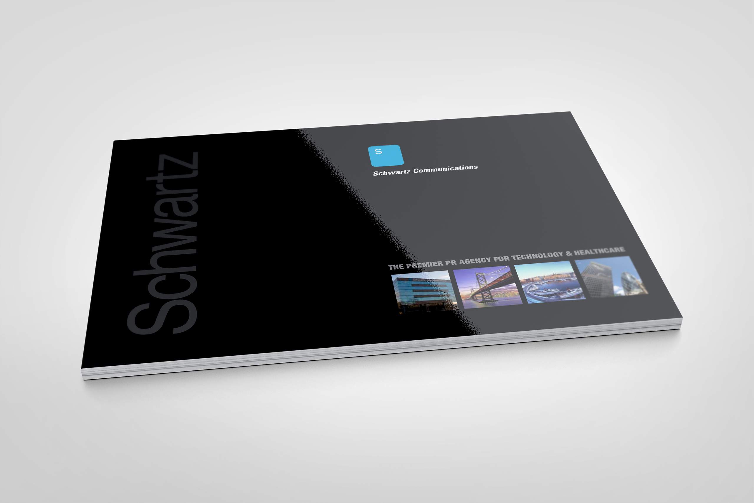
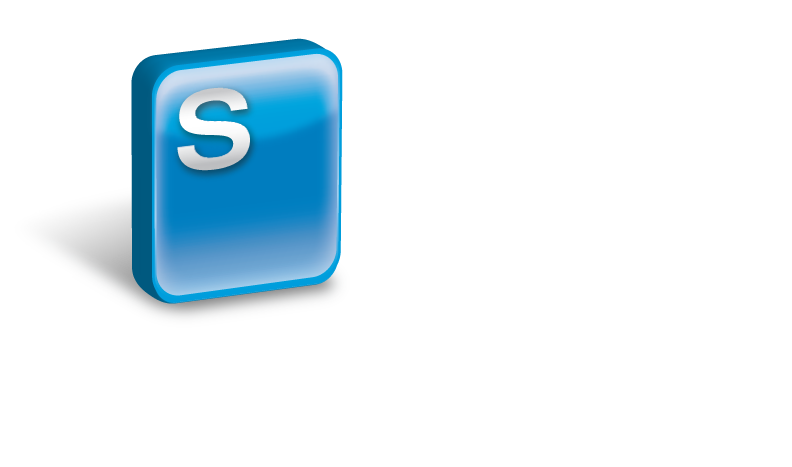
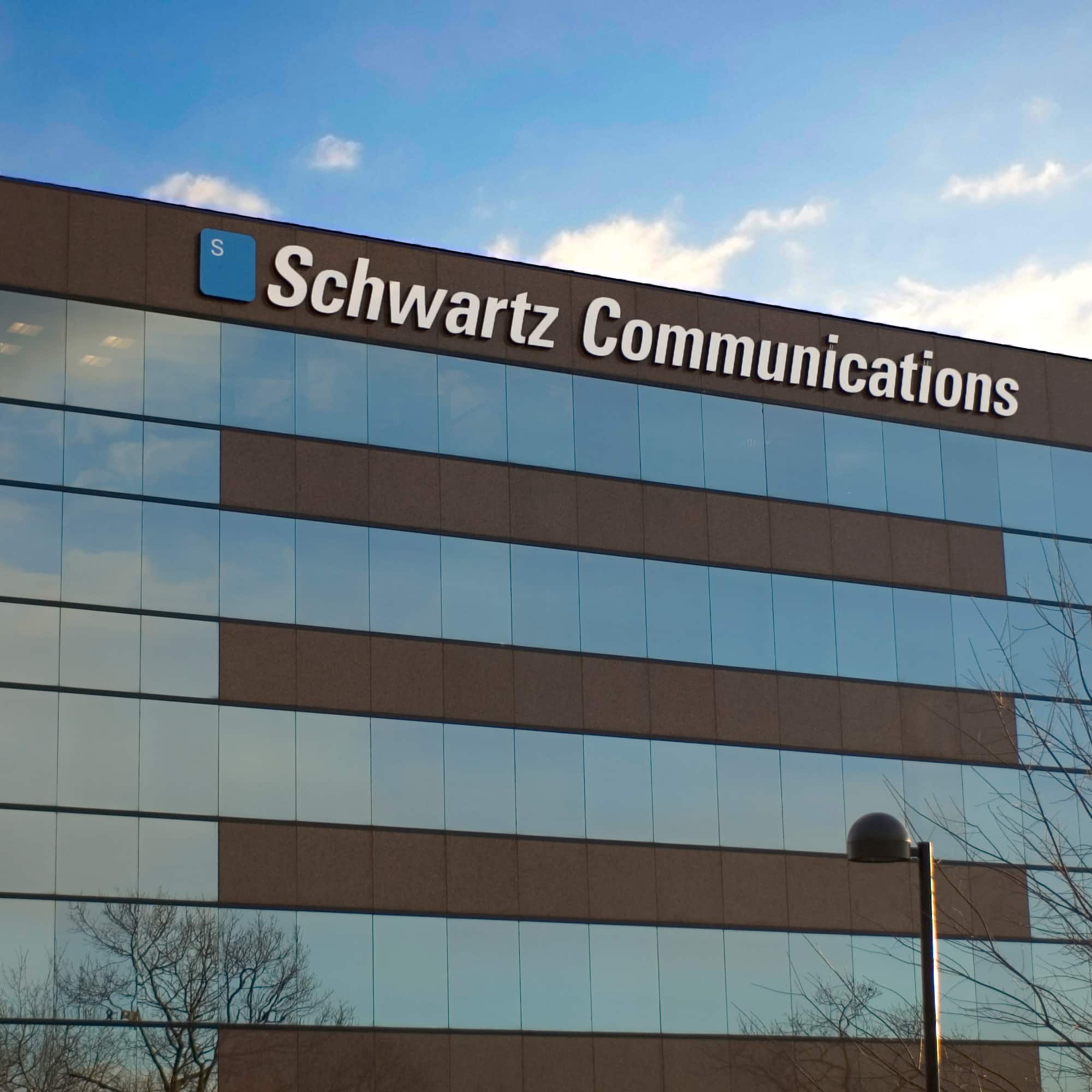
The mark wasn’t ours to replace, so we made it worth keeping: the flat blue chicklet became a glassy, dimensional badge in step with its era, without surrendering the firm’s familiarity. Around it, a new color system introduced the green that became the brand’s lifeblood.
The Website
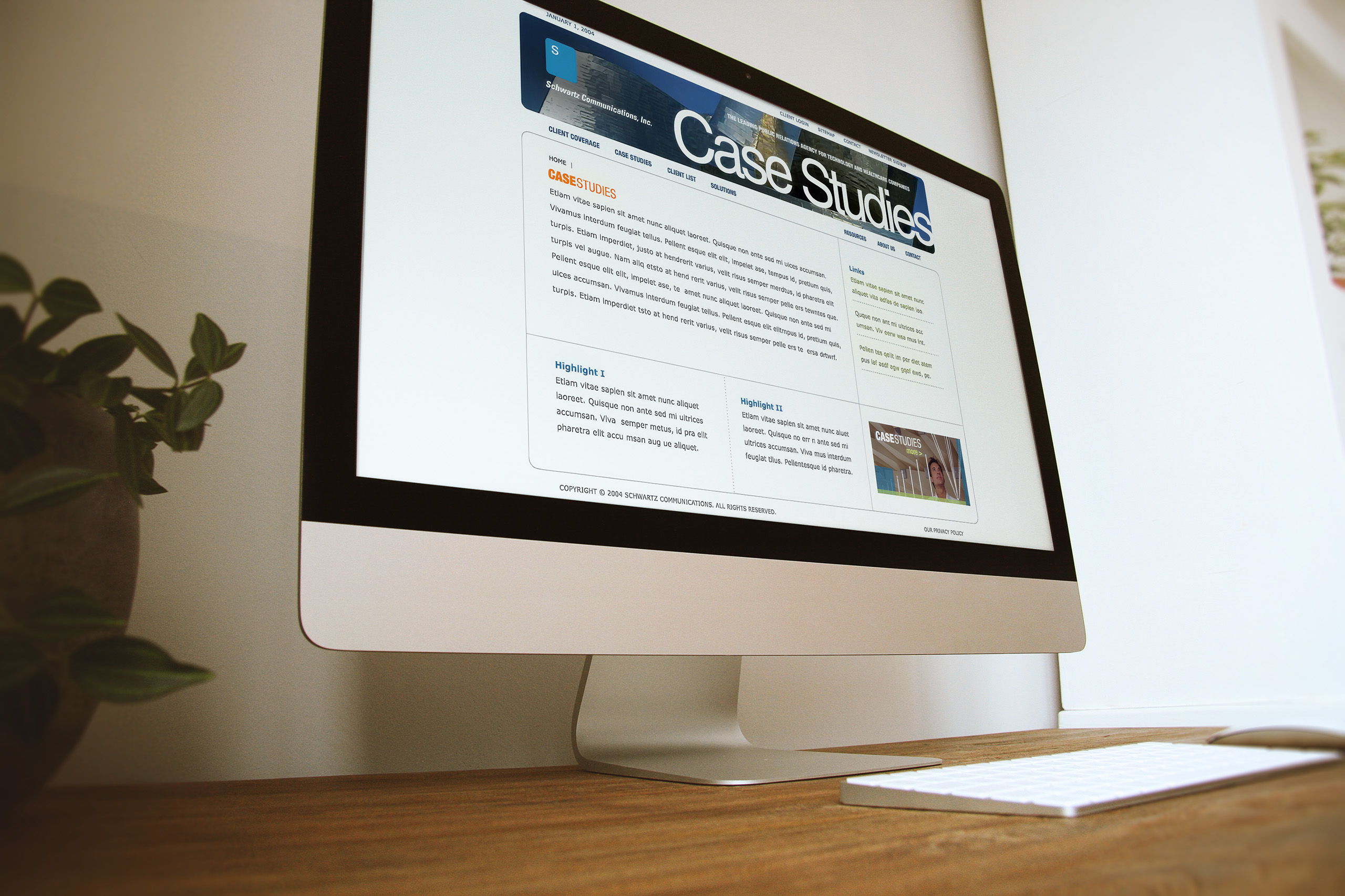
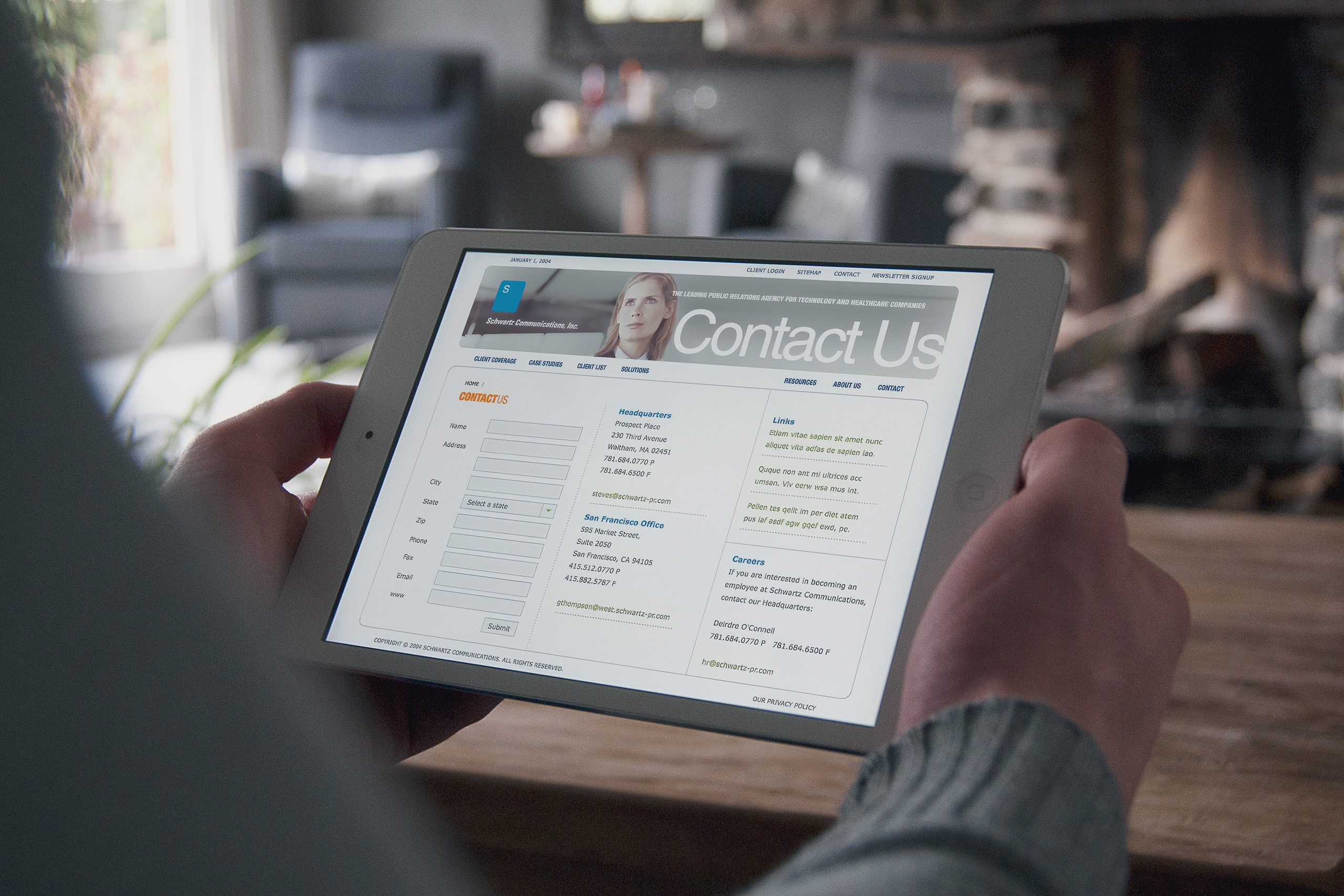
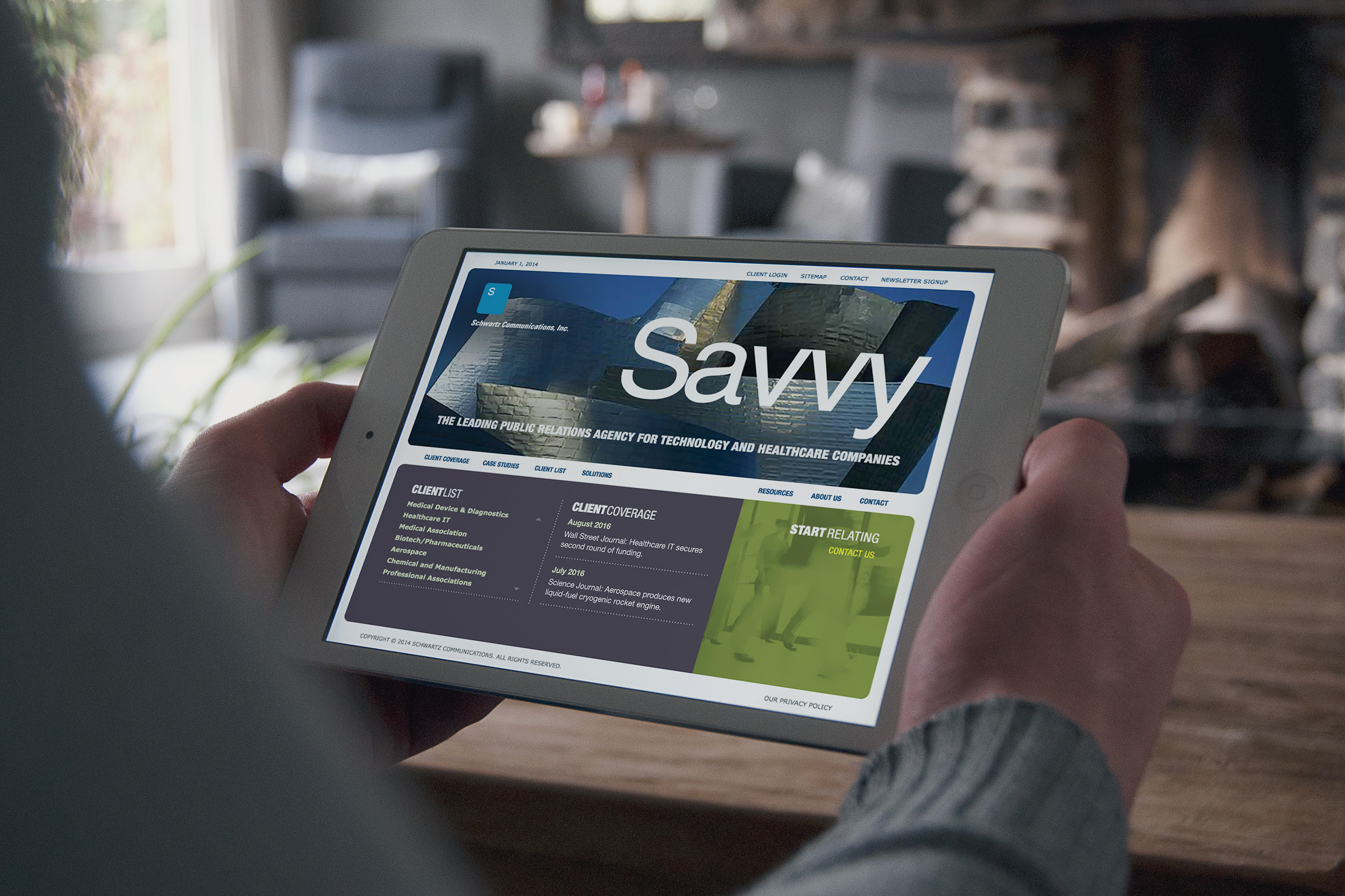
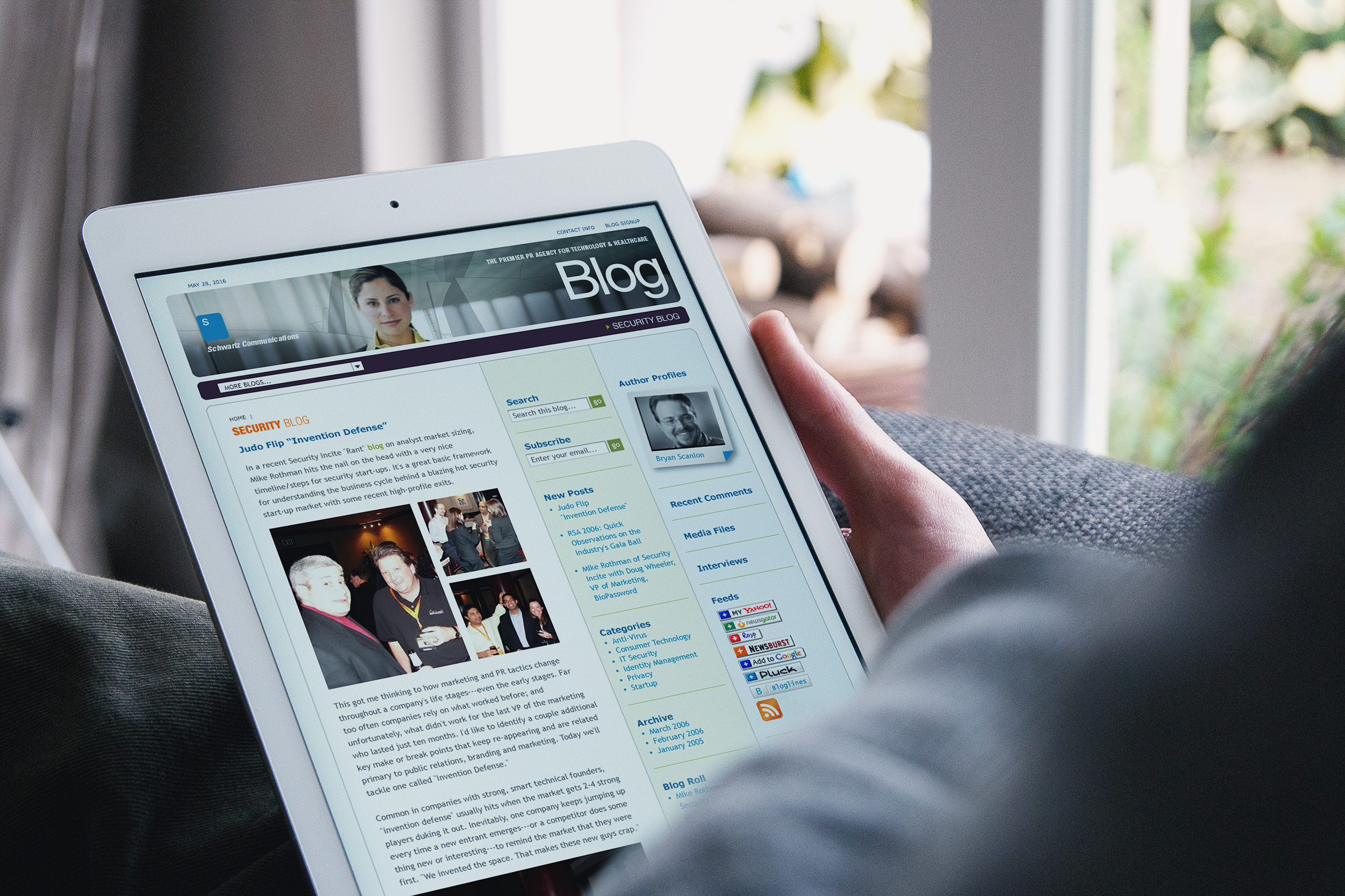
The 2004 site carried the new visual dialogue further than any Schwartz collateral had gone, and earned awards doing it. Its blog was designed before blogs had a settled form, built on Drupal with a custom interface that anticipated many of the conventions the medium would later adopt.
The Print System
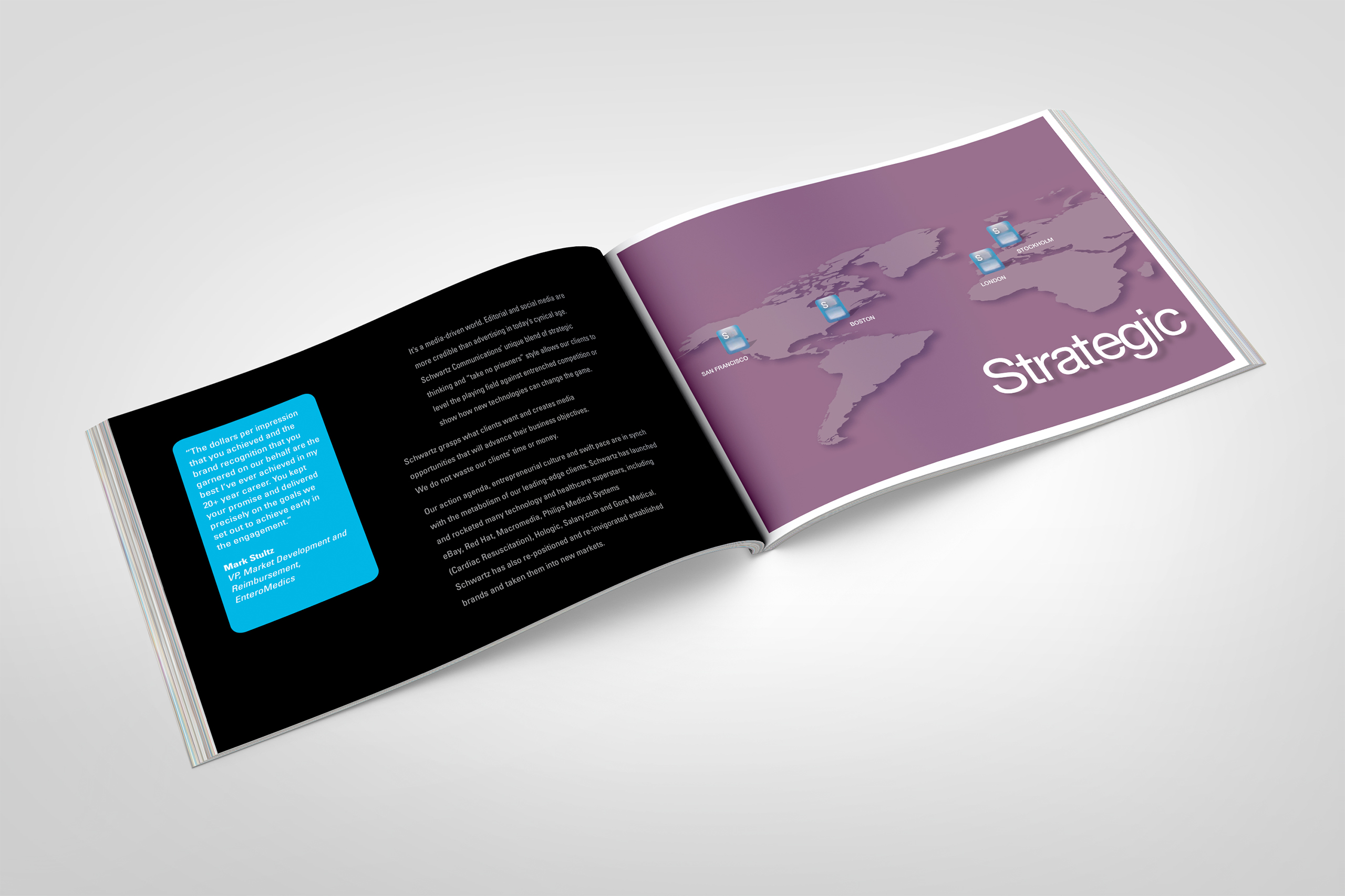
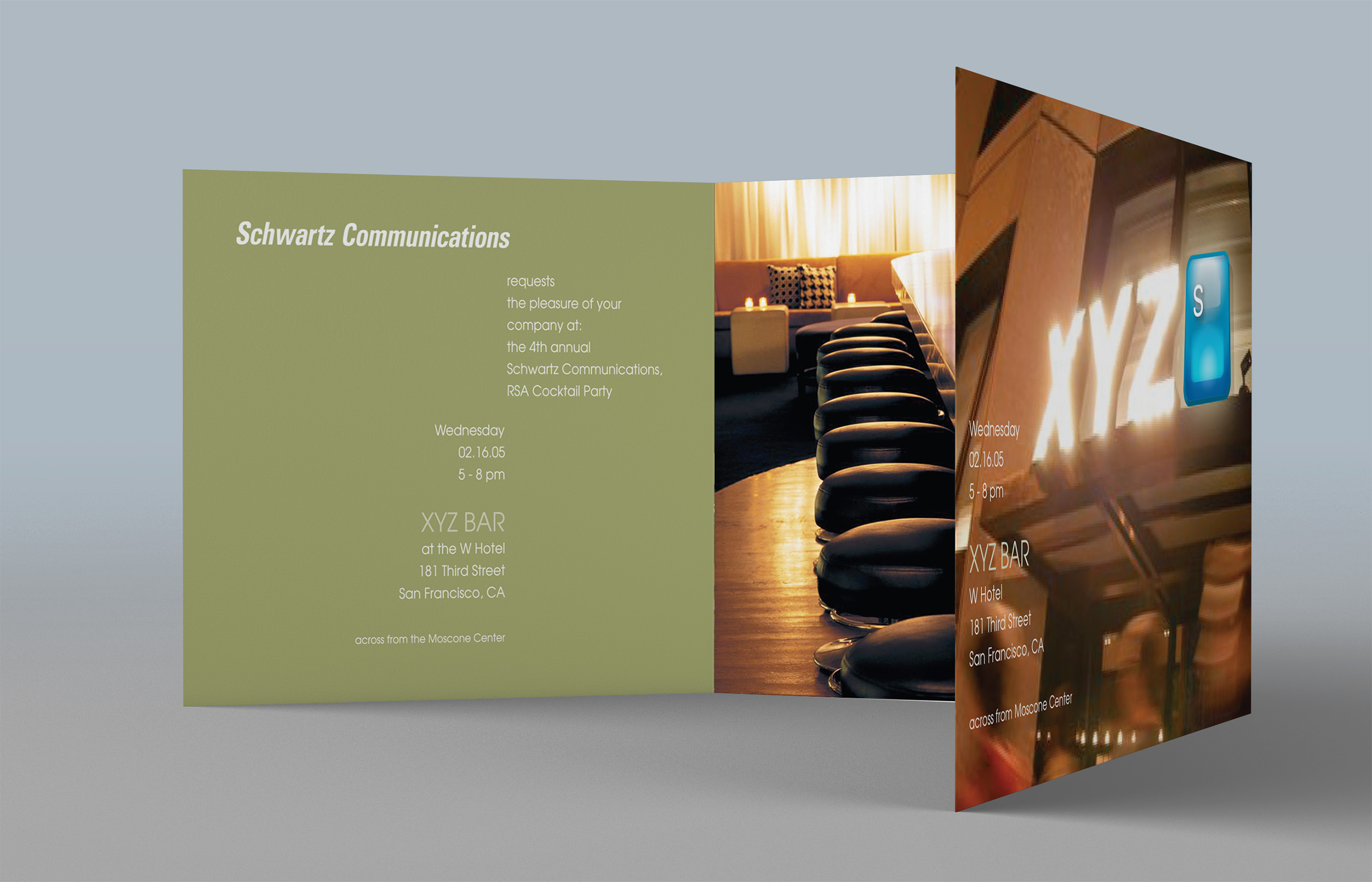
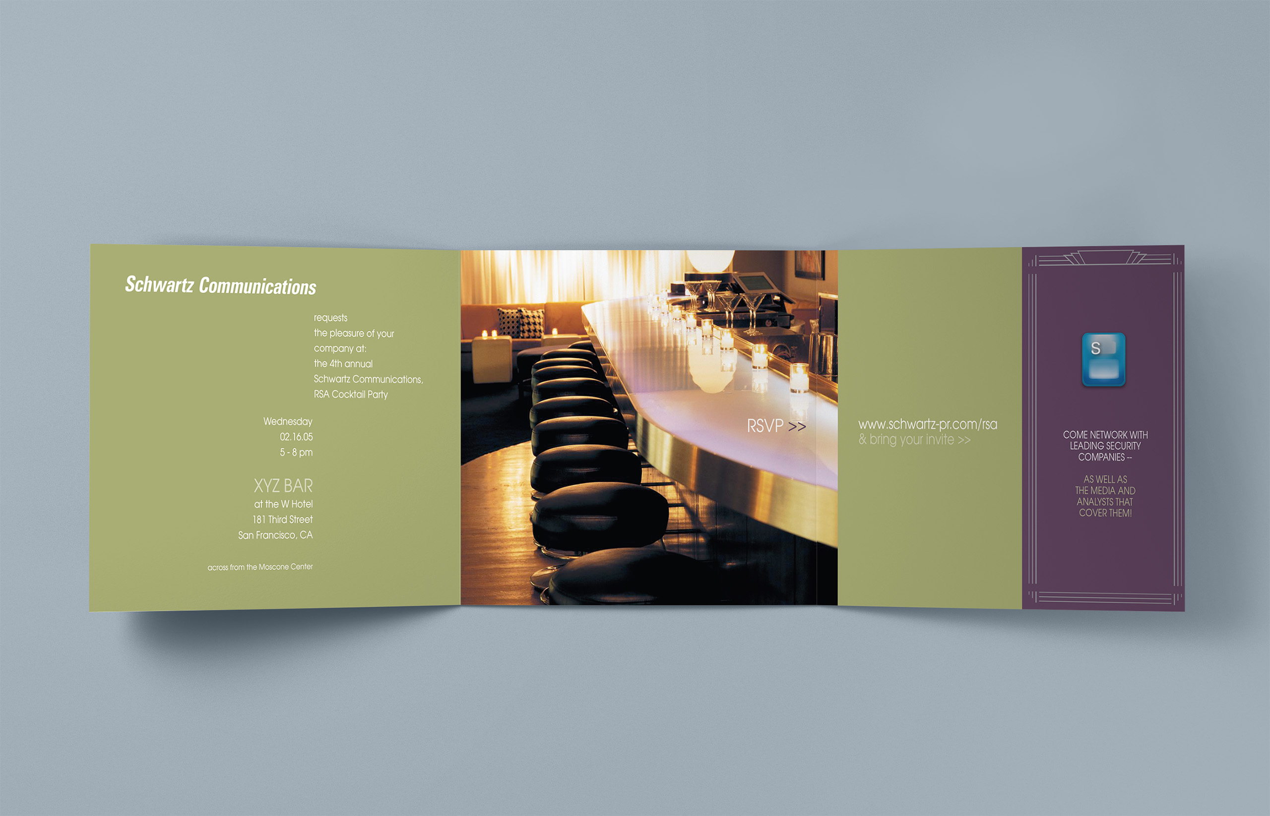
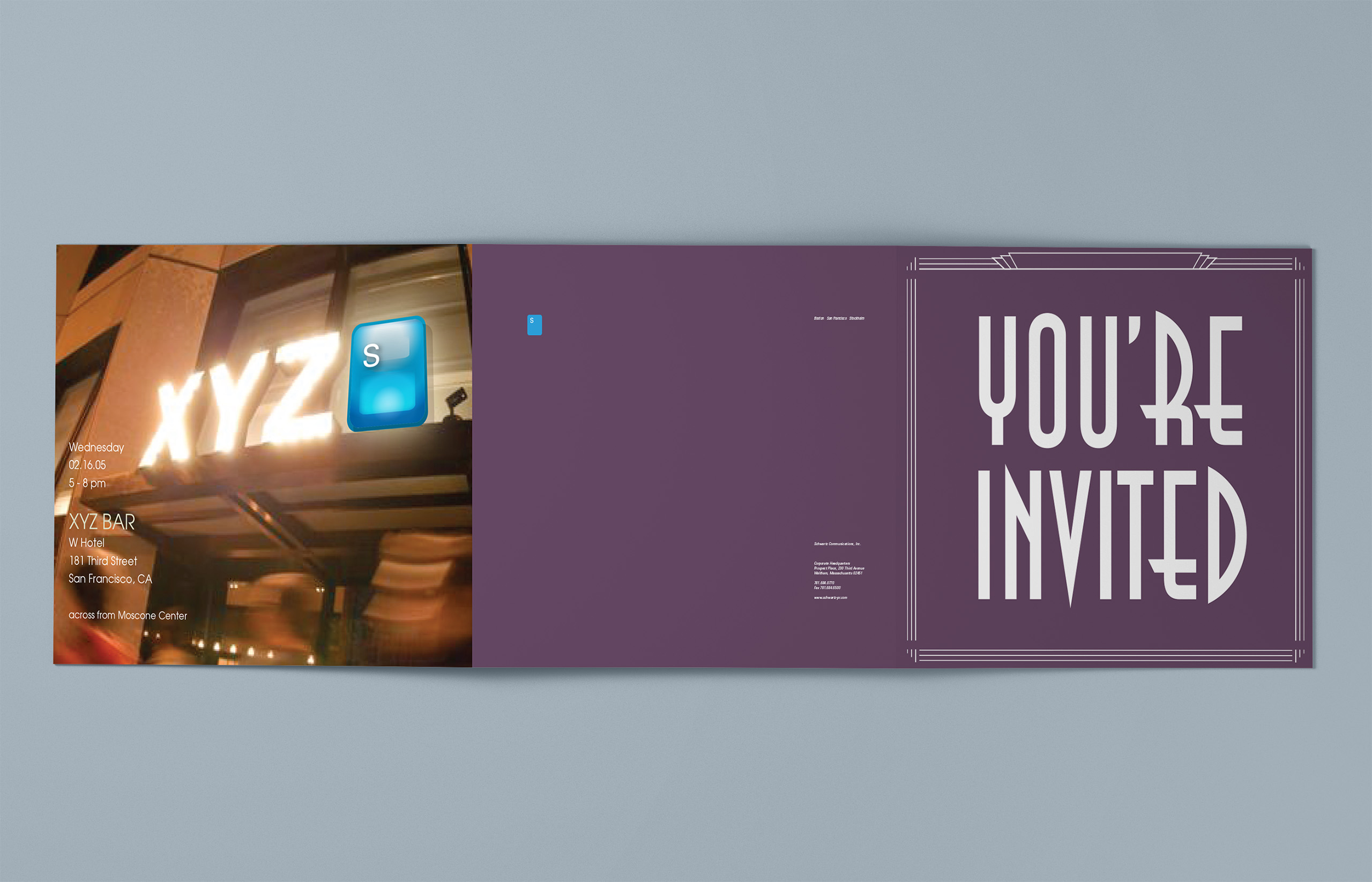
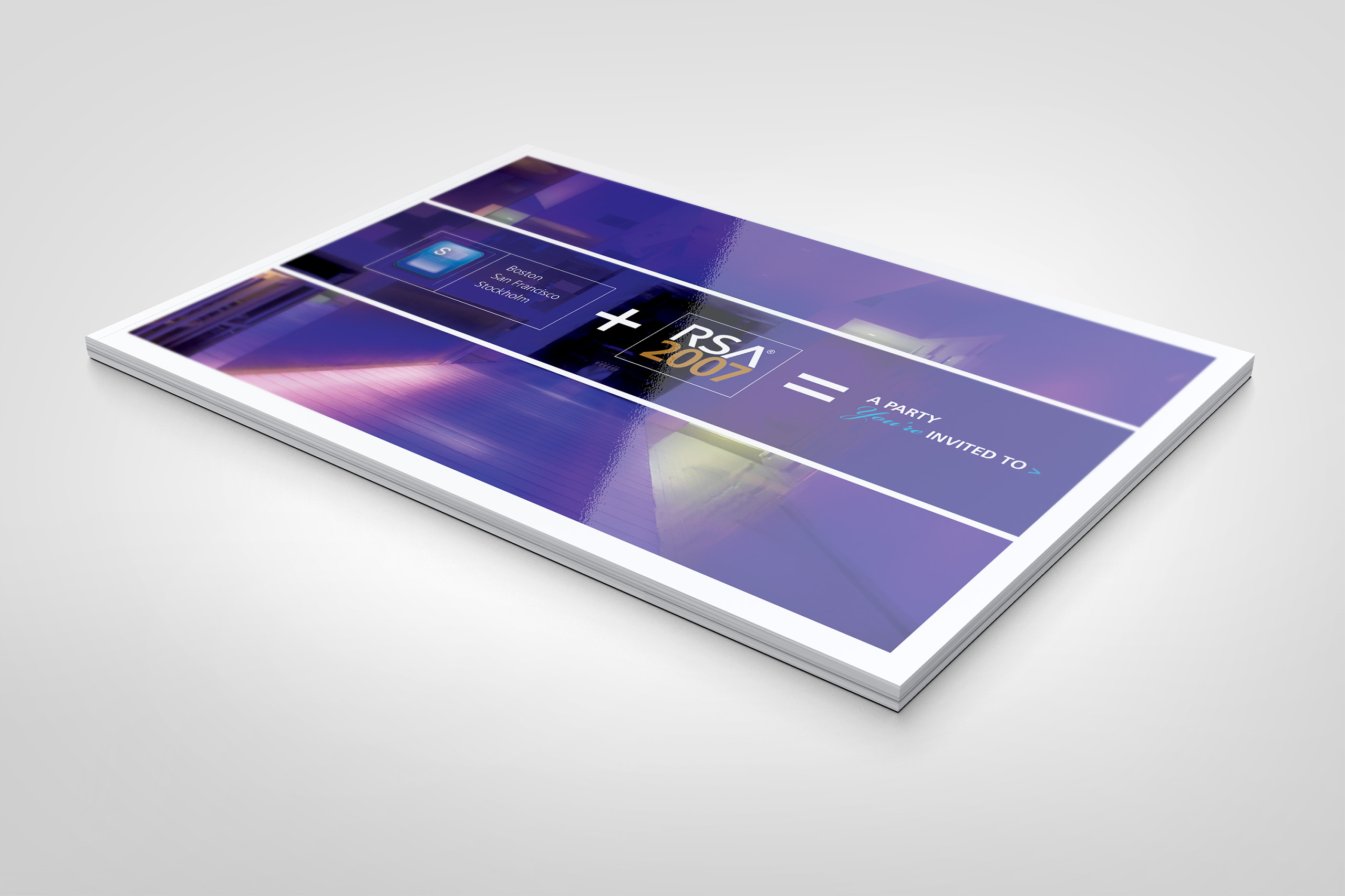
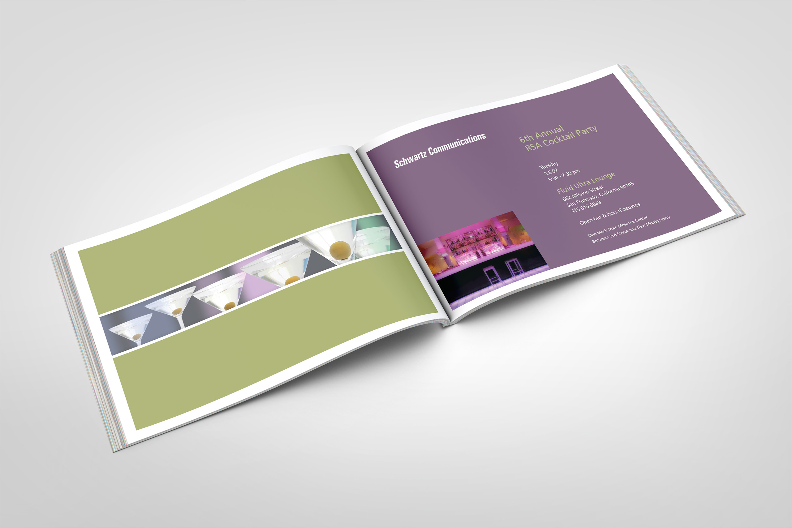
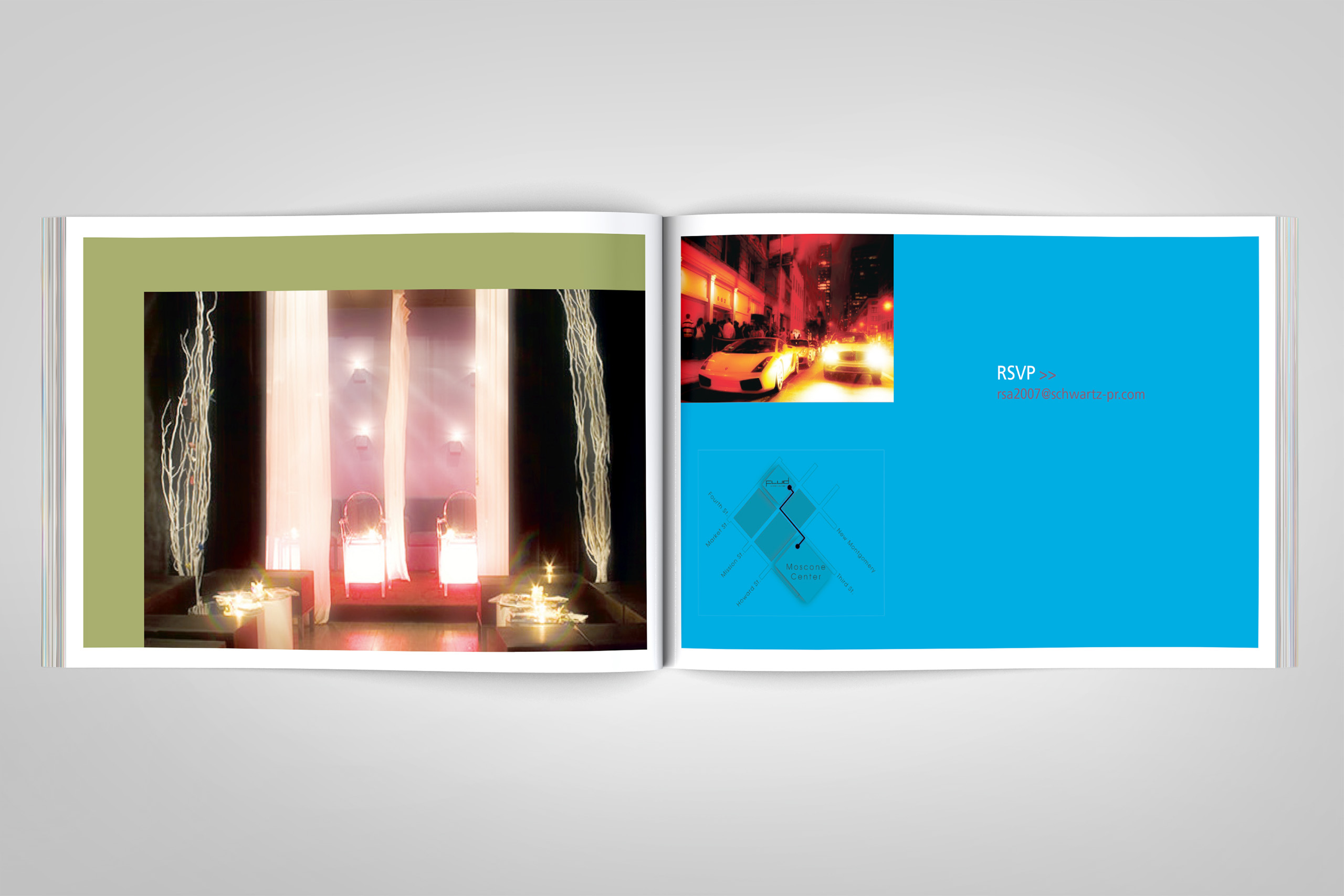
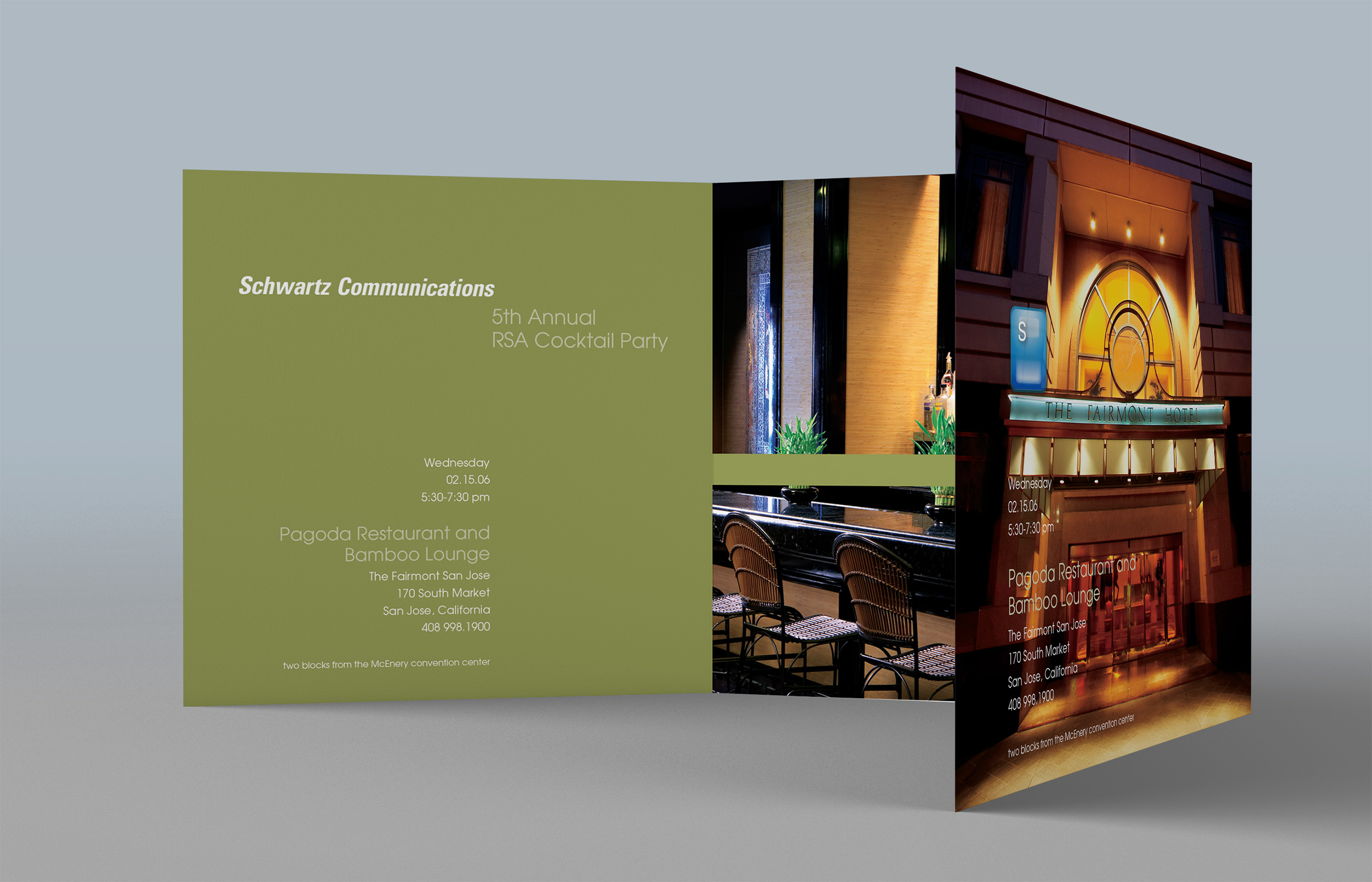
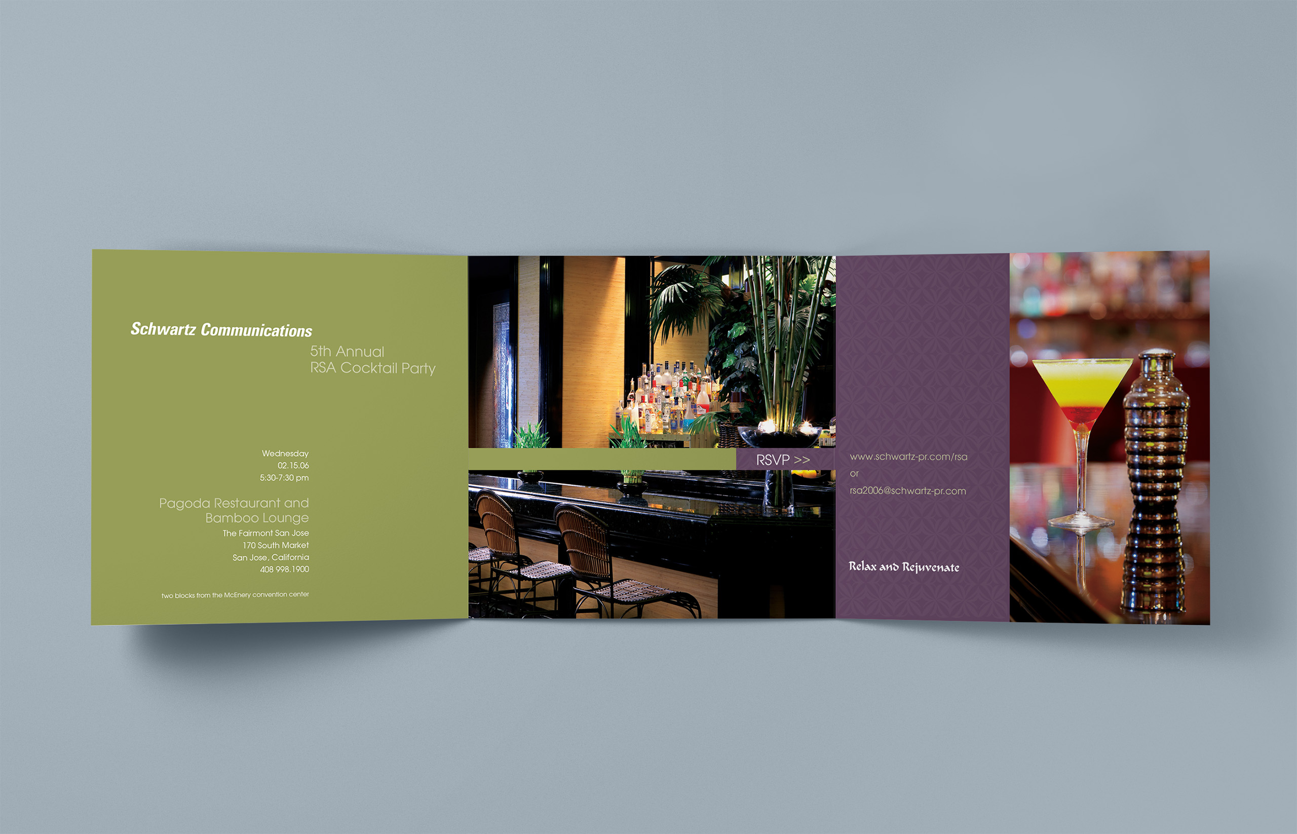
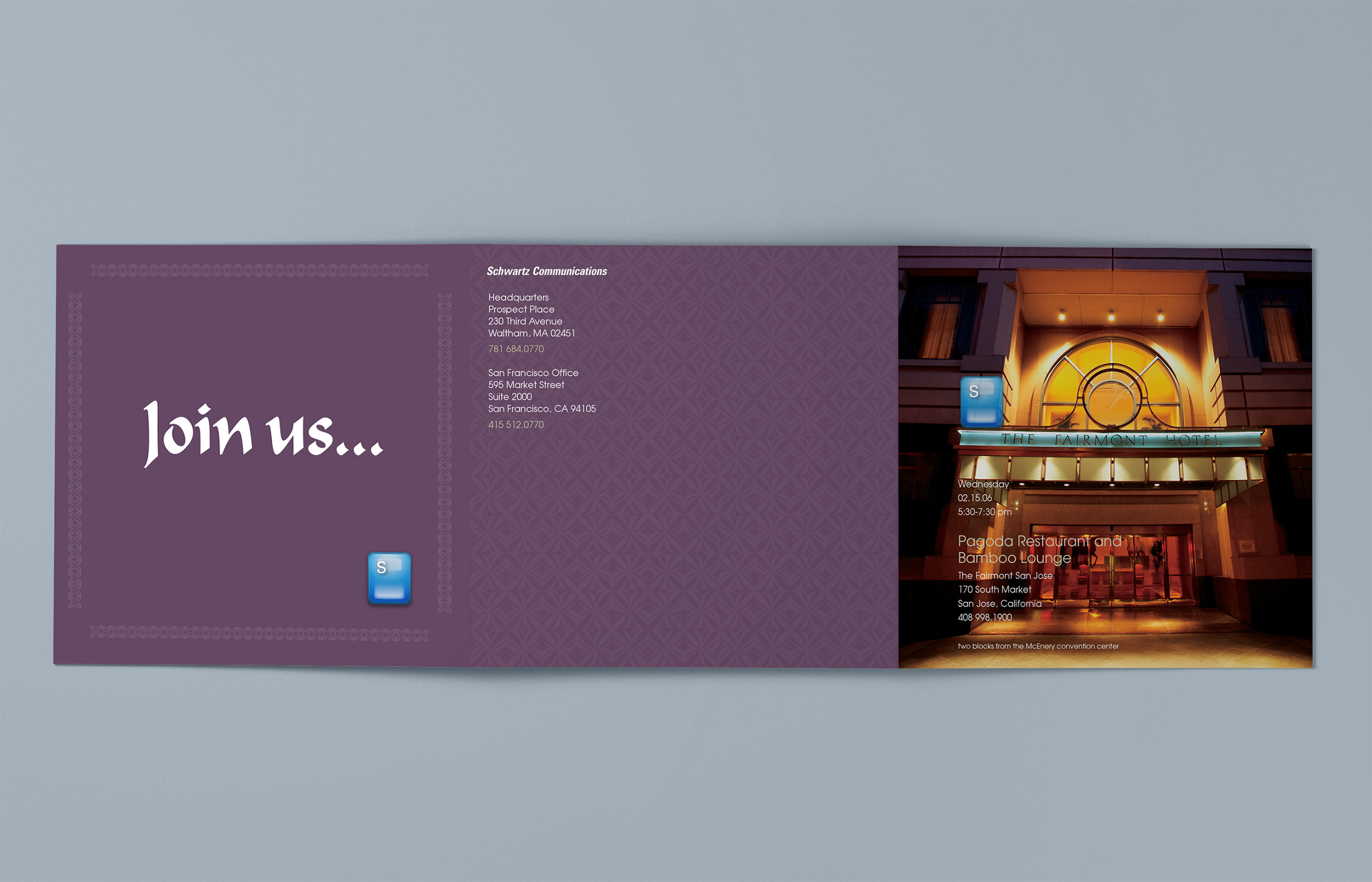
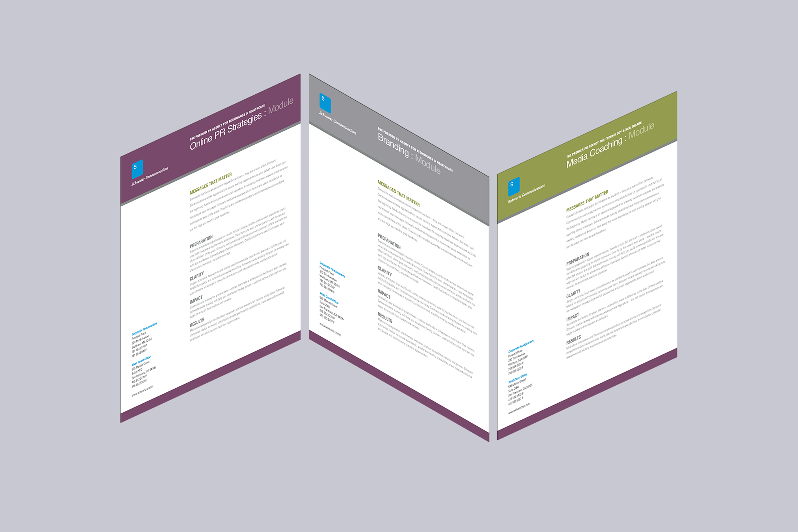
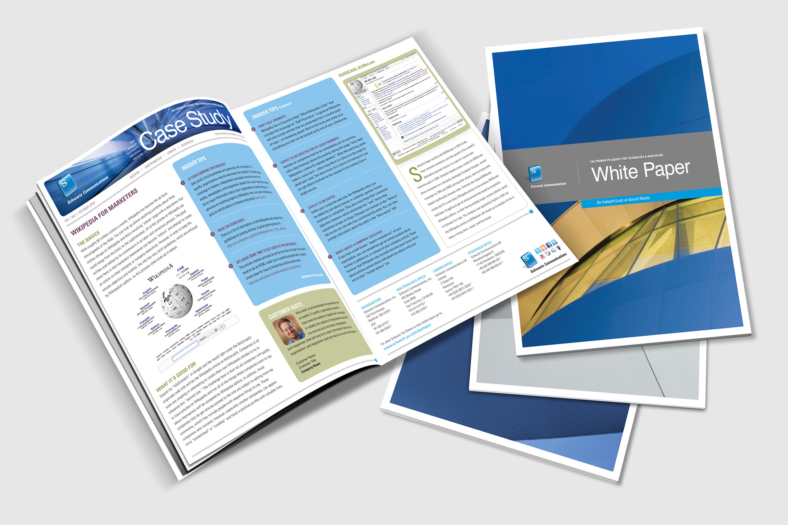
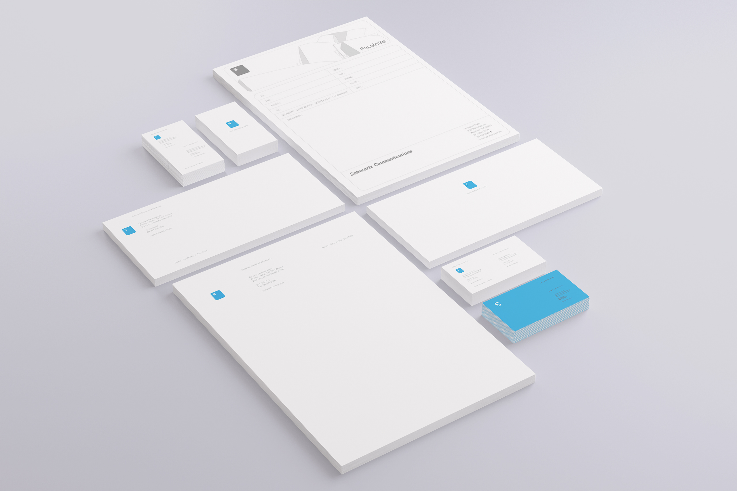
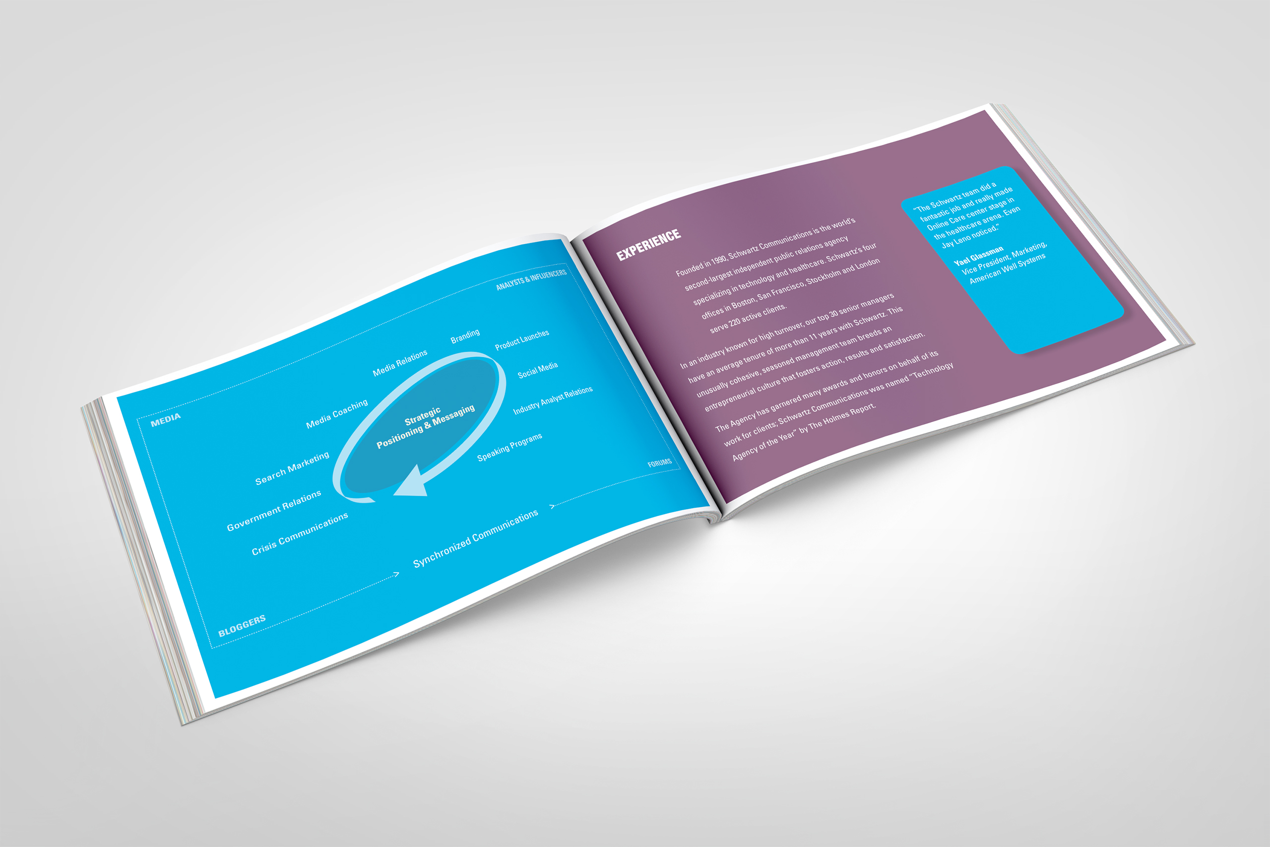
We rebuilt every printed surface to speak the website’s language: press kit, portrait and landscape brochures, data sheets, white papers, invitations, advertising, and a letterhead system so complete it included the fax cover sheet. One brand, no exceptions.
Environments & Expansion
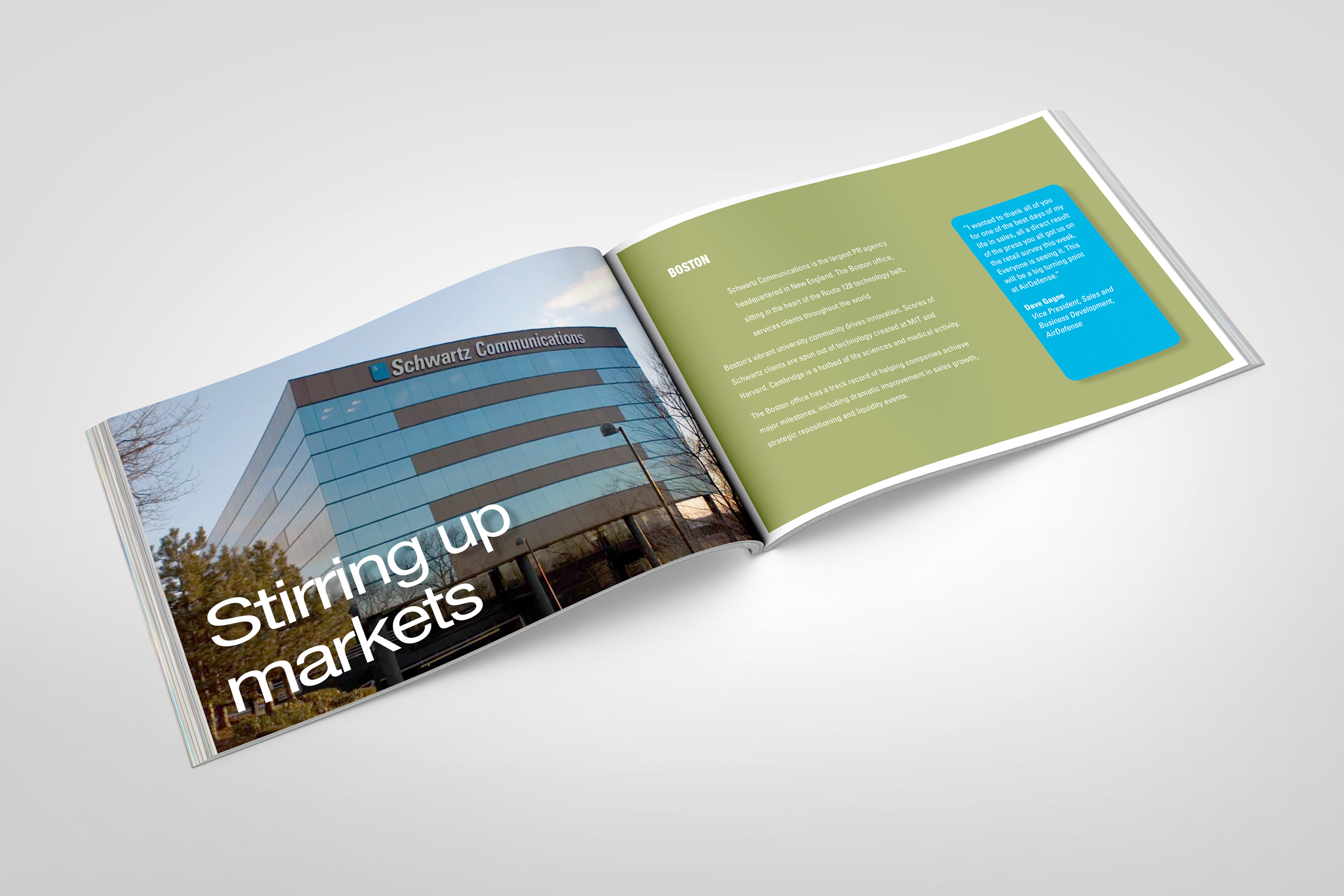
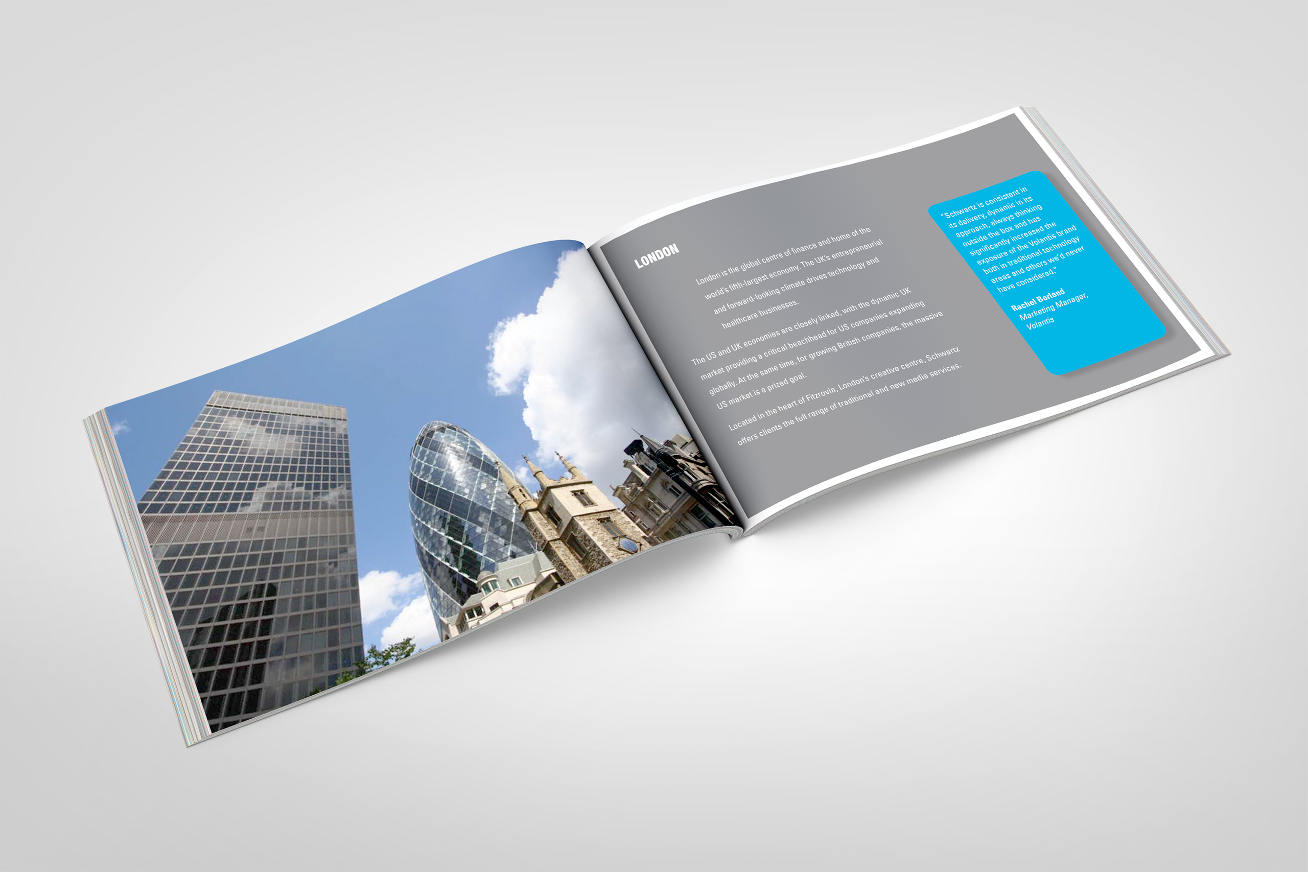
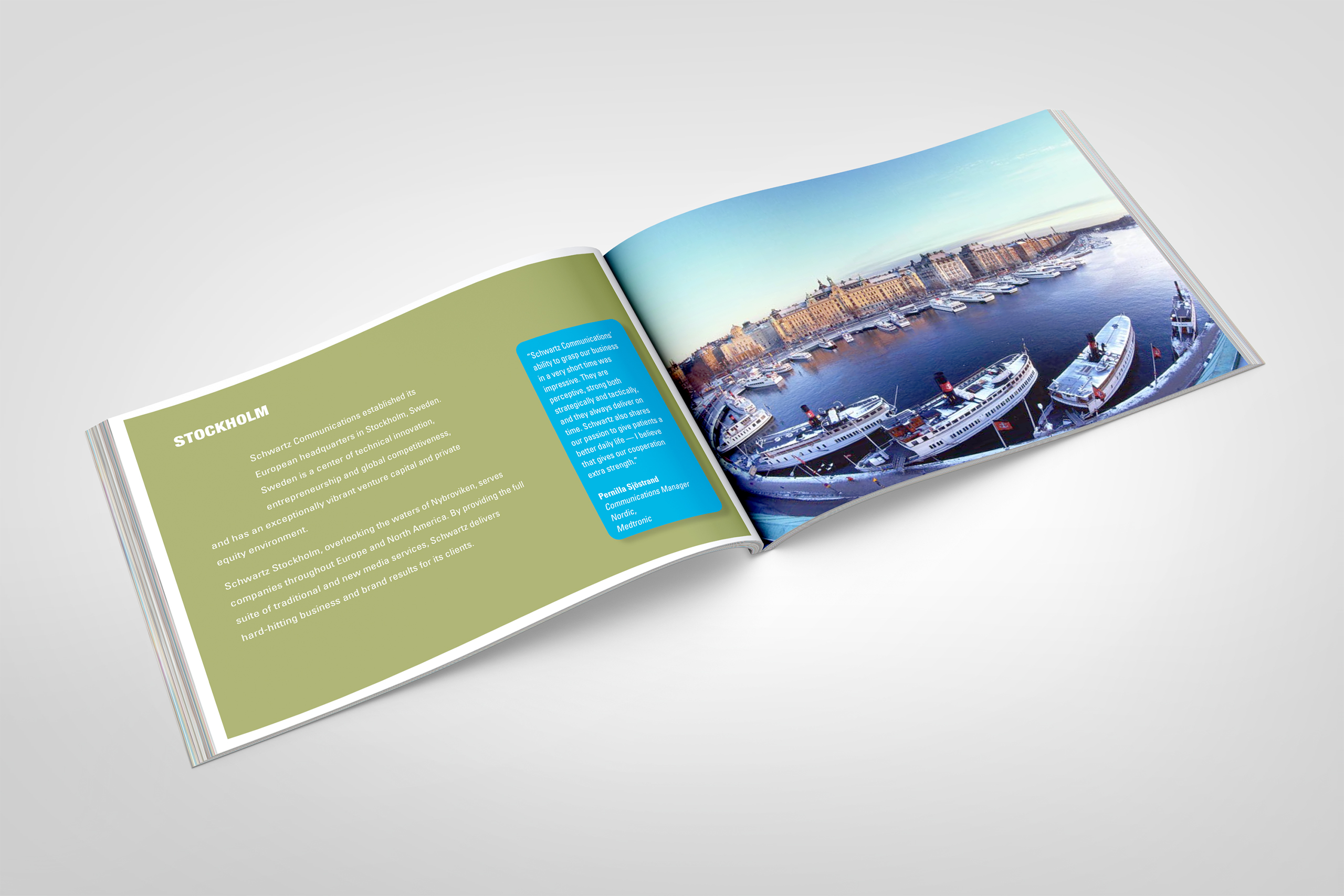
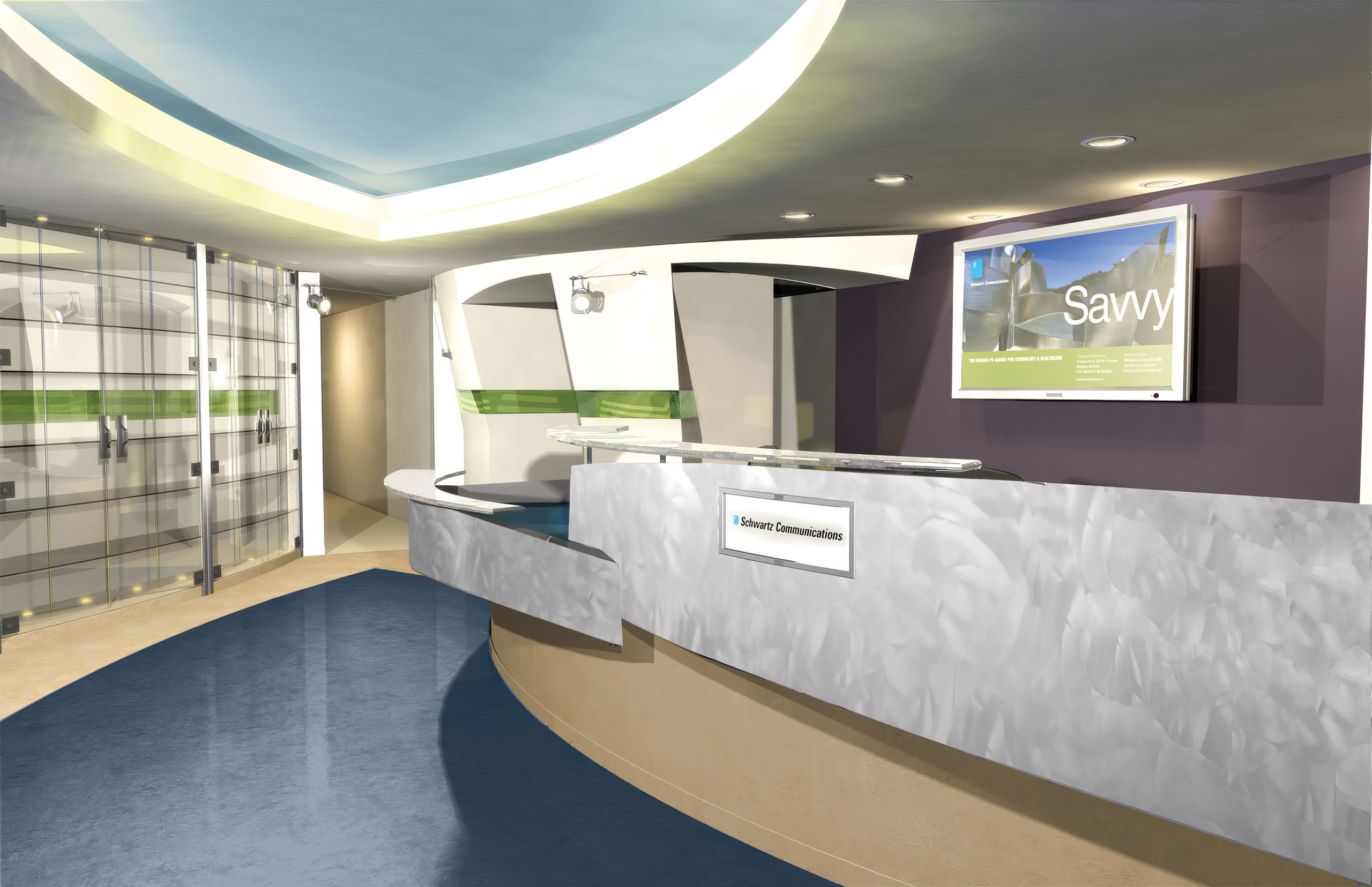
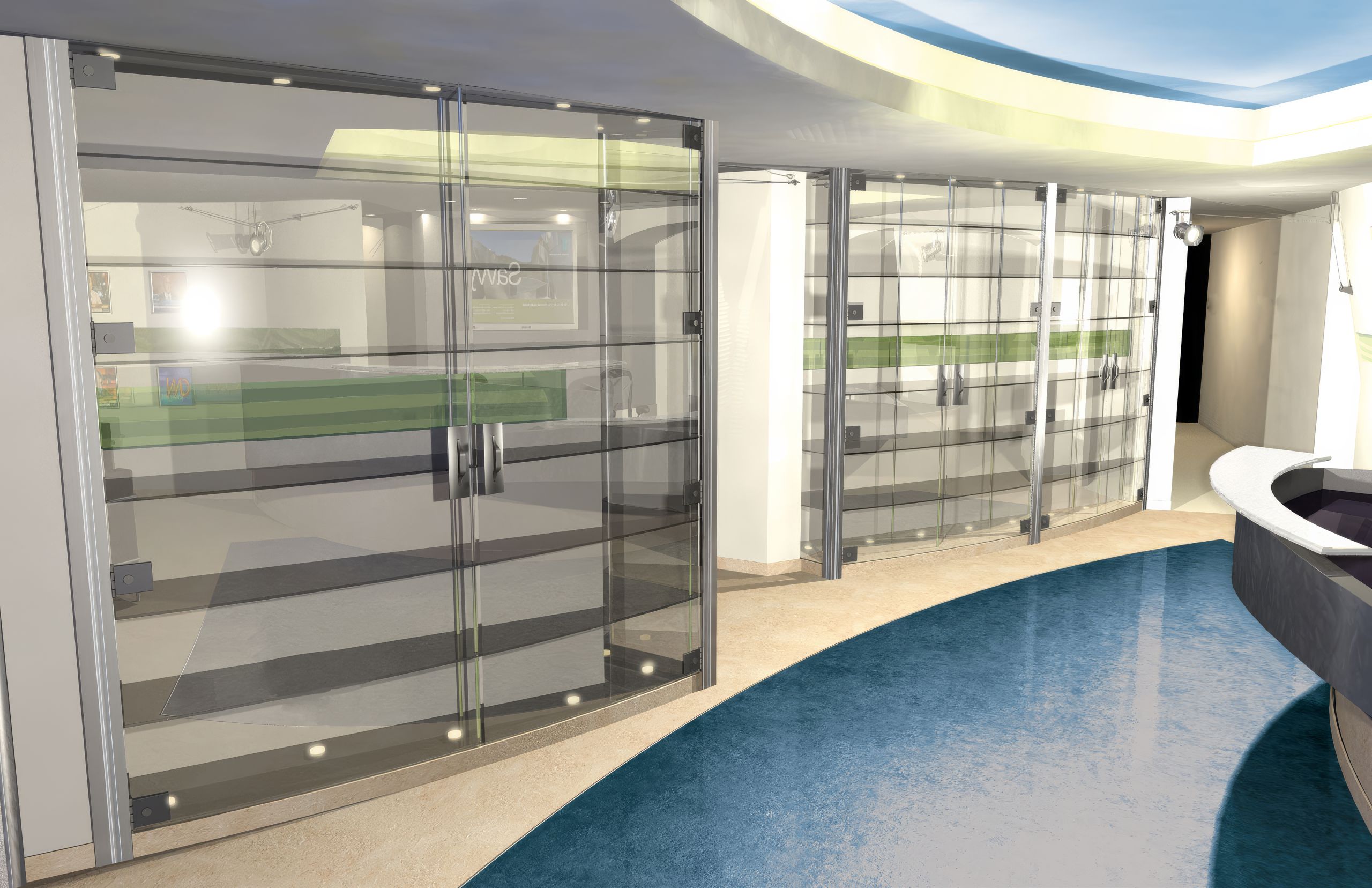
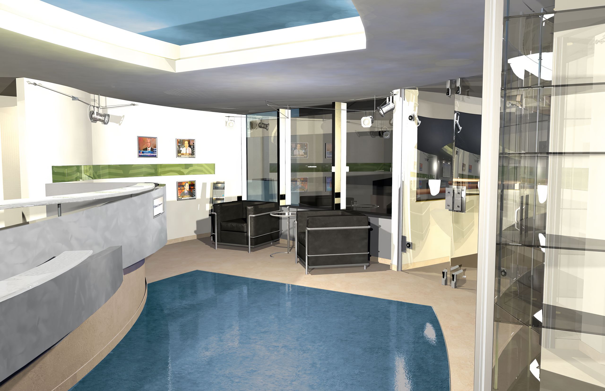
When the architects delivered a flat floor plan for the new lobby, Steve handed it to us. Directing a 3D artist, we designed the space around a single idea: client names streaming through a green glass ribbon, the firm’s lifeblood made architectural. As Schwartz grew into London and Stockholm, the same brand system traveled with it.
The Through-Line
What began as one website in 2004 became the way an entire company presented itself, right up to the day Publicis bought it.
Where the old mark sat flat, the refreshed identity caught light, and the green that entered as a color choice became the brand’s bloodstream, streaming client names through brochures and the lobby concept alike. Where most rebrands start with the stationery, this one started with the website, and every printed piece, from press kit to fax cover sheet, was rebuilt to keep its pace.
Where collateral usually accumulates, this system multiplied: brochures, invitations, data sheets, white papers, and advertising, each one another surface speaking the same language.
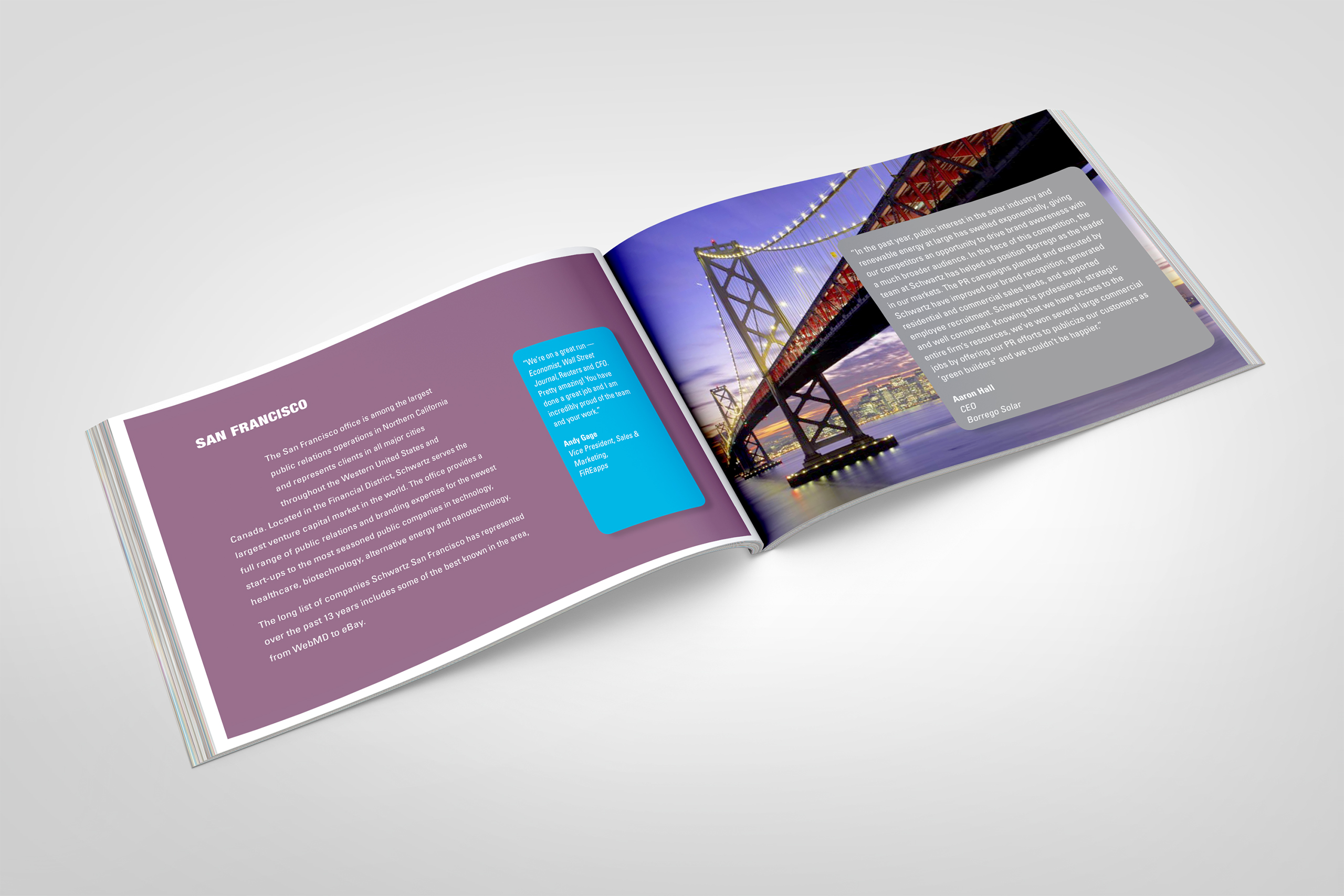
Where growth usually dilutes a brand, expansion strengthened this one. London and Stockholm opened with the same system the U.S. offices ran on, and the lobby itself was designed to greet visitors with the firm’s real product: its clients.
By the time Publicis came to the table, Schwartz had spent seven years becoming unmistakably itself.
Every Deliverable Kept the Same Promise: Start Relating.
Discovery + Strategy
Before design, we found the one story the storytellers had skipped: their own.
Discovery Session
An unhappy owner is a brief in disguise. We facilitated discovery with Steve Schwartz directly, converting years of frustration with design that missed into a clear picture of what the firm actually was.
Brand Architecture
One firm, many markets. Gehry’s fluid architecture gave us the model: a single identity confident enough to change shape for security, technology, healthcare, and software without losing itself.
Relationship Positioning
A PR firm’s inventory is its relationships. Start Relating named the promise, and the client roster, streaming through brochures and the lobby concept, became the proof.
Web-First Strategy
Most brands trickle down to a website. This one flowed up from it. The 2004 site set the standard, and every printed piece was rebuilt to match its pace.
Channel Unification
Consistency is a customer experience, not a style rule. Print, digital, environments, and events carried one visual language, so every touchpoint met the client mid-conversation.
Acquisition Readiness
The endgame was named early: make the firm look like what it was worth. A cohesive brand across two continents positioned Schwartz for the buyer it eventually found in Publicis Groupe.

Before
After
Identity Refresh
The Schwartz mark was already known, so the refresh came with a mandate: keep the equity, lose the flatness. Nothing about Schwartz needed to be replaced. It needed to be revealed.
The static blue chicklet became a glassy, dimensional badge that belonged to its era without surrendering the familiarity the firm had spent years earning.
Around it, a new color system did the heavier lifting, with green serving as the brand’s connective tissue, the thread that would stream client names through the portrait brochure and the lobby concept.
The relationships became something a visitor could follow across every surface, and every deliverable that followed obeyed the rule the refresh set.
The refresh preserved recognition while giving the firm a system broad enough to carry relationships across print, digital, and physical space.
Color System

Press Kit
Brochure
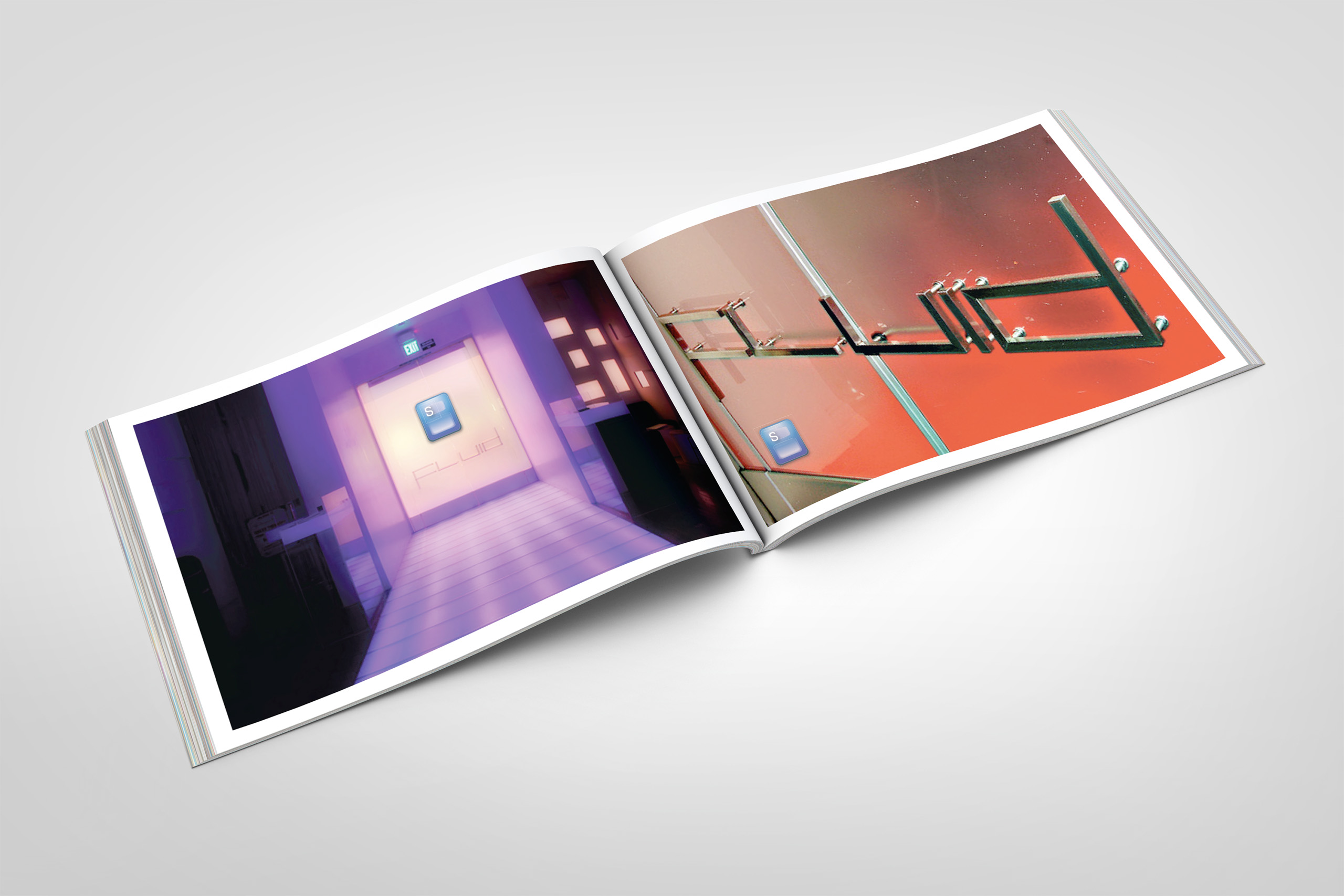
Signage
Brochure
Invitations
Collateral
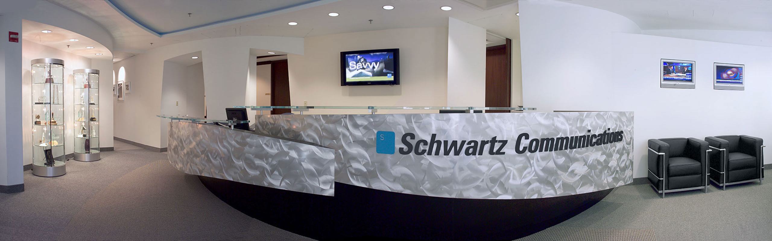
Interior Design
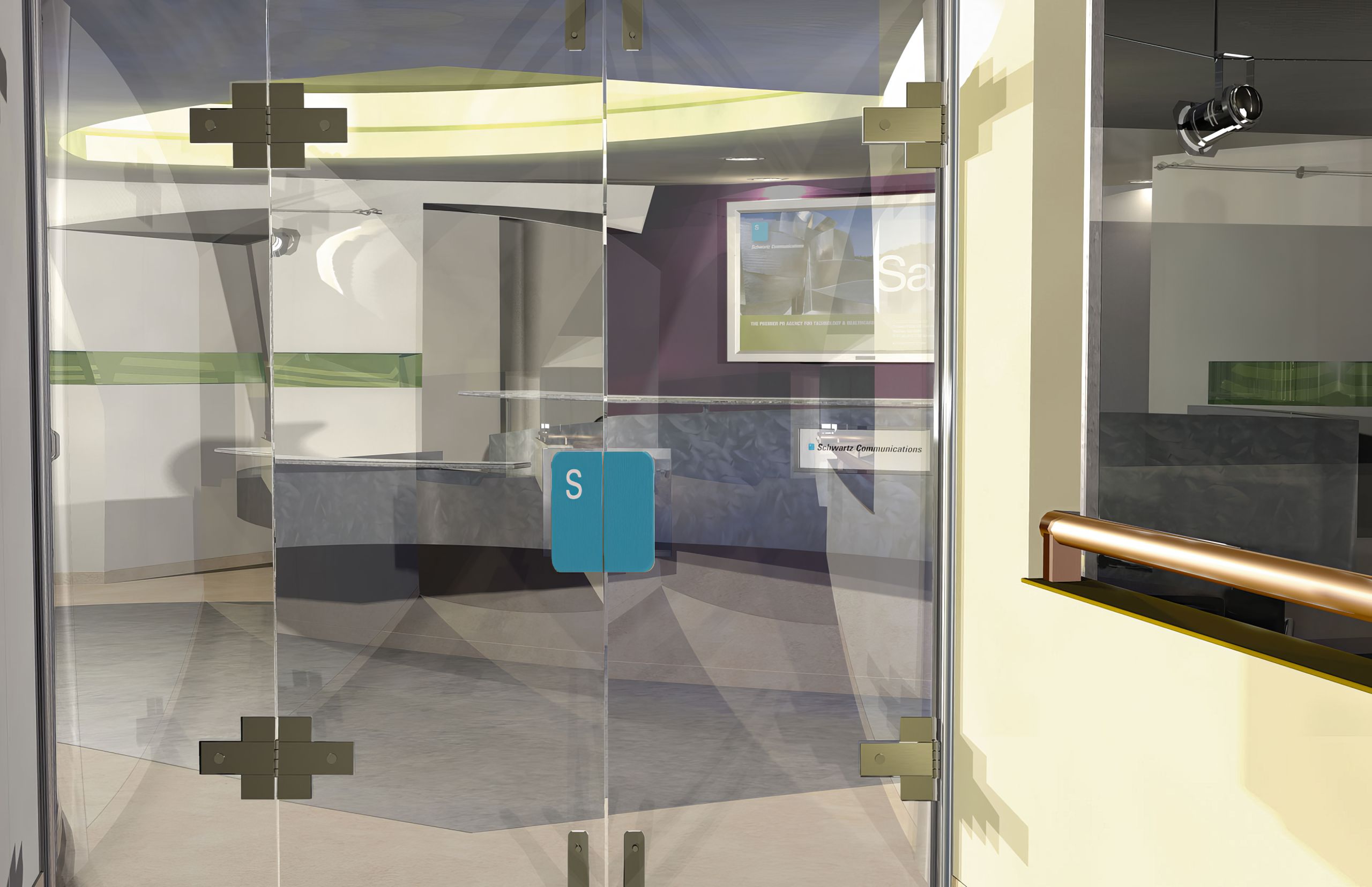
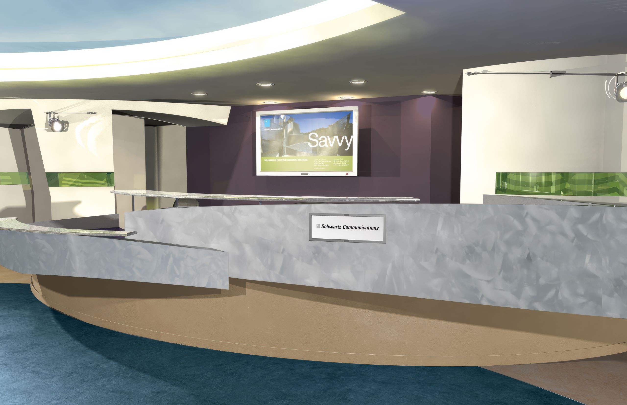
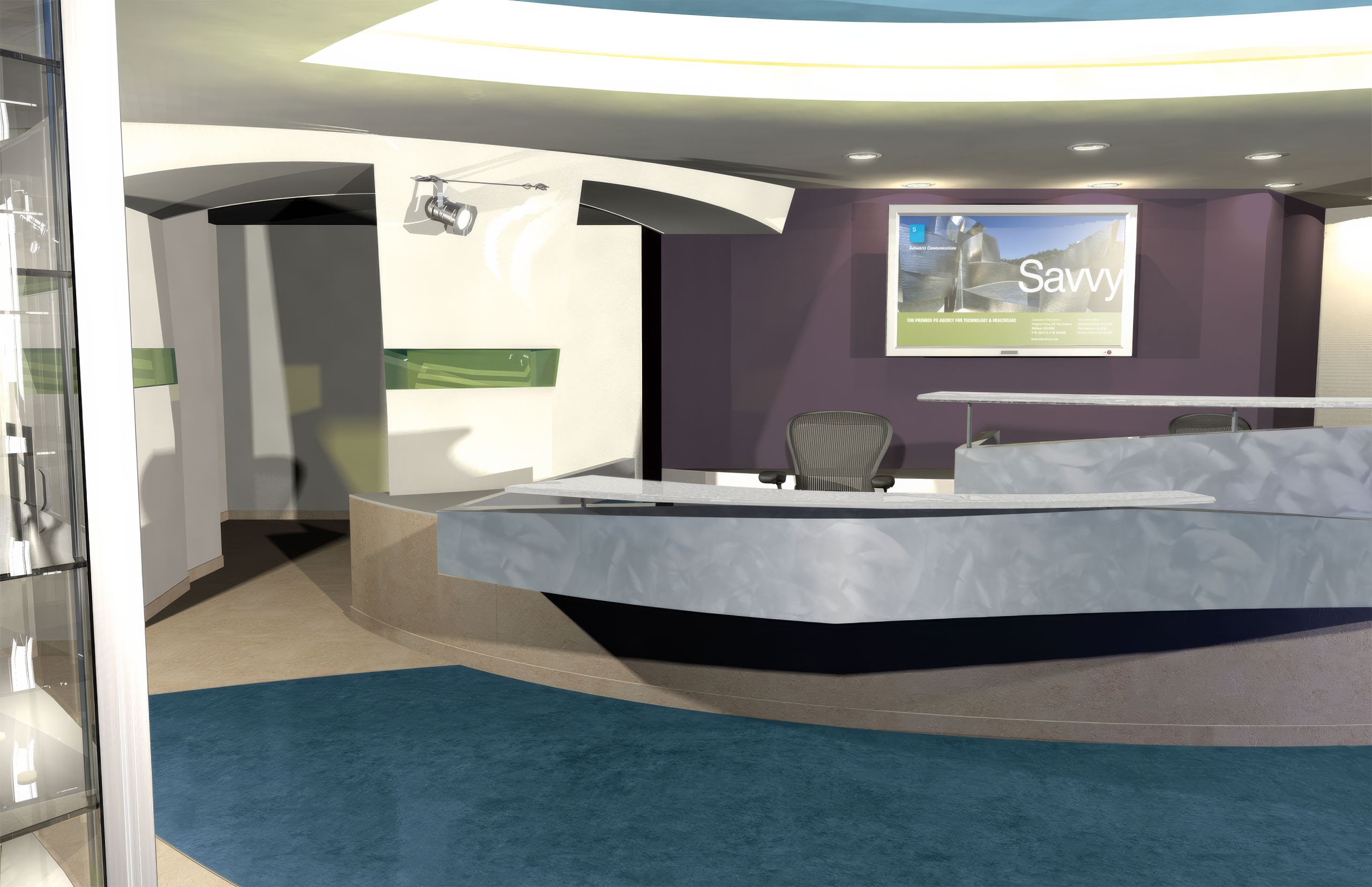
The architectural firm delivered a flat floor plan for the lobby. Directing a 3D artist, we extruded it into a rendered environment, verified the materials already specified, and in most cases recommended alternatives that carried the Schwartz brand more clearly.
The concept carried the visual language into the space through sculptural forms, illuminated surfaces, award displays, and a green glass ribbon running through the lobby. In the original design, that ribbon carried the names of Schwartz clients, extending the lifeblood idea we had already established across the website and brochures into the architecture itself.
Budget simplified the final build, and the client names did not make it into the realized interior. The green ribbon did. What began as a visual brand system had become a physical environment, carrying the same color, movement, and visual language into the place where Schwartz welcomed its clients.
The medium had changed completely. The brand had not. Visitors encountered the same movement, recognition, and welcome in the room that they had already seen across the firm’s communications. The system had changed scale and material without changing its meaning or the welcome it conveyed.
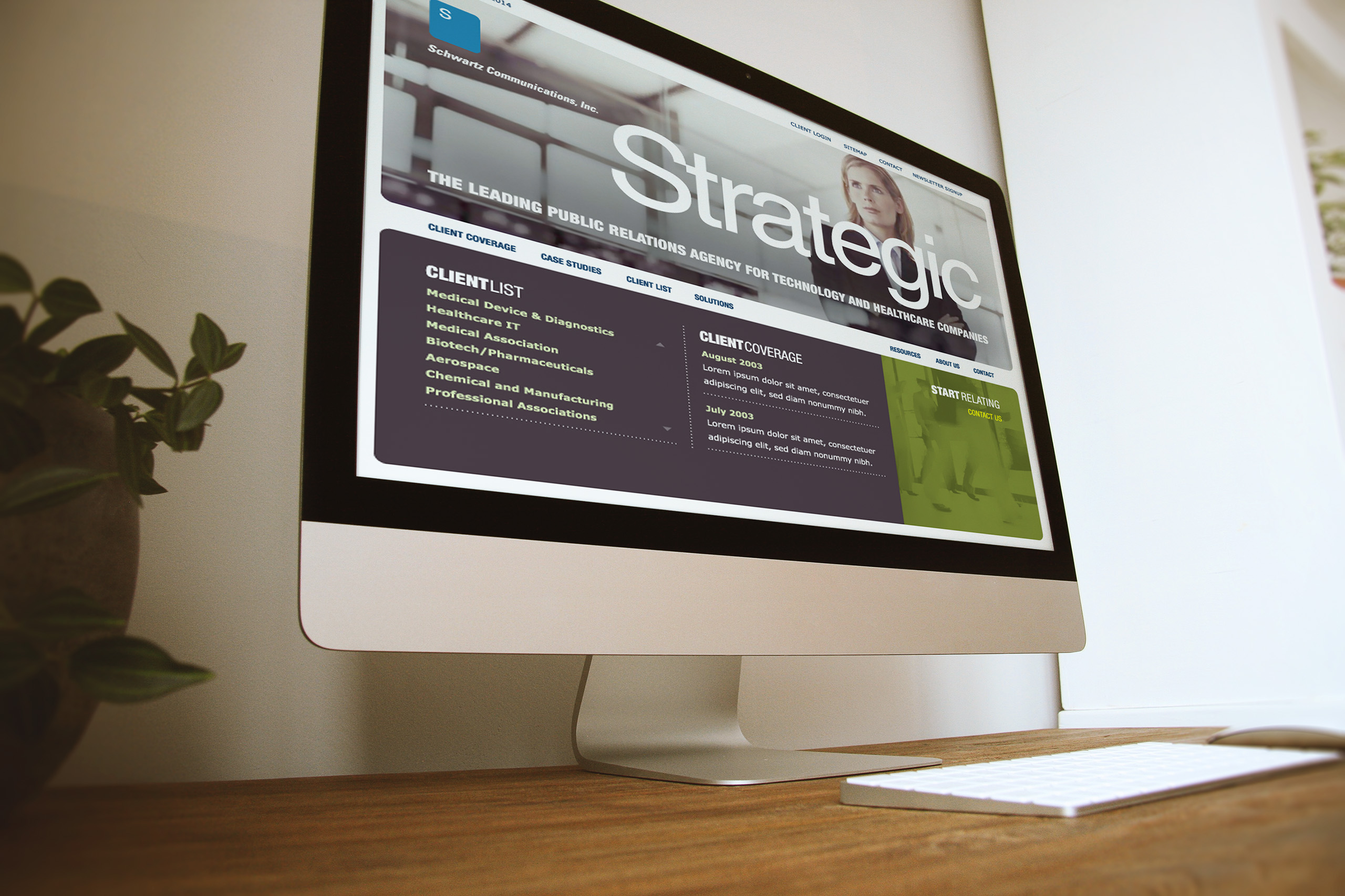
Website
We designed the site around the dialogue a prospective client wants to have: who Schwartz knows, what Schwartz has done, and how it would tell your story.
Launched in 2004, it carried a visual language none of the firm’s existing collateral could match, and it became the reference every later piece was measured against.
The blog arrived before the medium had rules.
Built on Drupal with a custom interface, its layout anticipated many of the conventions blogs would later adopt, and it gave a PR firm the thing it sells: a living, current voice.
The site earned its awards, and something rarer: a 400% rise in lead generation, and an owner who asked for the same thinking everywhere else.
The website became more than a successful channel. It established a visual and editorial language the brand could carry through years of growth.