
Fuze
Two companies. Eight weeks. One brand that proved its own promise.
Thinking Phones, a rising UCaaS leader, secured a second round of funding and acquired Fuze, a video conferencing company. The merger came with a mandate:
Become one company, under one name, before the market decides what the merger means.
Bowman Design Direction was brought in to merge two websites. We delivered the merger itself: brand, product hierarchy, taxonomy, message, and design re-architected into one company, and a digital foundation the new brand would build on for years.
Read the Story
Challenge
An acquisition doubles everything except certainty. Overnight there were two brands, two strategies, two product lines, two platforms, and two sets of customers, each wondering what the merger meant for them.
The new company would sell unified communications while it was not yet unified itself. Strategy was inconsistent, offerings were unclear, messaging was disjointed, and data lived in disparate systems. The holidays were approaching, the market was not waiting, and the window to define the merger before customers defined it was eight weeks wide.
Direction
We anchored the work on a single idea: a company selling unified communications had to become its own best proof. Customers would read the press release once. They would experience the merger every day, in the products, the platforms, and the website.
So unification stopped being the announcement and became the brief. One strategy, one product hierarchy, one taxonomy, one platform, one message. Every decision was tested against the same question: does this make us one company?
Outcome
In eight weeks, two brands became a single company brand with an elevated customer experience. Two digital experiences on two different platforms merged into one solution with zero SEO loss and zero 404 errors. Both companies’ customers arrived at one front door without ever hitting a dead end.
The strategy, architecture, and design established in that first sprint became the foundation the brand continued to build upon, and the market kept confirming it. In 2016, Gartner positioned Fuze as a Leader in its Magic Quadrant for Unified Communications as a Service.
Takeaway
Most mergers are announced. This one was designed. The work translated an acquisition into an operating brand: one strategy, one hierarchy, one experience customers could navigate and believe. Where most rebrands would have stopped at a new name and a launch announcement, the merger itself became the demonstration of what Fuze sold.
What We Built
One-Company Strategy
We re-architected two product portfolios, two message systems, and two digital experiences into one coherent company. Offerings from both sides were evaluated, merged, and organized into a single hierarchy and taxonomy, so the portfolio explained the company instead of its history.
Brand Consolidation
We elevated Fuze from acquired name to primary brand and built the message architecture beneath it. One voice, one story, one promise: unified communications from a company that was itself becoming unified, carried consistently across every touchpoint of the new business.
Website + Design Foundation
We designed the new website in two weeks over the holidays, merging two sites into one experience. The design system created during that sprint became the foundation the company continued to build upon. The teams that followed extended the work rather than replacing it.
Platform Migration
We merged two digital experiences on two different platforms into a single solution. Redirect mapping, taxonomy, and information architecture preserved every existing customer path: zero SEO loss, zero 404 errors, and two audiences delivered to one front door.
The Through-Line
What began as an acquisition announcement became a single brand customers could navigate, buy from, and believe.
Where most mergers bolt companies together and hope the seams hold, this one was rebuilt from the strategy down: offerings, messages, and navigation organized around what Fuze sold, so the first thing a customer felt was clarity instead of change.
Where the category talked about unification, the brand demonstrated it. The name, the message, and the experience made the same promise, and the company behind them was reshaped to keep it.
Where migrations usually lose customers at the seams, this one preserved every path, and the loyalty built under two brands arrived intact at the new one.
Fuze asked for two websites merged. It received the systems that let two companies operate as one.
Two Companies Became One Strategy. Two Product Lines Became One Hierarchy. Two Platforms Became One Experience. One Foundation Made Every Decision Afterward Easier.
Discovery + Strategy
Before design, we built the strategy that let two companies act as one.
Merger Roadmap
A merger isn’t finished when the deal closes; it’s finished when customers can’t find the seam. We sequenced strategy, brand, product, and platform into one eight-week roadmap built to outrun the market’s doubt.
Brand Architecture
Two brands, one future. We elevated Fuze to the primary brand and organized everything beneath it, so the equity of both companies flowed into a single name customers could follow with confidence.
Audience Architecture
Two customer bases don’t trust the same way. We mapped how each arrived, what each feared losing in the merger, and shaped message and migration so both found themselves in the new company.
Product Hierarchy
Two product lines read like a catalog collision. We evaluated, merged, and organized every offering into one hierarchy and taxonomy, so the portfolio explained what Fuze did rather than where it came from.
Rapid Discovery
Eight weeks leaves no room for ceremony. We led rapid discovery sessions and stakeholder interviews across both companies, directing multiple contributors toward what was true, what was duplicated, and what deserved to survive.
Migration Strategy
Most migrations lose customers at the seams. We planned the merge of two platforms and two data sets so every existing path survived the move. Zero SEO loss. Zero 404 errors. Few migrations of any size can claim either.
Creations
Fuze
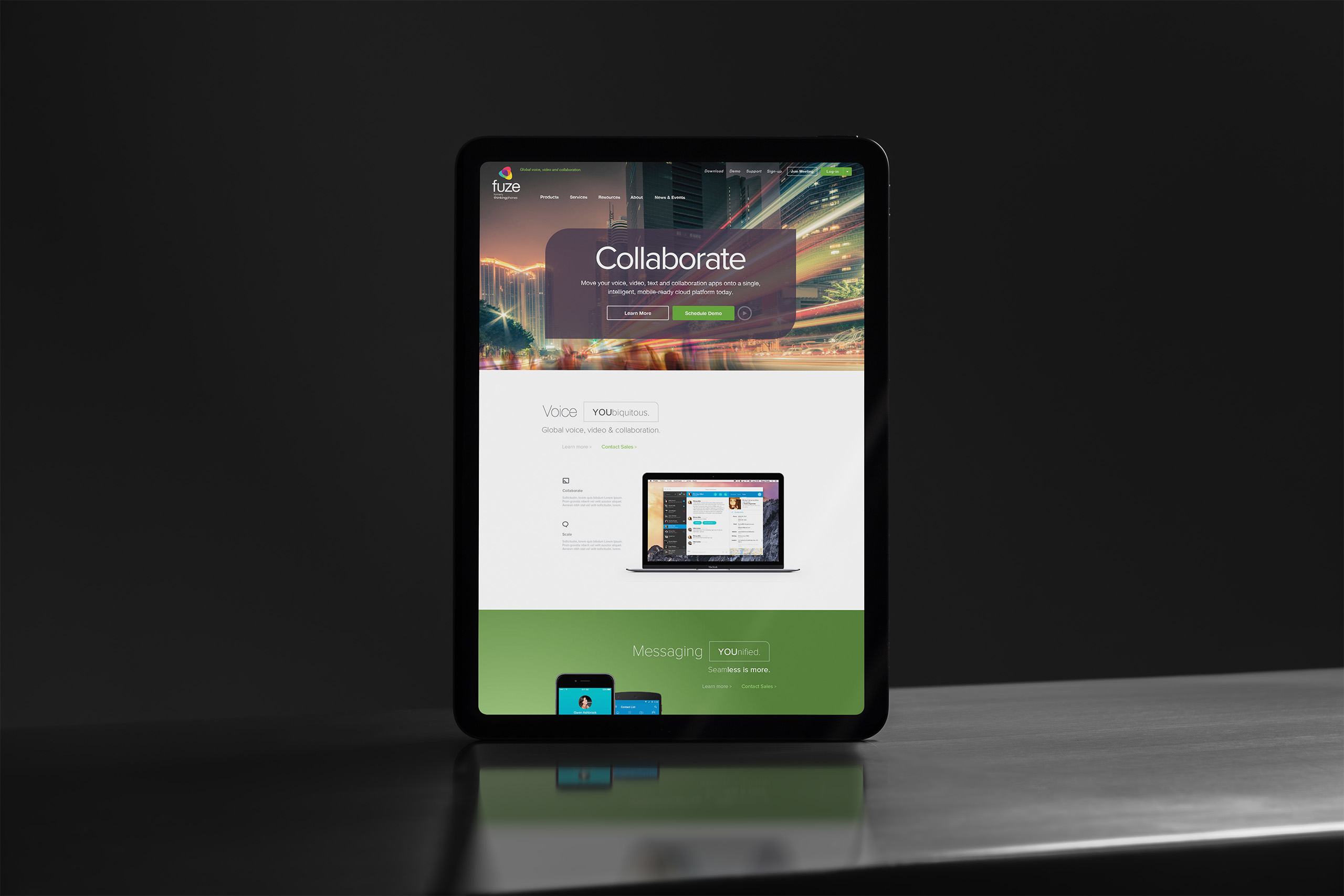
Website
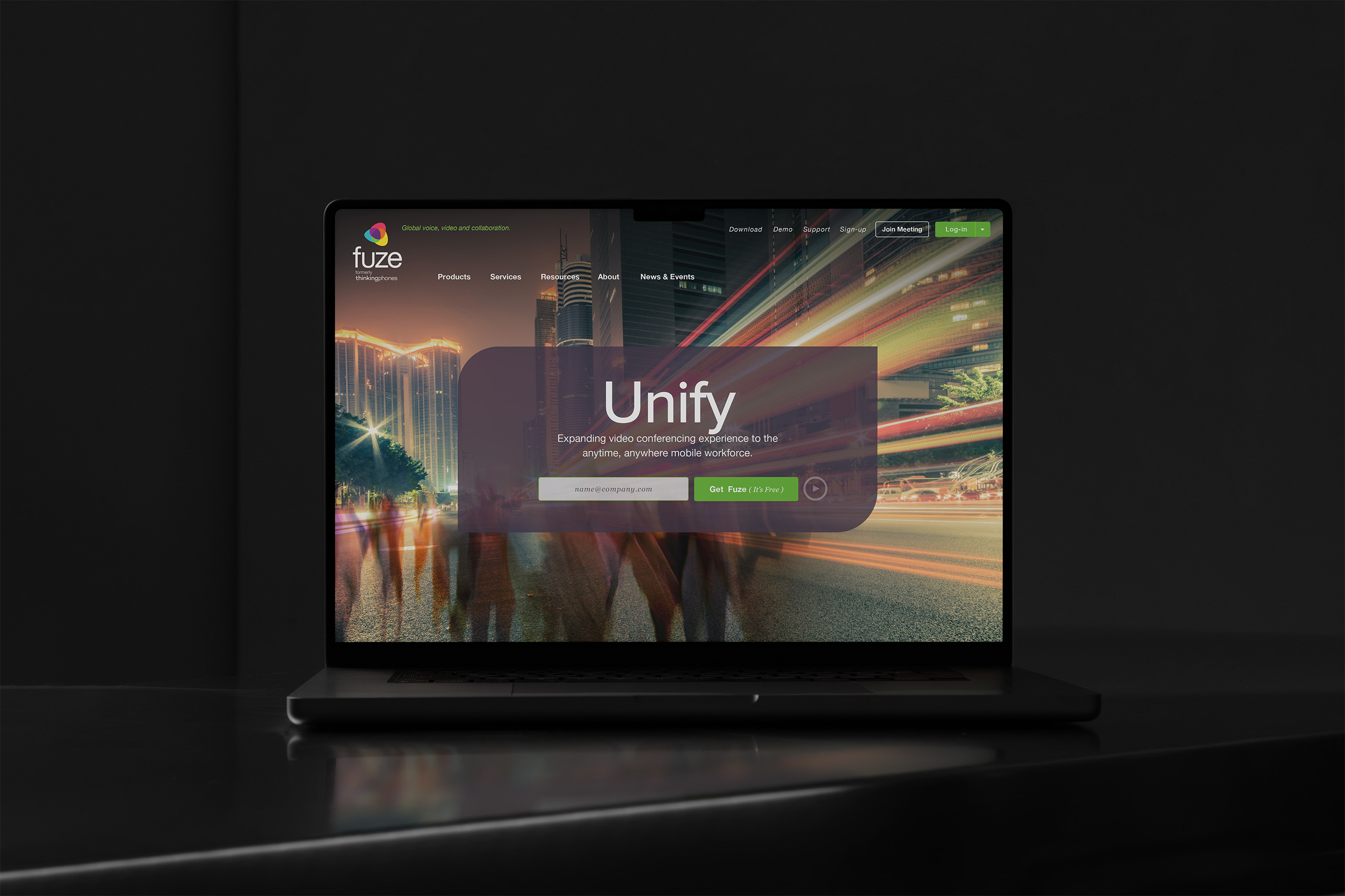
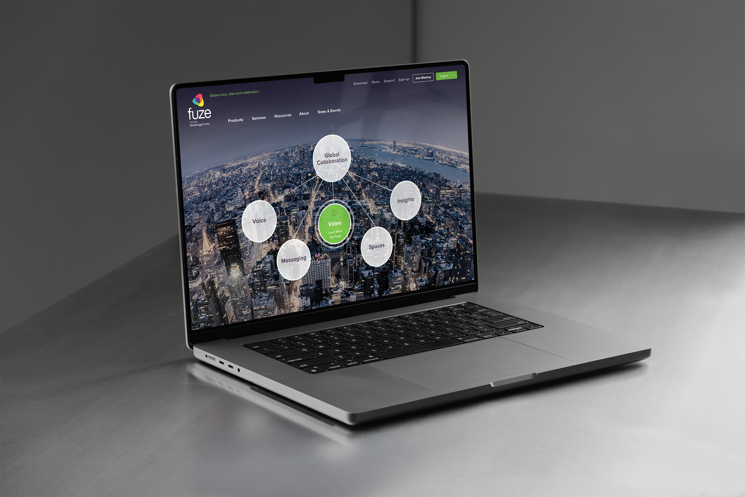
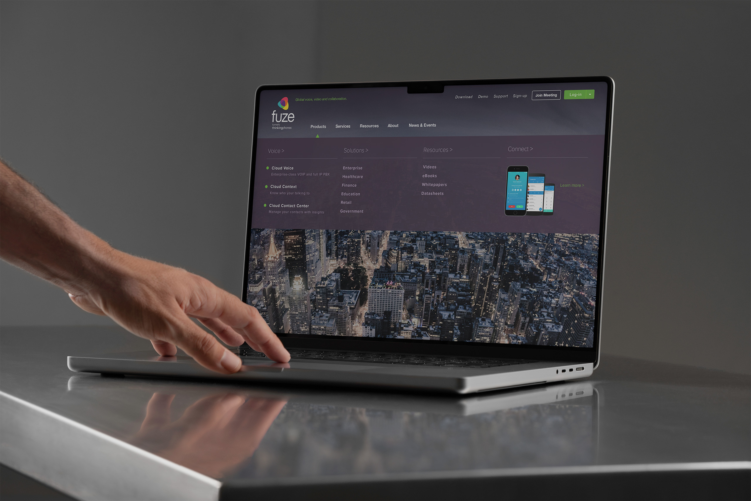
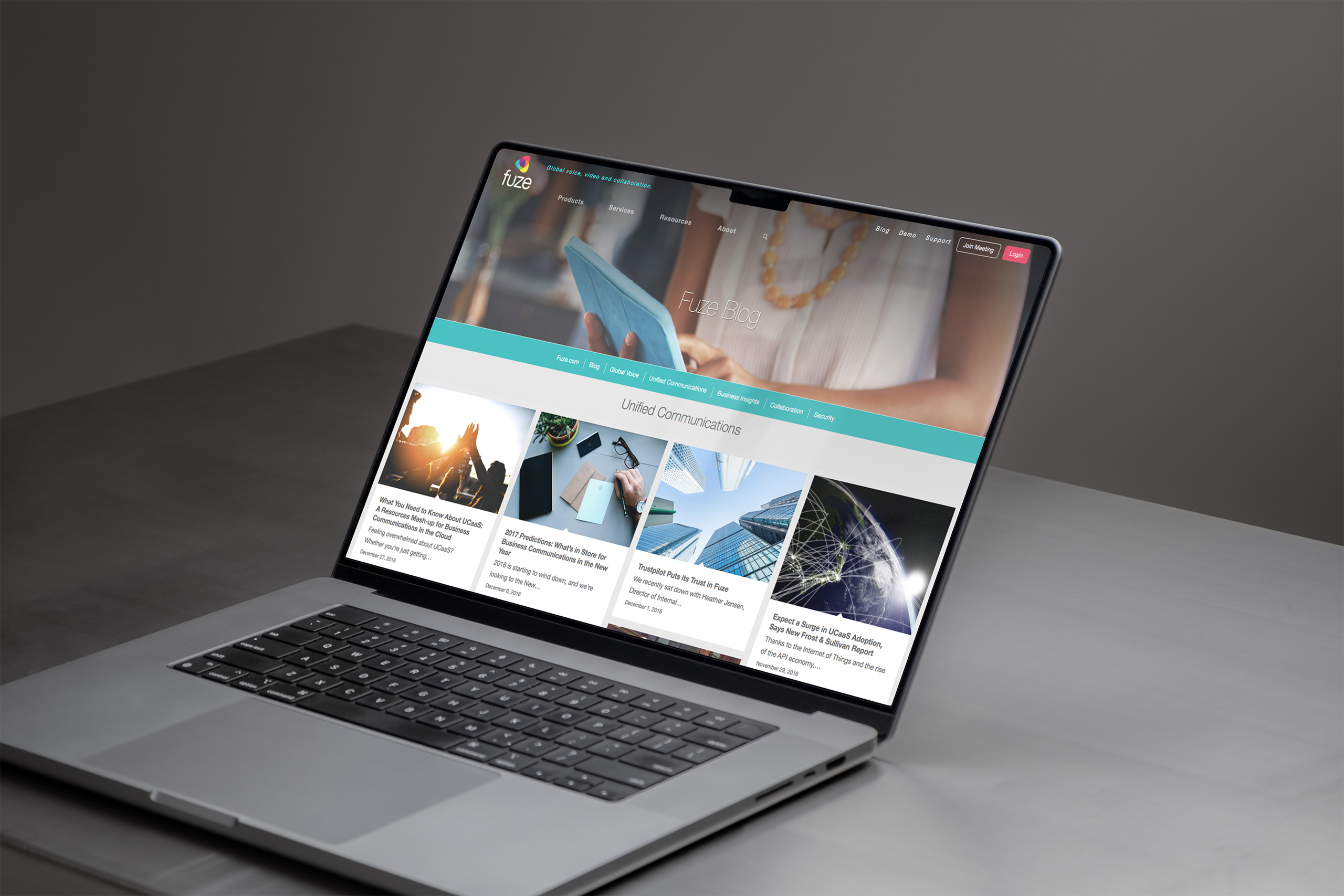
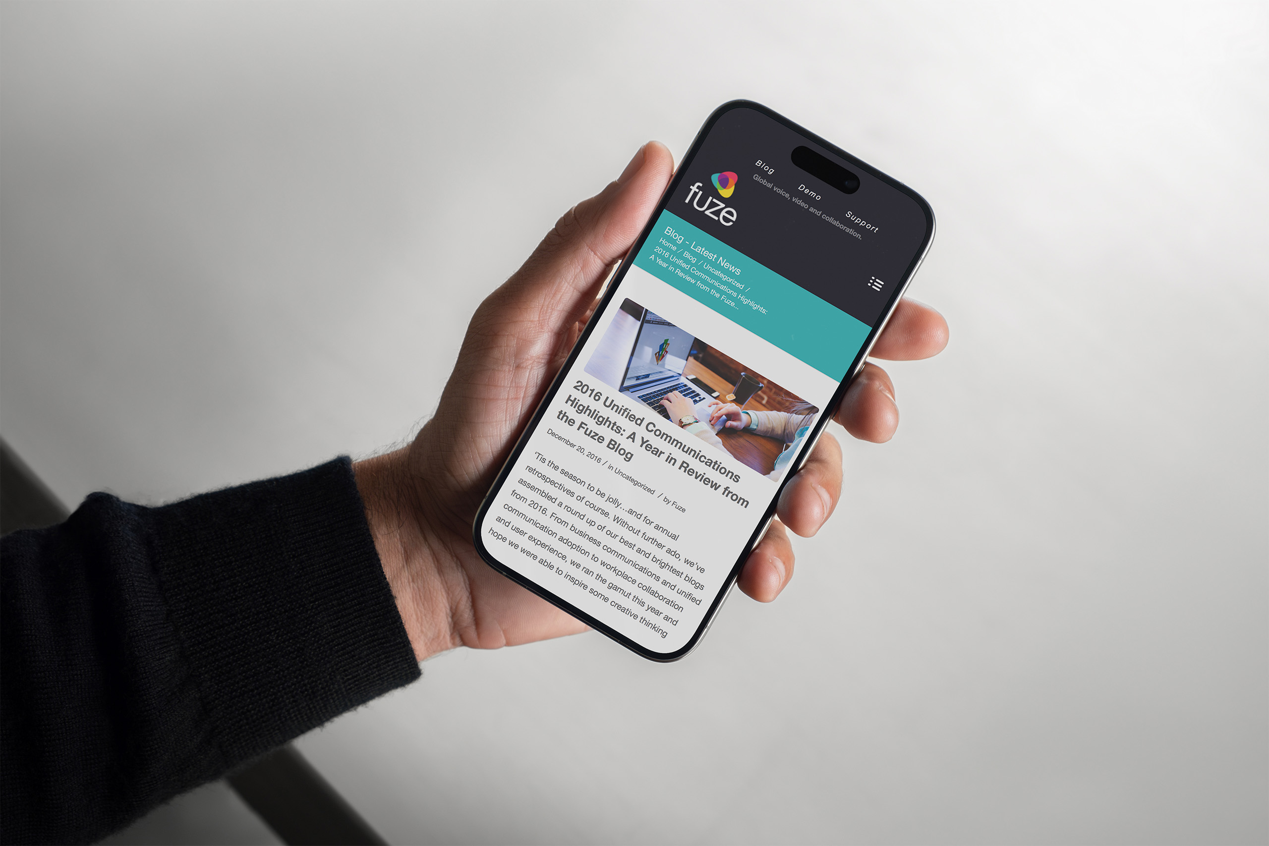
We designed the new website around the merger’s hardest job: making two companies read as one before the market had a reason to doubt it. One navigation, one product story, one voice, built directly from the taxonomy and hierarchy the strategy defined.
The design came together in two weeks over the holidays, merging two websites into a single experience. What that sprint established carried well past launch: every page that followed was an extension of the same foundation.
Product pages present unified communications as one portfolio rather than two inheritances. Every offering sits in a hierarchy that explains what it does and where it belongs, so a visitor from either legacy company recognizes what they came for.
The migration carried both audiences to the same front door. Two platforms became one with zero SEO loss and zero 404 errors, so customers and search engines arrived at the new brand without ever hitting a dead end.