
ASICS
A marathon run by 47,000. Shared by two million.
As a lead sponsor of the New York City Marathon, ASICS wanted runners to have more than gear and encouragement banners. The brief was simple:
Let every runner share the race with the people who got them there.
The creative agency leading the project brought Bowman Design Direction in when the application’s first design was off-brand and short on usability. We redesigned the entire experience, the look, the functionality, and the front-end interaction, and directed the development firms that built it, all against a date that could not move: race day.
Read the Story
Challenge
A marathon is run alone. The training, the miles, the wall at mile 20, all of it belongs to one runner in a crowd of thousands, while the people who carried them there stand somewhere along the course hoping for ten seconds of eye contact.
The application meant to change that was in trouble. Its design didn’t match the sponsor’s brand, and its usability didn’t match the moment. ASICS needed an experience worthy of both the brand and the race, and the date of the New York City Marathon was not going to wait for it.
Direction
One observation reset the design: nobody runs 26.2 miles for a sponsor. What carries a runner through the hardest miles is their own people. So instead of filling the race with brand messages, we designed the application to deliver personal ones.
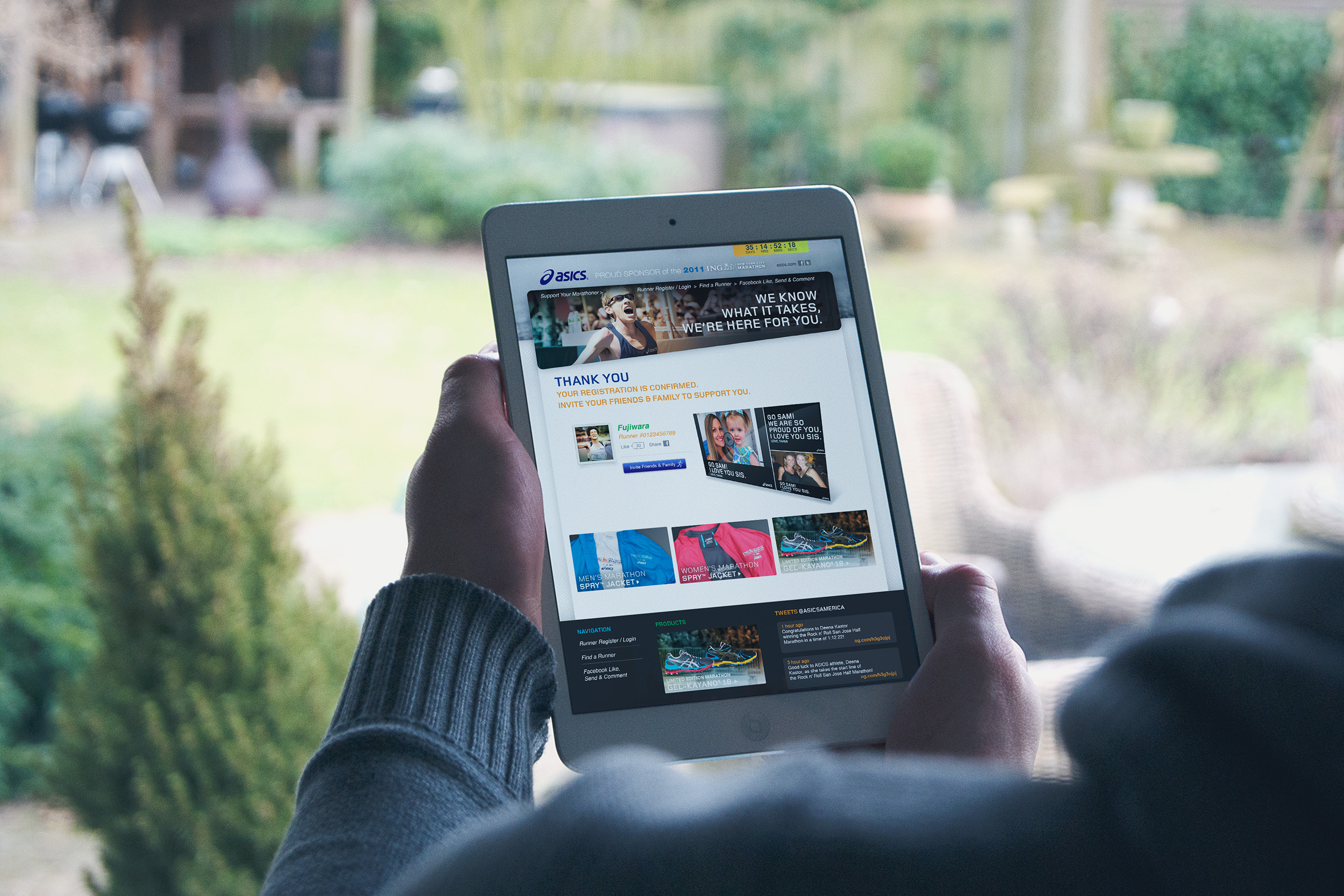
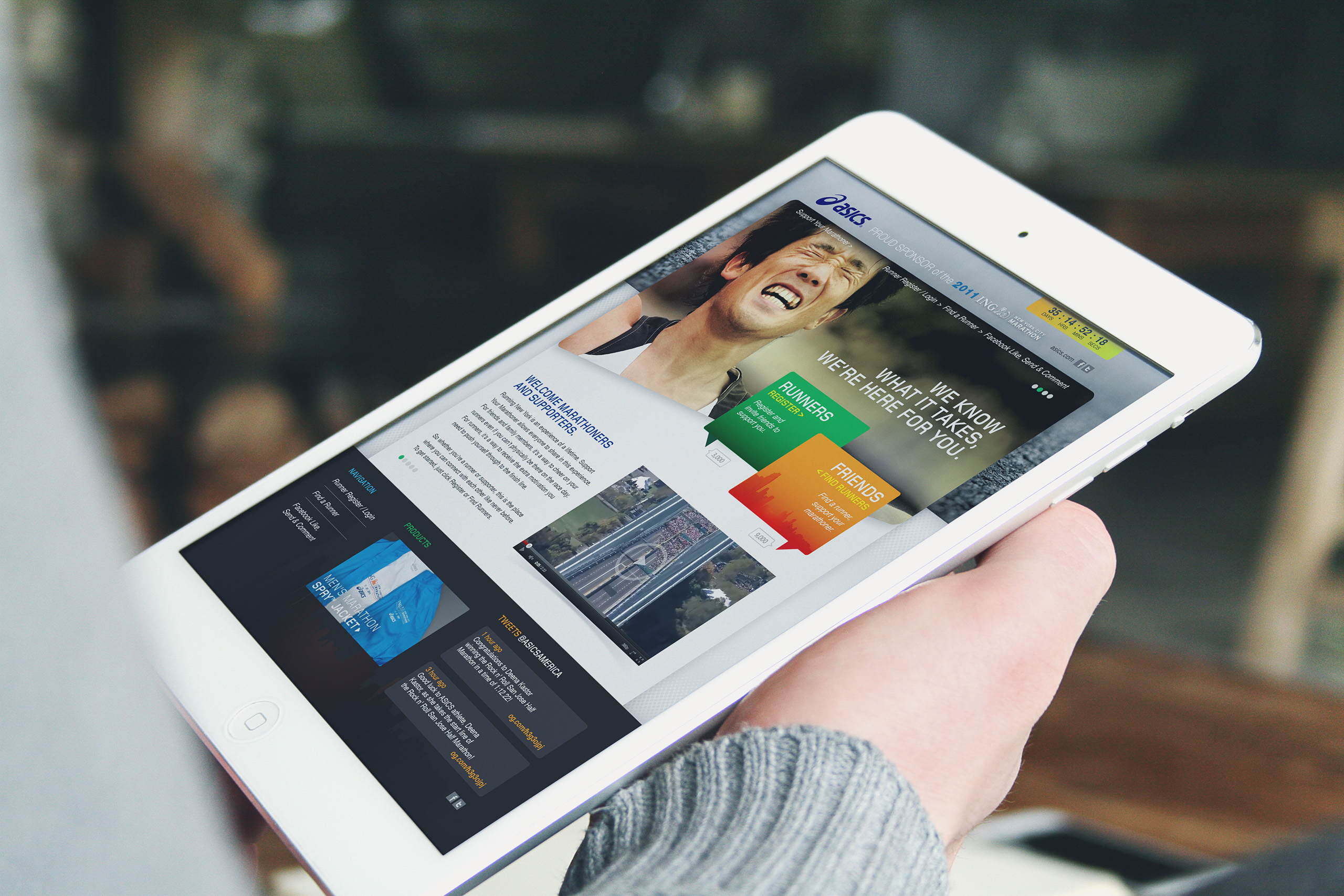
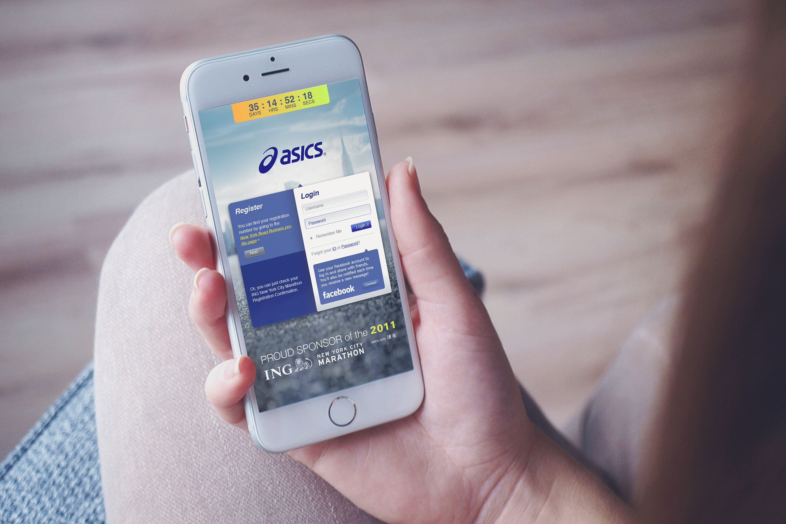
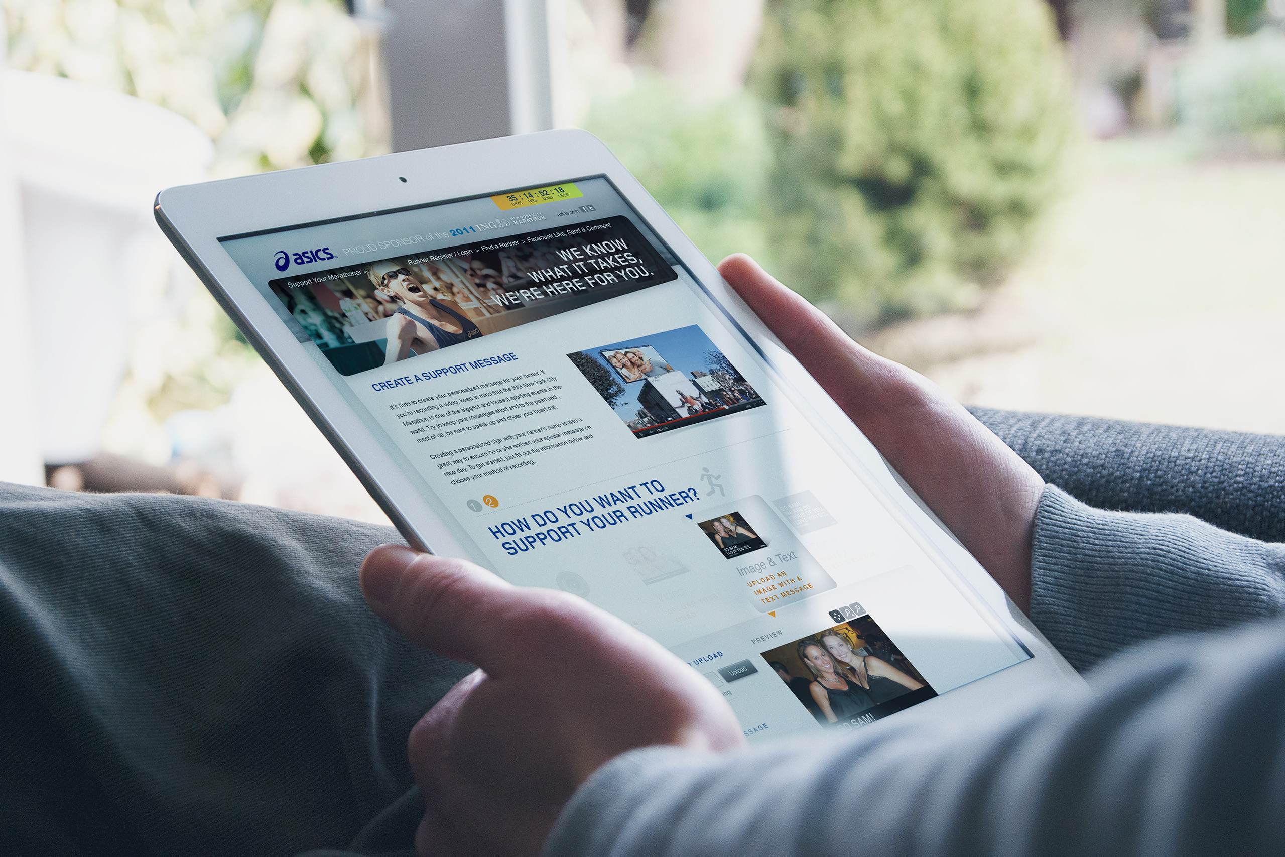
Runners logged in with Facebook and invited their friends in seconds. Family and friends recorded personalized text, video, and pictures. Geo-location and bib numbers routed each message to large screens along the course, so encouragement found its runner at exactly the mile it was needed. ASICS didn’t interrupt the moment. ASICS delivered it.
Outcome
On race day, 47,000 entrants and two million spectators had access to the application. Runners ran like the wind, brought their families along on the adventure, and shared their achievements as the race unfolded.
The experience shipped on an immovable date, held the ASICS brand it had once strayed from, and scaled on Heroku through the world’s largest marathon. The sponsorship became something no banner achieves: a moment a runner remembers as their own.
Takeaway
Sponsors buy visibility, and most spend it saying their own name louder. ASICS had a rarer opportunity: two million people standing on sidewalks with something to say to one runner each. The work translated sponsorship into delivery, a brand lending its screens to the voices runners actually needed to hear. The best thing a brand can put on a screen is someone else’s voice.
What We Built
Experience Design
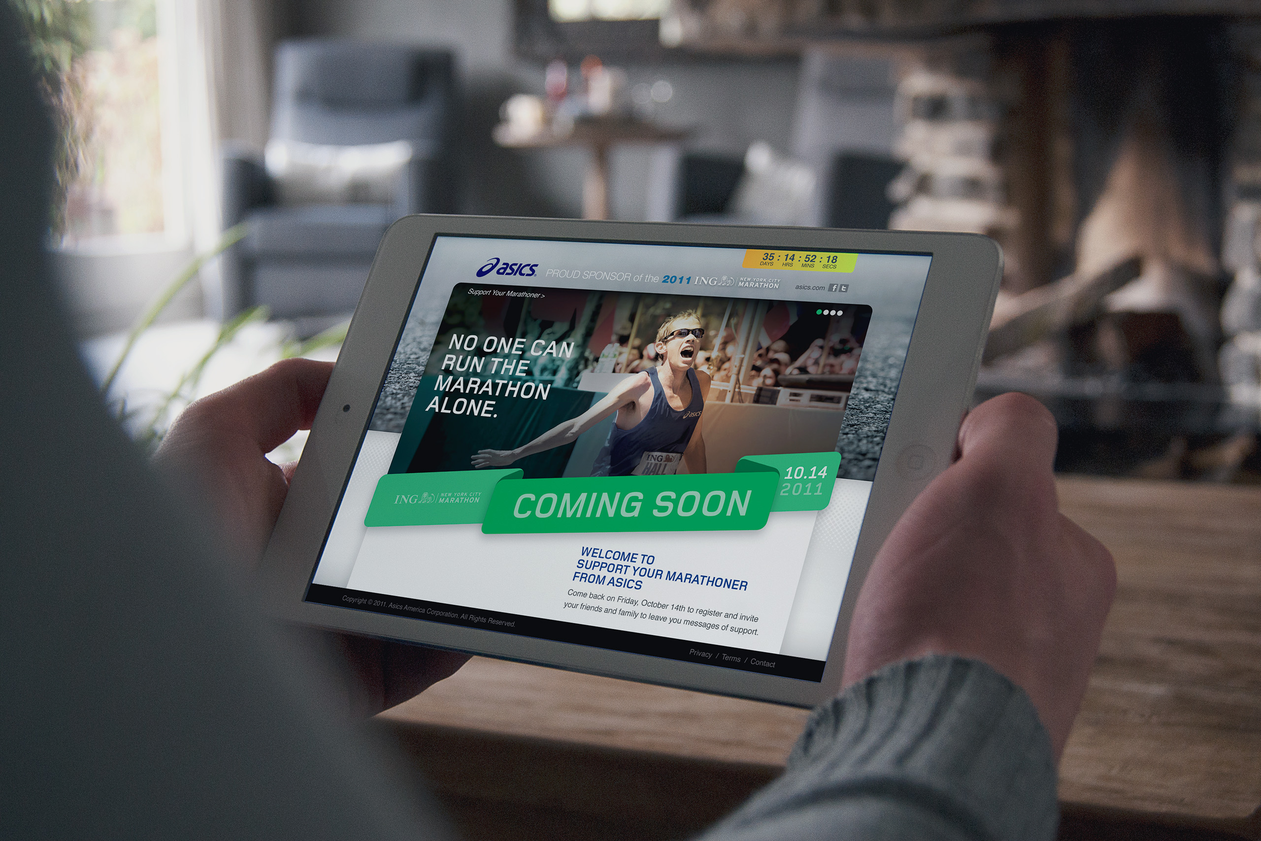
We designed the application’s entire look, functionality, and front-end experience, replacing an off-brand first attempt with an interface that felt unmistakably ASICS and behaved simply enough for a spectator on a sidewalk or a runner mid-race.
The Spectator Channel
Runners logged in with Facebook and invited their people in seconds. Friends and family recorded personalized text, video, and pictures before and during the race, turning two million spectators from an audience into participants with something to deliver.
Delivery by Location
Geo-location and bib numbers routed every message to large screens along the course, timed to each runner’s position. Encouragement arrived at the mile it was needed, found its runner by name, and disappeared into the next stride. The race itself became the delivery route.
Prescriptive Direction
More than thirty wireframes and finished comps, produced in a compressed window, gave the development firms an unambiguous specification. We directed the build through to race day, and the application shipped as designed, scaling on Heroku for the world’s largest marathon.
The Through-Line
What began as a struggling sponsor app became the way 47,000 runners heard their families for 26.2 miles.
Where the first design had drifted from the brand, the redesign made every screen unmistakably ASICS without ever making the race about ASICS. Where sponsor apps usually broadcast, this one listened first: Facebook login and instant invitations let each runner choose exactly whose voices the course would carry.
Where a message could have been an interruption, geo-location and bib numbers made it a rendezvous. Text, video, and pictures met their runner at the right mile, on screens too large to miss.
Where thirty wireframes could have stayed suggestions, prescriptive direction made them the build. The development firms shipped the experience as designed, and Heroku scaled it for 47,000 runners and two million spectators at once.
That is what the application proved: two million spectators were never an audience for the brand. They were the brand’s best content, waiting to be delivered.
Every Deliverable Carried One Thing to the Course: The Runner’s Own People.
Discovery + Strategy
Before the interface, we designed the moment it existed to deliver.
Brand Realignment
An off-brand app is a broken promise in public. We audited the original design against the ASICS brand and rebuilt the experience until the sponsor on the screens matched the sponsor on the course.
Two-Audience Architecture
Runners and spectators live the same race differently. We designed for both at once: effortless invitation for entrants, effortless sending for the people cheering them, one shared moment on screen.
The Delivery Moment
Encouragement has a right mile. Geo-location and bib numbers let us place each message where its runner would actually be, so support arrived as legs and will were running out.
Frictionless Onboarding
Nobody trains for a login screen. Facebook sign-in and instant invitations meant a runner could assemble a full cheering section in the time it takes to lace up.
Race-Day Engineering
One date, no extensions. We scoped the experience to what could ship and scale on Heroku, then specified it precisely enough that nothing depended on guesswork.
Partner Direction
Great collaboration is directed, not hoped for. Prescriptive guidance and finished comps kept a creative agency and multiple development firms building as one team toward one morning.
Creations
ASICS