Creations
Cartable
Cartable
Translating autonomous retail into something people could believe.
McFadyen Digital had an ambitious vision for autonomous retail, but the product did not yet exist in the real world. Before it could be introduced to the industry, the idea needed more than a logo, website, or sales deck.
It needed to feel tangible, credible, and ready for market.
Bowman Design Direction partnered with McFadyen Digital to name, brand, visualize, animate, and explain Cartable, transforming a fragmented product concept into a complete business story for autonomous retail.
Read the Story
Challenge
Autonomous retail combined ecommerce, logistics, AI, merchandising, analytics, advertising, solar power, secure lockers, and physical infrastructure into a new business model.
The challenge was not simply creating marketing materials. It was helping retailers, partners, and investors understand how all of those pieces worked together before the first unit existed.
Direction
We began by giving the concept a name that embodied portability and convenience. Cartable, the French word for backpack, suggested mobility, everyday access, and retail that could travel wherever customers already were.
From there, we built a complete communication system around the idea. Identity, messaging, 3D renderings, animation, illustrations, website content, and industry-specific use cases all worked together to make autonomous retail feel real.
Outcome
Cartable transformed from a fragmented concept into a launch-ready brand system that could be shown, explained, and understood.
The work gave McFadyen Digital a complete visual and verbal platform for presenting autonomous retail across campuses, apartment complexes, construction sites, convenience stores, sporting events, grocery, retail, and other high-traffic environments.
Takeaway
Innovation rarely fails because the technology is not promising enough. More often, it fails because people cannot yet see it, understand it, or believe in it.
With no finished product to photograph, the brand itself became the prototype. Every rendering, animation, illustration, and story helped transform an emerging idea into something customers, investors, and partners could experience long before the first unit was built. Belief became the first product Cartable shipped.
What We Built
Brand & Identity
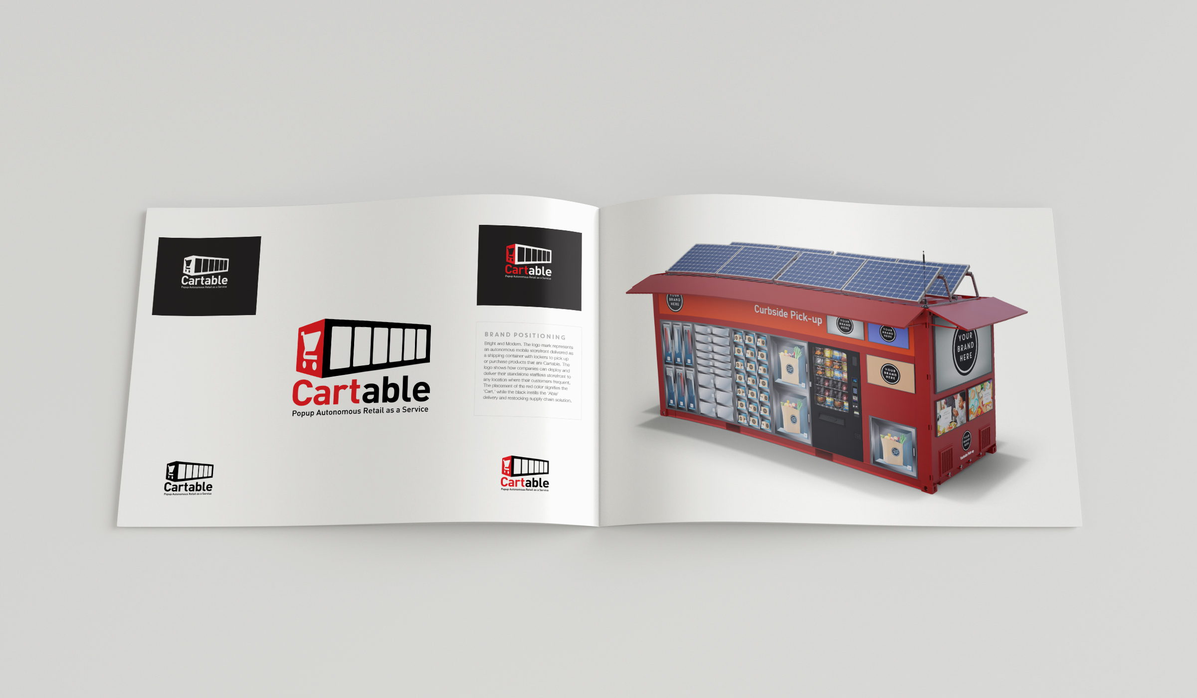
We created a bright, modern identity system built around the product itself. The mark transforms the autonomous storefront, shipping-container form, and locker experience into a simple visual idea, making the concept understandable before a single line of copy is read.
Naming & Messaging
Cartable gave the product a memorable name rooted in portability, access, and everyday movement. The tagline, Popup Autonomous Retail as a Service, positioned the offering as more than a kiosk. It framed Cartable as a deployable retail platform.
Visualization & Animation
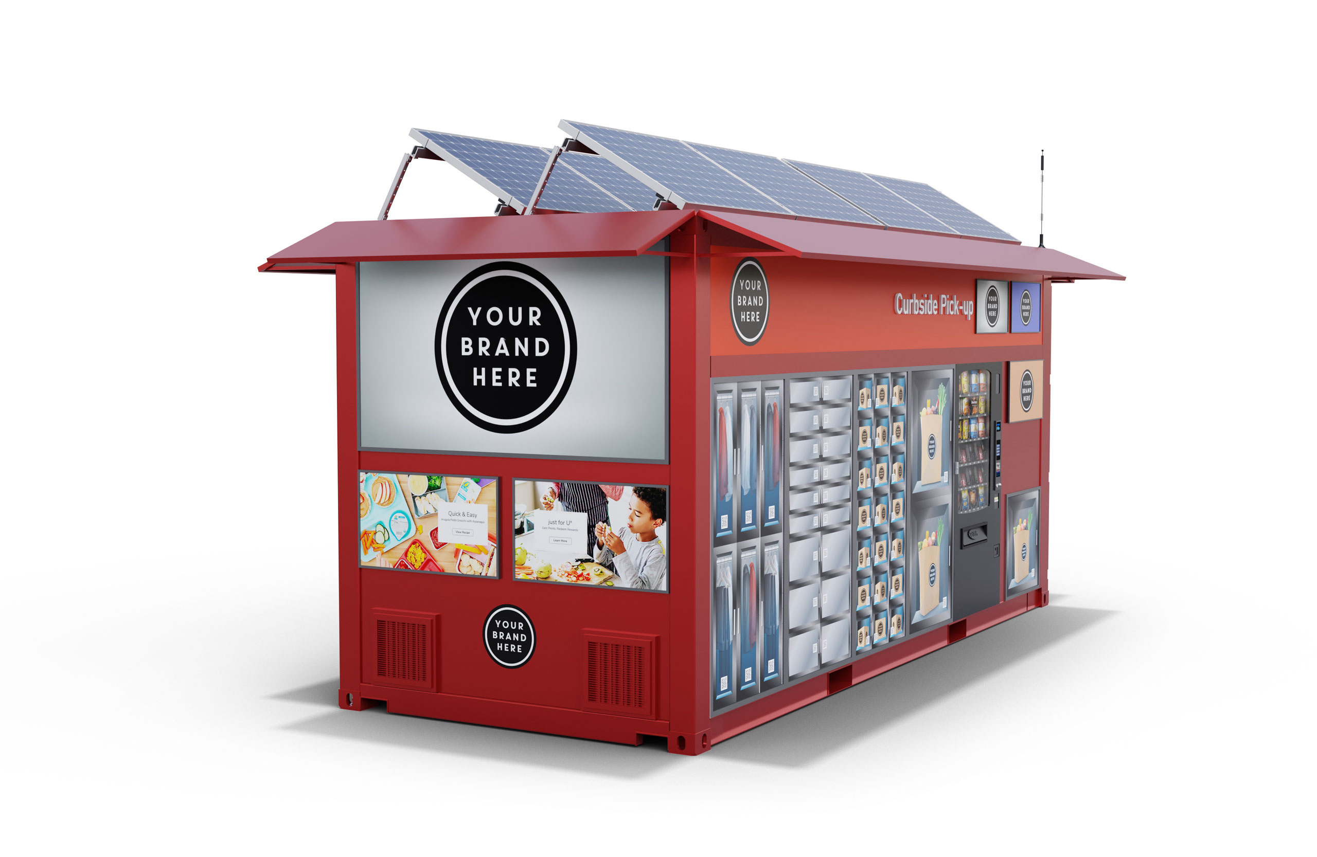
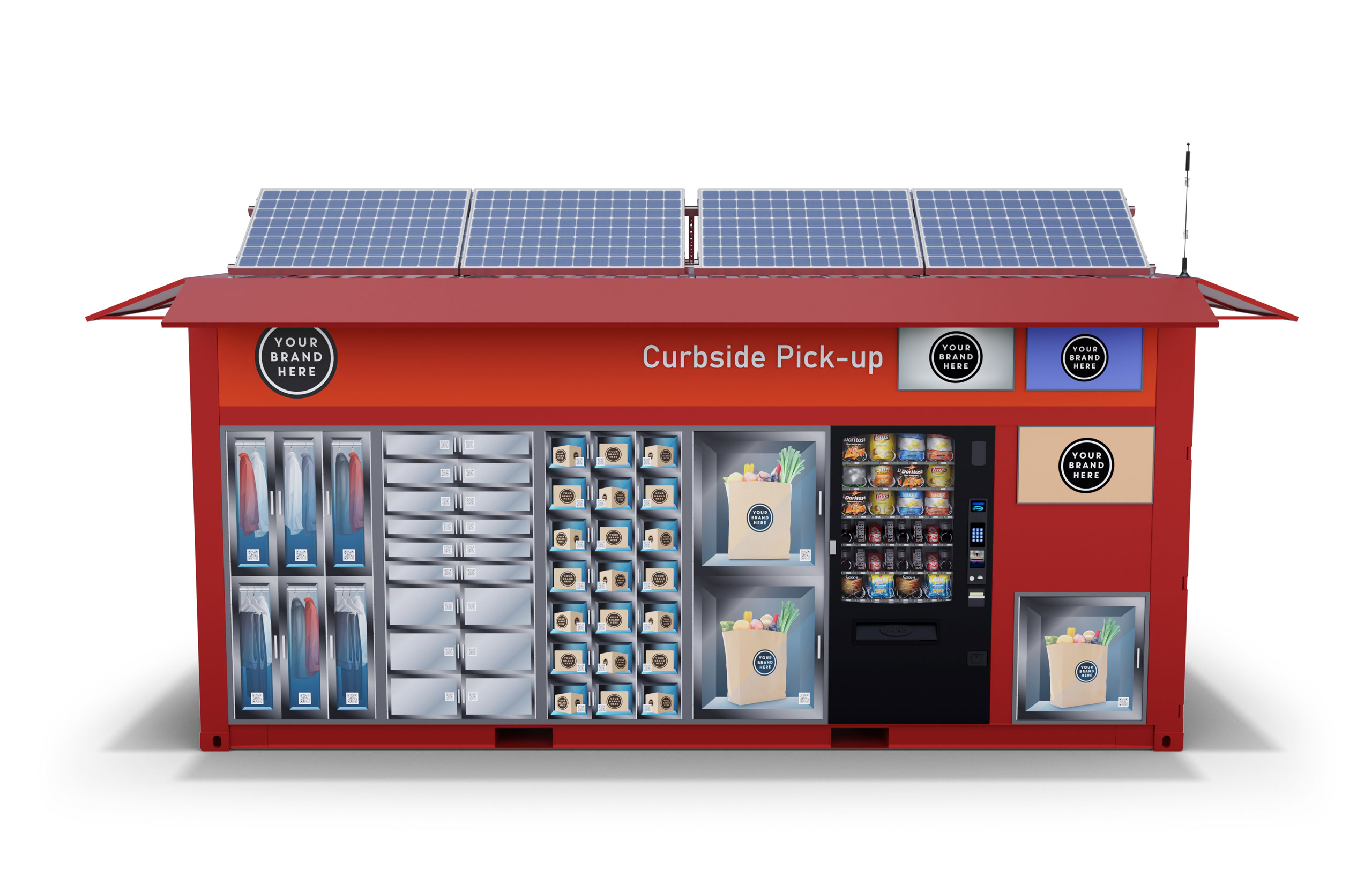
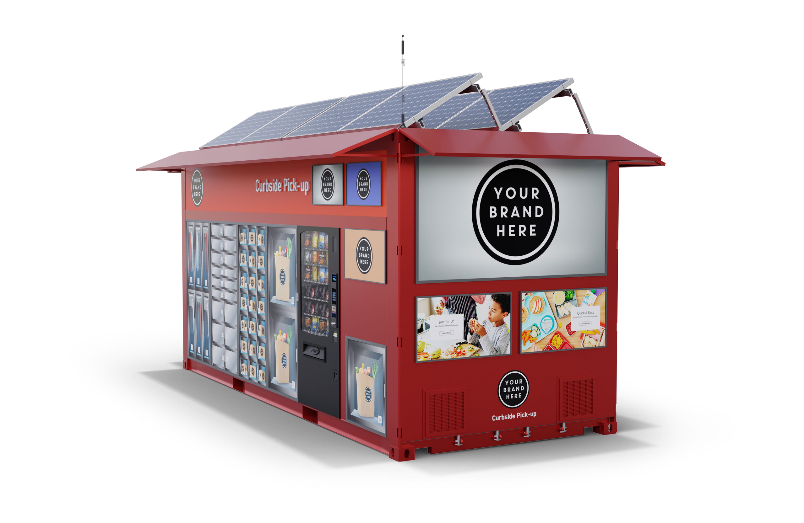
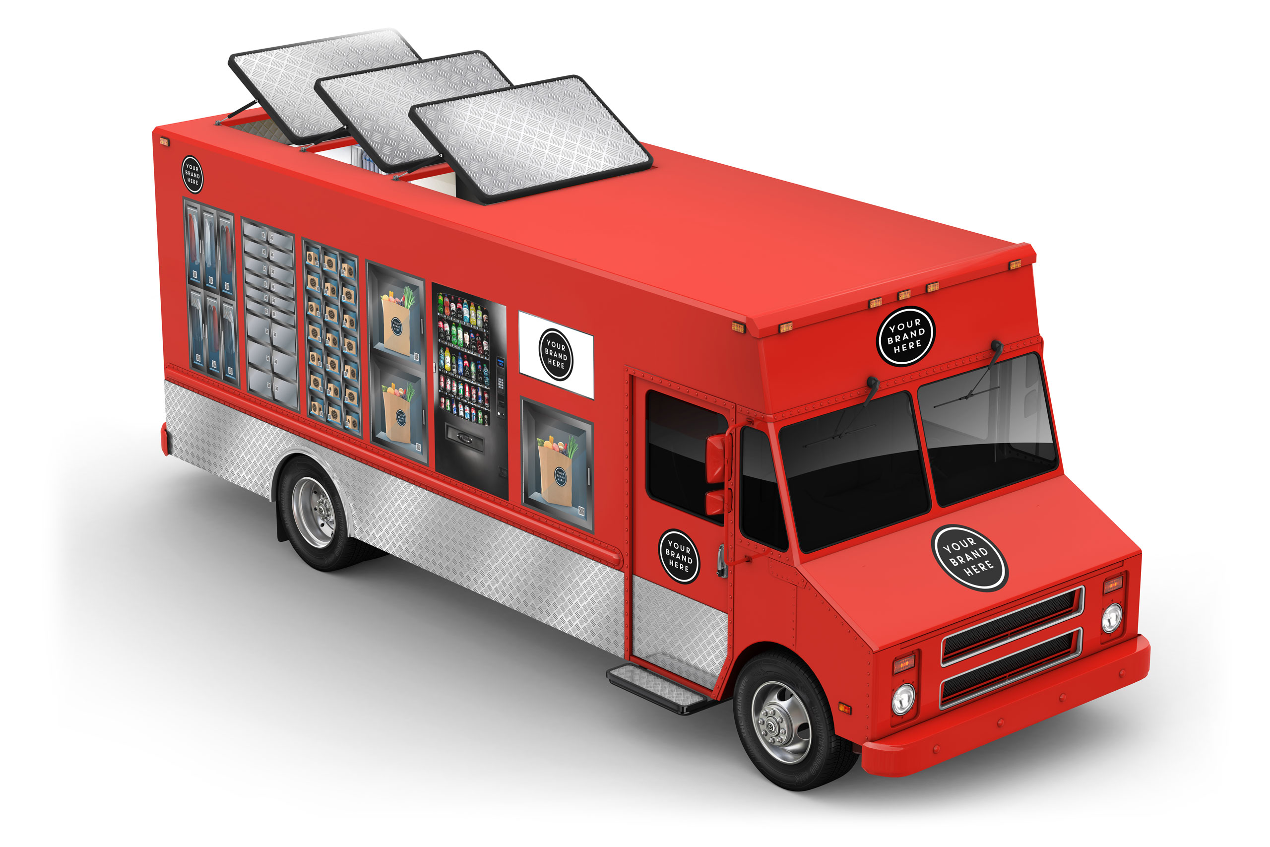
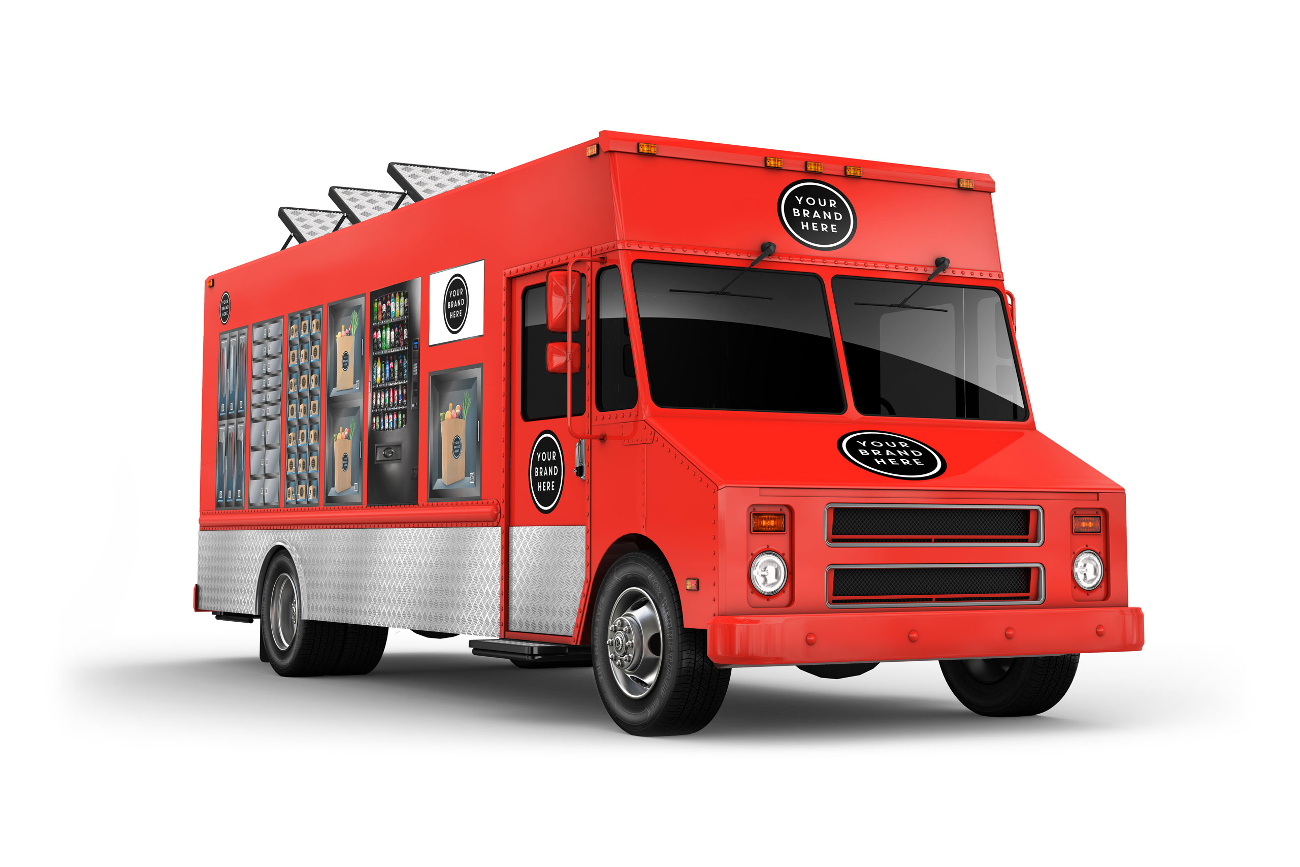
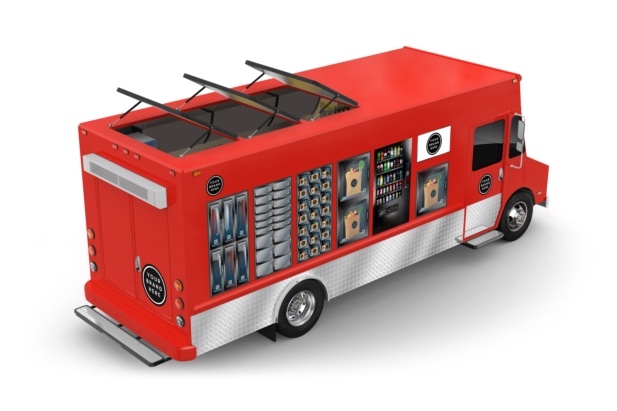
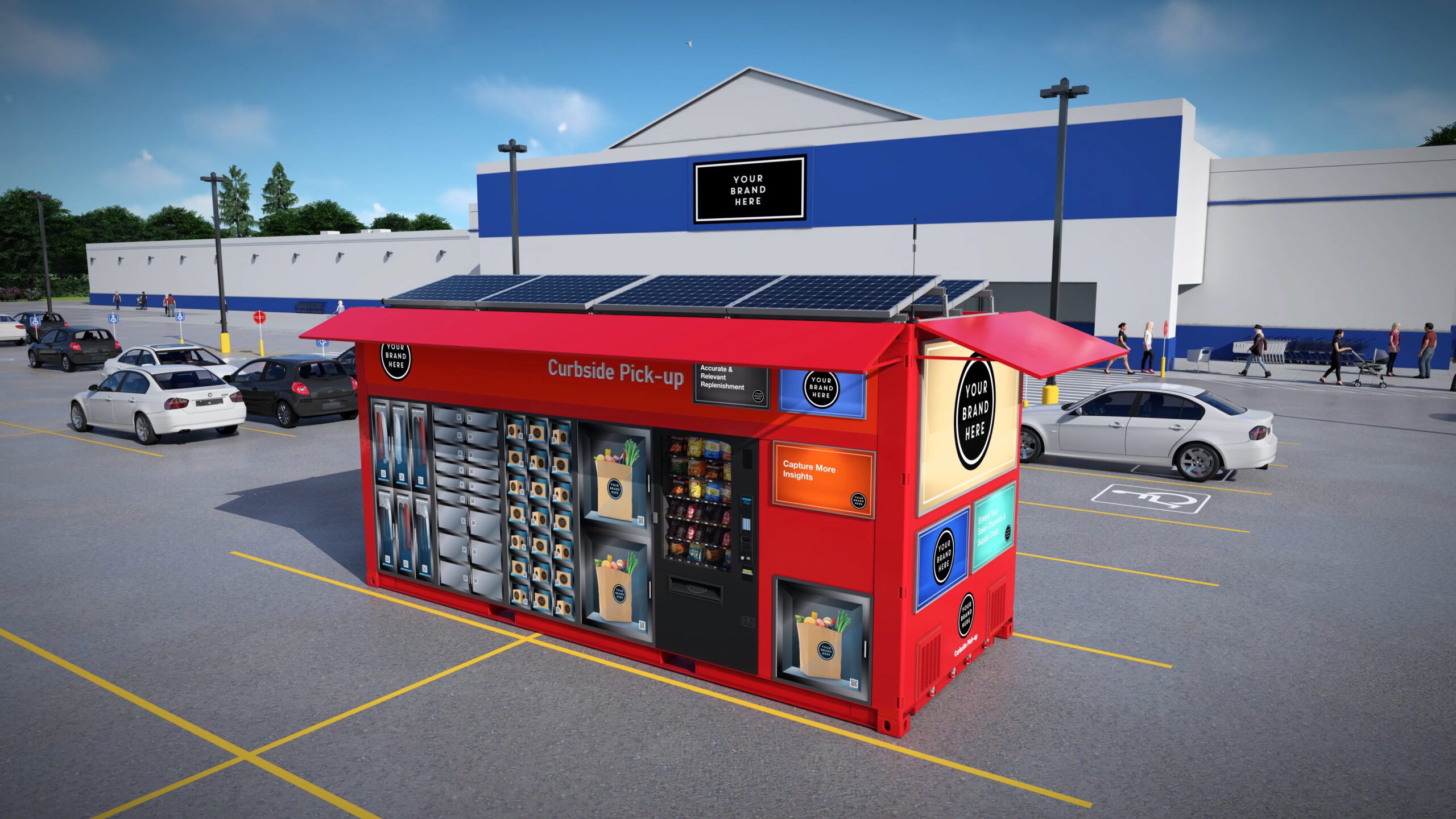
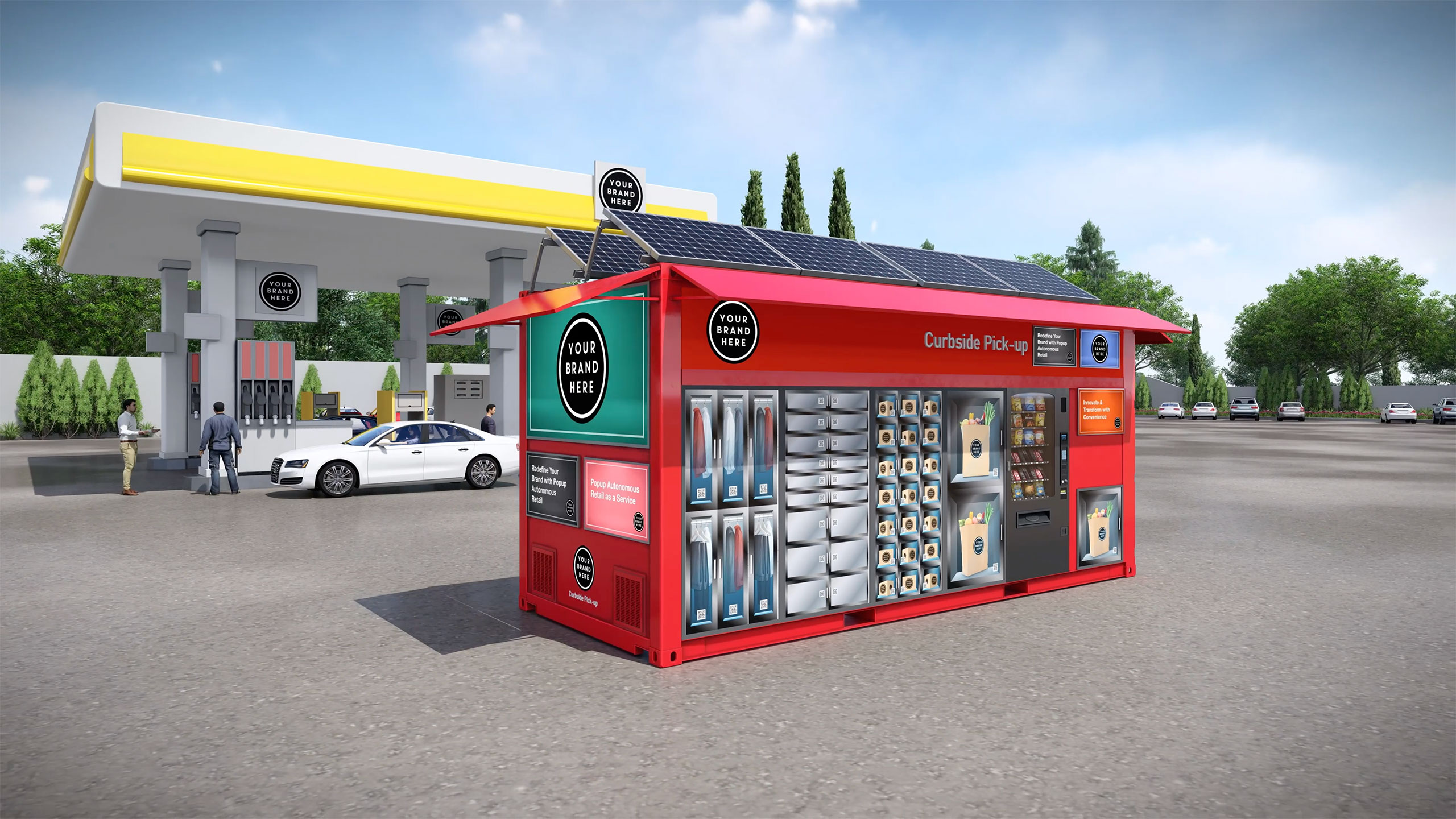
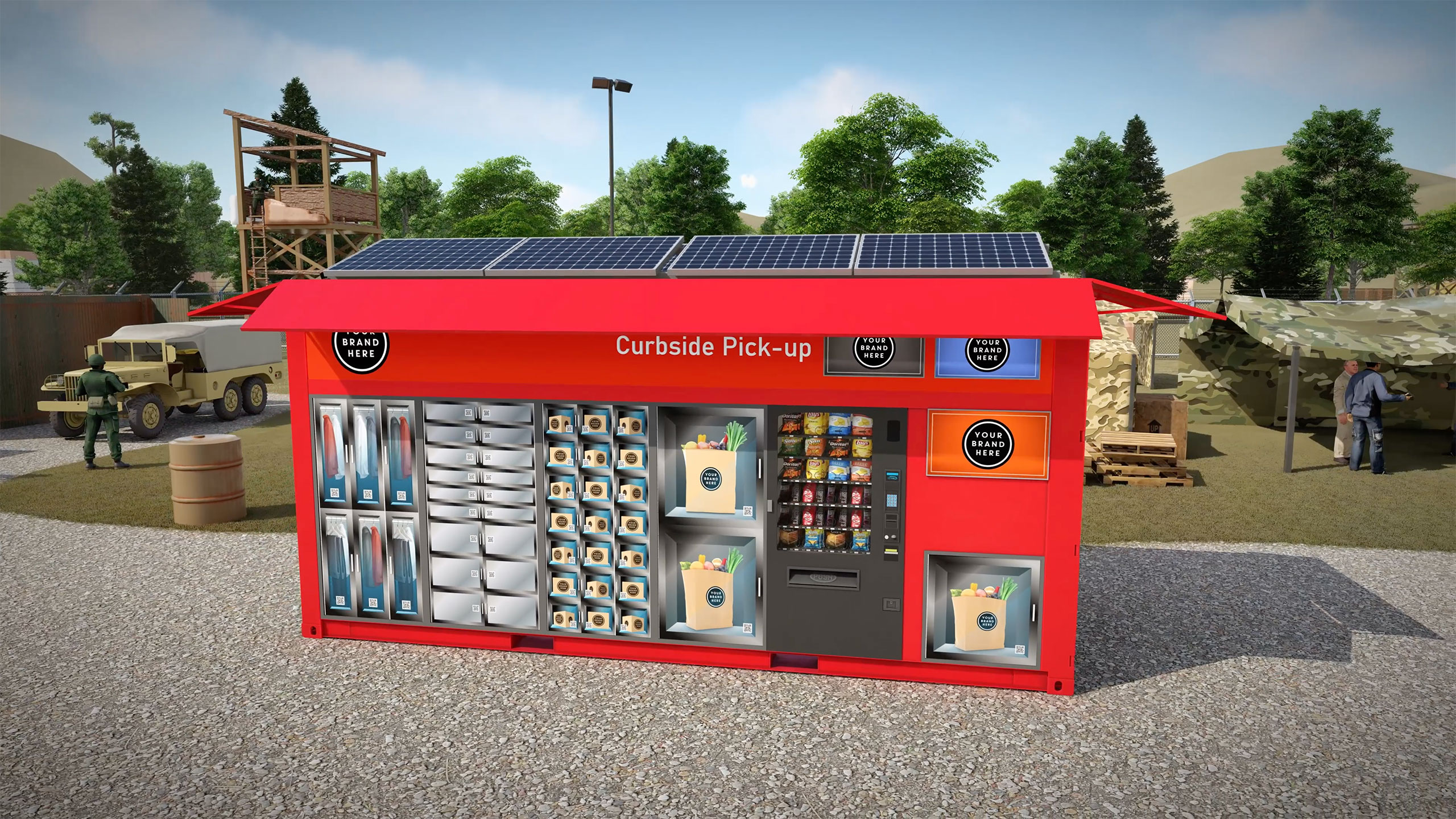
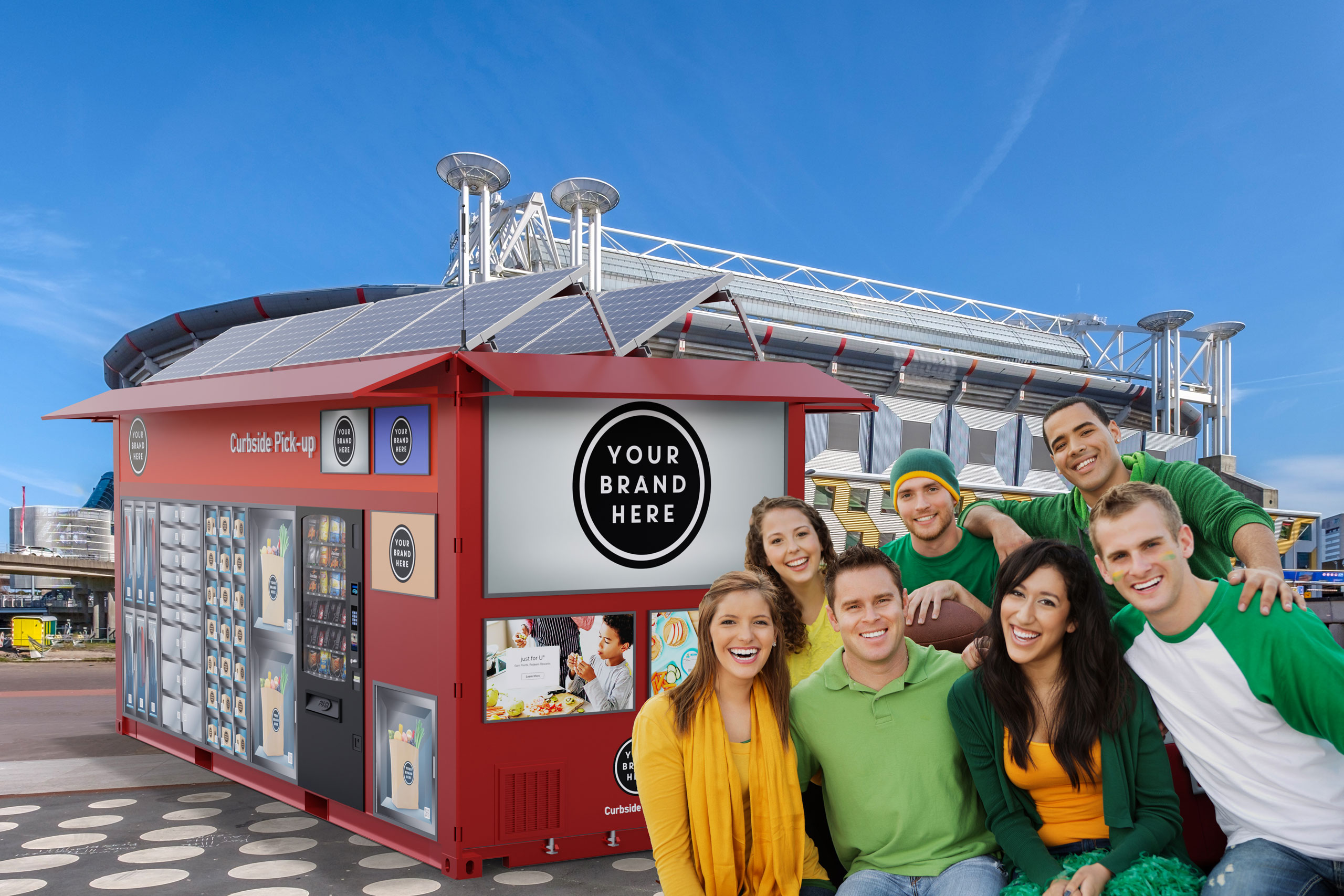
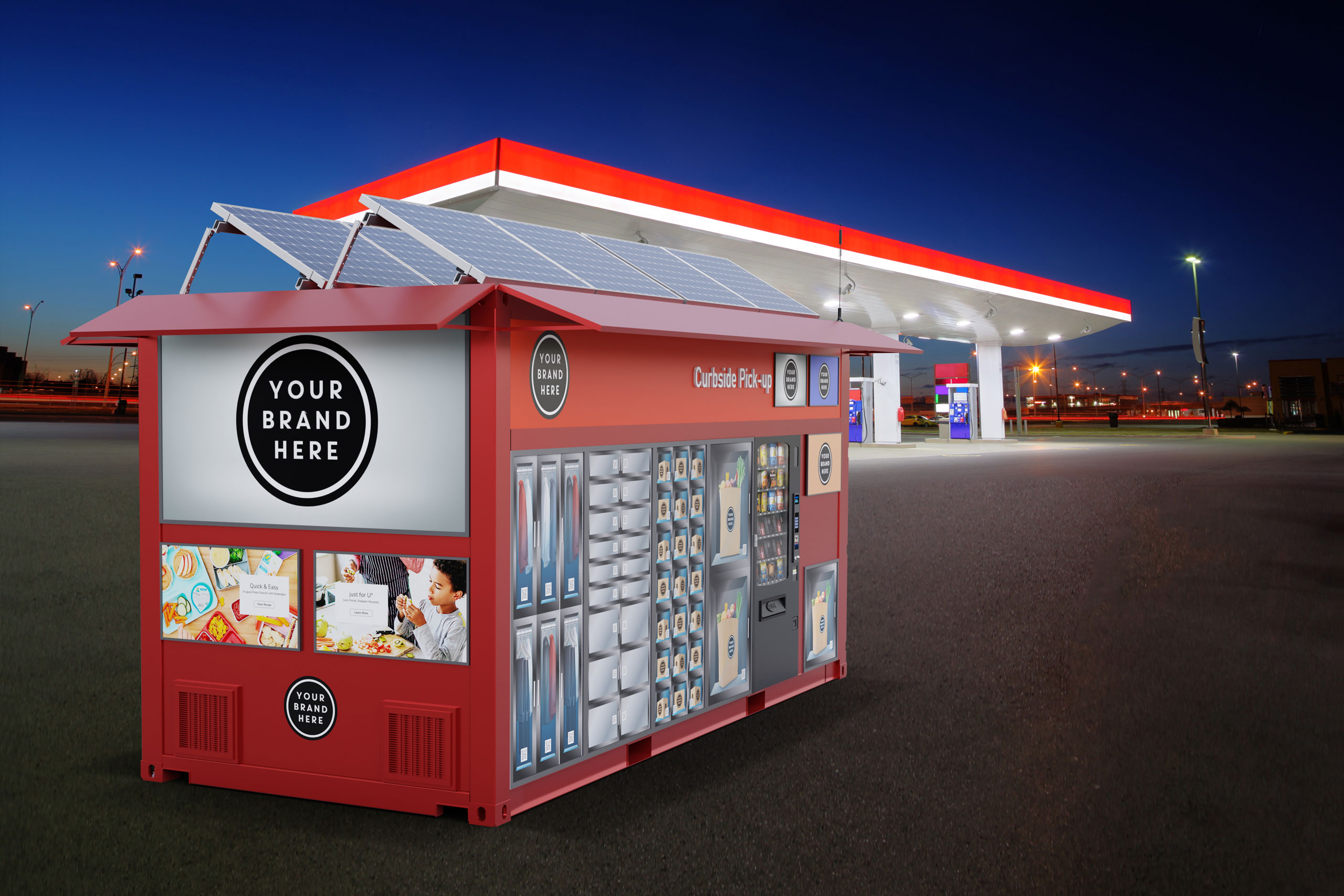
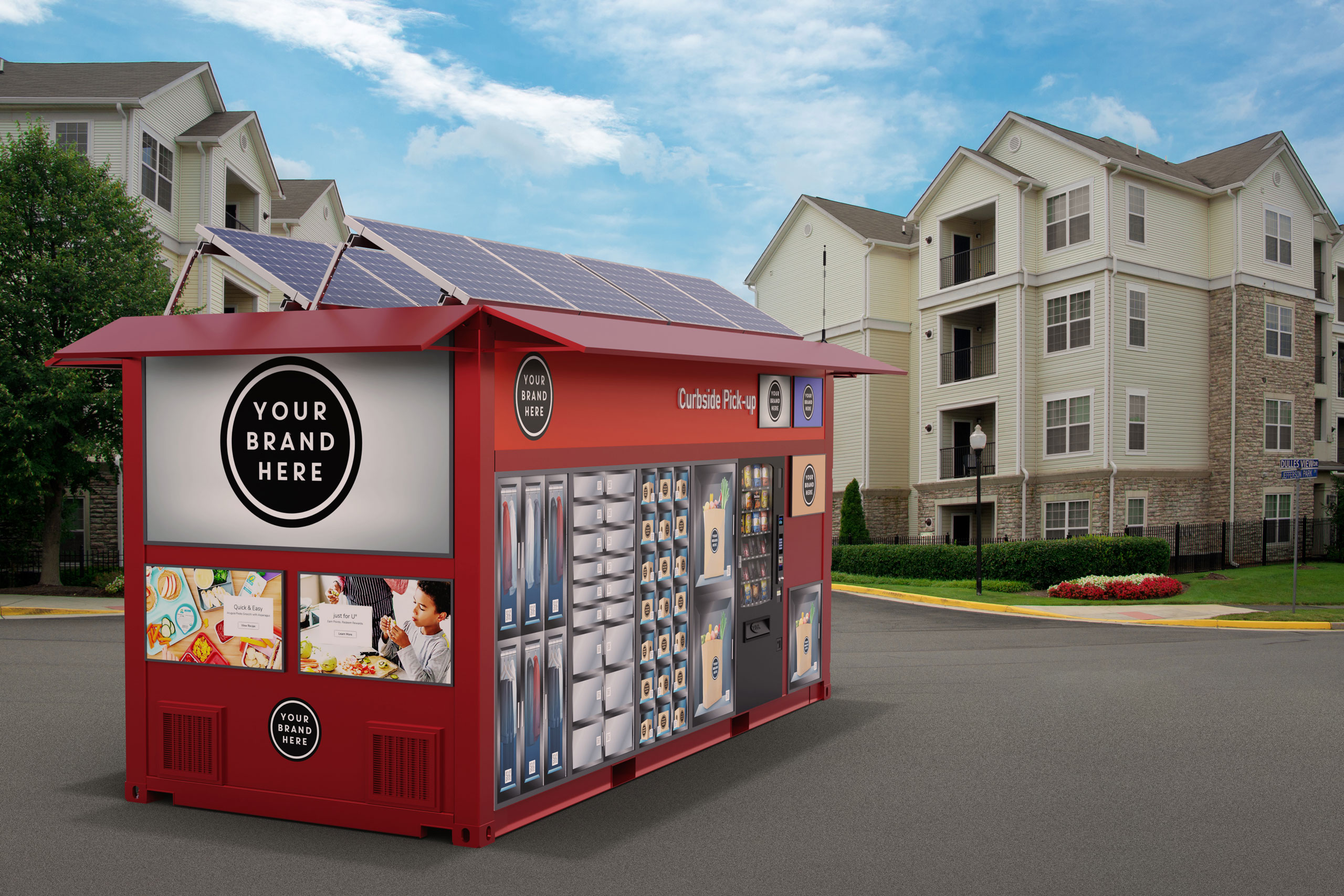
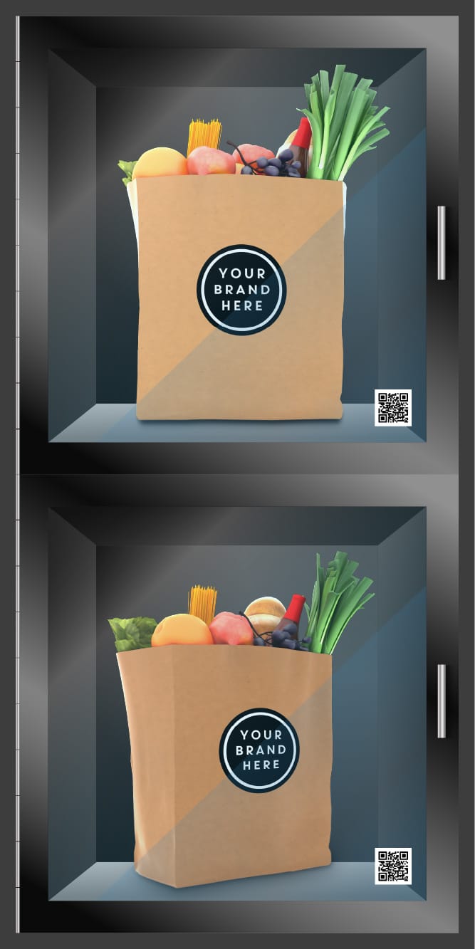
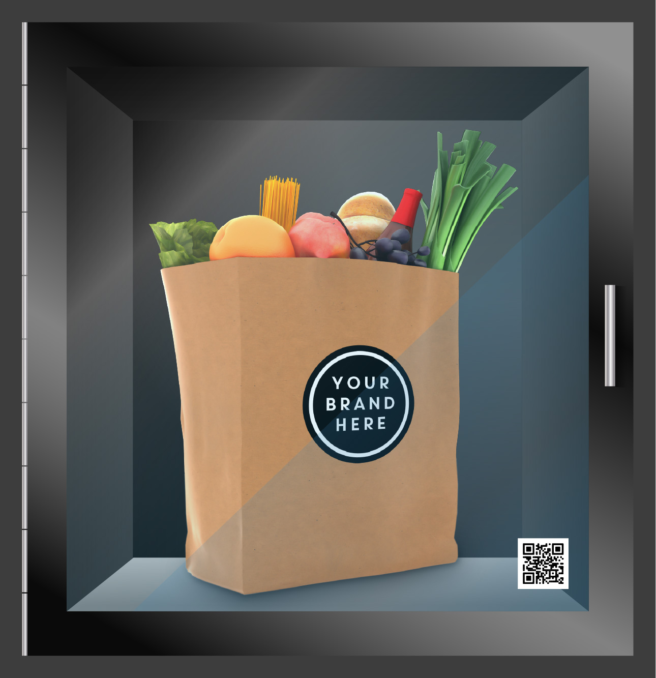
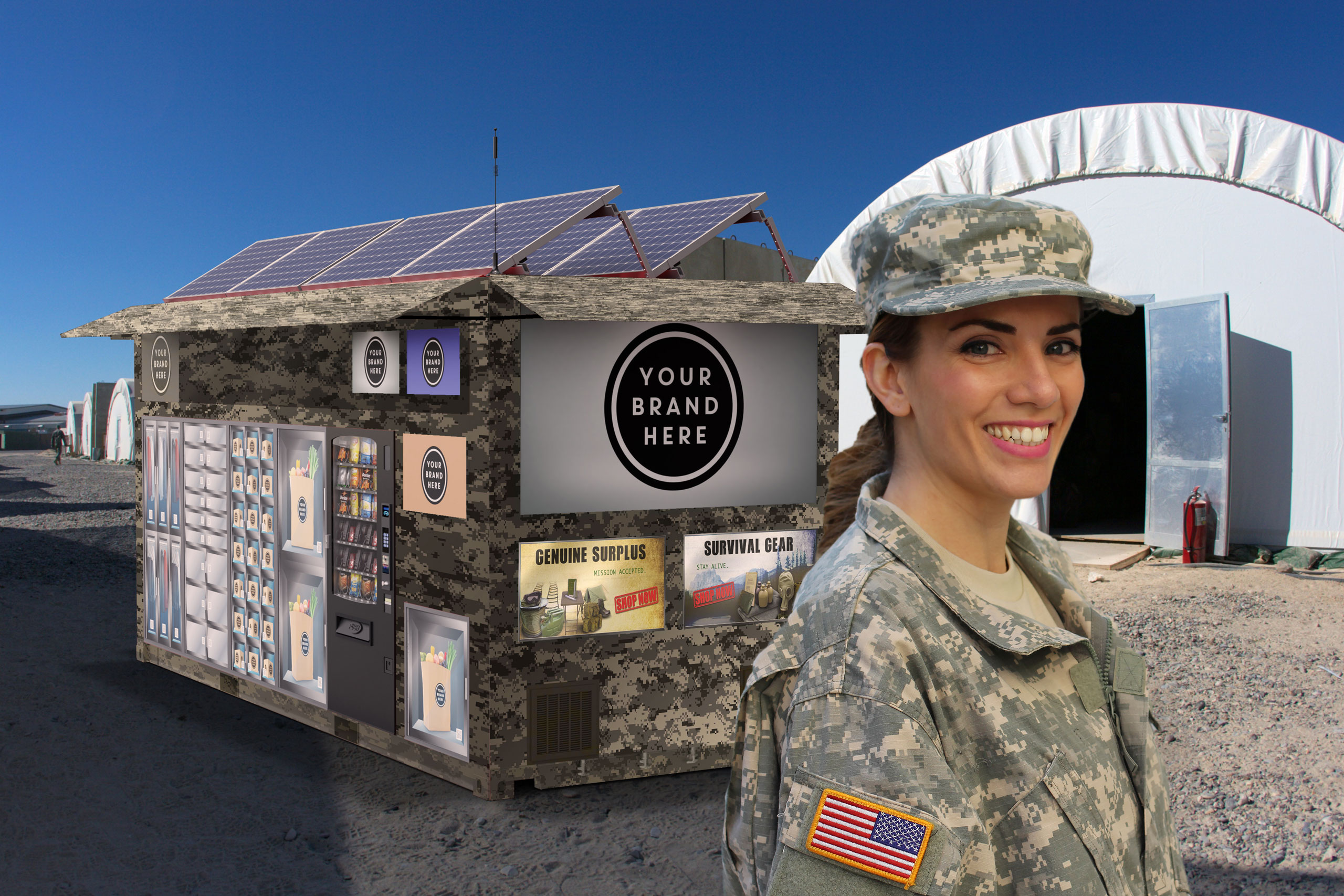
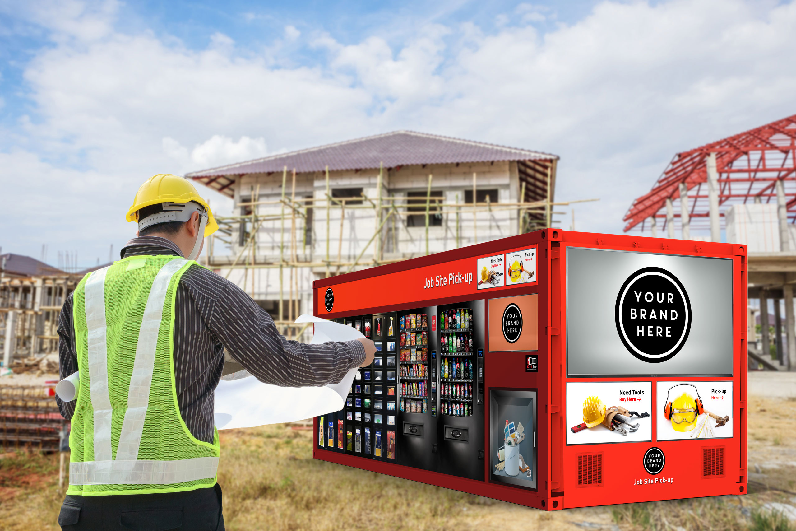
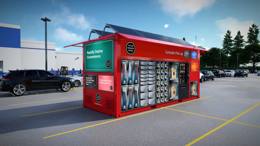
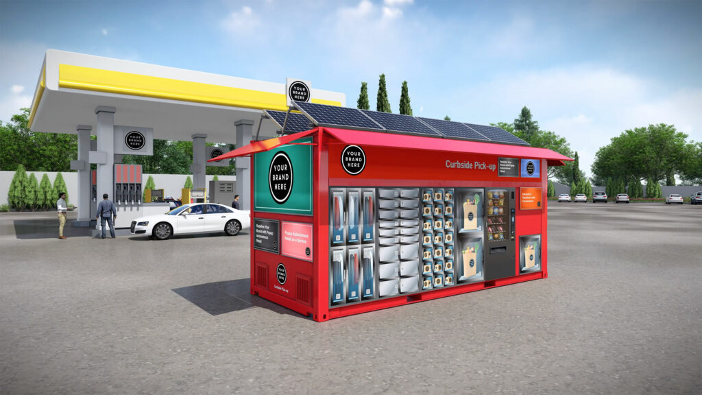
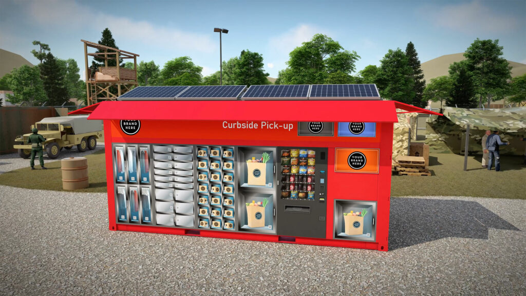
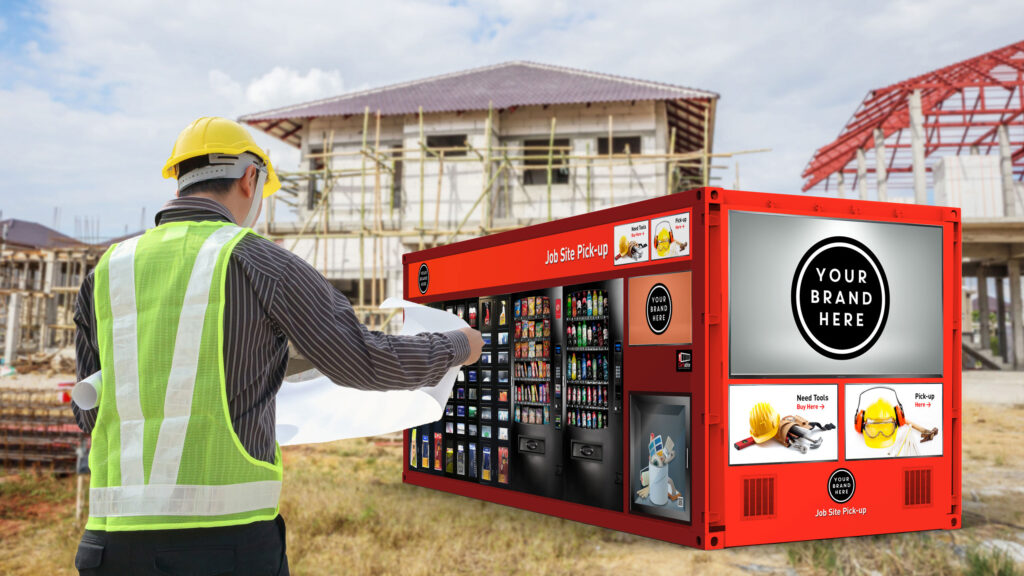
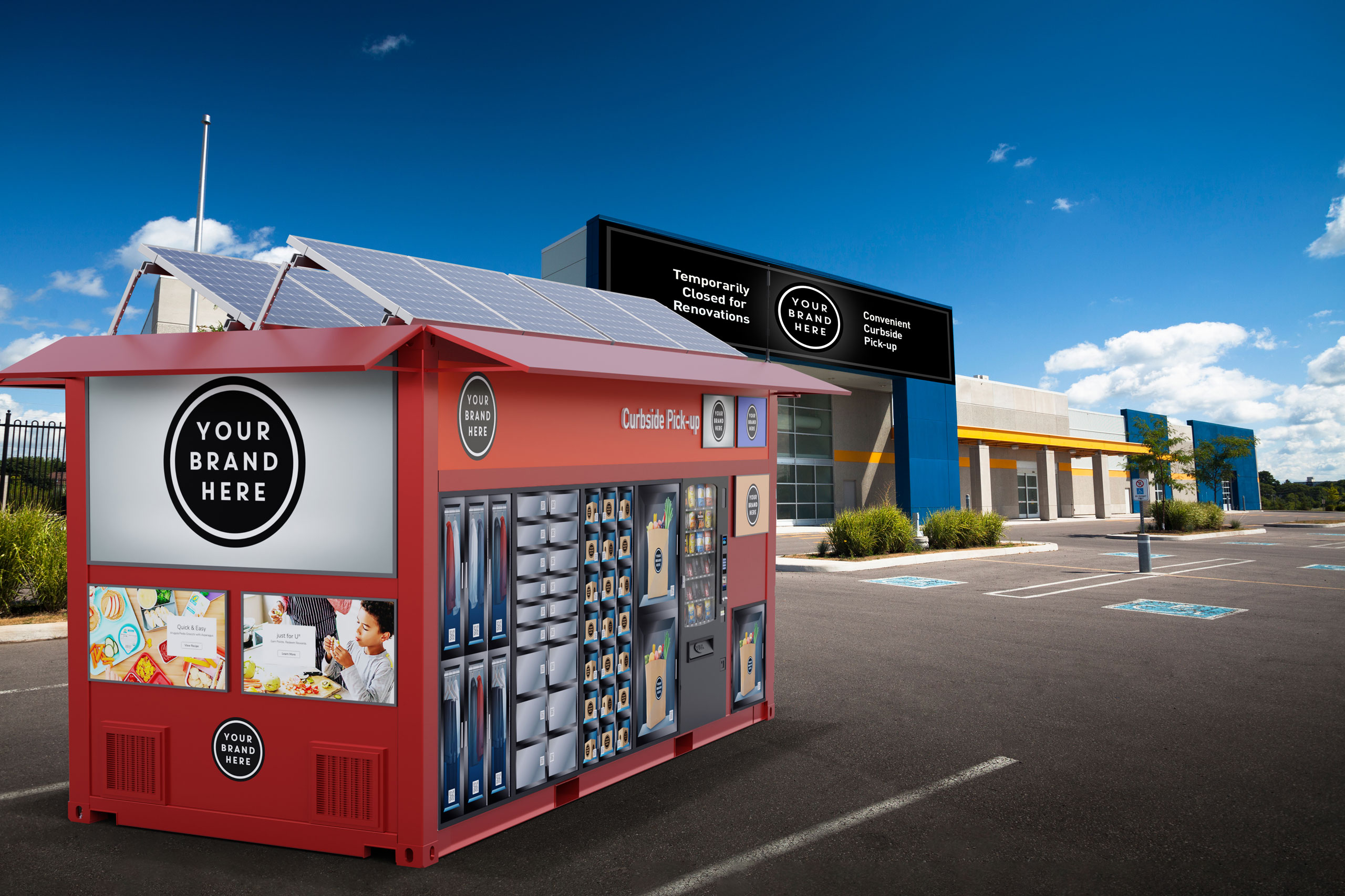
Because no physical product existed, we built one digitally. Detailed 3D renderings placed the CX popup units and VX vehicle in real-world environments, while animated product stories demonstrated deployment, shopping, pickup, restocking, and customer interaction, turning a static idea into a working retail experience.
Website & Launch System
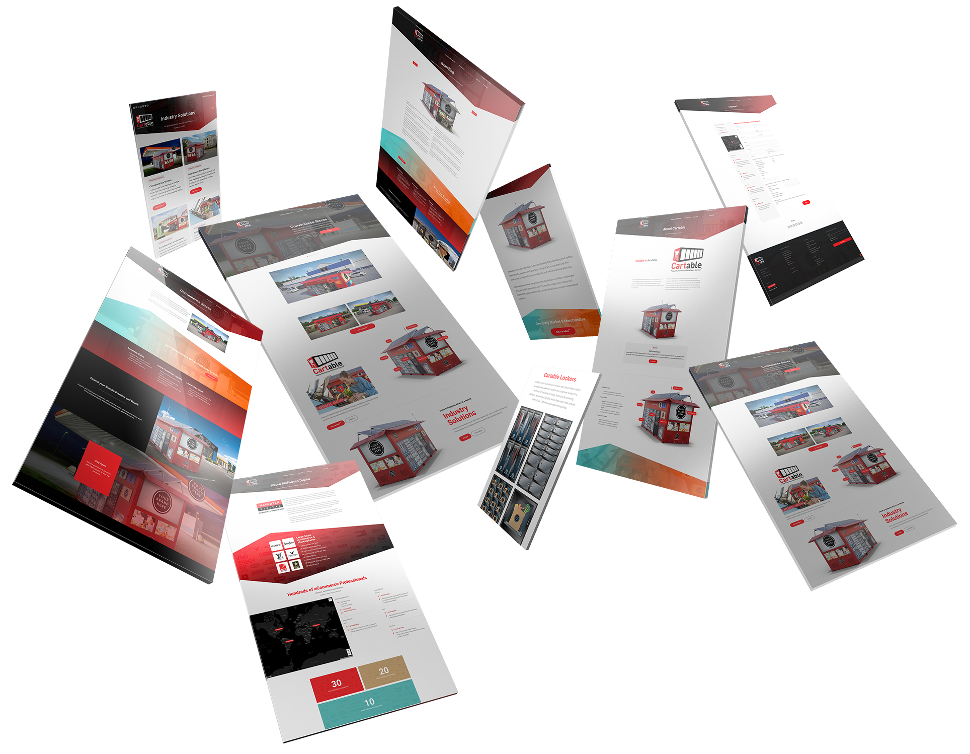
We designed a robust website and supporting launch materials that explained the full offering clearly. The site connected product benefits, industry applications, operating model, merchandising, analytics, advertising, and service opportunities into one coherent experience.
The Through-Line
Piece by piece, an idea that lived in a slide deck became a product the market could see, trust, and act on.
The name made the idea portable, giving an unfamiliar concept a word people could carry into any conversation. The logo made the product recognizable, turning the container form itself into a mark that says what Cartable is at a glance.
The renderings made it visible, placing a product that did not yet exist in the parking lots, campuses, and job sites where it would live. The animations made it understandable, showing how a unit arrives, opens, and serves its first customer.
The website made it explainable, organizing an entire operating model around the questions people actually ask. The launch system made it believable, giving every early conversation the weight of a finished brand.
The system was built to change the question in the room, from what is this? to where can we put one? Once that shift happens, belief has done its work.
Every Deliverable Served the Same Purpose.
Discovery + Strategy
Before design, we defined the product the market needed to believe in.
Product Definition
Before design could begin, the product needed a clear mental model. We helped define Cartable not only as a storefront, but as an autonomous retail service connecting commerce, fulfillment, inventory, data, and customer convenience.
Brand Positioning
Bright, modern, portable, and practical. The brand needed to feel inventive without becoming abstract, technical without feeling cold, and flexible enough to support retailers, property managers, universities, events, and commercial environments.
Audience Architecture
Different audiences needed different reasons to believe. Retailers saw new revenue opportunities. Property managers saw resident convenience. Universities saw campus access. Events saw flexible vending. Operators saw a deployable retail system.
Industry Applications
We translated the same core platform across multiple use cases, including apartment complexes, convenience stores, construction and industrial sites, grocery, retail, sporting events, universities, and other environments where customers already gather.
Go-to-Market Story
Cartable needed to explain what it was, how it worked, where it could go, and why it mattered. The brand system turned a complex operating model into a clear launch story for an industry-facing debut.
Credibility Architecture
A product that does not yet exist earns trust through evidence. Renderings, animation, and use-case detail were sequenced to answer doubt before it formed, making the system feel proven before the first unit shipped.
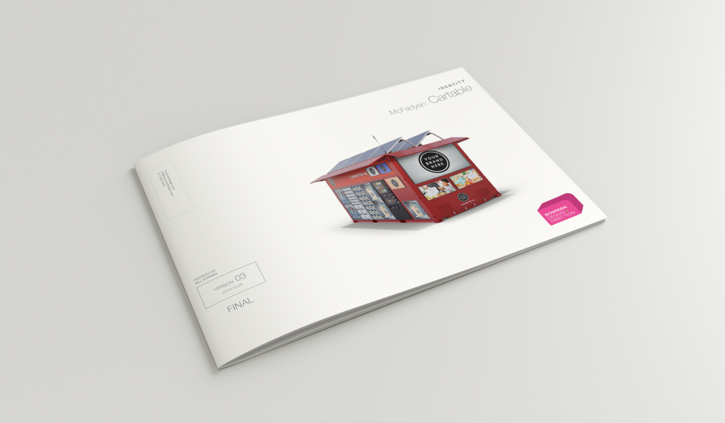
Brand Identity
Cartable’s identity was designed to make an unfamiliar retail concept immediately understandable. Rather than relying on abstract symbolism, the logo draws directly from the product itself, transforming the autonomous retail unit into a distinctive, memorable mark. The angled shipping-container silhouette and integrated locker system communicate mobility, accessibility, and self-service in a single graphic. The bold red accent introduces energy and visibility while reinforcing the idea of retail in motion, balanced by black and neutral tones that convey reliability, technology, and industrial precision.
Combined with modern typography and a clean visual system, the identity positions Cartable as both a forward-looking technology platform and a practical business solution, capable of serving customers wherever demand exists.
The system was also built to be shared. Because every unit carries retailer and partner branding of its own, the identity was engineered to frame other brands without competing against them, holding its presence on a locker door, a vehicle wrap, or a website header while leaving room for the businesses Cartable serves.
Color System

Style Guide
Product Visualizations
Product Visualization + Animation
The most important challenge was credibility. Cartable had to feel real before it was real.
With no physical prototype, product photography, or finished manufacturing, Bowman Design Direction created the product digitally. Through 3D modeling, rendered environments, and animated sequences, the CX popup units and VX vehicle became visible, understandable, and believable.
These visualizations did more than show what Cartable might look like. They demonstrated how the system could operate, how customers could engage with it, how products could be retrieved, and how autonomous retail could live in the real world.
Animation carried the final step. Watching a unit deploy, stock, and serve a customer answered questions no still image could: how it moves, how it opens, and how it fits into the rhythm of a parking lot, a campus, or a job site.
Products in the Field
Illustrations

Website + Digital Experience
The website translated a complex retail ecosystem into a clear, navigable story.
Rather than overwhelming visitors with technology, the experience organized Cartable around practical questions: what it is, how it works, where it can go, who it serves, and why it matters.
Messaging, illustrations, product renders, and use-case content worked together to make a new business model feel accessible and actionable.
The result was a digital platform that could support sales conversations, trade-show interest, investor understanding, and industry education, giving McFadyen Digital a polished foundation for launching Cartable to the market.