Trove
A beautiful design. A publishing system that keeps it that way.
Trove arrived with a strong creative foundation: a brand evolved by creative director David Merkoski and a desktop interface designed by Alex Modugno. Bowman Design Direction helped shape where that vision went next—recommending the circular mark and warehouse film, extending the experience across tablet and mobile, and engineering the publishing system that would preserve it.
Beautiful websites fail if marketers cannot safely maintain them.
Bowman Design Direction led development direction: translating the design into a custom WordPress platform, modeling the content beneath it, and engineering a publishing architecture where content and presentation evolve independently, each governed on its own terms.
Read the Story
Challenge
Trove partners with brands like Levi’s, Patagonia, REI, and Nordstrom to power circular shopping: customers trade in what they bought, brands resell it, and everyone gains, including the planet. The new website had to carry that story with the same care the design team had put into telling it.
The design pushed further than common tools support: scroll-driven storytelling, an animated infographic, layouts that flex without breaking. And it had to keep publishing at the pace of the business, with news, campaigns, and landing pages moving faster than any launch team could stay involved.
Direction
We treated the design as a contract. Every template, model, and field was engineered so that what Merkoski and Modugno designed is exactly what publishes, no matter who edits the site or when.
That meant a custom WordPress architecture built on a clean separation: content lives in structured fields, presentation lives in templates, and guided forms join them at publish time. Each evolves without disturbing the other.
Outcome
Trove launched with a website that renders the original design faithfully on every screen, from the animated Cycle of Circular Shopping to scroll-driven storytelling that survives the trip to mobile.
More important is what the platform became after launch. When Trove was ready for PR, the team extended the platform, adding a dynamic news blog, new landing pages, and a HubSpot-integrated contact experience, each published through the same governed architecture.
Takeaway
Handoffs are where ambitious design goes to die. A site launches perfectly, then erodes one edit at a time, until the portfolio screenshots are the only place the design still exists.
This engagement was engineered against that fate. The most creative decision on this project was refusing to let the design depend on vigilance. The architecture separates content from presentation, and the system publishes the vision correctly no matter who is in the room. That is how a beautiful launch became a durable platform.
What We Built
Design Translation
David Merkoski evolved the brand and Alex Modugno designed the interface. Our job was fidelity: translating their vision into a living website that honors every proportion, animation, and typographic decision at every screen size.
Content Architecture
Beneath the design we organized the content itself, so one body of writing serves every layout without being retyped, duplicated, or broken. The design stays whole because the content underneath it is.
Guided Publishing
In place of an open page builder, marketers get guided forms. Fill in the fields and the system assembles the design around the content. Publishing needs no code, and the brand stays consistent at any pace.
Motion & Storytelling
The animated Cycle of Circular Shopping turns Trove’s operating model into a story a visitor follows in seconds, and scroll-driven sequences carry that motion through the site without costing performance.
The Through-Line
The design did not merely survive its handoff. It grew stronger with every page.
Launch day is easy. The design always survives launch day. The test is the hundredth edit, and that is what this system was built for. The templates still hold their proportions. The models still feed every layout from one source of truth. The guided forms still assemble on-brand pages for editors who have never opened a design file.
The Cycle of Circular Shopping still moves the way it was choreographed, on a phone in a warehouse aisle as faithfully as on a boardroom screen.
The blog that shipped after launch still looks designed. The landing pages still hold the grid. The HubSpot forms still feel native to the brand they serve.
That is what development direction means here. Two designers set a standard, and the system refuses to let the website fall beneath it.
Every Deliverable Kept the Design Intact.
Discovery + Strategy
Before development, we separated what changes daily from what must never drift: the content and the design.
Platform Strategy
Every platform decision served the same architecture. WordPress won on control: we could rebuild it completely, shaping the platform around the design on one side and the marketing team on the other.
Design Fidelity
Fidelity was the specification. What Merkoski and Modugno drew is what publishes: same proportions, same rhythm, same typography, on the day the site launched and on every day since.
Audience Architecture
Trove speaks to brands, not shoppers. An executive at Levi’s or Patagonia has to understand circular commerce in minutes and believe Trove can carry their name. The design earns that belief. The architecture keeps it consistent.
Content Modeling
We mapped every kind of content the site would ever hold, then gave each one a home the design already understood. Write it once, and it appears correctly wherever the story needs it.
Marketing Enablement
Governance earns its keep by making people faster, not slower. Guided forms, ready defaults, and HubSpot integration mean the marketing team publishes on a Monday morning without waiting for a developer.
Responsive Translation
An ambitious desktop design earns nothing if tablet and mobile are afterthoughts. Every sequence, infographic, and layout was rethought for small screens rather than squeezed into them.
Design Translation
Trove’s identity was already in capable hands, and we helped shape where it went next. The original mark was rectangular. We recommended evolving it into a circle, reflecting the company’s purpose in the circular economy and reinforcing the idea of products returning to the marketplace rather than ending up discarded. Creative Director David Merkoski evolved the identity beautifully while Alex Modugno designed an interface with the calm confidence of the global brands Trove serves.
We recognized another opportunity just as quickly. Trove’s differentiator wasn’t simply technology. It was the care, precision, and choreography happening inside its warehouse every day. We recommended telling that story through film, allowing prospective partners to understand the operation in seconds rather than paragraphs. Pedal Born Pictures brought the concept to life beautifully, from the warehouse floor to sweeping drone footage that revealed the scale of the operation. Direction sometimes means creating; sometimes it means recognizing the right idea and empowering exceptional collaborators to execute it.
Our work began where the design files ended. David and Alex delivered an ambitious desktop vision, but the experience still needed to live across tablets, mobile devices, and the realities of everyday publishing. We challenged the team to think beyond desktop, documented responsive behavior directly in Figma, and translated every layout into a durable WordPress publishing system. Every animation served the story rather than decoration. Every template preserved the integrity of the design. Every component became reusable without requiring a designer, no matter who published the content or what device the audience used.
The measure of success was invisibility. Nothing about the finished website suggests a second team engineered it. It simply behaves exactly as the design promised, from a cinema display to a phone, while giving marketers the confidence to publish freely without compromising the work that came before. That is the quiet ambition of development direction: protecting the promise of the design long after launch day has passed.
Creations
Trove
Website + Publishing System
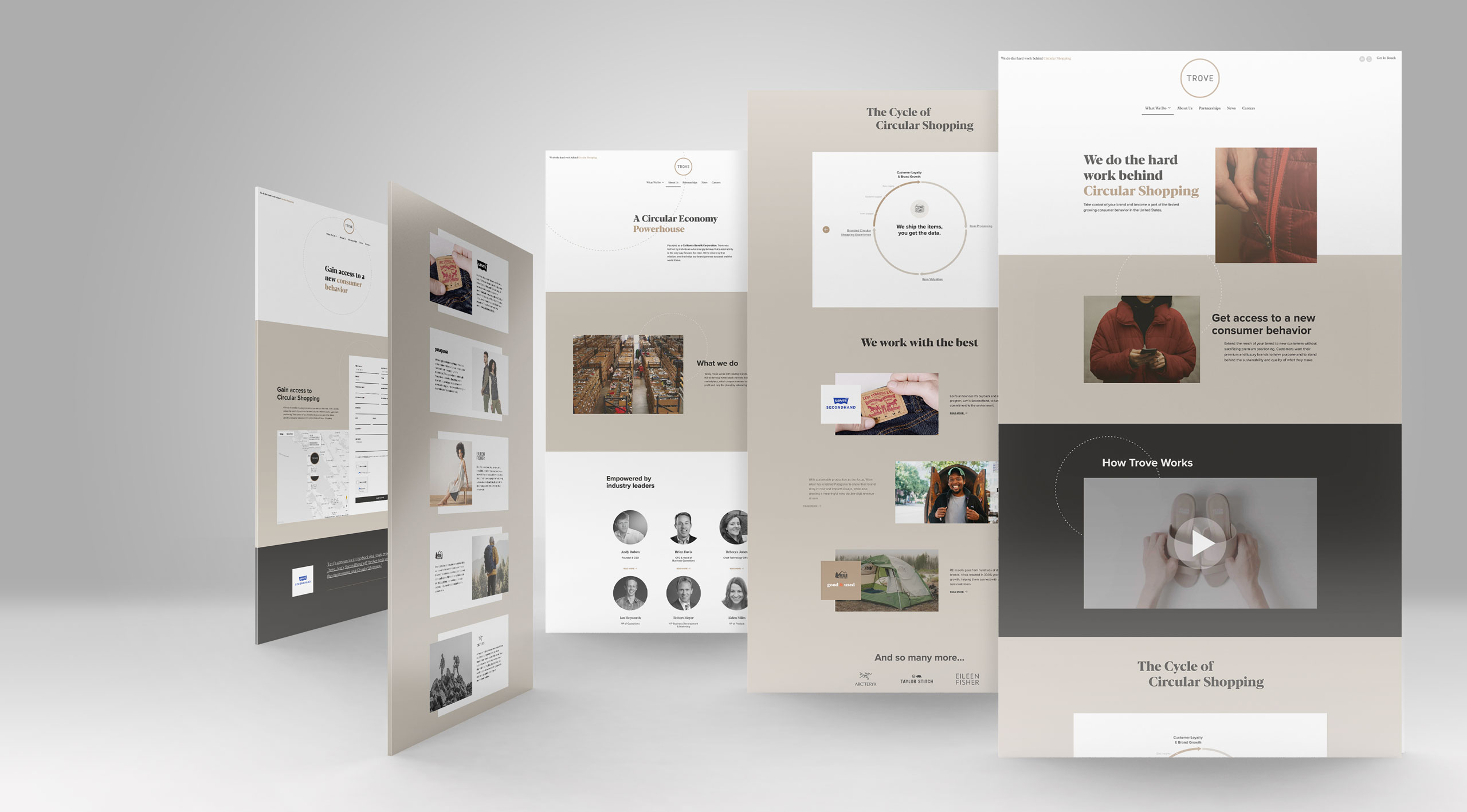
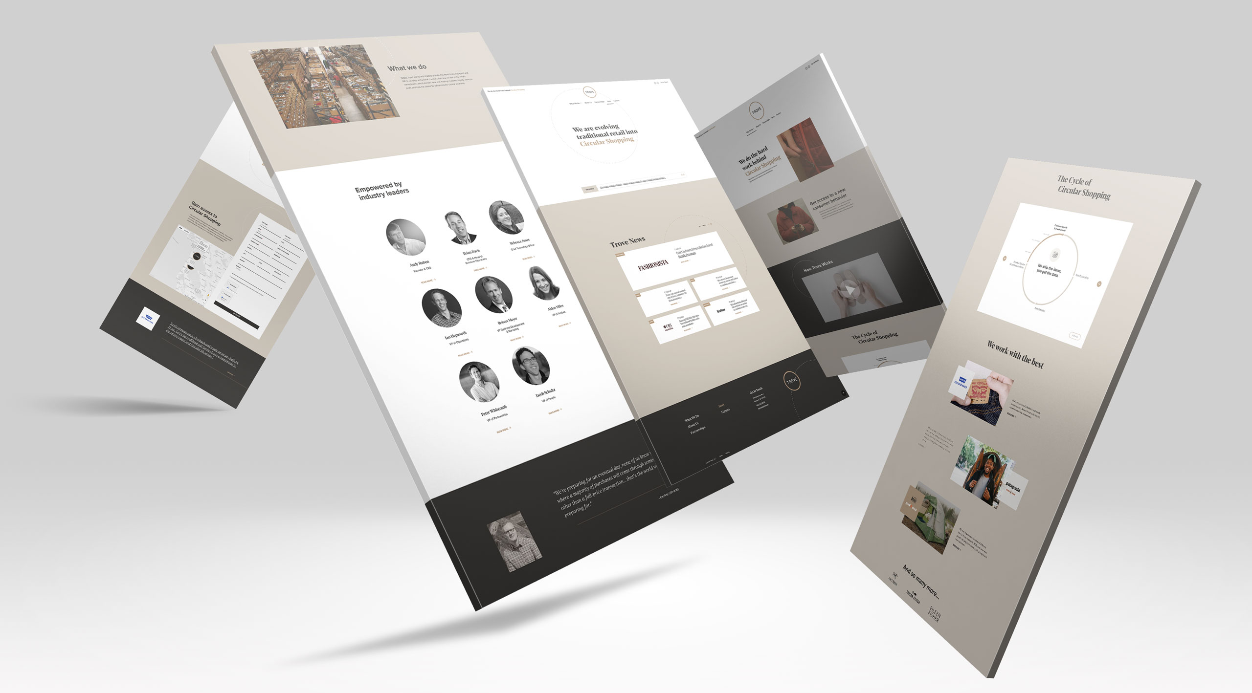
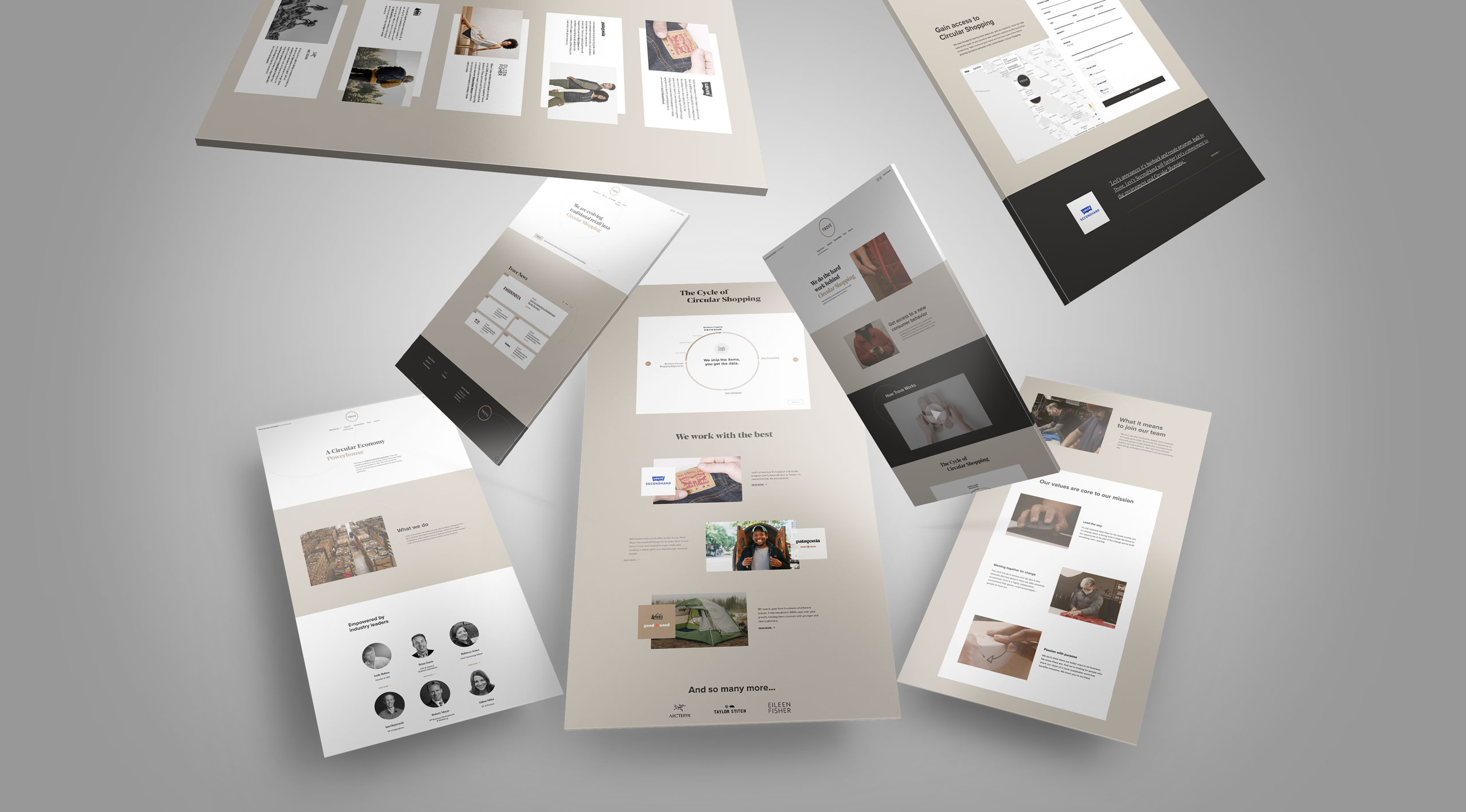
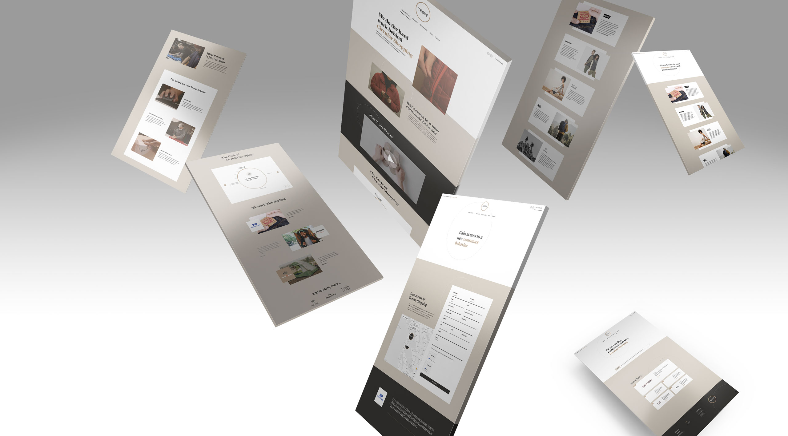
The finished platform serves two audiences at once. Brand executives discover what circular shopping is, how Trove powers it, and why brands like Levi’s, Patagonia, REI, Eileen Fisher, ARC’TERYX, Taylor Stitch, and Nordstrom trust the platform to represent their products. Trove’s marketing team inherits something equally valuable: a publishing system that lets them continue telling that story without compromising the design that earned attention in the first place.
Rather than treating every page as a one-off design, the platform reveals relationships through structured templates, reusable components, and guided publishing. Editors focus on the story. The system quietly preserves everything that makes the brand recognizable.
Animated Infographic
Circular shopping is simple once you see it, but difficult to explain with paragraphs alone. The Cycle of Circular Shopping transforms a complex operating model into a visual story that unfolds as visitors scroll. Trade-in becomes renewal. Renewal becomes resale. Resale becomes loyalty. In a matter of seconds, visitors understand a business model that once required presentations and lengthy conversations.
The animation was never decoration. It became one of the website’s strongest communication tools because movement explained relationships that static graphics could not.
CMS Engineering
The CMS is where ambitious designs usually go to die, so it is where the architecture went deepest.
Marketers never touch code or layout. Instead, they work through guided publishing forms that separate content from presentation, giving the marketing team complete freedom to evolve the story. Pages change. Campaigns change. News changes. The design remains consistent.
Good publishing systems distinguish between what evolves and what endures. Content grows with the business. The structure that gives the brand its identity stays steady. The CMS was engineered around that principle, giving marketers genuine freedom without asking them to become designers.
Responsive Translation
Responsive development was not shrinking the desktop design. It was preserving its intent as the conditions changed.
Layouts reflowed to maintain hierarchy as available space changed. Typography, spacing, and imagery were recalibrated at each breakpoint; animations adapted to smaller screens; touch targets and interaction patterns were rebuilt for hands instead of cursors; and reusable components changed behavior without losing their visual relationships.
Across every screen size, the system protected the relationships that made the design recognizable. Content could move, stack, crop, or pause, but the idea stayed intact.
That consistency made the platform more than a faithful launch. Each new story inherits the same hierarchy, movement, and responsive behavior automatically, so Trove can publish faster without choosing between flexibility and visual fidelity. The website can keep growing with the brand.