










Creations
Mystic Fitness
Mystic Fitness
Building a brand around movement, community, and personal transformation.
Mystic Fitness wasn’t selling yoga classes.
It was creating a place where people could reconnect with themselves through movement, challenge, and community.
The culture was already there. It just couldn’t be seen from outside.
Bowman Design Direction partnered with Mystic Fitness to translate that philosophy into a cohesive brand system spanning identity, photography, digital experiences, advertising, environmental graphics, and ongoing content marketing, creating a business that felt as authentic online as it did inside the studio.
Read the Story
Challenge
Mystic Fitness had built an incredibly loyal community, but its brand failed to communicate the warmth, energy, and philosophy that made the studio unique. New students encountered an outdated identity, inconsistent messaging, and very little authentic photography, leaving the studio’s most compelling strengths hidden behind an ordinary first impression.
Without a cohesive digital presence, its strongest differentiators were largely invisible online: the teachers, the welcoming community, and a transformative approach to hot yoga. The challenge wasn’t attracting new students. It was earning their trust before they ever walked through the door.
Direction
Rather than beginning with design, we started by understanding the owner’s philosophy and the community she had built.
Discovery revealed that Mystic Fitness wasn’t simply teaching yoga.
It was creating an environment where students challenged themselves, supported one another, and developed lasting physical and emotional confidence.
That insight became the foundation for the brand. Every decision that followed needed to make the experience inside Mystic Fitness visible to someone who had never been there.
Outcome
Mystic Fitness emerged with a brand that reflected the energy, optimism, and sense of belonging students already experienced inside the studio. A cohesive identity, authentic lifestyle imagery, immersive website, merchandise, and integrated marketing created a unified experience across physical and digital touchpoints.
The system expanded awareness beyond existing members while strengthening loyalty within the community. Seasonal campaigns increased promotional revenue, and the studio gained a scalable foundation for continued growth without sacrificing the authenticity that had made it successful in the first place.
Takeaway
Great brands don’t manufacture community. They reveal it.
For Mystic Fitness, success didn’t come from designing a better logo or building a better website. It came from uncovering the philosophy that already inspired its students and translating that belief into a brand people could experience before they ever walked through the door.
When people could experience the culture before they ever attended a class, choosing Mystic Fitness became less about buying a membership and more about joining a community.
What We Built
Brand & Identity
Identity had to feel like the studio, not describe it.
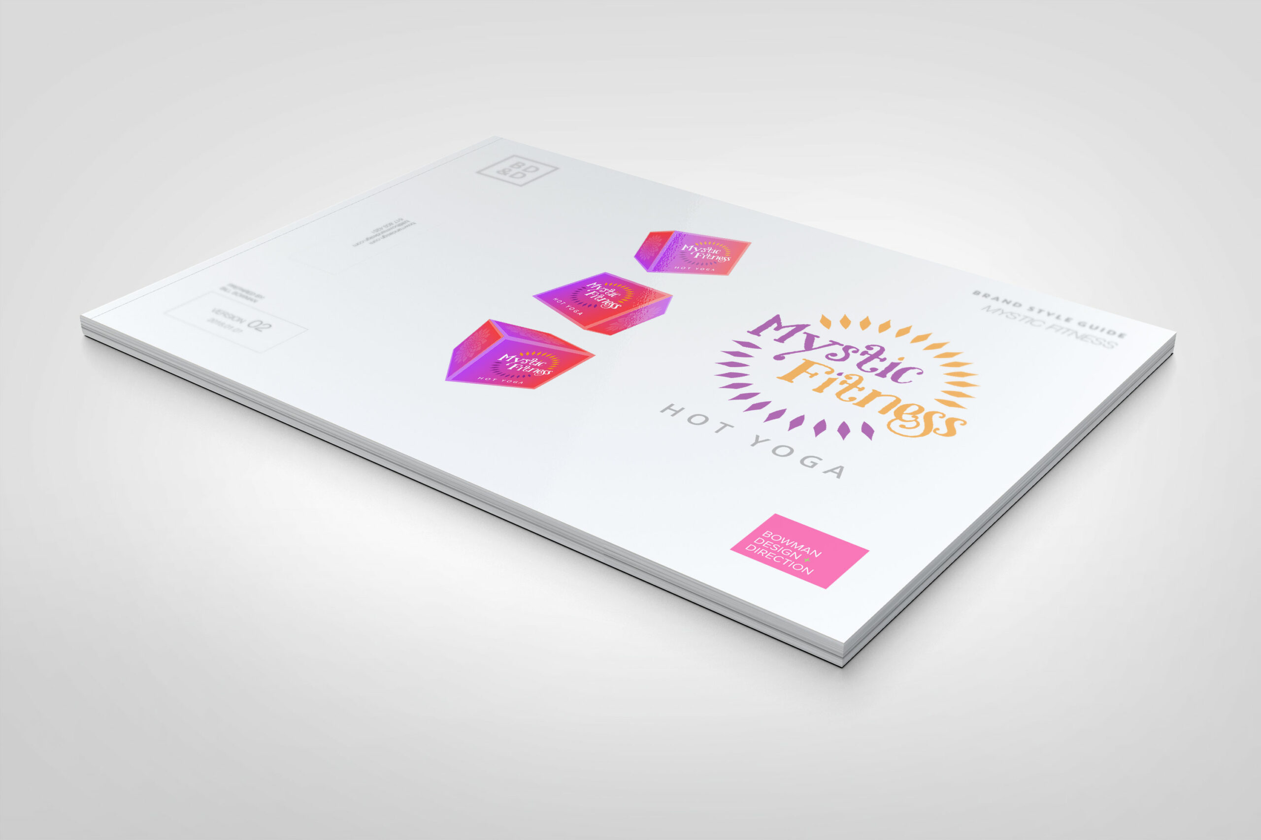
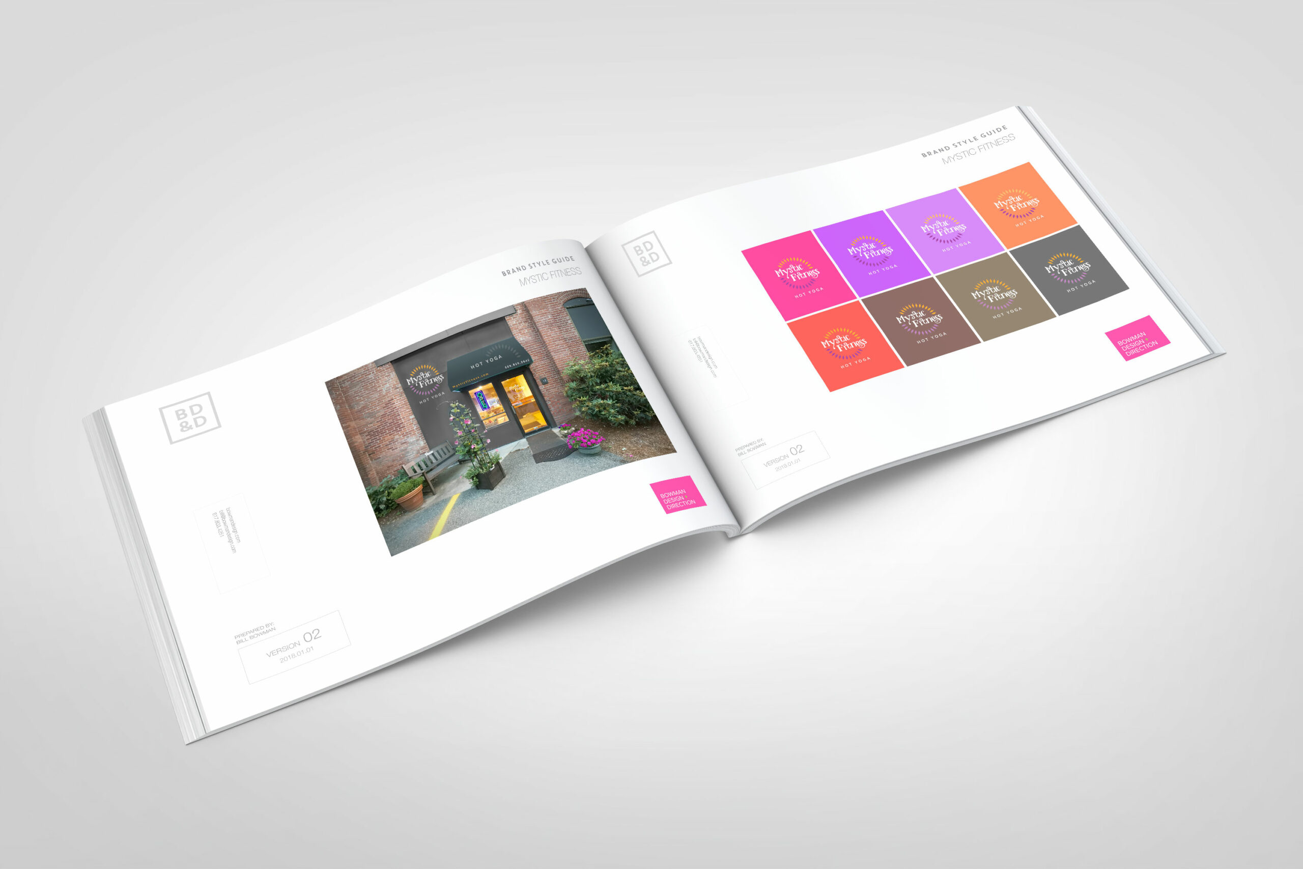
We developed a visual system rooted in movement, warmth, and optimism: logo, color, typography, and a style guide that gave Mystic Fitness a recognizable personality and held it consistent across every touchpoint, from the studio wall to the checkout screen.
Lifestyle Photography
The community became the brand.
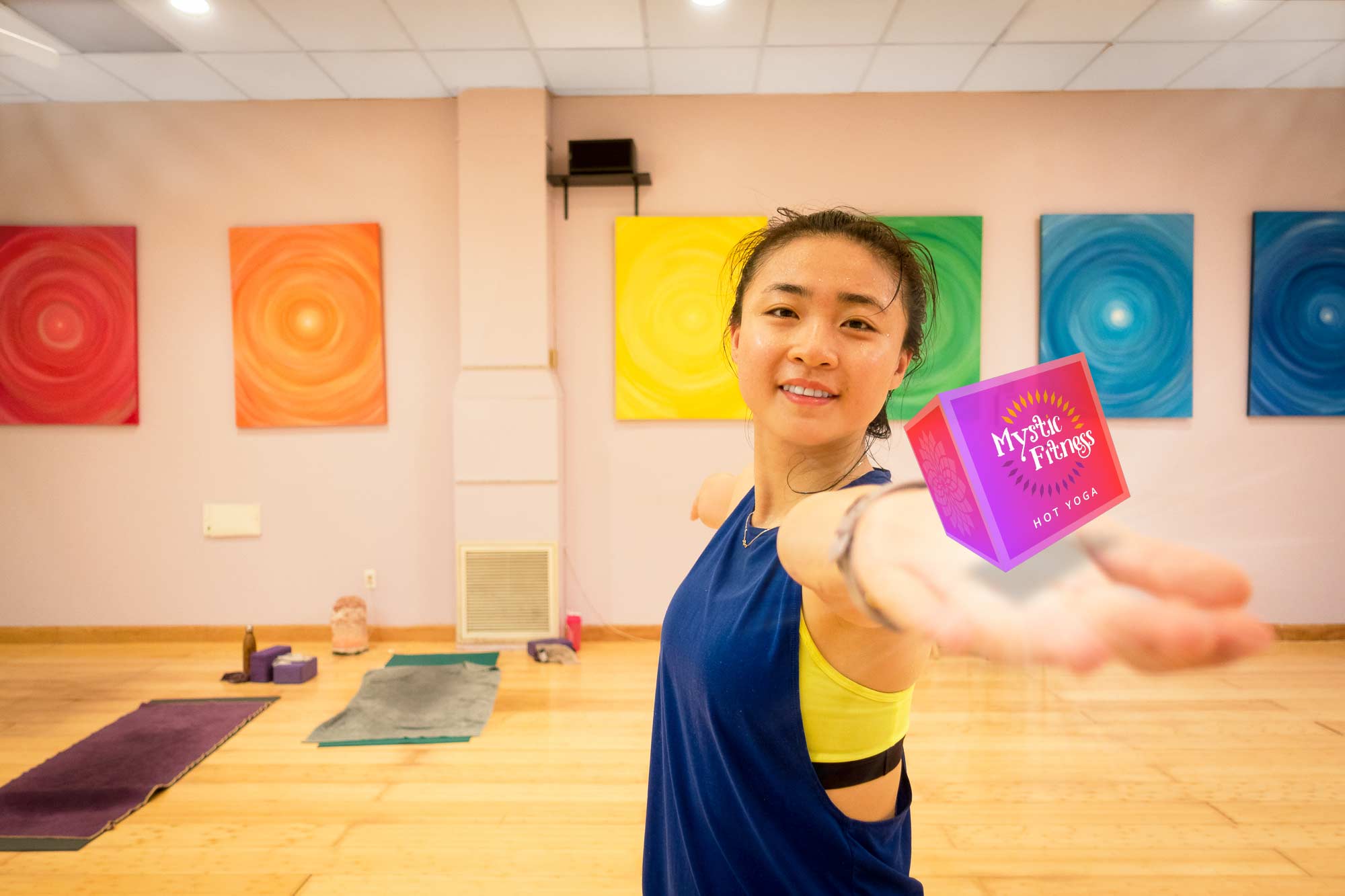
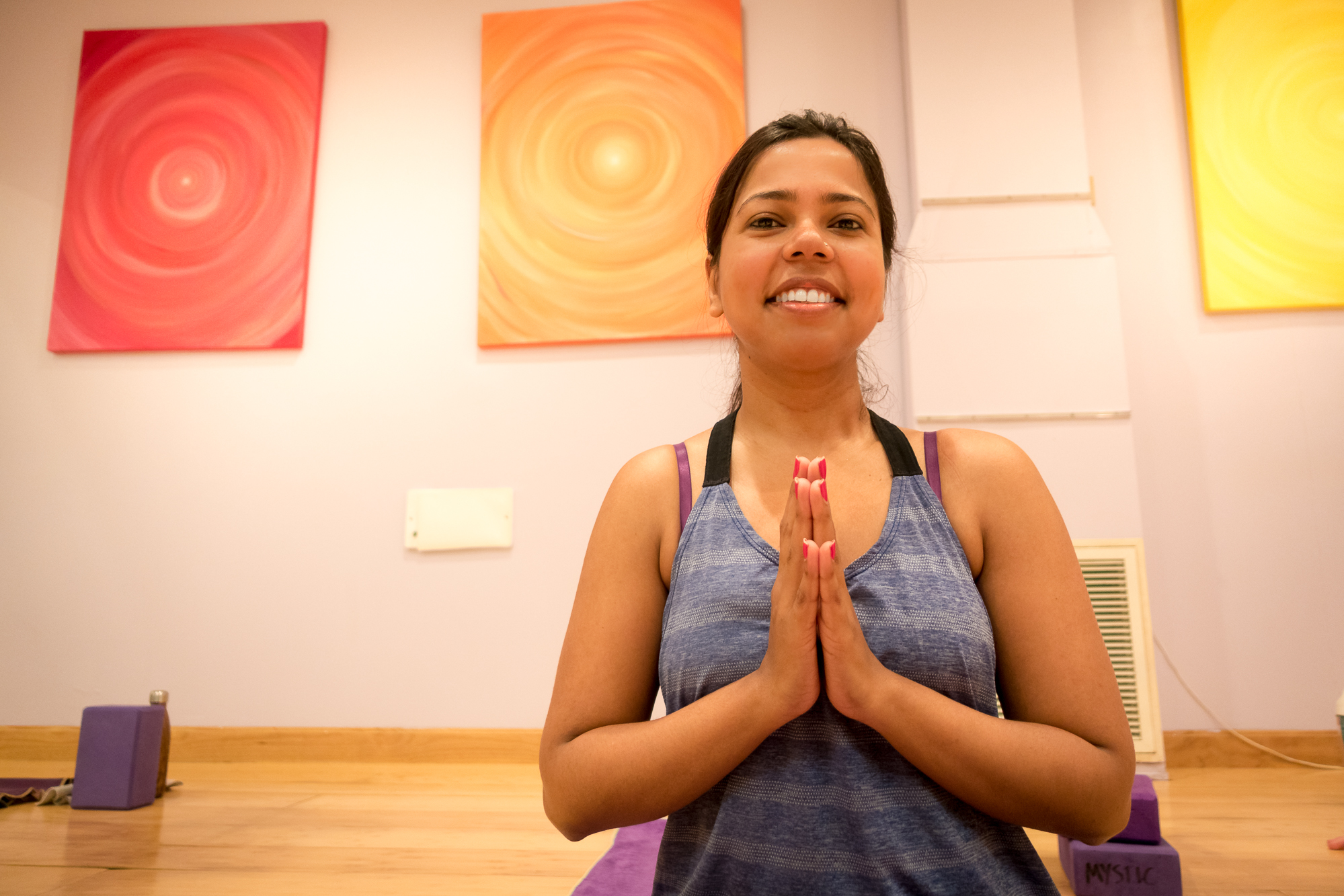
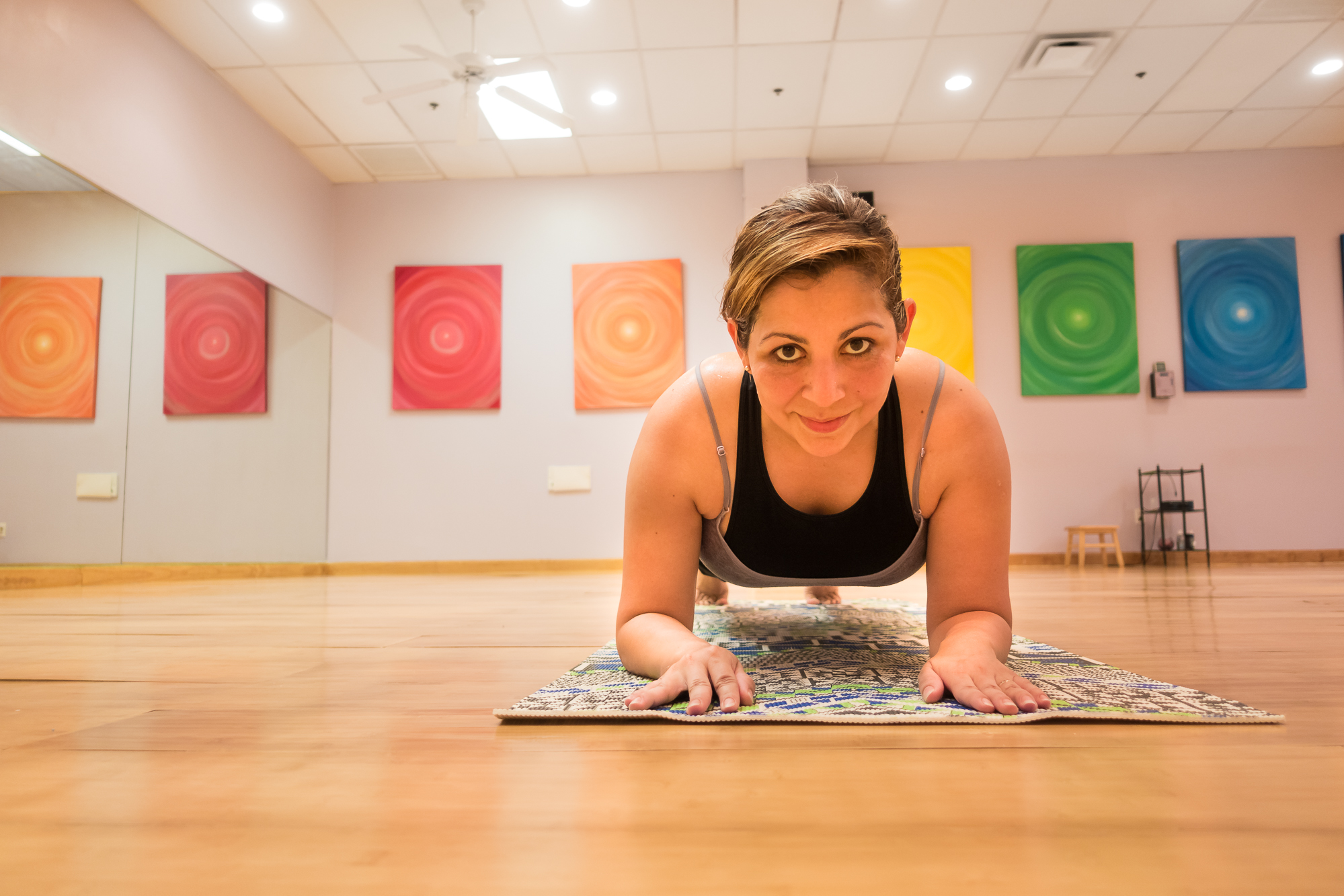
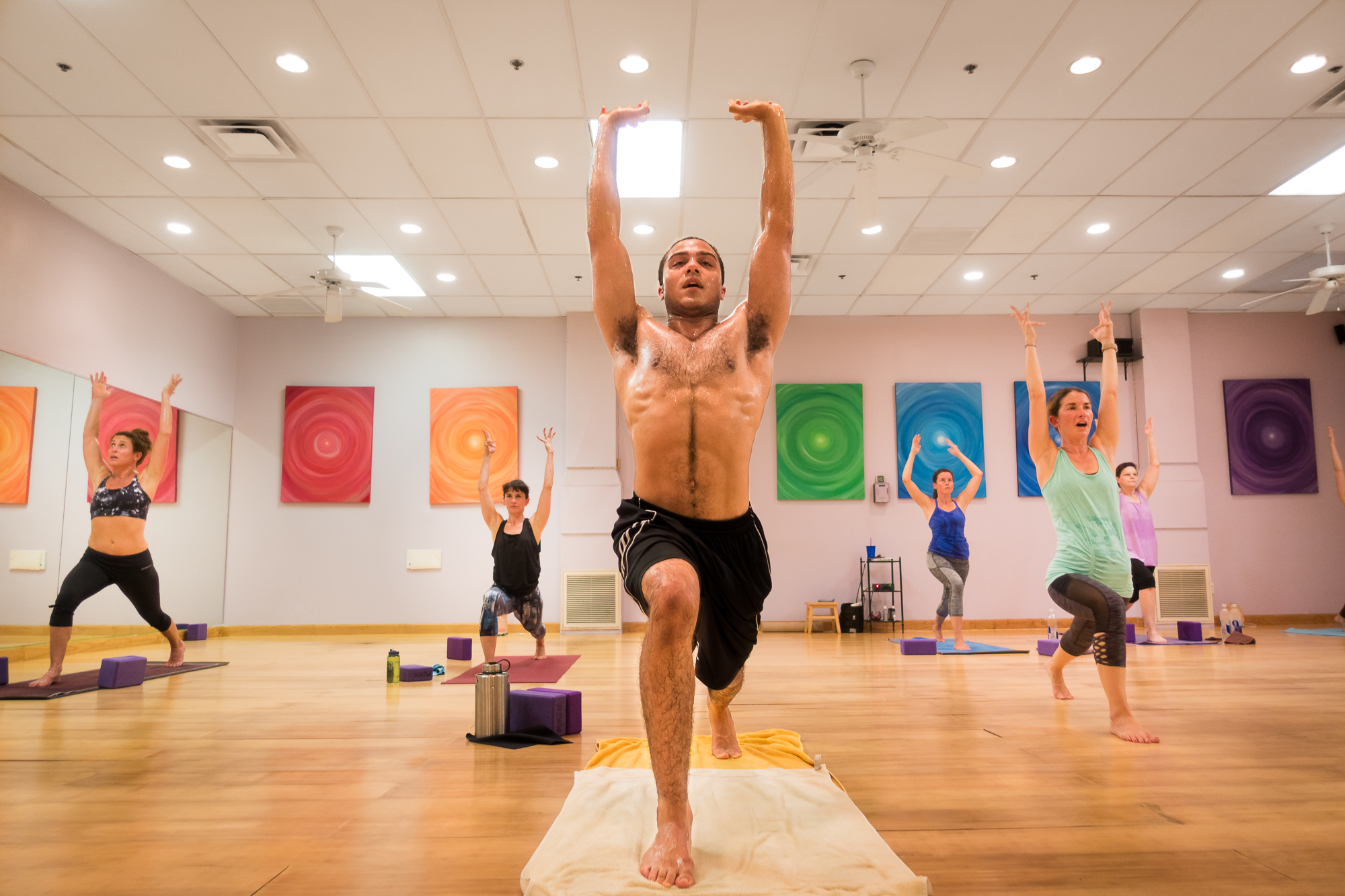
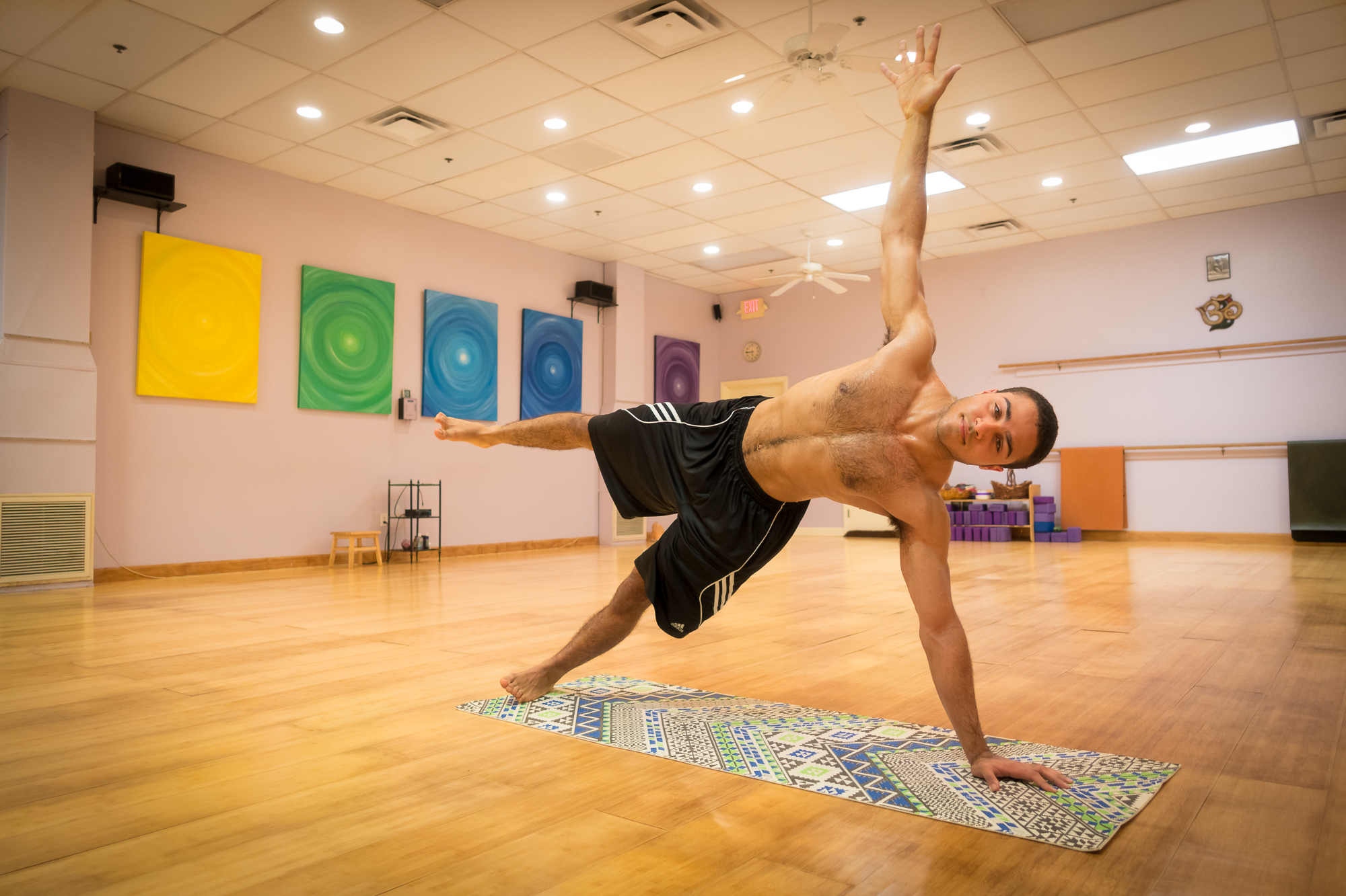
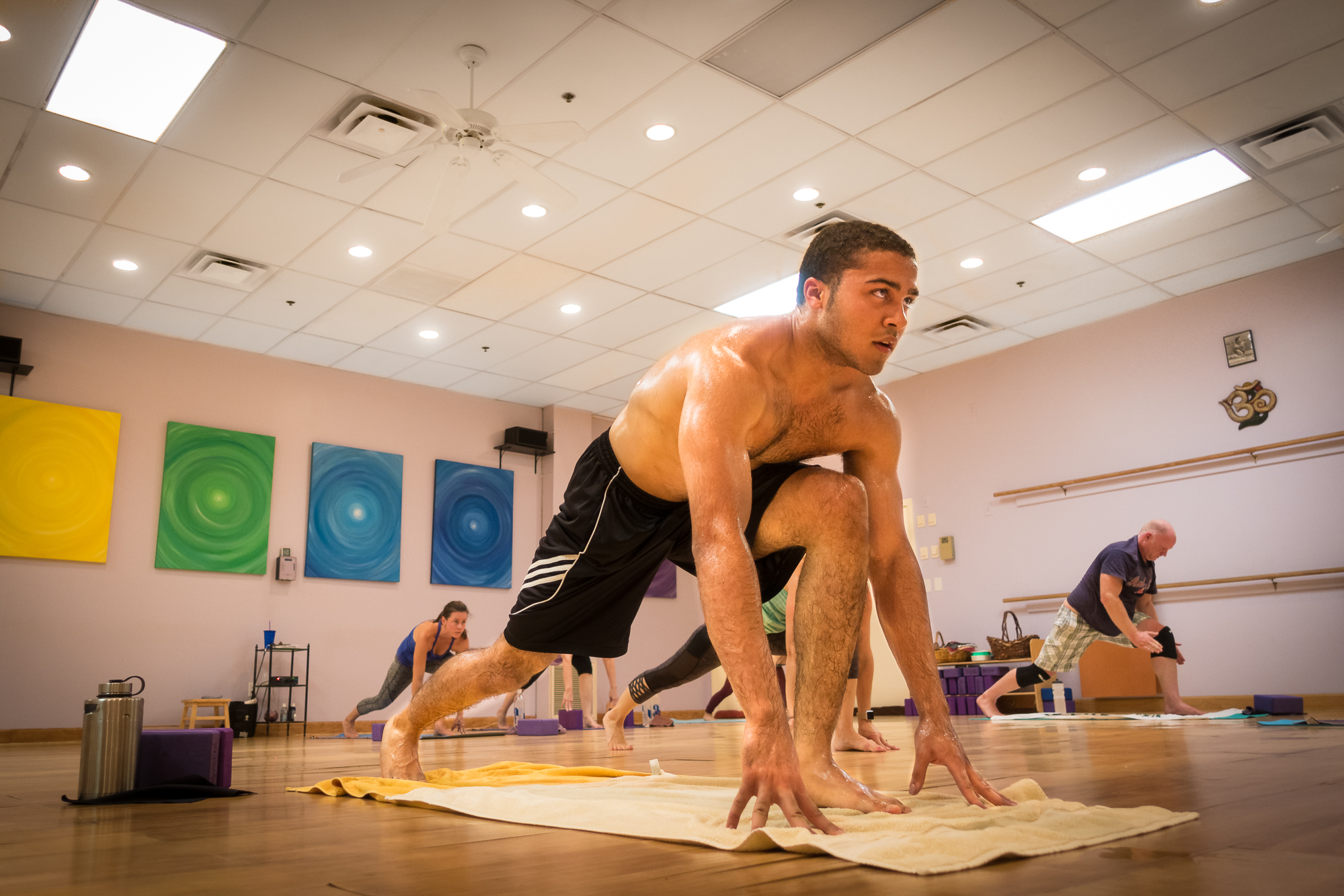
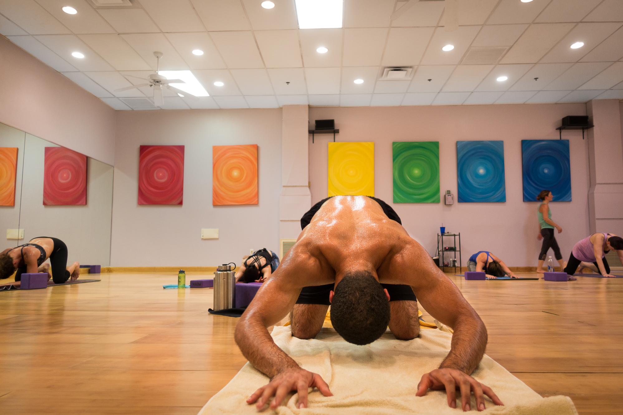
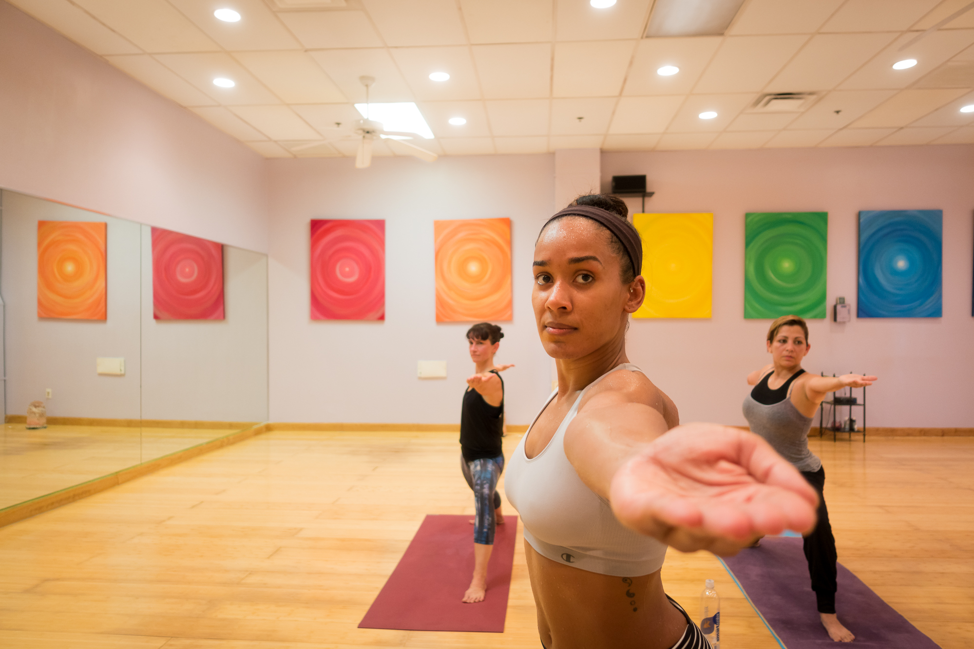
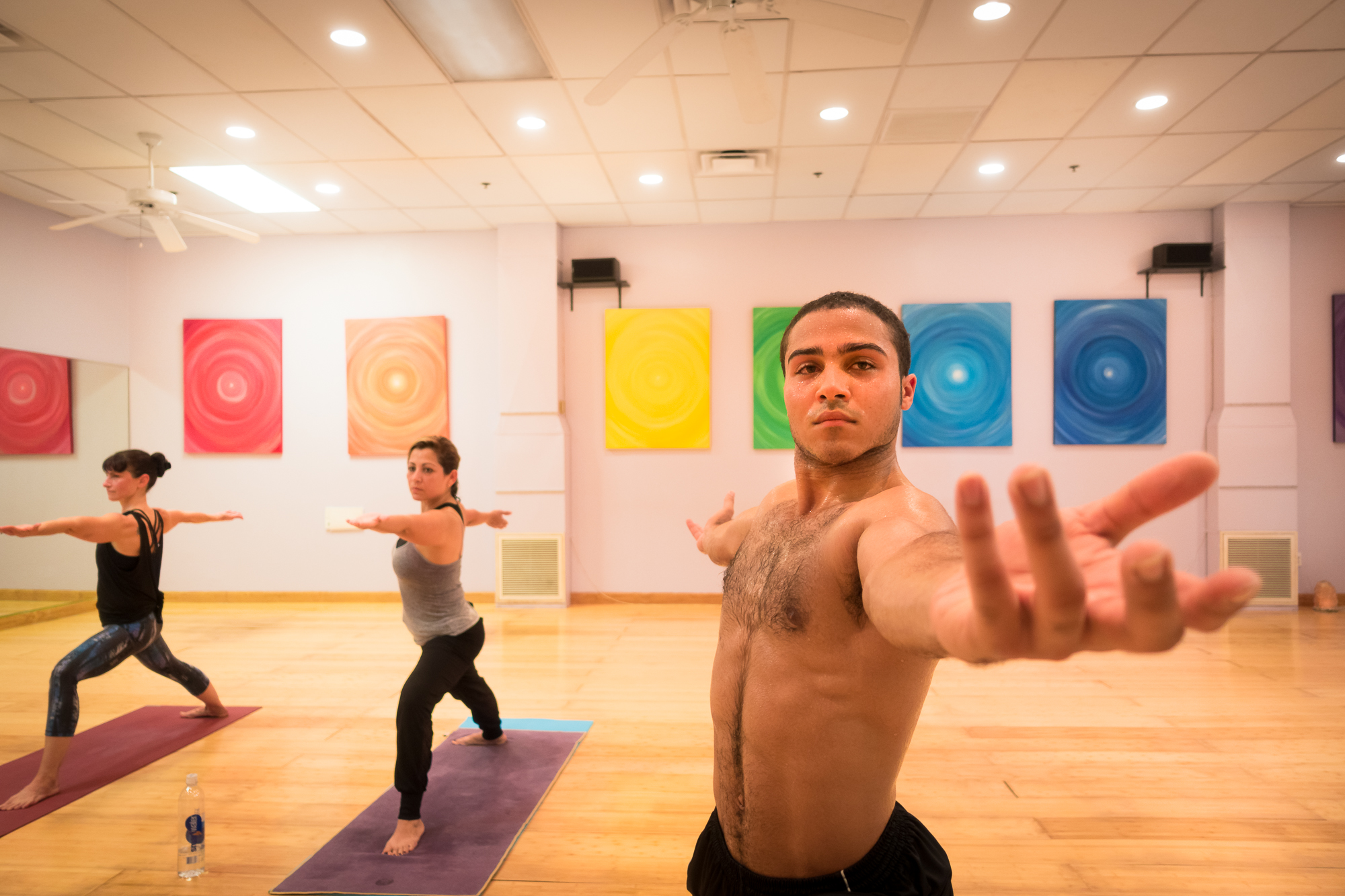
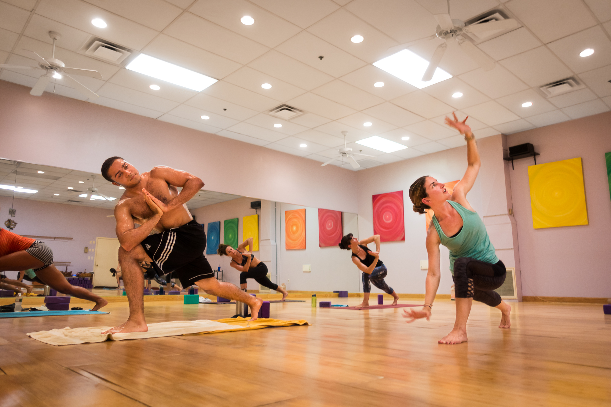
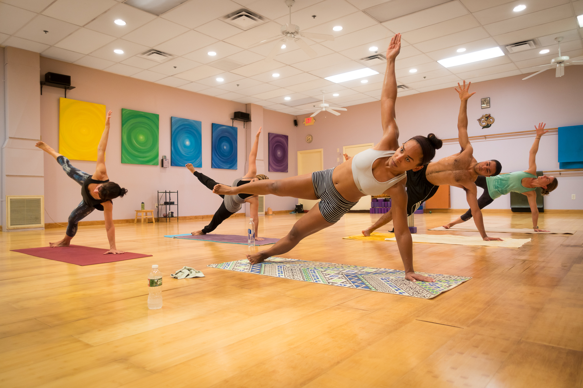
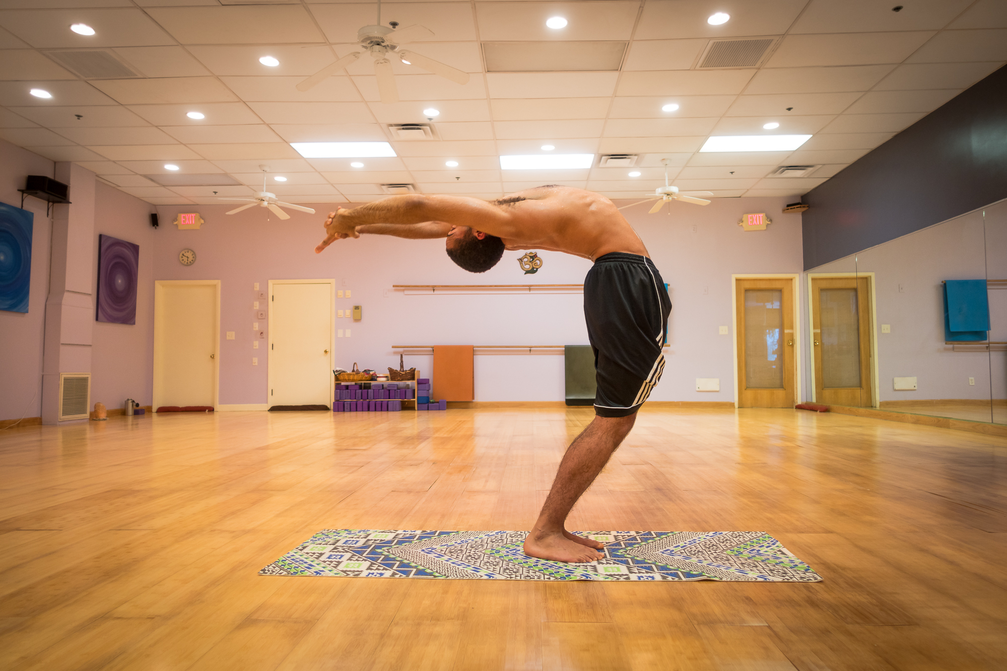
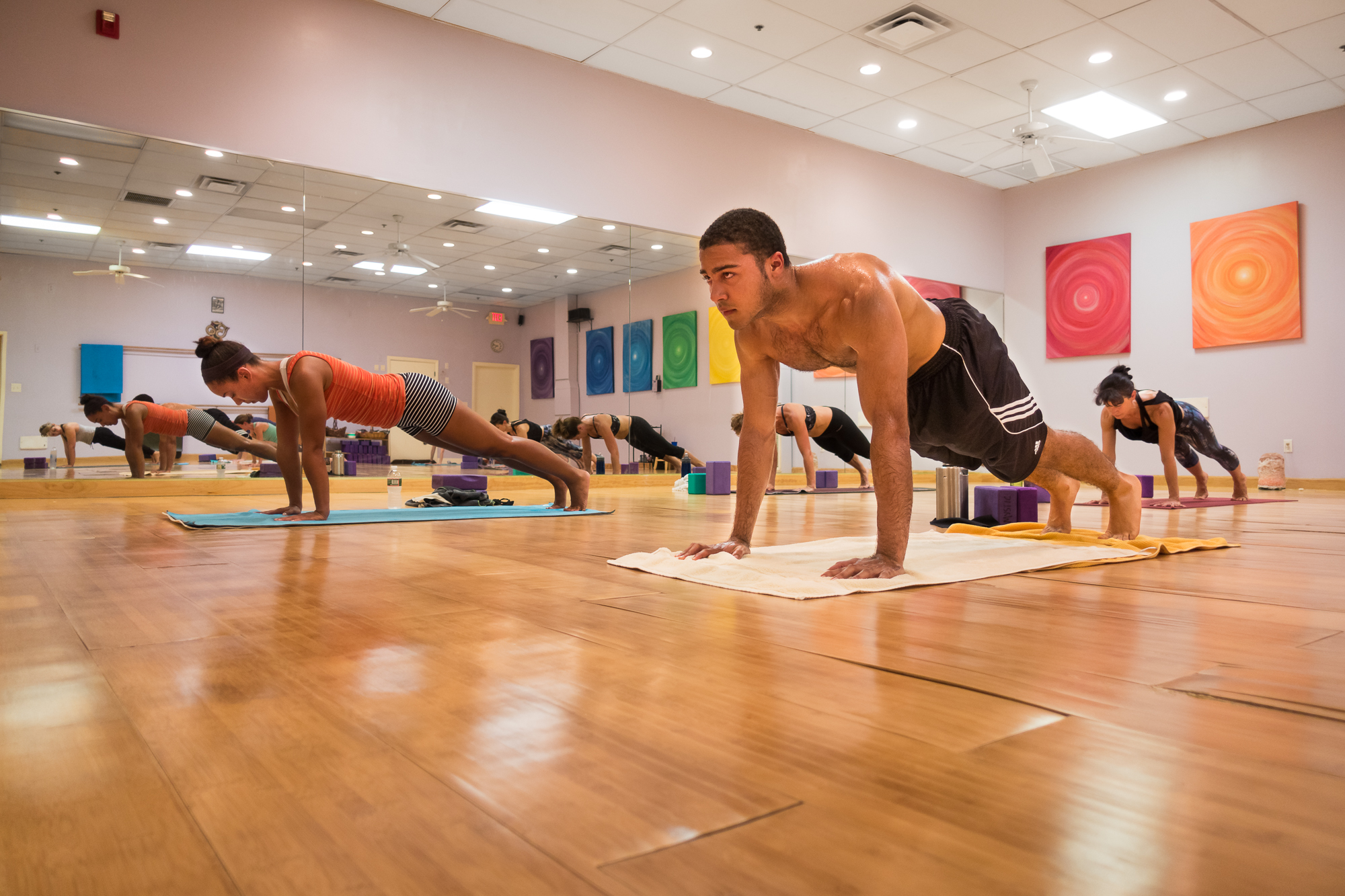
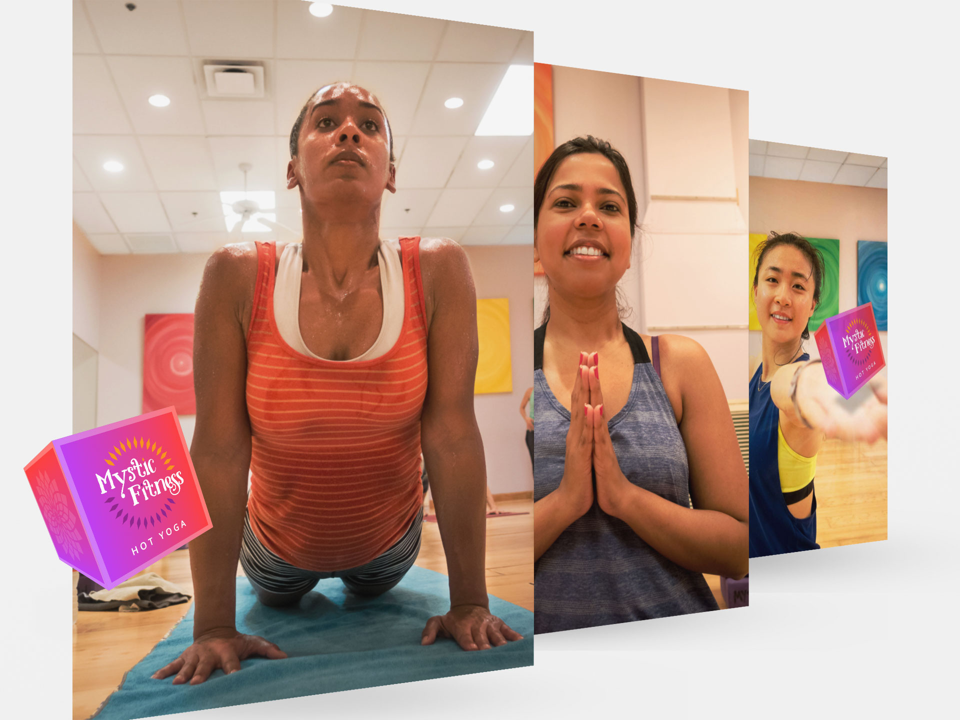
Rather than stock imagery or staged poses, we photographed real students and instructors throughout the studio, capturing authentic movement, emotion, and connection. That library became the visual foundation for the website, campaigns, social media, email, and merchandise.
Advertising System
One system, every placement.
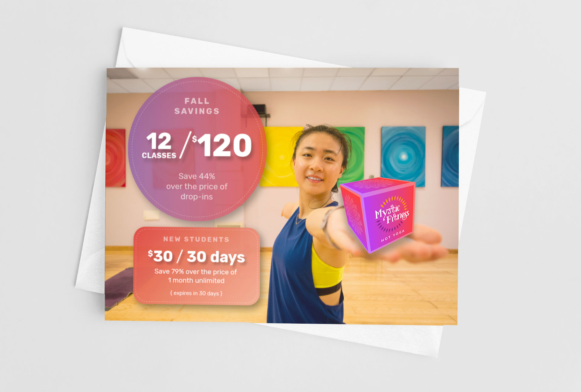
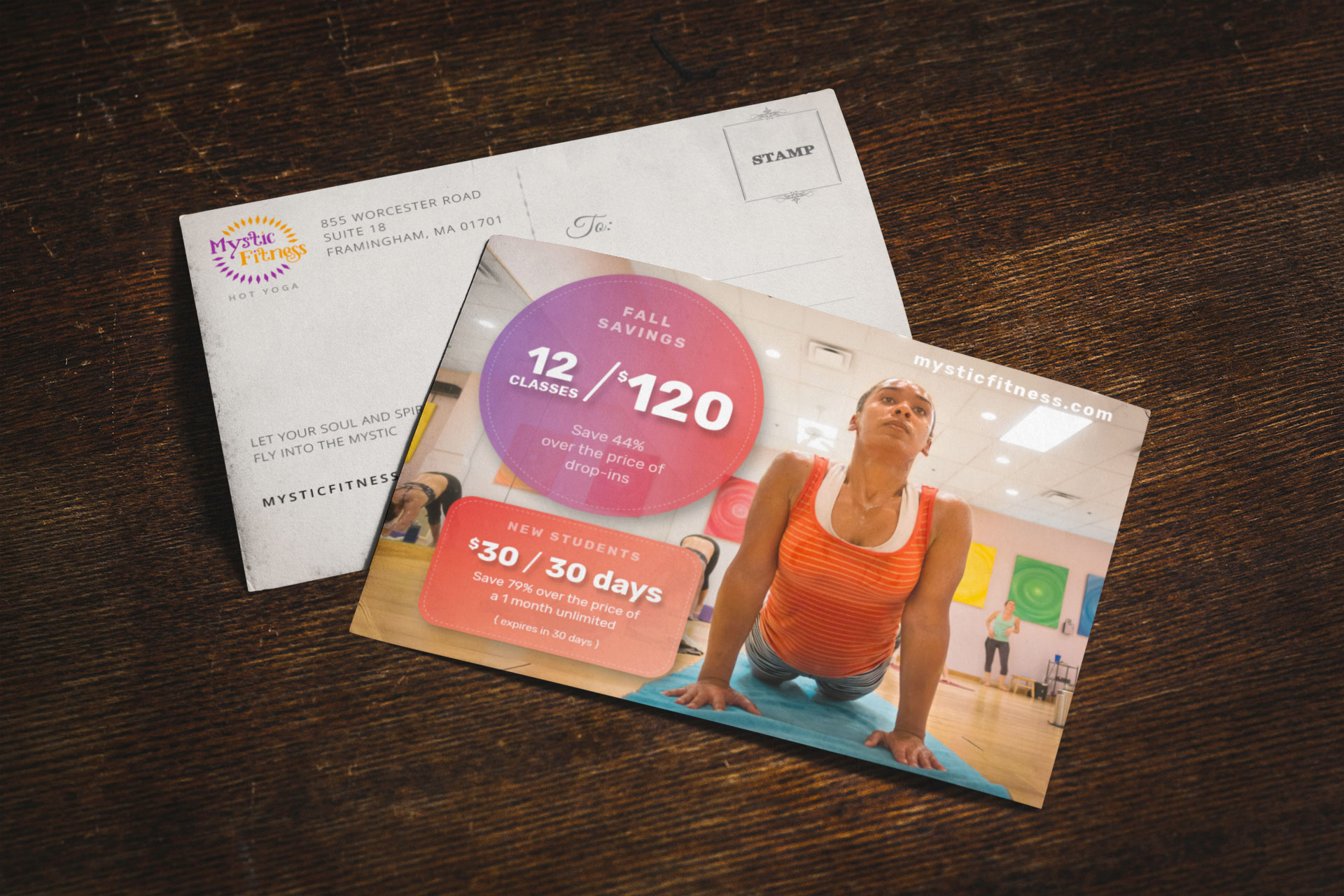
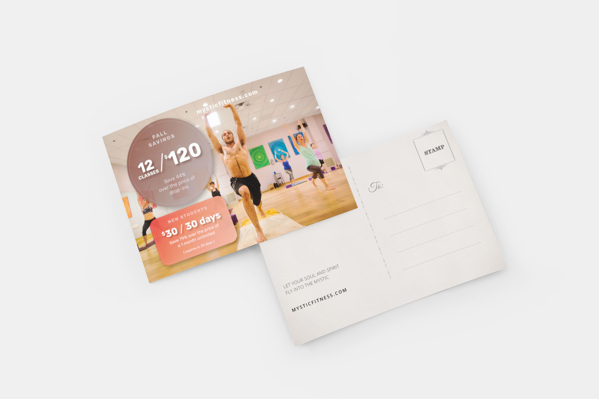
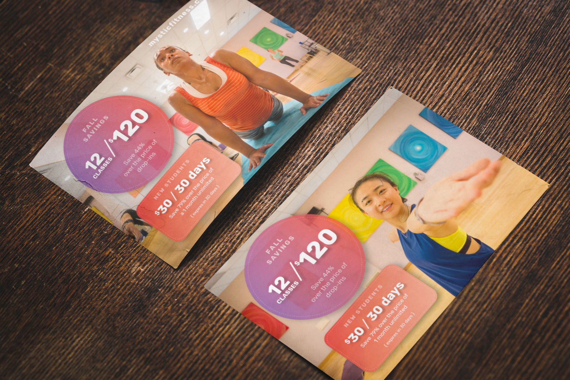
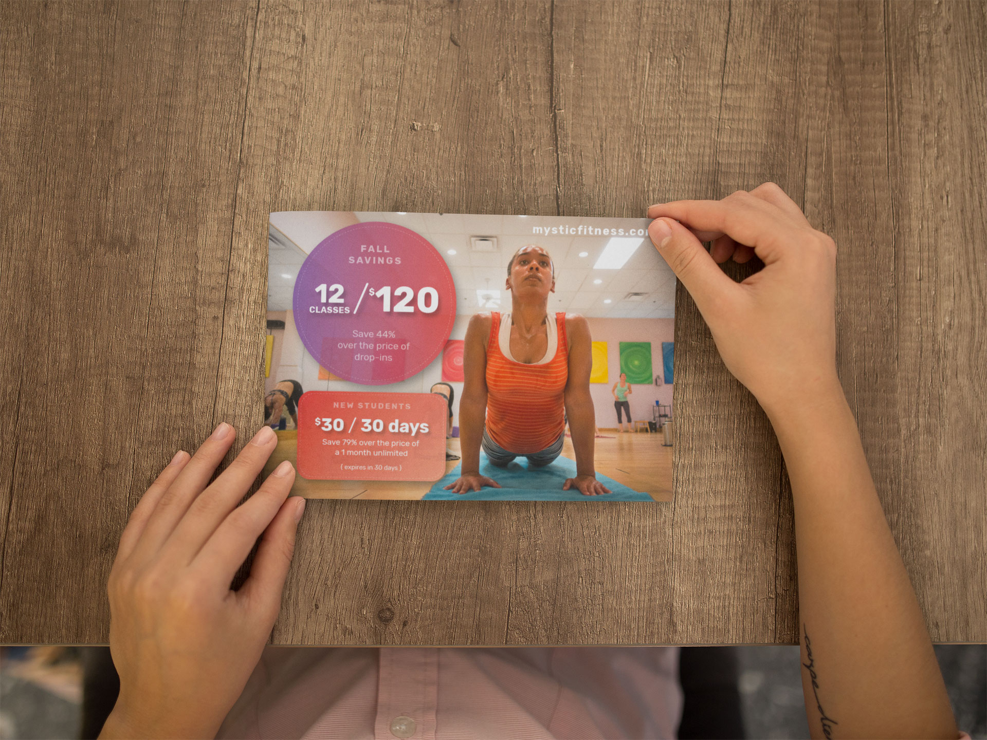
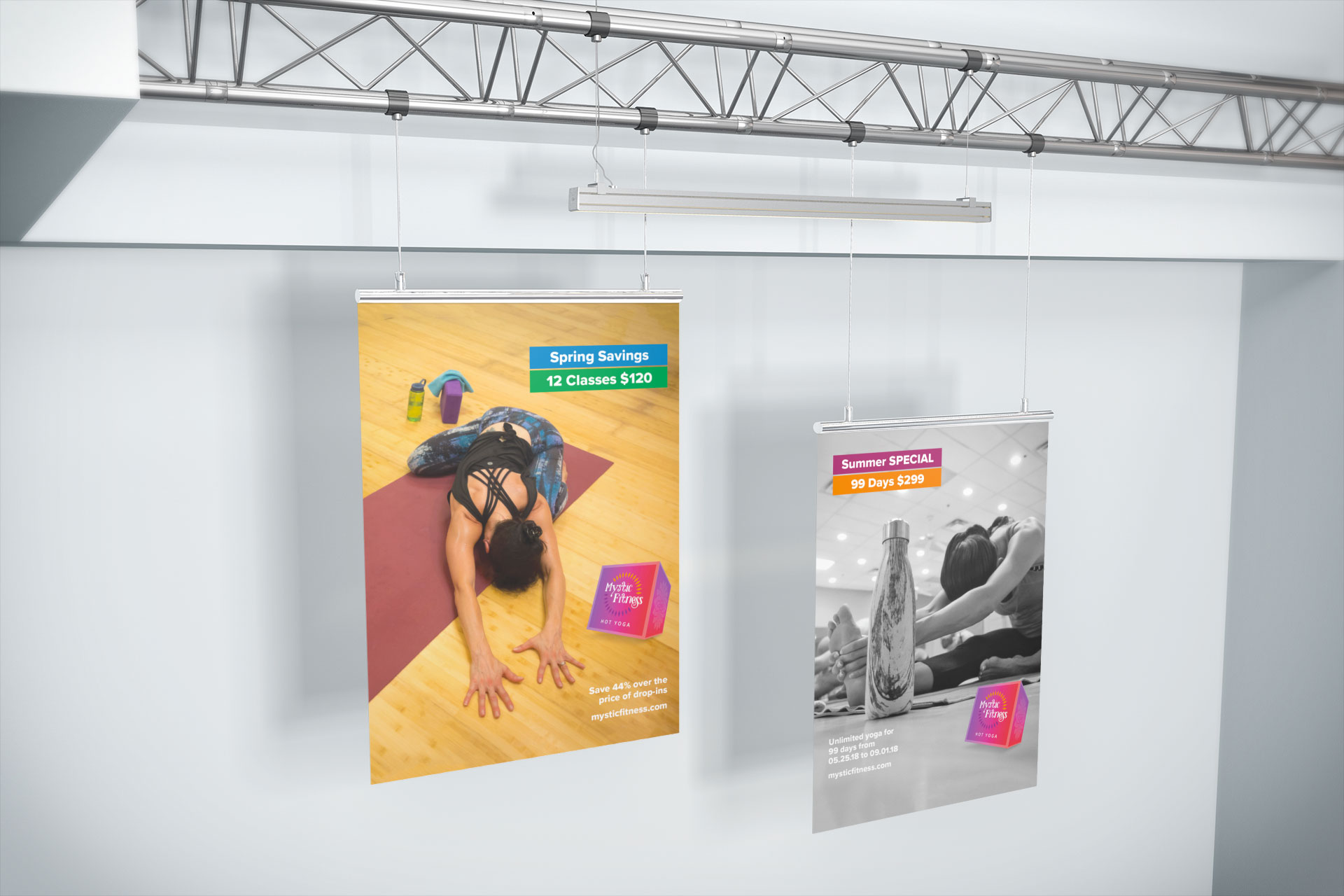
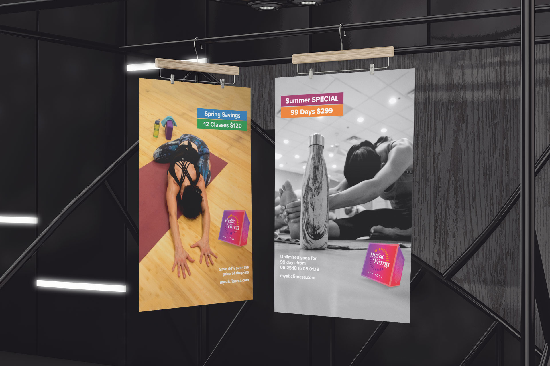
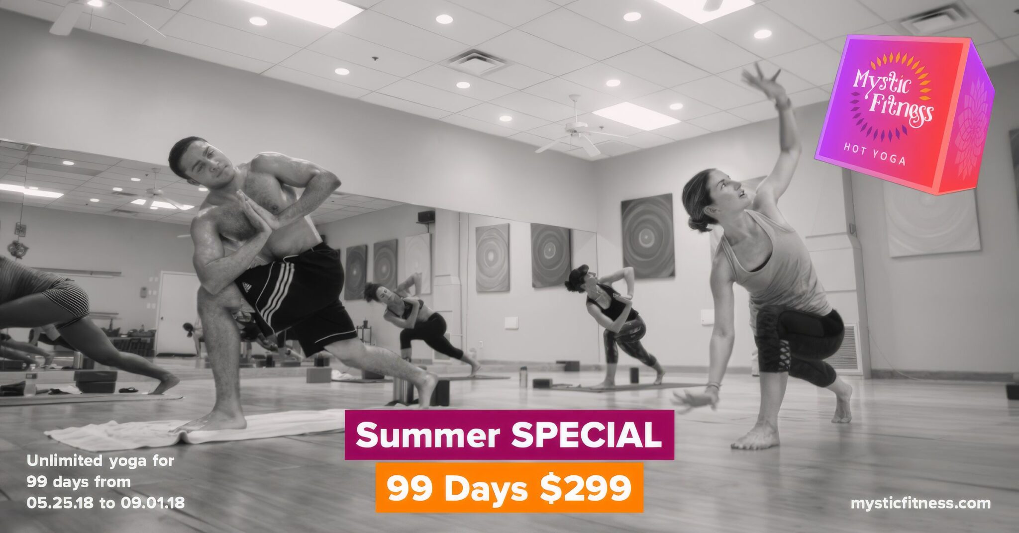
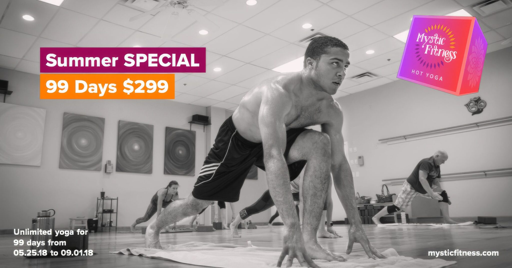
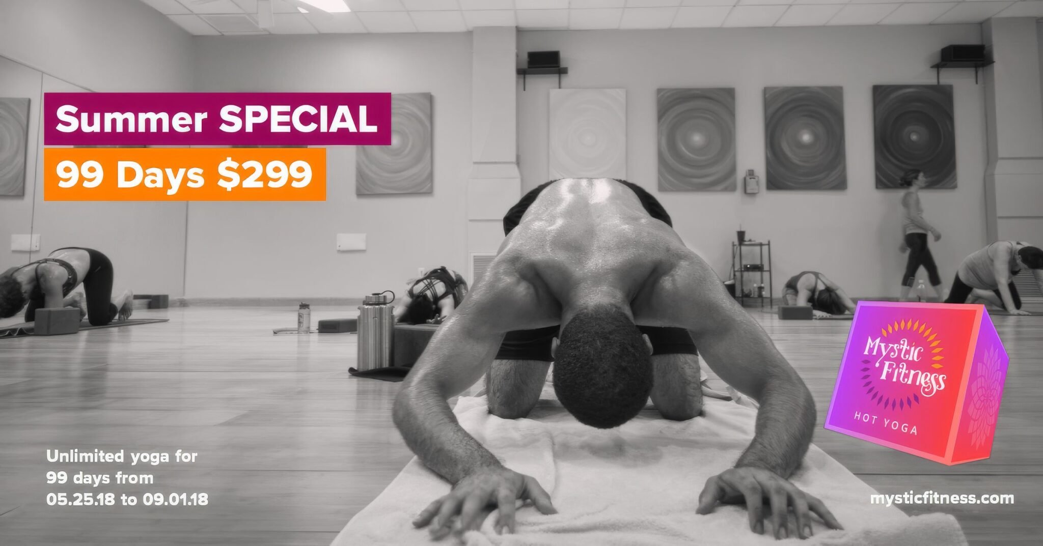
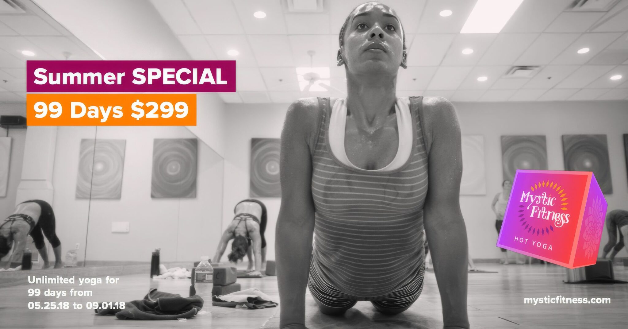
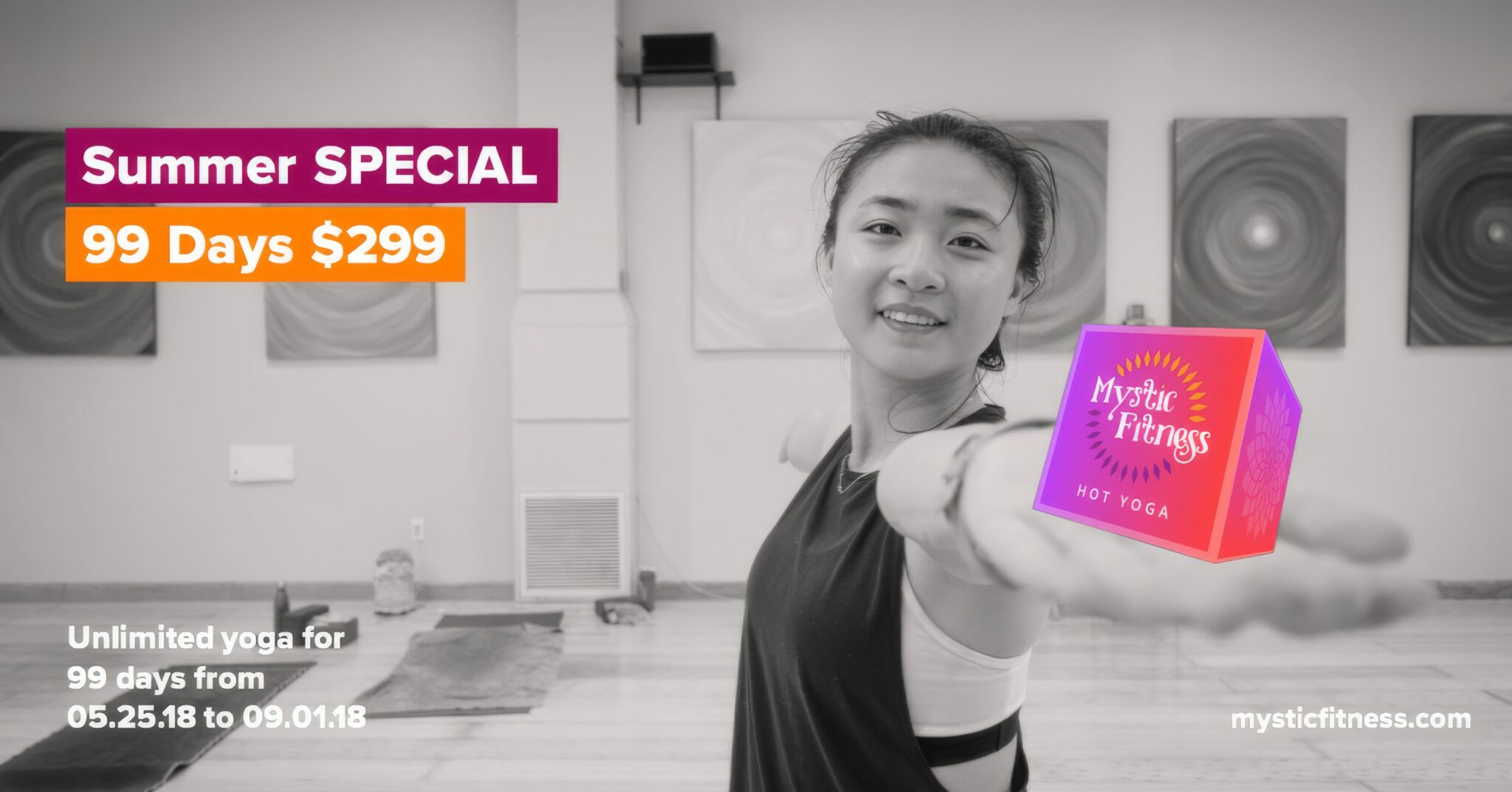
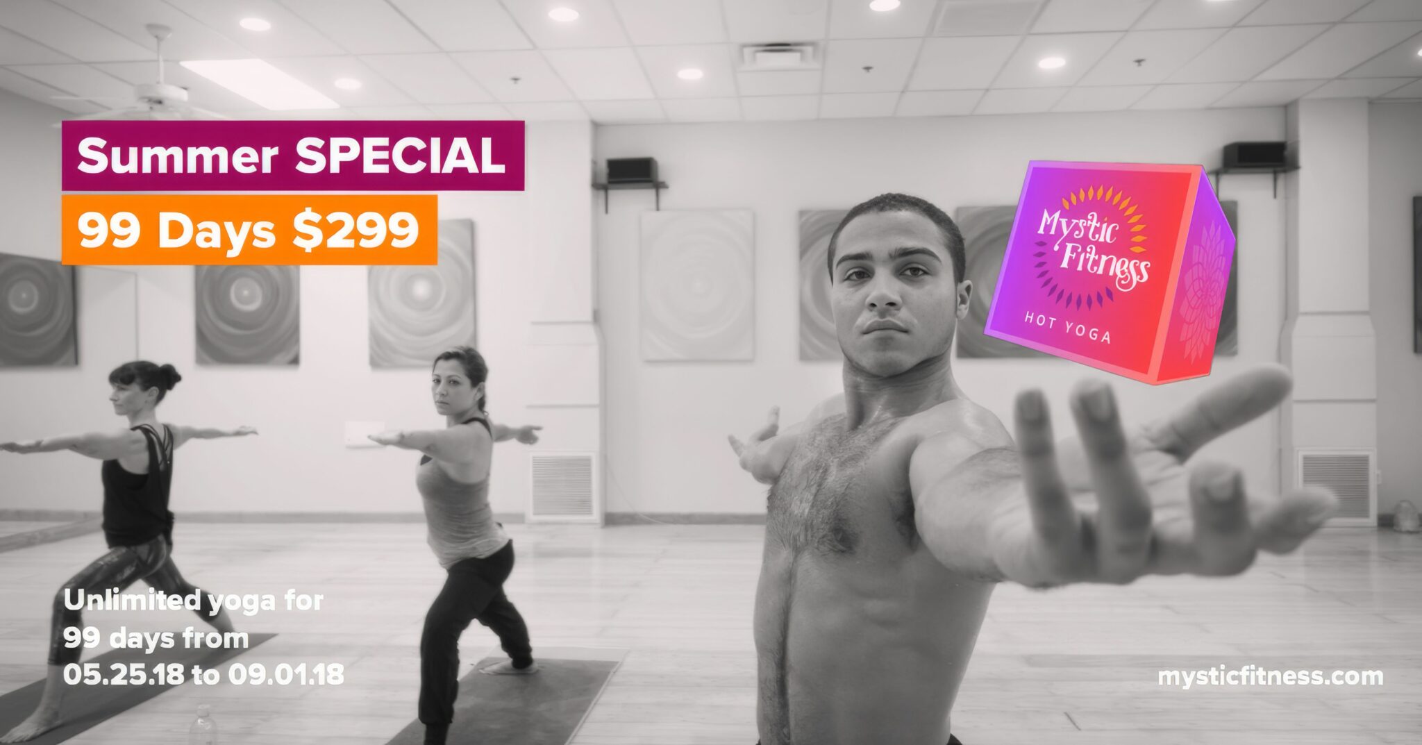
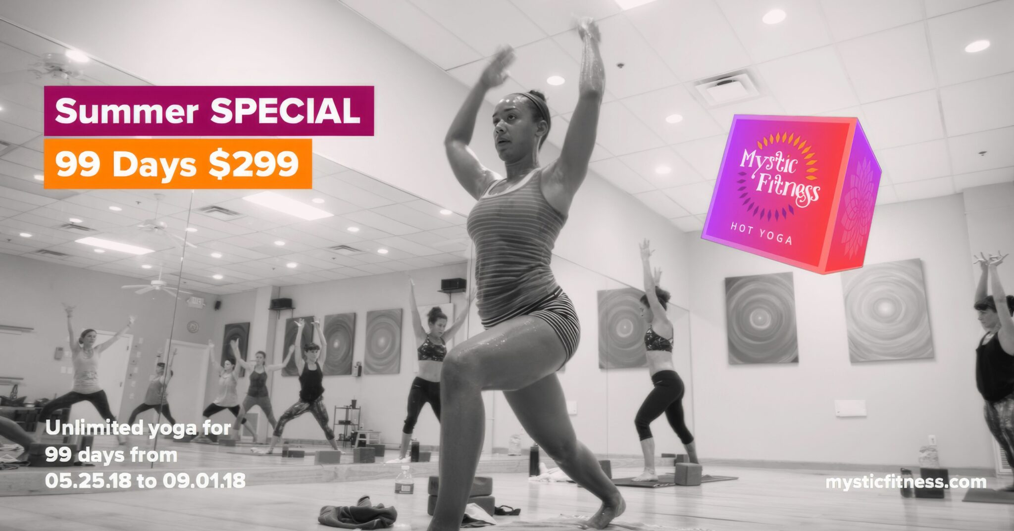
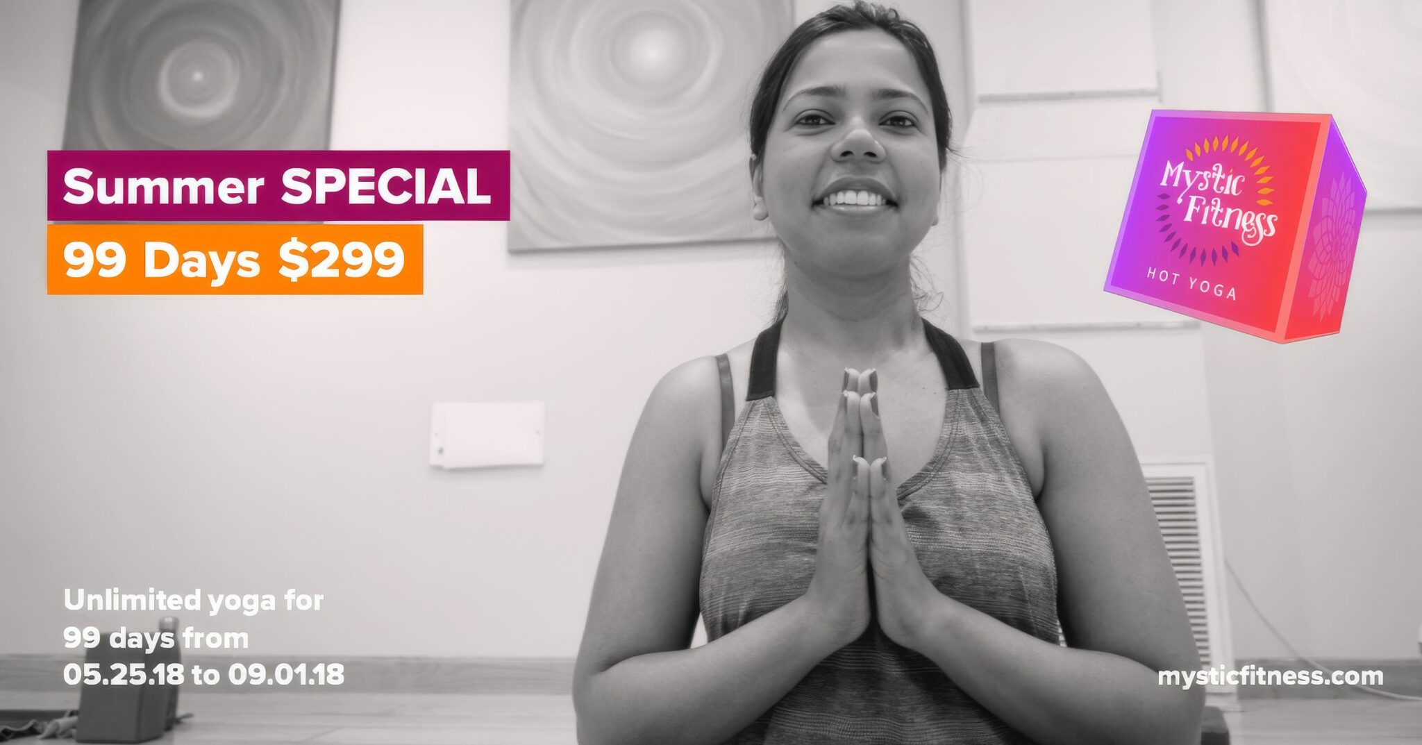
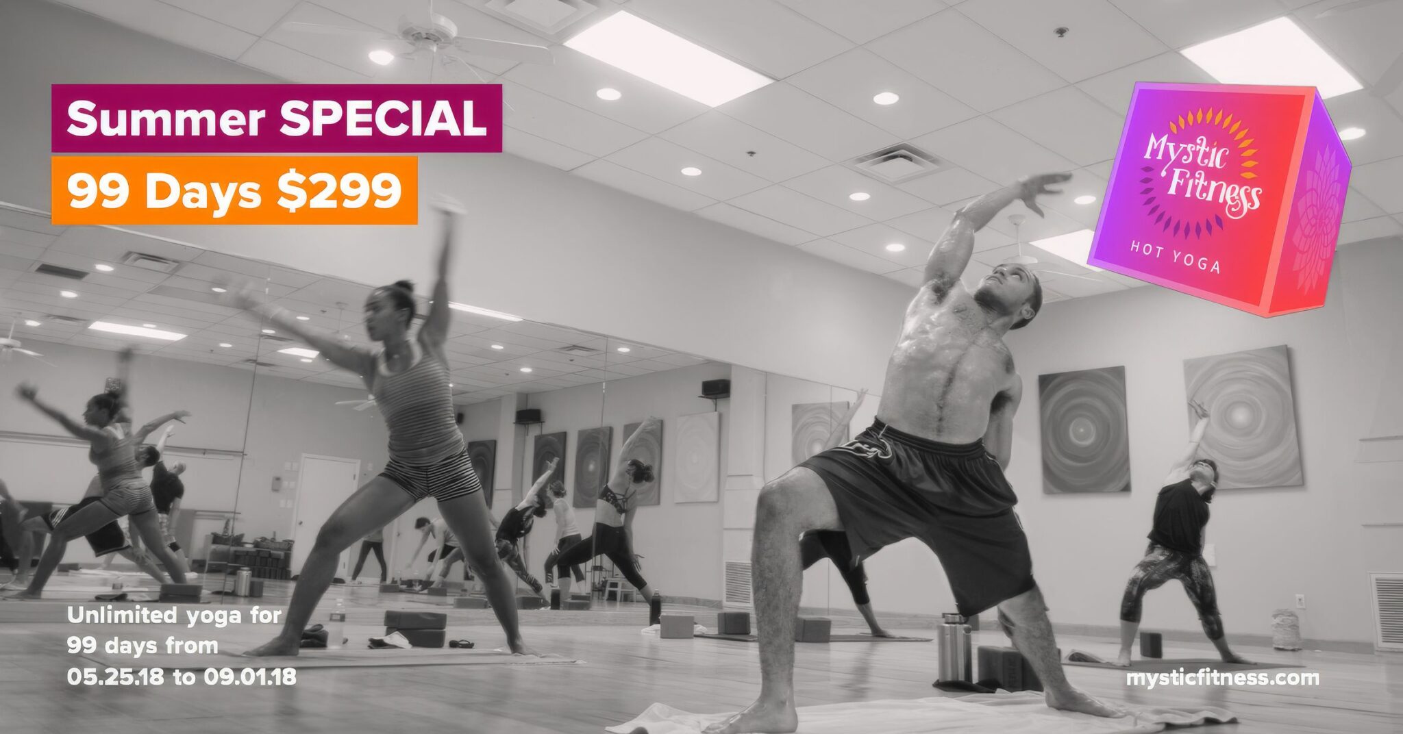
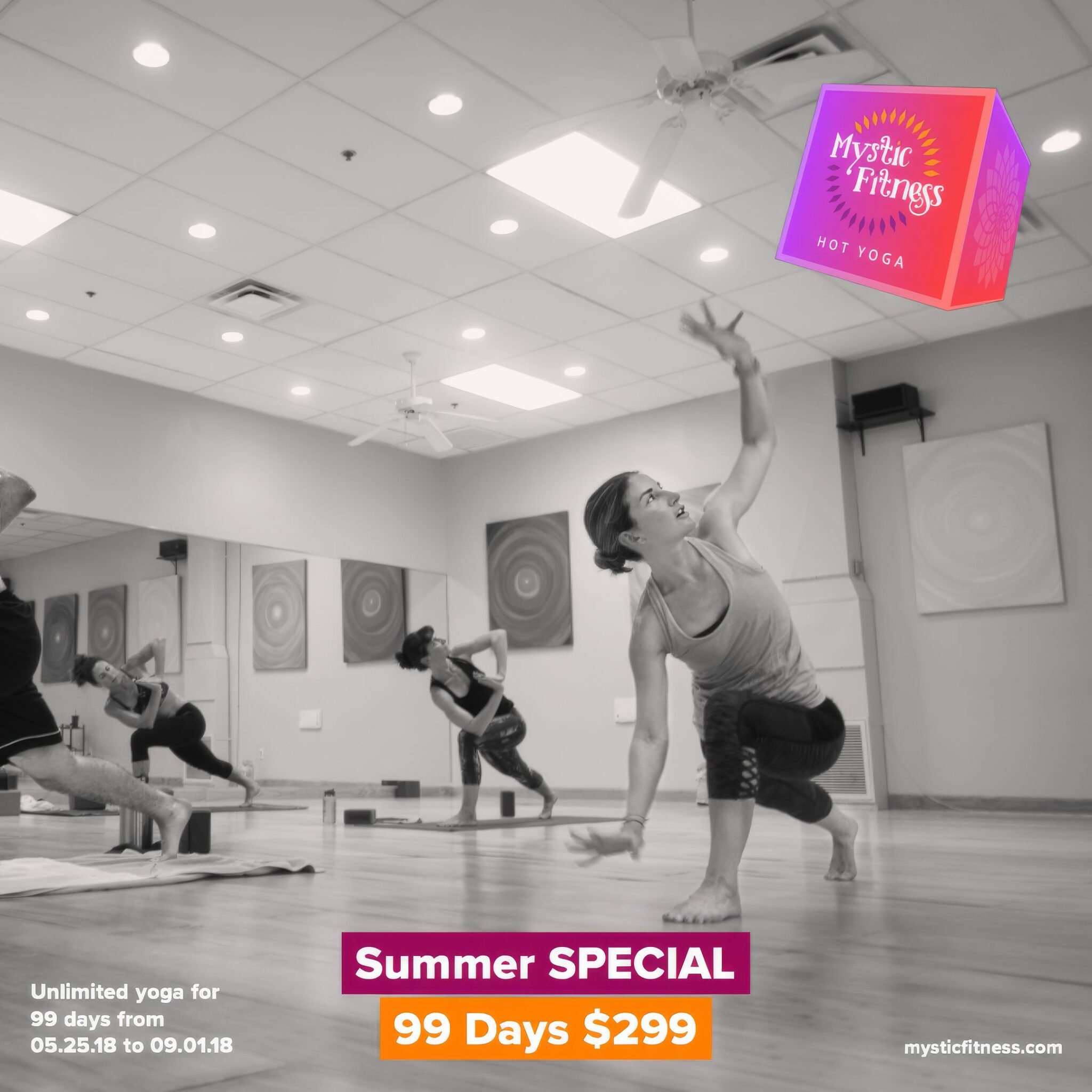
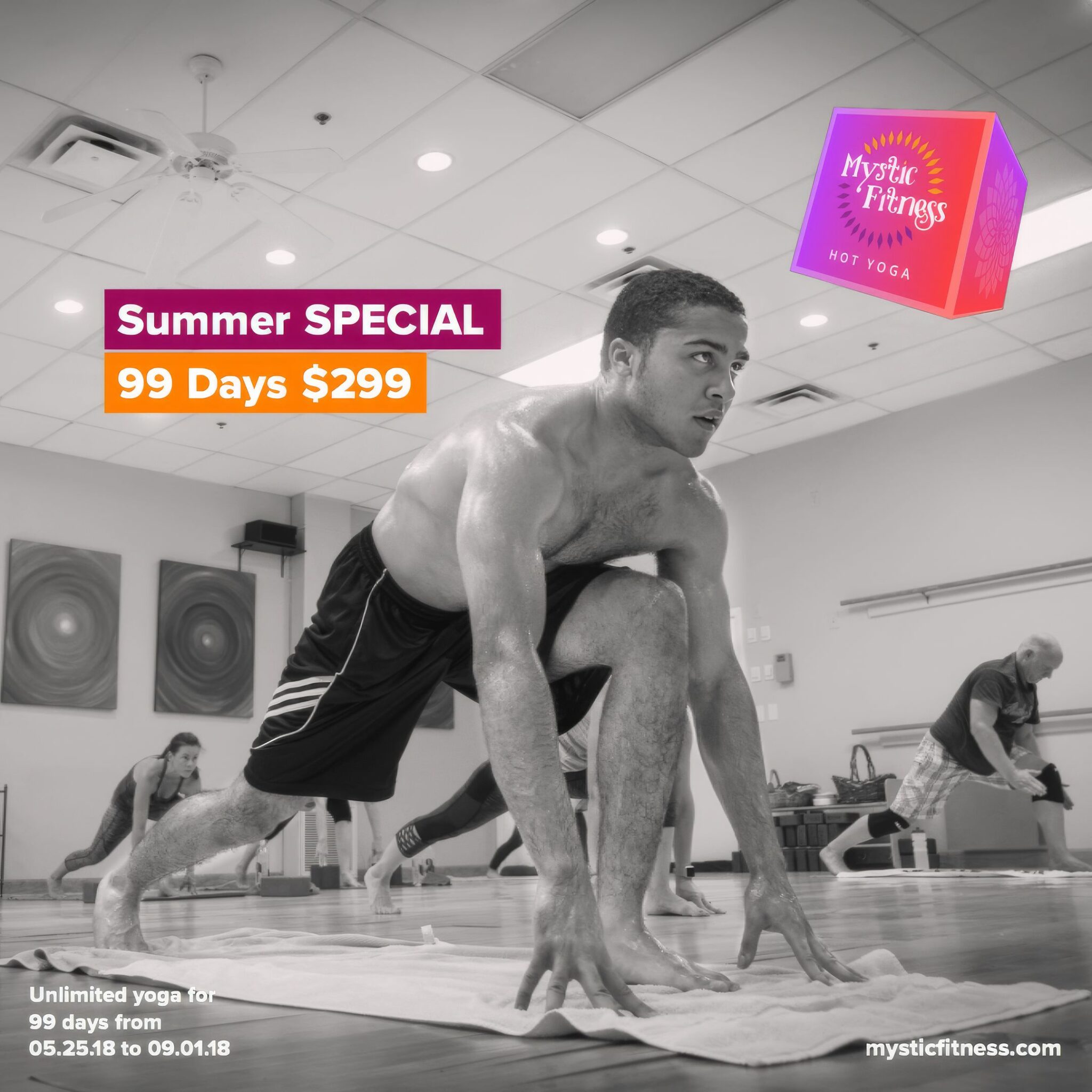
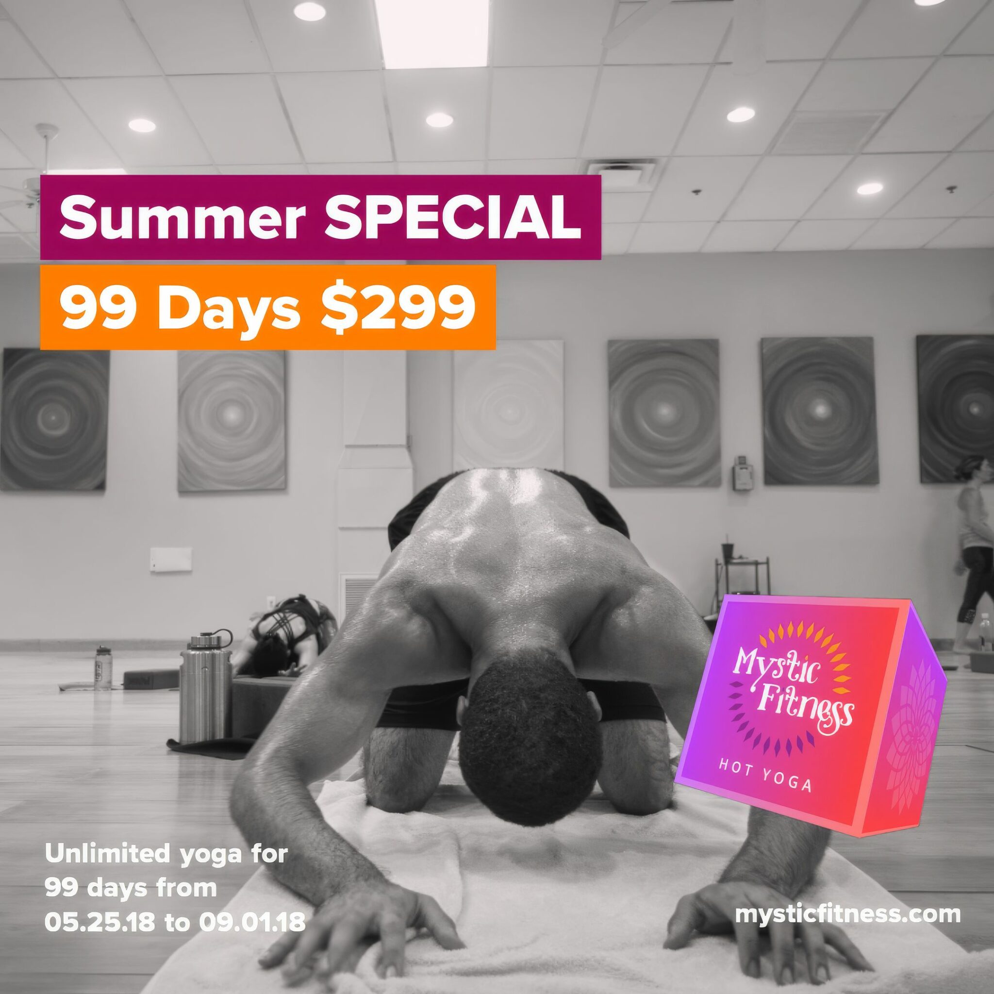
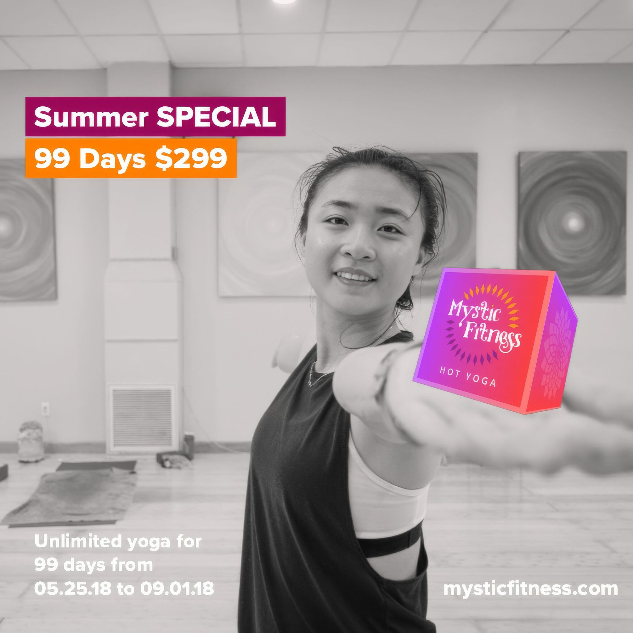
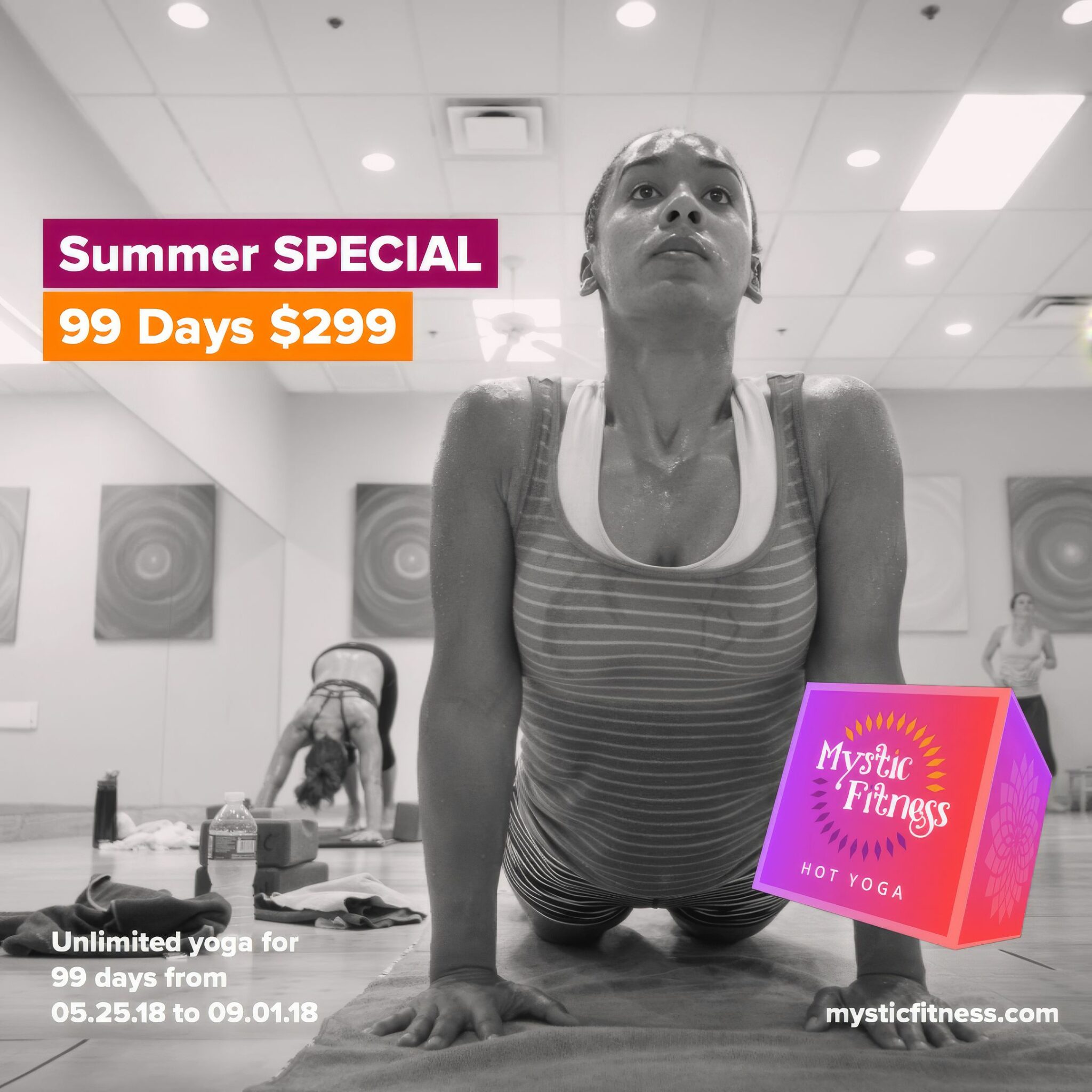
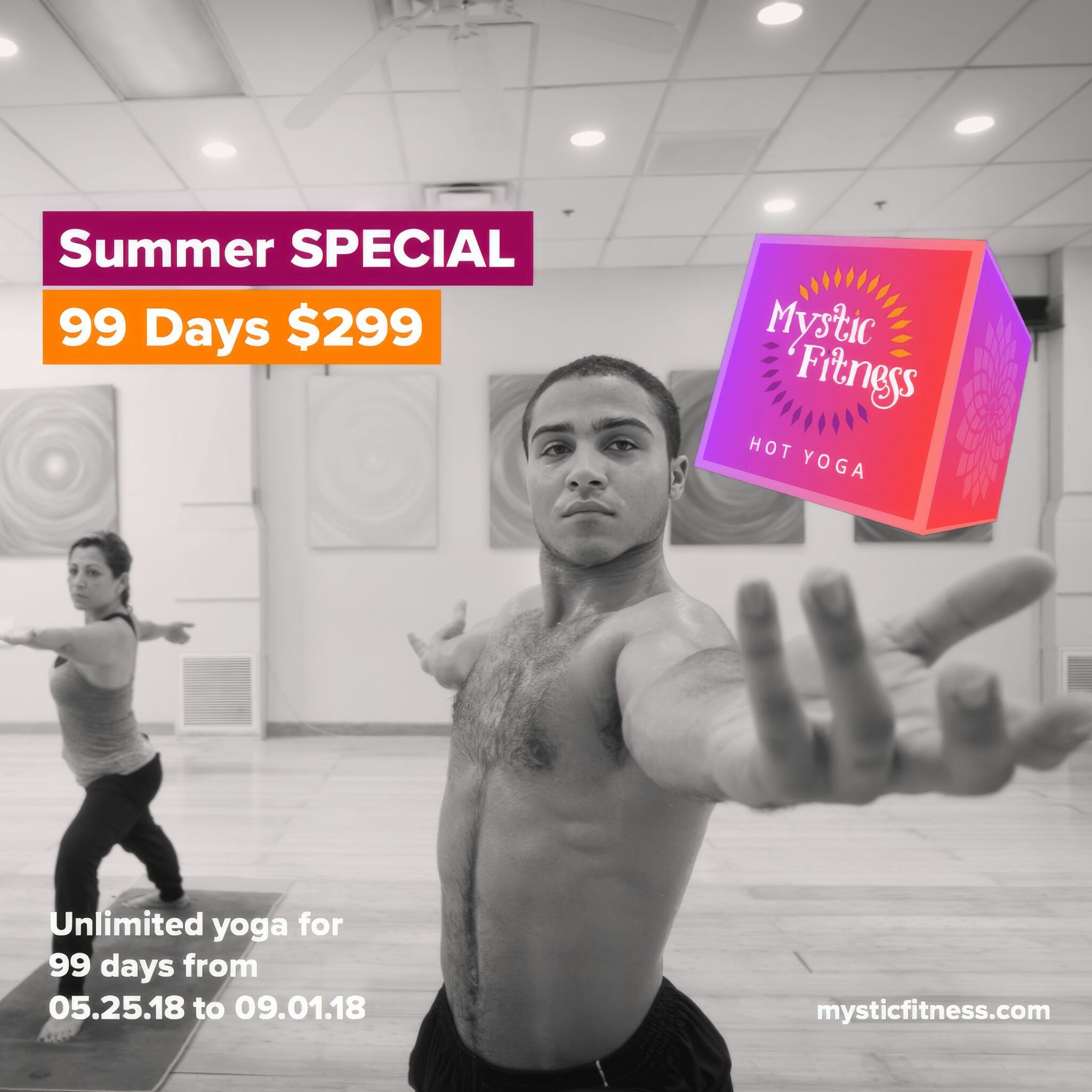
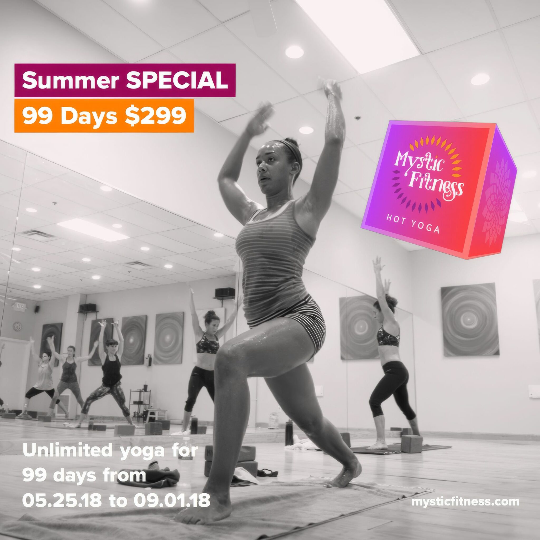
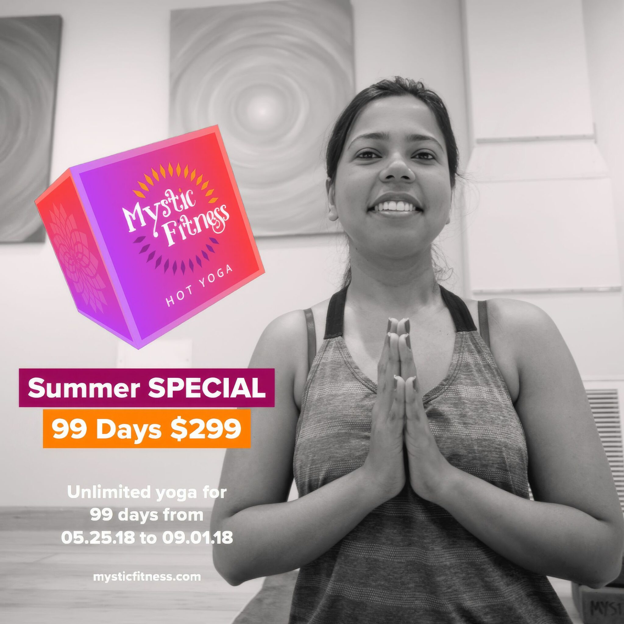
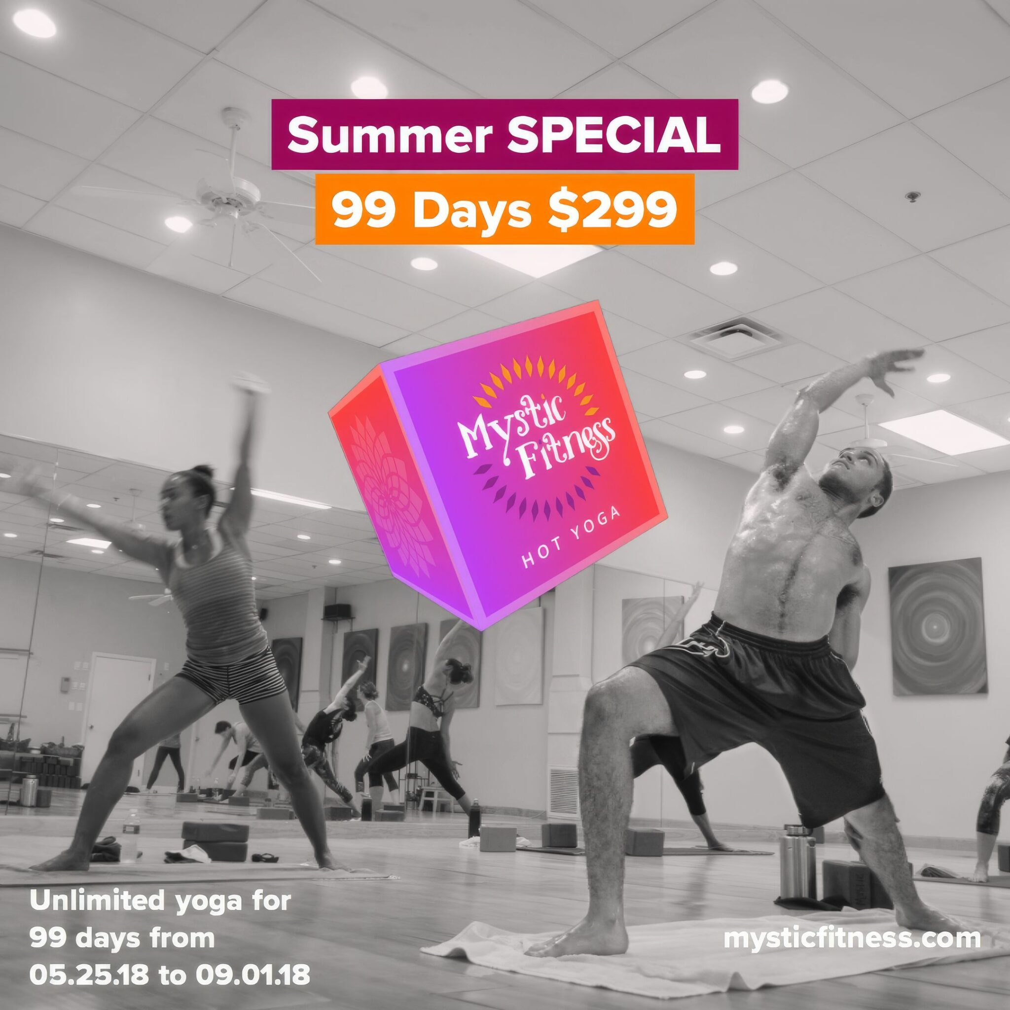
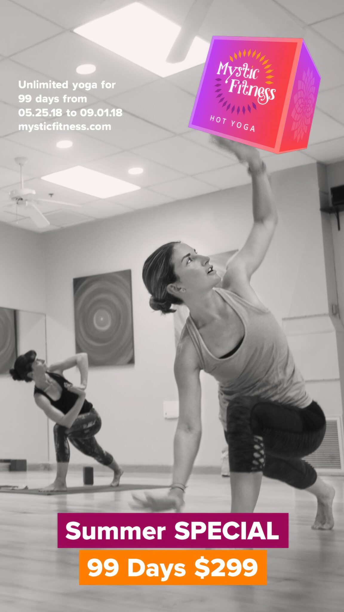
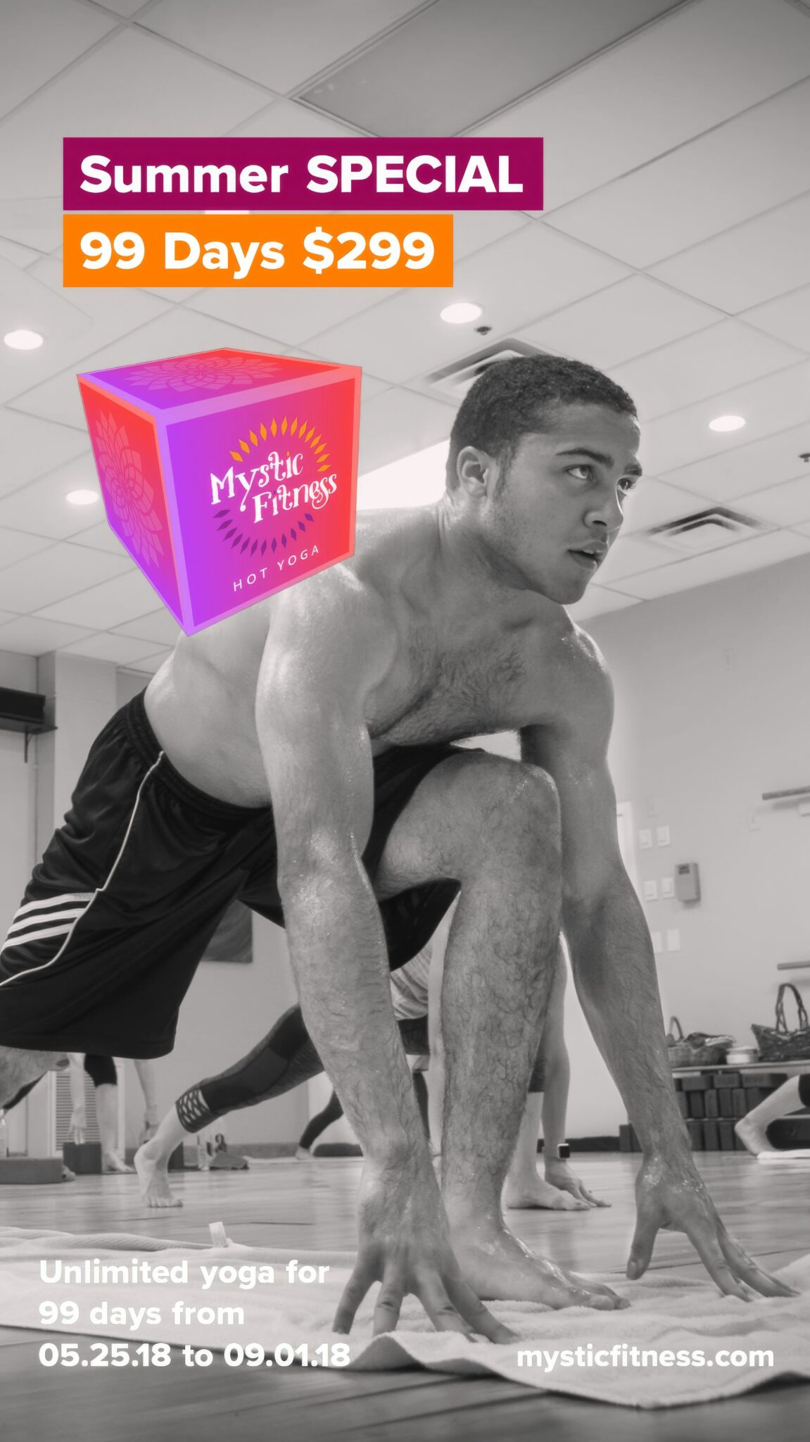
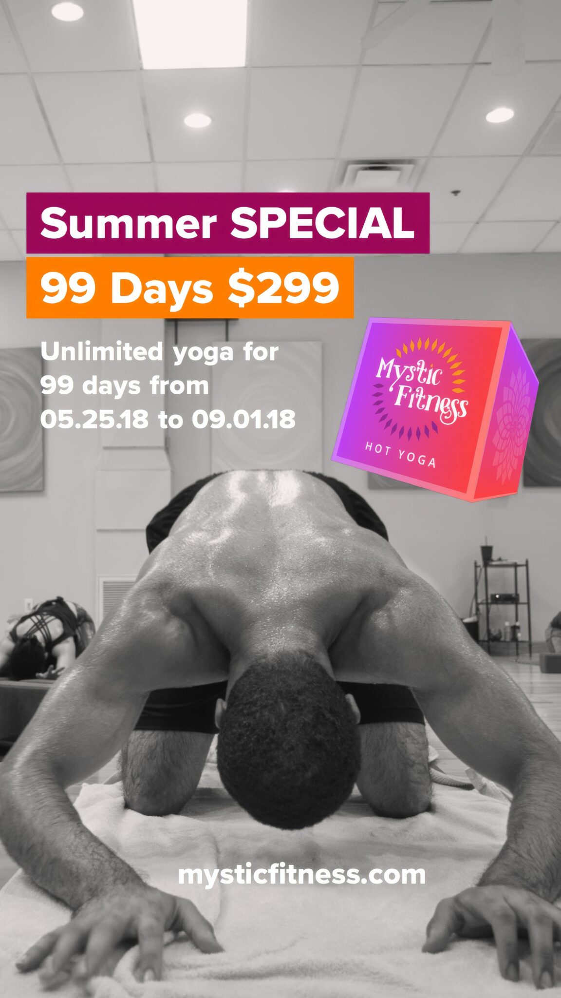
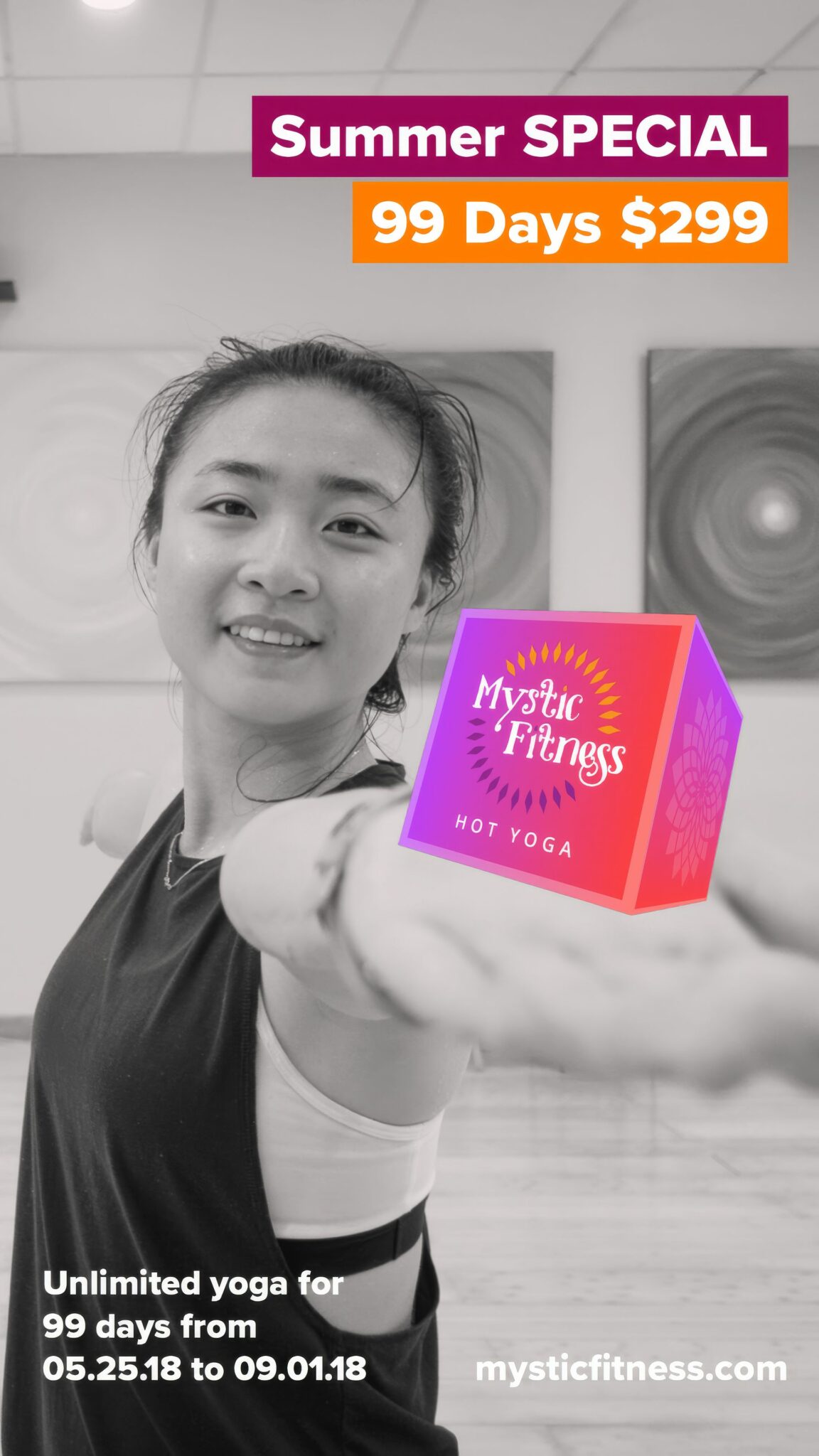
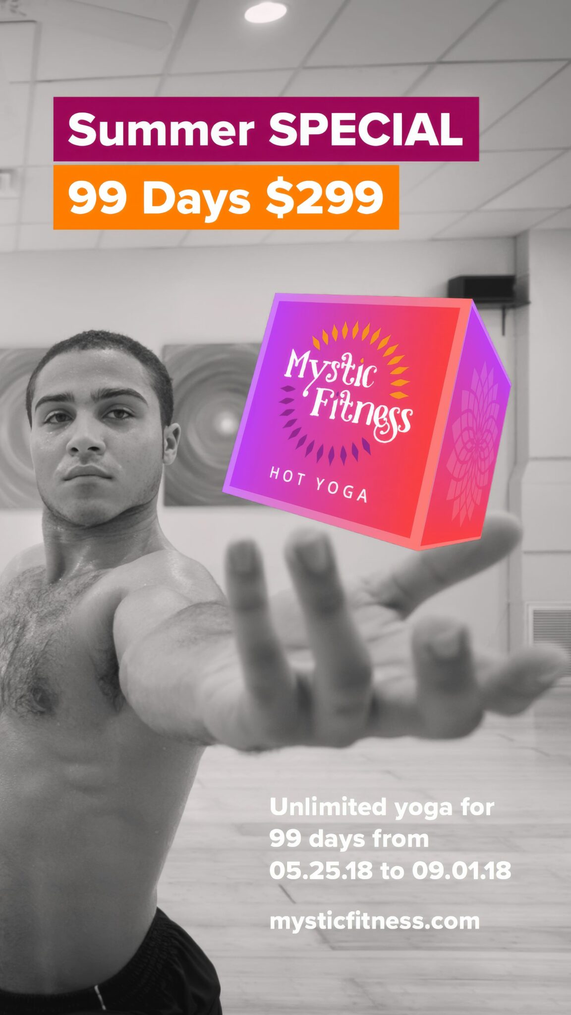
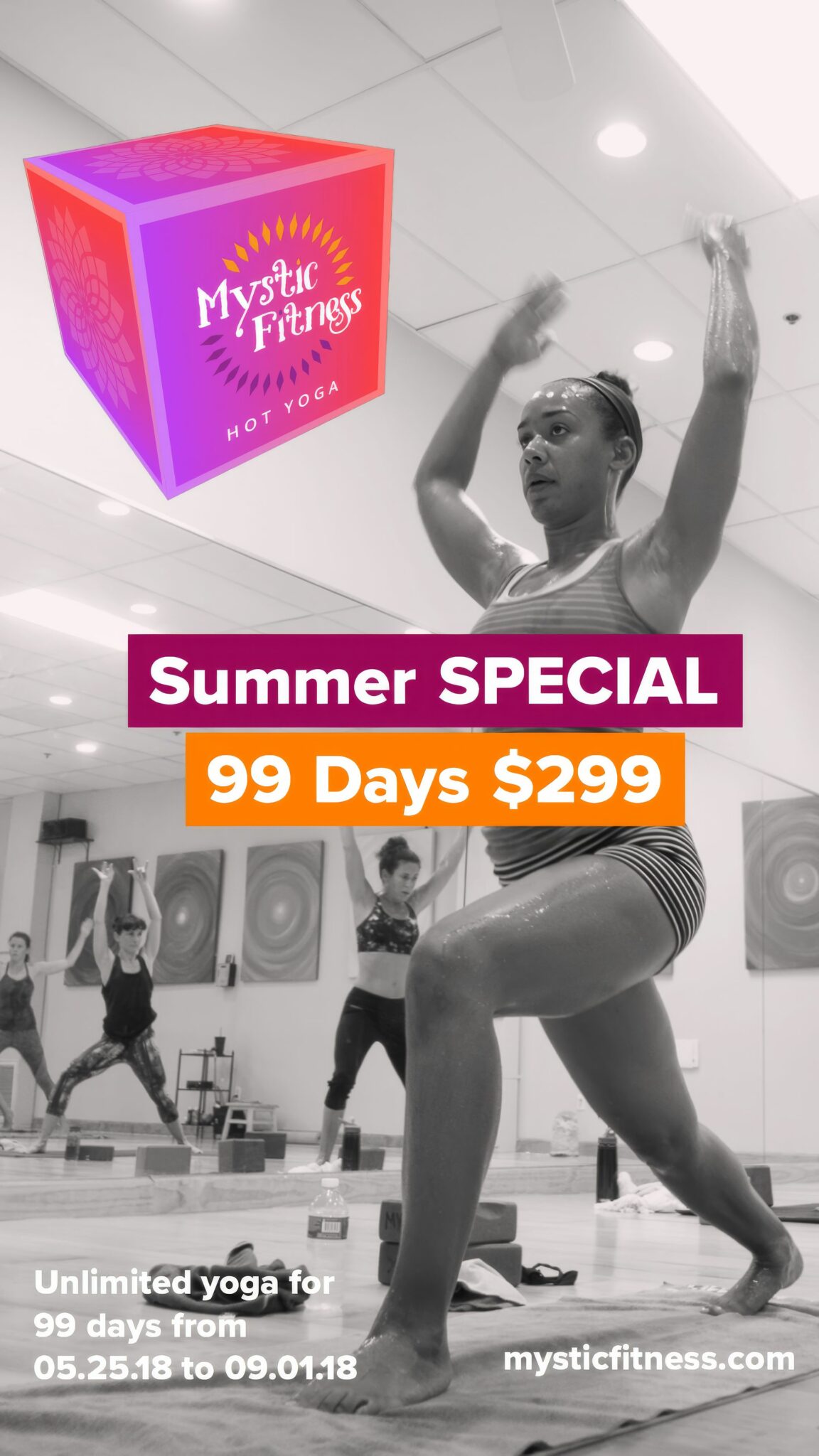
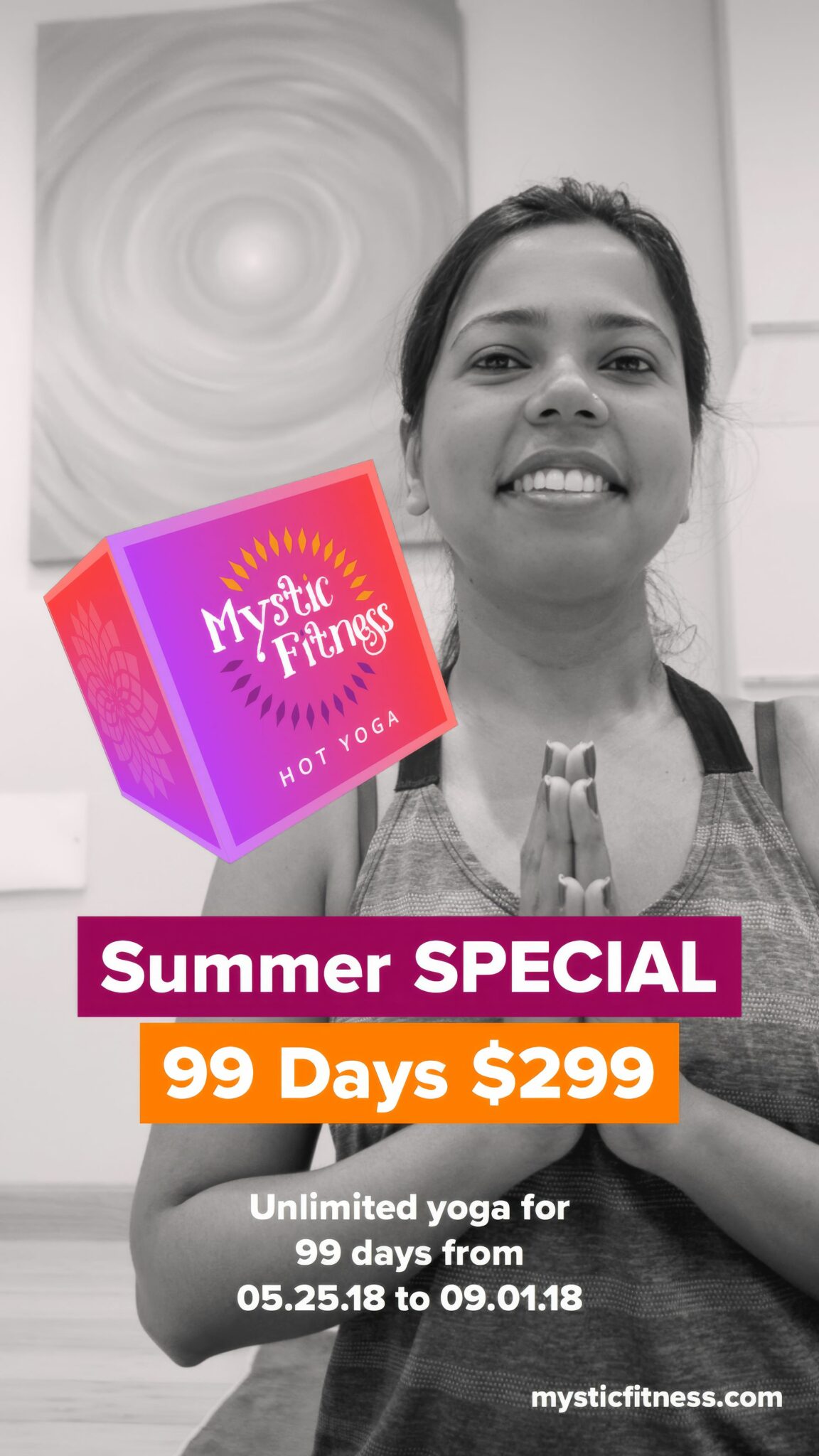
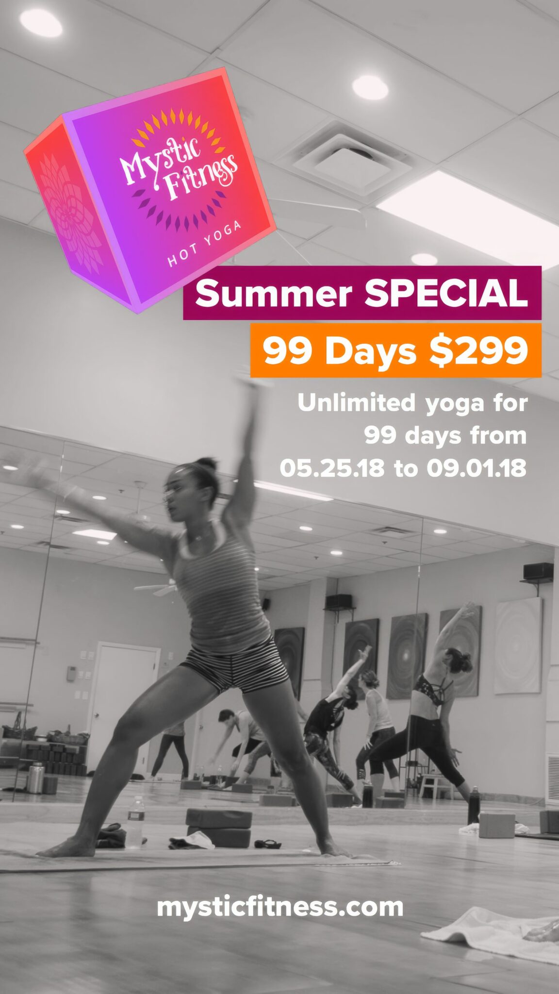
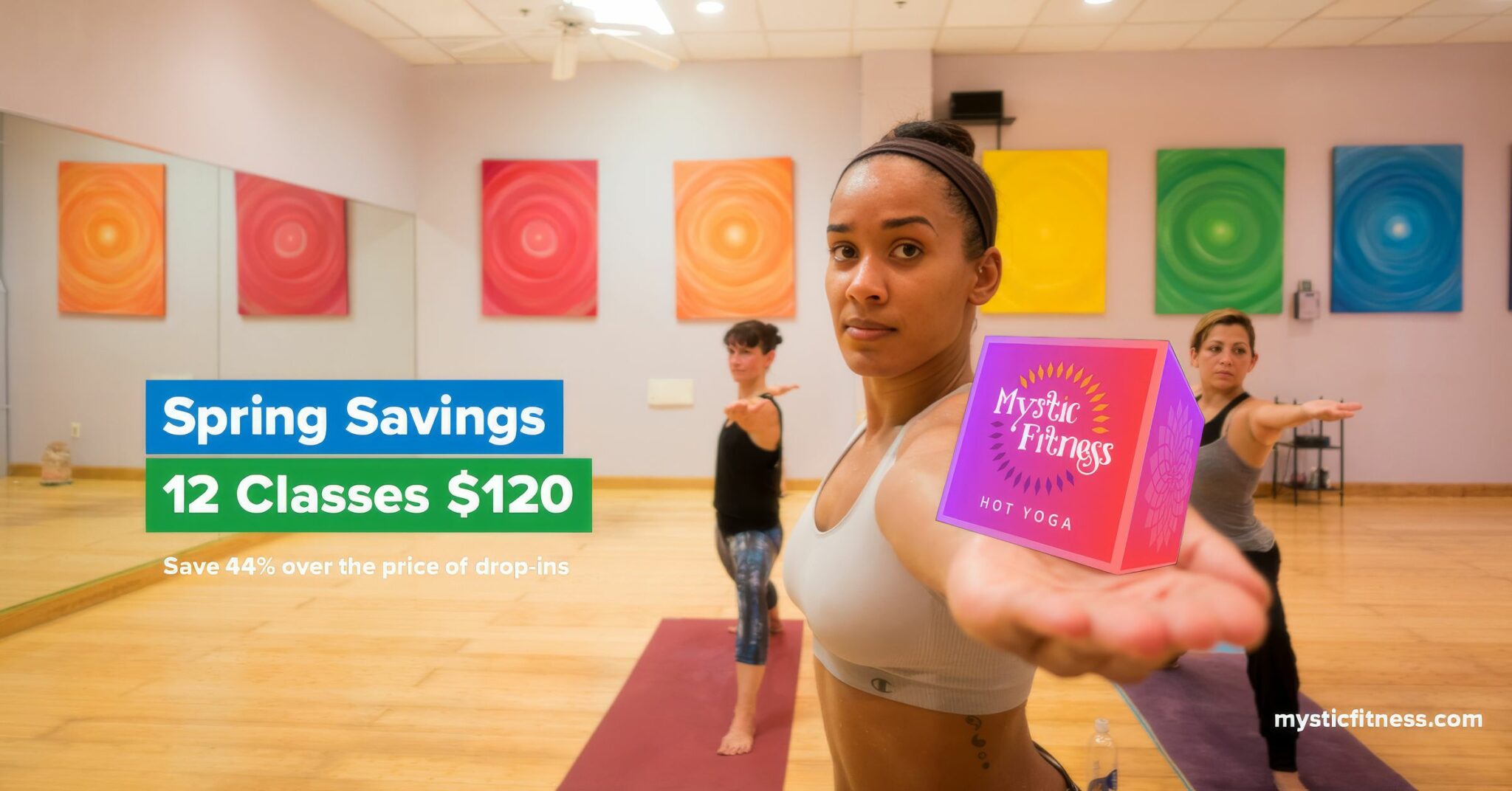
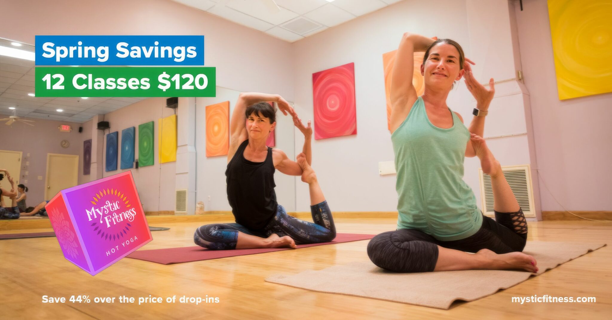
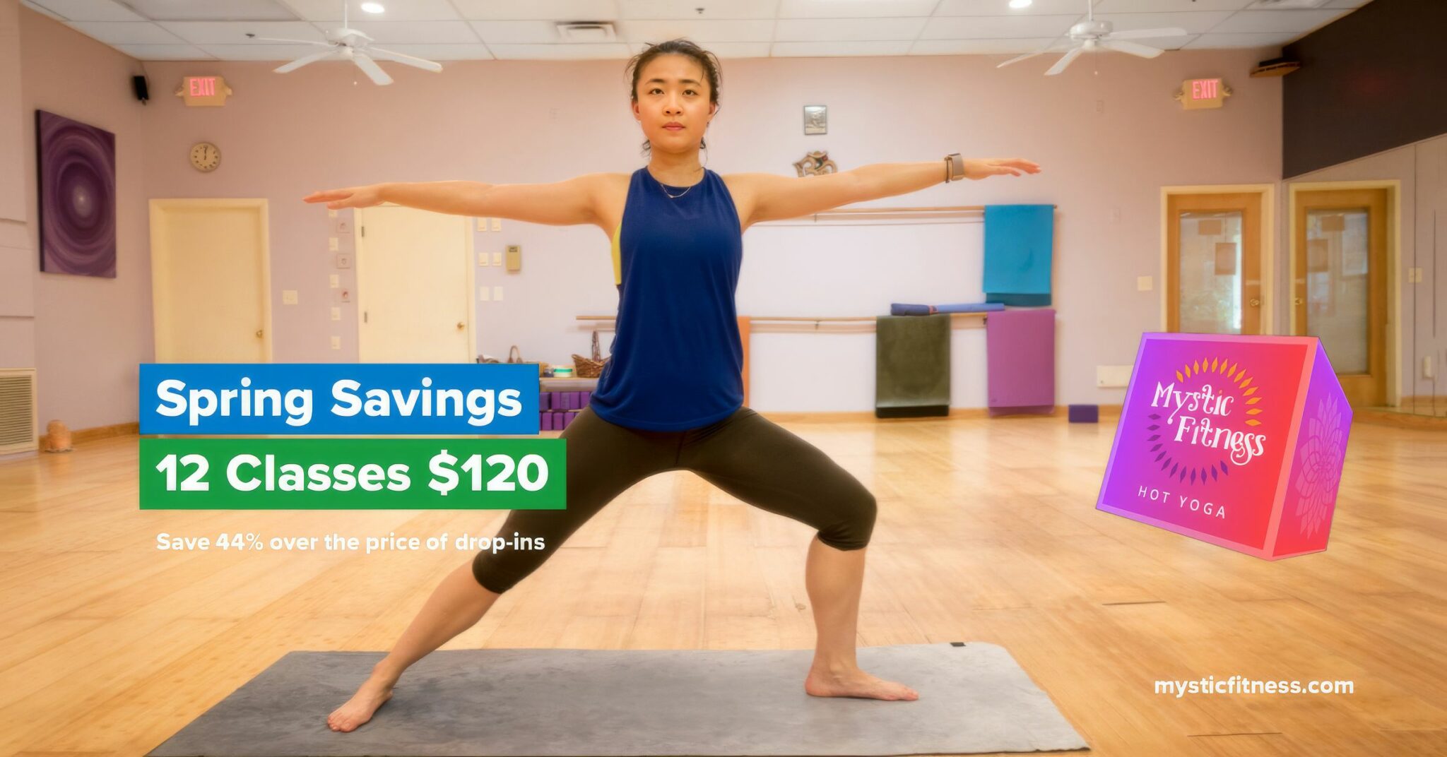
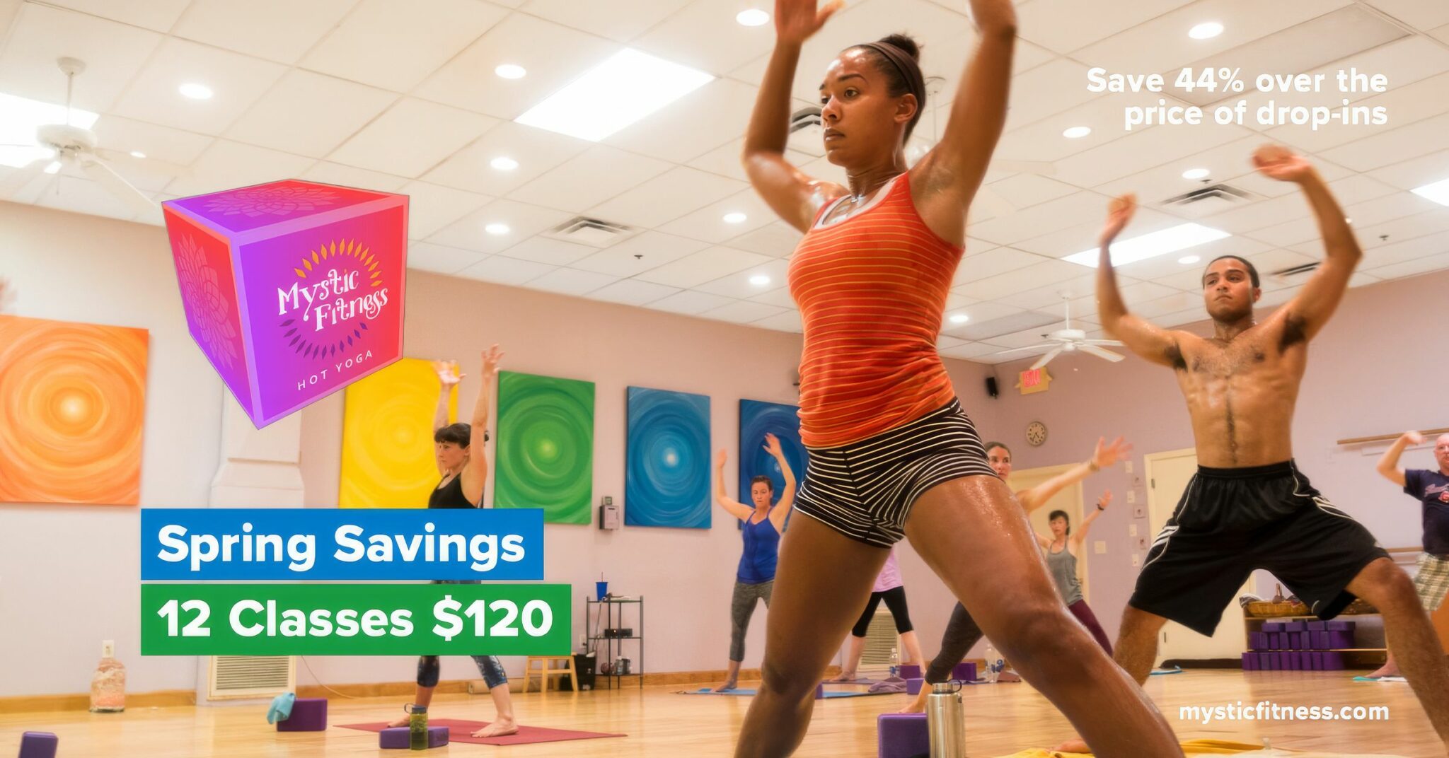
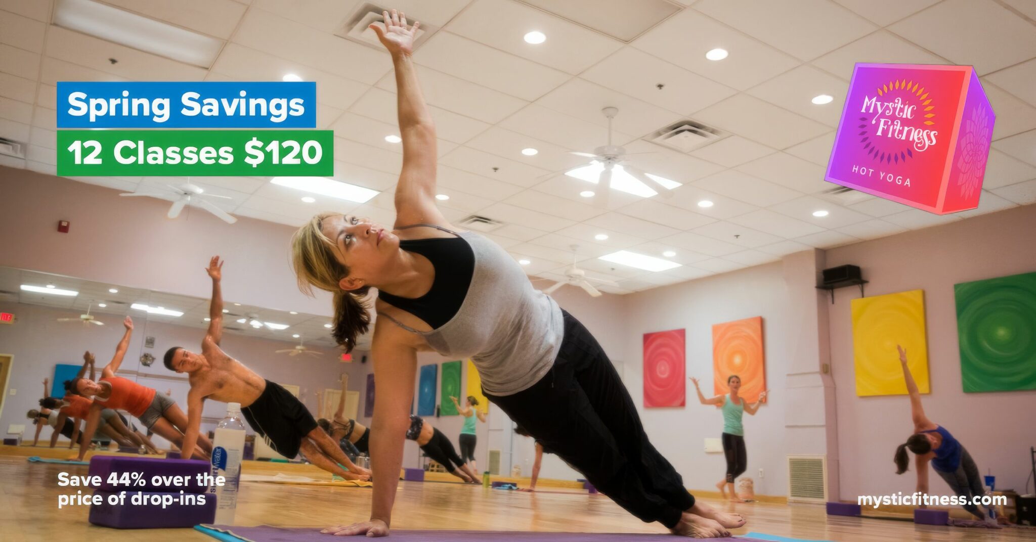
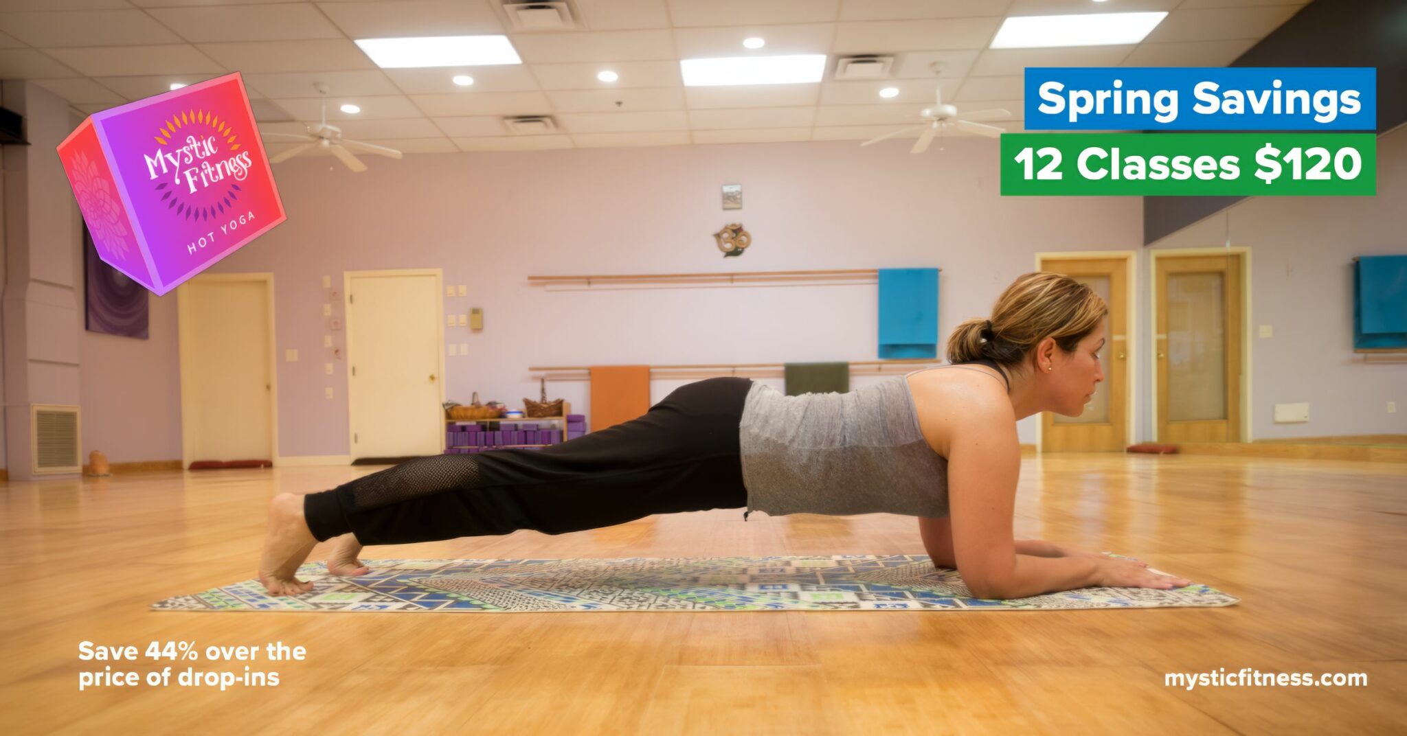
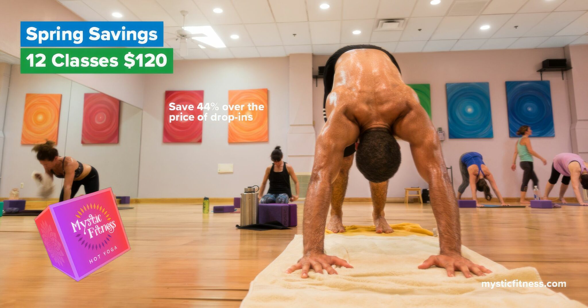
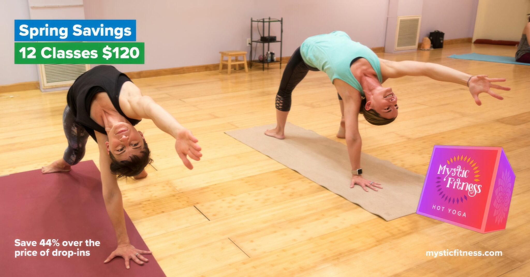
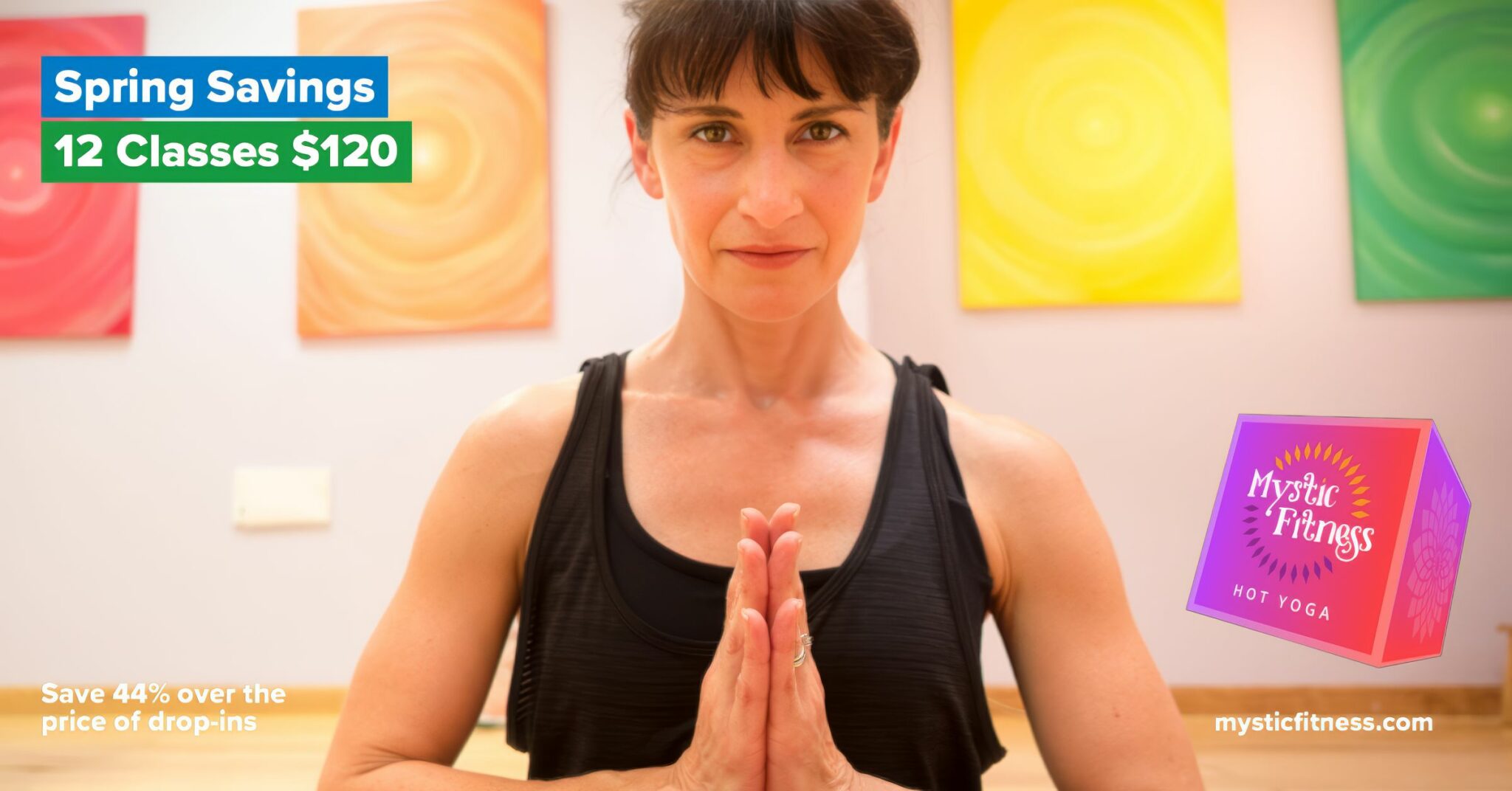
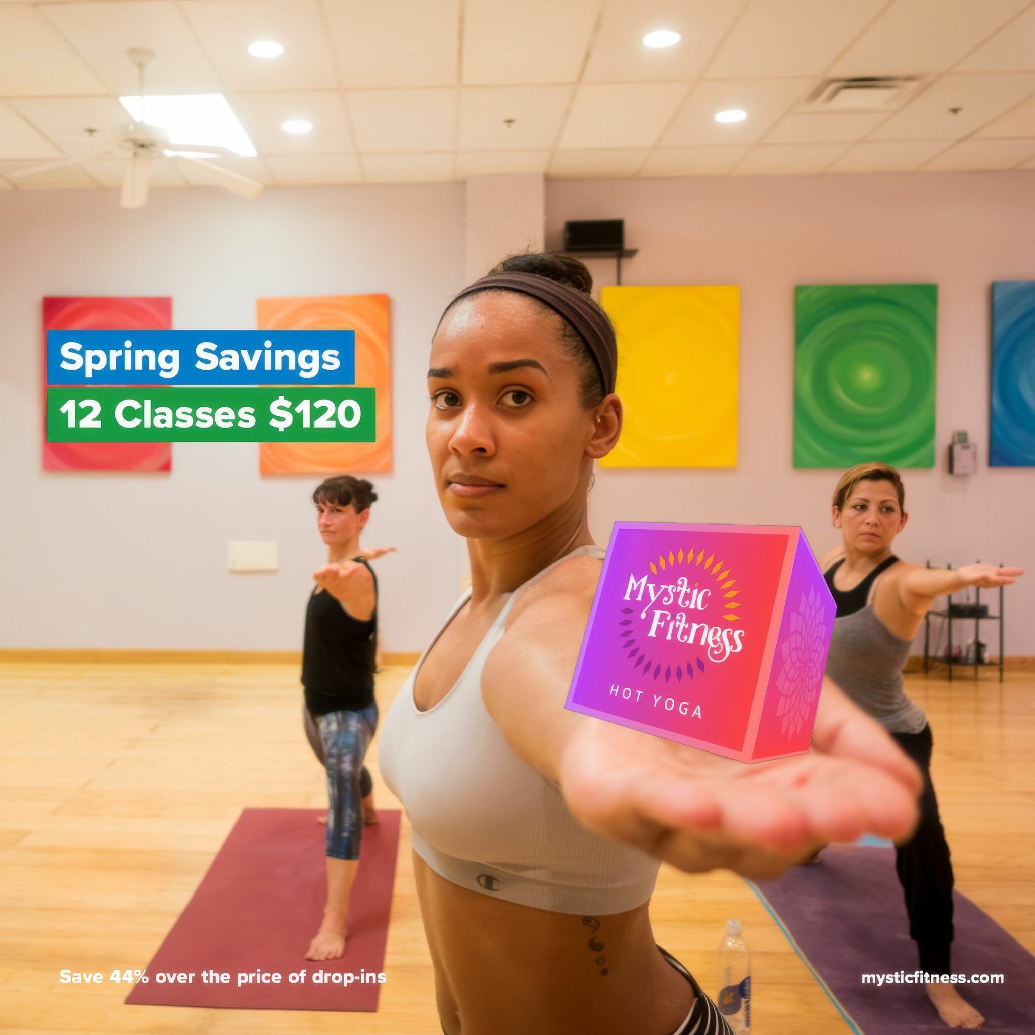
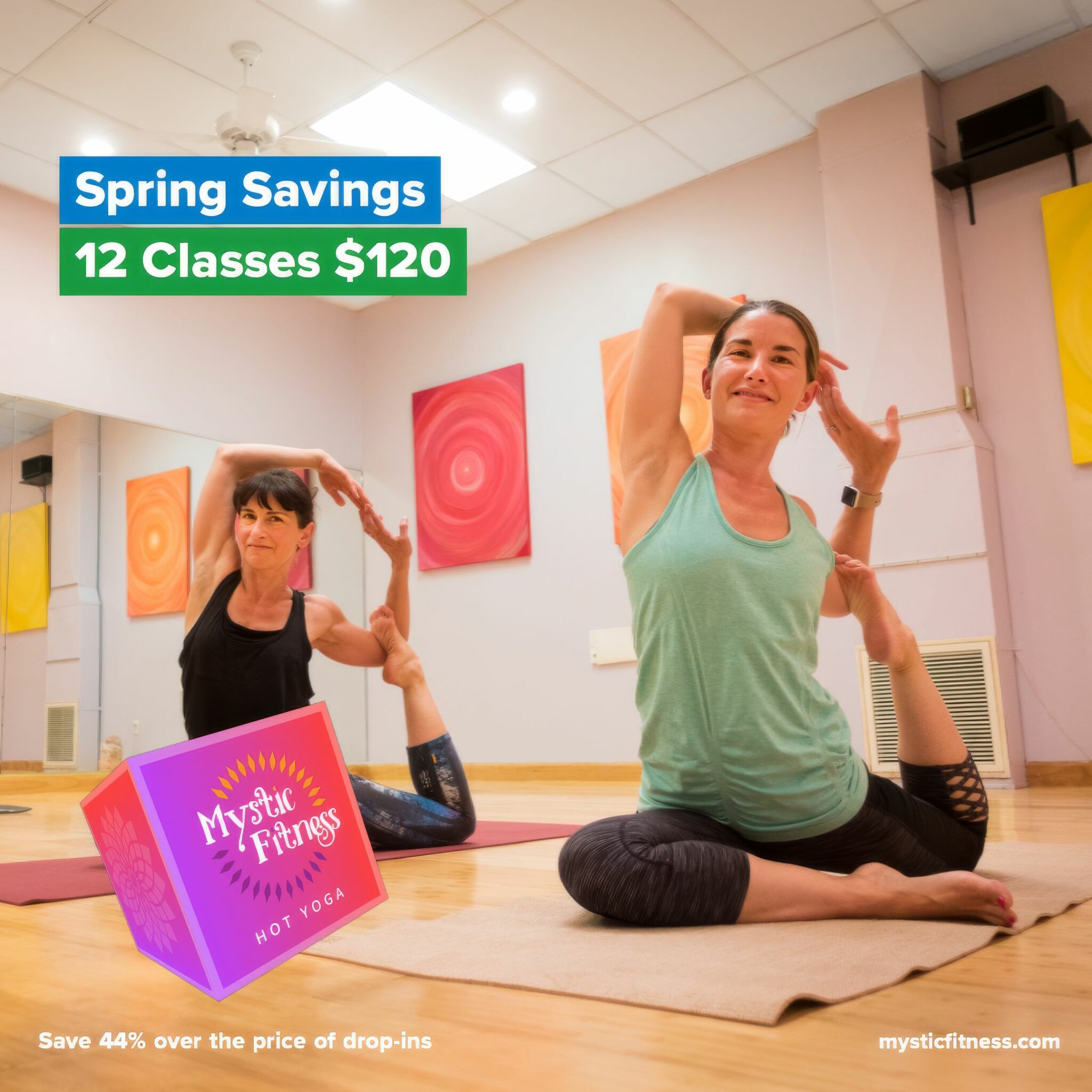
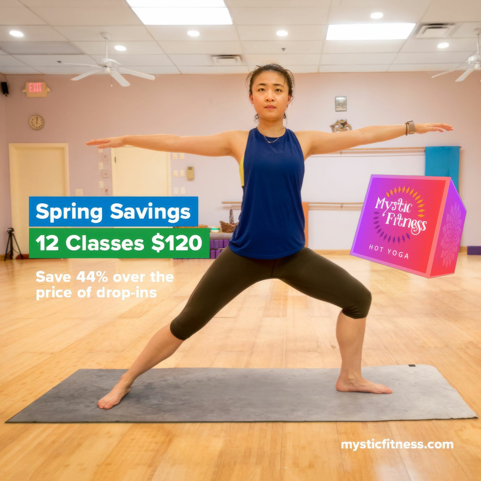
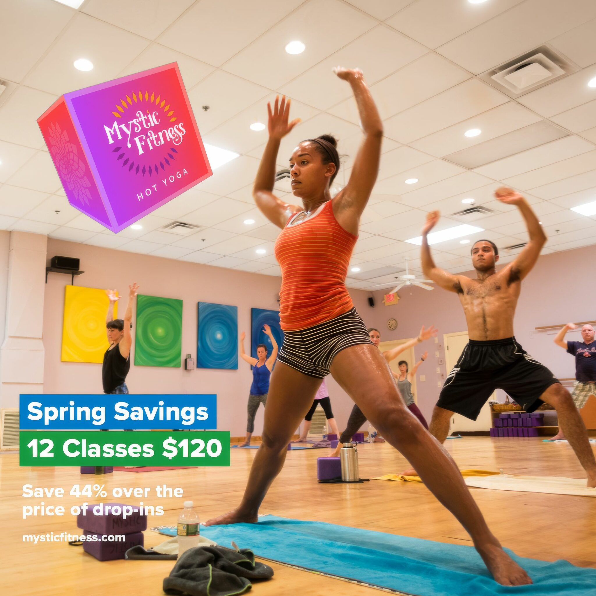
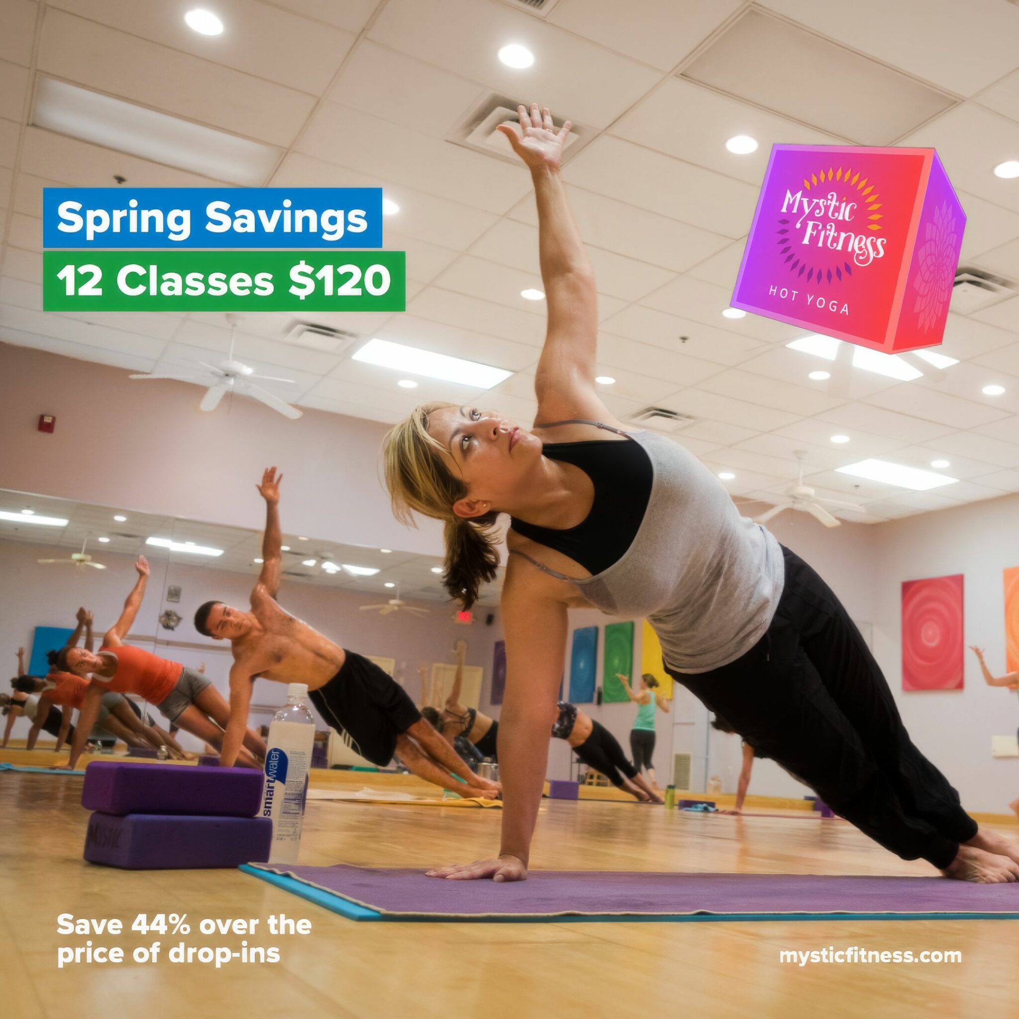
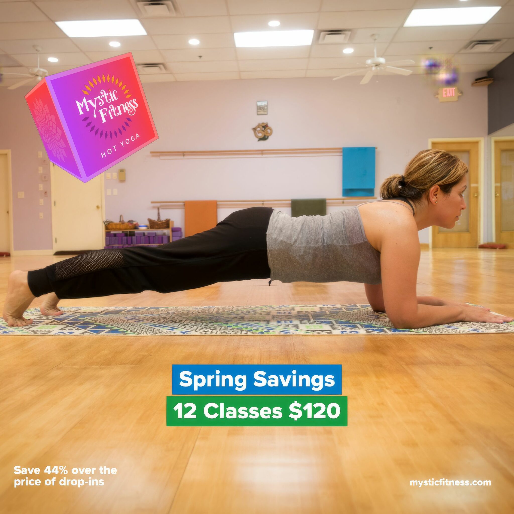
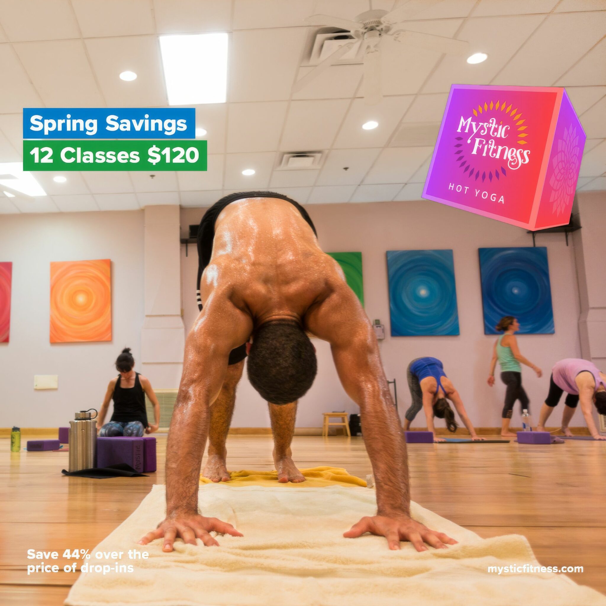
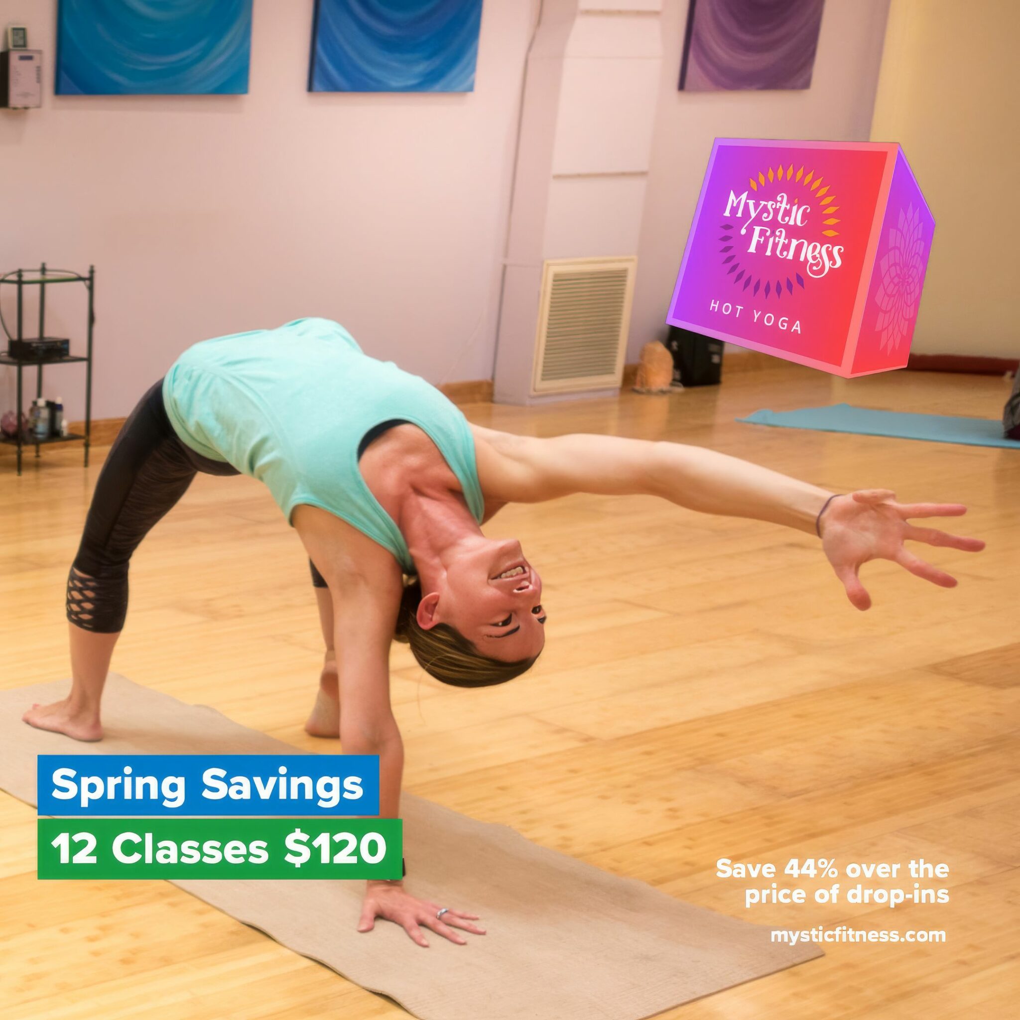
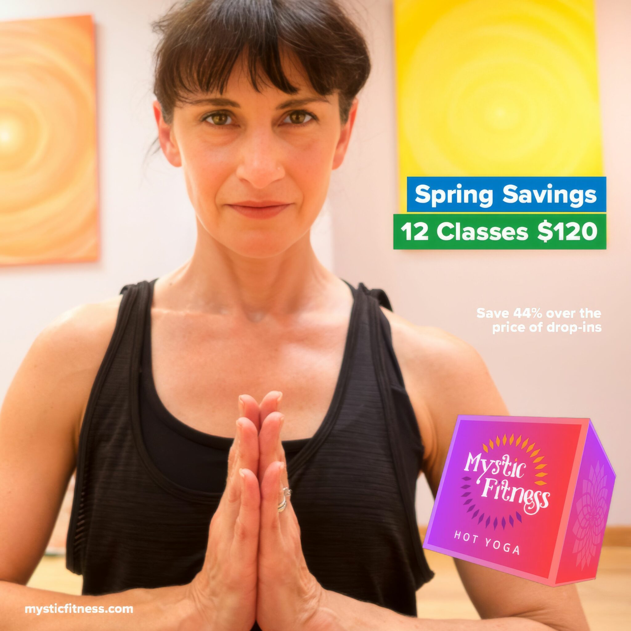
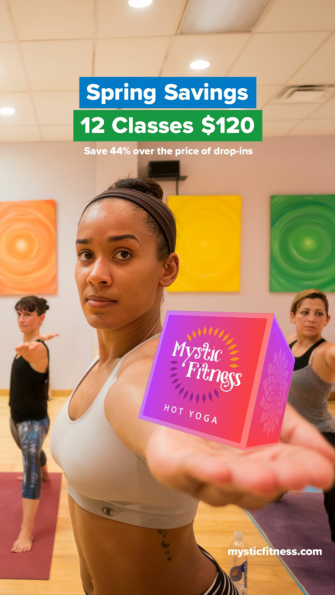
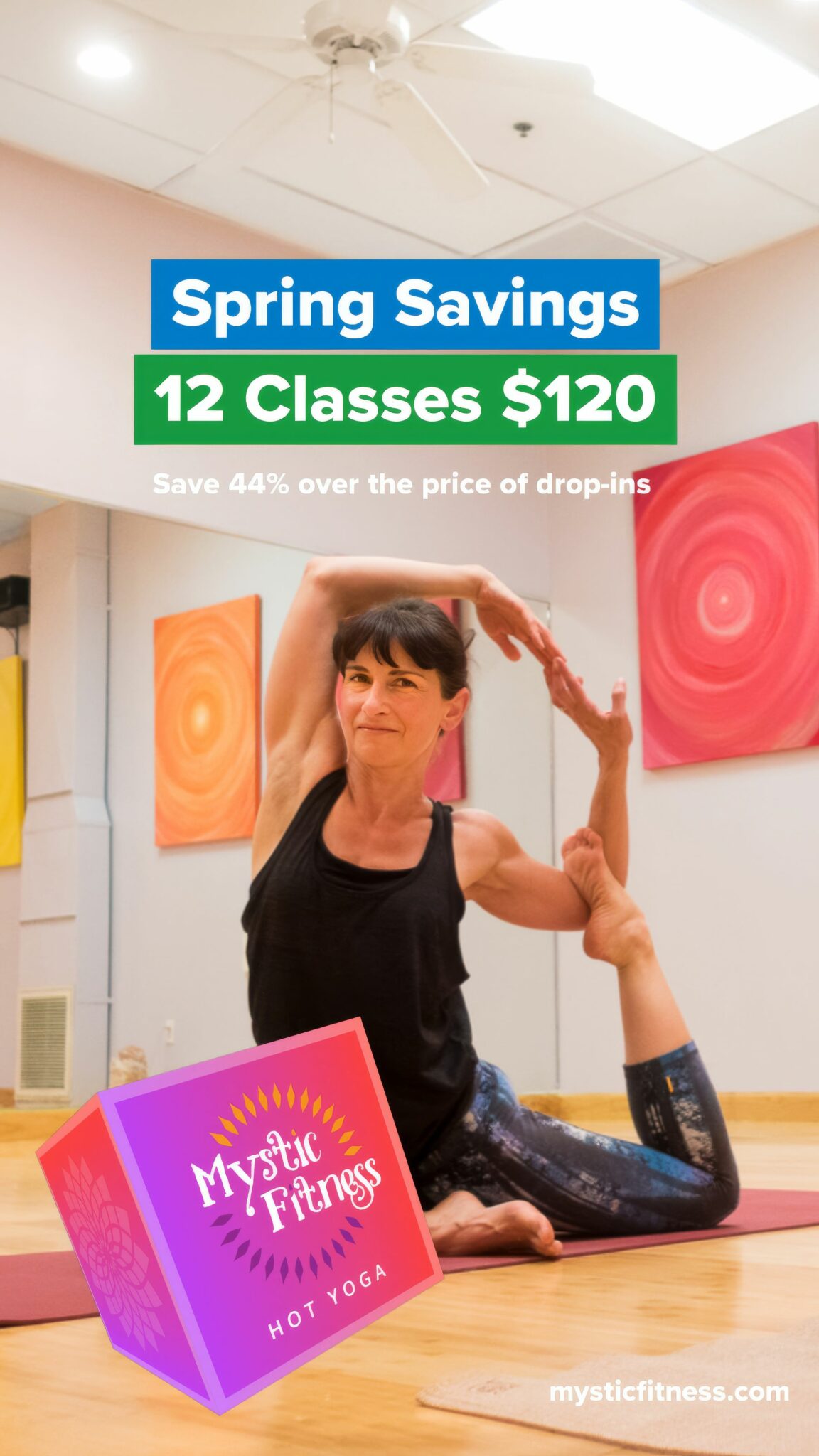
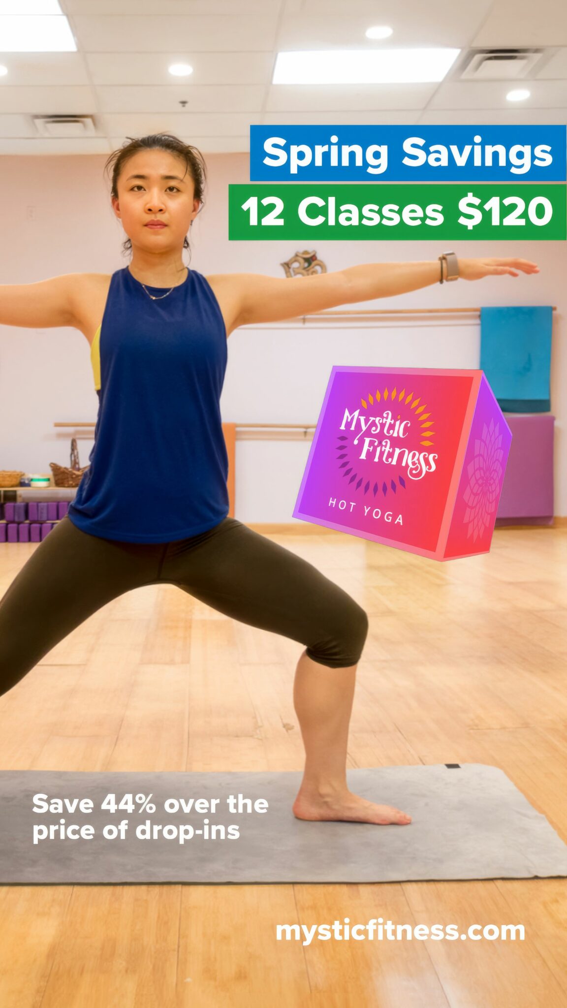
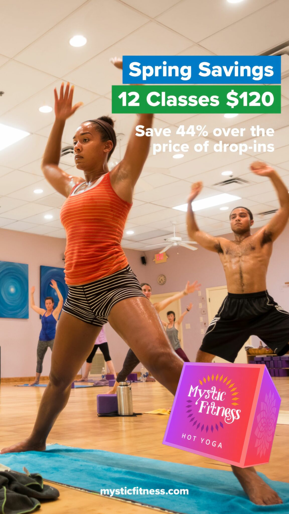
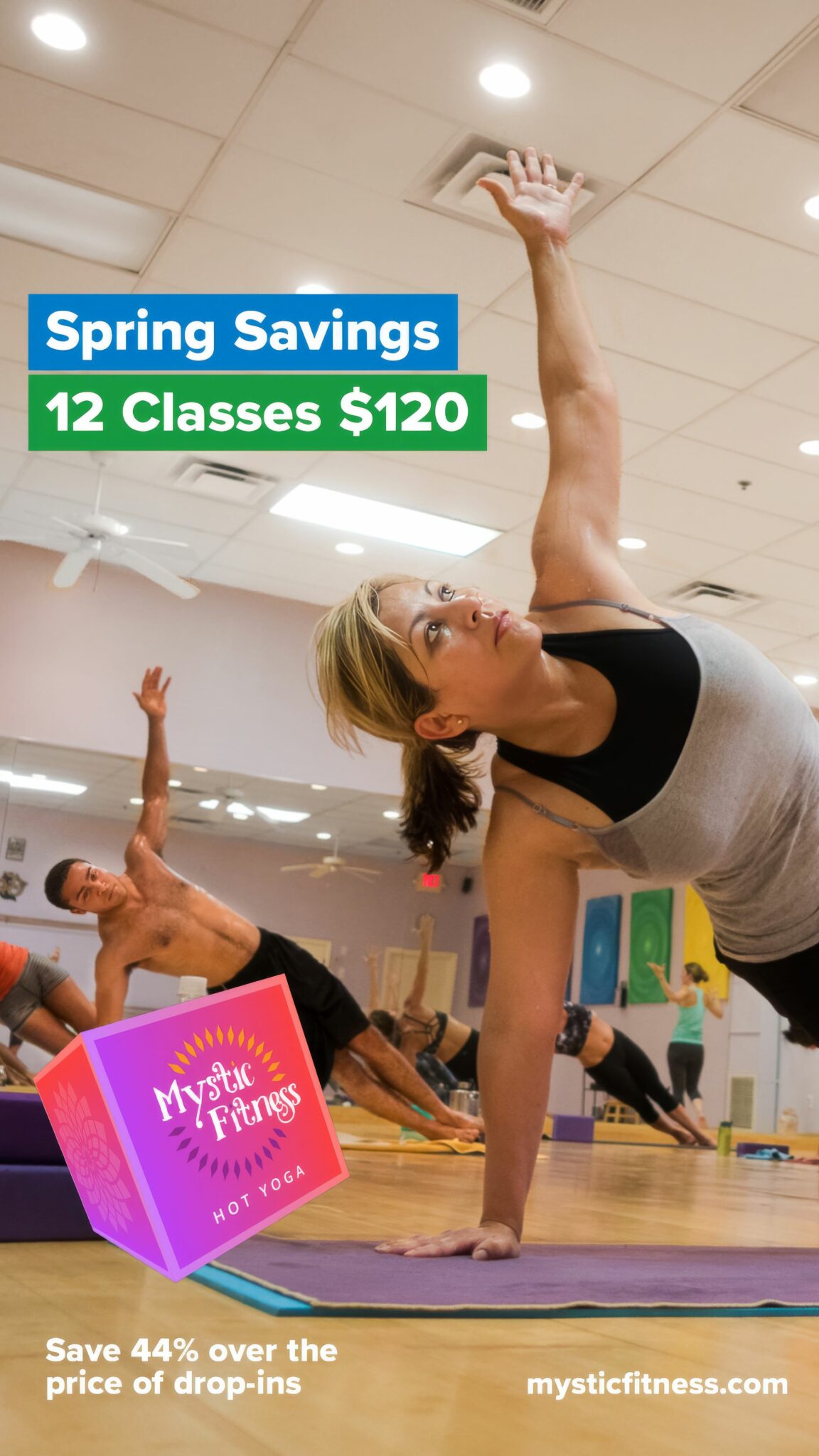
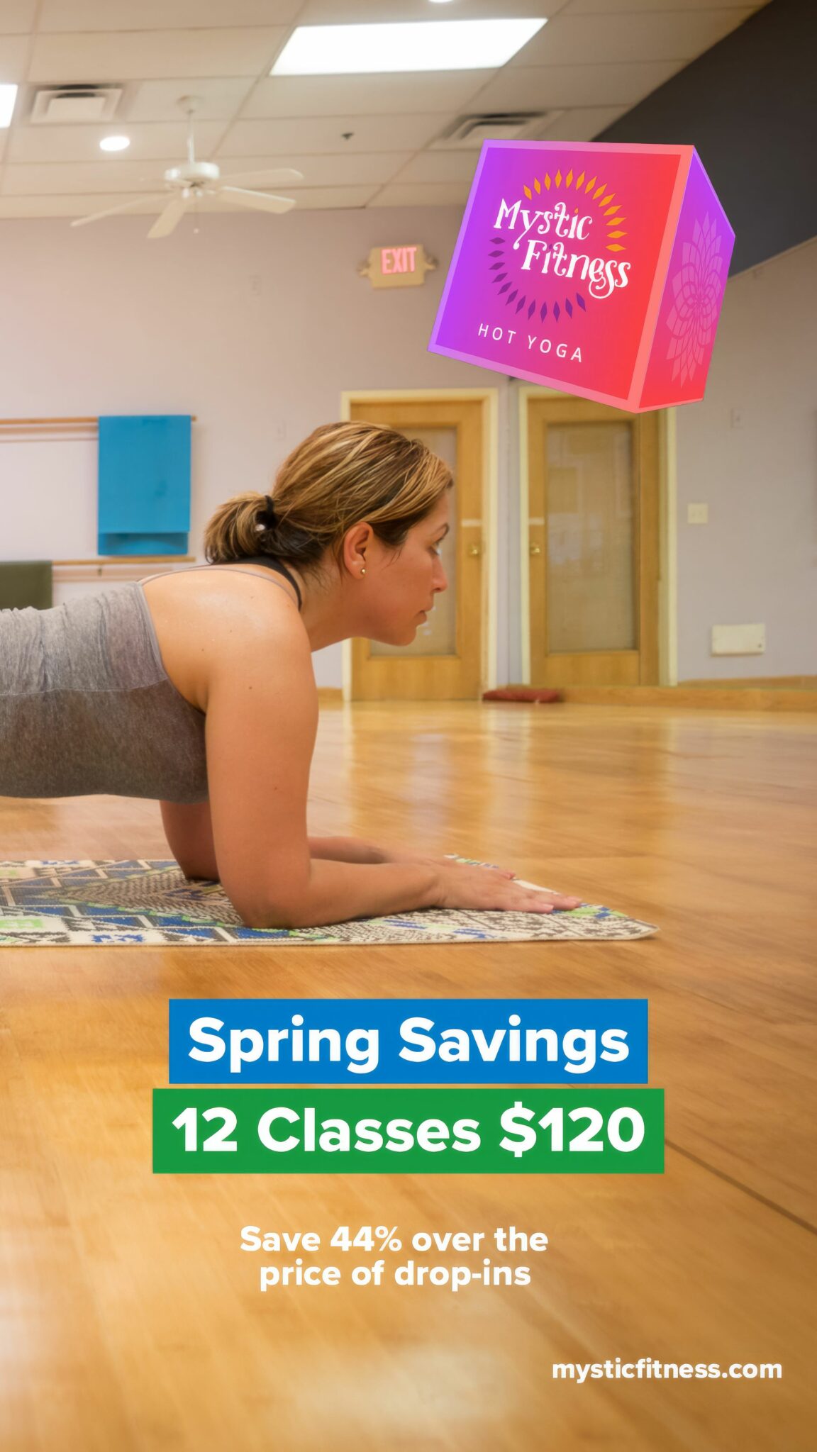
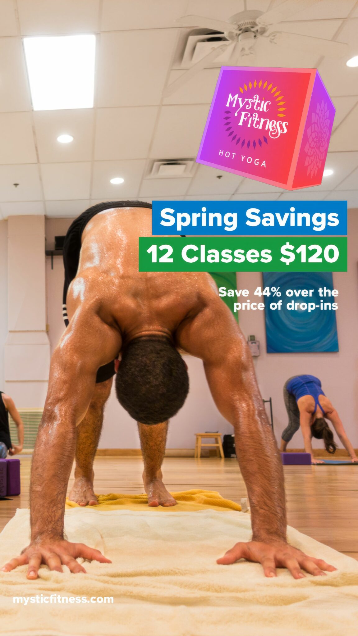
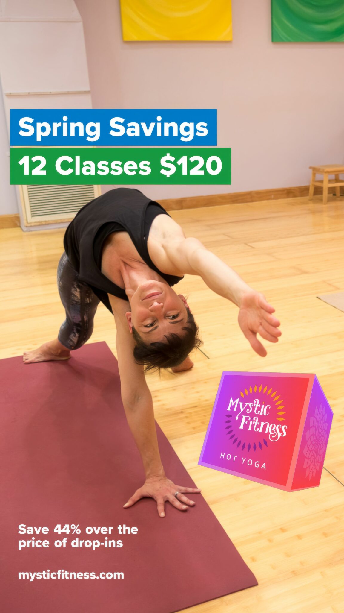
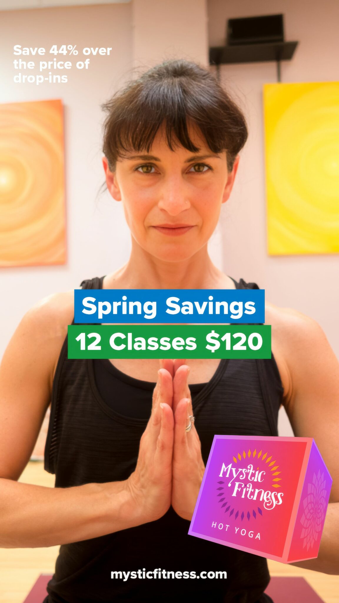
Instead of treating each promotion as an isolated campaign, we built a scalable advertising framework spanning postcards, Facebook, Instagram, and square, landscape, and vertical formats. A shared visual language made every execution immediately recognizable while giving seasonal promotions room to change.
Digital Experience
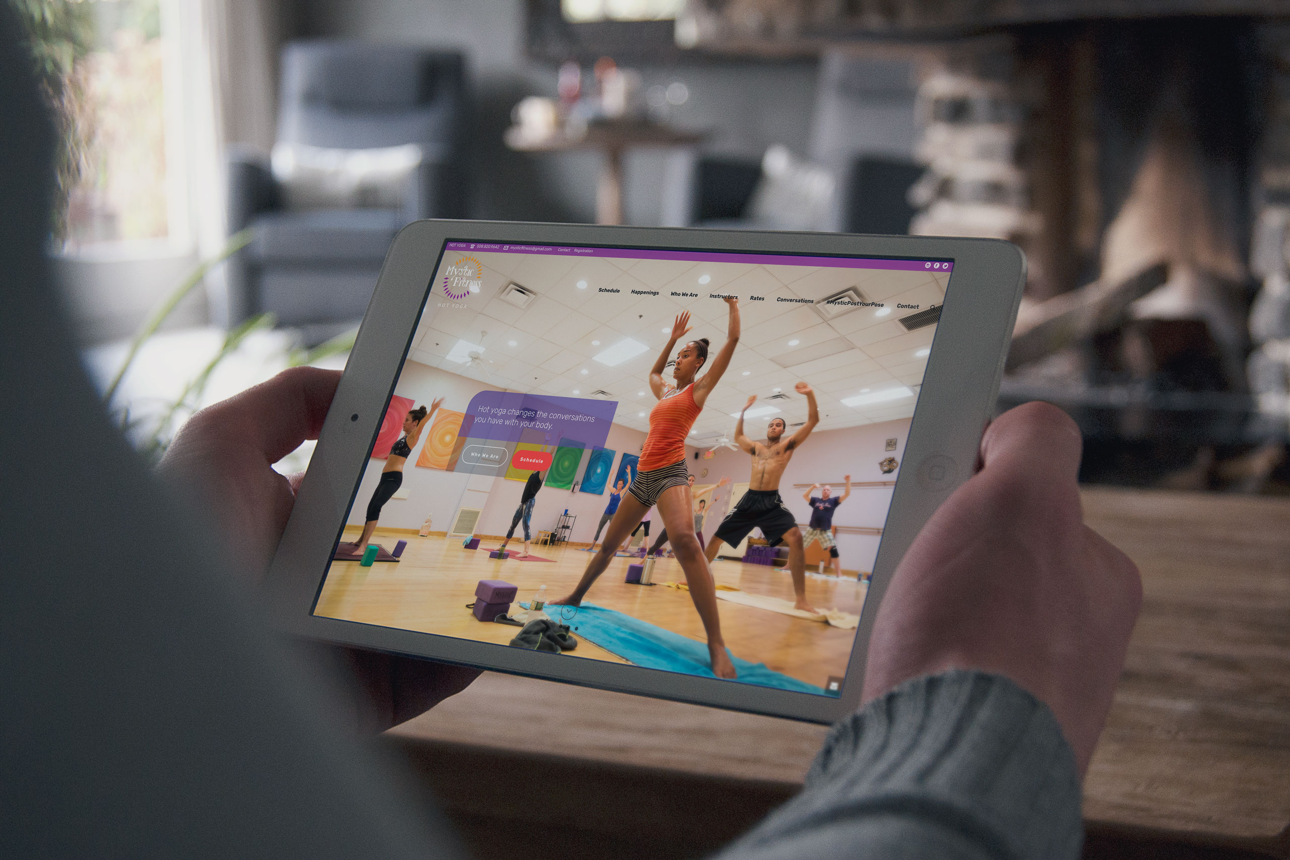
The website did the studio’s hospitality online.
We built an integrated experience on Mindbody, the scheduling and student-management platform the fitness industry already trusts, so students could explore memberships, compare pricing, book classes, and manage their accounts without friction.
Paired with ecommerce, email marketing, and class promotion, the experience made joining the community as welcoming online as walking through the studio doors.
The Through-Line
The belonging students felt inside the studio finally became visible on the outside.
The warmth was already in the room. Photography of real students and instructors captured it, and that library became the face of everything that followed. The philosophy was already the owner’s. The identity gave it a visual language of movement, warmth, and optimism.
The community was already gathering. The advertising system invited more of it: one unified voice across postcards, feeds, and seasonal campaigns.
The hospitality was already real. The website carried it online, letting students explore, book, and belong with the ease of walking in. Even the walls joined in: signage, patterns, and merchandise brought the brand into the studio itself.
None of it was manufactured. It was revealed. And when a brand shows people what they already love, joining it feels like coming home.
Every Touchpoint Revealed the Community That Was Already There.
Discovery + Strategy
Before design, we uncovered the philosophy that already inspired the community.
Business Roadmap
Build a business that grows through experience, not promotions. We aligned branding, photography, digital experiences, advertising, and member communications into a unified marketing system that strengthened community, increased awareness, and supported long-term growth.
Brand Architecture
The brand wasn’t yoga. It was transformation. Discovery revealed that Mystic Fitness wasn’t simply teaching classes. It was creating a place where movement, challenge, and community helped people reconnect with themselves. That philosophy became the foundation for every visual and verbal decision.
Audience Architecture
Different motivations. One shared destination. Students arrived seeking flexibility, strength, stress relief, spirituality, or community. Rather than marketing a single class, we designed messaging that welcomed every motivation while reinforcing one consistent brand experience.
Lifestyle Experience
People don’t join yoga studios. They join communities. Authentic photography, instructor stories, studio tours, and welcoming messaging removed uncertainty before the first visit, allowing prospective students to experience Mystic Fitness long before they walked through the door.
Content & Marketing System
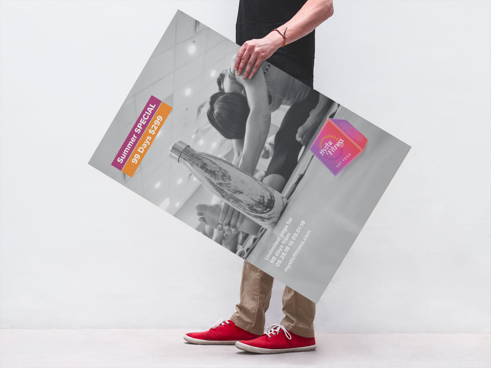
Consistency builds recognition. Authenticity builds trust. Photography, email marketing, posters, advertising, social media, merchandise, environmental graphics, and digital experiences all worked together as one coordinated system that reinforced the studio’s philosophy across every interaction.
Competitive Positioning
Stand apart by revealing what competitors couldn’t imitate. Instead of competing on schedules, pricing, or promotions, Mystic Fitness was positioned around the studio’s unique culture, teachers, and philosophy, creating a brand experience that larger fitness chains couldn’t replicate.
Brand Identity
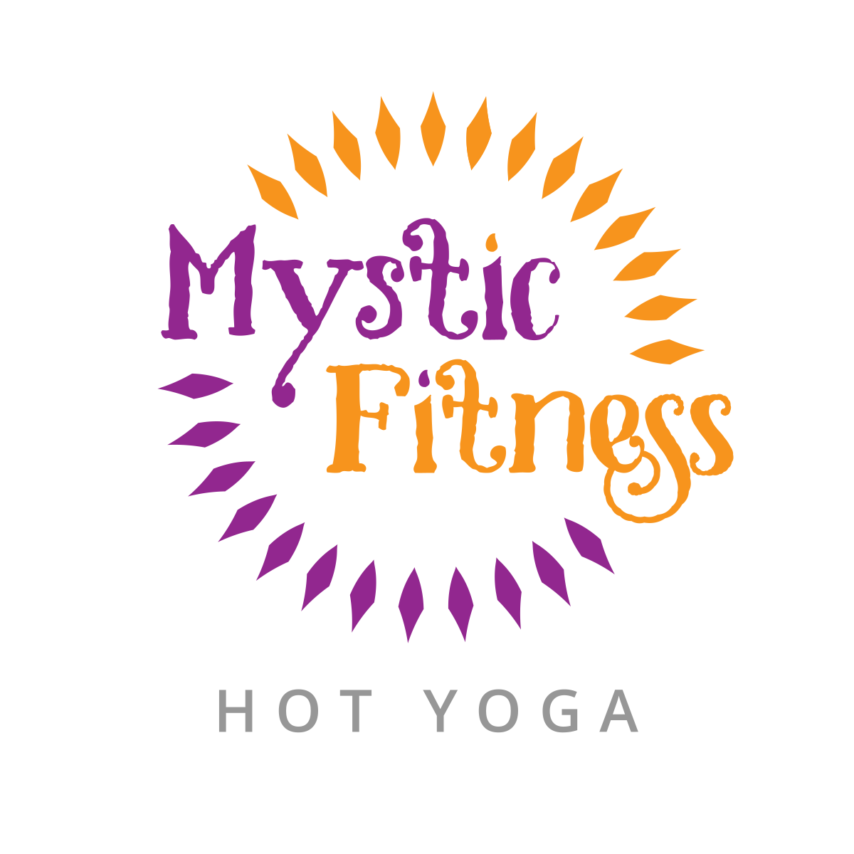
The Mystic Fitness identity was designed as a symbol of movement, belonging, and transformation. It expresses the philosophy behind the studio, not simply its name.
The handcrafted typography reflects personal growth as something organic rather than mechanical. Its flowing curves, imperfect edges, and expressive forms suggest that transformation is a continual process, reinforcing both the “Mystic” spirit of the brand and the deeply personal path each student walks.
Surrounding the name, a circle of individual diamond forms represents the community itself. Each shape stands independently, yet together they create a unified whole, reflecting the shared experience of students challenging and supporting one another through practice.
The color transition from vibrant orange to deep purple evokes the rhythm of sunrise and sunset, balancing energy with reflection. Together they suggest movement between opposites: effort and recovery, strength and mindfulness, challenge and growth. The identity becomes more than a logo; it becomes a visual metaphor for transformation through practice. Across the broader system, the palette lets energetic moments lead while quieter applications retain the reflective side of the studio experience.
Every element grew from the same strategic insight: Mystic Fitness wasn’t selling yoga. It was creating a place where people could challenge themselves, support one another, and continually become stronger together. Because that idea belongs to the culture rather than a campaign, it carries from merchandise and environmental graphics to the website without losing its meaning.
Color System

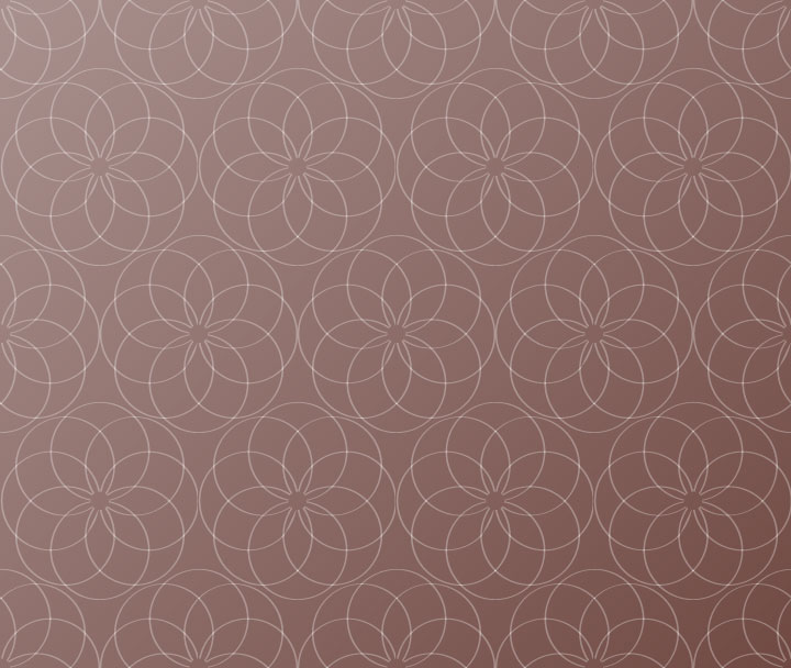
Patterns
Style Guide
Photography
- 01
- 02
- 03
- 04
01
02
03
04
Signage
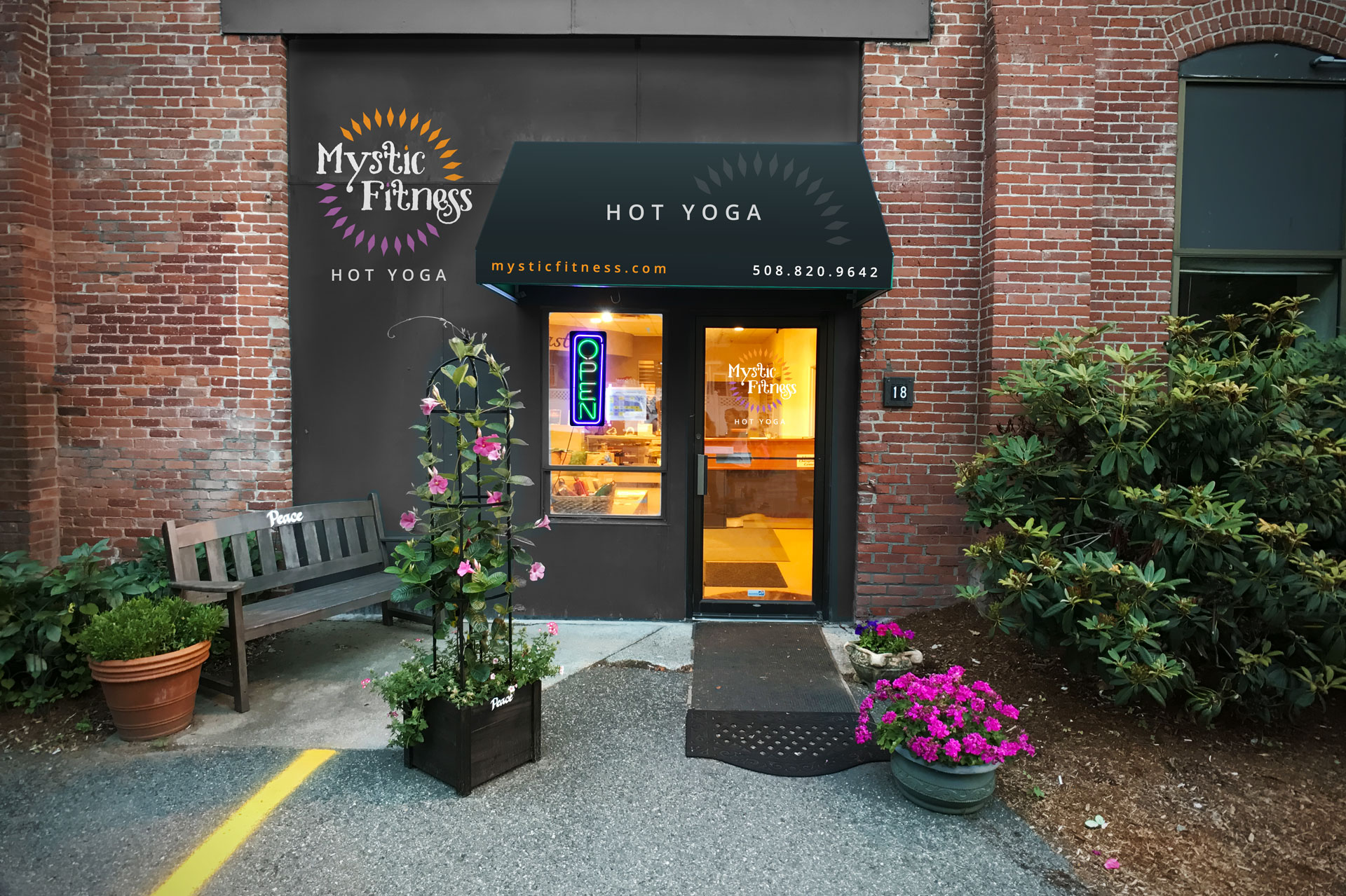
Postcards
Posters
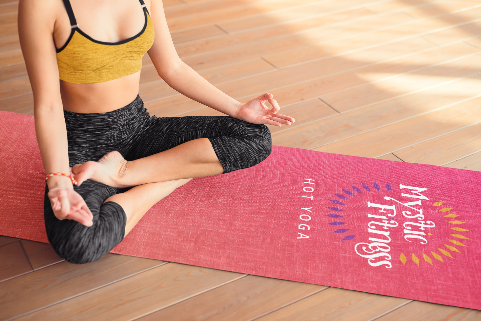
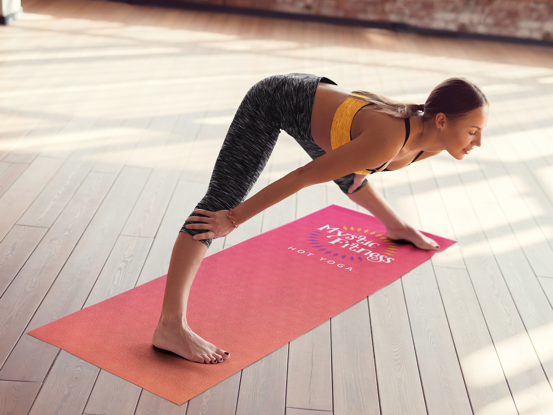
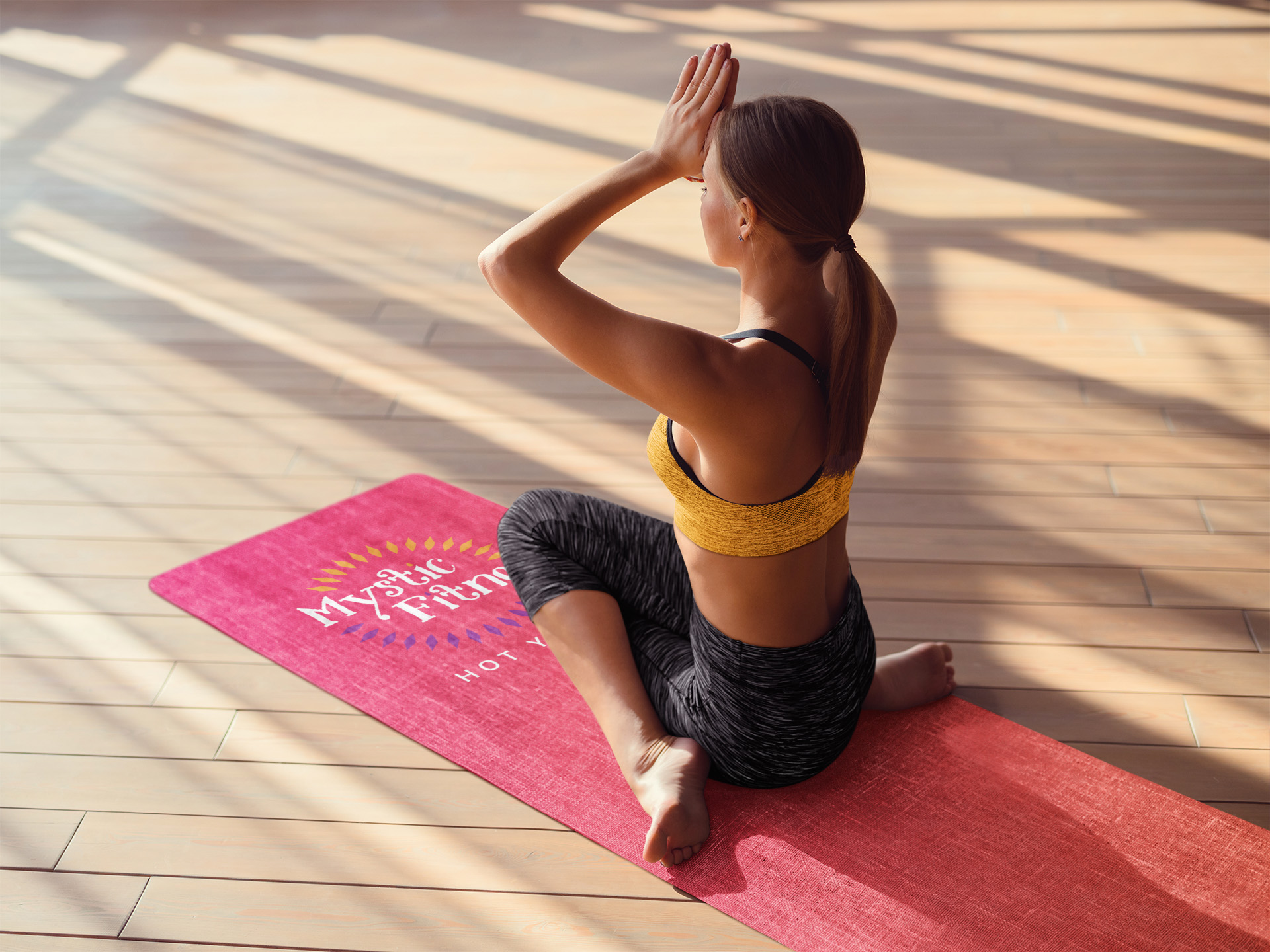
Brand Merchandise
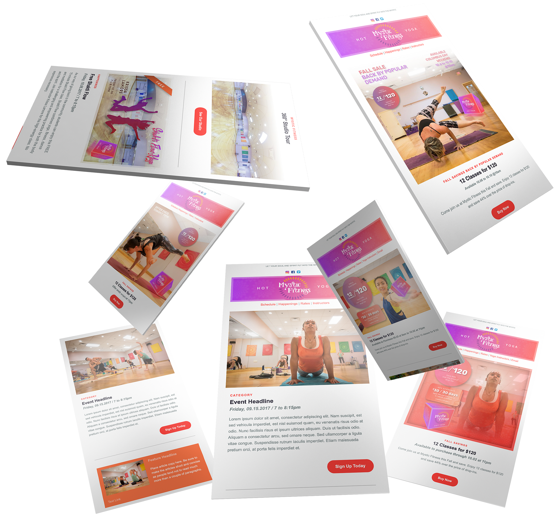
Email Marketing
Website + Student Experience
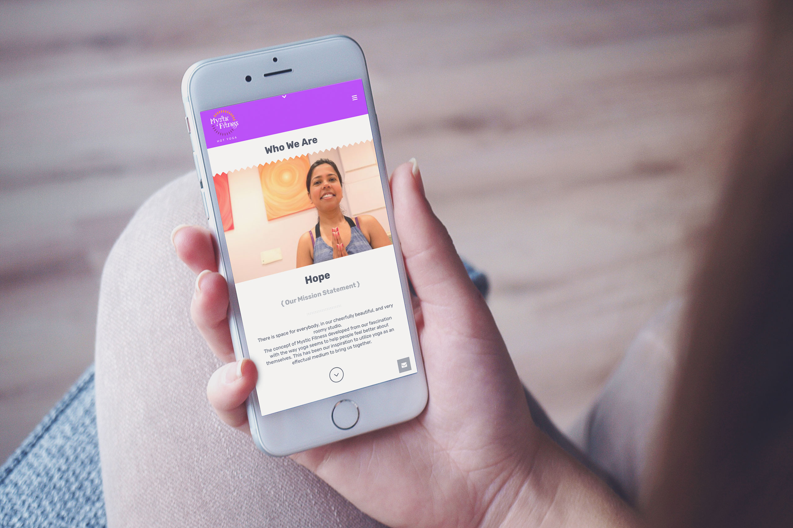
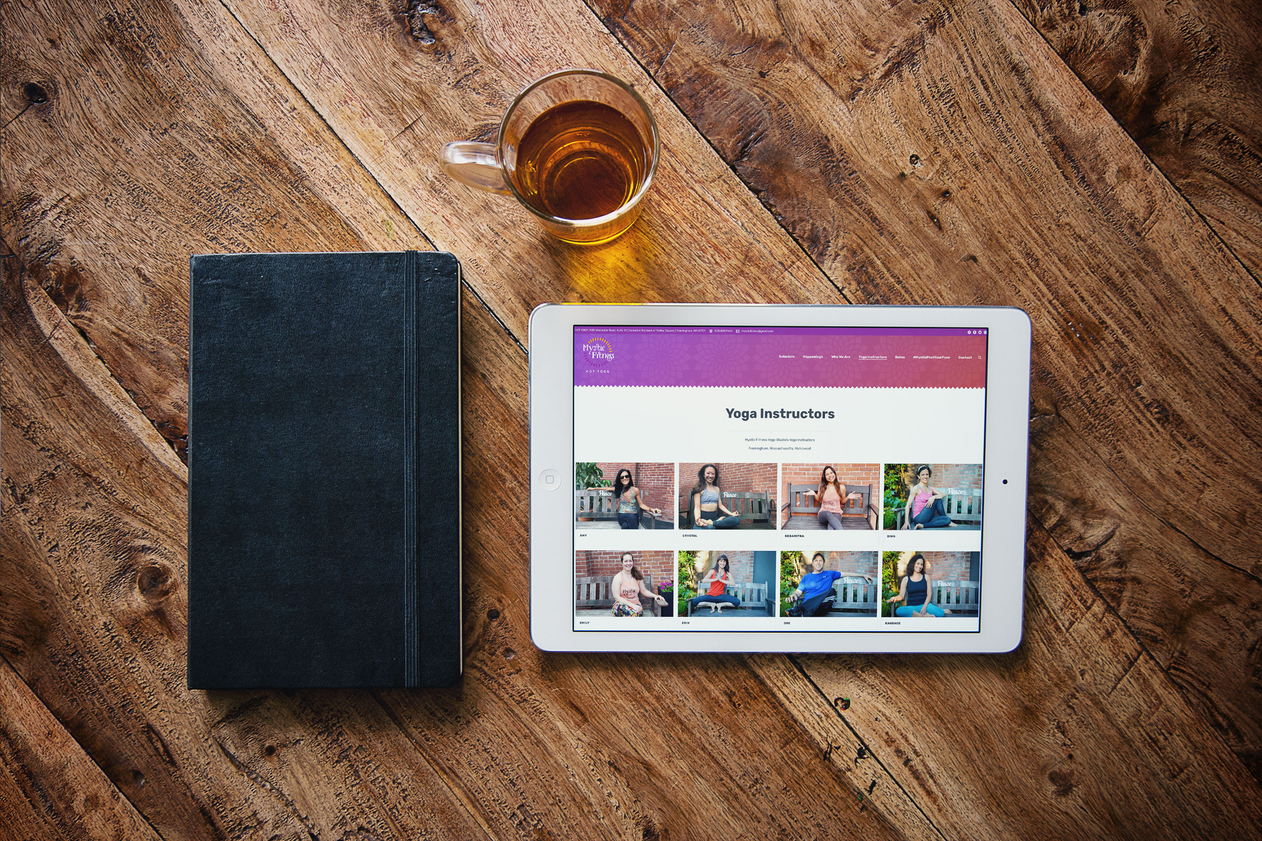
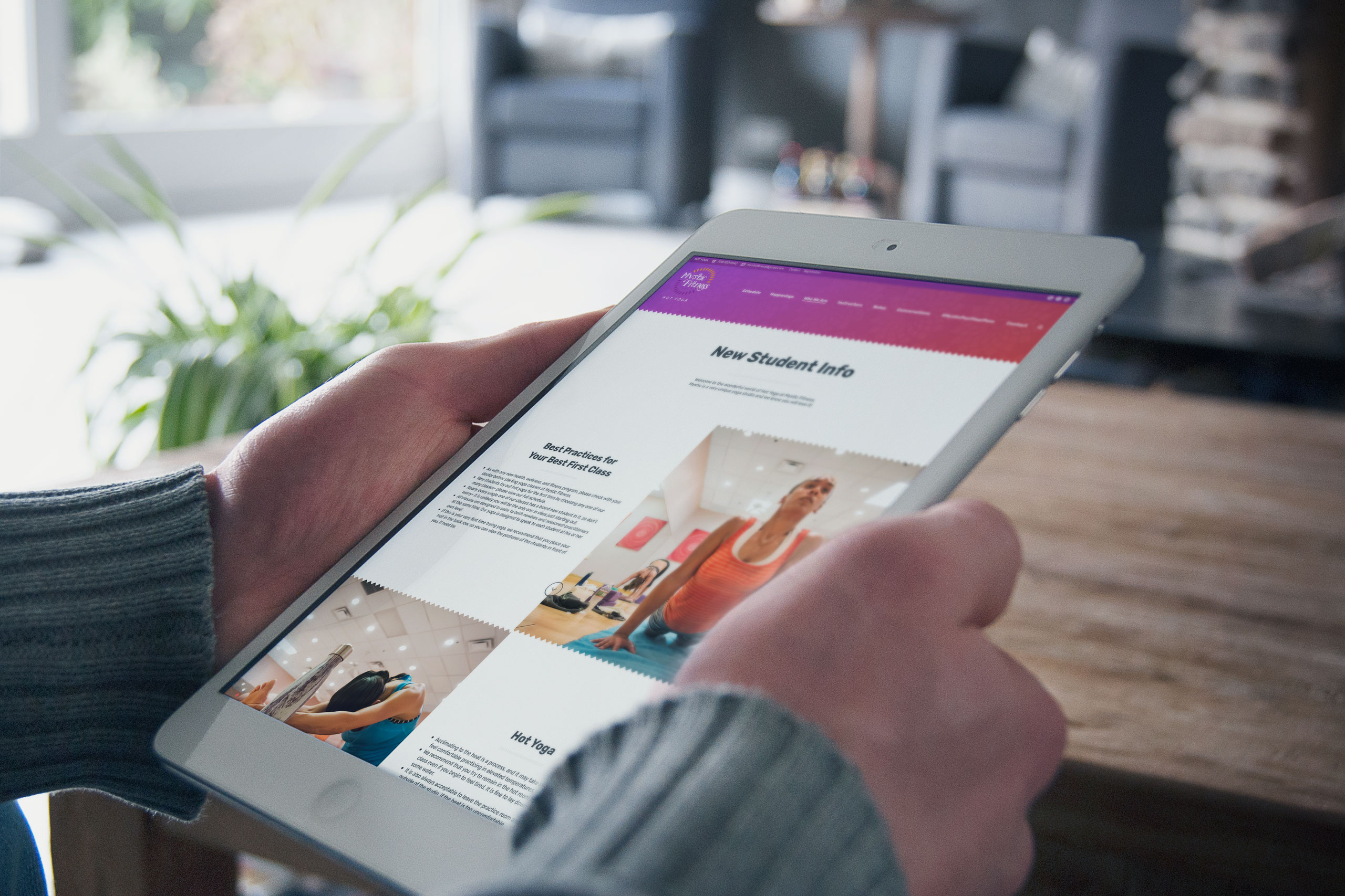
We designed Mystic Fitness around one simple objective: remove uncertainty before students ever stepped into the studio. Every page helped visitors understand the experience ahead, from class styles and teacher philosophies to what to expect during their first visit. Lifestyle photography, immersive content, and a virtual studio tour transformed the website from a scheduling tool into an invitation to join the community.
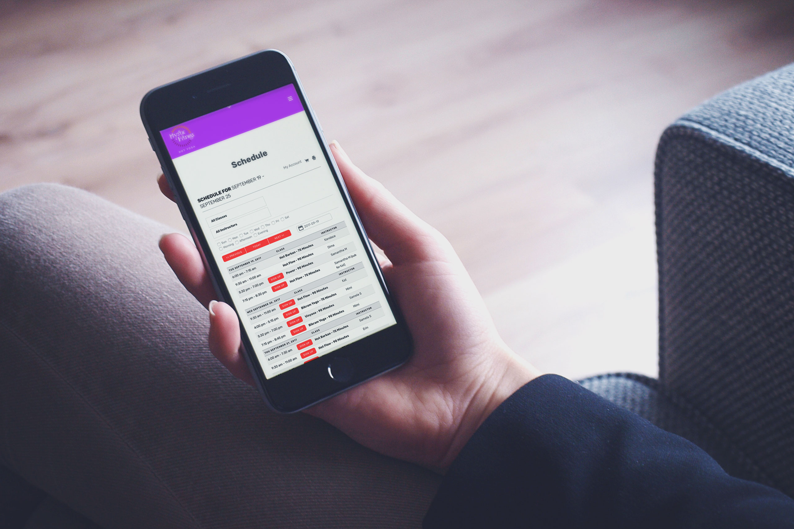
The website integrated with Mindbody, allowing students to explore memberships, compare pricing, schedule classes, and manage their accounts through a familiar platform already trusted throughout the fitness industry. Combined with instructor biographies, FAQs, contact tools, maps, and social channels, the experience reduced friction while making the studio feel welcoming long before the first class began.

Social Media Advertising
- B&W 16:9
- B&W 1:1
- B&W 9:16
- Color 16:9
- Color 1:1
- Color 9:16
B&W 16:9
B&W 1:1
B&W 9:16
Color 16:9
Color 1:1
Color 9:16