
Mekko Graphics
Clarifying a brand in true proportion. And automating the marketing behind it.
A software company that specialized in true proportion had not yet expressed it clearly across its brand. Mekko Graphics had led strategic charting since 1995, arming business consultants with the chart that shows a whole market at once. Sales and renewals kept climbing while traffic and conversion plateaued, which set the brief:
Rebuild a mature software brand without rebuilding the company around it. Four weeks. Tight budget.
Bowman Design Direction rebuilt the brand with the product’s own discipline. We clarified the existing Marimekko idea in the identity, restructured the website so every part of the business shows at its true value, and put publishing in the staff’s hands, no developer required.
Read the Story
Challenge
Mekko Graphics makes the chart consultants reach for when a market has to be understood in one view. The software kept winning renewals, and the numbers that mattered kept climbing. Traffic and conversion did not.
The brand had plateaued around its own strengths. Free trials, support, how-to resources, and the store all existed, but nothing about the site said which mattered or for whom. The company that sells clarity was hard to read, and there were four weeks and a tight budget to fix it.
Direction
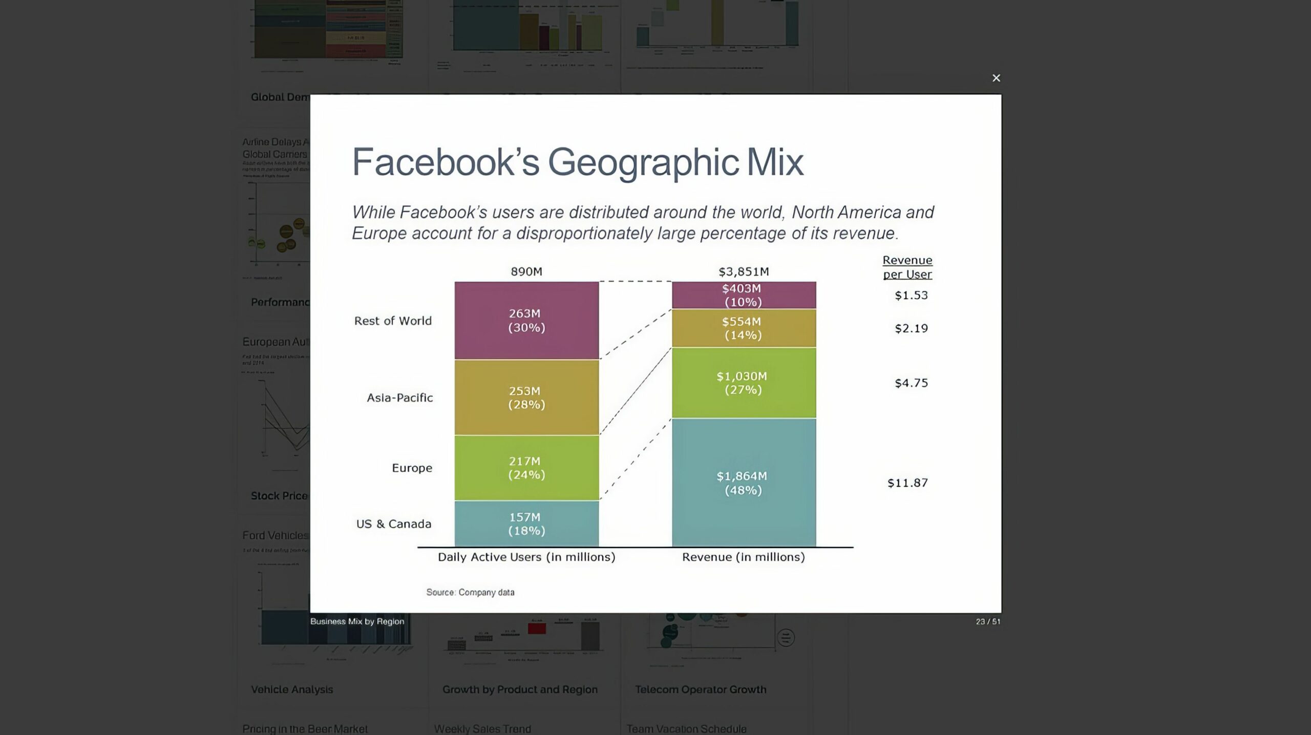
The answer had been present in both the product and its existing mark since 1995. A Mekko chart shows a whole market in true proportion, every segment sized by its value, and the logo already drew from that Marimekko geometry. The idea was right. Its expression needed to catch up.
We clarified and modernized that connection rather than replacing it. The site’s taxonomy was rebuilt the way the product sizes a market: free trials, support, learning, and the store each given the space their value earns, with three customer segments named and addressed: strategy, marketing, and finance consultants.
Outcome
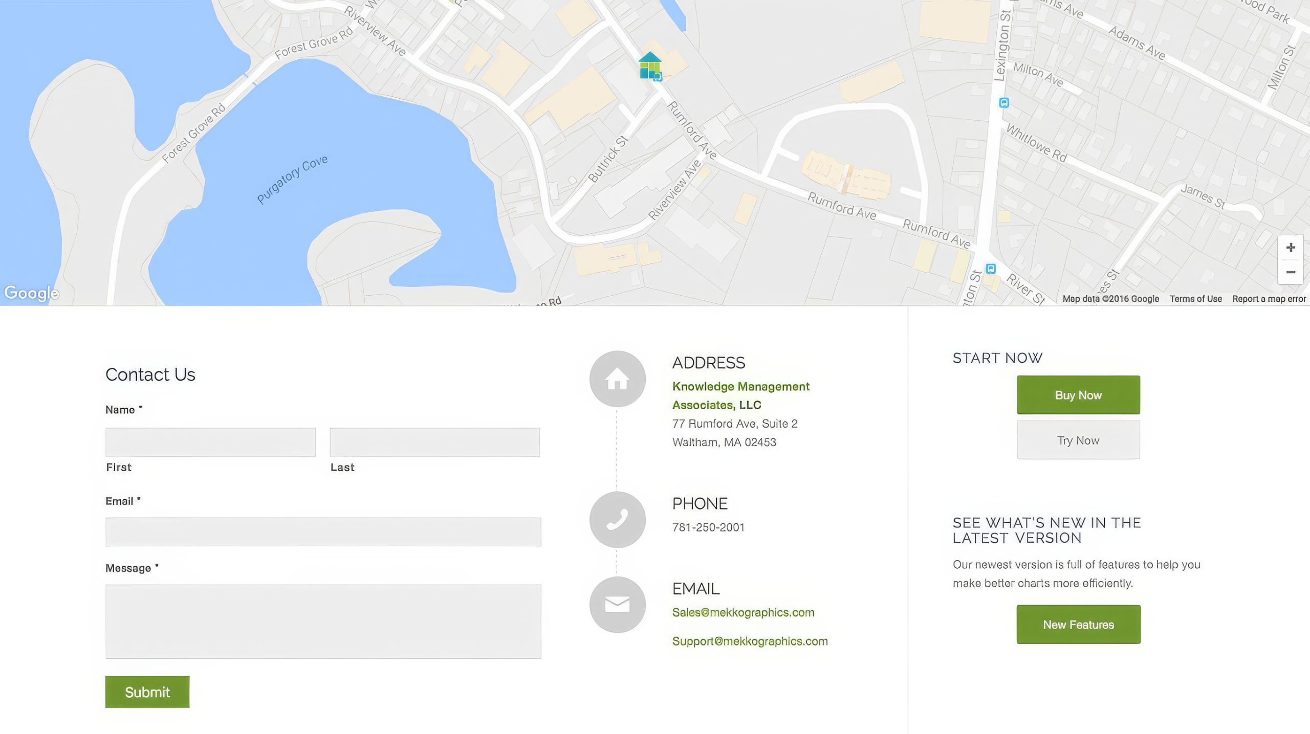
Four weeks after it began, Mekko Graphics relaunched with a modern brand, a clear hierarchy, and trials, resources, and a store a first-time visitor could find without help.
The deeper change was operational. Publishing moved in-house on WordPress, where staff and the marketing consultant could update the site and run content campaigns without a developer. Publishing frequency rose while the effort behind it fell: marketing that had waited on developers became a habit the company could keep. The same software built to simplify strategic communication was now supported by a website built to simplify marketing communication.
Takeaway
Four weeks and a tight budget usually buy decoration. The durable move was applying the product’s own discipline. The identity already held the right chart, but the system around it had not yet made that idea unmistakable. The work clarified the mark, carried true proportion through the site, and built a publishing system with every segment of the business sized by what it is worth.
What We Built
Brand & Identity
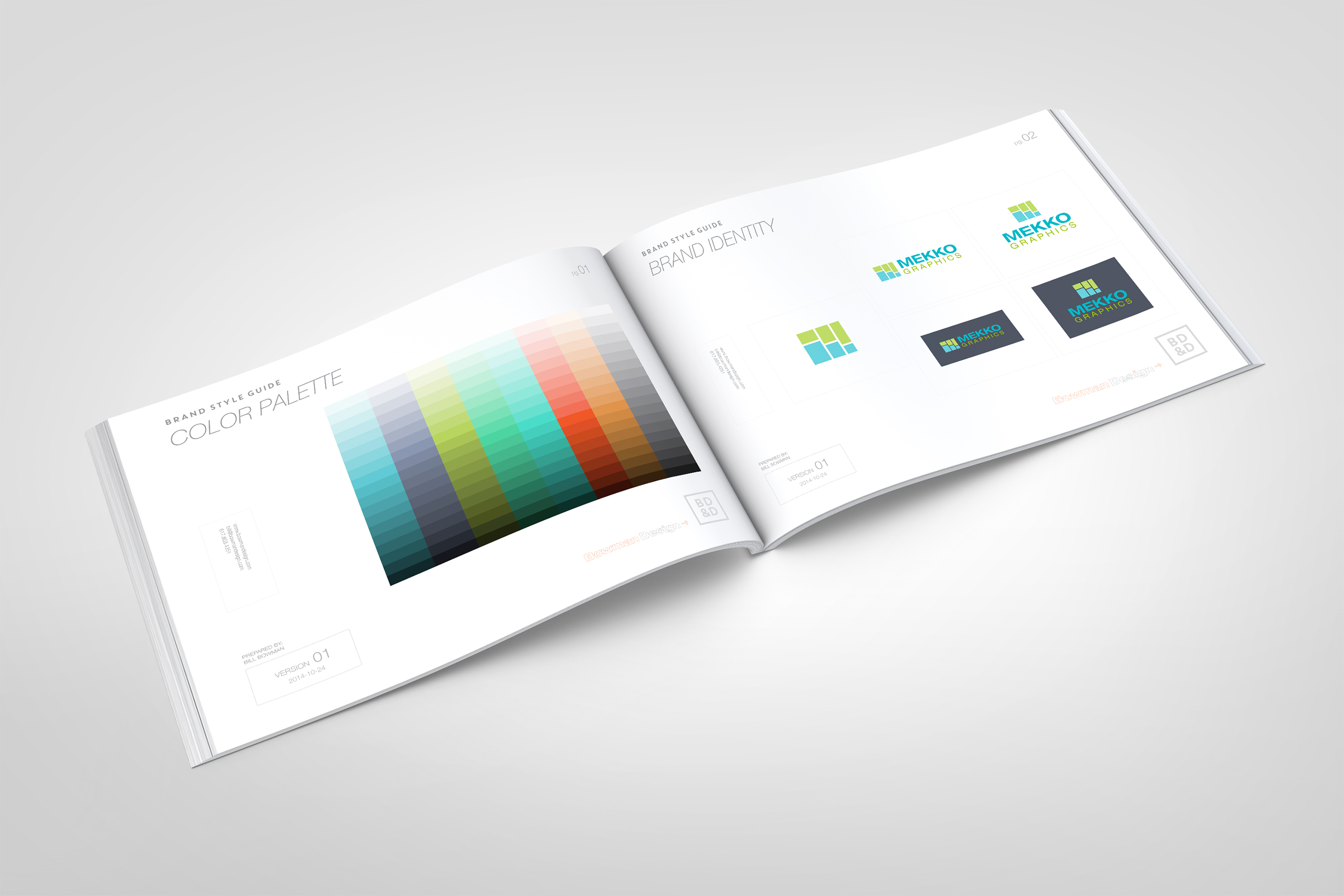
We clarified the identity from the geometry already inside it. The existing mark drew from the Marimekko chart; we modernized that connection until it unmistakably belonged to Mekko Graphics, then carried it through new type, color, grids, margins, and compositions doing the quiet work of credibility.
Website
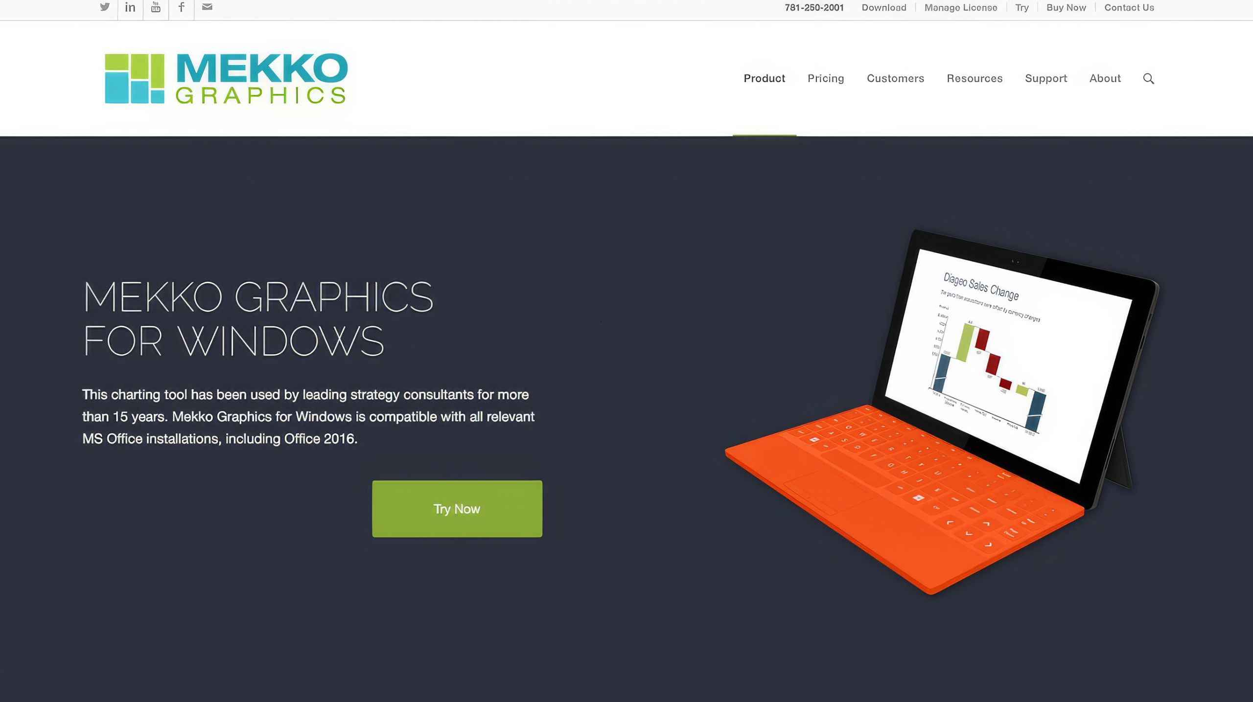
We rebuilt the site’s taxonomy with the marketing consultant, then designed it the way a Mekko chart reads: the whole business visible at once. Free trials, support, how-to resources, and the store were each sized by their value to a visitor deciding whether to commit.
Publishing Platform
We built the new brand on WordPress so staff and the marketing consultant could change anything, publish anything, and run campaigns without waiting on a developer. The product’s promise, persuasion without specialists, became the company’s own workflow.
Audience Segments
We defined three customer segments to design and write for: strategy, marketing, and finance consultants. Each got a path through the same site, so one brand could make three different cases without splitting into three.

The Through-Line
What began as a plateauing brand became a business drawn at its true value.
The identity’s existing Marimekko idea became unmistakable: a clarified mark, new type, and a disciplined palette signaling that the clarity in the product extends to the company. The website carried the same proportions, giving trials, support, learning, and the store the space their value earned.
Instead of one generic pitch, the taxonomy spoke to three consultancies by name, letting strategy, marketing, and finance each find their own case.
The publishing system removed the specialists from the loop, so the people closest to the content could ship it, and campaigns could run at the pace of the business instead of the pace of a developer’s calendar.
None of it required new ideas. It required applying the company’s oldest one, true proportion, to the one market Mekko had never charted: itself.
Every Deliverable Applied the Same Discipline: True Proportion.
Discovery + Strategy
Before design, we found the discipline already inside the product and its mark.
Business Roadmap
A plateau isn’t a ceiling; it’s a signal. We reframed flat traffic and conversion as untapped relationships, then planned a four-week rebuild that strengthened the weakest parts of the funnel without disturbing what already worked.
Brand Architecture
The existing logo already held the strategy: a direct connection to the Marimekko chart. We clarified and modernized that idea, then let the product’s principle, true proportion, govern type, color, and every composition.
Audience Architecture
Three consultants, three ways to trust. We mapped how strategy, marketing, and finance consultants each judge a charting tool, then gave each a path through one site built to earn their specific confidence.
Proportion Strategy
Show the whole business at once. We rebuilt the site’s taxonomy the way a Mekko chart reads, sizing free trials, support, how-to resources, and the store by the value each holds for a visitor deciding whether to commit.
Content & Marketing System
Marketing Moves without Developers. We built a publishing system the staff could run themselves, raising frequency while cutting the effort and cost behind every campaign.
Competitive Positioning
In a category of dense decks, clarity wins. We positioned Mekko as the tool that makes a consultant’s case legible at a glance, the opposite of the clutter its competitors sell.
Brand Identity
The Mekko Graphics identity already contained the right idea, but the execution had not caught up with it. Its existing mark drew from the Marimekko chart, the mosaic of proportioned columns that gives the software its purpose. Rather than replace that connection, we clarified and modernized it, turning an awkward visual reference into a mark that unmistakably belonged to the company. The logo could finally do what the product had always done: render a whole market in true proportion, every segment sized by its value.
New type and color palettes gave a brand founded in 1995 a contemporary footing, confident enough to sit beside the consultancies it serves. The palette holds equally well on positive and reversed backgrounds, no alternate brand colors required, giving one identity unusual reach across presentations, software, and marketing. That consistency matters for a product whose identity has to travel wherever its customers’ analysis does. The system could change context without changing character.
Restraint was the whole point. A brand built for strategy, marketing, and finance consultants cannot shout. It has to read cleanly in a boardroom, in a deck, and in the corner of a slide a client will study for half a minute. The system was drawn to disappear into the work its customers produce, present enough to be recognized without competing with the information it was designed to support. That required enough character to be remembered, but enough discipline to sit comfortably beside dense charts, analysis, and recommendations.
The result is an identity that behaves like the product. It organizes before it decorates, it sizes everything by importance, and it makes a complex offering legible at a glance. Nothing is added simply for effect; every element earns its place by helping the whole become easier to understand. Across applications, the identity builds recognition quietly, giving every touchpoint a shared visual logic without asking the brand to compete with the work. The mark that charts every market now charts the company itself.
Color System

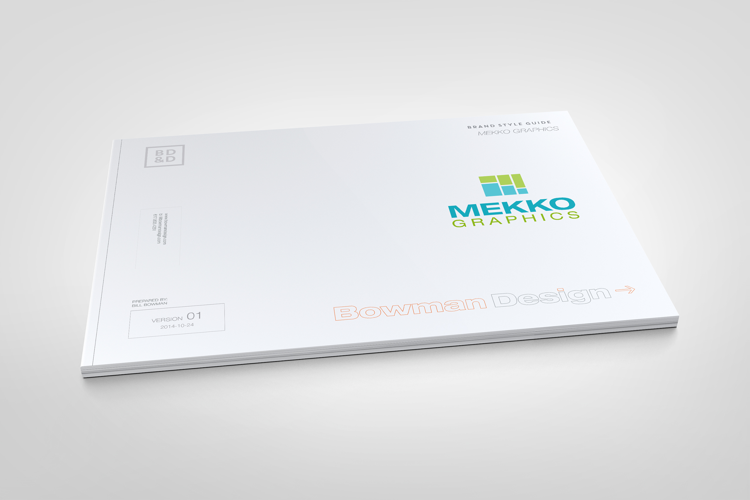
Style Guide
Creations
Mekko Graphics
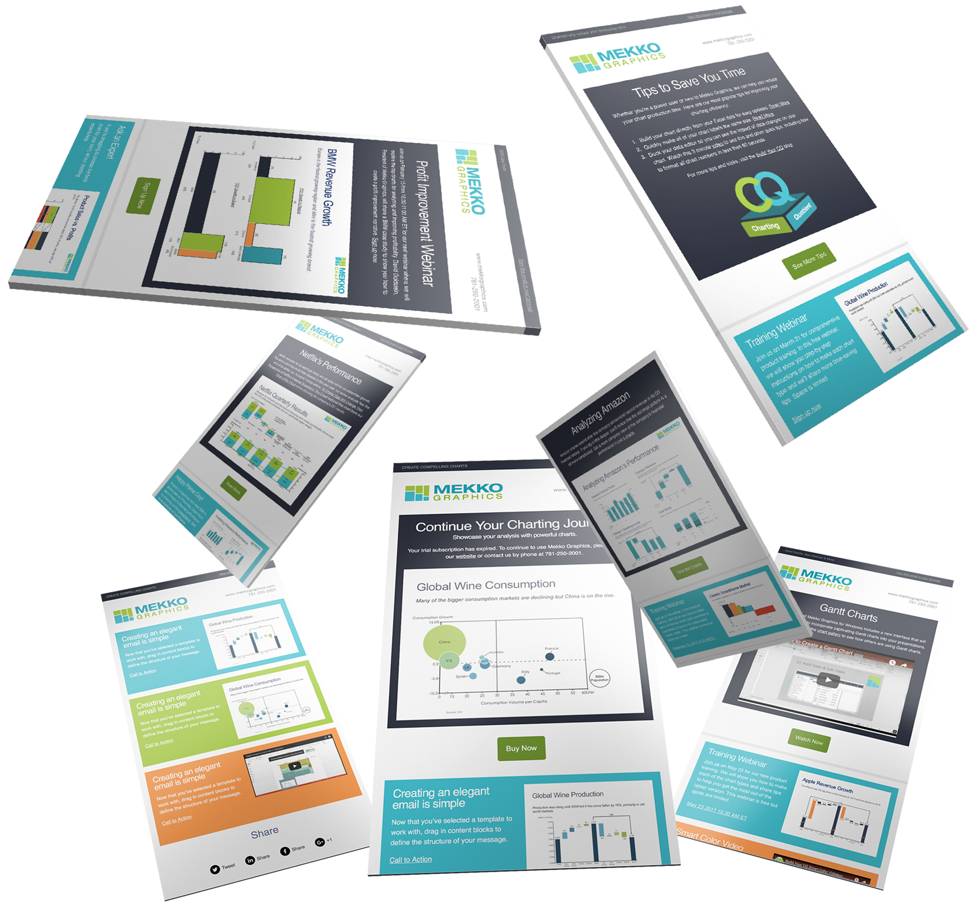
Email Marketing
Website
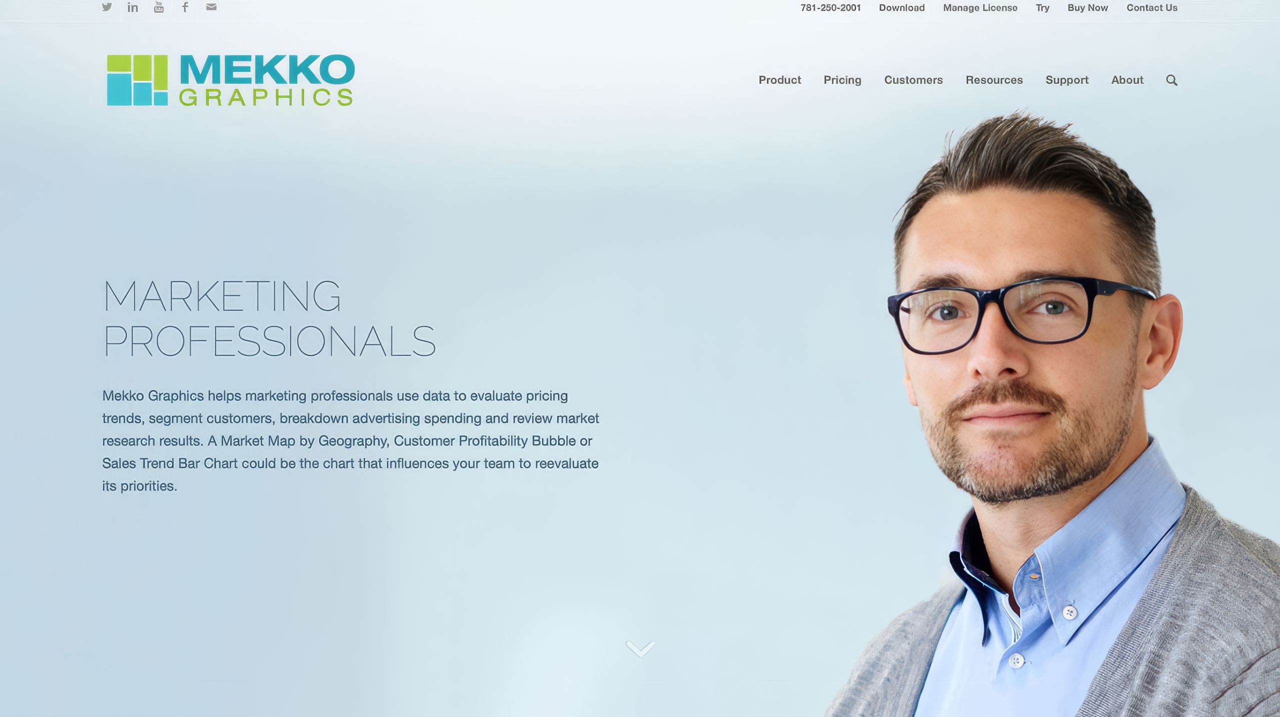
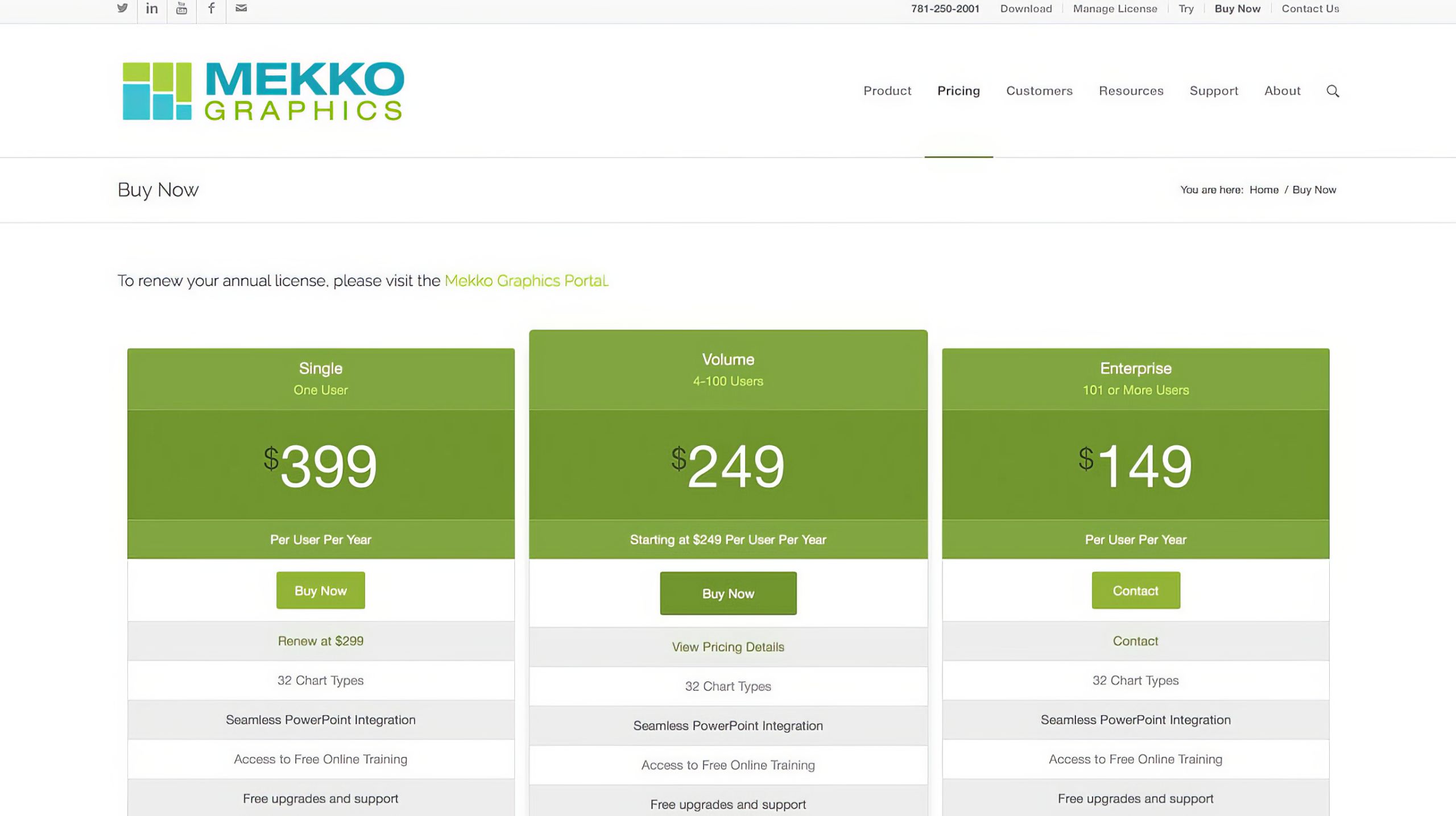
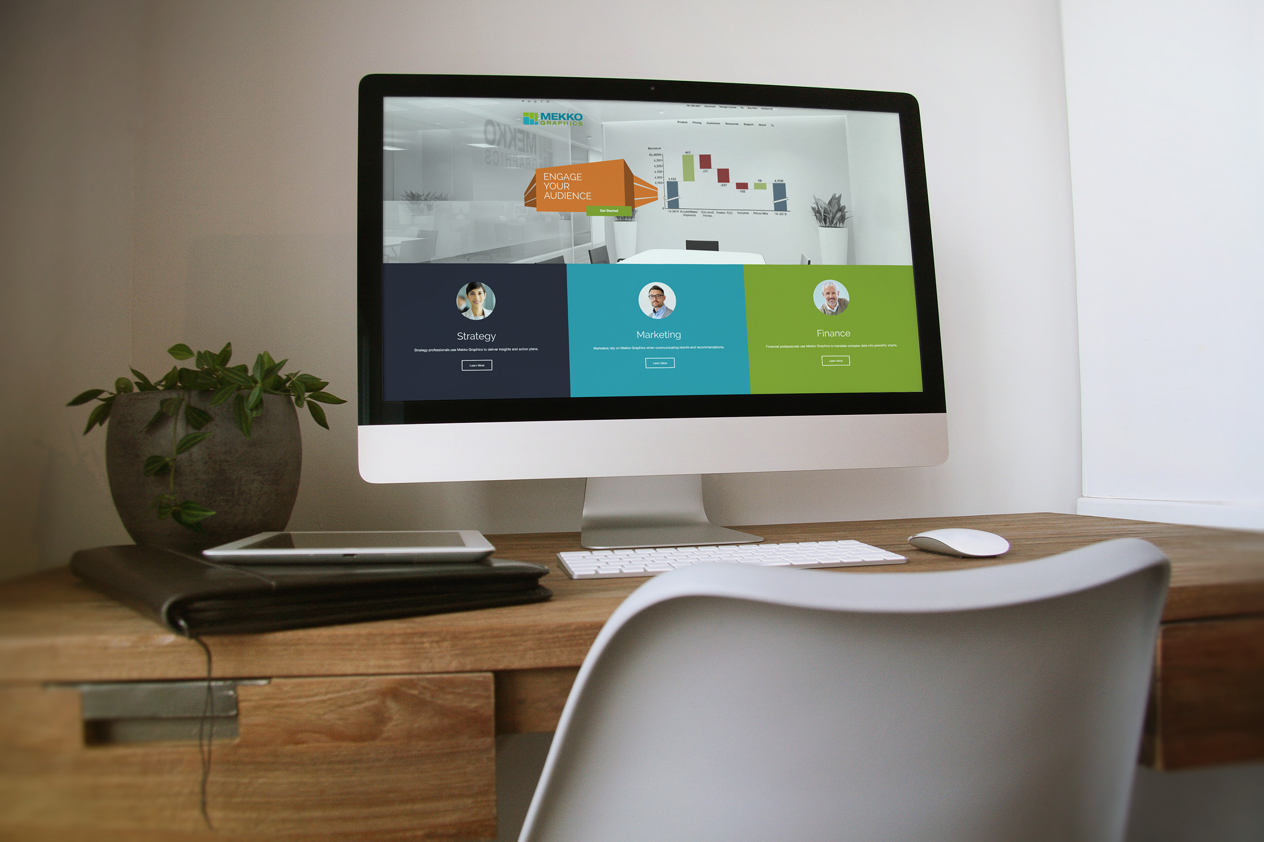
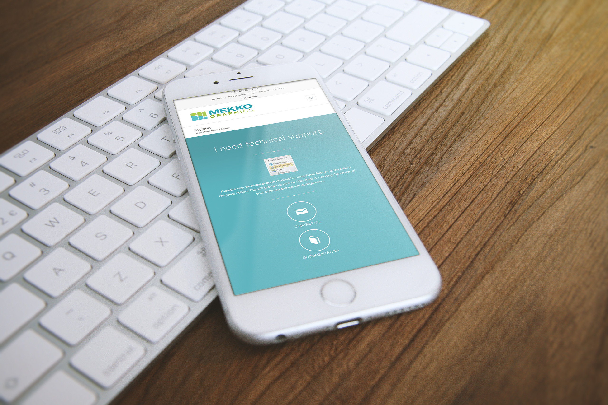
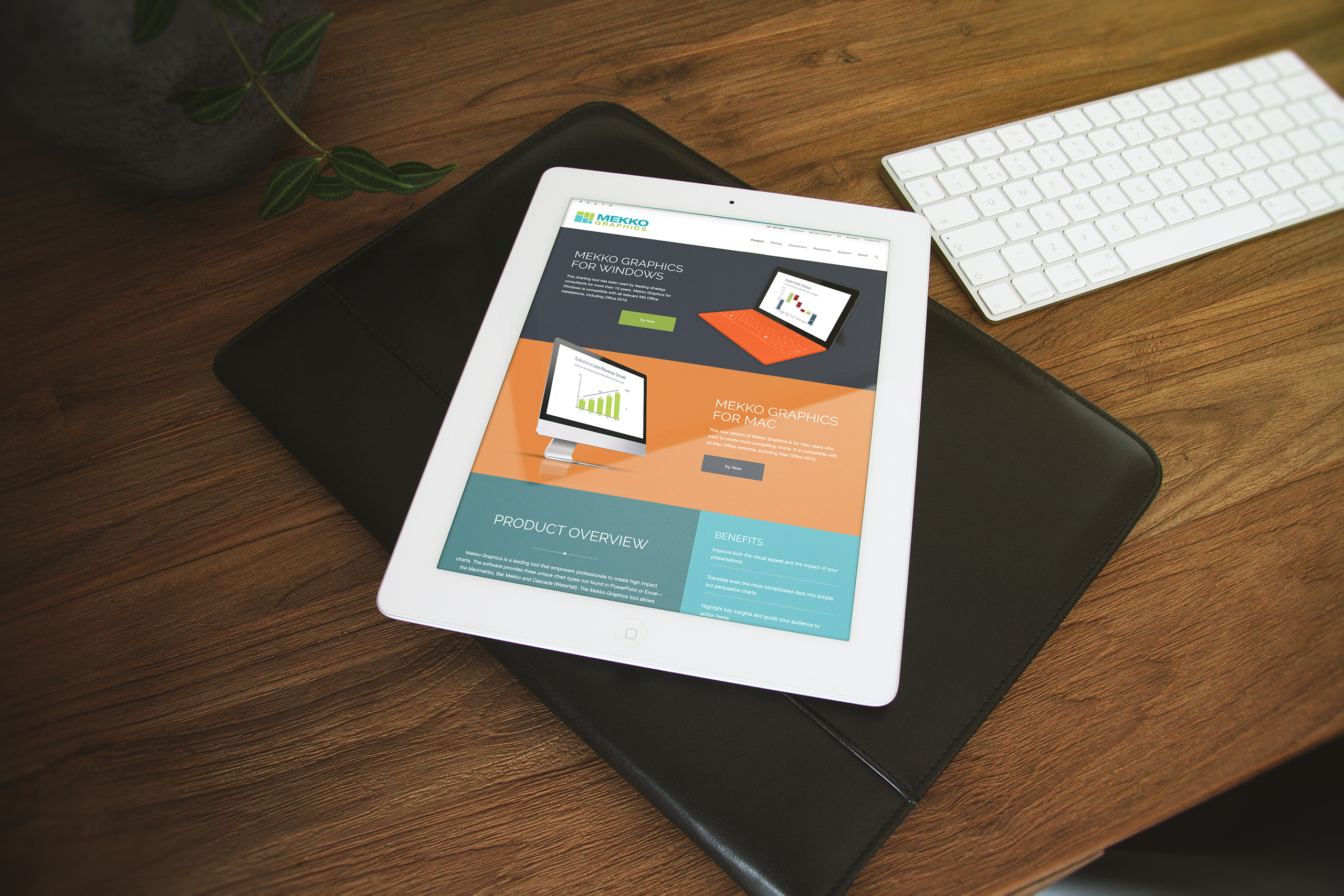
We designed the website around the decision a Mekko visitor is actually making: is this the tool my next client presentation deserves. Free trials lead, the store stays one step away, and how-to resources sit where a hesitating buyer looks for proof the software will hold up.
The taxonomy came first, planned with the marketing consultant before a pixel moved. Content is arranged the way the product would draw it: the whole offer visible at once, each section sized by its value to the visit, nothing buried in cleverness.
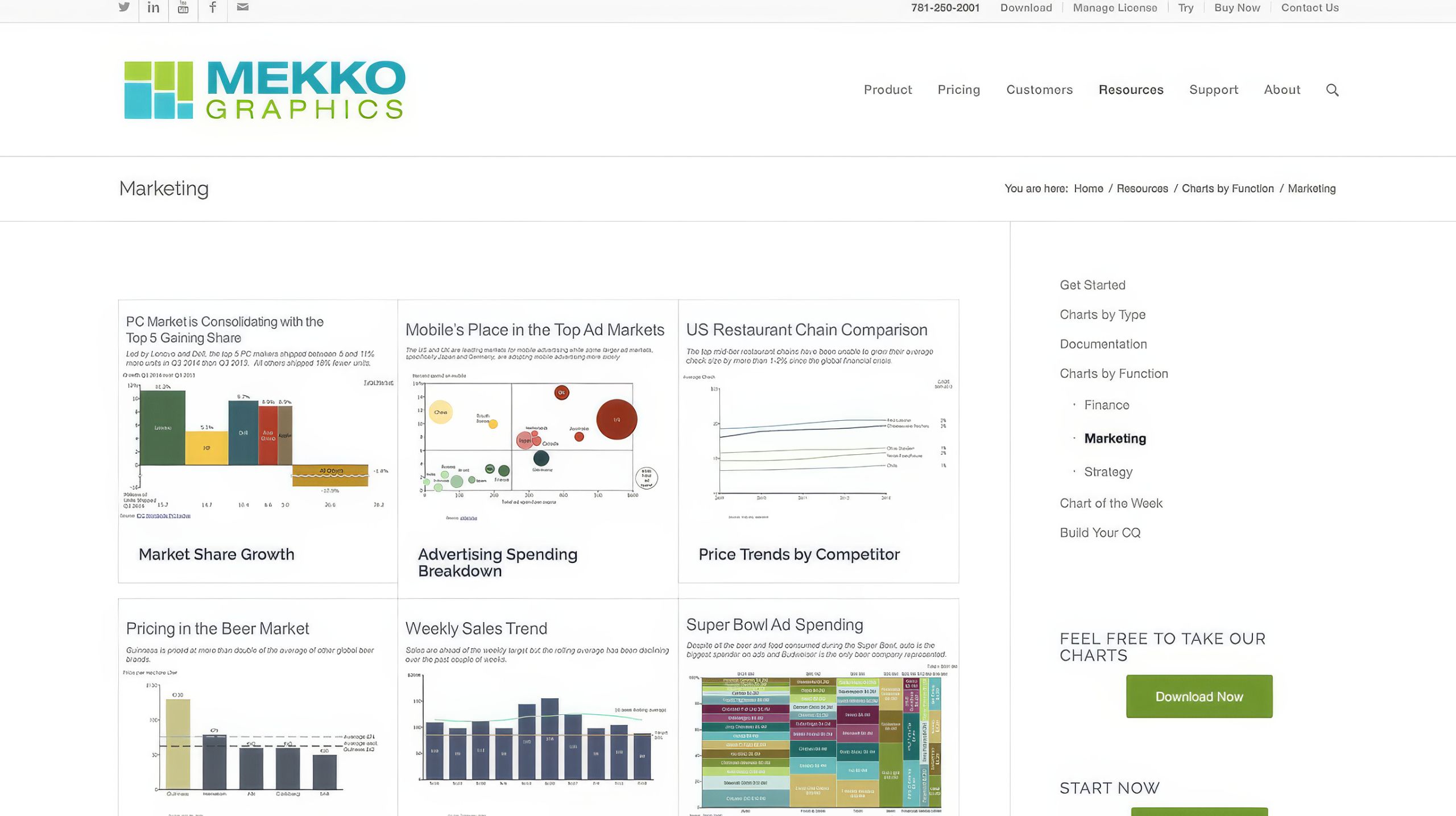
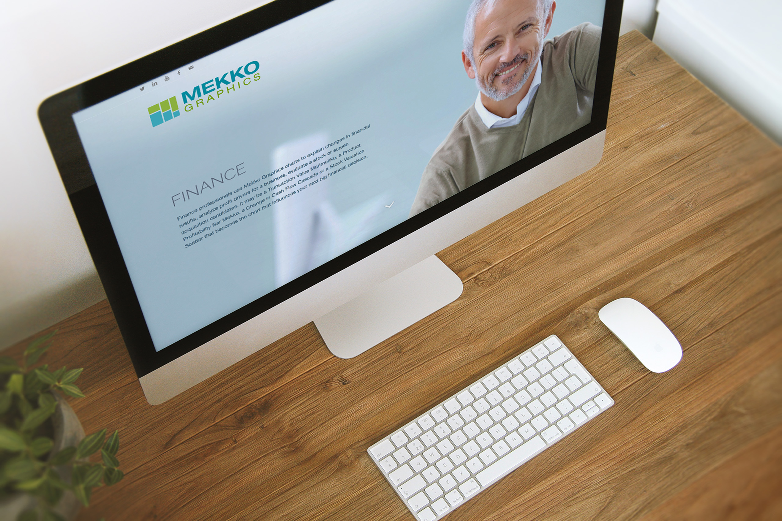
Three audiences read the same site three ways. Strategy, marketing, and finance consultants each find their own examples, their own language, and their own reasons to trust the chart they are about to stake a recommendation on.
Everything runs on WordPress, built so staff can edit, publish, and campaign without a developer. The four-week rebuild did not need a maintenance contract to survive, which was the point.